
MorningCooler · complex in dim light
A medium-light greige with a taupe base that turns cooler and more complex in dim or north light, then grounds to a true neutral in warm daylight. Sample it large and let your light cast the deciding vote.
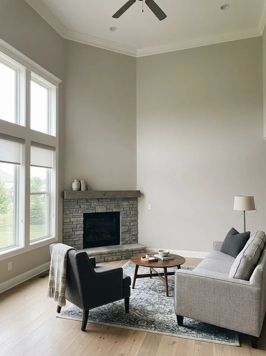
Repose Gray lands squarely in medium-light territory with an LRV of 58.2. That number tells you a lot: it is not a near-white that brightens a room by sheer reflectance, and it is not a moody mid-gray that demands careful placement. It reads as a soft, balanced gray with enough body to feel intentional on the wall, not washed out, and enough lightness to keep a room from feeling heavy. In good light, it settles into a calm neutral that reviewers describe as serene and clean without being cold.
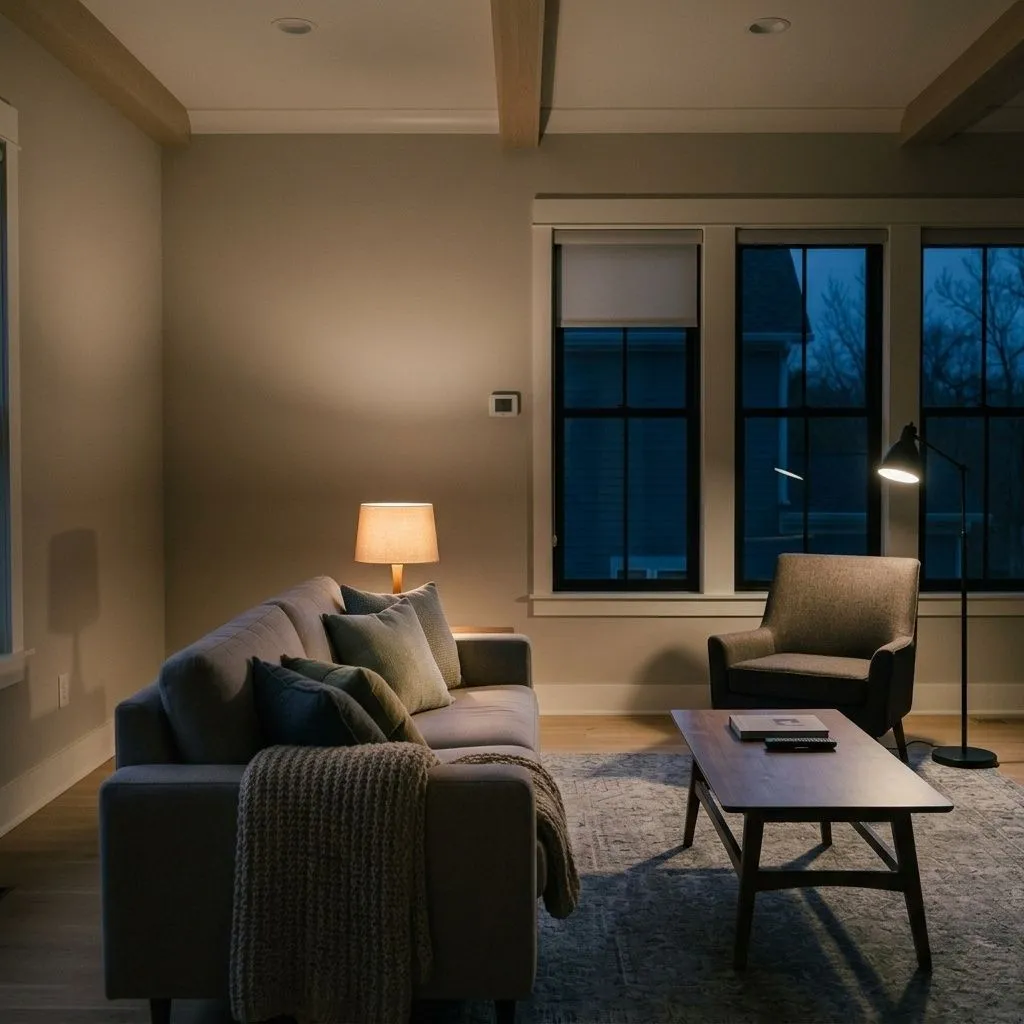
The tricky part is that Repose Gray does not look the same twice. Its behavior shifts noticeably with the light source, the time of day, and the colors around it. In bright south- or west-facing rooms it performs beautifully, showing a composed, slightly warm gray. In dimmer spaces or before the morning sun builds, it can turn flat and even read drab, because at LRV 58.2 it does not throw much light back into a dark room on its own. North-facing rooms or spaces with few windows are where reviewers consistently report disappointment.
The chameleon quality is both the appeal and the risk. You may paint your first coat on a cloudy afternoon and feel mild alarm at how purple or cool it looks, then return the next morning in warm sunlight and find it perfectly neutral. That range is real, not a trick of imagination, and it is the main reason every reviewer, without exception, tells you to sample large before committing.
The undertone debate around Repose Gray is one of the liveliest in the neutral-gray category, and independent reviewers do not land in the same place. The one finding that repeats most often is a violet or purple flash. It shows up most reliably in cool light conditions, early morning before warm sun enters, under daylight-spectrum bulbs rated at 5000K or higher, and on cloudy days. A few reviewers report it was strong enough on the first coat to genuinely worry them before warm light in the room settled it down. This purple note is the undertone that most surprises people who expect a straightforward greige.
The second thread is green. Some reviewers spot a soft green surface in north-facing rooms or under fluorescent lighting, and they note it is less buffered by beige than in warmer neutrals, which makes it more visible. A small number of reviewers also detect a faint blue shift in certain conditions, though most consider blue the least likely and least common of the three cool directions. Sitting beneath all of these shifts is a soft taupe and brown base that keeps the color grounded. That base is why Repose Gray almost never tips into muddy or dingy territory even when the cooler notes appear: there is warmth underneath doing quiet structural work.
Whether Repose Gray is ultimately warm or cool is genuinely contested. Many reviewers land on warm greige as the summary description, pointing to that brown-taupe foundation and the way it reads under warm incandescent or warm LED bulbs in the 2700K to 3000K range. Others insist that in practice, in real rooms with real light, the cool and lavender leanings are strong enough that calling it warm is misleading. Both camps have a point, and the honest answer is that lighting is the deciding vote. Warm bulbs keep it in its most grounded, neutral state. Cool or daylight bulbs hand the wheel to its violet side.
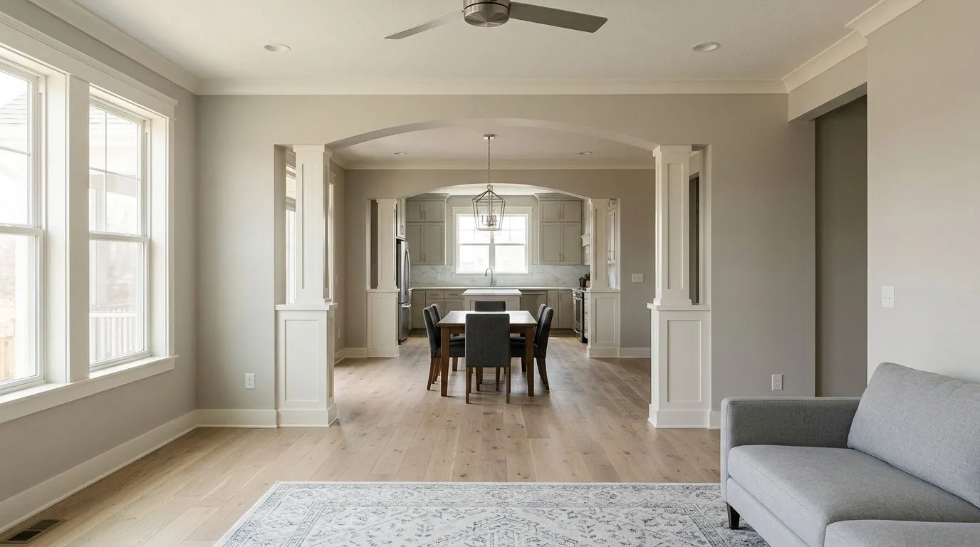
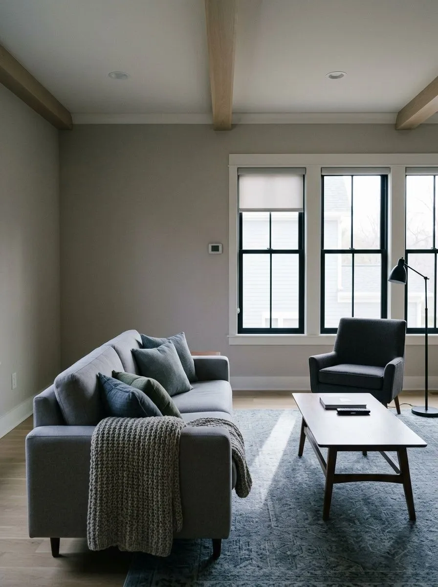
Repose Gray earns its spot on the Top Exterior Colors and Top Interior Colors lists because it genuinely works across a wide range of applications, but it works best under specific conditions. Bright rooms with south or west exposure are where it is most reliable. Open floor plans are a natural fit because the color holds its consistency across a large expanse and does not read differently from zone to zone the way more chameleon-like neutrals sometimes do. It is one of the most common whole-home neutrals for exactly that reason: it can travel from room to room without creating jarring shifts.
Bedrooms and bathrooms are strong candidates, especially if the rooms receive decent natural light. In bedrooms it reads calm and restful. In bathrooms the outcome depends heavily on the fixture lighting: warm vanity bulbs keep it from going lavender, while cool or bright-white bulbs will pull out its purple and green notes in a tighter space where there is less warm reflected light to balance it. For living rooms and main living areas, it performs well when there is ample window area and when the furnishings lean neutral or cool rather than warm tan or golden.
The places where reviewers consistently flag caution are north-facing rooms, rooms with small or few windows, and spaces where the primary light source is a cool overhead fixture. In those situations the LRV of 58.2 is not high enough to lift the room, and the color can read flat or even slightly dingy. It also requires some care around warm furnishings: tan rugs, golden wood tones, and clear-warm decor can conflict with its cooler undertones. If your home is already decorated with warm caramel or honey tones throughout, a warmer greige will likely cooperate better.
In an open living room with good south or west light, Repose Gray holds as a composed, cohesive neutral that reads the same from the seating area to the adjacent dining space. Pair trim in Eider White (SW 7014) and keep soft furnishings in cool or neutral tones to avoid a color fight with its lavender undertone. Cooler or gray-toned area rugs work better here than warm tan or beige ones.
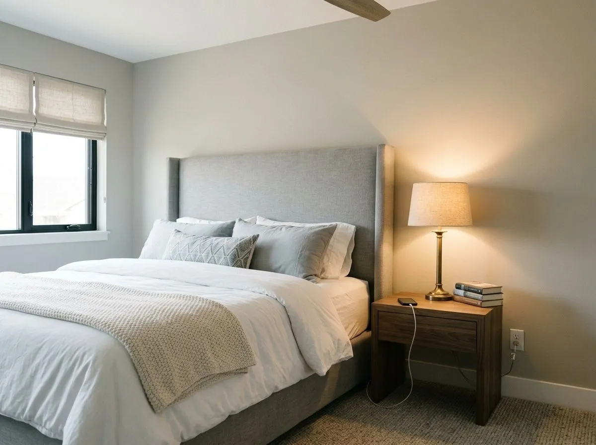
Repose Gray is a popular bedroom color because the slightly cool, gray quality reads as calm and restful rather than stimulating. It works especially well in rooms that receive morning or afternoon sun, which keeps its warmer base visible. Choose warm-white bedding and keep bulbs in the 2700K to 3000K range to prevent the lavender shift from dominating at night.
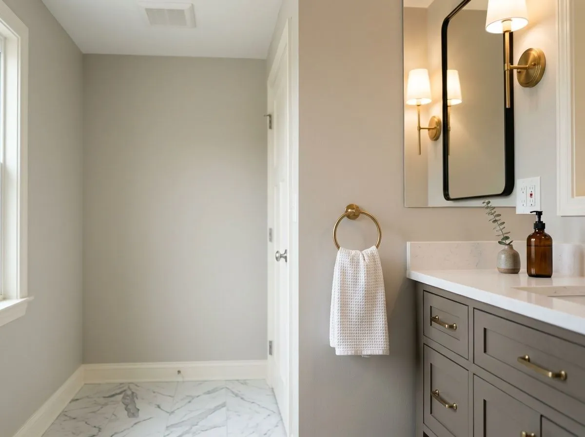
Bathrooms are where Repose Gray requires the most lighting attention. Warm vanity bulbs at 2700K to 3000K keep it looking like a clean, soft gray. Cool or daylight-rated bulbs in a small, enclosed bathroom with no natural light will pull out the purple and green notes noticeably, and there is less warm-reflected light to balance it than in a larger room.
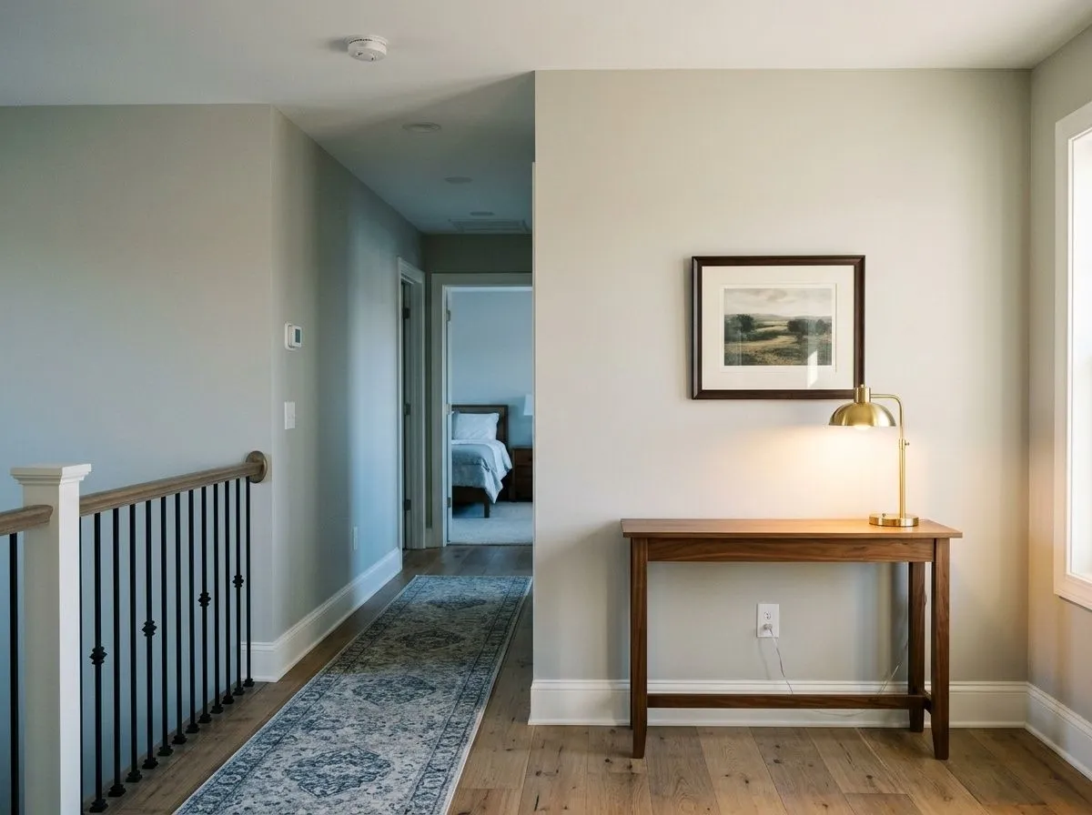
This is one of Repose Gray's strongest use cases. The LRV of 58.2 is consistent enough to travel from room to room without reading dramatically different in each space, and the neutral gray base bridges varied furnishings across different rooms. The caveat is that any north-facing or window-poor room in the same house may be the weak link, reading flat or dull compared to the sunlit spaces.
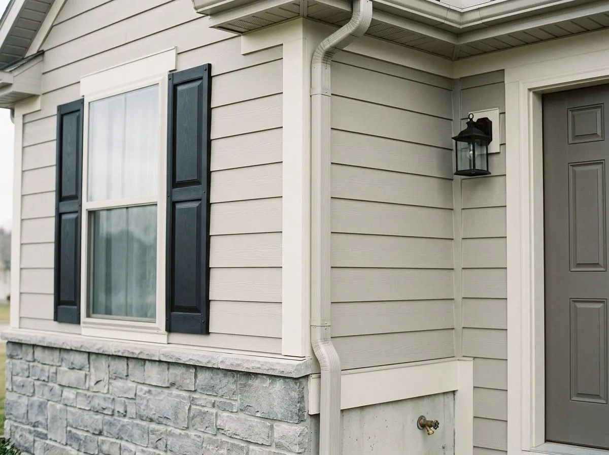
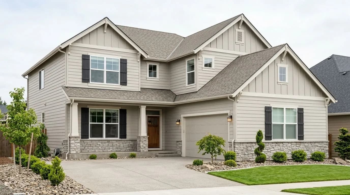
Repose Gray is on Sherwin-Williams' Top Exterior Colors list and reviewers confirm it reads well on siding under natural daylight. The main guidance for exteriors is to check the color in the actual orientation of your facade, since a north-facing elevation in shade will lean cooler and potentially more lavender than a sun-hit south side. Pavestone (SW 7642) works well for shutters or the front door.
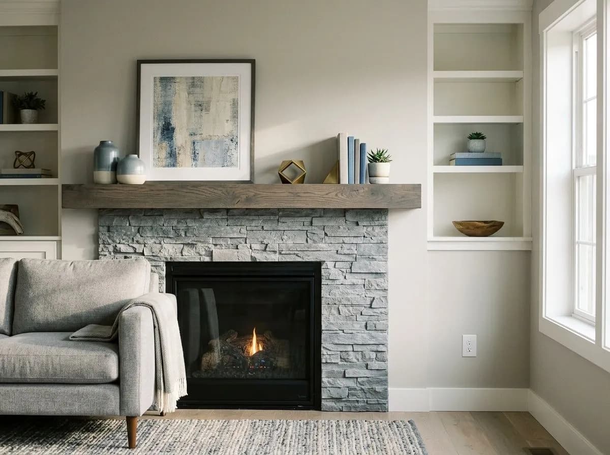
Sherwin-Williams pairs Repose Gray with Eider White (SW 7014), Pavestone (SW 7642), and Coral Clay (SW 9005) as its official coordinates, and the logic holds up. Eider White is the recommended trim choice precisely because it leans just slightly warm without pushing into cream territory, which keeps it from clashing with Repose Gray's cooler undertones. Pavestone gives you a darker, earthier anchor for doors, cabinetry, or accent moments and bridges the color's warm-base and cool-surface qualities well. The broader pairing principle that reviewers reinforce is to favor crisp, clean whites over warm or creamy off-whites for trim. Pure White and similarly clean whites work; richly warm creamy whites can fight the purple notes and create an uncomfortable contrast. There is some disagreement here since a handful of reviewers do pair Repose Gray successfully with warmer whites, particularly in rooms with strong warm light, but the safe direction is cleaner and cooler on the trim side.
For contrast and accent, the color responds well to deeper blue-grays, dark green-grays, and blue-green blends. These directions play with its cooler undertones rather than against them. On exteriors, reviewers point to pairings with Dorian Gray and Alabaster as consistently successful combinations that balance the body color's neutrality with a bright trim and a deeper accent.
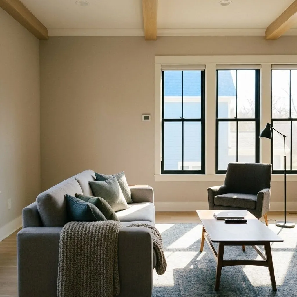
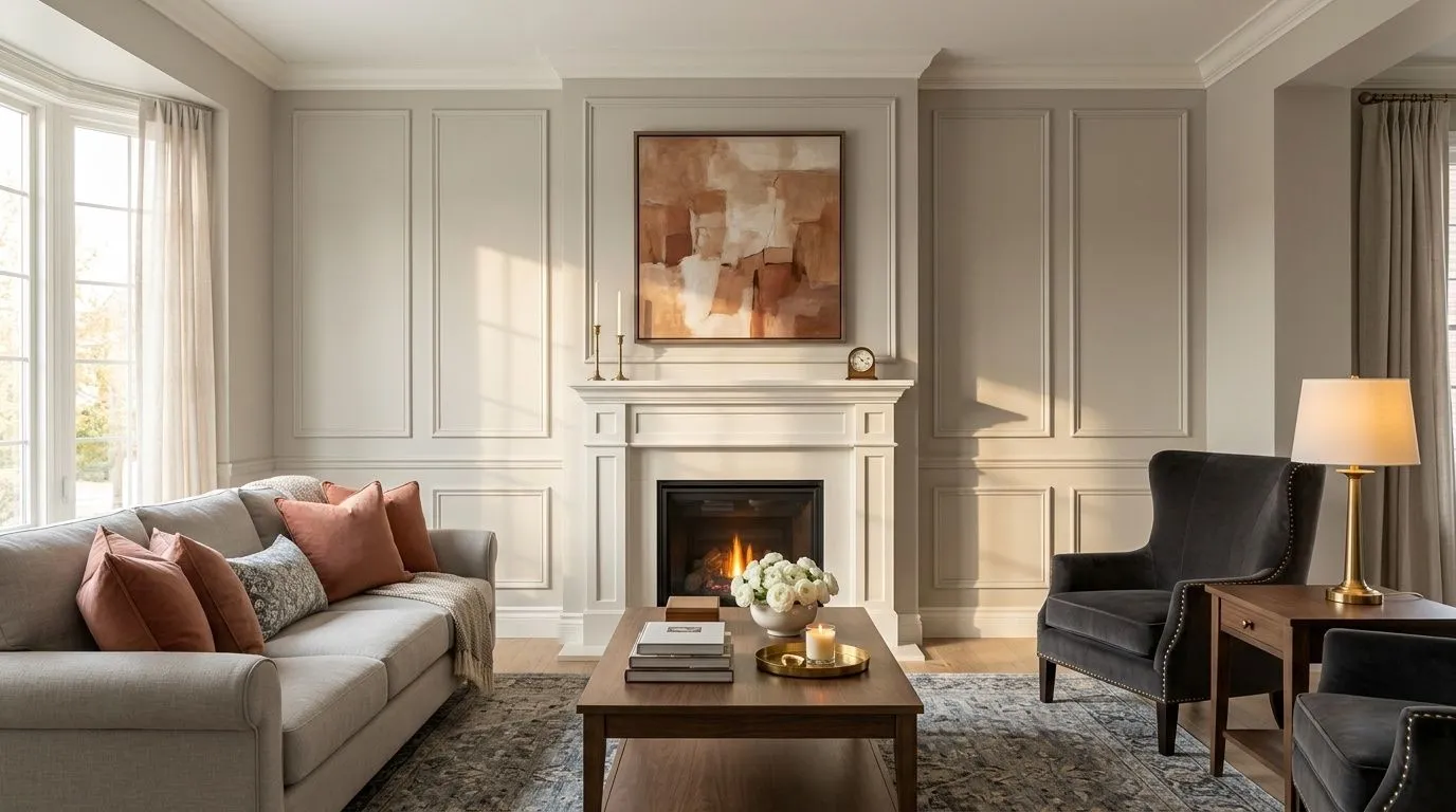
Pulling together this calm, classic living room starts with knowing exactly what you're shopping for, so the full palette of 7 colors is gathered here in one place. Two are actual paint: Repose Gray goes on the walls and the drenched panel-molding fireplace wall, while Eider White covers the trim, casings, crown, and mantel. The remaining five colors represent the room's furnishings and materials, each translated into its closest Sherwin-Williams match so you can hover a pin or swatch to identify what you're seeing.
All comparisons are matched against Repose Gray at LRV 58.2.
Repose Gray's violet and cool-gray undertones can fight a warm cream or ivory trim, creating an uncomfortable contrast rather than a clean border. The lavender note in the wall color and the yellow-orange warmth in a cream trim pull in opposite directions.
Strong golden wood tones, honey-stained floors, or tan and caramel rugs can make Repose Gray look cooler and more lavender by contrast. The warm tones in the floor read against the cool undertones in the wall and neither color looks its best.
In bathrooms or small rooms where a cool or daylight-spectrum overhead fixture is the dominant light source, Repose Gray can tip noticeably toward lavender or gray-green, with no warm reflected light to bring it back toward neutral.
Repose Gray (SW 7015) is a medium-light gray-greige with an LRV of 58.2. It sits between a true neutral gray and a greige, with enough body to read as a real gray color while a soft taupe-brown base keeps it from going cold. Its hex value is #CCC9C0 and its RGB is 204 / 201 / 192.
The undertone picture is more complicated than most paint brands suggest. The most commonly reported undertone in independent reviews is violet or purple, which surfaces most visibly in cool or dim light, on cloudy days, and under daylight-rated bulbs. A green undertone is the second most reported, especially in north-facing rooms. Some reviewers also detect a faint blue shift in certain conditions. Underneath all of those cooler notes sits a soft taupe and brown base that grounds the color and keeps it from reading muddy.
Both, depending on the light, and that is not a dodge. Many reviewers classify it as a warm greige because of its taupe-brown base. Others say that in real rooms with real lighting conditions, the cool and lavender leanings are prominent enough that calling it warm is misleading. Warm incandescent or warm LED bulbs in the 2700K to 3000K range keep it in its warmest, most grounded state. Cool or daylight bulbs hand the room to its violet side. The practical answer is to treat it as a neutral that can lean either direction depending on conditions.
Repose Gray has an LRV of 58.2. That puts it in the medium-light range. It is bright enough to use comfortably in well-lit rooms but not high enough to compensate for dark or north-facing spaces, which is why reviewers consistently caution against using it in rooms with limited natural light.
For trim, Eider White (SW 7014) is the recommended pairing because its slight warmth does not clash with Repose Gray's cooler undertones the way a rich creamy white can. For darker accents and doors, Pavestone (SW 7642) bridges the color's warm-base and cool-surface qualities well. For contrast accents, deeper blue-grays, dark green-grays, and blue-green blends all work with rather than against the color's undertones. Reviewers caution against warm creamy off-whites on trim and against heavily golden or tan accessories in the same space.
The Sherwin-Williams color code is SW 7015. The hex value is #CCC9C0 and the RGB is 204 / 201 / 192. The LRV is 58.2.
Yes on exteriors, with one important note. Repose Gray appears on Sherwin-Williams' Top Exterior Colors list and reviewers confirm it reads well on siding in natural daylight. Check it on the actual orientation of your facade before committing, since a shaded north-facing elevation will lean noticeably cooler and more lavender than a sun-facing side. For cabinets, it works well in kitchens and bathrooms with warm lighting, giving a soft gray look that is more refined than a stark white but less dramatic than a dark gray. Cooler cabinet lighting will pull out its lavender notes, so bulb temperature matters here too.