
MorningCrisp · graphic true black
A true, neutral black with an LRV of 2.8, Tricorn Black absorbs light cleanly and holds its identity in almost any condition. See how it reads in your space.
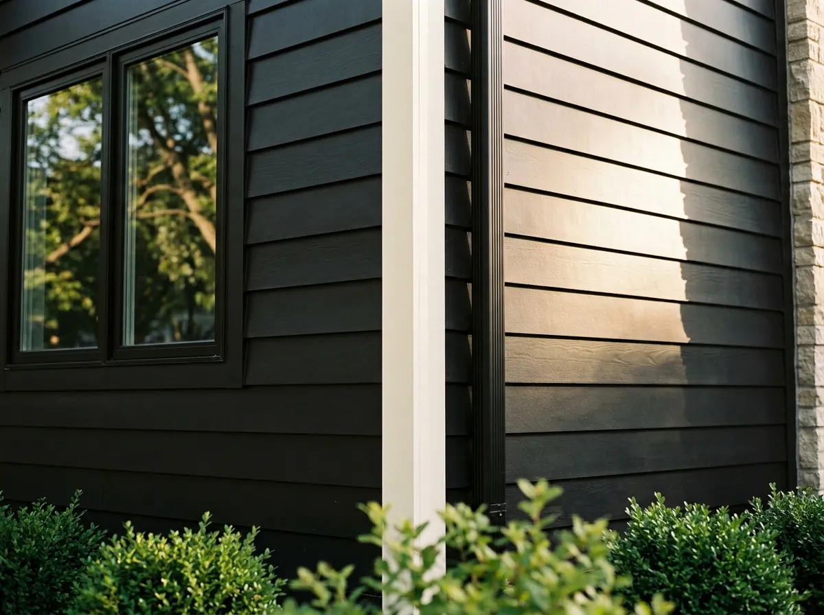
Tricorn Black reads as a saturated, crisp true black. At an LRV of 2.8 it absorbs almost all light that hits it, and the result is a depth that most other so-called blacks simply do not match. Reviewers consistently reach for it when they want pure black with no muddiness, no softening, no gray drift.
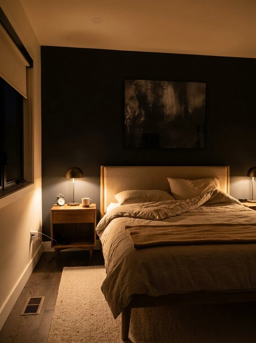
In bright natural light it stays crisp and graphic, almost graphic-design-level clean. Under warm or artificial light it can ease very slightly toward charcoal, but it never loses its identity. In a low-light or north-facing room it goes genuinely moody, and if you cover every surface it can tip into cave-like territory. That is a feature or a warning depending on what you are after.
Sheen choice shifts the reading considerably. A flat or matte finish gives you rich, even depth and hides wall imperfections well. Higher sheens reflect light off every surface irregularity, read a touch lighter where the light hits, and look harder-edged. Most reviewers land on flat or matte for walls, eggshell or satin for kitchens and baths, and semi-gloss or gloss for doors, trim, and cabinet faces where durability and wipeability matter.
The headline here is that Tricorn Black has almost no visible undertone, and that is precisely why it is so widely used. It does not lean blue, green, brown, or purple. It does not fight your flooring, your countertops, or your trim. Reviewers call it the neutral option when comparing it against blacks that carry more obvious color bias.
There is one small caveat that comes up repeatedly. It can read slightly bluish while it is wet. This resolves completely once the paint dries, and it is not a sign of a cool undertone in the finished color. If you have never painted with a very deep black before, do not judge the wet wall.
One observation worth noting: on the Sherwin-Williams fan deck Tricorn Black technically falls within a purple-blue color family, which surprises people who look it up. In practice that family placement shows almost no visible hue on the wall. It is included here for transparency, not because it changes how the color behaves in your space.
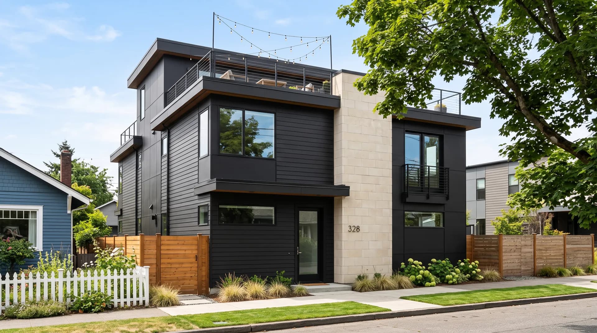
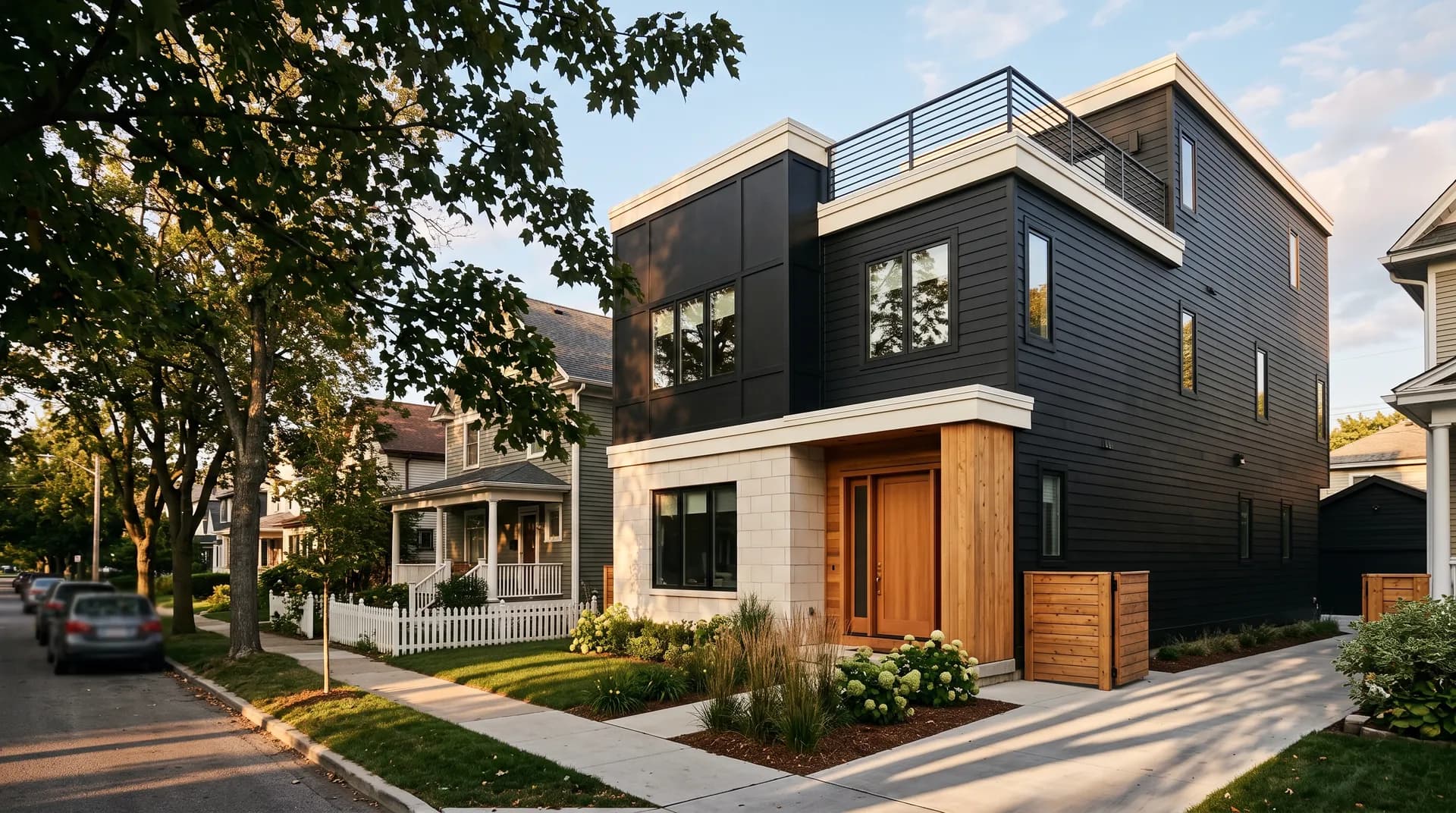
The biggest use case by volume is exterior work, and Tricorn Black earns that reputation. On siding it delivers crisp, timeless contrast against almost any surrounding material. On a front door it reads bold and grounded without being aggressive. Shutters, garage doors, fascia, window sashes, and trim all work well, and the neutral character means it does not fight brick, stone, or wood cladding. One reviewer noted nearly a decade of continued satisfaction with it on the outside of their home.
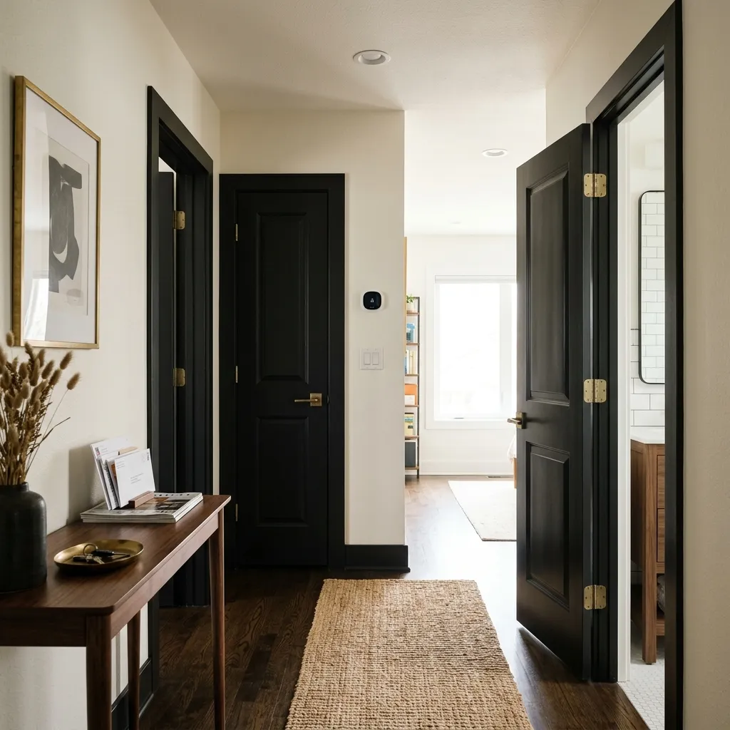
Indoors, cabinets and islands are the most common application. Kitchen and bath cabinets in Tricorn Black with warm wood countertops or warm metal hardware, brass or matte gold especially, photograph well and hold up over time. Vanities in smaller bathrooms can feel dramatic but work if the room has good light or white walls to balance. Interior and closet doors are another strong use, especially as a millwork color when you want contrast without committing to a full painted room.
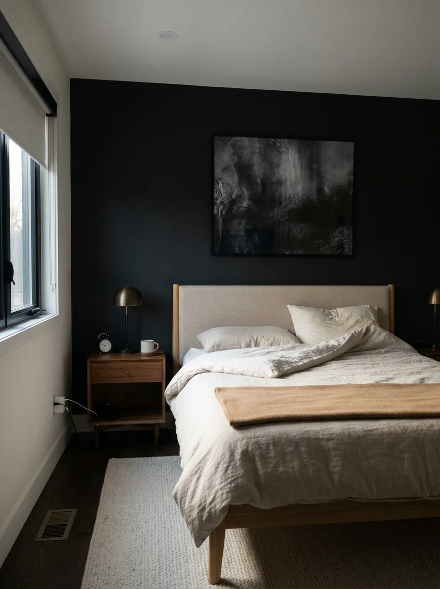
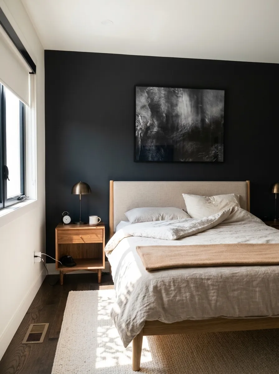
Accent and feature walls are popular too, as is the fireplace surround. Full room coverage indoors is less common and requires more care. If the room is small or dark, consider limiting Tricorn Black to one wall or to the millwork and keeping the ceiling in a crisp white. That approach gives you the drama without the enclosure.
Tricorn Black on exterior siding or as a full exterior color gives a sharp, graphic look that stays readable in almost any light. Its LRV of 2.8 means it will absorb heat in direct sun, so that is worth factoring in for very hot climates or surfaces with extended south or west exposure. Pair with a warm creamy white on trim for contrast that feels timeless rather than cold, or with natural wood and metal accents to keep it grounded.
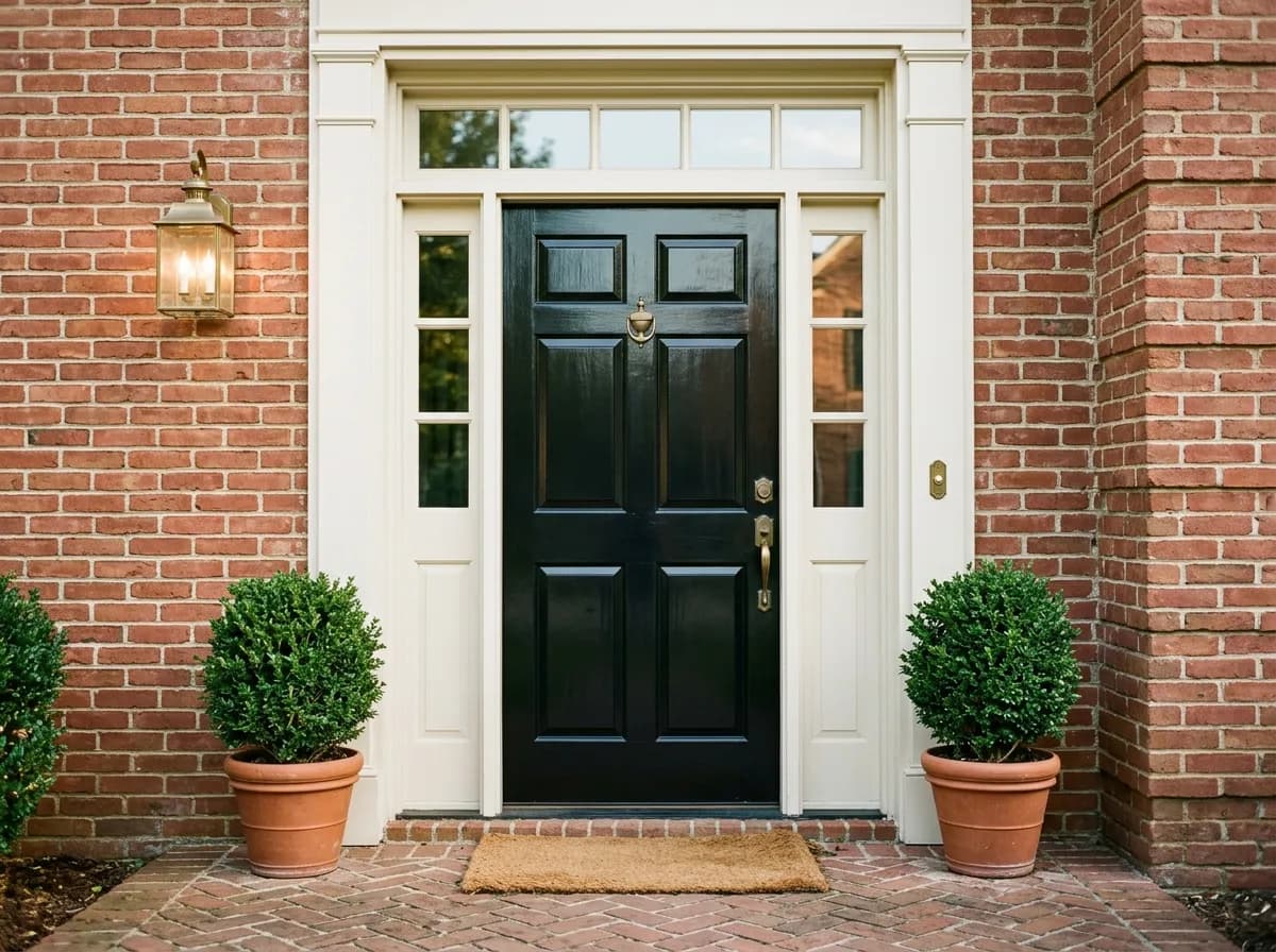
A front door in Tricorn Black is one of the most straightforward, high-impact moves in exterior color. It works against brick, stucco, lap siding, and shingle. A semi-gloss or gloss finish is the standard choice here for durability and the slight light reflection that makes the door pop. Brass or matte gold hardware reads especially well against it and adds warmth without softening the overall effect.
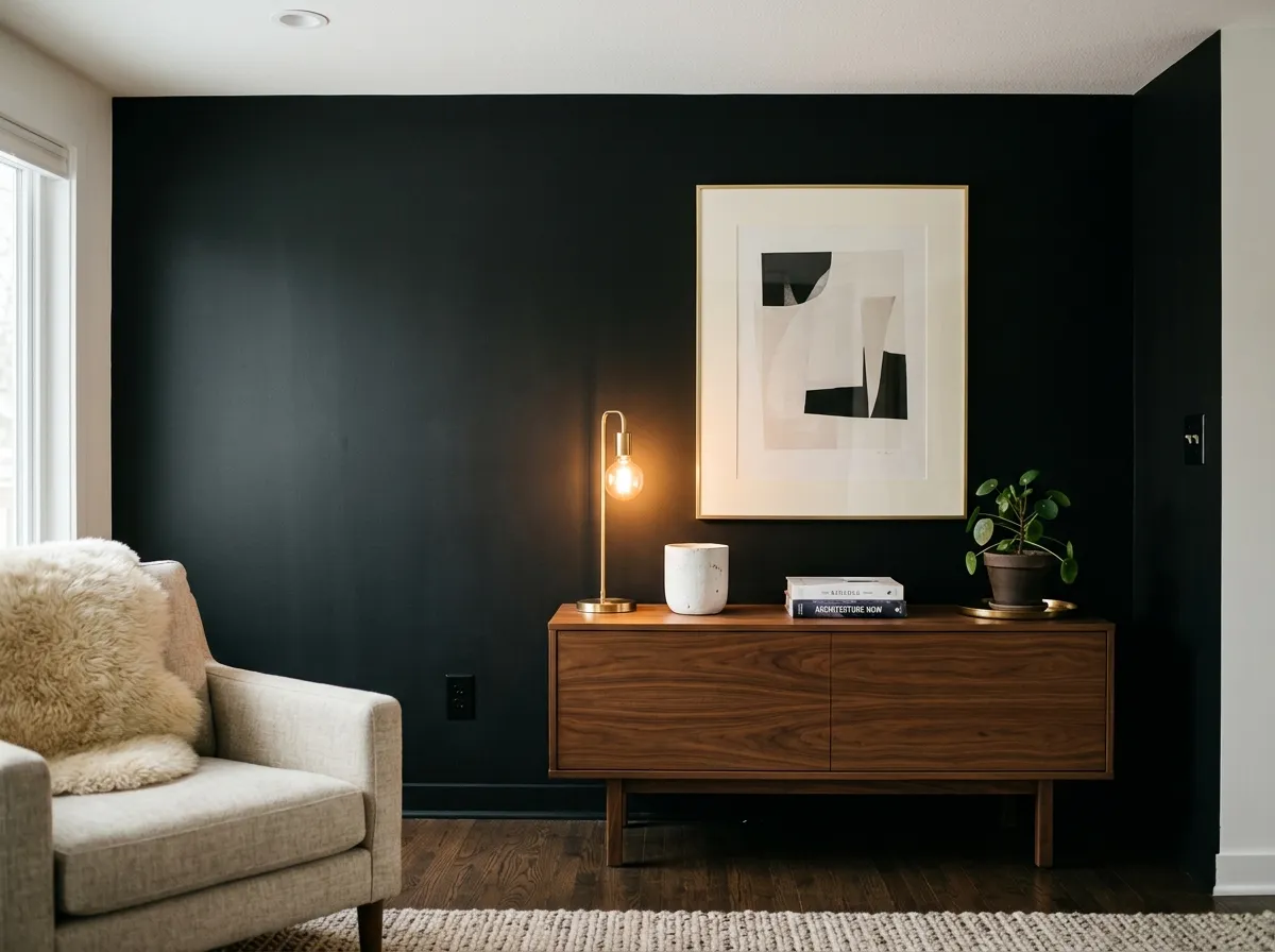
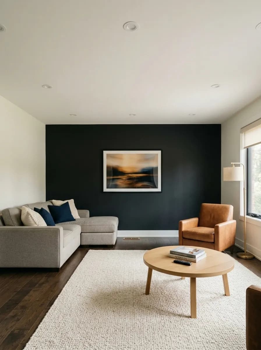
An accent wall in Tricorn Black anchors a room without requiring full commitment. In a bedroom or living room it works best on the wall behind a bed or sofa, where furniture in natural wood or warm fabric tones keeps the space from feeling heavy. Keep the ceiling white to maintain the sense of height. In a room with good natural light this is a confident move. In a darker room, limit it to the one surface and let the remaining walls breathe.
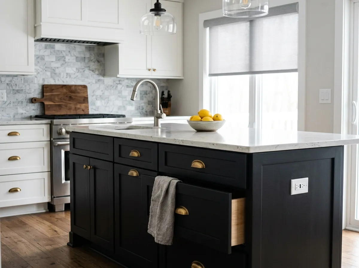
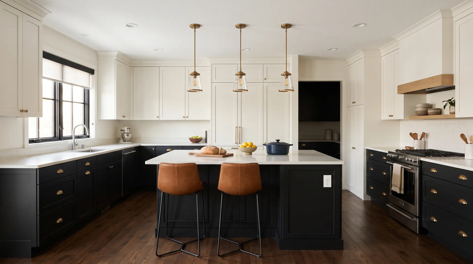
Cabinets are one of Tricorn Black's strongest interior applications. Lower cabinets in black with upper cabinets in a warm creamy white is a kitchen layout that photographs well and works day to day. Islands work beautifully in this color too. A satin or semi-gloss finish is practical here for cleaning, and the slight sheen on cabinet faces adds dimension without looking industrial. Warm wood hardware, pulls in matte brass, or open shelving in natural oak all pair well.
Because Tricorn Black carries essentially no undertone, it pairs naturally with both warm and cool colors without creating a fight. High-contrast combinations are where it really performs. Ice Cube gives you a clean, light counterpart that reads bright without going cold. Classic Light Buff brings in a warmer, softer note that takes the edge off full contrast without going muddy. Blithe Blue introduces a mid-tone cool accent that reads collected and current alongside such a deep neutral.
Outside the coordinating palette, warm whites generally work better as primary companions than cold blue-based whites, which can look clinical next to a true black. Exposed wood, brick, and warm metals like brass or matte gold hardware are natural allies. The color is forgiving in pairing because it gets out of its own way tonally.
Tricorn Black and Alabaster are the only paint here, with Tricorn Black on the island and lower cabinets and Alabaster carrying the perimeter cabinets and walls. The other five colors, Toasty, Naval, Basket Beige, Umber Rust, and Renwick Golden Oak, represent the room's actual furnishings and materials, each matched to its closest Sherwin-Williams equivalent. Hover any pin or swatch to see exactly which color you're looking at.
All comparisons are matched against Tricorn Black at LRV 2.8.
Pairing Tricorn Black with a trim color that has a strong blue or icy undertone can read clinical and harsh rather than crisp and grounded. The combination amplifies the coolness of both colors and loses warmth.
With an LRV of 2.8, Tricorn Black on all four walls and the ceiling of a room with limited natural light will absorb what little light exists and can feel enclosed and oppressive rather than dramatic and moody.
A semi-gloss or gloss finish on a wall with dings, roller texture, or patchy repairs makes every imperfection visible because the sheen catches and reflects light across the surface. At this depth of color, flaws read loudly.
Tricorn Black (SW 6258) is a deep, saturated true black. With an LRV of 2.8 it is among the darkest colors in the Sherwin-Williams line, absorbing nearly all light and reading as a crisp, clean black rather than a softened charcoal or very dark gray.
Tricorn Black is widely considered to have essentially no visible undertone. It does not lean blue, green, brown, or purple in its dried, finished state. One small note: it can read slightly bluish while wet, but that resolves completely once dry. Its neutrality is the main reason it is so widely used; it does not fight other finishes or materials in the space.
It is neither strongly warm nor strongly cool. Reviewers and our editorial read both place it as neutral. That neutrality is its defining characteristic and the reason it pairs easily with warm woods and metals as well as cooler whites and blues without creating a tonal conflict.
Tricorn Black has an LRV of 2.8. LRV measures how much light a color reflects on a scale from 0 (pure black) to 100 (pure white). At 2.8 it absorbs almost all light that hits it, which is why it reads as such a deep, definitive black rather than a very dark gray.
The Sherwin-Williams paint code is SW 6258. The hex value is #2F2F30 and the RGB is 47, 47, 48. These values reflect the near-equal red, green, and blue channels that confirm its neutral, undertone-free character.
Because it is neutral, Tricorn Black pairs with a wide range of colors. Warm whites reduce starkness and feel grounded. Crisp clean whites maximize contrast for a bold, graphic look. Ice Cube, Classic Light Buff, and Blithe Blue are the coordinating colors on this page and each takes a different approach to pairing. Warm wood tones, exposed brick, and metals like brass and matte gold all work naturally alongside it.
Yes to all three, and these are among its most common real-world uses. On exteriors it delivers crisp, timeless contrast against almost any material. On a front door it reads confident and grounded, especially with semi-gloss or gloss finish and warm metal hardware. On cabinets and islands it is a strong, practical choice in satin or semi-gloss for wipeability. Reviewers report long-term satisfaction in all three applications.