
MorningCoolest · near-neutral black
One of the deepest blacks Sherwin-Williams makes, with a quiet warmth that keeps it from reading cold or industrial. Sample it in your specific light before you commit.
Black Magic reads as one of the deepest colors Sherwin-Williams makes. On the wall it lands about as close to a true black as you can get from their lineup, with an LRV of just 3.1 pulling in almost all available light. In a well-lit room it holds a rich, solid depth. In a dim space it can flatten out and simply read as a dark void, so light really does determine how much you get out of it.
In direct natural light the color reveals a subtle warmth that keeps it from feeling stark or industrial. That warmth is slight but real, and it is what separates Black Magic from the cooler, more neutral blacks in Sherwin-Williams's palette. At night under incandescent or warm LED lighting, that quality becomes a little more visible, softening the edge just enough to feel intentional rather than severe.
Sheen level plays a notable role here. In a flat or matte finish the color is maximally absorptive and looks almost velvet-like. Step up to a satin or semi-gloss and the surface starts to reflect, which adds visual interest on cabinets, trim, or a front door but also makes any surface imperfections more visible. Sample it in the finish you plan to use, not just any finish, before committing.
The undertone story for Black Magic is genuinely contested, and it is worth understanding both sides before you buy. Sherwin-Williams positions the color as having a slight warmth, and that is consistent with where it sits in the Warms and Neutrals family. Many reviewers confirm a subtle warm brown quality that surfaces in certain lighting conditions, particularly in natural daylight on south- or west-facing walls.
At the same time, a fair number of people describe Black Magic as reading close to a neutral black with very little obvious undertone pull in either direction. At LRV 3.1 the color is so dark that undertones are compressed and hard to read confidently under most indoor lighting. The warm quality is there, but it is quiet enough that if you are not actively looking for it, you may simply see a deep, near-neutral black.
What this means practically: Black Magic is not going to throw a green or blue cast the way some very dark colors do, and it is warmer than Tricorn Black, which leans cool and neutral. But it is not a dramatically warm or brown-tinted black either. If you need a black that clearly reads warm, sample it against Caviar, which carries a more obvious warm brown lean. If your concern is coolness, Black Magic is likely safer than Tricorn Black. The honest answer is that the undertone is subtle enough that your specific lighting and surroundings will shape your perception more than any single description can predict.
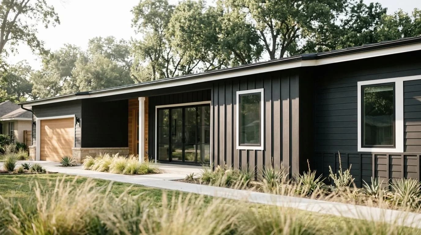
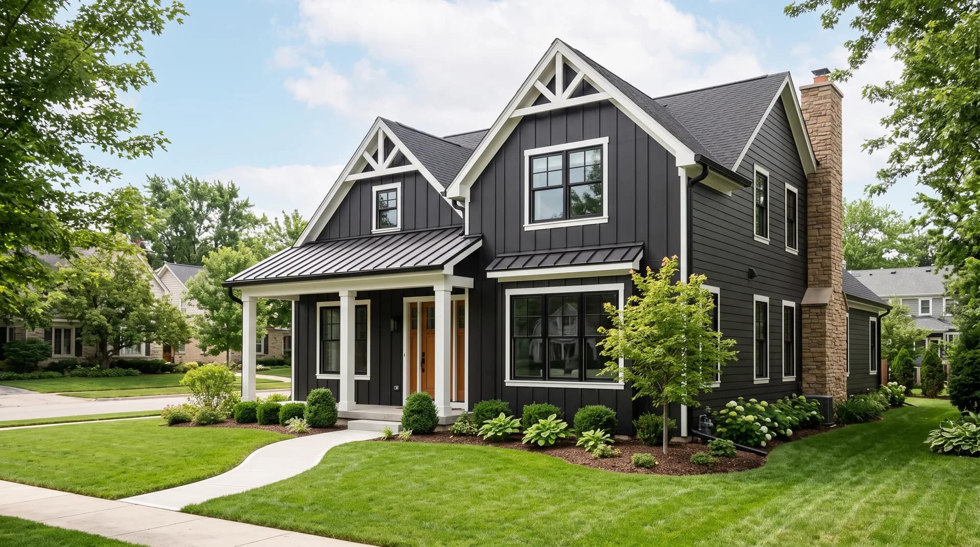
Black Magic is built for situations where you want real depth and commitment. On exteriors it excels, particularly on contemporary, modern farmhouse, or transitional homes where a deep black reads as crisp and intentional rather than heavy. It is included in Sherwin-Williams's Top Exterior Colors collection for good reason. Paired with bright white trim it creates the kind of high-contrast exterior that photographs well and holds up in all seasons.
For front doors it is a strong, flexible choice. A semi-gloss or high-gloss finish on a front door brings out a lacquer-like quality that looks sharp against a lighter facade. It works on both traditional and contemporary door styles, which gives it more range than some of the more stylistically specific deep colors in this category.
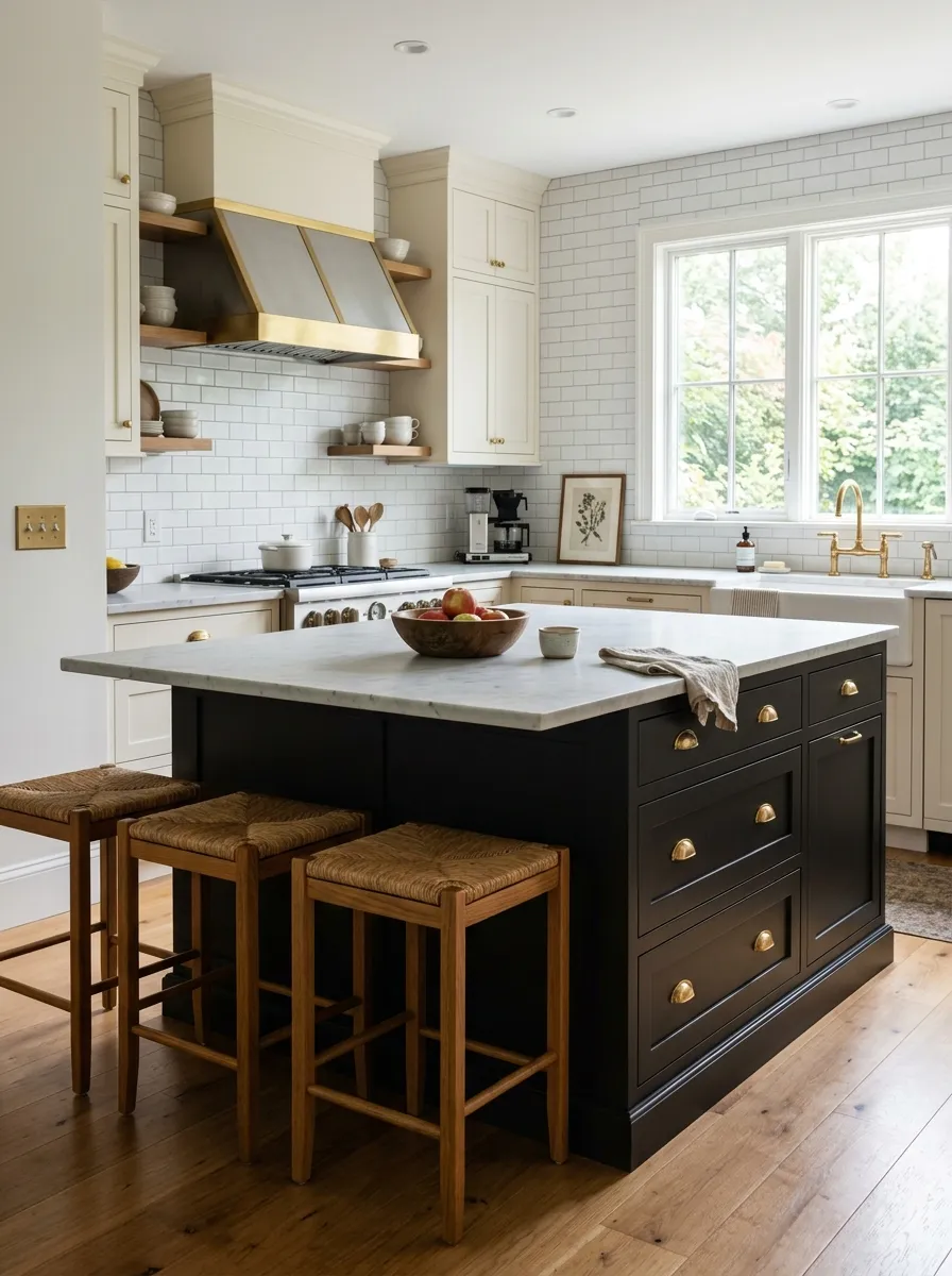
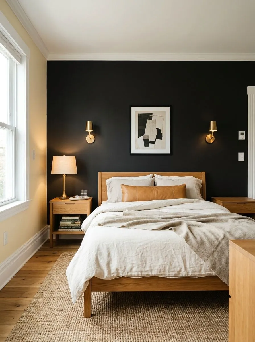
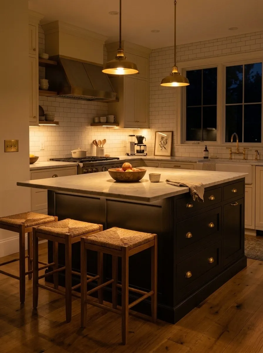
Inside the house, accent walls and cabinets are where Black Magic earns the most consistent praise. An accent wall in a living room or bedroom benefits from its depth as long as the rest of the room has enough light and contrast to keep things from feeling closed-in. For cabinetry, especially kitchen islands or bathroom vanities, the LRV of 3.1 means you are getting a very dramatic look, so pair it with lighter countertops and hardware to give the eye somewhere to rest. Avoid using it as a full-room color in rooms with little natural light or small square footage unless you are deliberately going for a moody, cocoon-like effect.
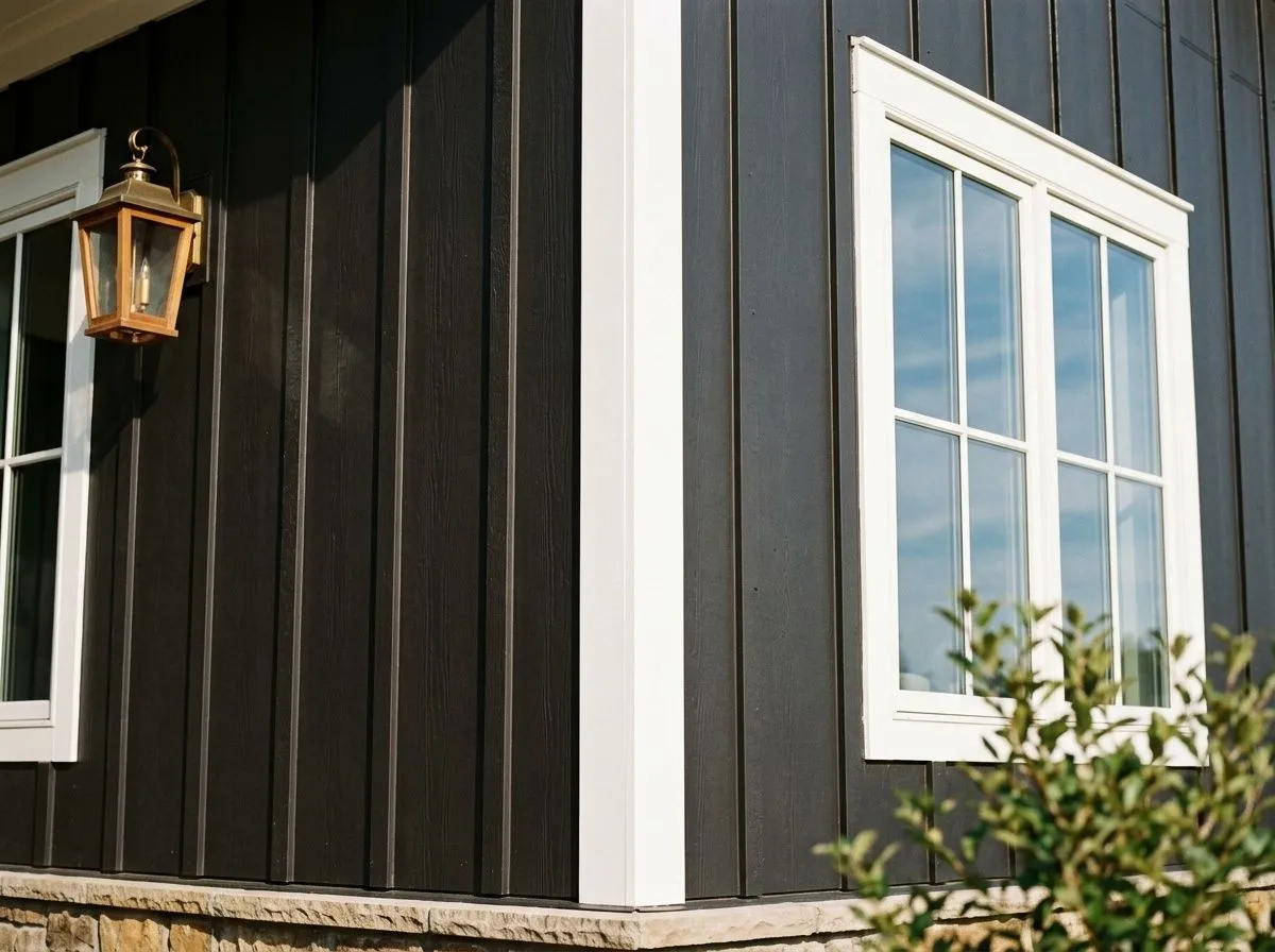
This is where Black Magic is most at home. The LRV of 3.1 reads as a rich, solid black on siding, shingles, or board-and-batten, especially against bright white trim. Use a satin or flat exterior finish on body, and consider bumping trim to a higher sheen to define the lines.
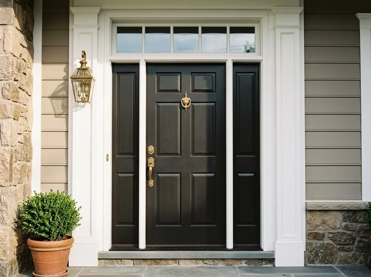
A semi-gloss or high-gloss application on a front door gives Black Magic a lacquer-like quality that holds up well to weather and sunlight. It suits both contemporary and traditional door styles, and the subtle warmth keeps it from looking cold against natural wood or warm-toned masonry.
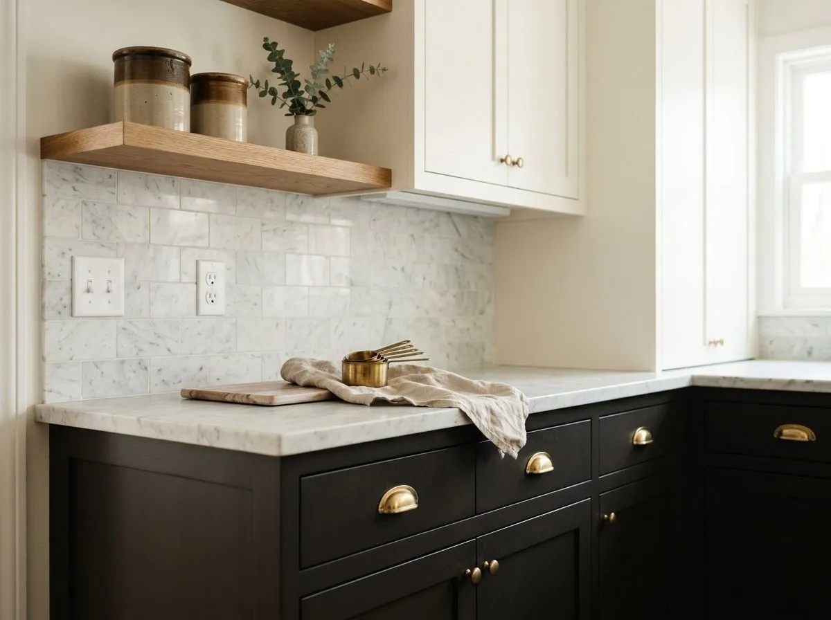
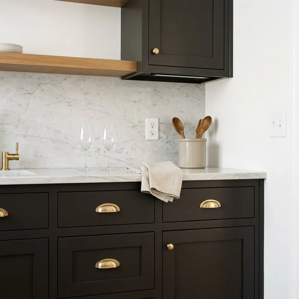
On lower cabinets or a kitchen island, Black Magic at LRV 3.1 creates a strong base that pairs well with lighter stone countertops and brass or unlacquered metal hardware. Keep upper cabinets and walls noticeably lighter so the room does not feel compressed.
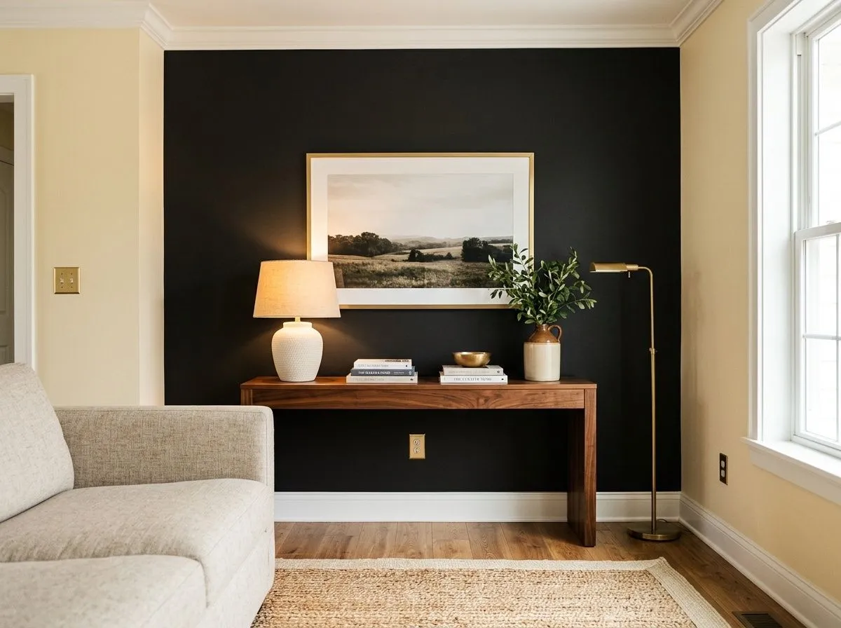
A single accent wall in a living room or bedroom lets you use Black Magic's depth as a focal point without overwhelming the space. The wall will absorb light, so make sure the adjacent walls are bright and the room has solid natural or layered artificial lighting.
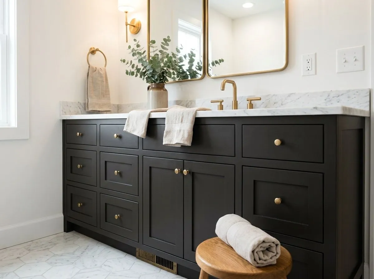
A painted vanity in Black Magic reads sharp and deliberate in a bathroom, especially with white or light marble countertops. Good overhead or mirror lighting is essential here since the LRV of 3.1 will drink up any dim light and the vanity can lose its detail.
Black Magic anchors a palette best when it is surrounded by colors that give it contrast or warmth to play against. Snowbound is the most direct pairing for trim, ceilings, and built-ins: its clean, bright quality creates a sharp boundary against Black Magic's depth without reading cold or blue. That high-contrast combination is a reliable move on exteriors and cabinets alike.
If you want to soften the overall palette and bring out the warmth that lives inside Black Magic, Lemon Meringue and Anjou Pear are well-suited options. A soft golden-cream wall color alongside Black Magic accents keeps the scheme from feeling heavy. These warmer tones make the subtle brown warmth in Black Magic more legible and give a room a grounded, cohesive feeling rather than a stark graphic one.
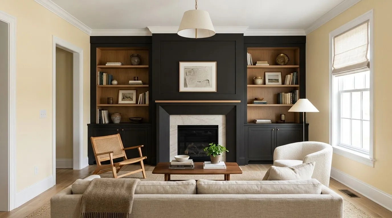
Black Magic is paint in three places only: the fireplace surround and the flanking built-in bookcases carry the dark feature, Snowbound covers all the ceiling, trim, crown, and window casings, and Lemon Meringue warms the surrounding walls. The remaining four colors are the room's furnishings and materials, each matched to its closest Sherwin-Williams equivalent so you can shop or mix with confidence. Hover any pin or swatch to see exactly which color it is.
All comparisons are matched against Black Magic at LRV 3.1.
Black Magic's subtle warmth fights with distinctly cool blue-gray wall colors. The contrast of undertone temperatures creates a visual tension that feels unresolved rather than intentional.
At LRV 3.1, Black Magic absorbs nearly all available light. In a room that already lacks natural light, a full application on walls or large surfaces can make the space feel smaller and flatter than intended.
A flat or matte finish at this depth shows fingerprints, scuffs, and cleaning marks quickly. On doors, cabinets, and trim those marks stand out against the dark ground.
Black Magic SW 6991 is one of the deepest colors in the Sherwin-Williams line, reading as a near-true black with a subtle warm quality that keeps it from feeling cold or stark. It sits in the Warms and Neutrals family and is designed for contemporary exteriors, front doors, cabinets, and dramatic accent walls.
The undertone is genuinely debated. Sherwin-Williams describes a slight warmth, and many reviewers confirm a subtle warm brown quality that shows in natural daylight. Others read it as a near-neutral black where the undertone is too compressed by the low LRV to be obvious. It is warmer than Tricorn Black but far less obviously brown than Caviar. The safest approach is to sample it in your specific light conditions.
Black Magic leans warm rather than cool, which is what separates it from Tricorn Black. The warmth is subtle at LRV 3.1 because the color is so dark, but in direct natural light a mild brown quality emerges. It is not a cold, blue-leaning black, and it is not a dramatically warm brown-black either. It sits closer to neutral with a warm tilt.
Black Magic has an LRV of 3.1, which is extremely low. It reflects back only about 3 percent of light, meaning it absorbs almost everything and reads as a deep, heavy black in most conditions. This makes it best suited for well-lit spaces or for use as an accent rather than a full-room wall color.
The Sherwin-Williams code is SW 6991. The hex value is #323132 and the RGB is 50, 49, 50.
Snowbound is the most reliable pairing for bright, high-contrast trim and ceilings. For a warmer, softer palette, Lemon Meringue and Anjou Pear bring out the warmth in Black Magic and keep the combination from feeling too stark. On exteriors, crisp white trim is the classic approach. On interiors, warm wood tones, brass hardware, and light stone countertops all work well alongside it.
Yes to all three. It is included in Sherwin-Williams's Top Exterior Colors collection and works well on contemporary and transitional home exteriors. On a front door in semi-gloss or high-gloss it has a clean, lacquer-like look. On cabinets, especially kitchen islands or bathroom vanities, it makes a strong statement as long as the surrounding surfaces are light enough to provide contrast.