
MorningBright light · brown depth shows

A warm near-black with a faint brown depth that keeps it grounded and confident rather than cold. See how that warmth shifts in your light.
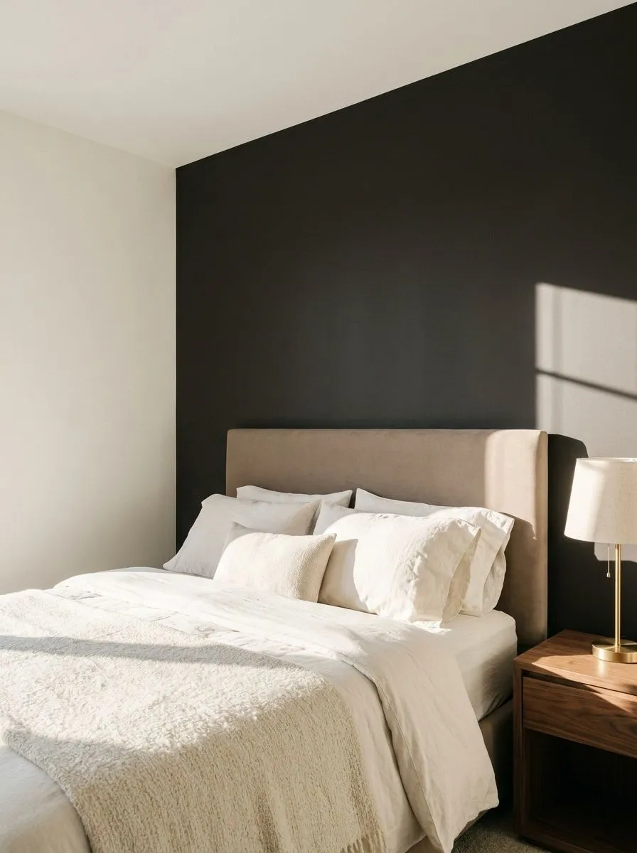
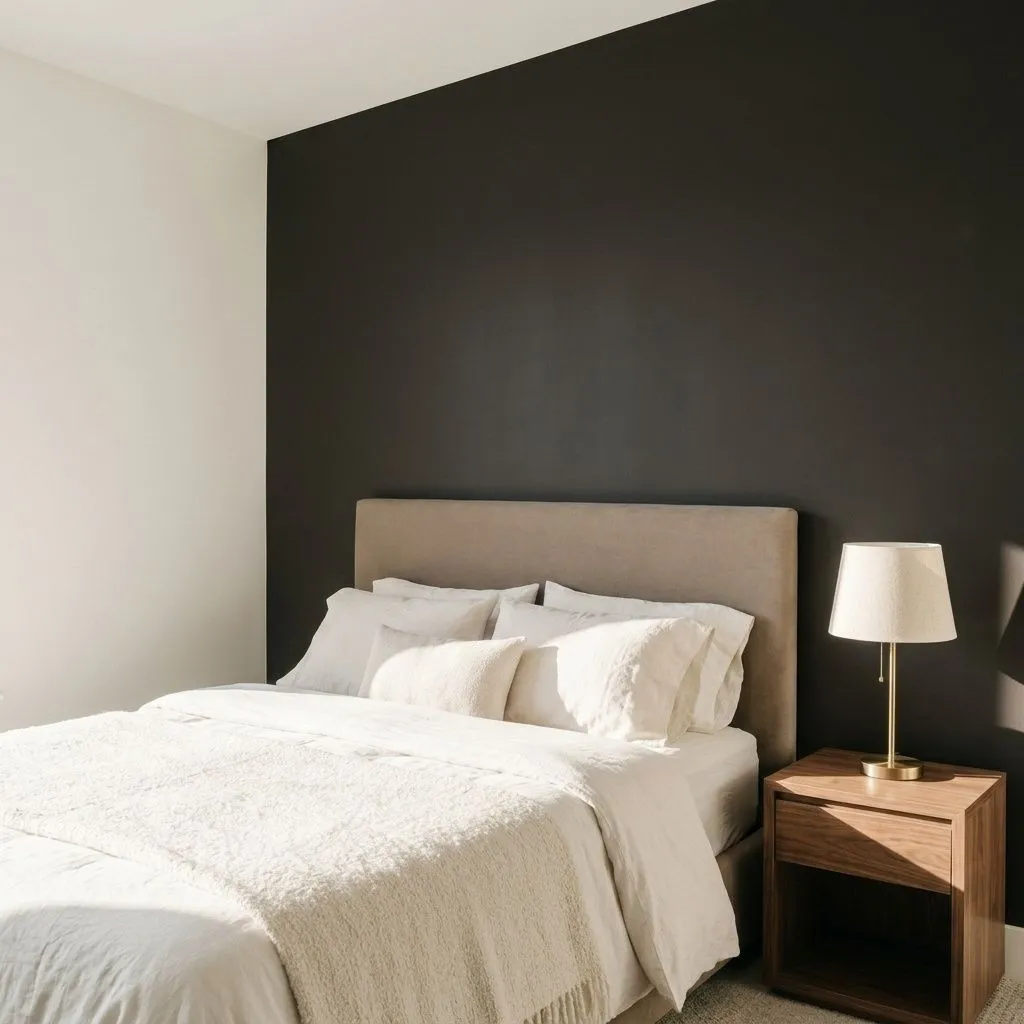
Caviar lands on the wall as a true, commanding near-black. With an LRV of 3, it absorbs nearly all the light in a room and reads as a deep, definitive dark anchor in almost any condition. It does not waver toward gray or blue the way some near-blacks do. What sets it apart is a faint warmth that keeps it from feeling cold or harsh.
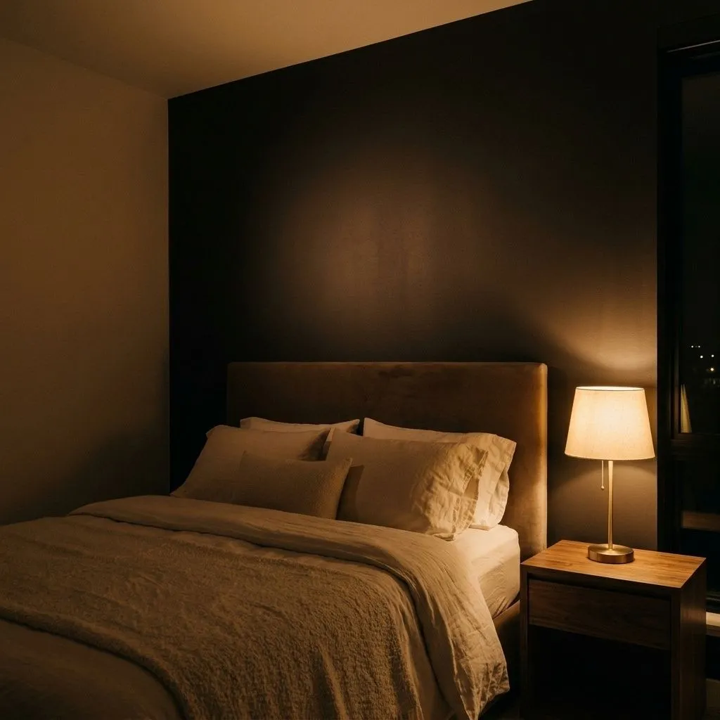
In strong natural light, that warmth becomes more perceptible and the color can read as a very deep charcoal-tinged black rather than a flat, one-dimensional void. In dim or artificial light, it simply reads as rich, true black. The overall effect is bold but not aggressive. Reviewers consistently describe it as confident and neutral in character, meaning it does not fight the other colors in a room, it grounds them.
On cabinetry, furniture, or trim, Caviar has a sleek, modern quality, especially under a satin or semi-gloss finish where a bit of sheen softens any flatness and gives the color life. On large walls it creates the kind of moody, enveloping atmosphere that makes a space feel intentional and considered rather than simply dark.
The undertone story with Caviar is where reviewers pay the most attention, and there is genuine nuance worth understanding. The dominant read, shared across most independent reviews, is a subtle warm brown undertone. It is not obvious or orangey, but it is there, and it is what keeps Caviar from reading as a cold, blue-leaning, or stark black.
That said, not everyone perceives the warmth equally. Some reviewers describe Caviar as nearly neutral, placing it closer to a clean black with only the faintest whisper of brown. Others, particularly those who have sampled it directly against cooler blacks like Tricorn Black, say the warmth becomes much more apparent in comparison. The difference in perception likely comes down to the undertones in surrounding surfaces, flooring, and furnishings. Warm wood tones and brass hardware can amplify the brown warmth, while a very cool white trim or gray flooring can push Caviar toward reading more neutrally.
What reviewers agree on is that Caviar does not go green, blue, or purple under typical lighting conditions. That reliability is part of its appeal. If you want a near-black that stays grounded and warm, it behaves predictably. If you were expecting a truly cool or neutral black, sample it on your specific wall alongside a comparator before committing.
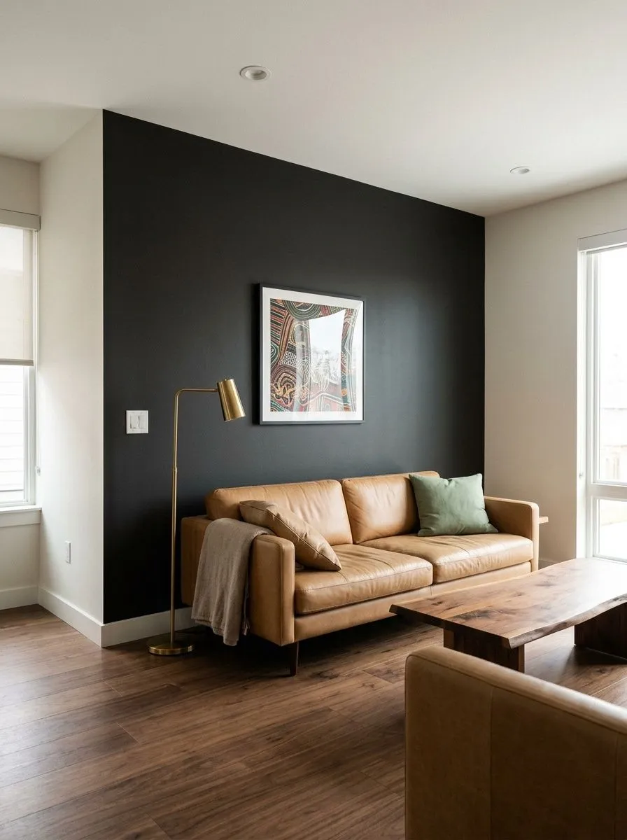
Caviar is most often called out for accent walls, and the reason is straightforward. In living rooms, dining rooms, and bedrooms, a single Caviar wall creates a dramatic focal point without requiring you to commit an entire room to near-black. The low LRV of 3 means it works best when there is enough contrast from adjacent surfaces, trim, or furnishings to keep the space from feeling closed in.
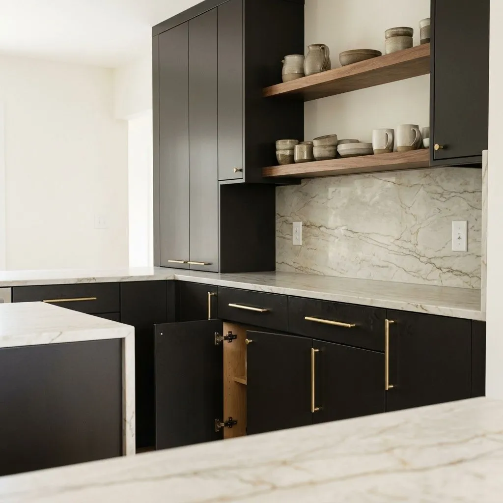
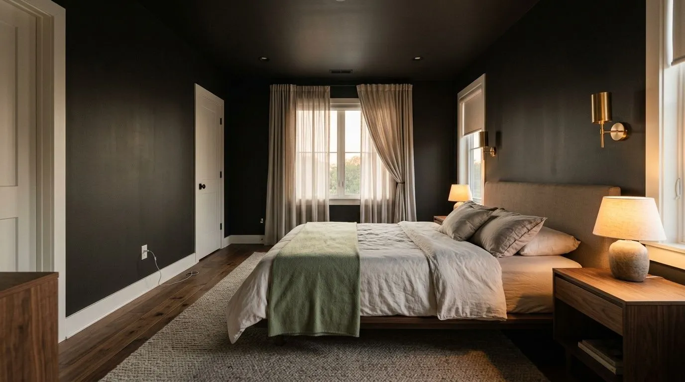
For cabinets, Caviar performs especially well in kitchens and bathrooms where it is paired with lighter countertops, warm wood open shelving, or brass and gold hardware. The warm undertone plays well against natural materials and warm metals. On furniture, it delivers a sophisticated, almost lacquered quality depending on sheen level. It has also found a strong following in moody, intentional bedroom schemes where the goal is an enveloping, restful atmosphere.
On exteriors, Caviar is a standout choice for front doors, shutters, and trim, particularly on homes with lighter body colors where high contrast is the goal. Many reviewers use it on front doors specifically because the warm brown depth gives it more character than a flat black. One real caution from reviewers in hot, sun-heavy climates: dark colors at LRV 3 absorb significant heat and can fade faster on large exterior surfaces under intense sun. For a shaded facade or a front door that gets indirect light, Caviar holds up well and draws strong curb appeal. For a south-facing wall baking in full sun, weigh the heat absorption before using it broadly.
A single Caviar accent wall in a living room or dining room creates a strong focal point without overwhelming the space. Pair it with Snowbound on the remaining walls and trim for maximum contrast. The LRV of 3 ensures the wall reads as a true deep anchor, so keep lighting intentional.
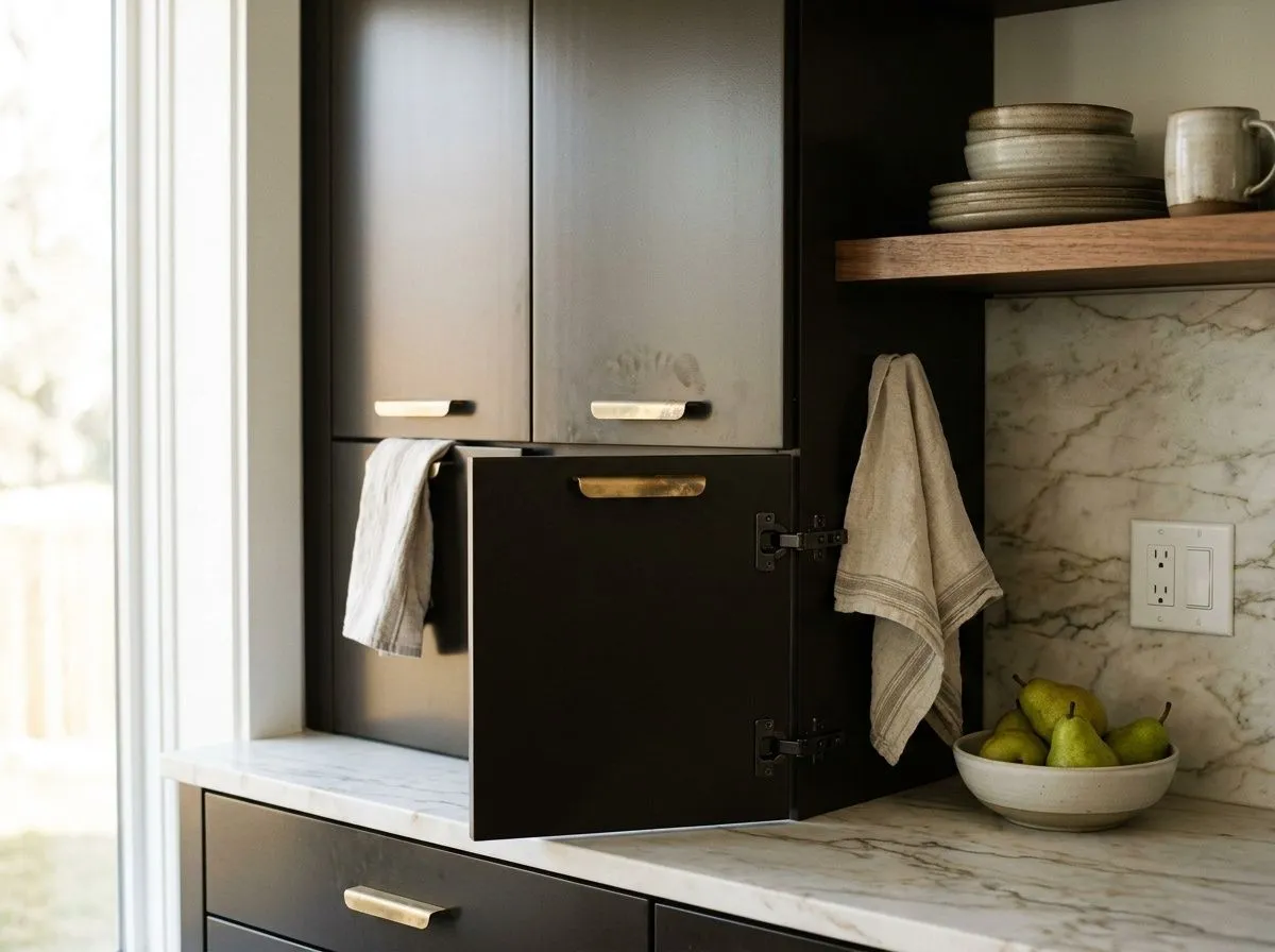
Caviar on lower cabinets or a full kitchen cabinet suite looks sharp and grounded, especially against lighter stone countertops and brass hardware. The warm undertone works with natural wood open shelving and prevents the cabinetry from feeling cold. A semi-gloss finish adds dimension and makes cleanup practical.
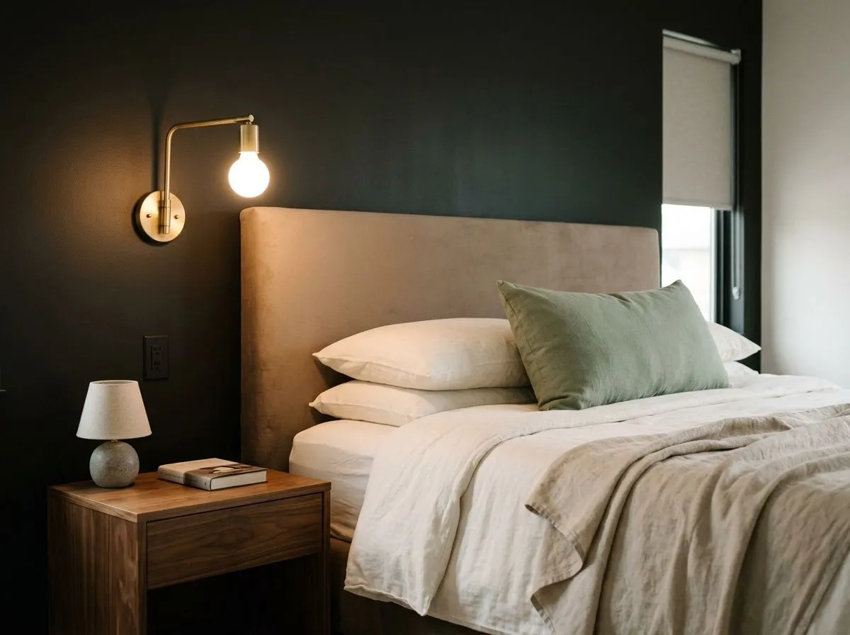
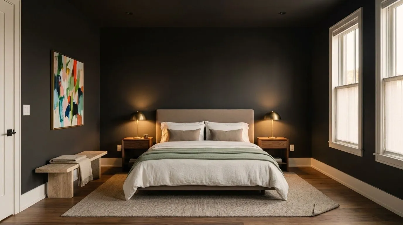
In a bedroom, Caviar on all four walls creates an enveloping, cocooning atmosphere that many reviewers find restful rather than oppressive. Layer in warm textiles, natural wood furniture, and warm-toned lighting to bring out the brown warmth and keep the room from reading flat. Adequate light sources matter at LRV 3.
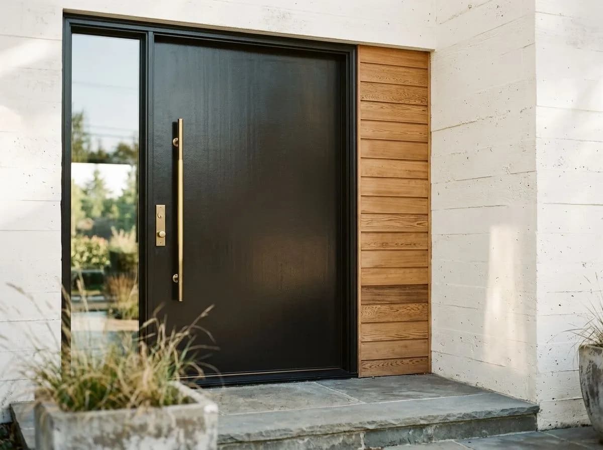
Caviar is a standout front door color, delivering high contrast and depth against lighter exterior body colors. The warm near-black reads more characterful than a flat cool black, especially with brass or bronze hardware. It holds up well on doors with covered porches or indirect sun exposure.
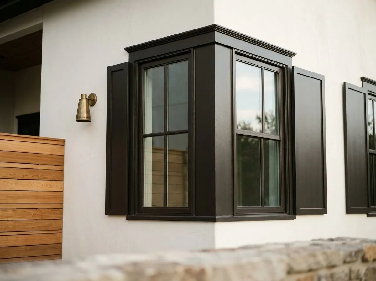
On trim and shutters, Caviar creates crisp definition against cream, white, or light gray siding. Reviewers in moderate climates report excellent results. In very hot, high-sun climates, the LRV of 3 means significant heat absorption, so consider placement and finish quality carefully before using it on large sun-exposed trim runs.
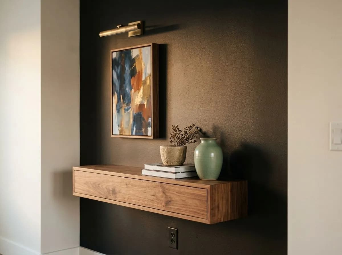
Caviar's core coordinating palette works because the color reads as a warm neutral anchor, not a statement color fighting everything around it. Snowbound, a soft near-white with a warm, barely-there undertone, is one of the most commonly cited pairings. The contrast is sharp and clean without the harshness that a pure cool white would introduce. Taupe Tone brings a warm, earthy mid-tone into the mix that bridges Caviar to wood floors, linen upholstery, and natural textures, softening a scheme that might otherwise feel too stark.
Oh Pistachio introduces a muted, dusty green that works against Caviar's warmth in a way that feels organic and grounded rather than trendy. Beyond the coordinating trio, Caviar reads well with warm wood tones, unlacquered brass, aged bronze, and natural stone. Because it behaves as a neutral, it rarely clashes, and you have wide latitude with accent colors ranging from deep terracotta to dusty blush to rich navy.
Caviar and Snowbound are the only two paints here: Caviar goes on all four walls and the ceiling in a full drenched application, while Snowbound handles the trim, casings, and window surrounds. The remaining five colors, Taupe Tone, Oh Pistachio, Renwick Golden Oak, Umber Rust, and Natural Stone, represent the room's actual furnishings and materials, each matched to its closest Sherwin-Williams equivalent. Hover any pin or swatch to see exactly which color you're looking at.
All comparisons are matched against Caviar at LRV 3.
If adjacent rooms or surfaces carry strong cool blue or lavender undertones, Caviar's warm brown depth can feel disconnected and slightly muddy at the transition rather than intentional.
Strongly golden or orange-leaning surfaces, think honey oak flooring or terracotta tile used broadly, can amplify Caviar's brown undertone in a way that pushes the combination toward heavy and muddy rather than warm and grounded.
At LRV 3, Caviar in a room with limited natural light and no layered artificial lighting will read as flat, heavy, and dimensionless. The warmth that gives it character essentially disappears in poor light.
Caviar SW 6990 is a warm near-black with a faint brown depth. It reads as a true, rich dark color on the wall and functions as a grounded neutral anchor in almost any palette.
Caviar carries warm brown undertones that keep it from reading as a cold or harsh black. The warmth is subtle and becomes more apparent when you compare Caviar directly against cooler near-blacks. Surrounding surfaces with warm wood tones and brass hardware will bring out the brown quality more noticeably.
Caviar is warm. Its undertone leans brown rather than blue, gray, or green, which is what separates it from cooler near-blacks. Most reviewers describe it as behaving like a warm neutral rather than a stark or cool black.
Caviar has a precise LRV of 3, meaning it reflects only about 3 percent of light and absorbs the rest. It reads as a true, very dark color in virtually all lighting conditions.
The Sherwin-Williams color code is SW 6990. The hex value is #313031 and the RGB is 49, 48, 49.
Caviar coordinates well with Snowbound for crisp, warm-white contrast and with Taupe Tone for a softer, earthy mid-tone balance. Warm wood tones, unlacquered brass, aged bronze hardware, and natural stone all work well alongside it. Because Caviar reads as a warm neutral, it pairs broadly with accent colors from dusty blush to deep terracotta to muted greens.
Yes on all three, with one practical note for exteriors. On front doors and trim, Caviar delivers sharp contrast and warm depth that outperforms flatter cool blacks. On cabinets, the warm undertone works especially well with brass hardware and natural wood. For large exterior surfaces in hot, high-sun climates, the LRV of 3 means significant heat absorption and potentially faster fading, so consider sun exposure and finish quality before using it broadly on sun-baked walls.