
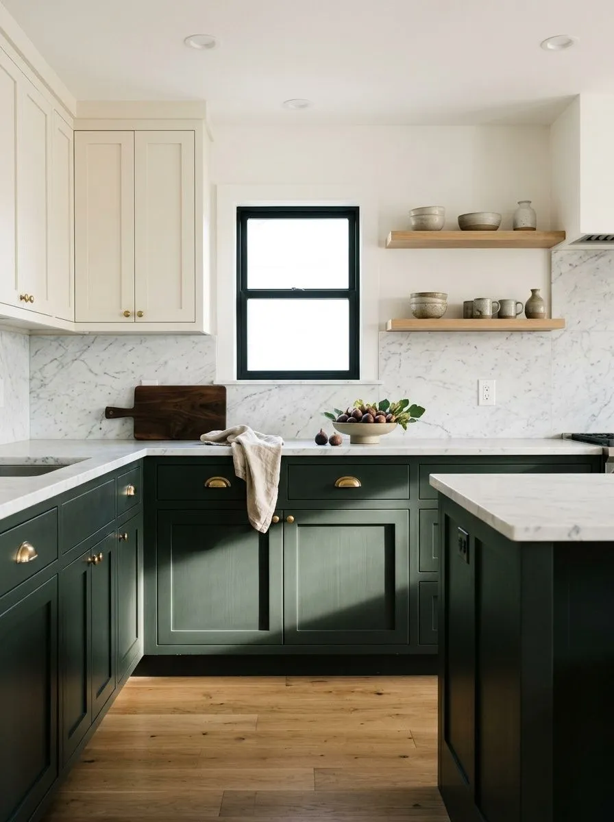
MorningCool · green beginning to surface
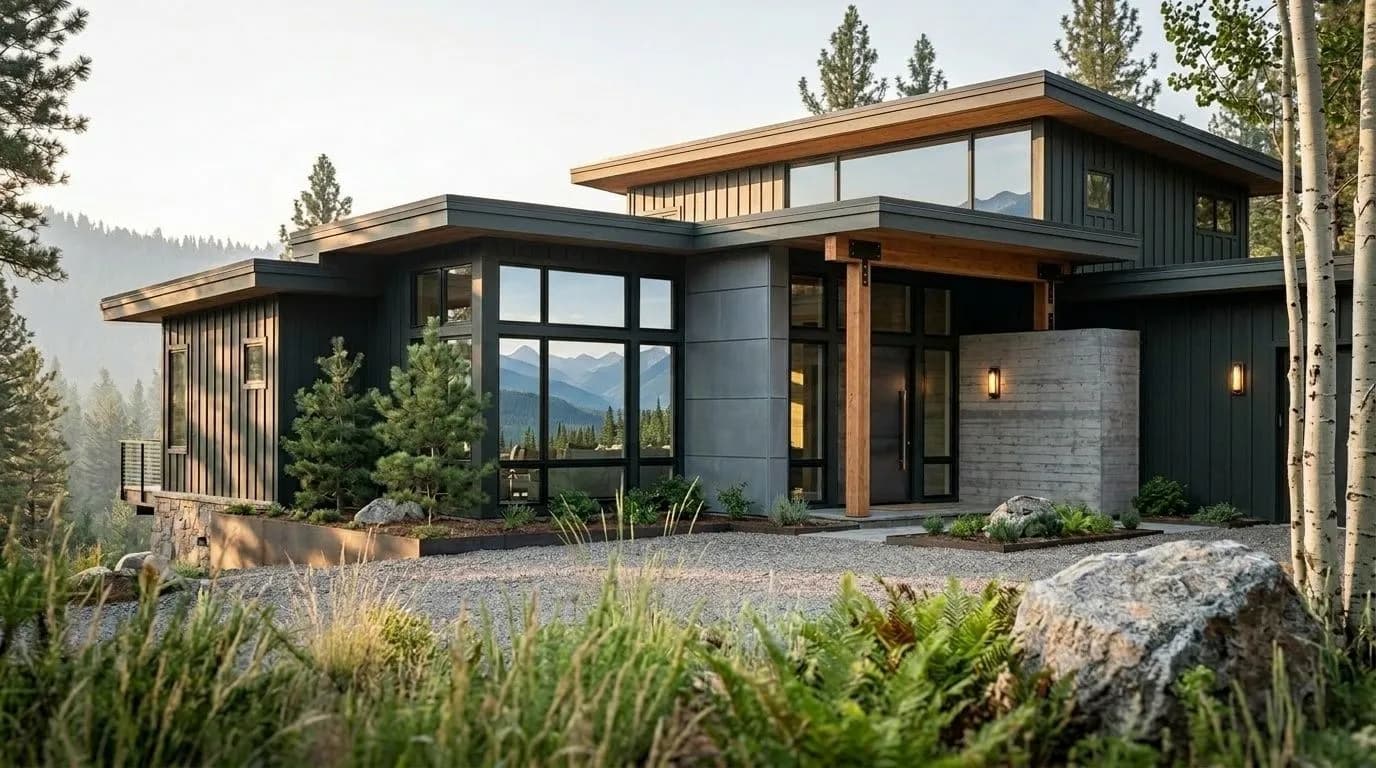
A near-black with a genuine cool green cast inside it, one that surfaces in daylight and settles to flat black by lamplight. See which version your room gets.
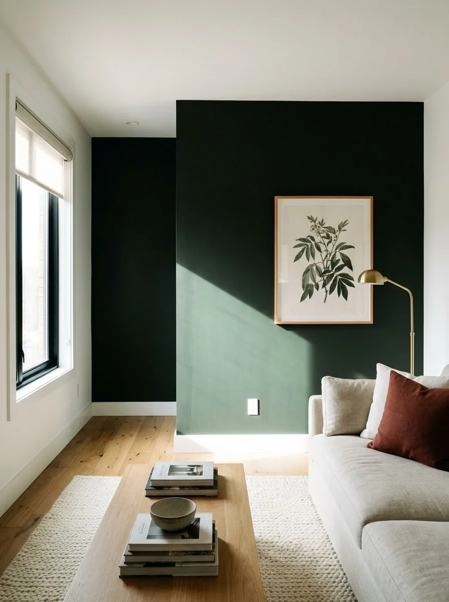
Greenblack SW 6994 lands in the very bottom tier of Sherwin-Williams's value scale at LRV 4.1, making it one of the darkest colors the brand produces. On the wall it reads as a deep, near-black charcoal in most conditions, rich enough that the eye registers it as black before anything else. The name is not a stretch, though: there is genuine color in there, and it is clearly different from a neutral or warm black once you spend time with it.
The green shows itself most clearly in strong natural daylight, under cool-white LED bulbs, and on walls with direct or reflected sun. In those conditions a foresty, organic cast becomes visible and gives the color its character. In dim rooms or under warm incandescent light it flattens almost completely to straight black, losing the green entirely. That shift is predictable once you understand it, but it means the color will behave differently at different times of day in the same room, and north-facing spaces with weak ambient light may never show the green at all.
Most reviewers agree on the broad strokes: Greenblack is cool overall, and the undertone is genuinely green rather than blue, gray, or brown. That earthy, foresty quality is what separates it from other near-blacks and gives it the organic feel that makes it popular on modern exteriors and in nature-adjacent settings. The coolness is consistent across sources, though the color never reads clinical or hard the way a blue-tinted black might.
Where reviewers diverge is on how visible and how green that undertone actually is. Some describe it as clearly green in daylight and easy to read. Others say it behaves more like a dark neutral in most interior conditions and that the green only announces itself in specific lighting. Both camps are right, because the answer depends heavily on light source, wall orientation, and surface sheen. Those hoping for a color that always reads as green-black should understand they are dealing with a near-black that reveals its undertone selectively, not a dark green that always shows its hand.
The comparison to a warm black like a brown-tinted near-black is instructive: Greenblack does not go brown or amber in warm light. It either shows green or it goes neutral black. That consistency on the cool side of the undertone spectrum is part of why it pairs so well with metals like brass and copper, which introduce warmth from outside the color itself.
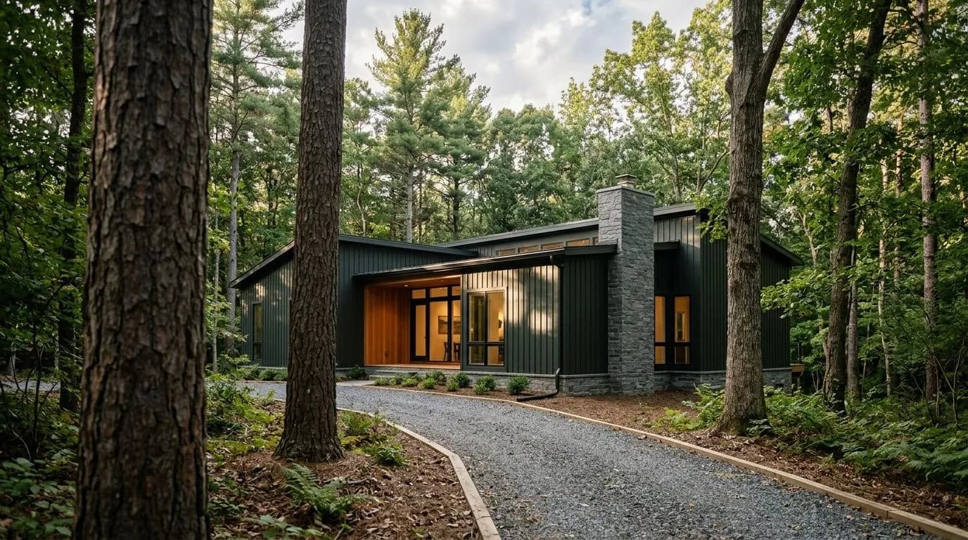
Exteriors are where Greenblack earns the most consistent praise. As a main body color on siding it pulls a house into its surroundings, particularly on wooded lots, waterfront properties, and anything with a modern farmhouse or organic-modern character. It works against red and orange brick without fighting, sits naturally beside gray and light-tan stone, and reads beautifully next to both light and dark wood stains. Steel, copper, and brass trims all coordinate with it. The main caution from exterior specialists is that making the jump to a full dark body color is a significant commitment, and that on homes with limited sun exposure the green may disappear, leaving you with what reads as a flat black.
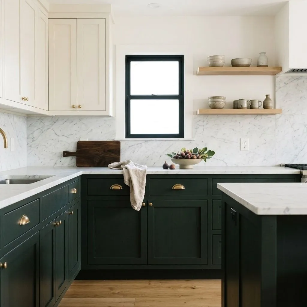
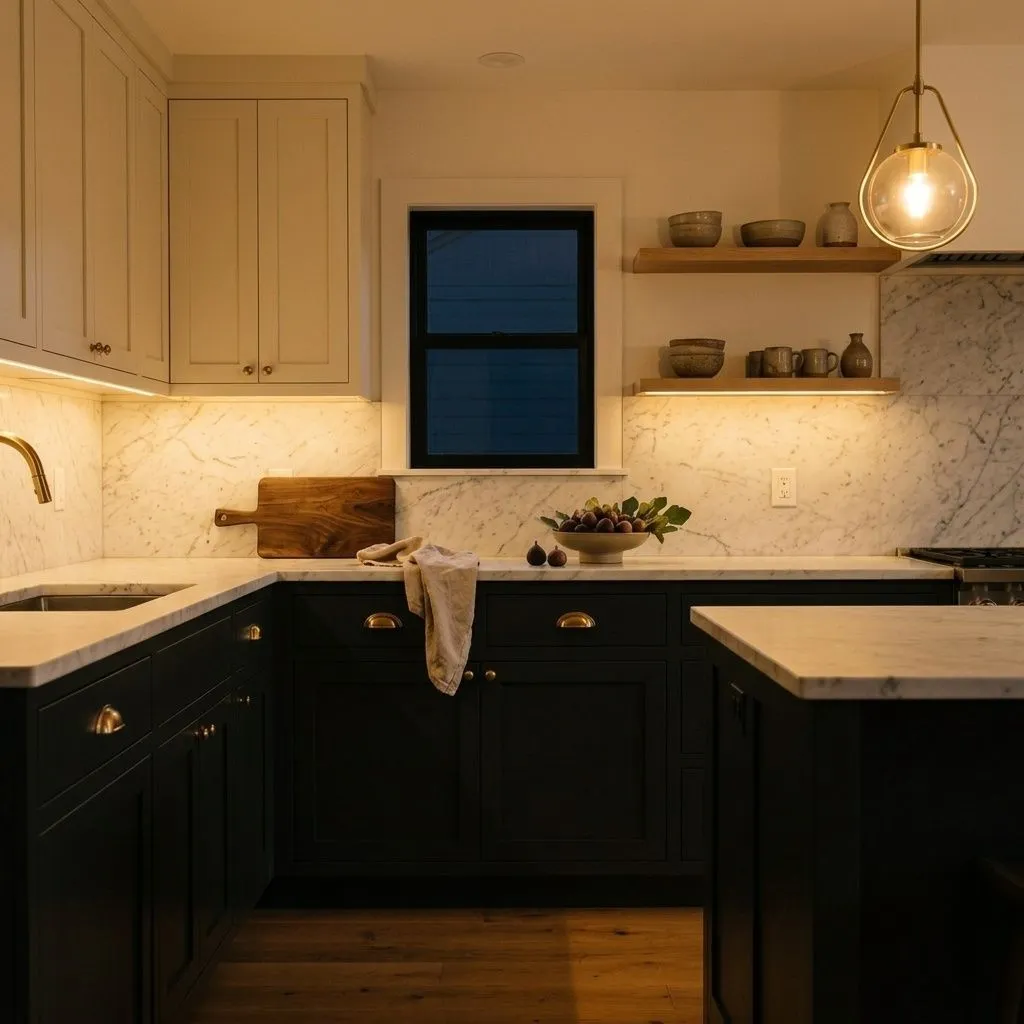
Kitchen cabinets and islands are the second major use case. At LRV 4.1 the color is dark enough to feel dramatic on lower cabinets while still leaving room for contrast with upper cabinets or a backsplash in a crisp white. Hardware in aged brass, satin brass, or matte black all land well against it. Front doors are another strong application where a single dark surface can carry the full depth of the color without overwhelming a space.
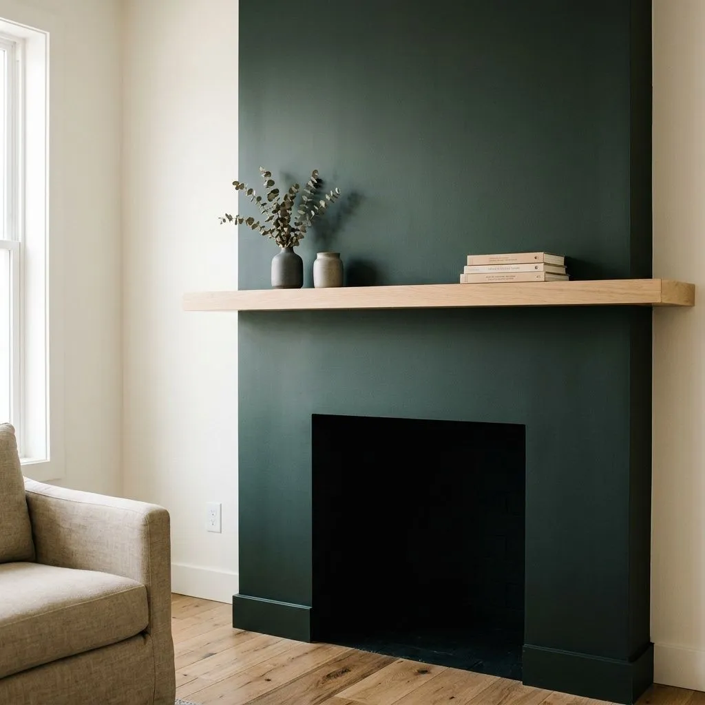
Accent walls, fireplace surrounds, and bedrooms as moody backdrops round out the interior uses. One wall in a room with adequate natural light and light-colored furnishings can work well. Painting every surface of an enclosed space at LRV 4.1 without compensating with bright furnishings and strong light sources is the move most likely to make a room feel smaller than it is.
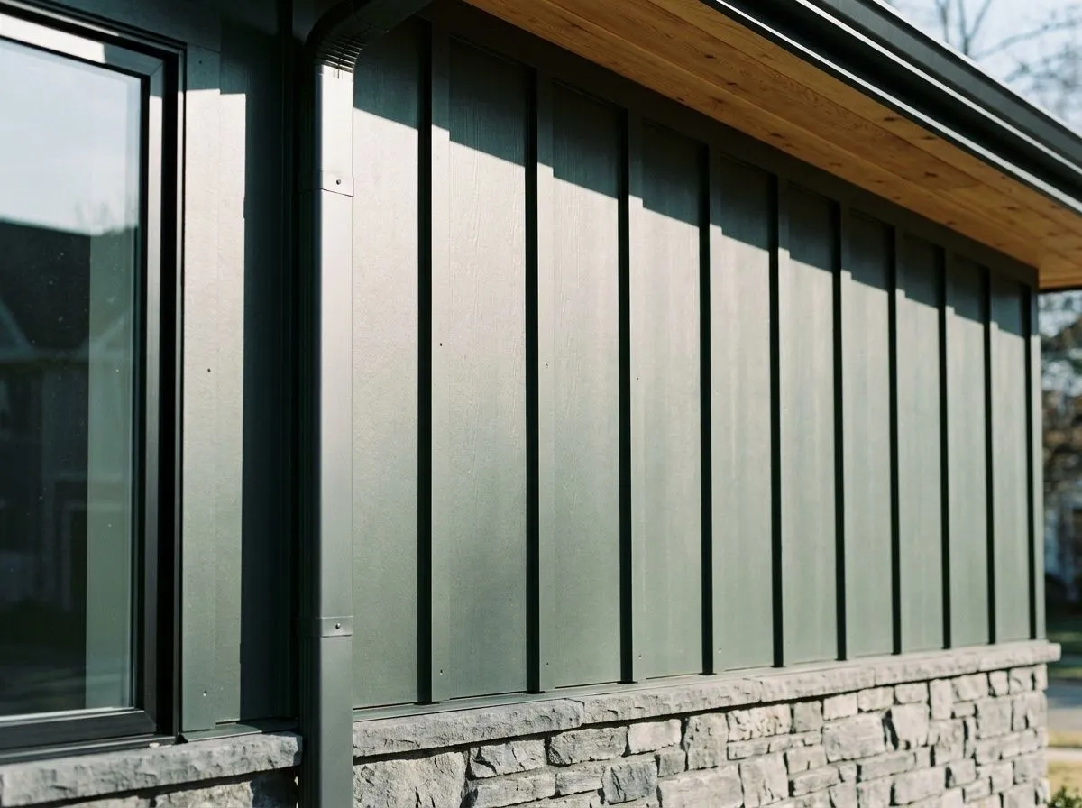
Greenblack is designed for this application. It blends a house into wooded or waterfront settings, holds up against brick and stone, and works with a wide range of wood and metal trim choices. Test it in full sun before committing because the green cast requires good light to show, and factor in that dark siding absorbs heat and may fade in intense-sun climates.
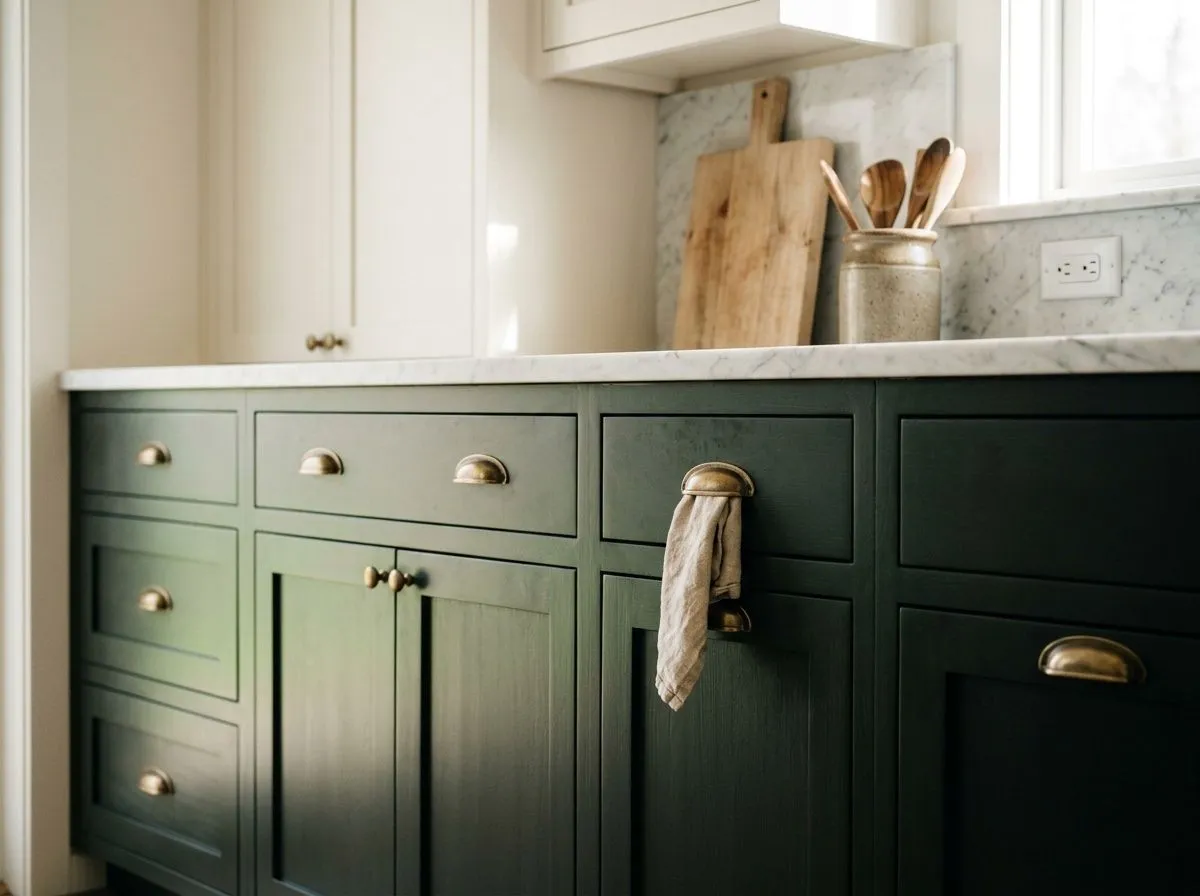
On lower cabinets or an island, LRV 4.1 is dark enough to feel dramatic but still readable under typical kitchen lighting. Pair the lowers with white or off-white uppers to keep the kitchen from feeling heavy. Aged brass or satin brass hardware reads especially well against this color.
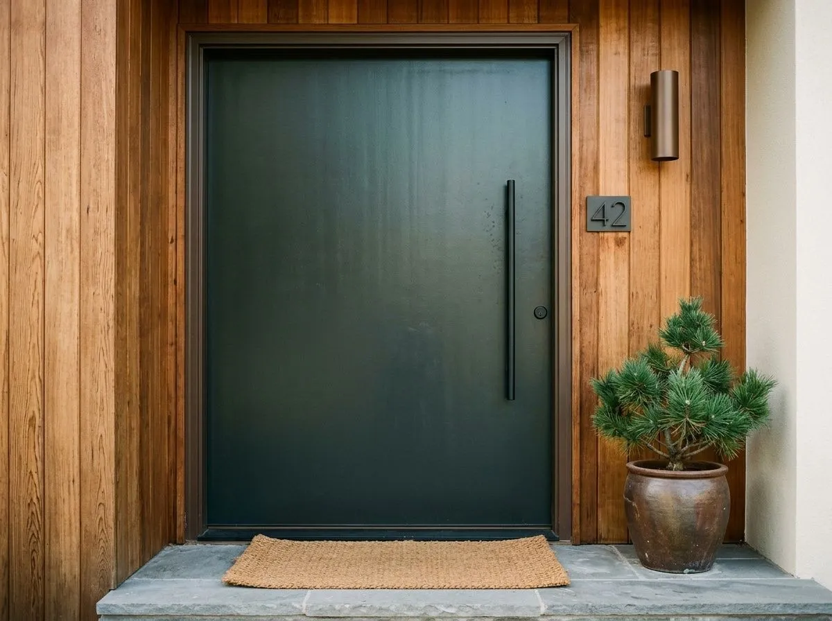
A front door is one of the best single-surface uses for Greenblack because the exterior light brings out the green undertone without you needing to commit to a full body color change. It works on both traditional and modern homes and pairs naturally with brick, stone, and wood surrounds.
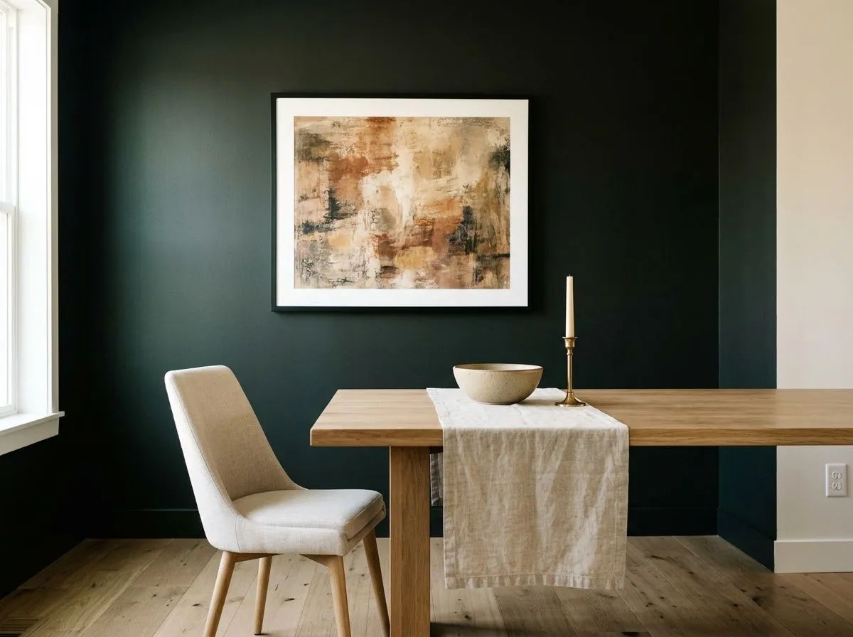
One Greenblack wall in a living room or dining room can anchor a space without closing it down, especially if the remaining walls are a light neutral and the room gets decent daylight. In south-facing rooms the green undertone will be visible and active; in north-facing rooms expect it to read much closer to straight black.
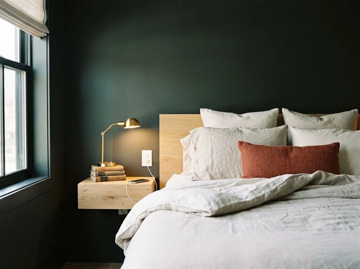
As a backdrop for a moody bedroom it works when natural light is available during the day and furnishings are light enough to provide visual relief. Keep bedding and textiles pale or natural in tone. Avoid using it on all four walls in a small bedroom without a deliberate plan for ambient and accent lighting.
The most straightforward pairing strategy is to put Greenblack against a clean, bright white to maximize contrast and keep the room from feeling enclosed. Snowbound SW 7004 works well here because its warmth softens the cool depth of the green-black without muddying it, a combination that shows up frequently on cabinetry with Snowbound uppers and Greenblack lowers. Extra White SW 7006 pushes the contrast further and reads crisper, which suits modern and minimalist interiors where you want the dark color to feel intentional and graphic.
For accents and finishes, the color's cool green undertone creates a natural conversation with organic materials: raw wood, linen, stone, and metals with warm patina all sit well alongside it. Hardware choices matter at this depth of color, and aged brass and satin brass are the most cited recommendations because they introduce warmth that the paint color itself holds back.
Greenblack is the only paint doing real work here, two ways: saturating the feature wall and wrapping the concrete fireplace mass in that drenched, foresty near-black, while Snowbound keeps the surrounding walls and boucle sofa soft and warm. The other five colors are the room's furnishings and materials, each represented by its closest Sherwin-Williams paint match. Hover any pin or swatch to see exactly which color it is.
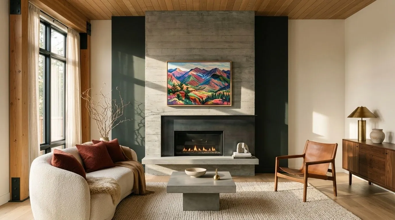
All comparisons are matched against Greenblack at LRV 4.1.
Pairing Greenblack with a cool blue-gray on adjacent walls tends to compete rather than coordinate. The green undertone in Greenblack and the blue in a typical cool gray can make both colors look slightly off, neither reading cleanly.
Bright chrome and polished nickel fixtures can feel cold and disconnected against Greenblack's organic, foresty depth. The high-contrast metallic sheen reads harsh rather than sharp at this value level.
At LRV 4.1, Greenblack absorbs light aggressively. In a small interior room with no windows or only artificial warm lighting, the green disappears and the walls close in fast. The effect can feel oppressive rather than dramatic.
Greenblack is a near-black paint color with a genuine green undertone. In most conditions it reads as a very deep, dark charcoal-black. In strong daylight or under cool-white light the green cast becomes visible, giving it a foresty, organic quality. In dim or warm light it flattens to a straight black.
The undertone is green, specifically a cool, foresty green rather than anything warm, brown, or blue. Reviewers broadly agree on this, though they differ on how visible it is. The green shows up reliably in bright daylight and under cool-white LEDs. In warm incandescent light or weak north-facing light it can disappear almost entirely, leaving a near-neutral black.
Cool. Despite the earthy, organic character of its green undertone, Greenblack reads cool overall. It does not shift warm or amber in warm light the way a brown-tinted black would. That consistent coolness is part of what makes it work well with warm metals like brass and copper, which supply the warmth from outside the color itself.
Greenblack has an LRV of 4.1, placing it among the darkest colors Sherwin-Williams produces. For reference, Tricorn Black sits at LRV 2.8. At 4.1 the color absorbs most of the light that hits it, which means surface preparation matters and room lighting needs to be considered carefully before using it on multiple walls.
The Sherwin-Williams code is SW 6994. The hex value is #373A3A and the RGB is 55, 58, 58.
Yes to all three. Exteriors are its most praised application, especially on homes in wooded or waterfront settings where the color blends the house into its surroundings. Front doors are an easy entry point that lets you get the full effect in a limited area. Kitchen cabinets and islands are the top interior application, typically with a crisp white on upper cabinets and warm-metal hardware to complement the dark color. The main cautions for all applications: prepare surfaces well because LRV 4.1 will show every imperfection, and note that on exteriors dark siding absorbs heat and may fade faster in high-sun climates.
Crisp whites are the most direct and useful pairing. Snowbound SW 7004 brings a warm softness that keeps the combination from feeling stark, while Extra White SW 7006 pushes into a cleaner, more graphic contrast. Warm whites, greige, and taupe tones all work as adjacent wall colors. For hardware and finishes, aged brass, satin brass, and matte black are the most consistently recommended choices. On exteriors the color works naturally against red and orange brick, gray and light-tan stone, wood in light or dark stains, and metals including steel, copper, and brass.