
MorningBalanced · gray stays quiet
A soft, muted white with a gray base and conditional undertones that shift from creamy to cool depending on your light. Sample it in your actual room before you commit.
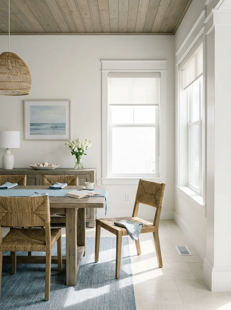
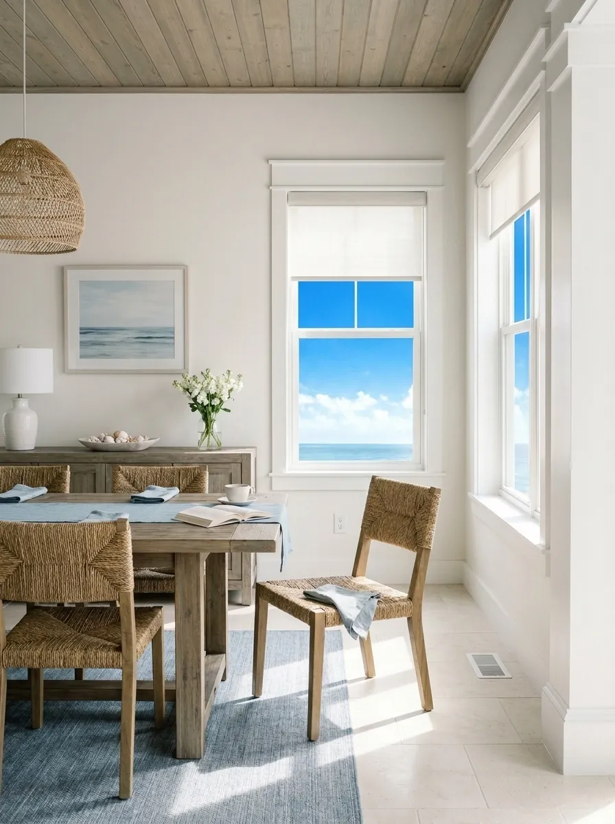
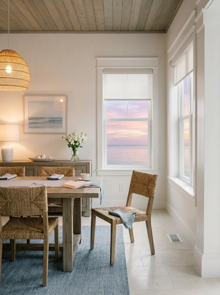
Snowbound sits in that sweet spot where a white feels genuinely bright without turning stark. Its LRV of 82.8 places it well inside bright-white territory, yet the gray base keeps it from reading crisp or clinical the way a true clean white does. On the wall it lands as a soft, muted white with just enough depth to feel intentional rather than builder-default.
What makes Snowbound interesting, and occasionally frustrating, is how much it shifts. It is a chameleon. In a room flooded with warm afternoon or evening sun it warms toward creamy and can even flash a faint pink or violet. Hit it with cool north light and the gray base comes fully forward, reading more like a light gray-white than a white at all. Midday light tends to brighten it toward something closer to crisp. No two rooms or times of day will show you exactly the same color, and that is not a flaw so much as a trait you need to plan around.
Because it leans neither strongly blue nor strongly yellow, Snowbound reflects surrounding tones more than most whites will. Dark charcoal furniture, warm wood floors, and blue-gray accents all pull it in their direction. This also means nearby finishes can make or break the read. Sampling in your actual room, at multiple times of day, is not optional with this color.
The undertone picture for Snowbound is genuinely complicated, and reviewers do not fully agree, so it is worth being honest about that. The most consistent read is a gray base with subtle violet and taupe or greige warmth layered underneath. Some reviewers also pick up a faint pink. Others see a hint of green or beige. The authoritative database read calls it cool, gray, and green. In practice all of these can surface depending on the light.
Where the disagreement gets real is on the warm-versus-cool question. Snowbound is often described as a slightly warm white because the violet and taupe prevent it from reading icy or blue. But in north-facing rooms or under cool overhead lighting, the gray base dominates and it reads cool and muted without question. In warm south or west light it tips the other way, softening toward creamy. That means calling it simply warm or simply cool misses the point: it is conditional, and your room's orientation will determine which face it shows.
The practical implication is that you cannot assume your neighbor's Snowbound walls will match yours. If your space gets cool natural light, expect the gray to lead. If you have warm-toned floors, furniture, or lighting, watch for the pink or violet to surface. The green undertone noted in some reviews tends to be the quietest of the bunch but can appear under certain overhead lighting conditions. Test a large sample before committing.
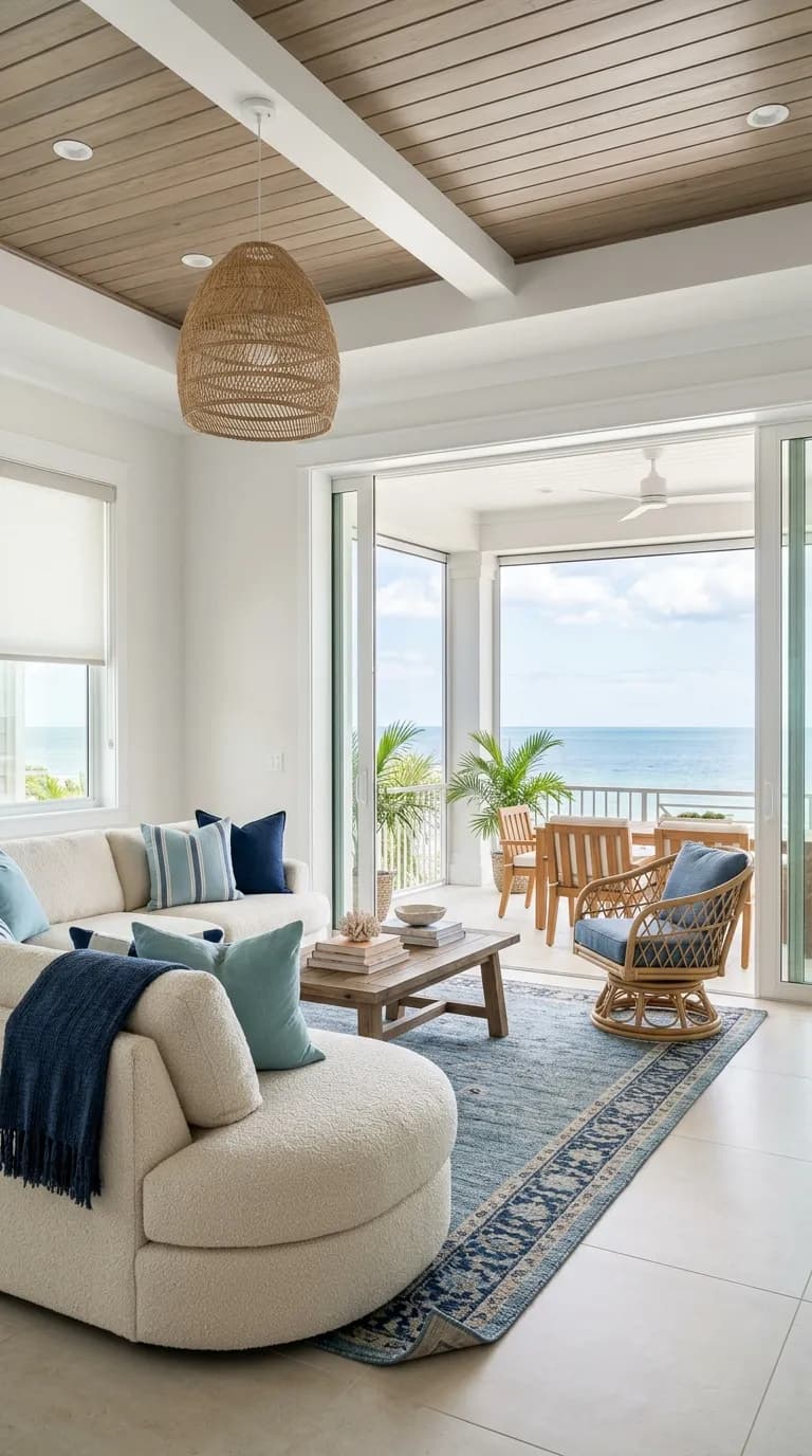
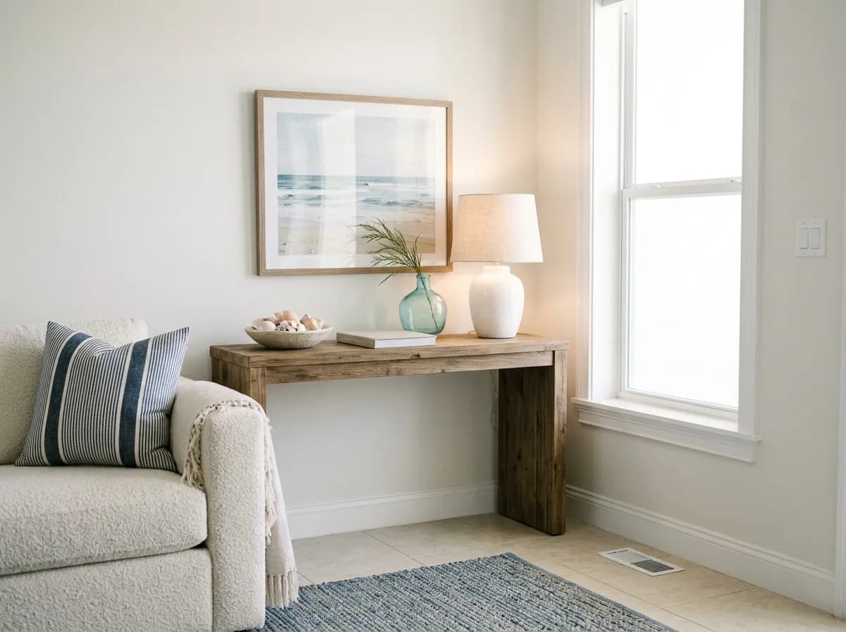
Snowbound works best in living rooms, bedrooms, kitchens, and open-plan spaces where you want a white that feels calm and inviting rather than stark or corporate. It fits naturally into coastal, transitional, and modern farmhouse aesthetics because its soft gray warmth reads relaxed without being rustic. In a bedroom it reads restful. In a living room it provides a neutral backdrop that lets furniture and accents carry the room.
Light orientation matters more with Snowbound than with most whites. South and west-facing rooms are generally its friendliest settings: the warm afternoon light keeps the gray from going flat and brings out the subtle warmth in the undertones. North-facing rooms are workable but you should expect a cooler, more muted result. If that is your situation, test it against warmer-toned furniture or lighting before committing. East-facing rooms get bright morning light and tend to balance out reasonably well.
For more specific applications, reviewers are split. Some say it works fine on cabinetry, trim, ceilings, and even exterior surfaces. Others specifically caution against using it on kitchen cabinets, ceilings, and exteriors because the unpredictable undertones can read strange in those contexts. The honest answer is that it can work in all of those roles, but the margin for error is smaller than with a more straightforward white. Trim pairing is its own challenge: matching trim to Snowbound walls creates a seamless, quiet look, while pairing it with a brighter clean white makes the softness read intentionally. Avoid contrasting it against creamy or antique whites, which will fight its cool-leaning undertones and make the whole scheme look off.
In a living room, Snowbound's LRV of 82.8 keeps the space feeling open and airy without the harshness of a bright white. It reflects warm wood tones and blue-gray or charcoal accents well. South or west exposure gives you the most inviting read; north light will push it cooler and grayer.
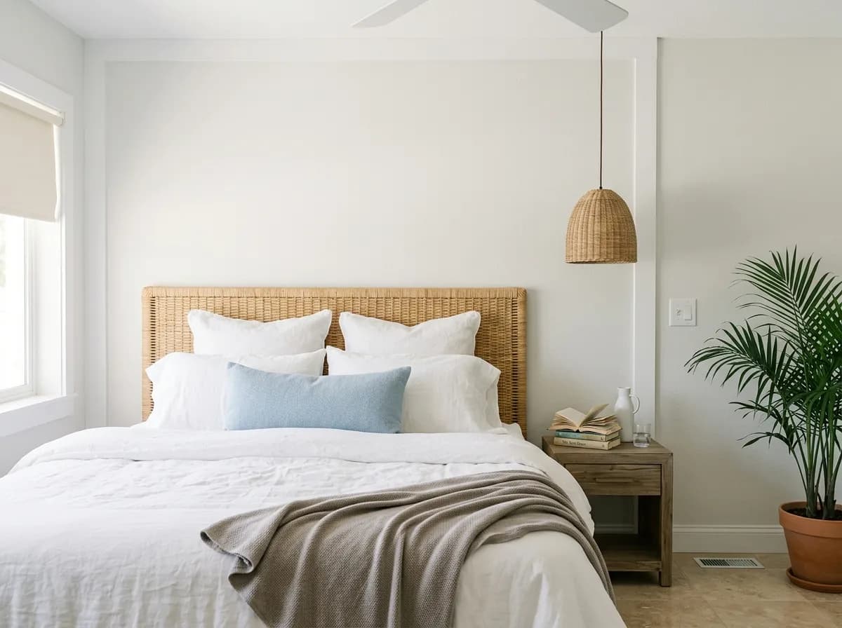
Snowbound reads restful and calm in a bedroom, where the soft gray-white quality helps the room feel like a retreat. It layers easily with linen, warm whites, and muted taupes in bedding and furniture. The subtle undertone shift in evening light can add a faint warmth that works in your favor here.
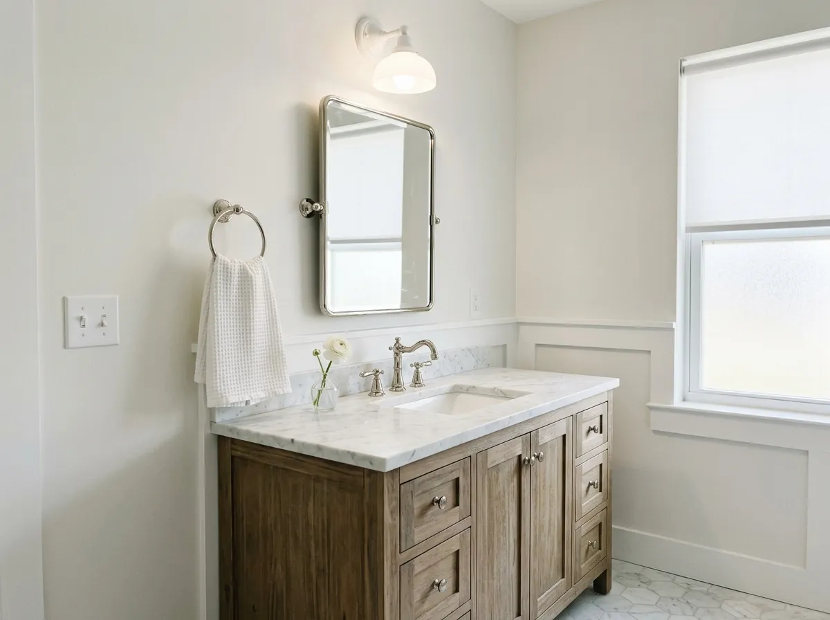
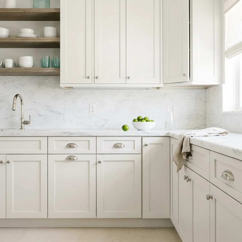
In a bathroom, the gray base in Snowbound pairs naturally with white marble, cool stone, and chrome or brushed nickel fixtures. Under cool overhead lighting the gray can come forward more than you expect, so test it under your actual bathroom light before committing. It works better with cooler tile choices than with warm beige or cream ones.
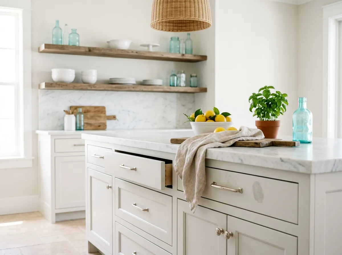
Snowbound can work in a kitchen, including on cabinetry, but reviewers flag that the undertones are less predictable in that context. If you go this route, sample it on a cabinet door under your kitchen's specific lighting and next to your countertop material. Pairing it with a brighter white on upper versus lower cabinets, or using it only on walls while going brighter on cabinets, are both safer starting points.
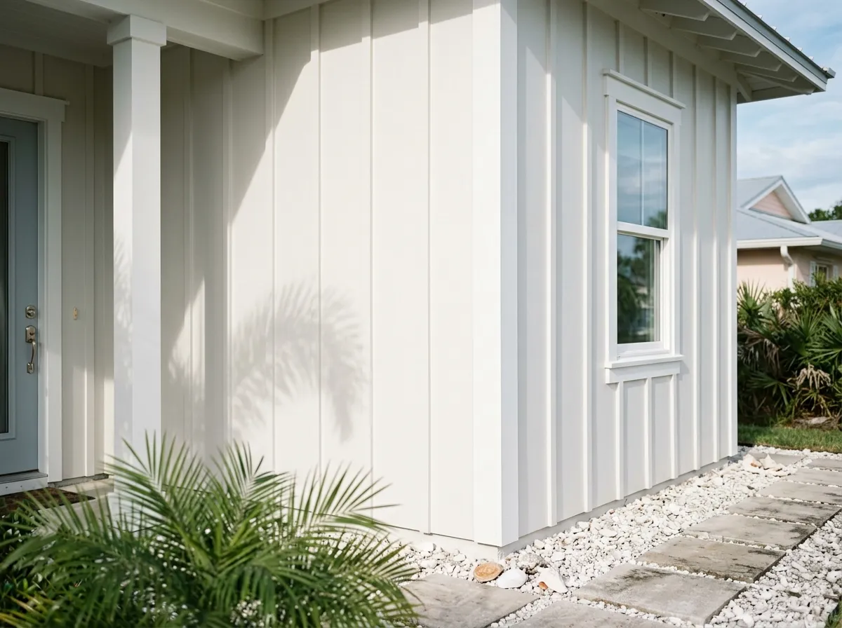
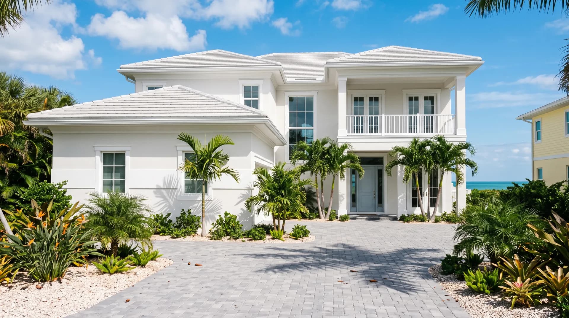
Snowbound appears on Sherwin-Williams' top exterior colors list, and some reviewers use it successfully on exterior walls and trim. That said, others caution that the undertones read differently in full outdoor light. Sample it on your actual exterior surface in direct sun and in shade before deciding, and note how it looks against your roofline and stone or brick if applicable.
Snowbound is built to coordinate with grays, taupes, and soft neutrals that share its balanced, neither-blue-nor-yellow character. Colonnade Gray (SW 7641) is a natural partner: its warm gray tone echoes the gray base in Snowbound without competing, and together they create a layered, cohesive neutral palette. For something with more color, Autumn Orchid (SW 9157) connects through the subtle violet undertone that both colors carry, making the pairing feel considered rather than accidental.
Beyond those named coordinates, Snowbound plays well with warm wood floors, blue-gray accents, dark charcoals, and Carrara or white marble. One consistent observation from reviewers is that it does not go yellow next to warm wood, which is a real advantage over creamier whites. If you are building a palette around it, lean into soft grays, greiges, and muted taupes rather than anything strongly warm or strongly cool, and let Snowbound do what it does best: sit quietly in the background and make everything around it feel intentional.
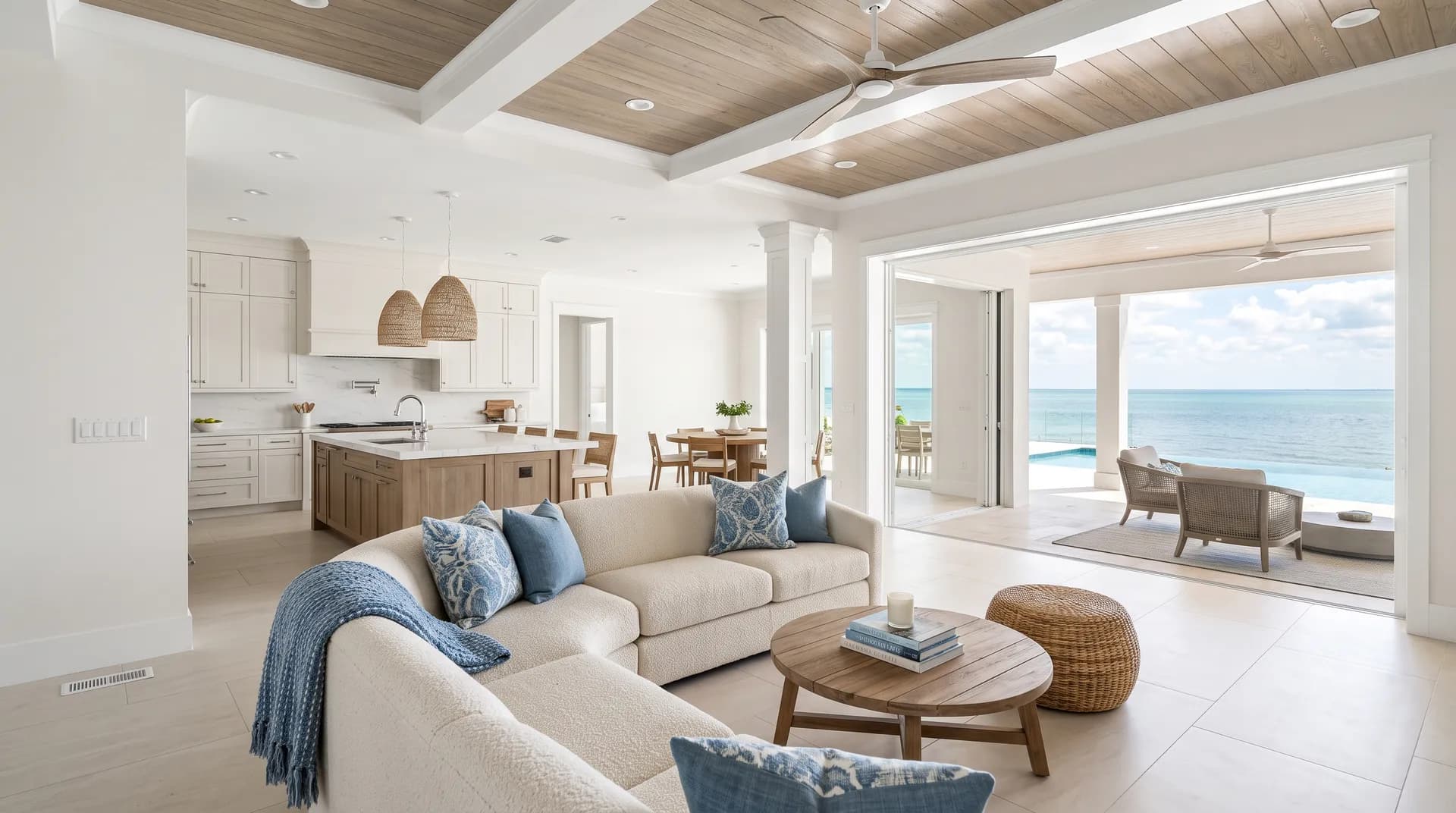
Of the seven colors building this relaxed coastal lanai, just two are actual paint: Snowbound wraps the walls, columns, and house-side envelope, while Extra White sharpens the trim, column caps, beams, and railing. The remaining five, from layered coastal blues to travertine and polished nickel, are the room's furnishings and materials, each shown as its closest Sherwin-Williams paint match. Hover any pin or swatch to see exactly which color is doing that work.
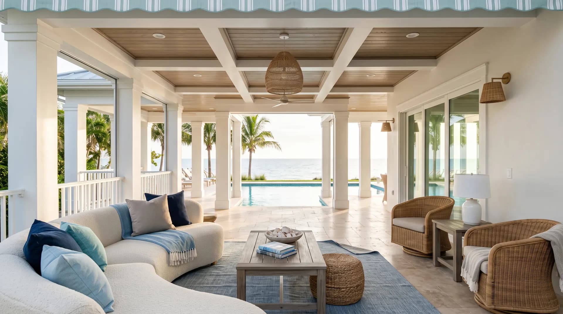
All comparisons are matched against Snowbound at LRV 82.8.
Placing a warm, yellow-toned creamy white on trim next to Snowbound walls creates an undertone fight. The gray and violet notes in Snowbound make the cream look dingy, and the cream makes Snowbound look cold and unintentional.
Snowbound holds up against warm wood floors without going yellow, which is an advantage. But very orange or heavily saturated warm wood, like a honey-toned pine or a bright cherry, can pull the pink and violet undertones in Snowbound to the surface in a way that reads unintended.
In a north-facing room Snowbound already reads cool and gray. Pairing it with icy blue accents or bright stark white furniture in that light pushes the whole room into flat and cold territory, draining any of the softness that makes Snowbound appealing.
Snowbound is a soft, muted white with a gray base that keeps it from reading stark or bright. It sits in bright-white territory with an LRV of 82.8, but it never looks clinical. Depending on the light in your room it can read as a calm gray-white, a barely creamy white, or somewhere in between.
Snowbound carries a gray base with subtle violet, taupe, and greige undertones. Some reviewers also pick up faint pink. Others note a hint of green or beige under certain lighting. These undertones are conditional: cool north light brings the gray forward, warm afternoon light surfaces the violet and can flash a faint pink, and warm-toned surroundings pull the taupe forward. No single undertone dominates in all conditions, which is what makes Snowbound behave like a chameleon.
It is genuinely both, depending on context. The gray base and occasional green read push it cool, while the violet, taupe, and faint pink undertones add warmth. In warm south or west light it reads as a soft, slightly warm white. In north light or under cool overhead lighting it reads clearly cool and gray. Calling it one or the other in absolute terms will set you up for a surprise, so test it in your specific room.
Snowbound has an LRV of 82.8. That puts it firmly in bright-white territory, since true whites generally start around LRV 80, but the gray base prevents it from reading as stark or high-contrast as something near LRV 90. It reflects a lot of light while keeping a soft, calm quality.
The Sherwin-Williams color code is SW 7004. The hex value is #EDEAE5 and the RGB values are 237, 234, 229.
Snowbound coordinates well with warm grays that share a violet undertone, taupes, greiges, blue-gray accents, and dark charcoals. Colonnade Gray (SW 7641) is a natural pairing that echoes Snowbound's gray base without competing. Warm wood floors and Carrara or white marble both work well alongside it. For trim, either match the trim to Snowbound for a seamless look or use a brighter, cleaner white to make the wall color read intentionally soft. Avoid contrasting it with creamy or antique whites.
It can work in all of those applications, but it requires more careful sampling than a simpler white. Some reviewers use Snowbound on cabinets, trim, and exterior surfaces without issue. Others specifically caution against it in those roles because the unpredictable undertones can read strange depending on the light and surrounding materials. The consistent advice: sample it large, in your actual space or on your actual surface, at multiple times of day, before committing.