
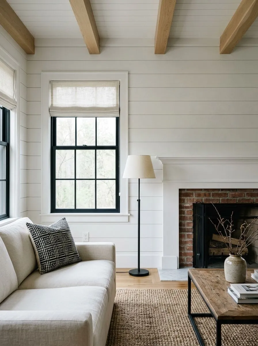
MorningCool north light, quiet and restful

A clean, soft warm-neutral white at LRV 84 — bright and airy without going harsh, a quiet warmth in good light that settles calmer in shadow. Sample it in your room before you commit.
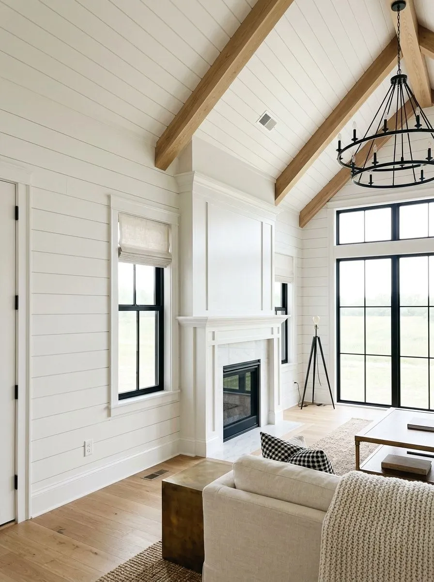
Pure White lands in a genuinely useful middle zone. With an LRV of 84 it sits well above most off-whites and noticeably below the bright whites that push into the low 90s. On the wall it reads clean and fresh without the sharp, almost clinical edge you get from the whitest whites. It is not creamy, not yellowed, just a soft, composed white with very little noise.
The color is a chameleon in the truest sense. Put it in a south- or west-facing room with warm afternoon light and a subtle, pleasant warmth rises to the surface: a barely-there yellow, softened by a quiet gray undertone so it never tips toward butter or ivory. The room feels bright and easy. Move it into a north-facing or low-light space and the dynamic flips. That same gray component takes over, and multiple independent reviewers specifically warn it can read cooler, crisper, even slightly dingy or gray-blue in those conditions. The color has not changed, the light source has, but the shift is real enough to matter before you commit.
On trim, cabinets and doors the slightly off-bright quality is an asset. It avoids the stark contract of a high-LRV bright white while still reading unmistakably white from across the room. Reviewers consistently note it does not yellow as it ages, which matters on trim especially.
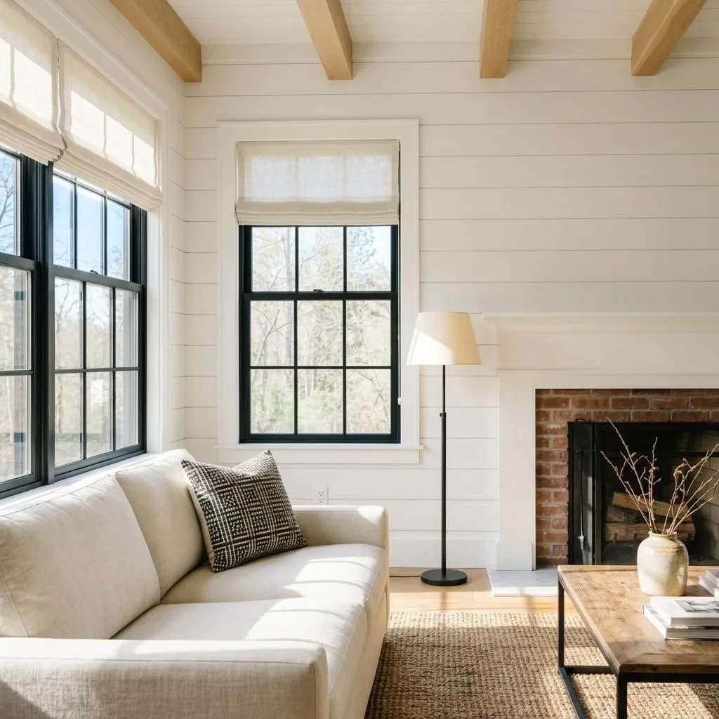
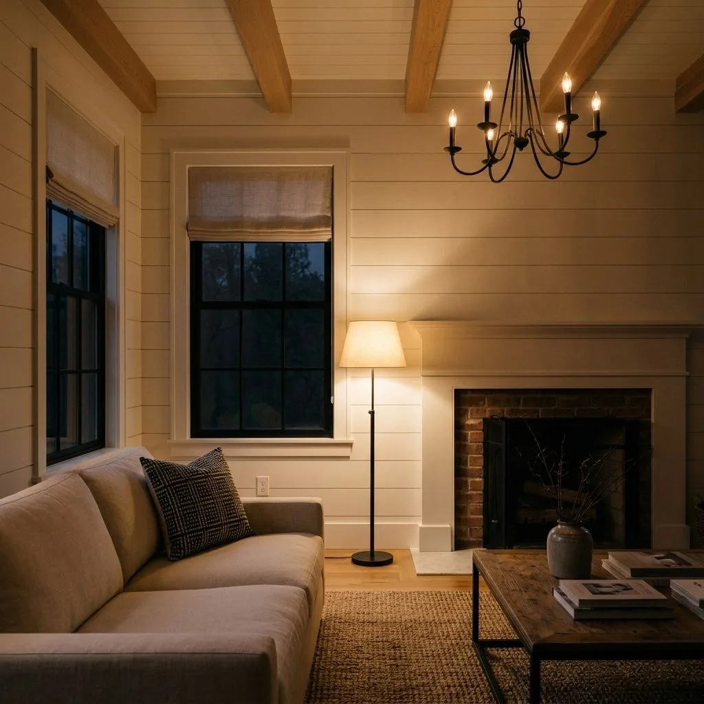
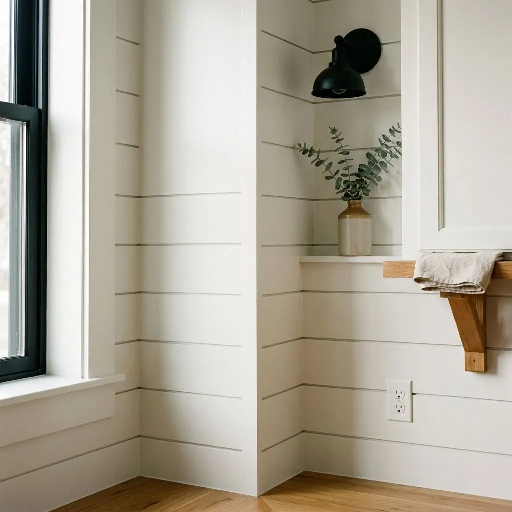
The short answer is that Pure White is very subtly warm, but that answer only holds under the right conditions, and the nuance is worth understanding before you buy a gallon.
Most independent reviewers describe the base undertone as a passive, muted yellow with a counterbalancing thread of gray or black. That combination is why it does not read cream or warm white in an obvious way. The warmth is present but stays in the background, which is exactly what makes it feel fresh rather than cozy. Reviewers who place it next to a true cool white confirm the warmth, but standing alone in a warm, well-lit room it registers as a clean neutral white to most eyes.
The disagreement comes from light. Several reviewers, including those who specialize in undertone analysis, flag a specific caution: in north-facing rooms or spaces with cool, limited natural light, the yellow warmth recedes and the gray component reads forward. At that point some observers describe it as slightly cool, others as gray, and a few note it can veer toward blue or look flat and a little dingy. This is not a flaw in the color so much as a characteristic of any white near LRV 84 with a dual warm-cool structure. The practical takeaway: if you need a white that holds warmth reliably in a north or low-light room, Pure White may not deliver it. If your room gets good south or west light, the undertone behaves warmly and consistently.
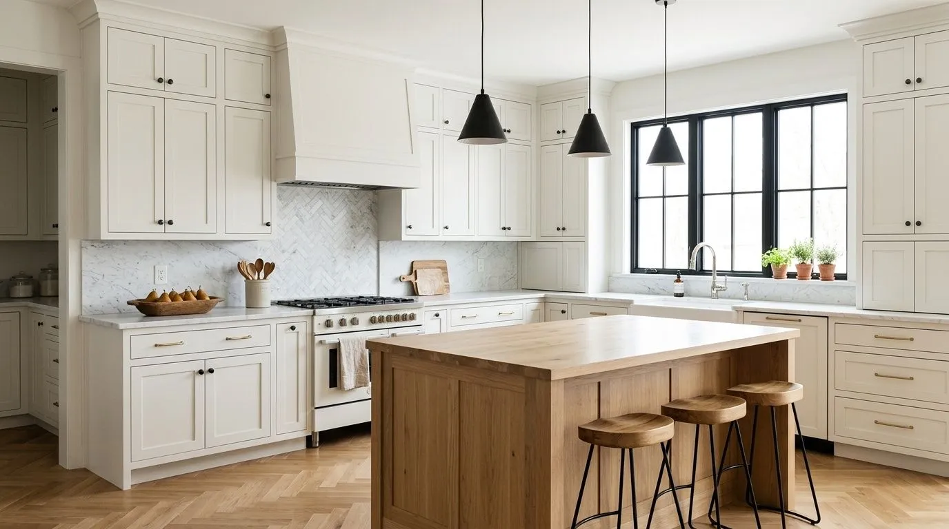
Pure White earns its place as a whole-home white in open floor plans precisely because it does not commit hard in either direction. It flows from room to room without clashing against warm wood floors, cool gray upholstery or natural stone, and the LRV of 84 keeps spaces feeling open without the visual tension of a near-pure bright white. This is where most reviewers agree: for connected, open spaces with reasonable natural light it is one of the most reliable single whites you can roll out.
For specific applications, kitchen cabinets are where it gets the most consistent praise from independent sources. It sits between crisp and cozy, does not compete with quartz countertops or marble, and holds up well under the cool-toned LED lighting common in modern kitchens. On trim and doors it performs equally well, and the practical move is to use Pure White in a semi-gloss or gloss on trim in the same rooms where you paint walls in Pure White at a lower sheen, rather than introducing a second white that will create an unflattering contrast. Bathrooms and bedrooms with decent natural light are solid candidates too.
The cautions are real. North-facing rooms are a genuine risk: the color can go cool and flat there, and reviewers who specifically advise on north rooms do not list it among their recommendations for that orientation. Rooms that rely heavily on artificial light with a cool color temperature carry the same warning. On the exterior it works well as siding for a softer, less stark look than a bright white, but some reviewers suggest a step-deeper white for large, sun-drenched siding expanses. As exterior trim it can read too bright if the adjacent wall color is already quite light, so the contrast math matters there.
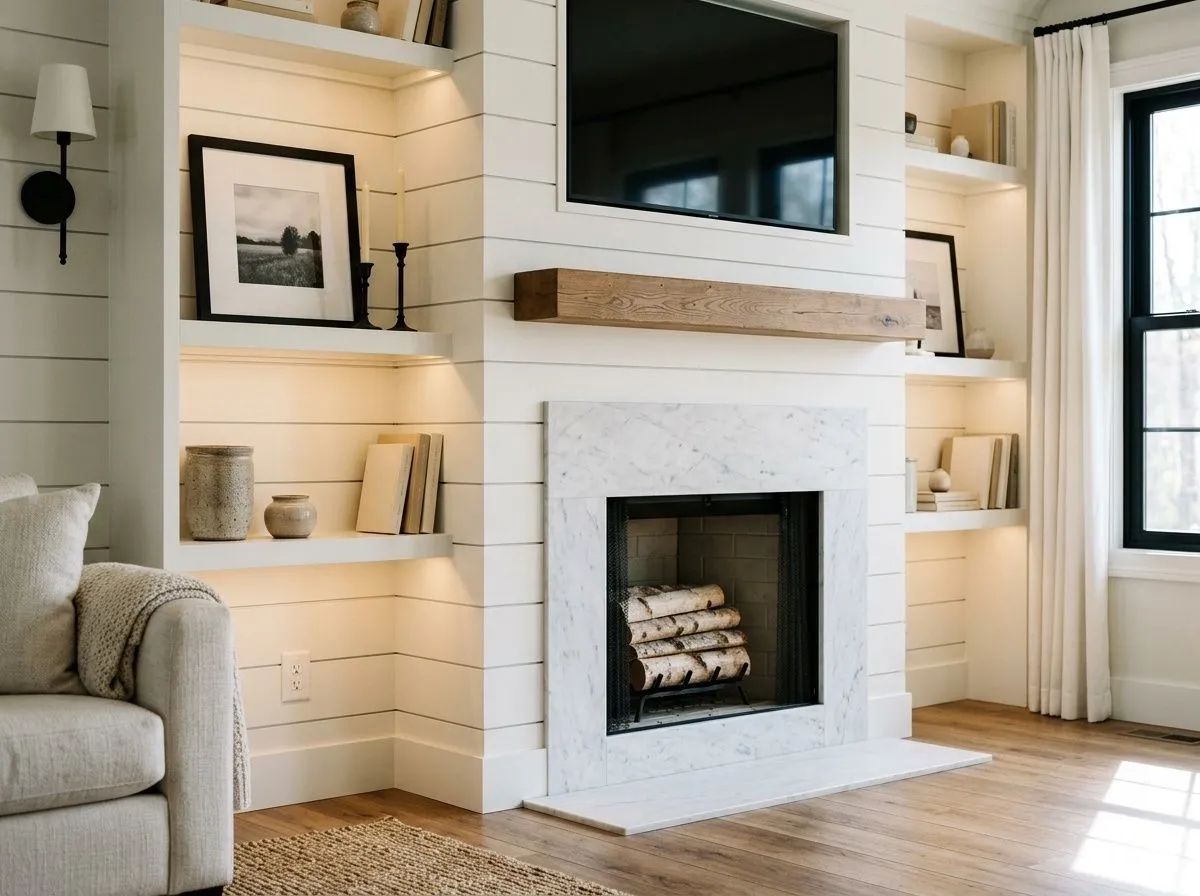
In a south- or west-facing living room Pure White holds its subtle warmth across the day and keeps the space feeling open at LRV 84 without the glare of a brighter white. It pairs easily with warm wood furniture, neutral upholstery and layered textiles. Avoid it if your living room faces north and relies on artificial light, where the gray component tends to take over.
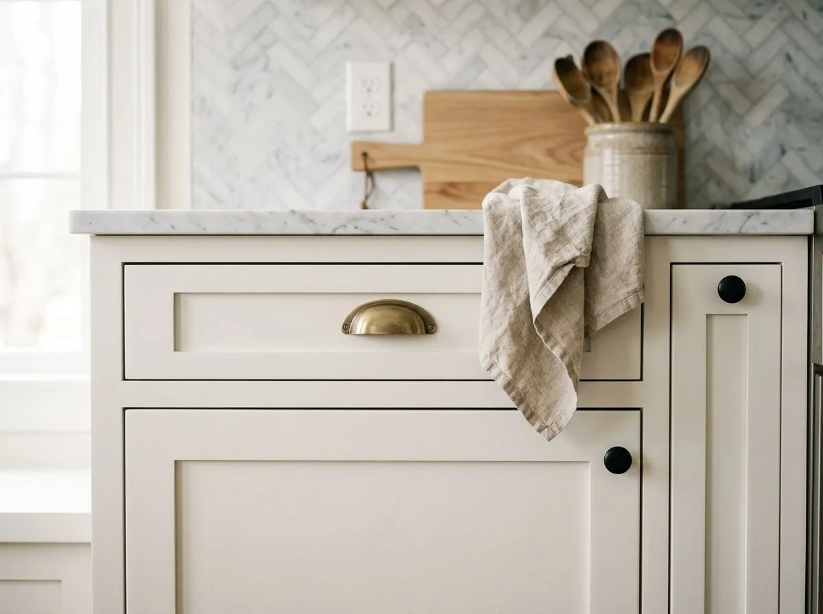
Kitchen cabinets are arguably the strongest use case for this color. Reviewers consistently rank it among the best cabinet whites because it reads clean and bright under work lighting but does not clash with warm stone, wood or quartz. Use it in a semi-gloss on the cabinets and carry the same color onto the trim for a seamless, unfussy result.
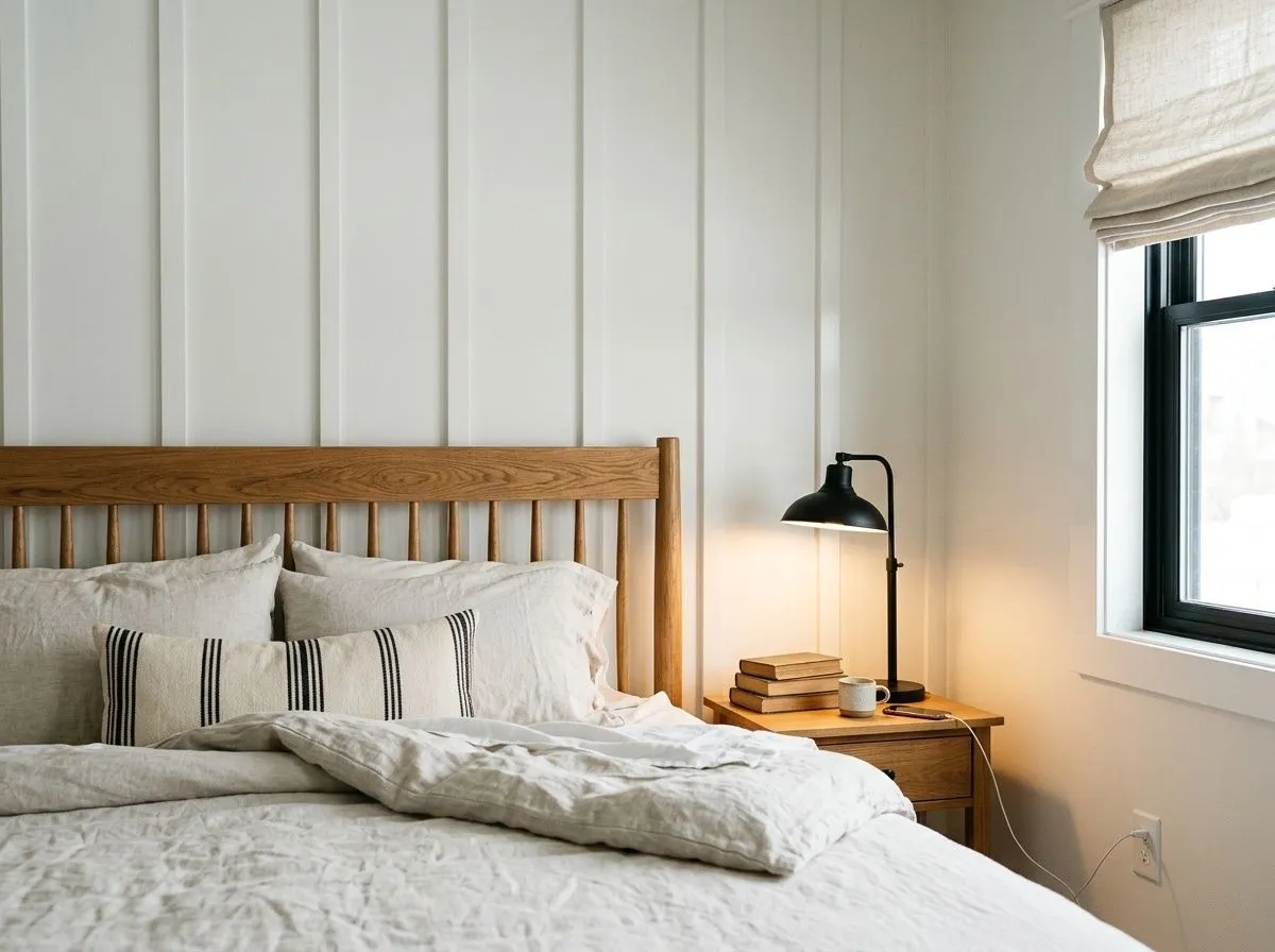
In a bedroom with good natural light Pure White keeps walls calm and unobtrusive, letting bedding and furniture carry the visual weight. It works with both warm and cool palettes, which is useful in rooms where the textile mix is varied. North-facing bedrooms are the exception: add supplemental warm-toned lighting or consider a color with a more assertive warm undertone.
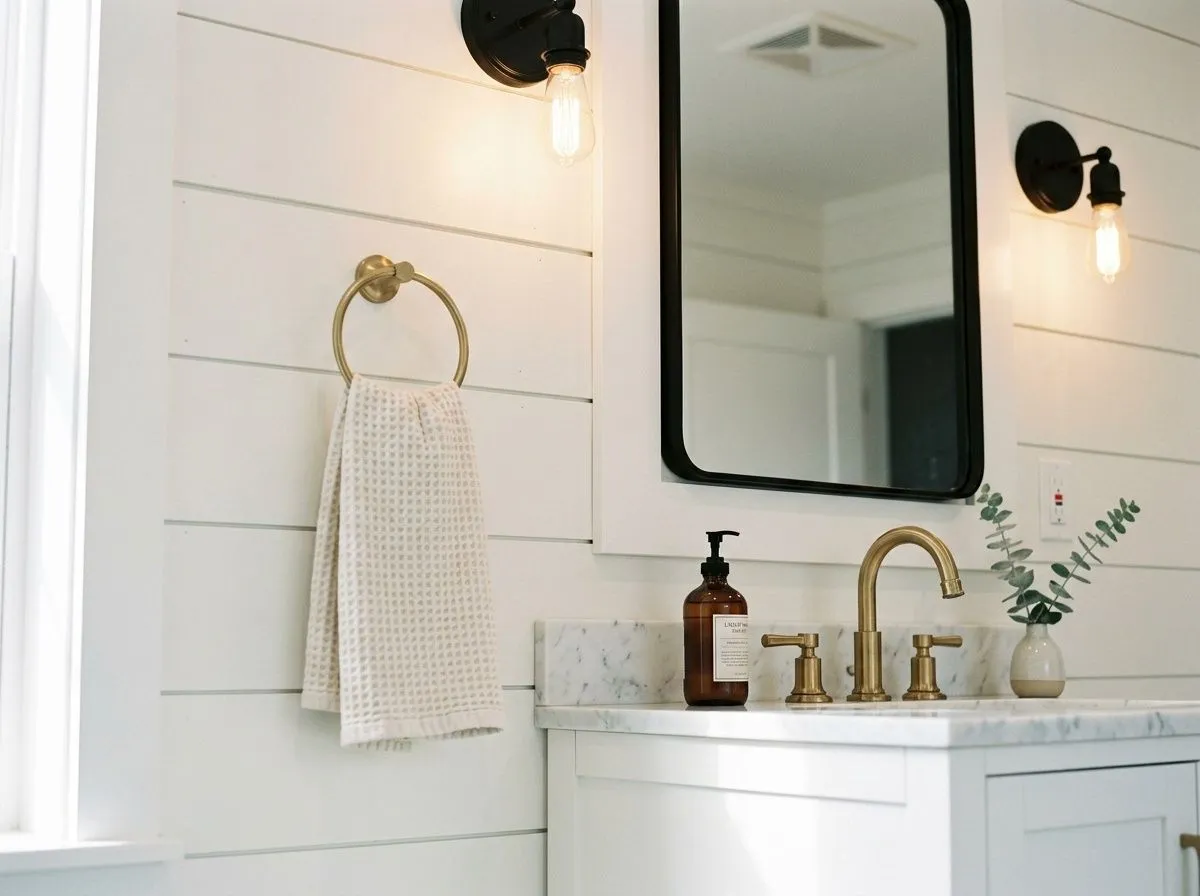
Pure White handles bathrooms well when there is a window or warm-toned lighting to keep the gray undertone from surfacing. On trim, vanities and walls together it creates a clean, cohesive look without the clinical edge of a bright cool white. Pair it with warm metal hardware in brass or matte gold to keep the subtle warmth readable.
Pure White's passive warmth gives it genuine range as a pairing partner. It sits comfortably alongside warm palettes built on taupe, greige, honey-toned wood and aged brass without amplifying the warmth too far. It is equally at home as the neutral anchor in cooler schemes that use blues, blue-greens and grays, as long as those colors carry a little gray themselves rather than reading as cold and saturated. Dark accents read particularly well against it: deep charcoal, navy and black give Pure White its definition without creating the hard, stark contrast you would get with a true bright white.
From the coordinating palette, March Wind (SW 7668) pairs with it naturally as a soft, muted tone that references the gray-green range and keeps the overall palette quiet and grounded. For a higher-contrast approach with depth, Perle Noir (SW 9154) works as an accent, bringing a rich dark note that lets Pure White read at its brightest and cleanest. When building a trim-and-wall scheme, resist the urge to pair Pure White with a brighter or cooler white on the adjacent surface. Reviewers specifically flag that placing it next to Extra White (SW 7006) makes Pure White look dingy by comparison. Use sheen variation on the same color instead.
Most of what builds this room has nothing to do with a paintbrush: the textiles, wood tones, and metals are the real workhorses, each matched here to its closest Sherwin-Williams equivalent so you can clock the palette clearly. The one actual paint is Pure White, pulling double duty on the shiplap walls and ceiling in matte and on the millwork, built-ins, and trim in satin. Hover any pin or swatch to see exactly which color you're looking at.
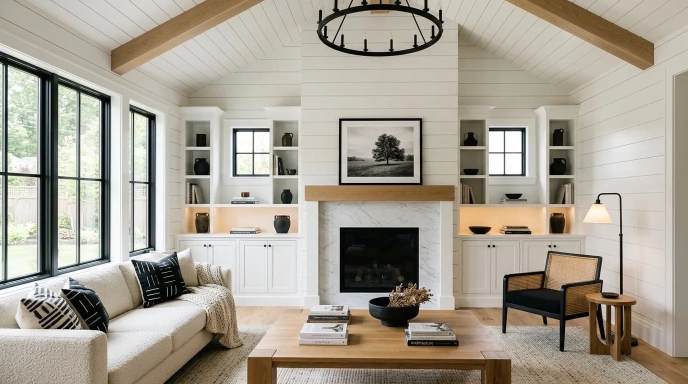
All comparisons are matched against Pure White at LRV 84.
If you use Pure White on walls and then switch to a brighter, cooler white such as Extra White on the trim, the contrast will make Pure White look yellowish and dingy rather than clean. The two LRV values are close enough that the shift reads as a mistake rather than an intentional contrast.
In north-facing rooms or spaces lit primarily by cool-temperature LEDs, the gray component of Pure White's undertone reads forward and the color can look flat, cool or slightly dingy. The LRV of 84 does not compensate for an unflattering light source the way a warmer or higher-LRV white might.
Placed directly next to a rich warm beige or cream, Pure White's restrained warmth is not enough to bridge the gap and it can read as a cold intruder rather than a clean complement. The color's warmth is passive, not bold, and it gets outcompeted by heavily warm neighbors.
It reads as a clean, fresh white that sits between a stark bright white and a creamy off-white. At LRV 84 it has enough reflectivity to keep rooms feeling open, but the slight warmth and quiet gray undertone soften any harshness. In warm or well-lit rooms it looks bright and inviting. In cool or north-facing rooms it can shift toward gray or flat.
The primary undertone is a very muted, passive yellow, countered by a thread of gray. The result is a white that reads subtly warm in good light but can flip toward cool and gray in north-facing or low-light conditions. Most independent reviewers describe it as warm overall, but the caveat about cool light is consistent across sources and worth taking seriously.
Technically warm, but only barely. The yellow undertone is present but quiet, and the gray component keeps it from reading as a cream or warm white in the way that something like Alabaster does. In south- or west-facing rooms it feels warm. In north or low light it reads closer to neutral or even cool, so the answer genuinely depends on your room's light exposure.
Pure White has an LRV of 84. That puts it well above most off-whites and greiges, and about 6 to 9 points below the brightest whites in the Sherwin-Williams line. In practical terms it reflects a lot of light and keeps rooms feeling open, but it does not have the near-mirror brightness of whites in the low 90s. It is bright enough for small rooms and dark spaces, but not so bright that it creates glare.
The Sherwin-Williams code is SW 7005. The hex value is #EDECE6 and the RGB is 237, 236, 230. These are the values for the Sherwin-Williams formulation specifically. Do not use these to match across other paint brands, as cross-brand matches will not reproduce the same undertone reliably.
Yes, and it is one of its strongest applications. Reviewers consistently praise it on trim, doors and cabinets because it reads clean without the hard edge of a bright cool white. The key is to use Pure White on both walls and trim, varying only the sheen, rather than pairing it with a different white on adjacent surfaces. Mixing it with a brighter white like Extra White on the same trim run creates an undertone clash that makes Pure White look dingy.
For cabinets, yes, it is one of the most consistently recommended whites from independent reviewers, particularly with modern quartz countertops and light wood tones. For exteriors it works well as siding for a softer alternative to bright whites. As exterior trim it can read too bright against certain light wall colors, so check the contrast in your specific conditions. Some reviewers suggest a step-deeper white for very large, sunlit siding surfaces.
Chantilly Lace (OC-65) is widely cited by independent reviewers as a comparable clean white in a similar LRV range. It tends to read slightly crisper and cooler than Pure White in most lights. Do not attempt a cross-brand paint match using Pure White's hex or formula. If you want Chantilly Lace, buy it as a Benjamin Moore product.