Cold Foam is a very light, soft white with an LRV of 84, which puts it squarely in bright, reflective territory. It reads as open and airy on the wall without tipping into the stark, clinical quality that true whites can carry. You get fullness and presence without visual noise.
The color behaves differently depending on the light in your room. In strong natural daylight it leans crisp and slightly cool, reading as a fresh, clean white with a calm, serene quality. Under dimmer or warmer artificial lighting it settles into something slightly deeper, with a faint creaminess that keeps it from feeling flat. That range of behavior is genuinely useful: it adjusts to your room rather than fighting it.
The undertone on Cold Foam is legitimately contested, and the honest answer is that it depends on your conditions. Our database reads it as cool and green-leaning. Many independent reviewers agree, describing a clean, near-neutral white where the cooler nuances sharpen and become readable under strong natural light, particularly in north-facing or east-facing rooms.
Other reviewers come to a different conclusion entirely, calling it a soft warm white with a passive creamy, faintly yellow cast layered on top of some gray. Those observers tend to be sampling it under warmer artificial light or alongside true cool whites, where the relative warmth of Cold Foam becomes visible by contrast. Neither read is wrong; the color genuinely shifts between these two characters.
What that means practically: if you place Cold Foam next to a bright, blue-toned white it will look warm. If you place it next to a distinctly creamy or golden white it will look cooler and more neutral. Sample it in your own space, against your existing trim, in both daylight and evening light before you commit. The light in your specific room is going to be the deciding factor.
Cold Foam is listed for bedrooms, bathrooms, and living rooms, and those recommendations track with how the color actually performs. The LRV of 84 means it reflects a lot of light, so it works especially well in rooms that already get decent natural light and where you want to amplify that brightness without going stark. In a bedroom it stays calm and fresh rather than energizing, which supports a restful atmosphere.
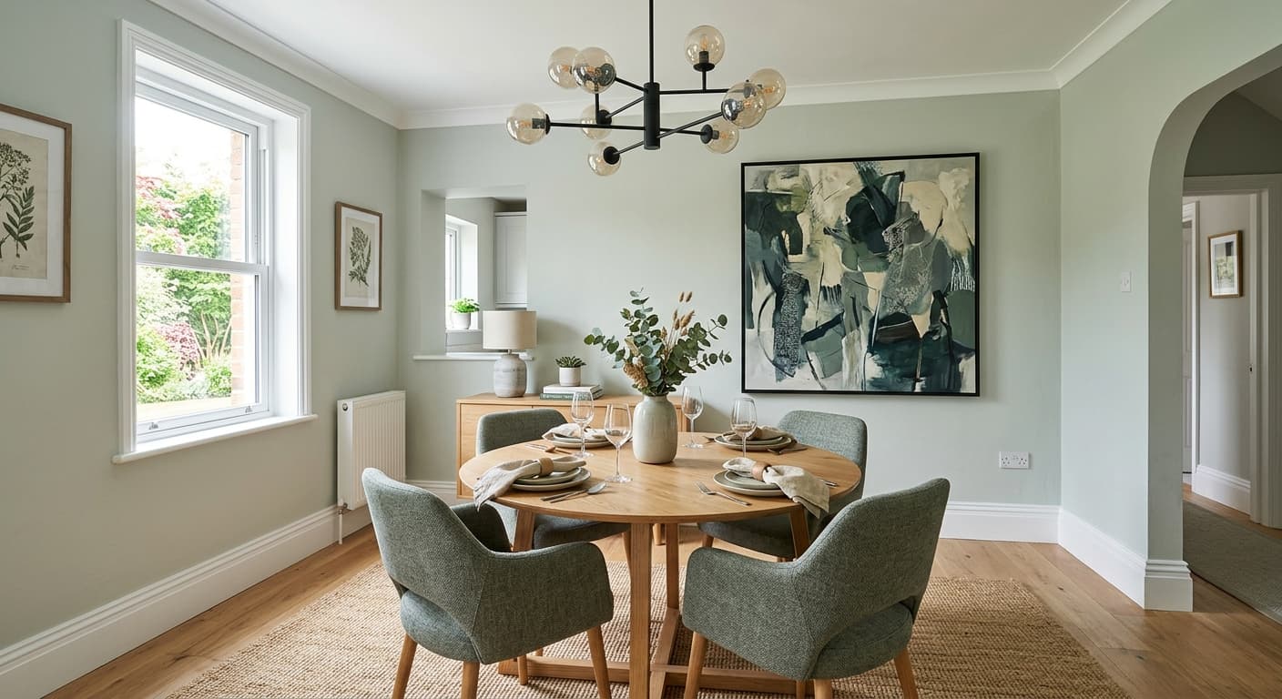
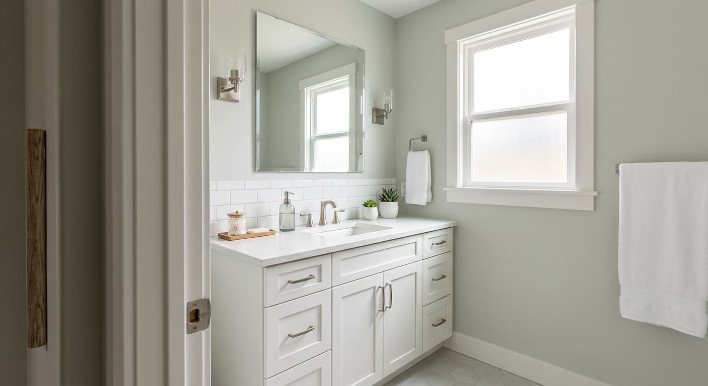
In bathrooms it reads clean and serene, and the slight coolness that shows up in natural light plays well against white tile and chrome or brushed nickel fixtures. For living rooms it provides a backdrop that recedes and lets furniture and art carry the room. Designers often use it specifically for contemporary schemes where the goal is a crisp, uncluttered look with dark accents, because Cold Foam gives you contrast without the harshness of a pure white.

It is available in both interior and exterior formulas, and the color holds up well as an exterior white because it is bright enough to read clearly from a distance while still having enough warmth and body to avoid the chalky or cold look some stark whites carry on siding. It works on cabinets too, where the controlled LRV gives you a finished, clean look that photographs well.
Cold Foam keeps a bedroom feeling calm and open without the restless energy of a brighter white. The LRV of 84 reflects enough light to make even a modest-sized room feel larger. Pair it with soft linen bedding and warm wood furniture to balance any cooler moments the color produces in morning light.
In a bathroom with natural light, Cold Foam leans fresh and clean, working well alongside white tile, marble, and chrome or brushed nickel hardware. Under warmer vanity lighting it softens slightly, keeping the space from feeling cold. It is a reliable choice if you want a white that does not compete with your fixtures.
Cold Foam gives a living room a crisp, uncluttered backdrop that lets furniture and art carry the visual weight. It works especially well in contemporary spaces with dark accent pieces, because the LRV of 84 creates real contrast without the harshness of a pure white. South-facing rooms will show its cooler, fresher side most clearly.
On cabinets Cold Foam reads as a clean, polished white with just enough depth to feel intentional rather than default. It photographs well and pairs naturally with dark hardware or countertops that have warm undertones. Because its undertone can swing cool, test it alongside your countertop material before painting the full run.
Cold Foam is available in an exterior formula and holds up as a bright, readable white on siding and trim. It avoids the chalky or icy look that some very cool whites carry in full sun, thanks to the slight body in its undertone. It pairs well with a darker front door color for clear contrast.
The coordinating palette Sherwin-Williams built around Cold Foam leans into earthy, grounded neutrals that give the white something to work against. High Sierra and Perfect Khaki bring warm, sandy tones that anchor Cold Foam without fighting its cooler tendencies, letting the white read fresher by comparison. Settlement adds depth and contrast as a rich, dark taupe, which is the move if you want Cold Foam to pop as a clean backdrop rather than blend into a tonal scheme.
Beyond those coordinates, Cold Foam pairs well with dark accents broadly, whether that is near-black trim, deep charcoal textiles, or warm wood tones that balance the white's cooler moments. Natural materials like linen, rattan, and unfinished wood also work well because they introduce organic warmth that complements the color's flexibility.
All comparisons are matched against Cold Foam at LRV 84.0.
If Cold Foam is used in a room that flows into a space painted in a warm golden or orange-toned color, Cold Foam's cooler moments will amplify and it can read almost lavender or gray by contrast.
Under heavily amber artificial light Cold Foam's faint cool undertone can flatten and the color may read slightly dull or dingy rather than fresh and crisp.
Placing Cold Foam next to a true cool white or a bright blue-white trim color will pull out whatever warmth or creaminess lives in Cold Foam, making the wall color look dingy or off rather than intentional.
Cold Foam is a very light, soft white from Sherwin-Williams with an LRV of 84. It reads as bright and airy on the wall, reflecting enough light to make spaces feel open, while still carrying subtle undertone complexity that keeps it from feeling stark or sterile.
Cold Foam's undertones are genuinely debated. The color leans cool and slightly green in our editorial read, and many reviewers confirm that coolness becomes noticeable in strong natural daylight. Other reviewers read a passive creamy, faintly yellow quality with some gray mixed in, describing it as a soft warm white. In practice it shifts: cooler and fresher in abundant daylight, slightly warmer and softer under dim artificial light. Sample it in your own lighting before committing.
Cold Foam sits in a middle zone that shifts with your conditions. In bright natural light it reads as a cool, crisp white. Under warmer or dimmer artificial light it softens toward a faint creaminess. It is not a definitively warm white like a creamy off-white, and it is not an icy cool white either. That in-between quality is part of its appeal, but it also means the answer depends on your room's light and your surrounding colors.
Cold Foam has an LRV of 84, which makes it a bright, reflective white. At that level it will help rooms feel larger and lighter without the visual weight of a deeper color, and it stops well short of the near-pure-white range where colors can start to feel clinical.
Cold Foam's Sherwin-Williams code is SW 9504. The hex value is #efece3 and the RGB is 239, 236, 227.
Cold Foam coordinates well with warm earthy neutrals. Sherwin-Williams pairs it with High Sierra and Perfect Khaki for a grounded, sandy palette, and with Settlement for deeper contrast. Broadly it works well with dark accents, near-black trim, warm wood tones, and natural textiles like linen and rattan that balance its cooler moments.
Yes on both counts. Cold Foam is available in an exterior formula and reads as a bright, clean white on siding and trim without going chalky or icy in full sun. On cabinets it gives you a polished, intentional white with enough depth to feel considered. In both applications, test it alongside your adjacent materials first, since its undertone can swing cool depending on the light and surrounding colors.
