
MorningGentle warmth · cream forward
A soft, creamy off-white with a warm yellow base held in check by a quiet gray modifier, sitting right at the edge of true white. Test it in your light before you commit.
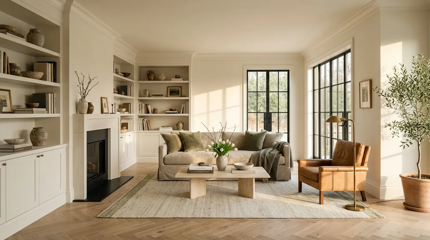
Alabaster lands on the wall as a soft, creamy off-white that reads nothing like a crisp or bright white. Its LRV of 82.2 places it in the upper range of light colors, but on the wall it behaves more like a gentle off-white than a true white, sitting right at the boundary of the two worlds. The overall impression is warm and quiet, inviting without being yellow or tan.
Context changes everything with this color. When Alabaster is the only white in a room, it reads almost neutrally white. Put it next to a brighter white such as Pure White or Extra White and it immediately shifts, looking distinctly creamier and letting its underlying gray modifier come forward. That dynamic means what you see on a sample strip at the store and what you see on a finished wall can feel genuinely different depending on your fixtures, appliances, and adjacent materials. Large painted samples tested in place, through morning and afternoon light, are not optional here.
Every reviewer agrees Alabaster reads warm. The core of that warmth is a faint, muted yellow or creamy yellow that stops well short of true cream. What keeps it from tipping into cream territory is a quiet gray modifier sitting underneath, and that gray is doing real work. It is the main reason Alabaster reads less overtly yellow than Benjamin Moore Simply White, which many people compare it to.
That said, there is genuine disagreement on how much yellow you actually get. Some reviewers find it nearly neutral, only subtly creamy, easy to live with in a wide range of rooms. Others insist the yellow is quite present, more so than Greek Villa (SW 7551), and say it can read as an obvious cream depending on the room. Both camps have a point, and they are likely measuring it against different things in different light.
Light is the real variable. In north-facing rooms or under cool or low light, the yellow stays muted and the warmth reads as softness rather than color. In south-facing rooms or under warm incandescent or warm LED bulbs, the yellow and creaminess become more pronounced and can feel heavy for anyone chasing a bright, clean white. There are also reports of it flashing slightly green or slightly pink depending on surrounding materials and natural light angles. Those shifts are minor but they are real, and they explain why people in identical houses sometimes describe the color completely differently.
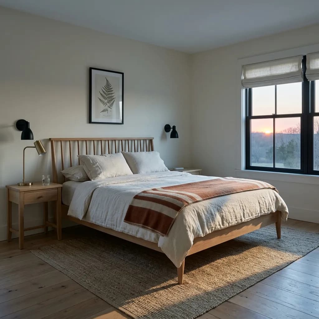
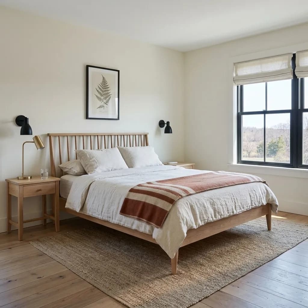
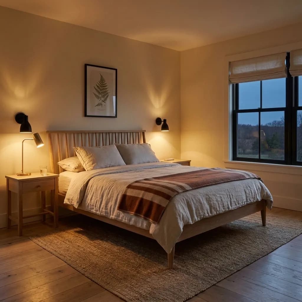
Alabaster is most at home in north-facing rooms, where its warmth reads as gentle and flattering rather than heavy. It is also well suited to east-facing spaces that get soft morning light and transition to indirect light in the afternoon. In those orientations it holds its composure and avoids the yellowish cast that brighter, warmer afternoon and southern sun can introduce. Bedrooms and nurseries come up constantly in reviews because the color feels cozy without being obvious about it.
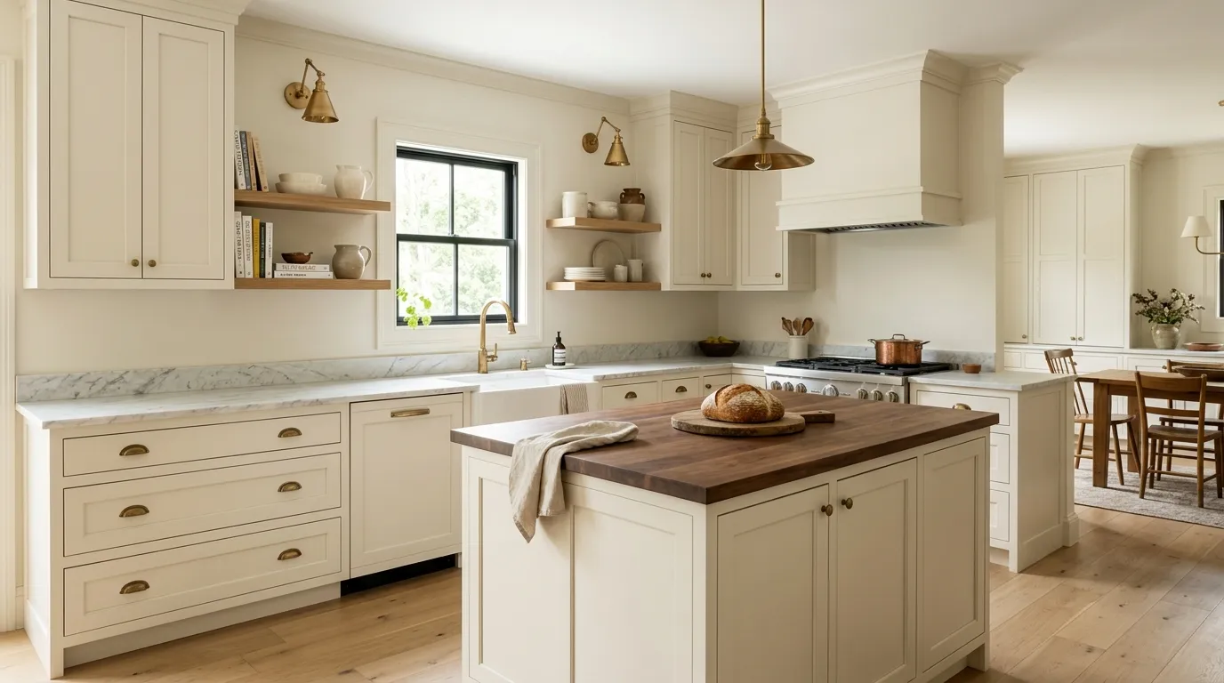
Cabinets are the single strongest recommendation across independent reviewers. Against wood countertops, marble, or darker granites, and especially with brass or warm gold hardware, Alabaster on cabinets reads rich without competing. It suits both modern farmhouse and traditional kitchen styles. Trim and millwork are the other high-frequency recommendation. Using it across walls, trim, and ceiling at once in a higher sheen for the woodwork is a reliable approach that avoids the problem of mismatched whites.
For exteriors, opinion splits in a way worth taking seriously. Some reviewers like it as farmhouse siding and trim that avoids the starkness of a true bright white. Others warn that strong southern sun amplifies the creaminess and that placed next to white window frames or white garage doors it can look two-tone or muddier than intended. Exterior use is fine in principle and the color is specifically listed among Sherwin-Williams' top exterior colors, but an on-site sample is non-negotiable. The same caution applies inside if you have bright white appliances or white subway tile, where Alabaster can look yellowish-cream by contrast.
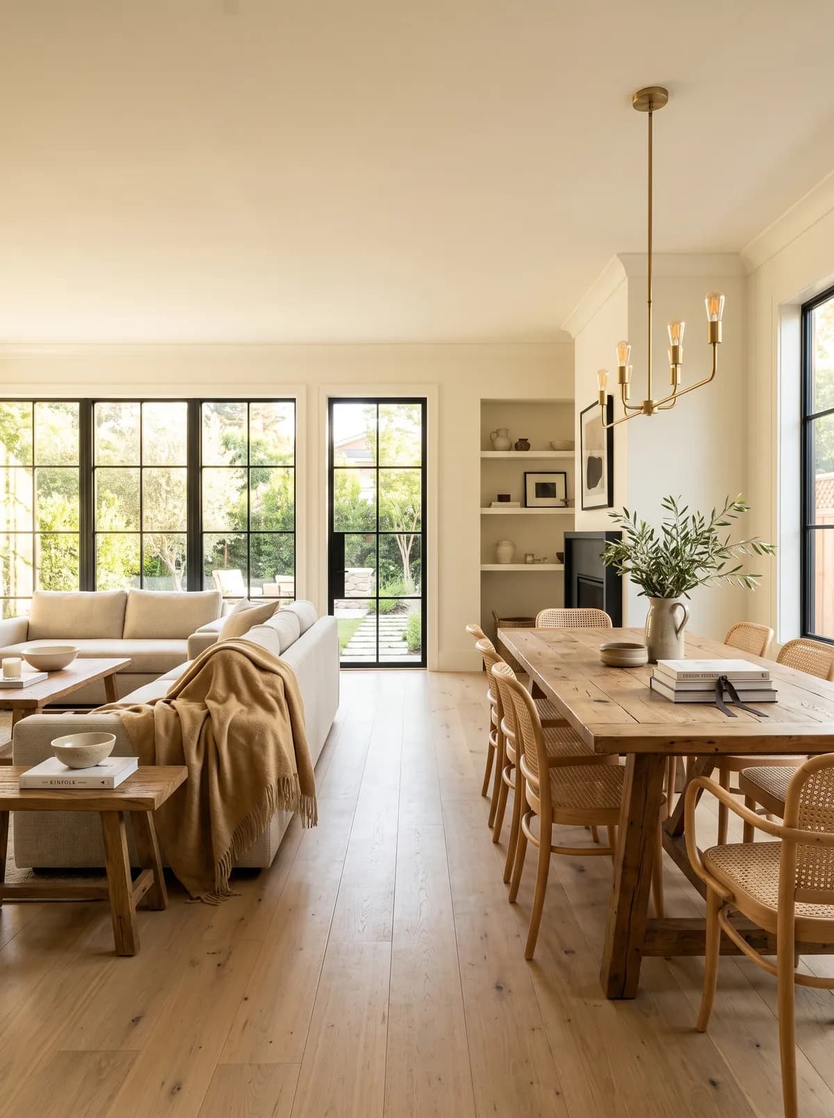
In a living room, Alabaster creates a warm backdrop that works with most furniture tones. North or east exposure keeps the creaminess soft and livable. Pair with warm wood floors and natural textiles and you get a cohesive, unfussy space.
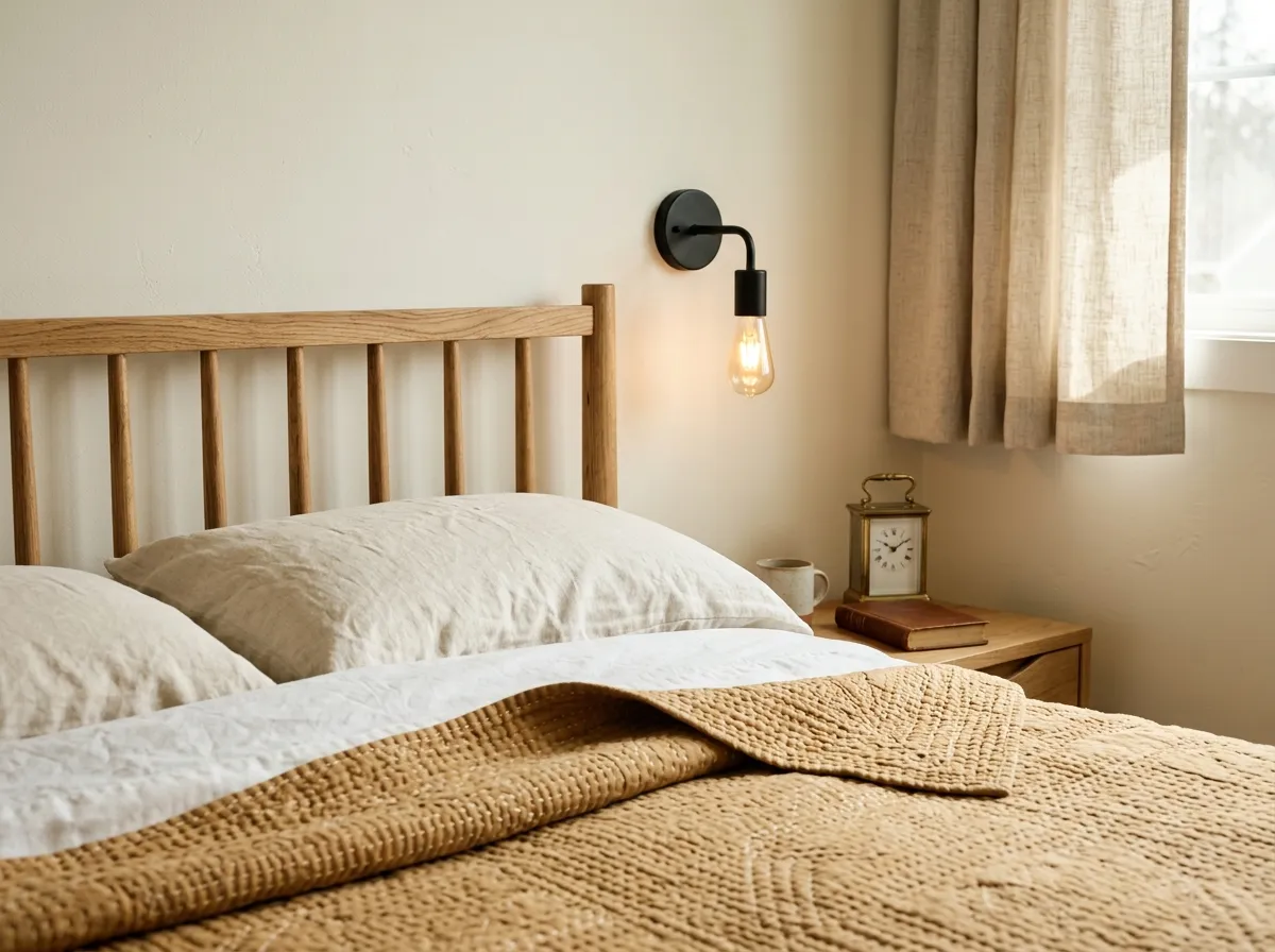
Bedrooms and nurseries are among the most common real-world uses reviewers report. The warmth reads as restful rather than stimulating, and it works in rooms that get limited direct light. Layering in warm-toned bedding and wood furniture keeps the palette consistent.
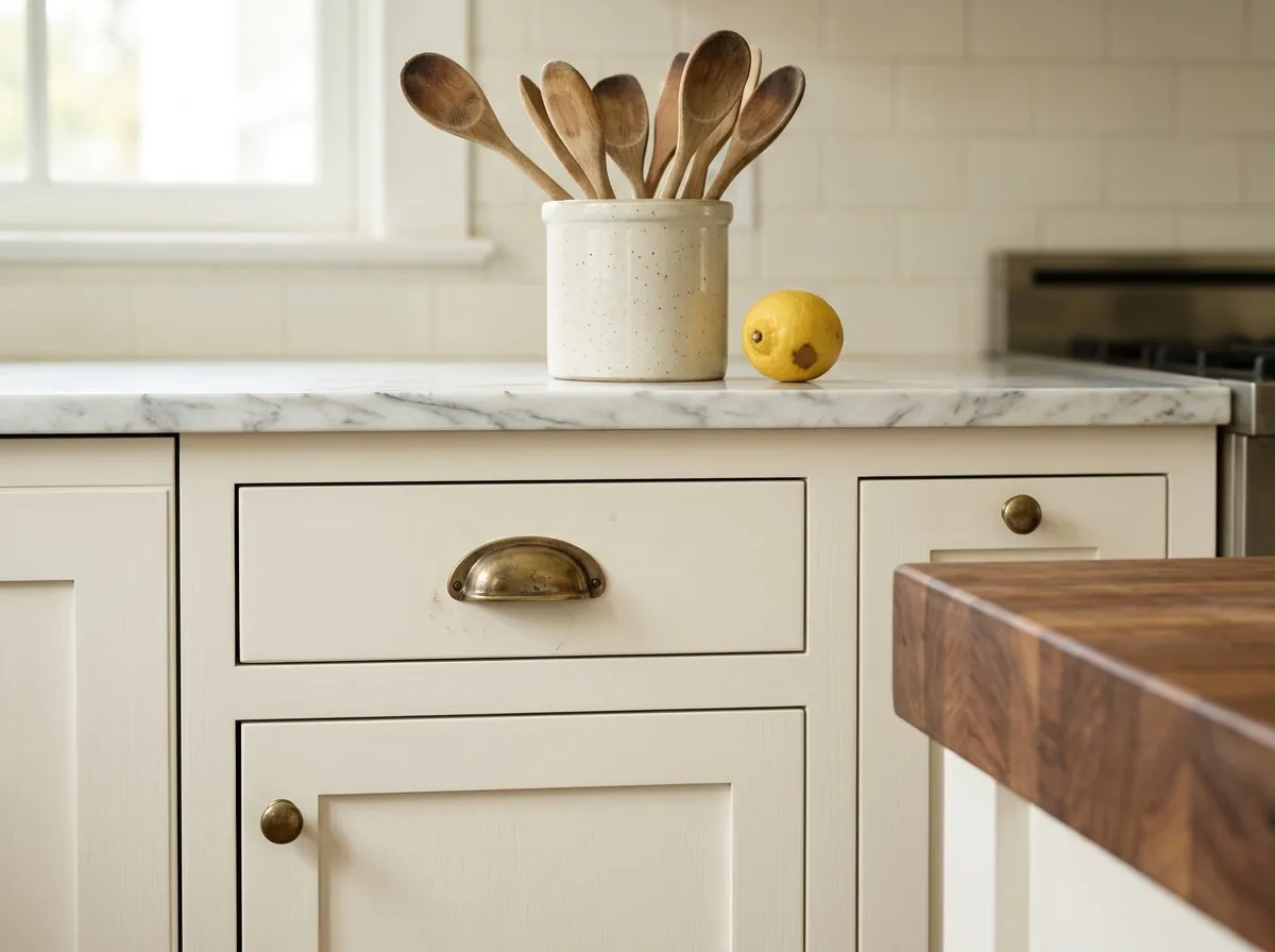
Alabaster on kitchen cabinets is where it earns its highest marks. It flatters warm hardware finishes like brass and unlacquered bronze, and reads well against wood, marble, and dark granite counters. Avoid placing it next to bright white appliances without testing first, as the contrast can make it look cream.
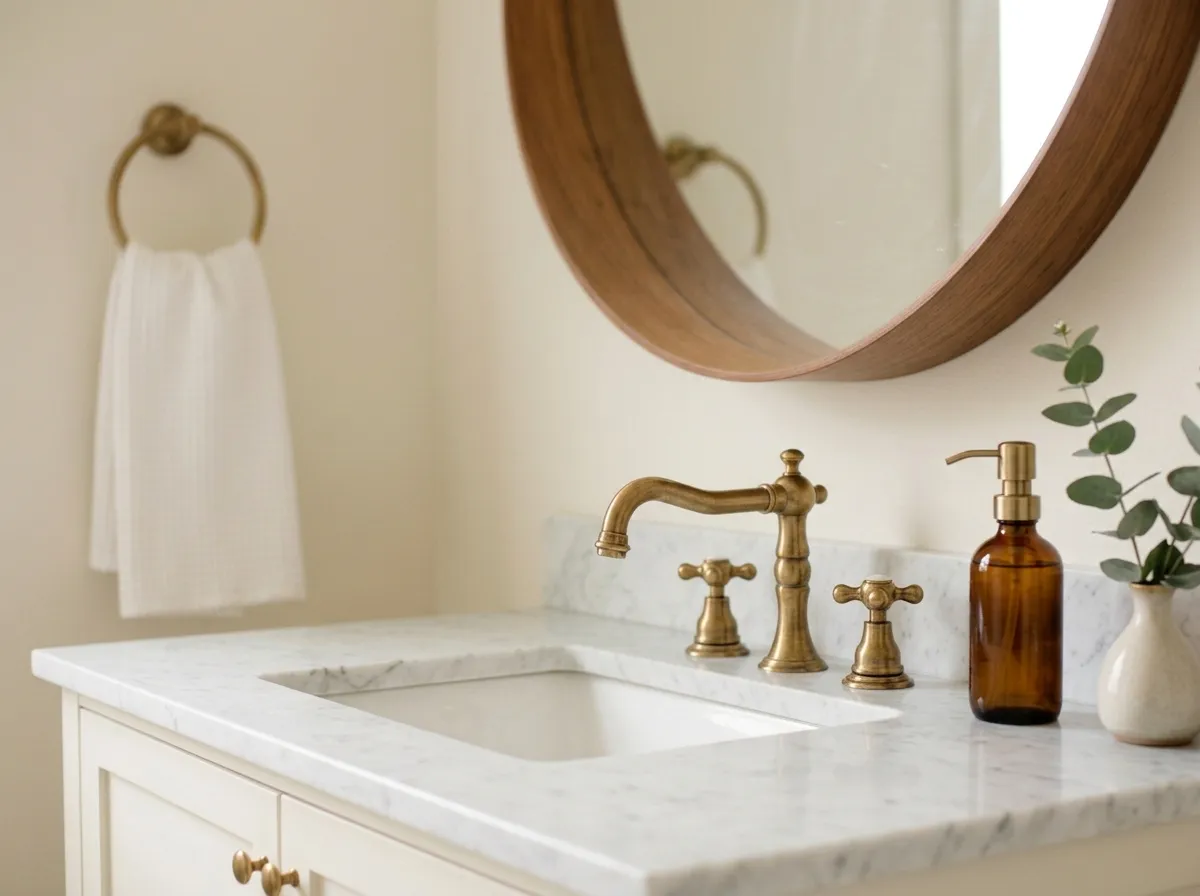
In bathrooms with warm or natural light it reads clean and soft. It suits vintage-style and farmhouse tile palettes well. In a bathroom with cool or blue-toned tile it can feel slightly off, so check your tile undertones before committing.
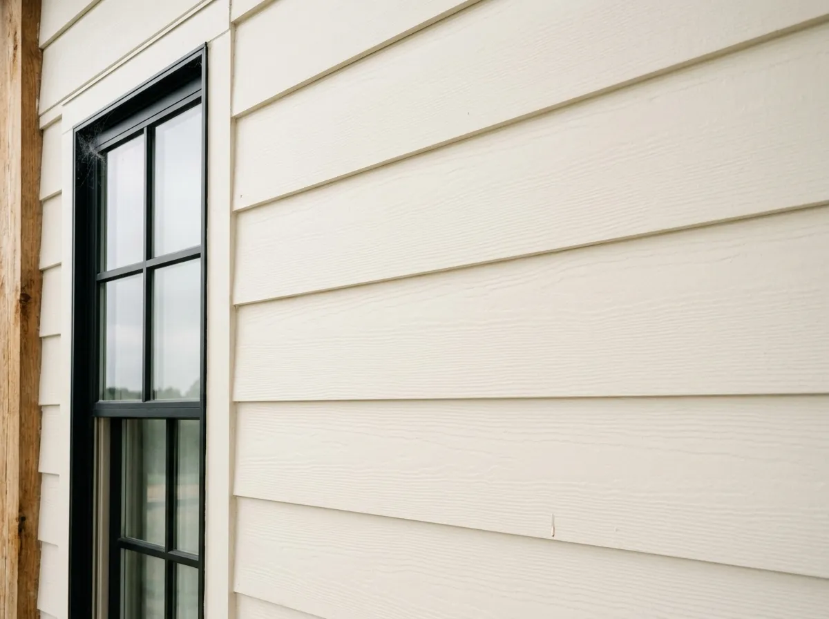
Alabaster can work as a farmhouse-style siding or trim color that avoids the sharpness of a pure white. In strong southern sun the creaminess amplifies, so test a large board sample through the full day before painting. Mixed with brighter white windows or trim it can look two-toned.
Alabaster pairs best with materials and colors that share its warmth. Cool grays and cool blues fight its yellow base and make both colors look off, so the working rule is to keep the palette on the warm side. Townhall Tan (SW 7690) gives it a grounded, earthy anchor for accent walls or larger surfaces, and Dakota Wheat (SW 9023) layers in a honeyed mid-tone that flatters the creamy base without competing with it. Warm grays, greiges, and taupes work broadly well alongside it.
For drama, dark accents and near-blacks are a reliable move. Deep charcoals and moody blacks give Alabaster something to push against, and the contrast flatters both. Warm wood tones and natural materials like rattan, linen, and wool read beautifully against the off-white base. Brass and warm gold hardware on cabinets or light fixtures is close to universally praised. If you need a trim color alongside Alabaster walls, the cleanest path is to use Alabaster itself in a higher sheen rather than introduce a second white that may read as conflicting.
All seven colors here come from one paint pot: Alabaster goes on the walls, trim, ceiling, and built-ins, wrapping the whole room in a single quiet tone. The remaining six colors are the furnishings and materials, each matched as closely as possible to a Sherwin-Williams paint for easy reference. Hover any pin or swatch to see the name and number.
All comparisons are matched against Alabaster at LRV 82.2.
Alabaster's warm yellow-cream base and cool or blue-toned grays fight each other directly. The contrast makes Alabaster look more yellow and the gray look more stark, and neither reads as intended.
Next to refrigerators, dishwashers, or white subway tile in a true bright white, Alabaster's LRV 82.2 and creamy base make it look visibly yellow-cream by comparison, which most homeowners find unflattering.
Introducing a second white product, such as Pure White or Extra White, on trim next to Alabaster walls creates a visible mismatch. The brighter trim makes Alabaster look warmer and slightly dingy by comparison.
Alabaster is Sherwin-Williams' best-selling warm off-white. It has a hex of #EDEAE0, an RGB of 237/234/224, and an LRV of 82.2. On the wall it reads as a soft, creamy white rather than a bright or crisp white, sitting right at the edge of the white color family.
Alabaster's primary undertone is a faint, muted yellow or creamy yellow, softened by a gray modifier that keeps it from tipping into obvious cream. Reviewers disagree on how strong the yellow reads: some find it nearly neutral, others say it reads distinctly creamy, especially next to brighter whites or in warm light. It can also flash a subtle green or pink depending on light conditions and surrounding materials.
Alabaster is warm. Every independent review agrees on this. The warmth comes from its yellow-cream base, and while the gray modifier keeps it from being overtly warm, it always reads on the warm side of the white spectrum. It is not a cool, crisp, or bright white.
Alabaster's LRV is 82.2. That places it firmly in the light range, reflecting most of the light that hits it, but it reads softer and creamier on the wall than the number might suggest because its warm undertones make it feel richer than a cooler white at the same LRV.
Alabaster pairs well with warm grays, greiges, taupes, and earthy tones. Townhall Tan (SW 7690) and Dakota Wheat (SW 9023) are two specific coordinating picks. Dark accents, near-blacks, and warm wood tones work well with it. Brass and warm gold hardware on cabinets are widely praised pairings. Avoid cool grays and cool blues, which clash with its warm base.
The Sherwin-Williams color code is SW 7008. The hex is #EDEAE0 and the RGB is 237/234/224. The LRV is 82.2.
For cabinets, it is one of the most recommended warm whites across independent reviews, especially with warm hardware and against wood or stone counters. For exteriors, it can work as a soft farmhouse-style siding or trim color, but strong southern sun amplifies its creaminess and it can look two-toned next to brighter white windows or doors. Test a large on-site sample through a full day before committing to an exterior application.
White Dove (OC-17) is the most commonly cited Benjamin Moore near-equivalent. It shares Alabaster's warm, soft quality but has a stronger gray modifier that makes it read slightly less creamy and more muted. They are close but not identical, so test them side by side in your actual light before deciding.