
MorningBalanced · truest green read
A muted, earthy green with a soft olive lean and a quiet, settled depth that shifts gently with the light. Sample it in your own light before you commit.
Dried Thyme (SW 6186) is a muted, mid-to-deep green that reads earthy and grounded rather than bright or botanical. It sits at LRV 20.8, which puts it firmly in medium-dark territory. That means it absorbs a fair amount of light and will read noticeably deeper in dim conditions or shaded corners, while still holding a refined, composed quality in well-lit spaces. Think of it as a green that has been toned down with gray and a touch of olive, stripping out any vibrancy in favor of something quieter and more complex.
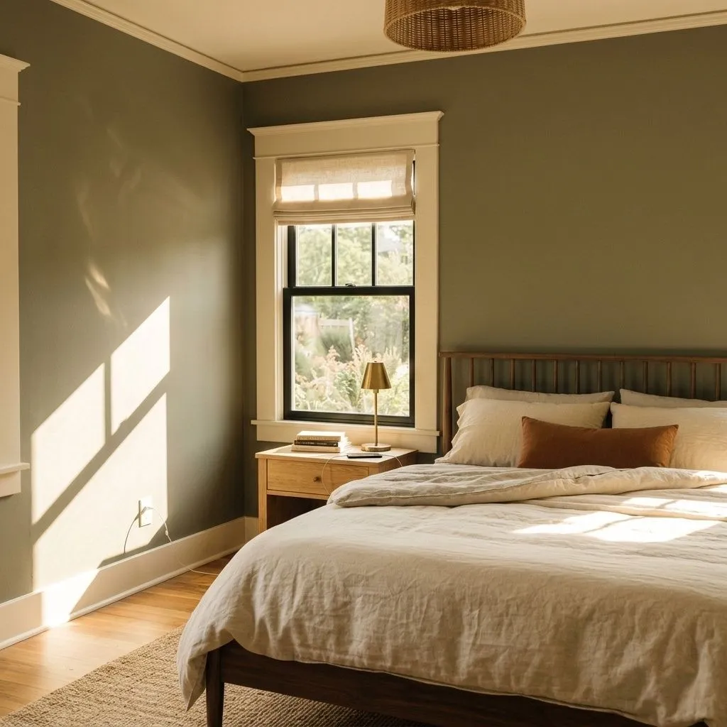
What makes the color interesting is how much it shifts with light. In direct sun or a south-facing room, it warms slightly and the olive reads more clearly. In cloudy or low light, it deepens and the gray takes over. Warm incandescent or evening bulbs pull out a cozier, earthier character. Reviewers consistently note that morning daylight gives you the most balanced read of the color. On a paint chip or sample card it can look almost neutral, but on four walls it carries real presence and weight, which is something worth knowing before you commit.
Dried Thyme carries three overlapping undertones: soft gray, olive, and a quieter but real green. That combination is what gives it such a chameleon quality, and most independent reviewers agree on at least the gray and olive components. The gray is what keeps it from reading as a garden or lime green, and the olive is what keeps it from reading as a cool or blue-based gray. Together they produce a color that sits in a genuinely ambiguous place between warm and cool.
Where reviewers disagree is on the blue. Some sources read Dried Thyme as a balanced near-neutral green where gray provides coolness and olive provides warmth, landing in a composed middle ground. Others emphasize a noticeable blue undertone and call it cool-leaning overall, especially in north or east-facing rooms or under cool-toned light. Both readings are defensible because the color genuinely behaves differently depending on orientation and light source. In north and east-facing rooms the cooler, slightly blue quality becomes more apparent. In south-facing rooms the olive and warmth come forward.
The practical implication is that you cannot fully trust what you see in the store or on a screen. The muted body of the color means its undertone reads shift more dramatically than a cleaner, brighter green would. Every source that reviewed this color said the same thing: sample it in your actual room, in your actual light, at different times of day, before making a final call.
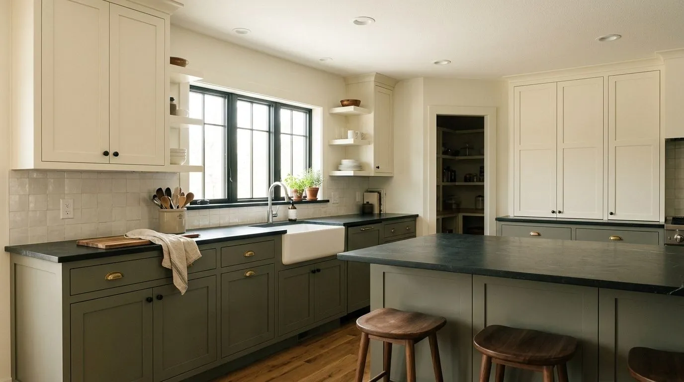
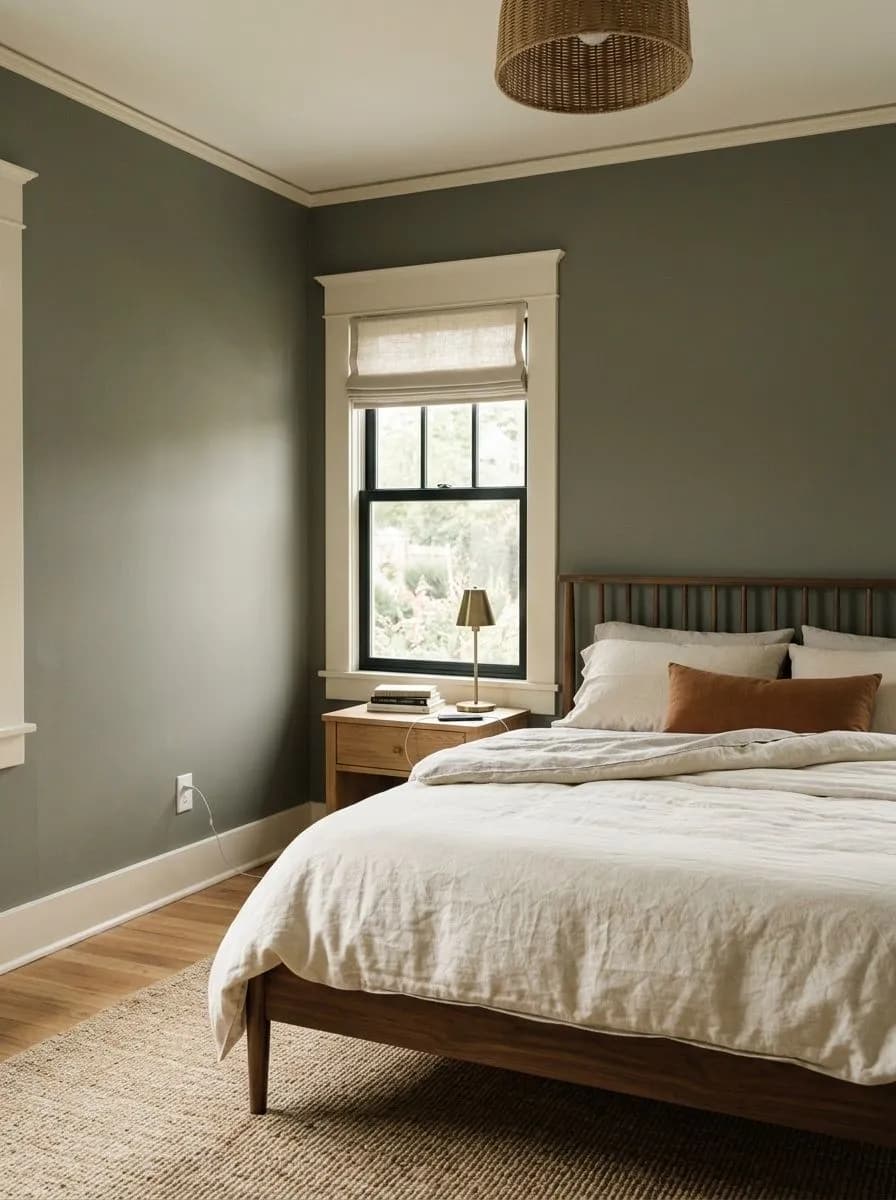
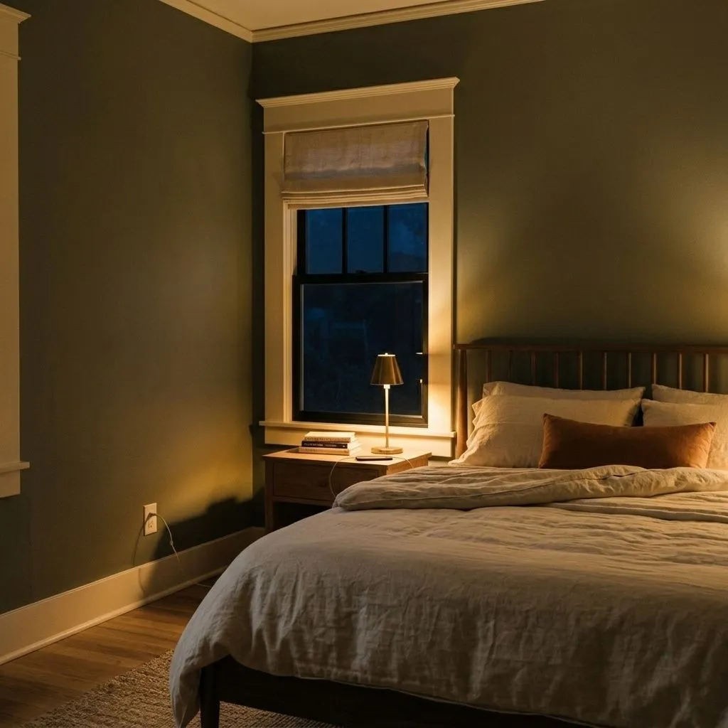
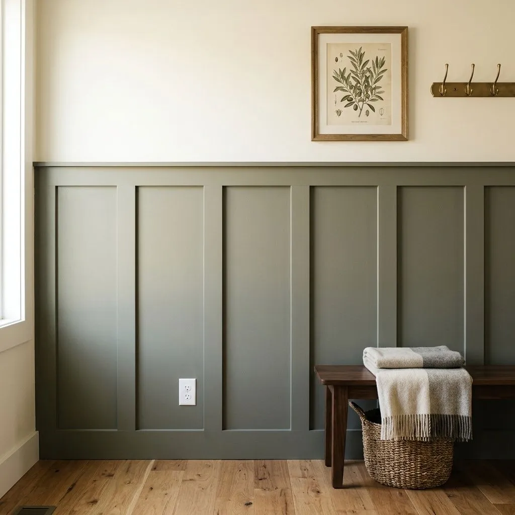
Inside, Dried Thyme performs best in rooms where you want a sense of calm, depth, and earthy character without going fully dark. Kitchens are a top use case, particularly on lower cabinets paired with white or off-white uppers. It also works well in bedrooms, home offices, libraries, and dining rooms used as accent walls or full color treatments. Wainscoting is another strong application, letting you bring in the color without fully committing to four walls at LRV 20.8.
Light and orientation matter a lot here. South-facing rooms are the most forgiving: the extra daylight balances the depth and lets the warmer olive side of the color show. North and east-facing rooms will read cooler and more muted, which can feel sophisticated or heavy depending on the room's size and how much natural light it gets. Reviewers flag windowless or very dark rooms as risky territory where Dried Thyme can tip toward oppressive. If you are working with limited natural light, consider using it on a single accent wall rather than all four.
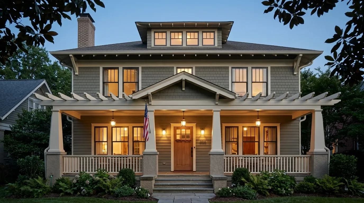
Outdoors, Dried Thyme holds up well. It reads rich and earthy without fading out or looking chalky in full sun, though it does read more muted outside than inside. It suits a wide range of architectural styles including cabins, ranch homes, coastal cottages, and transitional or traditional houses. You can use it as a body color, on shutters, or as a front door color. Trim in an off-white or creamy tone ties it together cleanly outdoors.
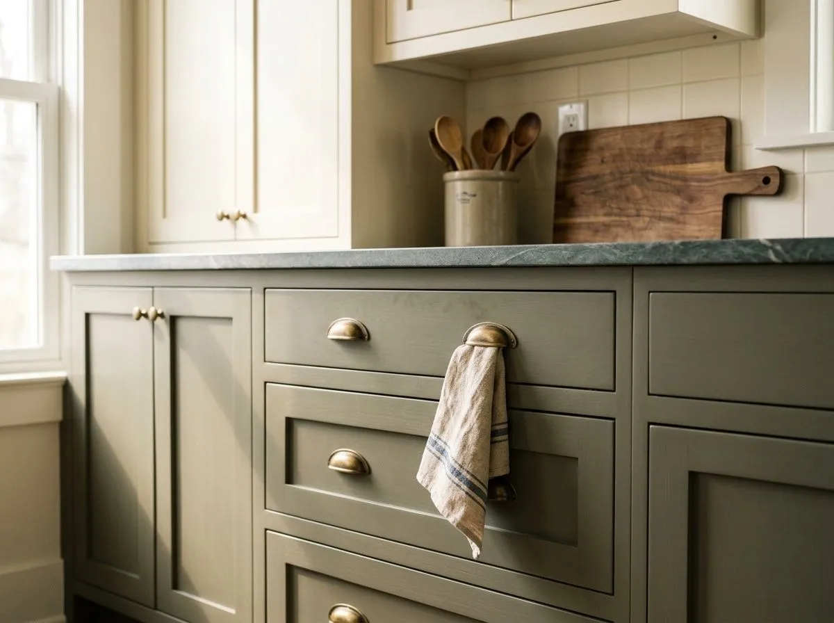
Dried Thyme is a natural on kitchen lower cabinets, where its earthy depth adds character without overwhelming the space. Pair it with white or off-white upper cabinets and counters in marble, white quartz, soapstone, or natural wood. Brushed brass or matte black hardware finishes the look cleanly.
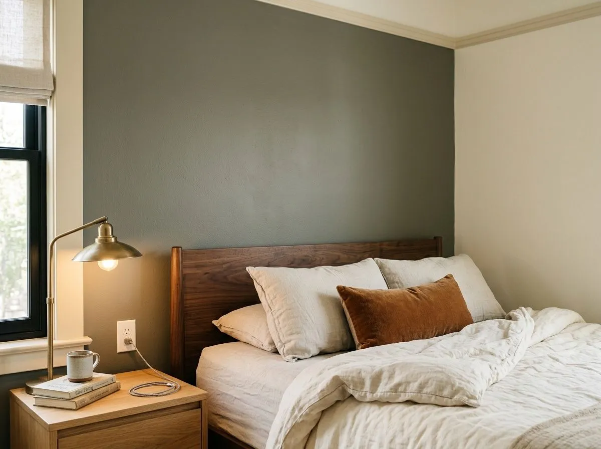
In a bedroom, Dried Thyme creates a calm, grounded atmosphere that many people find easier to sleep in than cooler or brighter greens. It works as a full four-wall treatment in rooms with good natural light, or as a single accent wall behind the headboard in smaller or darker rooms. Warm wood furniture and linen textiles keep it from feeling heavy.
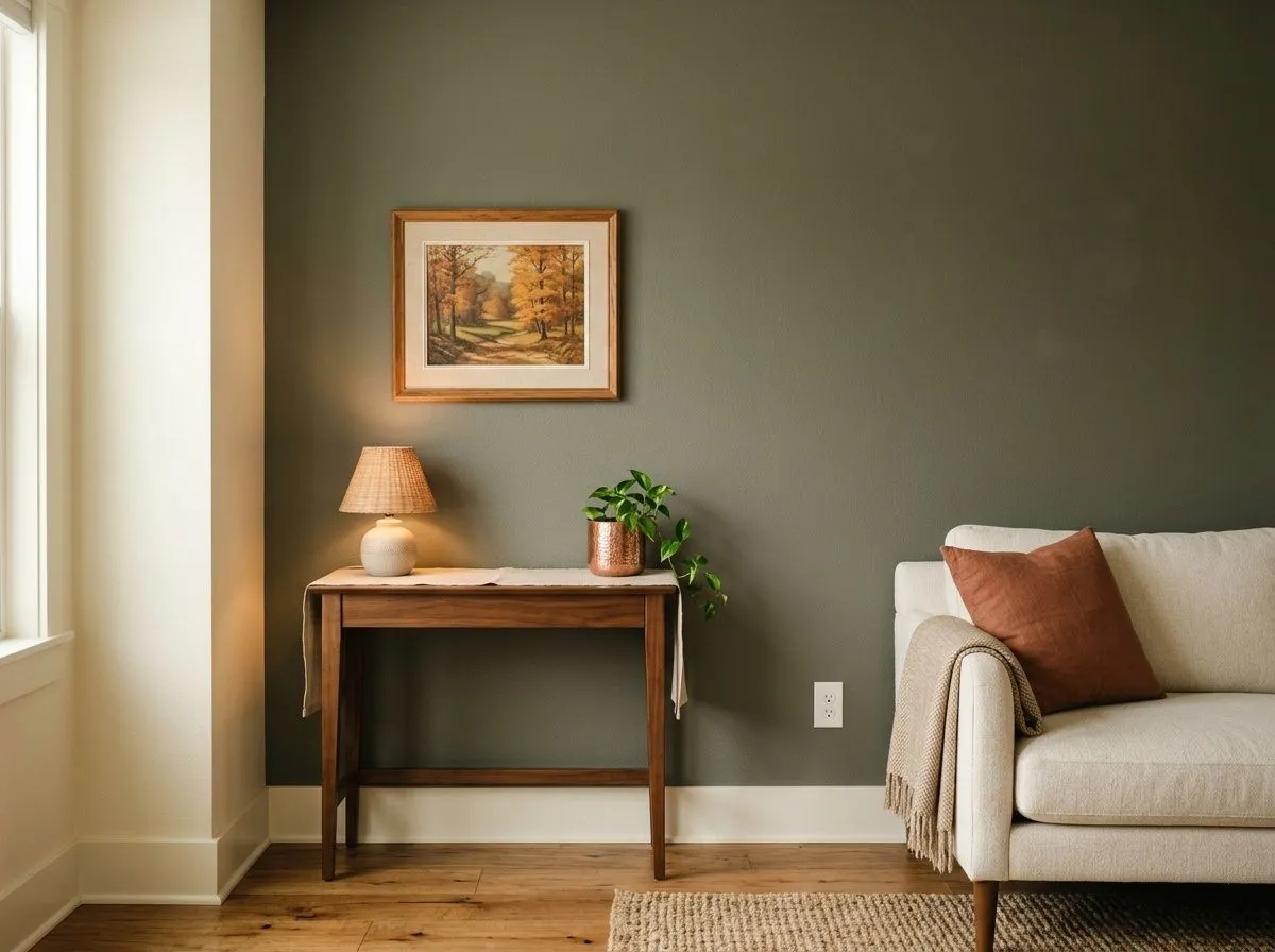
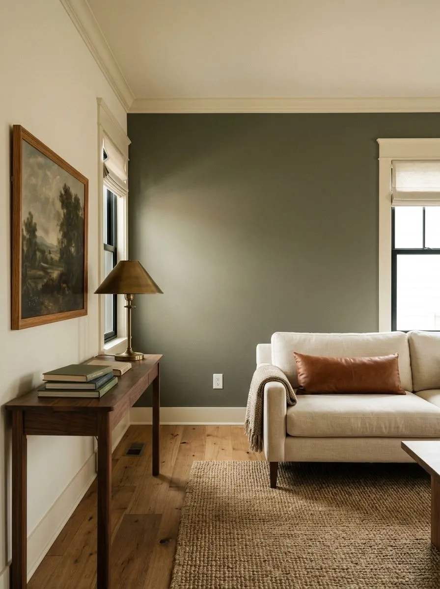
As an accent wall in a living room, Dried Thyme anchors the space and provides a backdrop that makes warm wood tones, terracotta accents, and cream upholstery pop. In a south-facing room you can take it to all four walls. In a north-facing room, one wall is usually the safer call at LRV 20.8.
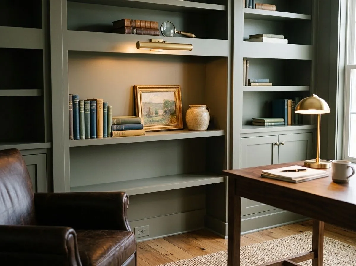
The muted, focused quality of Dried Thyme makes it a strong choice for a home office or library where you want the room to feel settled and purposeful. It pairs well with dark wood shelving, leather, and warm-toned task lighting. Keep the ceiling a light neutral so the room does not feel closed in.
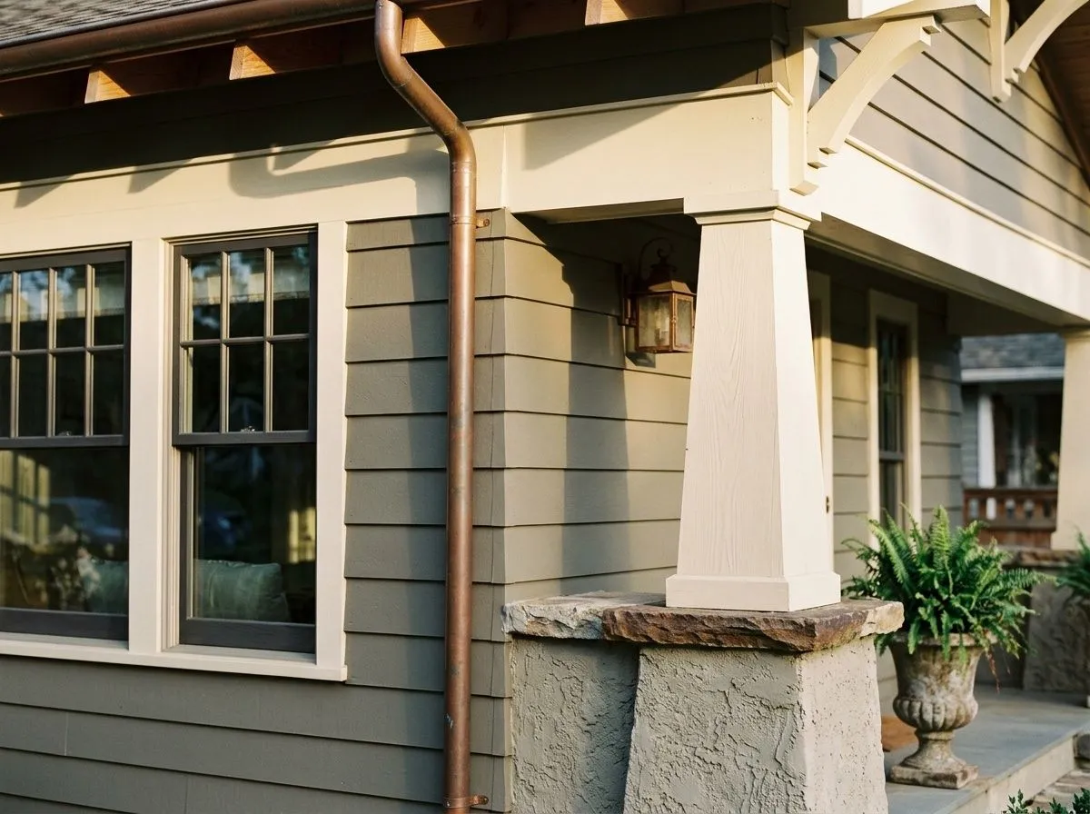
On the exterior, Dried Thyme holds its earthy richness in full sun and reads more muted than it does inside, which suits cabins, ranch homes, and traditional houses well. Use it on the body or as a shutter and door color against off-white or creamy trim. Brick and stone both pair naturally with its herb-toned quality.
Sherwin-Williams groups Dried Thyme with Grecian Ivory (SW 7541) as a natural trim and accent partner, and the pairing works because Grecian Ivory brings warm, creamy yellow undertones that balance the gray in Dried Thyme without going stark white. For a softer, more tonal look, Ethereal White (SW 6182) and Prairie Grass (SW 7546) round out the coordinating family, though those two are best treated as reference points for the surrounding palette rather than standalone trim choices.
Beyond the official coordinates, reviewers point to warm wood tones as an essential pairing: medium to dark oak, walnut, espresso, and driftwood floors all ground Dried Thyme and bring out its earthiness. Hardware in brushed or aged brass, matte black, or oil-rubbed bronze reads especially well on cabinets. For accent colors, warm tones like rust, mustard, terracotta, and burnt umber complement it naturally. Navy works as a deeper contrast. On adjacent walls, soft beiges, taupes, and warm greiges keep the palette cohesive. Avoid icy blue-based grays, very cool whites, and overly bright greens, as those fight the muted, earthy quality that makes Dried Thyme worth using.
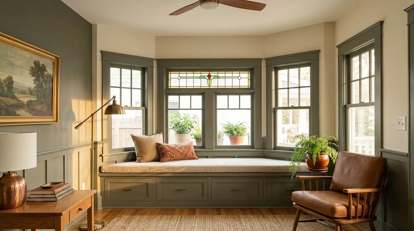
Pulling this sitting room together starts with the full palette in one place, so every color here is a Sherwin-Williams shade you can actually shop. Three of the seven are real paint: Dried Thyme goes on the window-seat built-ins and the accent wall, Grecian Ivory covers the walls, trim, and ceiling, and Ethereal White handles the soft tonal surround. The remaining four, Prairie Grass, Toasty, Basket Beige, and Renwick Golden Oak, are the room's furnishings and materials, each shown as its closest Sherwin-Williams match. Hover any pin or swatch to track it down.
All comparisons are matched against Dried Thyme at LRV 20.8.
Pairing Dried Thyme with a cool, blue-inflected gray on a neighboring wall creates an undertone conflict. The gray in Dried Thyme is a warm-neutral gray, and a blue-tinted gray next to it will make Dried Thyme look muddy or unresolved rather than earthy.
Bringing in a bright, high-chroma green as an accent alongside Dried Thyme exposes just how muted the main color is, and the contrast tends to make Dried Thyme look dull rather than intentional.
A bright, blue-white trim color will pull against the warm olive and herb notes in Dried Thyme, making the color look murkier and the overall scheme feel unfinished. This is a common mistake because stark white seems like a safe choice with any dark color.
Dried Thyme is a muted, medium-dark green with earthy herb character. It reads somewhere between a sage and an olive, kept from being bright or saturated by a significant gray component. At LRV 20.8, it absorbs a fair amount of light and has real depth on the wall.
The primary undertones are soft gray and olive, which together give the color its muted, earthy quality. Some reviewers also identify a subtle blue undertone that becomes more apparent in north or east-facing rooms or under cool-toned light. That blue is the main point of disagreement among sources, so sampling in your own room and light is the only reliable way to know how it will behave on your walls.
It sits in a genuinely ambiguous middle ground. The olive component adds warmth, the gray adds coolness, and a possible blue quality pushes it further cool in some conditions. Whether it reads warm or cool in your room depends heavily on light direction and light source. South-facing rooms bring out the warmer, olive side. North and east-facing rooms pull out the cooler, grayer read.
Dried Thyme has an LRV of 20.8, which sits in the medium-dark range. In practical terms, it will read as a noticeably deep color on the wall, especially in rooms with limited natural light. It can feel heavy in small, dark, or windowless spaces. In well-lit or south-facing rooms it holds up well, but in tricky light situations consider using it on one accent wall rather than all four.
For trim, creamy and off-white tones work better than stark bright whites. Grecian Ivory (SW 7541) is a natural match. On adjacent walls, soft beiges, taupes, and warm greiges keep the palette grounded. For accents, warm tones like rust, mustard, terracotta, burnt umber, and navy complement the earthy character. Medium to dark wood floors in oak, walnut, or espresso pair naturally with it. On cabinets, brushed or aged brass, matte black, and oil-rubbed bronze hardware all read well.
The Sherwin-Williams color code is SW 6186. The hex value is #7B8070. The RGB breakdown is 123 red, 128 green, 112 blue. The LRV is 20.8.
Yes on all three, with some caveats. On kitchen cabinets it is one of its strongest applications, especially on lower cabinets paired with white or off-white uppers and warm hardware. On exteriors it holds its richness without fading or looking chalky, and suits cabins, ranch homes, and traditional styles as a body color or shutter color. As a front door it works well against off-white or creamy trim. Just know it reads more muted outdoors than inside.
It sits close to the sage family but is earthier and more olive-inflected than a classic sage. A typical sage green reads cleaner and sometimes cooler. Dried Thyme has more gray and olive weight to it, which makes it feel more herb-toned and traditional rather than the brighter, airier quality you often see in current sage trends. If you want something that reads more unmistakably sage, Privilege Green (SW 6193) at LRV 22.6 is a slightly lighter and truer sage alternative.