Crooked River lands in that genuinely hard-to-pin-down territory between a warm brown-gray and a muted olive-gray khaki. On the swatch it reads as a subdued, dusty earthy tone, low in chroma and deep in value, not vivid or saturated in any direction. That restraint is the whole point. At LRV 18.5 it is a legitimately dark color, and on a full wall it delivers a moody, enveloping quality rather than anything light or airy.
The color behaves differently depending on what surrounds it. In a room with warm incandescent light and natural wood nearby, it pulls toward brown and taupe, reading almost like a rich mud color. Shift to cooler daylight or set it against a crisp white trim, and the olive-green cast moves forward noticeably. That chameleon behavior is not a flaw; it is what gives the color its depth and keeps a room from feeling flat. It is the kind of color that seems to change throughout the day as the light moves, which many reviewers appreciate and a few find unsettling until they sample it in place.
Sherwin-Williams places it in the Warms and Neutrals family, and that filing makes sense when you see it with wood floors or leather. It never reads as a true green or a true brown. It sits deliberately between those categories, which is precisely why it feels sophisticated rather than ordinary.
The undertone story for Crooked River is genuinely contested, and you should go in knowing that. Some reviewers read it clearly as a muted olive-gray with a khaki cast, and in certain light conditions the olive component is unmistakable. A smaller group of observers also call out a faint purple or lilac undertone lurking beneath the surface, especially against very neutral or cool-white comparisons. That layer of complexity is what keeps the color from reading as a plain brown.
Other reviewers land in a completely different place, describing it as a warm, brown-based earthy neutral with very little green at all. Both readings are honest, because the color genuinely shifts. In warm light it suppresses the olive and leads with the brown and taupe notes. In cooler north or east light, the olive-gray comes forward and the purple ghost can appear at the edges. There is no single fixed undertone answer here.
What all sources agree on is that the undertones are complex and layered rather than simple. That means Crooked River rewards careful sampling before committing. Put a large chip on the wall, look at it in morning light, midday light, and evening artificial light before deciding. The color you see at noon may feel quite different at 7 p.m. with lamps on, and both readings are real.
Crooked River earns its place in rooms where you want atmosphere over brightness. Studies and home offices are a natural fit: the deep, cocooning quality of an LRV 18.5 color focuses attention and creates that sense of a room that wraps around you. Traditional dining rooms are another strong candidate, especially with candlelight or warm pendants that will deepen the brown notes and make the whole room feel gathered and intimate.
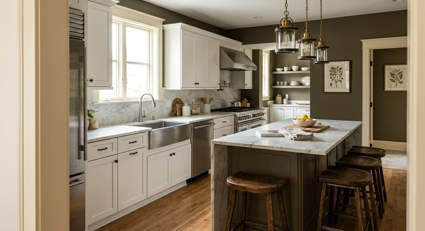
Accent walls are a practical way to introduce the color without committing every surface to its depth. A fireplace wall, a built-in bookcase surround, or the wall behind a bed all benefit from its grounding presence without the light cost that comes from painting all four walls at LRV 18.5. Cabinetry and kitchen islands are also widely cited uses: the low chroma and earthy palette work well in kitchens that lean toward natural materials, brass hardware, and wood shelving.
Orientation matters a lot here. South- and west-facing rooms with good natural light can absorb this level of depth without feeling cave-like. North- and east-facing rooms will read darker and moodier, which can work beautifully in a dining room or study where you want that quality, but it calls for more intentional lighting. Reviewers also mention it working on exterior elements like trim in natural, woodsy settings, though the official availability is listed as interior. In any application, pair it with enough warm light sources to keep the brown notes present and prevent the olive cast from going cold.
The deep LRV 18.5 value creates a focused, cocooning environment that works well for a room meant for concentration. Pair it with warm-toned wood shelving and brass or bronze fixtures to keep the brown notes dominant. Add good task lighting because the color will absorb ambient light.
Traditional dining rooms are a classic application for this kind of earthy deep neutral. Candlelight and warm pendant fixtures will bring out the brown and taupe qualities and make the space feel gathered and intimate. White Sesame (SW 9586) on the ceiling and trim keeps the room from feeling too enclosed.
A single accent wall behind a sofa, bed, or fireplace lets you use the color's moody depth without the light cost of painting all four surfaces. It reads as a sophisticated grounding element rather than an overwhelming backdrop. Natural wood and warm metals in the same space tie it together.
Crooked River on lower cabinets or an island pairs naturally with wood countertops, open shelving, and brass hardware. The low chroma means it does not compete with materials around it but instead recedes and grounds the kitchen palette. It reads earthy and calm rather than trendy.
In woodsy or natural settings, this color reads as an organic, low-key accent on trim, shutters, or a front door. Its earthy khaki-brown quality suits rustic and cabin-style exteriors especially well. Note that the color is cataloged as interior availability, so confirm exterior product suitability with your retailer.
Crooked River pairs best when you balance its depth with lighter, warmer companions rather than fighting it with stark contrast. White Sesame (SW 9586) is the natural first choice for trim, ceilings, and doors: it is a warm, slightly creamy white that prevents the kind of stark contrast that would make the olive undertones read cold. Nocturne (SW 9520) moves in the other direction, a deeper coordinating color that lets you layer tones in the same room for a cohesive, low-contrast dark scheme. Outrigger (SW 9517) bridges middle ground and works well for adjacent walls or furniture where you want something related but lighter.
Beyond the coordinating palette, natural wood tones in medium to dark ranges echo the earthiness of Crooked River without competing. Brass, aged bronze, and warm gold hardware all pick up the color's warm brown notes and keep the palette feeling grounded. Avoid very cool, stark whites on trim if you want the color to read warm, because cool contrast will push the olive and potentially the purple undertones forward in ways that may surprise you.
All comparisons are matched against Crooked River at LRV 18.5.
Stark, cool-white trim creates high contrast that pushes the olive and latent purple undertones in Crooked River forward in ways that can feel jarring and unintended.
Pairing Crooked River with cool blue or slate accessories can activate the gray component of the color and make the whole palette feel cold and disconnected rather than warm and grounded.
Light gray tile or pale cool-toned flooring in the same room creates a disconnected contrast at the floor-wall transition and strips the warmth from the color, leaving it reading flat and ashy.
Crooked River is a deep, muted earthy color that sits between a warm brown-gray and an olive-gray khaki. It has low chroma and high depth, reading as a sophisticated, moody neutral rather than a vivid green or a straightforward brown. Its hex value is #797869.
The undertones are genuinely debated. Some reviewers read clear olive-gray and khaki notes, with a faint purple or lilac layer visible in certain light. Others see it as a brown-based earthy neutral with very little green. Both are real: in warm light it leans brown and taupe, while in cooler or north-facing light the olive cast comes forward. Sample it in your specific room before committing.
Crooked River is primarily a warm color, filed by Sherwin-Williams in the Warms and Neutrals family. In warm incandescent light or alongside wood tones it reads clearly warm and earthy. In cooler daylight or against stark whites it can show a cooler olive-gray quality, but its brown and taupe foundation keeps it on the warm side overall.
The precise LRV is 18.5, which places it firmly in the deep shade category. That means it absorbs a significant amount of light and will read moody and enveloping on walls, especially in smaller or north-facing rooms. Plan your lighting accordingly.
Crooked River coordinates well with White Sesame (SW 9586) for trim and ceilings, Nocturne (SW 9520) for a layered deep-tone scheme, and Outrigger (SW 9517) for adjacent walls or furnishings. Natural wood tones in medium to dark ranges pair naturally, as do brass, aged bronze, and warm gold hardware. Avoid very cool whites on trim, which will push the olive undertones forward.
The Sherwin-Williams color code is SW 9524. The hex value is #797869 and the RGB values are 121, 120, 105. The precise LRV is 18.5.
Benjamin Moore Gettysburg Gray (HC-107) is a widely cited cross-brand candidate in the same deep earthy warm gray-brown territory. It shares the low chroma and muted, complex quality of Crooked River. Always sample both side by side in your specific room, since undertone behavior will vary with your light conditions.
