
MorningCooler · slate-gray lean
A cool, deep, mysterious charcoal, a soft black that grounds a room without going flat. See how it falls in your light.
Iron Ore is a soft black, not a hard true black. At an LRV of 5.6 it absorbs most of the light that hits it, so in dim rooms or north light it reads near-black. Move it into bright or south light and it loosens into a rich charcoal with visible character.
The hex value of #434341 and RGB of 67 / 67 / 65 tell you why it never goes flat or dead. There is warmth and a hint of green buried in that near-black, gray, green mix, and it comes forward as light and sheen change.
Every designer source agrees on one thing. This color flexes. It is not a static black, and it will not look the same at noon as it does at dusk, so sample it where it will actually live.
Our editorial undertone read is near-black, gray, green, and the designer sources do not fully agree on where it lands. Keep all three positions in mind.
Sherwin-Williams and some designers see a cool, neutral charcoal with no strong secondary color. Most designers see a subtle green that is strongest in full sun, on exteriors, on cabinets, in satin sheen, and in south or west afternoon light. A separate set of reviewers report a blue or even deep navy read in certain bright or afternoon light.
The honest takeaway is that Iron Ore picks a direction based on your exposure and sheen. Warm incandescent bulbs soften it toward a warmer charcoal. Cool LED flattens it and pushes the cooler, sometimes greener or bluer side forward. North rooms go darker and cooler, while south and west rooms bring the green out. Place clean whites, warm woods, and aged metal next to it and test a sample before you commit.
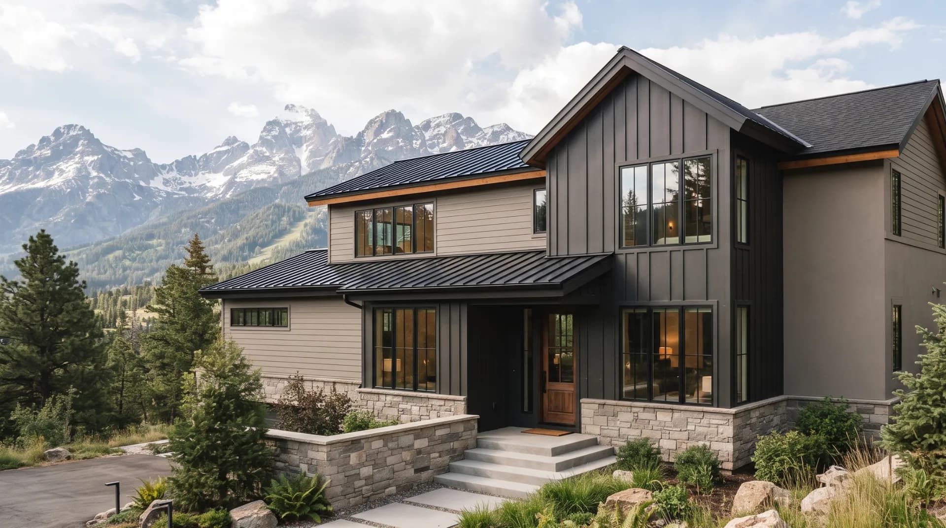
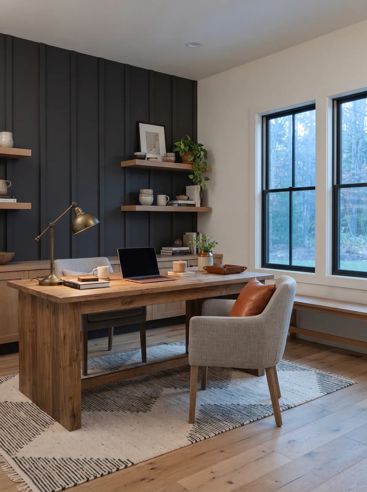
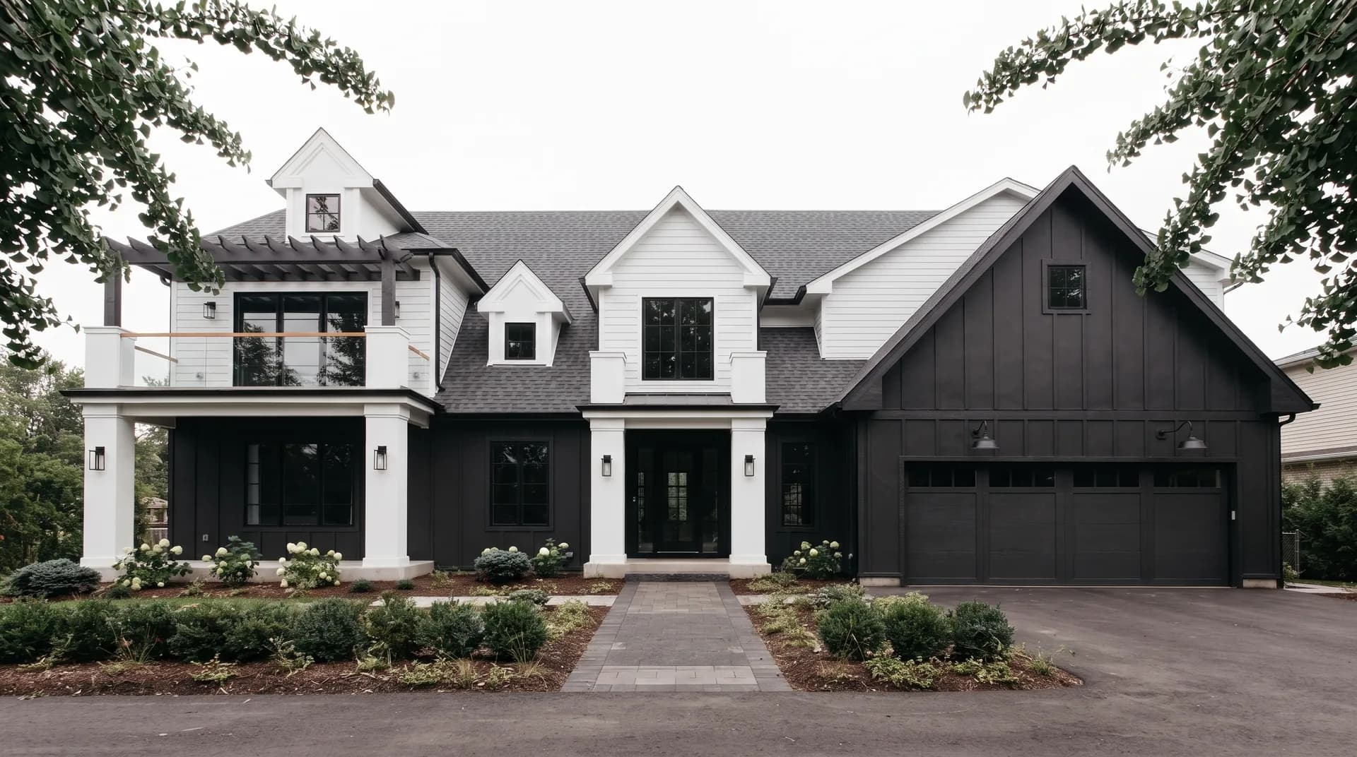
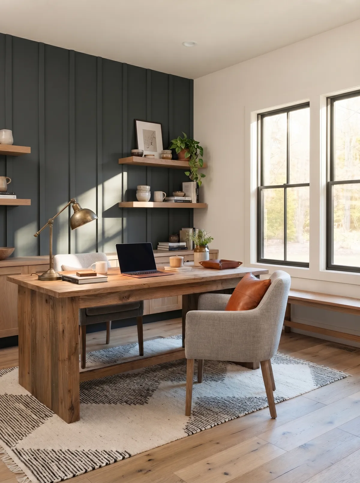
Exterior is the biggest use for Iron Ore, and it earns it. From the street it usually reads as deep charcoal, with the green peeking in only when direct sun hits. It works on siding, front doors, and shutters, and as a whole-house near-black on modern and farmhouse styles. It is rated for interior and exterior, so you can carry it in either direction.
Orientation drives the result. North-facing surfaces go darker and cooler, so an LRV of 5.6 can feel heavy there. South and west exposures bring the character and the green forward, which is where the color is most interesting.
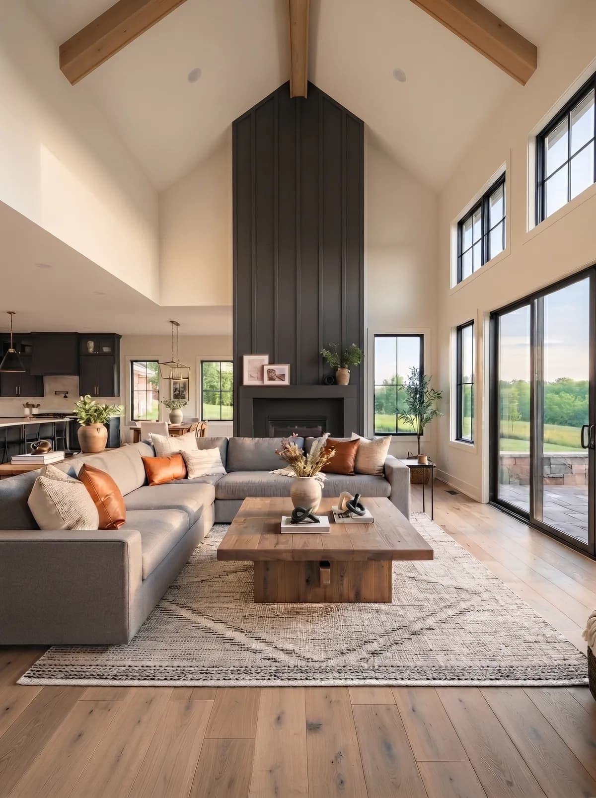
In small or low-light rooms, use it with restraint. At 5.6 it absorbs light, so one feature wall keeps the depth without turning the space into a cave. In larger, brighter rooms you have more room to spread it around.
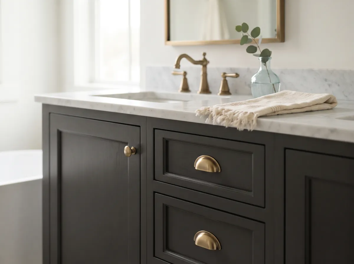
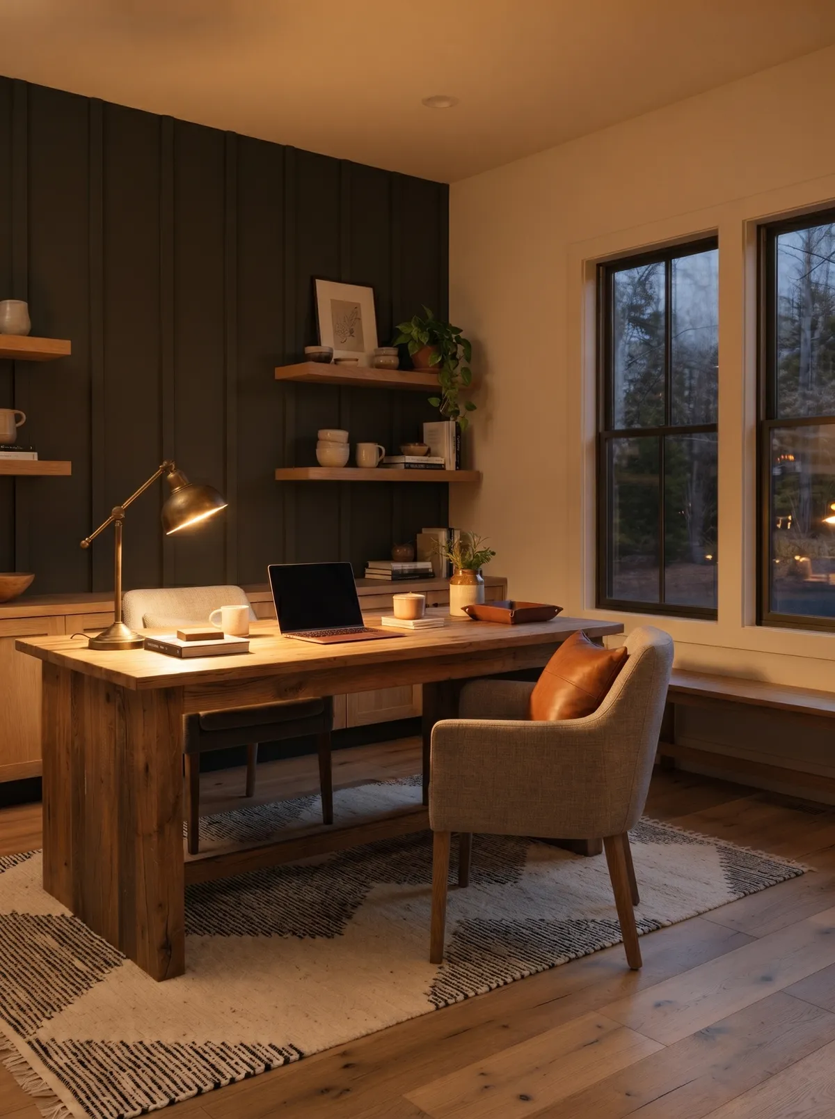
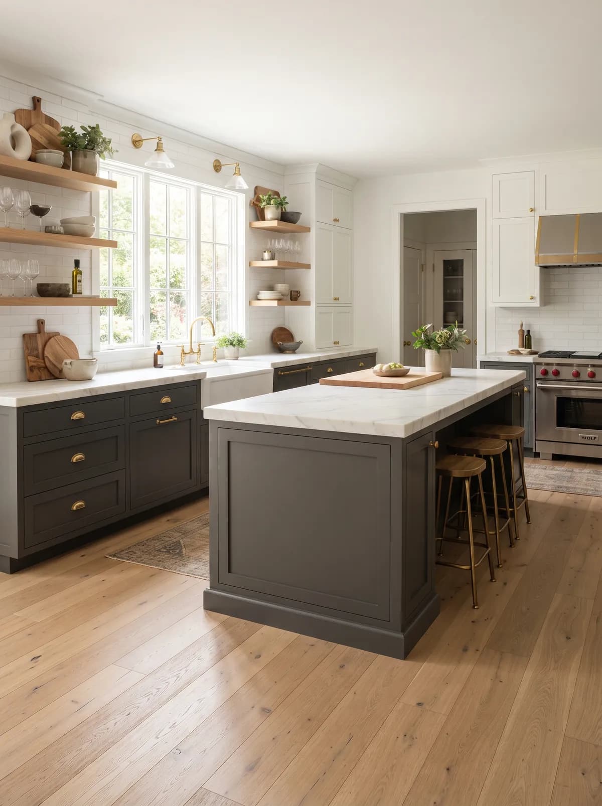
A strong high-contrast choice, often on islands or lower cabinets in a tuxedo kitchen. The satin sheen tends to show the green a little more, so pair with light counters and warm metal to balance it.
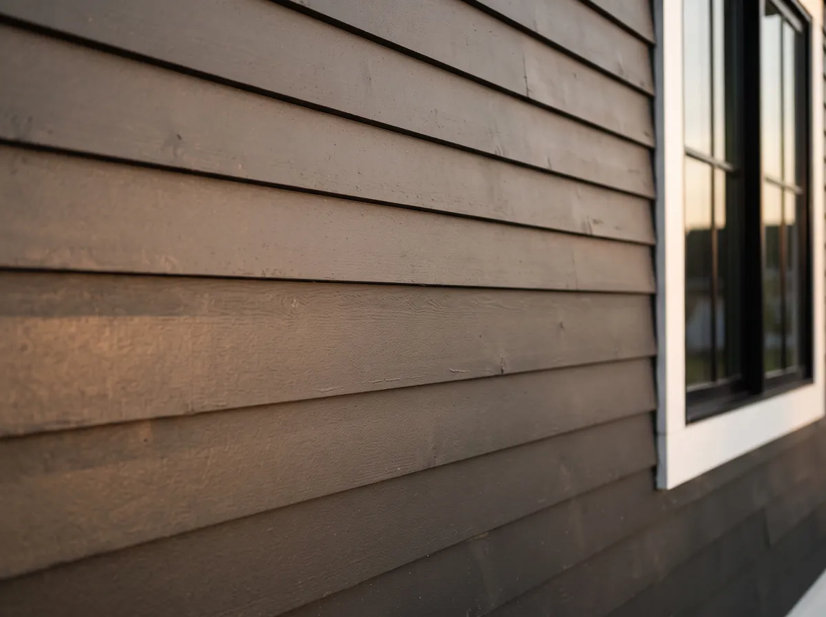
Reads as deep charcoal from the curb, with green surfacing in direct sun. It pairs well with red brick and with warm or cool stone, and holds up as a whole-house near-black on modern and farmhouse builds.
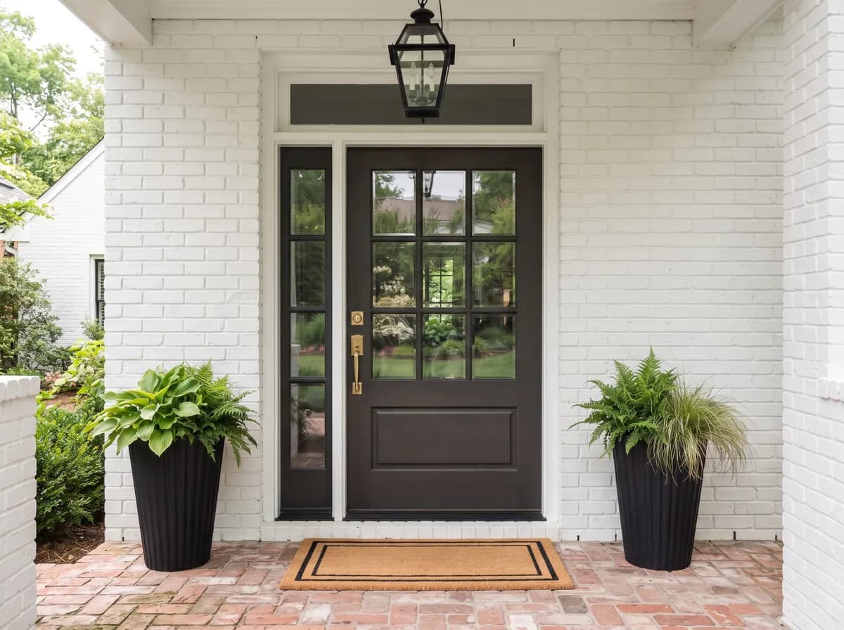
Gives you weight and contrast without going pure black. It pairs cleanly with a white or warm-white casing, and on interior doors it adds dimension to an entry.
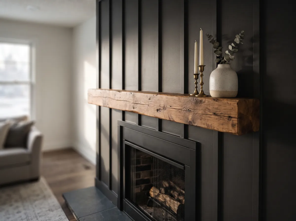
Use it on one feature wall, a fireplace, or the wall behind a bed. Keep the surrounding walls lighter so a low-light room does not go cave-like at 5.6.
Trim whites set the tone. Crisp cool whites give sharp contrast, and a high-reflective white in that category will draw the cleanest line. Softer warm whites soften the edge instead. One caution from the sources: very creamy or yellowed whites can push Iron Ore's green undertone forward, so if you want to mute the green, choose a cleaner white.
The official coordinating colors give you a ready-made range. Extra White (SW 7006) at LRV 85.9 is a bright, clean, near-true white for maximum contrast. Cityscape (SW 7067) at LRV 21.8 is a mid gray that steps the depth down between the two extremes. Nebulous White (SW 7063) is a soft neutral white if you want a gentler transition.
Beyond white, warm woods, natural stone, and brass or aged metal balance the coolness. A sage or gray-green neutral leans into the green rather than fighting it, which is the smarter move if the green read appeals to you.
This library works because everything feels deliberate and dense, dark walls pulling the whole room into focus. Only one paint color is doing that work: Iron Ore on the walls, trim, and built-ins. The other six colors are the room's furnishings and materials, each shown as its closest Sherwin-Williams match. Hover any pin or swatch to see what it is.
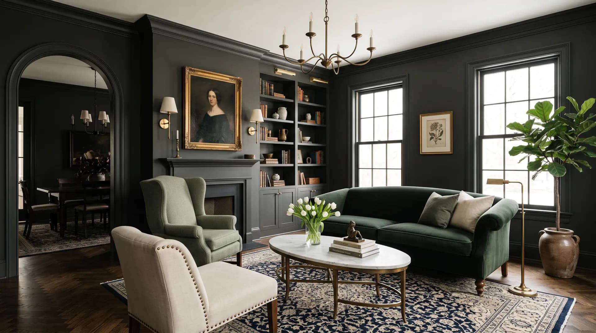
All comparisons are matched against Iron Ore at LRV 5.6.
They make Iron Ore's cool side look cold and clinical.
They amplify the muddier reads and fight the green.
They pull Iron Ore toward its murkiest side.
At 5.6 it turns the space into a cave.
Our editorial read is near-black, gray, green. Sherwin-Williams and some designers see a neutral charcoal with no strong secondary color, most designers see a subtle green that is strongest in sun, on exteriors, on cabinets, and in satin sheen, and a separate set of reviewers report a blue or deep navy read in certain bright light. It flexes with your exposure and sheen, so sample it where it will live.
Iron Ore is Sherwin-Williams SW 7069. Its hex value is #434341 and its RGB is 67 / 67 / 65. Its LRV is 5.6.
The official coordinating colors are Extra White (SW 7006) at LRV 85.9, Cityscape (SW 7067) at LRV 21.8, and Nebulous White (SW 7063). Beyond those, warm woods, natural stone, and brass or aged metal balance its coolness, and a sage or gray-green neutral leans into the green.
Crisp cool whites give sharp contrast, and Extra White (SW 7006) at LRV 85.9 is a clean choice. Softer warm whites soften the line. Avoid very creamy or yellowed whites if you want to mute the green, since they can push the green undertone forward.
Benjamin Moore Wrought Iron (2124-10) at LRV 8.2 is the closest cross-brand match, and sources call the two nearly identical. Iron Ore leans greener and more neutral, while Wrought Iron reads a touch bluer.
No. It is a soft black at an LRV of 5.6. It reads near-black in dim or north light and loosens into a rich charcoal in bright or south light.
Yes, but use it with restraint. At 5.6 it absorbs light, so reserve it for one feature wall and keep the surrounding walls lighter to avoid a cave-like result.