
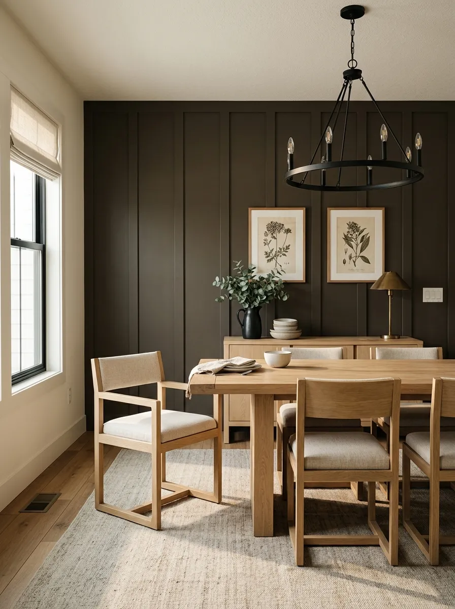
MorningBrown base · espresso forward
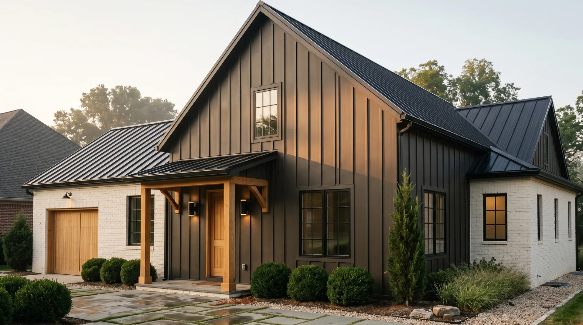
A warm near-black that shifts between espresso brown and soft charcoal depending on the light, never landing flat or cold. Sample it through a full day before you commit.
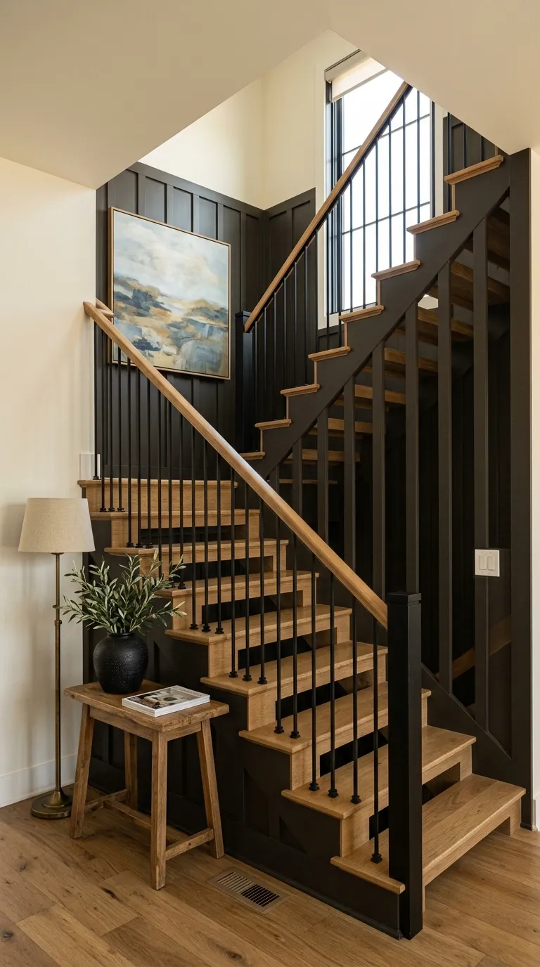
Black Fox lands somewhere between dark espresso brown and soft charcoal on the wall, never settling at a flat, definitive black. At arm's length it reads as a deep, earthy near-black, but get it into real light and the brown and warm gray layers separate and assert themselves. The color has genuine depth without the coldness that true black paint carries.
Lighting determines almost everything about how it shows up. In strong southern or late-afternoon western light, the warm espresso side comes forward and the color can read unmistakably as a dark brown rather than black. Morning light does the same thing, pulling out the brown base. At night under lamps, or in dim conditions, it pushes back toward black. Bright artificial overhead light lifts the gray component and gives it a charcoal character. Because the color shifts so credibly between these reads, every reviewer stresses sampling it on the actual wall before committing. A painted swatch left through a full day of your room's light is not optional with this one.
The LRV of 6.7 tells you it sits well above the near-zero range of true blacks, which cluster between 2 and 4. That extra lightness is what keeps it from feeling oppressive in a well-proportioned space. It is softer and more approachable than flat black, but make no mistake, it is still a deep color and behaves like one.
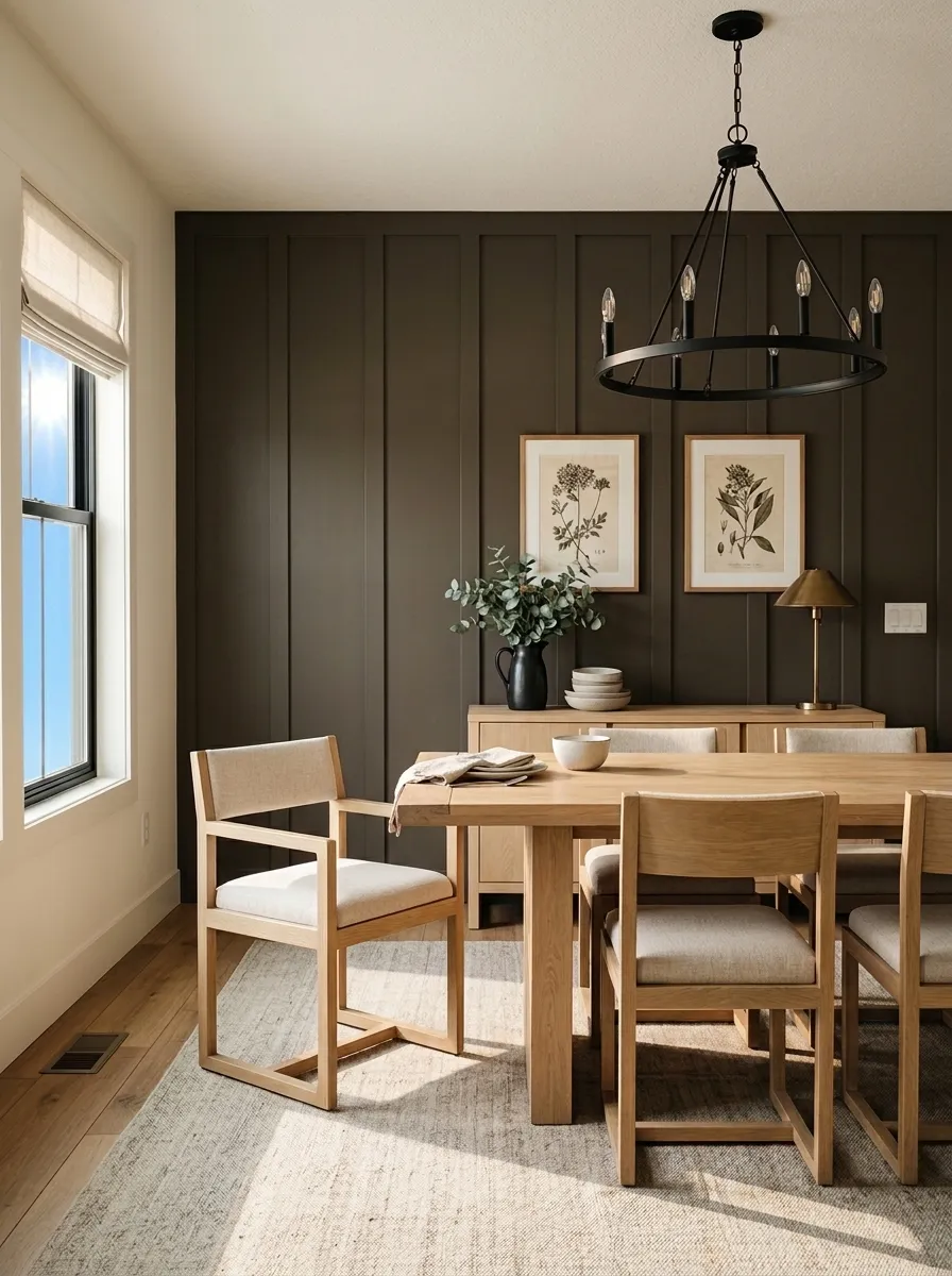
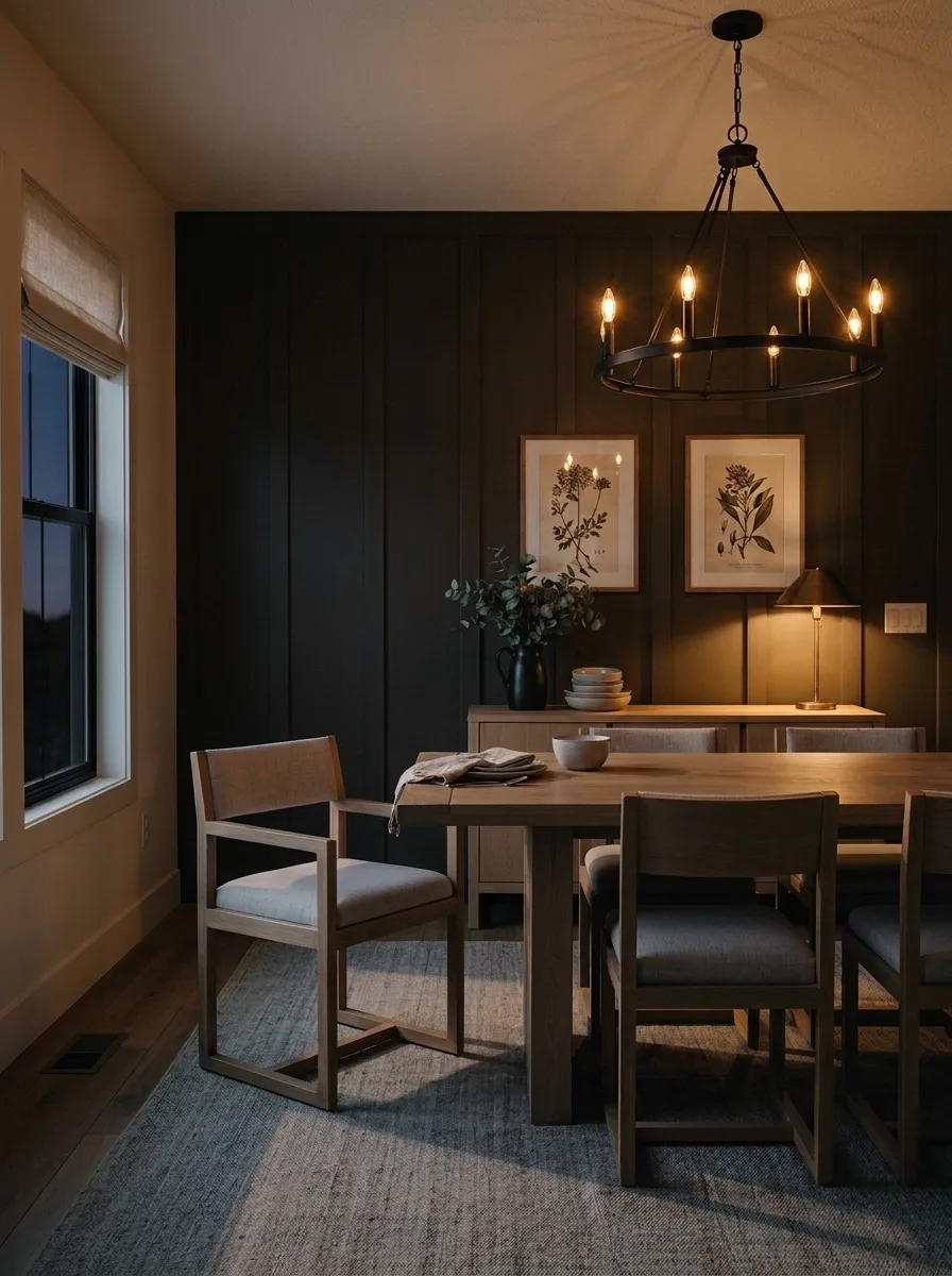
There is broad agreement in independent reviews that warm brown is the primary undertone in Black Fox, with a quieter gray underneath that keeps it from going fully chocolate. What reviewers debate is how much green plays into it. Most describe the green as a faint background note that surfaces mainly in certain lights rather than a defining quality, but it is present and worth knowing about before you pair it with other colors or materials.
Sherwin-Williams categorizes it within warm grays, and that classification undersells how much brown this color carries. Independent reviewers consistently push back on the gray label, reading it as far closer to a warm espresso brown that happens to have gray in reserve. The warm and beige character is not subtle in direct natural light. That said, in low light or north-facing rooms the gray asserts itself more, and the color can look closer to a cool charcoal. So both reads are legitimate depending on your conditions.
The question of whether Black Fox is warm or cool has a clear answer: it is warm. The brown base and beige quality make it earthy and grounded rather than cold or sleek. The faint green note keeps it from reading as purely red-brown, which is part of what makes it versatile against a range of trim and wood tones. If your space already carries a lot of green in furnishings or plants, that background note is worth watching.
Exterior is the strongest use case independent reviewers put forward for Black Fox. On siding, shutters, front doors, and stucco, the warm undertones prevent it from reading harsh or flat the way a true black can. It suits Craftsman bungalows and modern farmhouse styles particularly well, and in full sun it delivers the espresso-brown richness that makes it feel considered rather than stark. It earned a spot in Sherwin-Williams' Top Exterior Colors collection for real reasons, and the warm undertones hold up against the bleaching effect of direct sunlight better than cooler near-blacks.
Indoors, well-lit living rooms, dens, and dining rooms are where it does its best work as a full-wall color. The LRV of 6.7 means it absorbs a lot of light, so rooms with at least one generous window or strong ambient lighting are the right match. North-facing rooms without supplemental light are risky, as the color goes dingier and flatter without warmth to enliven it. South- and west-facing rooms give it the best possible conditions. Accent walls, interior doors, and barn doors are low-commitment entry points that let you get the drama without overwhelming the space.
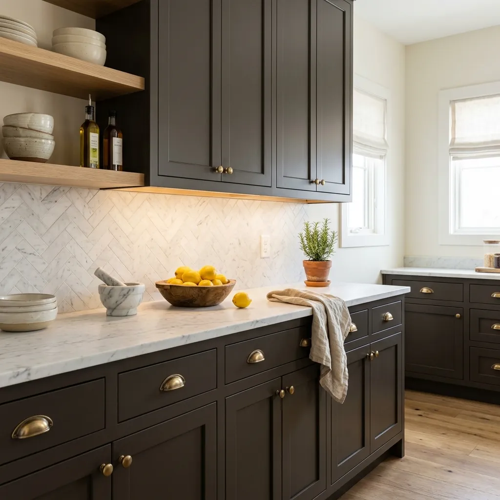
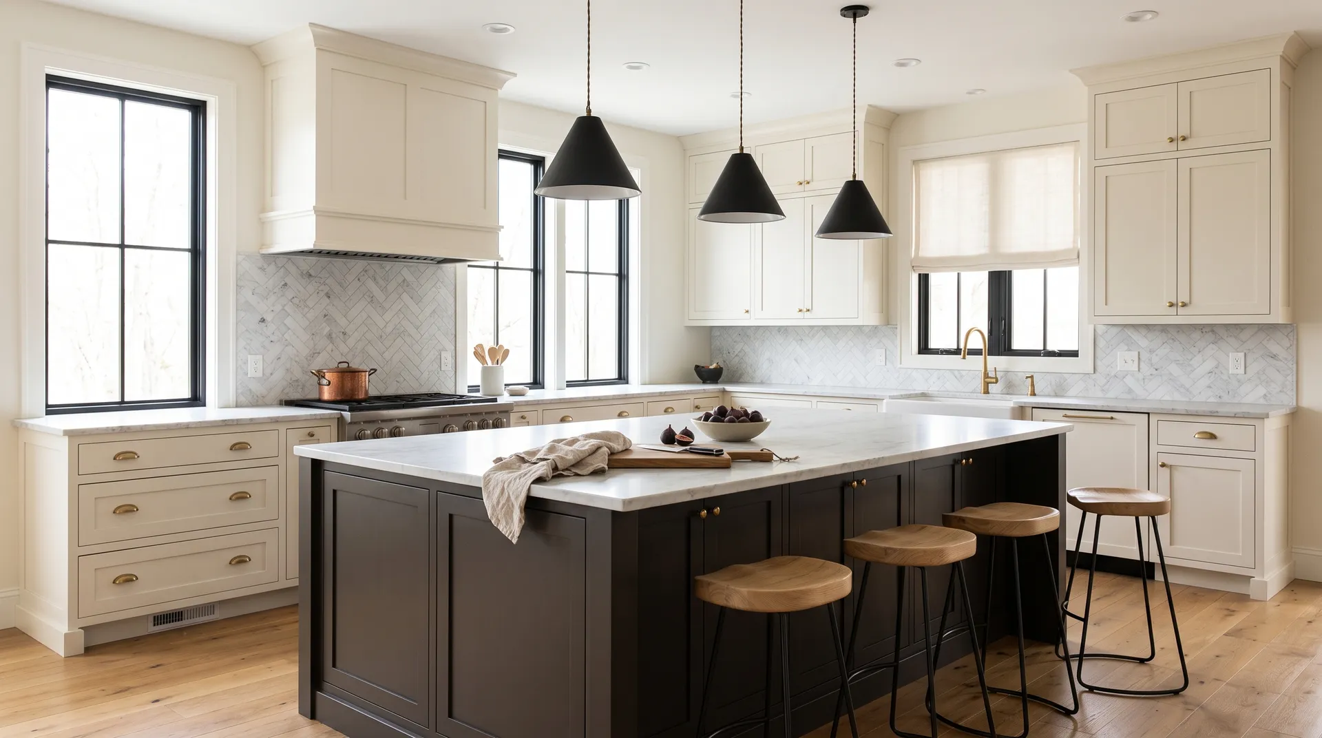
Bedrooms work when the goal is a cocooning, moody quality, but keep the room size in mind. Small bedrooms with limited windows will feel compressed. Bathrooms are generally a caution zone unless the space is generous and well-lit. Cabinets and kitchen islands are genuinely contested territory. Several reviewers find it excellent on islands and cabinet lowers paired with cream or white uppers, but at least one raises a legitimate concern that full cabinetry in this color can drift toward a dated early-2000s espresso-cabinet look. Island or accent use is a safer play than all-in full-kitchen commitment.
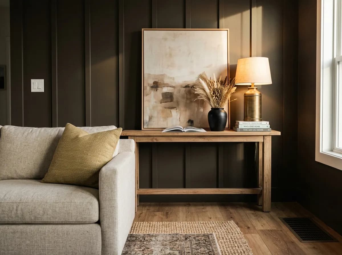
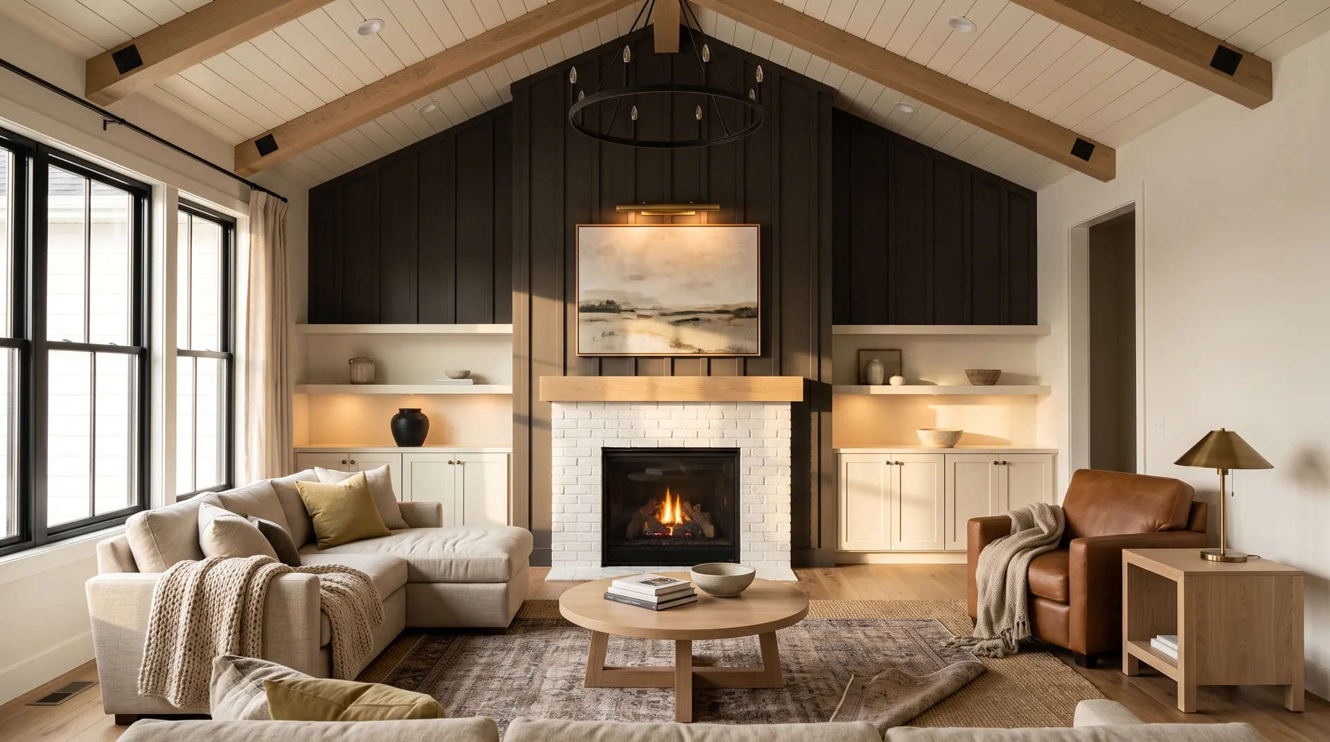
As a full accent wall behind a sofa or fireplace, Black Fox gives living rooms a moody, grounded quality that warm wood furniture and natural textiles reinforce. Pair it with a warm creamy white on the remaining walls to keep the space from closing in. The LRV of 6.7 absorbs light, so supplement with table and floor lamps for evening use.
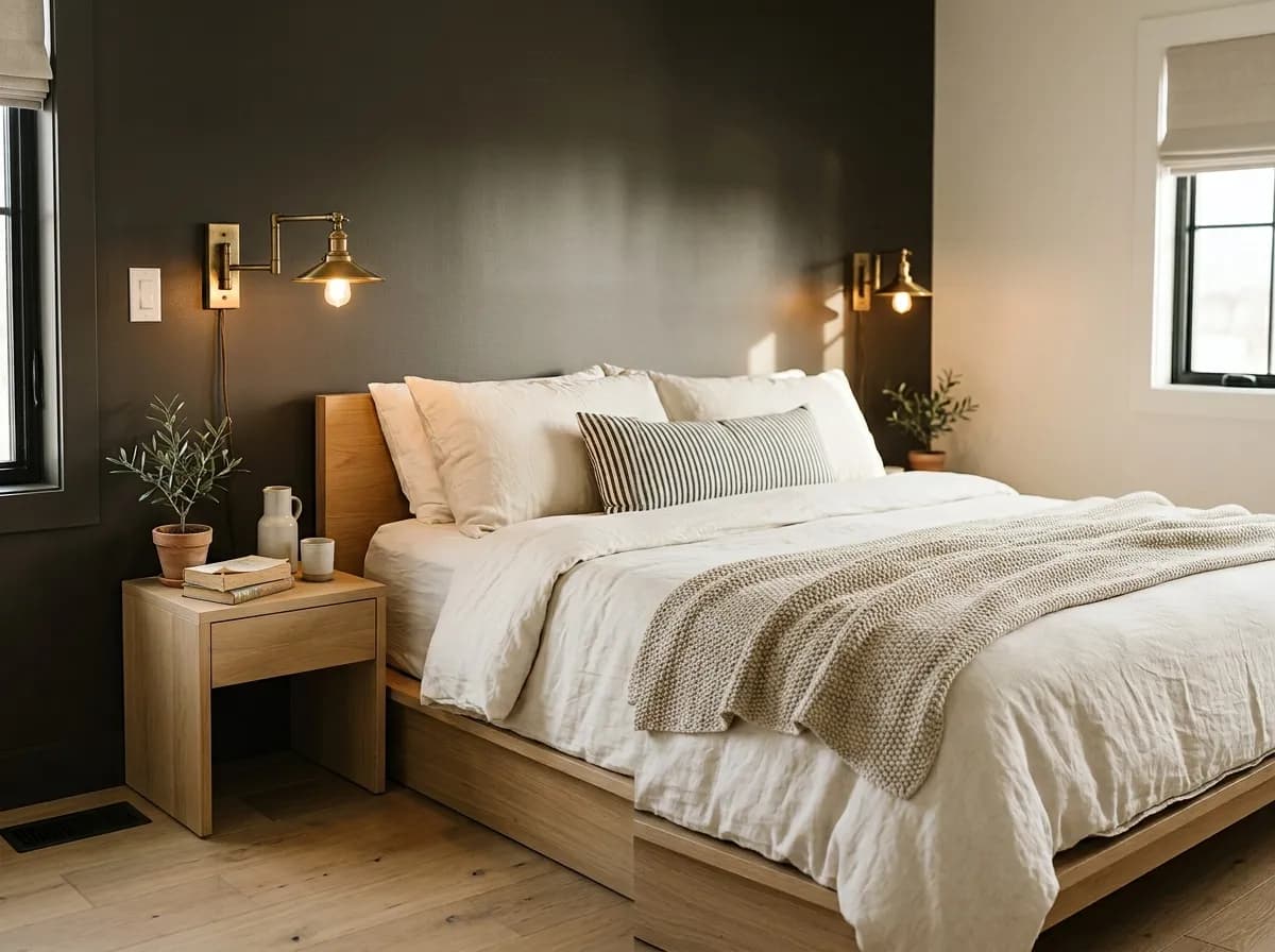
In a bedroom with decent window exposure, Black Fox creates a cocooning atmosphere that works well behind a bed as a feature wall. Keep bedding and textiles light to balance the depth. Avoid using it on all four walls in a smaller bedroom, where the LRV of 6.7 will make the space feel smaller than it is.
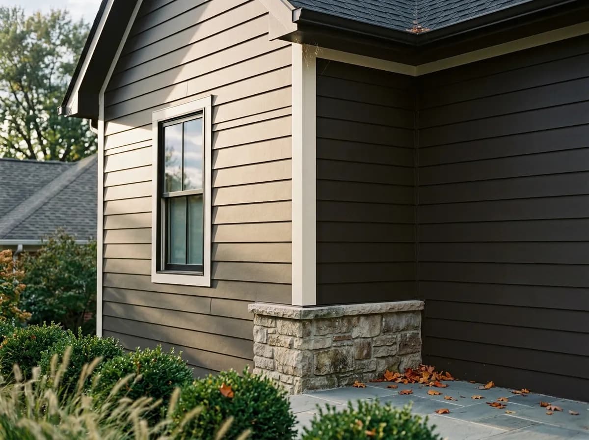
Black Fox is one of the stronger warm near-blacks for exterior siding, shutters, and front doors, with the brown undertones preventing the harshness that flat black can carry in direct sun. It suits Craftsman and modern farmhouse architecture and pairs well with natural wood accents and stone. In full afternoon sun expect it to read more espresso-brown than black.
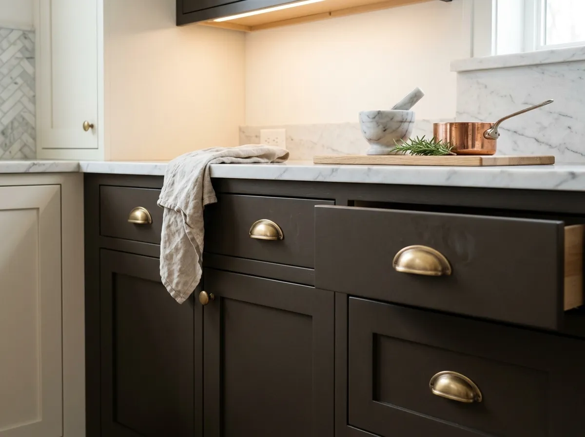
On a kitchen island paired with cream or white perimeter cabinets, Black Fox brings drama without full commitment. Reviewers are more cautious about using it on all cabinetry, where the deep espresso quality can feel reminiscent of early-2000s dark-wood kitchens. Satin brass hardware is the finish that best complements its warm undertones.
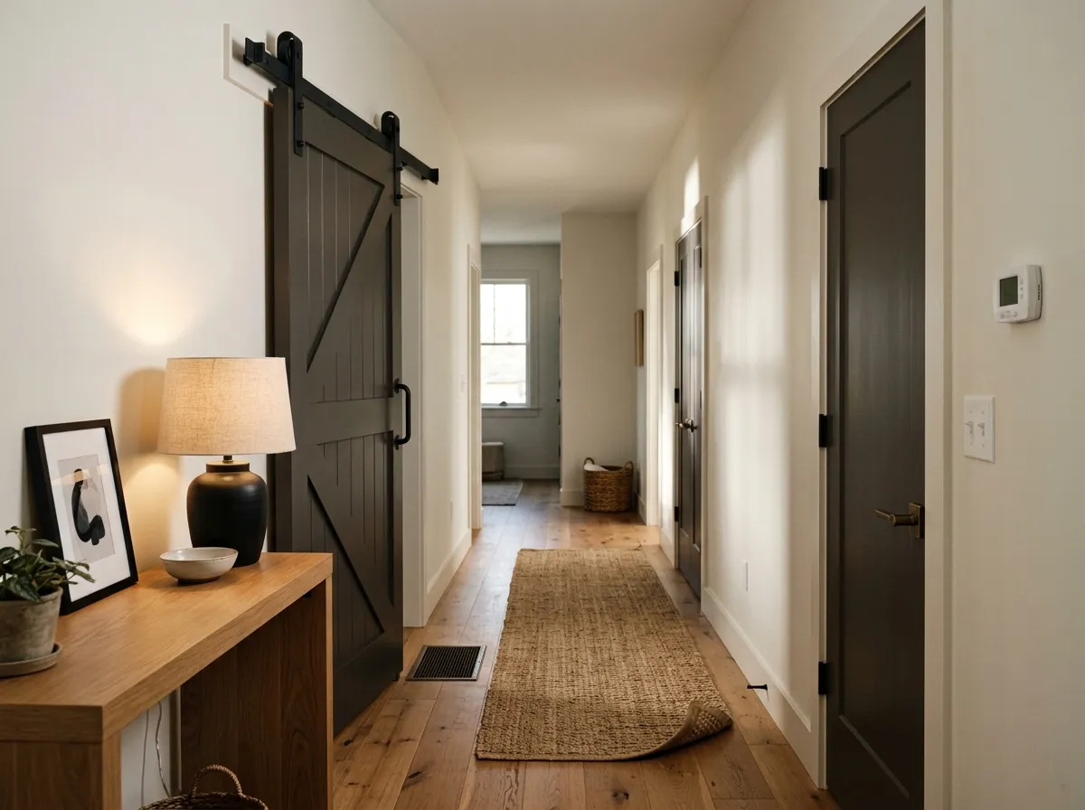
Interior doors, barn doors, and built-in shelving are low-risk ways to bring Black Fox into a space. At LRV 6.7 it has enough presence to read as a true design choice on a door without the commitment of a full wall. Against Eider White (SW 7014) walls, the contrast lands cleanly without feeling harsh.
Black Fox has a lot of range as a pairing color because the warm brown base works with both warm and cool partners. For trim and ceilings, Eider White (SW 7014) is a natural match, its soft warm gray character echoing the earthy quality of Black Fox without competing. Greek Villa (SW 7551) brings a creamier, more antique-white warmth that leans into the espresso side of Black Fox and suits traditional or farmhouse interiors well. Cool Avocado (SW 9029) is the coordinating option for those who want to bring the green undertone deliberately into the palette, making it feel intentional rather than accidental.
Beyond the official coordinates, warm creamy whites and off-whites make reliable trim partners. Satin brass and oil-rubbed bronze hardware are the metal finishes reviewers consistently call out as the right match for the warm, brown-leaning character. Wood tones in natural walnut, oak, and unstained wood stains work beautifully alongside it. Stay away from strong red-toned wood stains, which fight the warm-gray layer and make the whole palette feel muddy. Soft blues, muted greens, and warm greiges round out textile and accent options that let Black Fox anchor a room without dominating every surface.
Two of these seven colors are actual paint: Black Fox on the board-and-batten fireplace wall and Greek Villa on the vaulted tongue-and-groove ceiling, built-ins, mantel, and brick surround. The other five represent the room's furnishings and materials, each translated to its closest Sherwin-Williams paint match so you can study the palette as a whole. Hover any pin or swatch to see exactly which color you're looking at.
All comparisons are matched against Black Fox at LRV 6.7.
Cherry-stained floors or furniture with a heavy red-orange cast fight the warm gray layer in Black Fox and push the whole palette into a muddiness that neither color recovers from.
Placing true flat-black hardware, frames, or furniture directly against Black Fox exposes the brown warmth of the wall color and makes it read as an imprecise, slightly muddy version of black rather than a deliberate design choice.
High-contrast cool whites with blue or purple undertones clash with the earthy warmth of Black Fox and make the undertone shift toward an unflattering greenish cast in certain lighting conditions.
Black Fox is a deep, warm near-black that reads as a blend of dark espresso brown and soft charcoal rather than a flat or true black. At LRV 6.7 it is lighter than pure black, which gives it an earthy, grounded quality that shifts between brown and dark gray depending on the light in your space.
The dominant undertone is warm brown, with a quieter gray layer underneath it and a faint green note in the background. The brown comes forward strongly in natural light, especially in south- and west-facing rooms, while the gray asserts itself more in low light or north-facing conditions. The green is subtle but can surface when paired with certain trim or wood tones.
It is warm. The brown base and beige quality make it earthy rather than cold or sleek. Despite Sherwin-Williams placing it in the warm gray family, independent reviewers consistently describe it as leaning far more brown than gray, particularly in natural light.
The precise LRV is 6.7. That puts it well above the 2 to 4 range of true blacks, which is part of why it reads as an earthy near-black rather than a flat, light-absorbing void. It still behaves like a deep color and will darken a space, but it has more warmth and life than colors at the very bottom of the LRV scale.
The Sherwin-Williams code is SW 7020. The hex value is #4F4842 and the RGB values are 79 red, 72 green, 66 blue.
Warm creamy whites and off-whites are the most reliable trim and ceiling partners. Eider White (SW 7014) and Greek Villa (SW 7551) are both solid coordinating choices. Natural wood tones in walnut and oak work well alongside it, as do soft blues, muted greens, and warm greiges. For metals, satin brass and oil-rubbed bronze are the most consistent recommendations from reviewers. Avoid strong red-toned wood stains and cool bright whites.
Exteriors are where it earns the strongest endorsement, including siding, shutters, stucco, and front doors, where the warm undertones keep it from reading harsh in sunlight. For cabinets, opinion splits: it works well on a kitchen island paired with white or cream perimeter cabinets, but full-kitchen cabinetry in this color can edge toward a dated espresso-cabinet look in some reviewers' assessment. Interior doors and accent pieces are consistently recommended as lower-risk applications.