
MorningGray forward · charcoal-adjacent
A deep, earthy greige-bronze that carries brown, gray, and a quiet green at once, shifting visibly as the light changes. See which note leads in your room.
Urbane Bronze lands somewhere most paint colors avoid: it is not brown, not gray, and not green, but it carries all three at once. On the wall it reads as a deep, earthy greige-bronze, warm and grounded, with enough complexity that it shifts visibly across the day. With an LRV of 8.1, it absorbs a significant amount of light, and in dim conditions indoors it can push close to black. That depth is part of its appeal, but it means the color rewards rooms with decent natural light rather than punishing them.
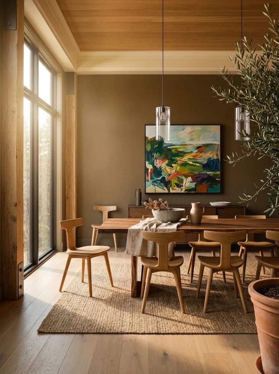
The shift with exposure is the most consistent observation from reviewers. Morning light and north-facing walls pull the gray component forward, giving the color a more stoic, charcoal-adjacent quality. As afternoon sun arrives from the south or west, the warm brown note takes over and the color feels richer and earthier. Under lamplight in the evening, the faint green undertone surfaces in a way it rarely does in daylight. Because of this range, a sample that looks one way at the paint store can look genuinely different on your wall at different times of day, and that variability is not a defect, it is the whole character of the color.
Most reviewers land in the same general territory but weight the undertones differently, and that disagreement is worth understanding before you commit. The broad consensus is that Urbane Bronze carries brown, gray, and a quiet green note together. What varies is which one gets treated as the lead.
Some reviewers foreground the brown and gray, describing the green as secondary or almost secret, a background warmth that prevents the color from reading flat or purely cool. From this view, Urbane Bronze is essentially a sophisticated warm gray that leans brown, and the green is just what gives it life. Other reviewers flip this and argue the green undertone is the defining trait, the thing that separates Urbane Bronze from a standard warm gray or greige and puts it in its own category. Both readings are defensible because both are visible, depending on your light source and surrounding finishes.
All sources agree on one thing: this is a warm color. It is never a cool gray. If your room already has blue-based grays, slate, or cool-toned stone, Urbane Bronze can read muddy next to those materials because the contrast between its warmth and their coolness works against both. Warm wood tones, brass fixtures, terracotta, and creamy whites all cooperate with it. The green undertone, wherever you rank it, tends to harmonize rather than clash with natural materials like timber, stone, and brick, which is a big part of why the color works so reliably on exteriors.
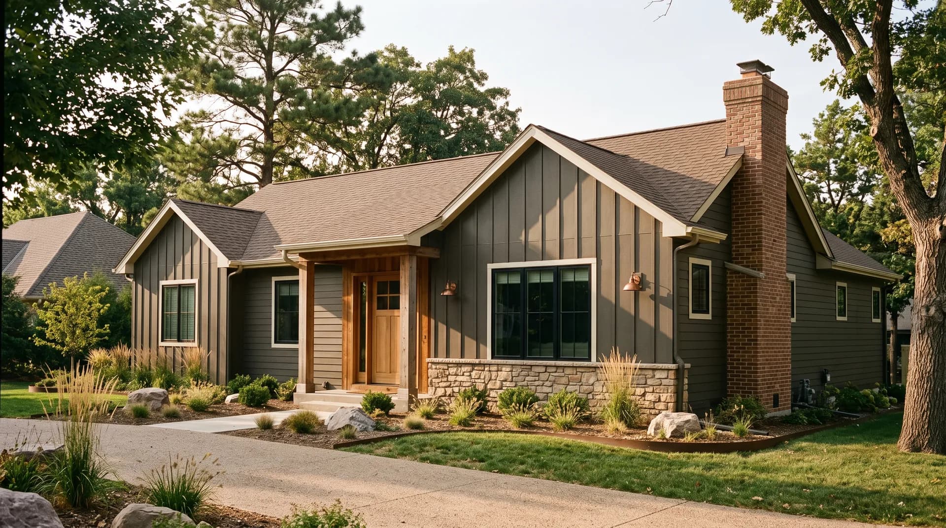
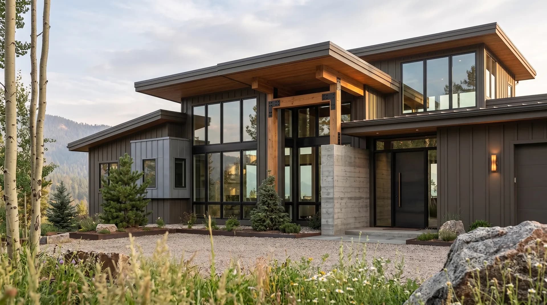
On the exterior, Urbane Bronze is strong on siding, stucco, board-and-batten, and brick. Reviewers note it holds up surprisingly well even next to red brick, because its warm brown and green notes find common ground with brick's earthy tones rather than fighting them. It wants warm support: a warm roof color, warm stone accents, or aged wood rather than cool gray concrete or stark white trim. North-facing exterior walls will read grayer and more restrained; south and west faces pick up the warmth. Front doors in Urbane Bronze appear frequently in reviews, and it works on garage doors and shutters too without looking costume-y.
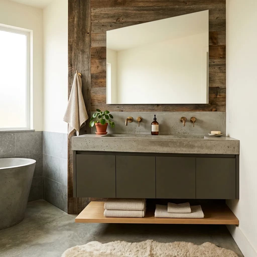
Indoors, the best uses are focused rather than whole-house. Cabinets and islands are the most cited application. On lower cabinets or a kitchen island paired with light uppers, light countertops, and a light backsplash, it delivers a bold, grounded statement without collapsing the room. Using it on both upper and lower cabinets risks making the kitchen feel heavy, particularly in kitchens that do not get much daylight. Bathroom vanities follow the same logic: one piece of furniture-scale color reads well; flooding a small bathroom with an LRV of 8.1 on all walls can make the space feel like a cave.
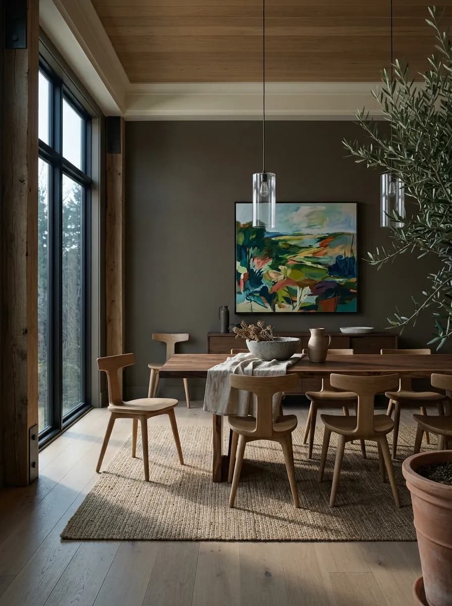
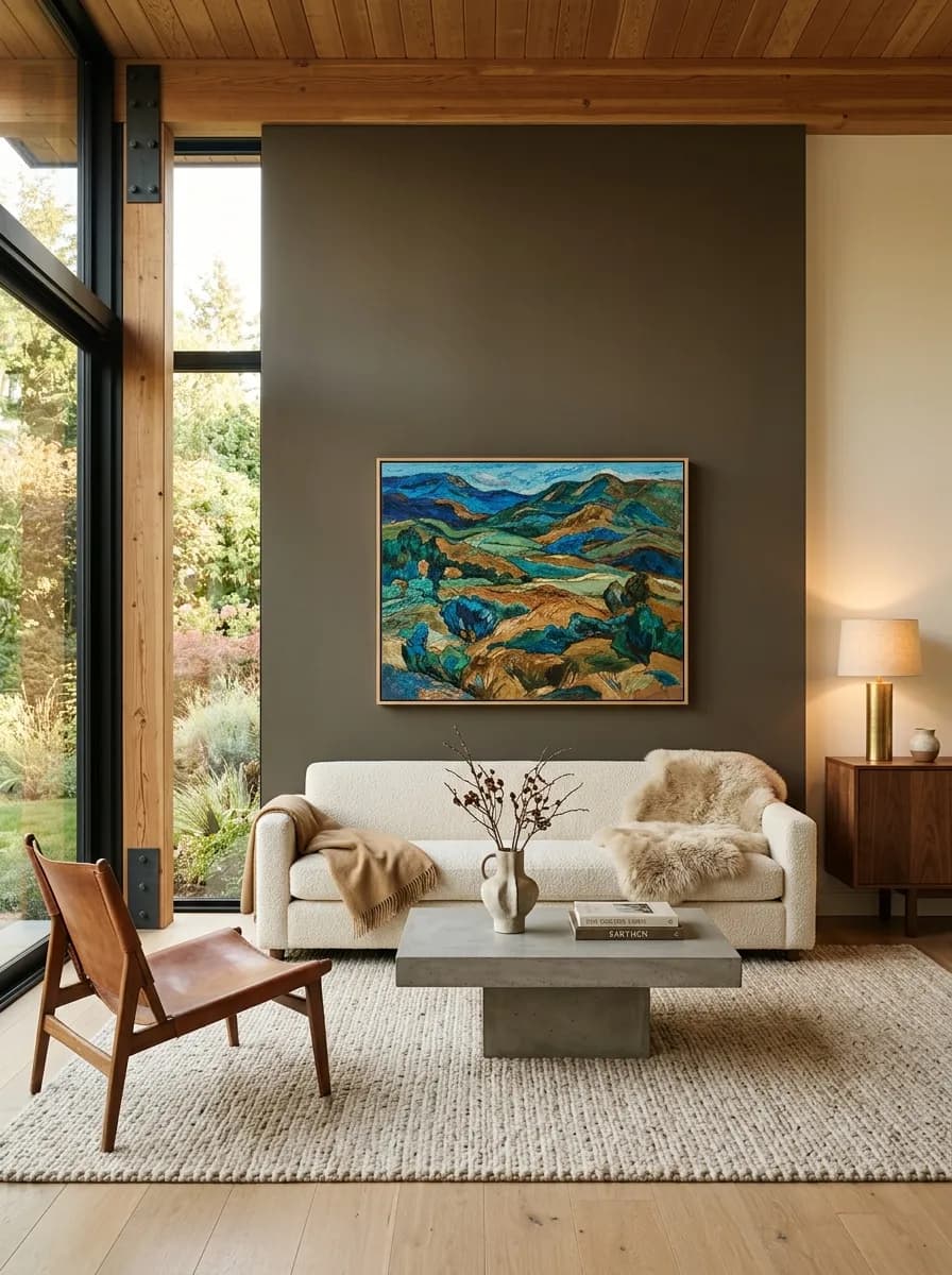
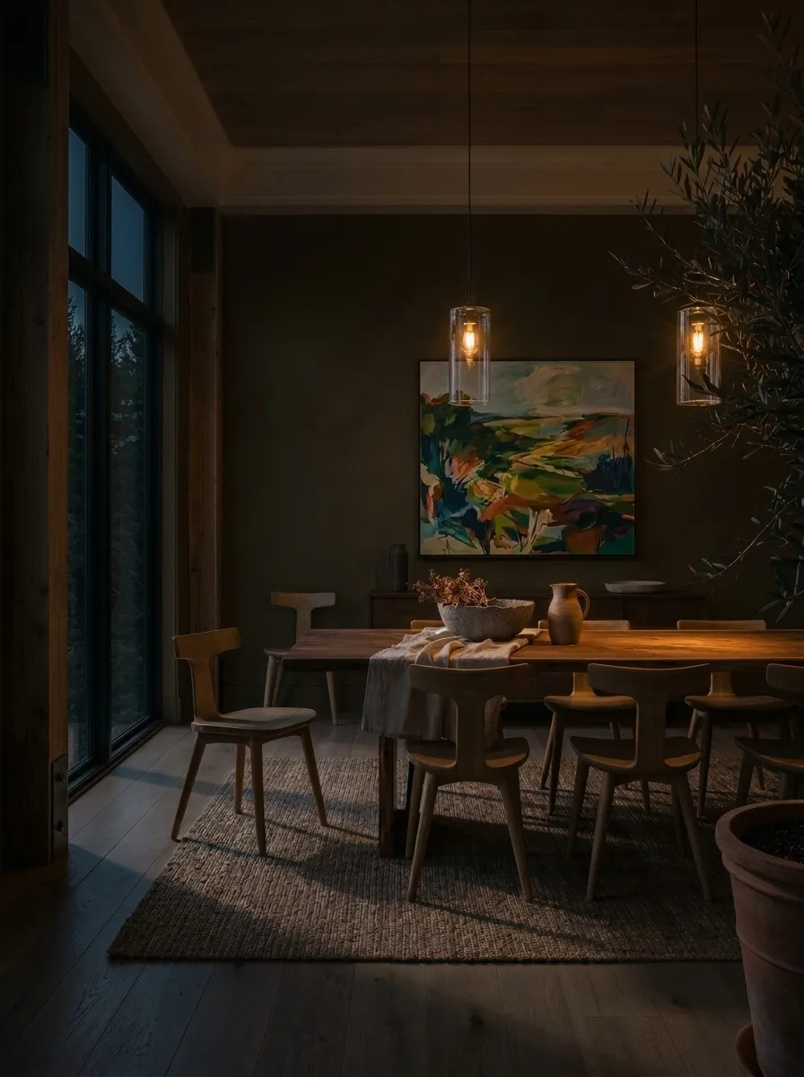
For walls, the most successful applications are well-lit rooms used as intentional accent spaces: home offices, libraries, dining rooms, and primary bedrooms where the drama is the point. Several reviewers recommend a flat or matte sheen indoors to keep the depth from turning shiny and distracting. Avoid using it on all four walls of a room that relies entirely on artificial light, because at LRV 8.1 it will absorb whatever illumination is there and the room can read much darker than the paint chip suggests.
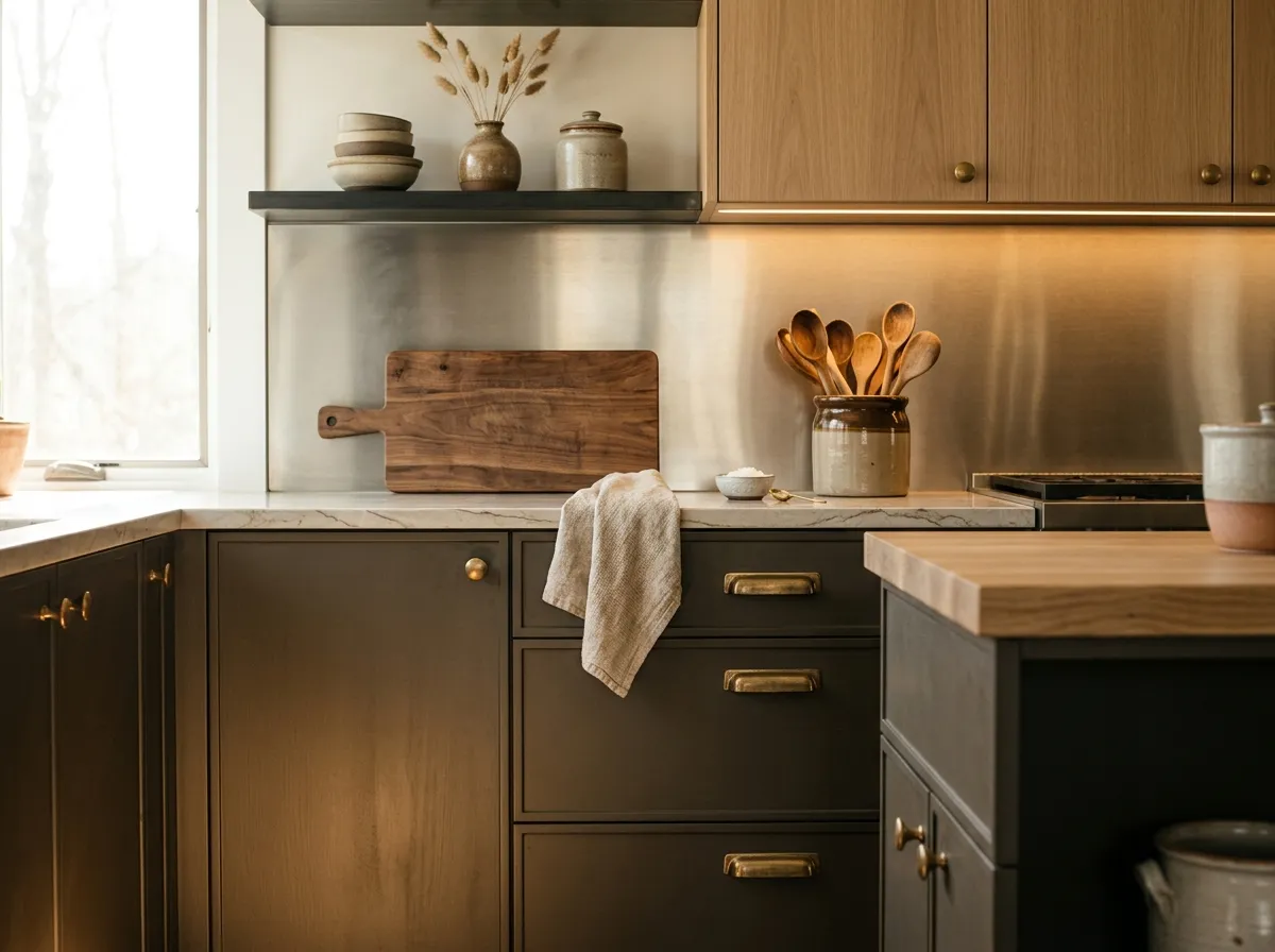
Urbane Bronze on lower cabinets or a kitchen island paired with white or cream uppers, light stone countertops, and a light backsplash is the application reviewers return to most. The contrast reads intentional and grounded without overwhelming the room.
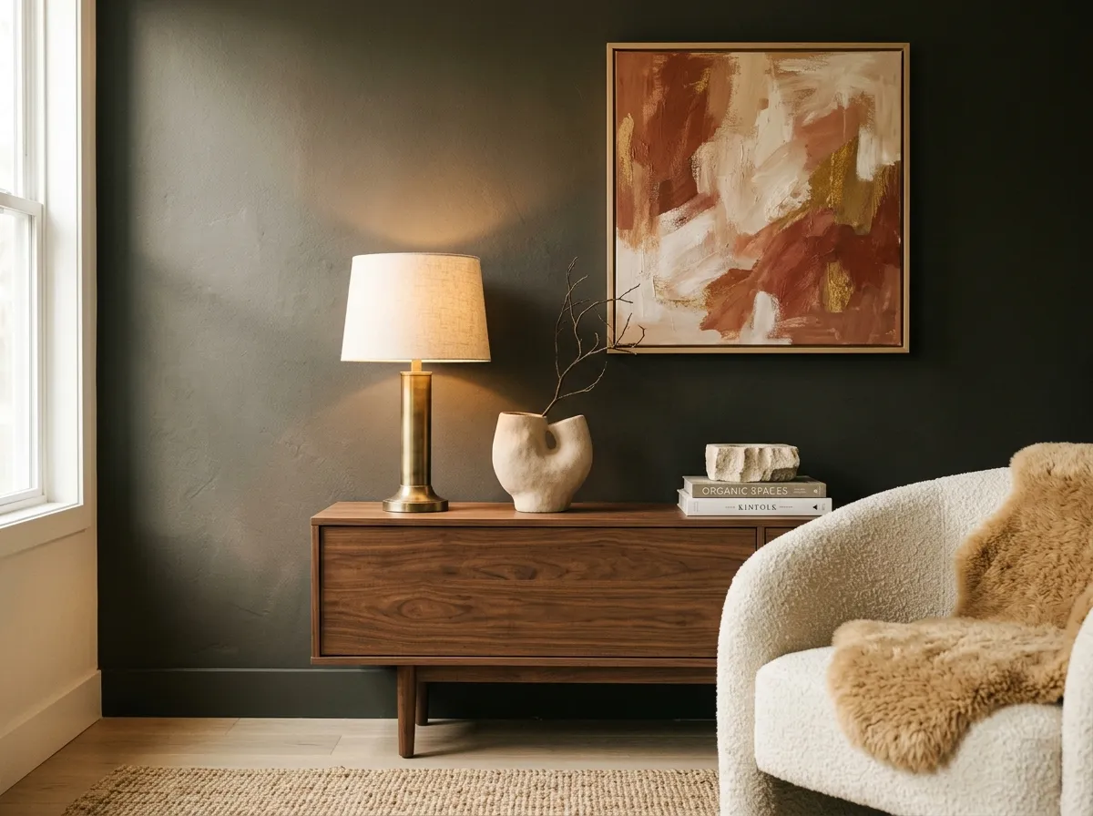
On a single focal wall in a well-lit living room, Urbane Bronze creates real depth without requiring you to commit the whole room to such a low LRV. It pairs well with warm wood furniture, natural fiber rugs, and warm-toned art. Use a flat or matte finish to keep the wall from catching light in a way that distracts.
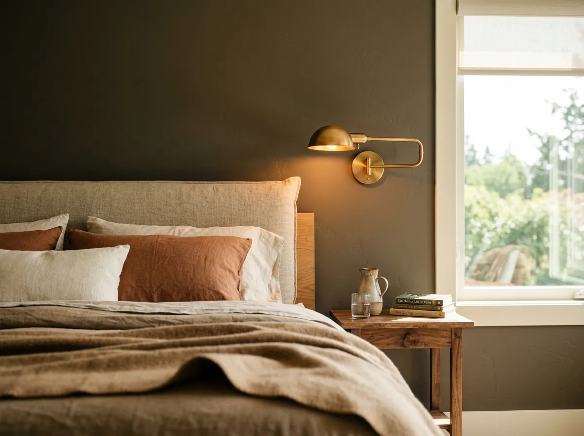
In a primary bedroom with good natural light, Urbane Bronze on all four walls reads moody and intentional. The key is window exposure: south or west-facing rooms bring out the warm brown and keep the color from feeling oppressive. Pair with warm whites on trim and linen or warm-toned bedding to avoid the room tipping into a cold, heavy space.
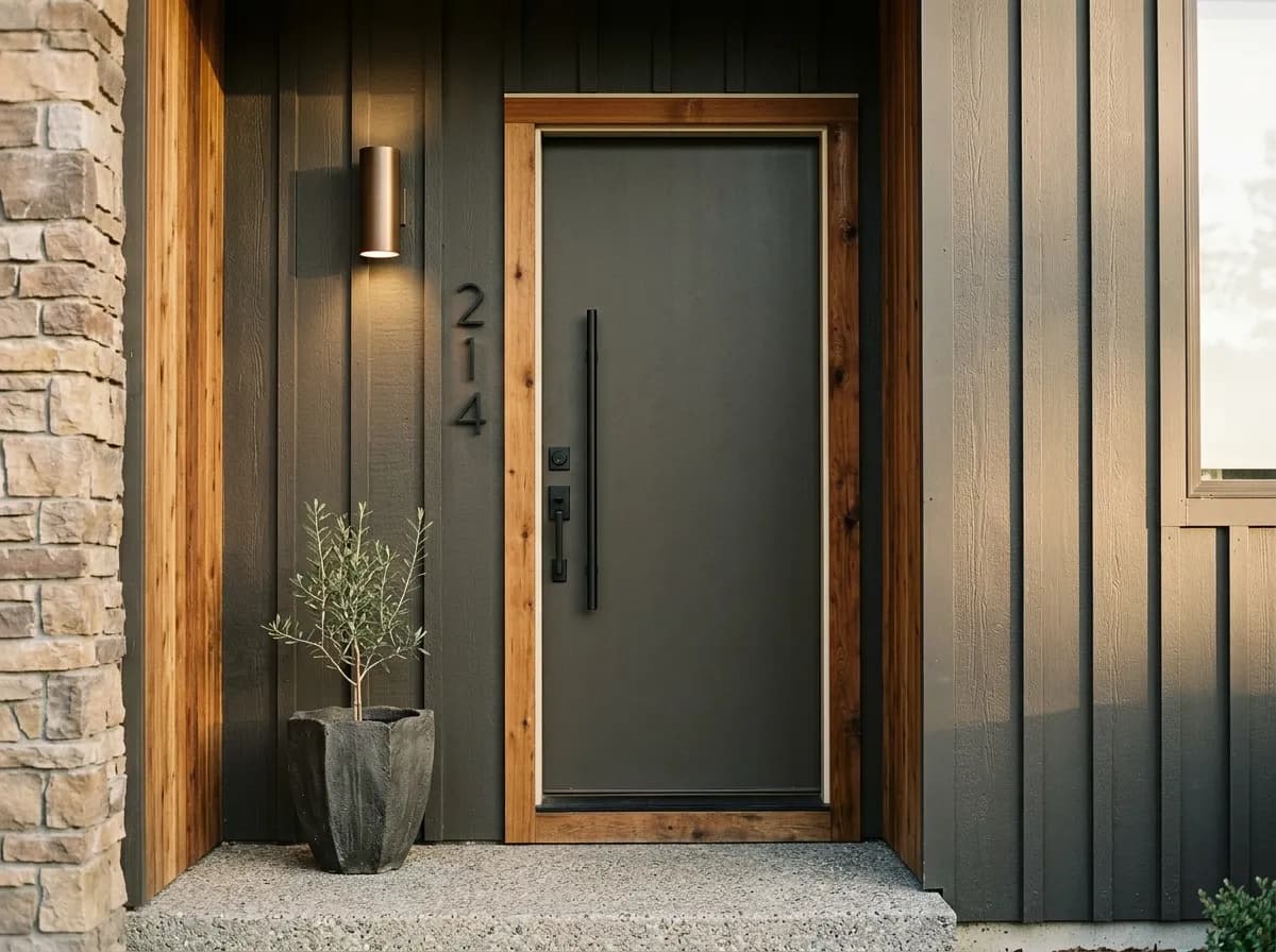
This is where Urbane Bronze earns its Color of the Year credentials. On siding, stucco, or board-and-batten it reads as a sophisticated, earthy neutral with real presence. On a front door it makes a confident statement without feeling trendy. Warm roof tones and natural stone or brick surrounds help it read cohesive rather than isolated.
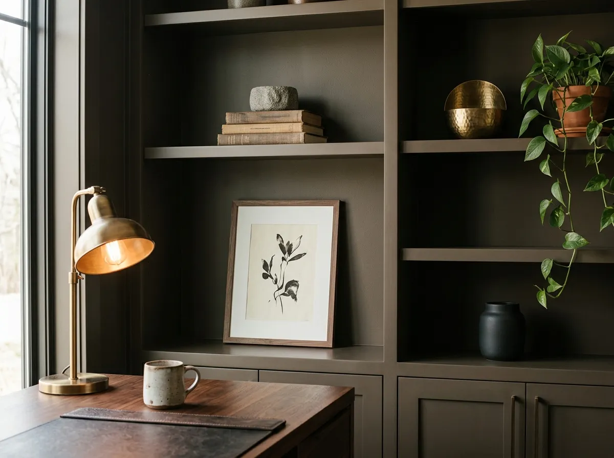
A dedicated workspace or book-lined room is one of the better all-wall applications indoors. The depth feels purposeful in a focused-use room, and these spaces tend to get task lighting that flatters the color's warmth. A matte finish and warm brass or wood accessories complete the look without adding visual noise.
Urbane Bronze takes well to warm, creamy whites, and reviewers broadly recommend that direction for trim, ceilings, and companion walls. Cobblestone brings a lighter, grounded warmth that builds a tonal palette without jumping to stark contrast. Ivoire adds a creamy, slightly golden quality that plays up the warm brown note in Urbane Bronze rather than fighting it. Extra White is listed as a coordinating color in our database, though it is worth noting that some independent reviewers flag cool or bright whites as a risky pairing, arguing they can feel too sharp against the warm depth of SW 7048. If your room's light is warm and abundant, Extra White may resolve comfortably; in cooler or lower light it is worth sampling both Extra White and a warmer cream side by side before deciding.
Beyond the coordinating whites, natural materials do a lot of the work. Brass, unlacquered bronze, and black hardware all cooperate with this color without competing. Warm wood tones in cabinetry, flooring, and furniture reinforce the earthy quality. What to steer clear of: cool-toned grays, blue-based slate, and anything with a clearly purple or lavender cast, because those cooler tones make Urbane Bronze read muddy rather than rich.
Sherwin-Williams has a match for every single color you see here, making the whole scheme shoppable from one source. Two of those colors are actual paint: Urbane Bronze goes on the feature wall and concrete fireplace mass as a drenched zone, while Alabaster covers the surrounding walls. The remaining five represent the room's furnishings and materials, each translated to its closest Sherwin-Williams equivalent. Hover any pin or swatch to see which is which.
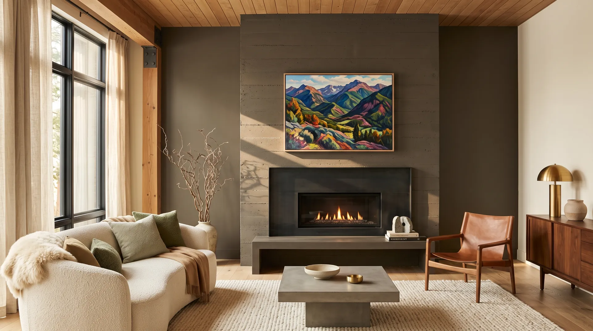
All comparisons are matched against Urbane Bronze at LRV 8.1.
Urbane Bronze is a warm color at its core. When it sits next to cool gray tile, cool gray countertops, or cool gray paint, the contrast between the warm undertones and the cool surface makes Urbane Bronze read muddy and the gray read washed out.
At LRV 8.1, Urbane Bronze absorbs most of the light in a room. In a basement, interior bathroom, or north-facing room with small windows, it can push close to black and feel heavy rather than atmospheric.
Some reviewers explicitly flag cool and crisp whites as a difficult pairing with Urbane Bronze, arguing the sharp contrast highlights the color's green undertone in an unflattering way and makes the overall scheme feel unresolved rather than contrasting.
Urbane Bronze SW 7048 is a deep, warm greige-bronze. It blends warm brown with soft charcoal gray and carries a quiet green undertone that keeps it from reading as a plain brown or a flat gray. Think earthy, complex dark neutral rather than any single color category.
The undertones are brown, gray, and a subtle green. Reviewers agree on all three but weight them differently. Some treat the brown and gray as the leads and the green as a quiet background note. Others argue the green is the most defining trait and the thing that sets Urbane Bronze apart from ordinary warm grays. In practice, morning and north light surface the gray, afternoon and south light bring out the brown, and lamplight can reveal the green more clearly.
Warm, without question. Every independent source agrees on this point. It is never a cool gray, and it does not read neutrally. Its warmth is why it pairs well with brass, warm wood, and creamy whites, and why it can clash with cool blue-based grays or stark white finishes.
The LRV is 8.1, which puts it at the darker end of the dark range without reaching true near-black territory. At that LRV it absorbs most light in a room and will shift noticeably depending on natural light conditions, so testing a large sample in your actual space before painting is strongly recommended.
The Sherwin-Williams code is SW 7048. The hex value is #54504A and the RGB is 84, 80, 74.
Warm, creamy whites work best for trim and ceilings. Cobblestone and Ivoire are coordinating colors that build a warm, tonal palette around it. Natural materials like brass hardware, warm wood tones, and earthy stone all cooperate with its warmth and faint green note. Avoid cool or blue-based grays in the same space, as those can make Urbane Bronze read muddy. If you are considering a crisp white trim, sample it heavily in your specific light conditions first, because the pairing divides reviewers.
Yes on all three, and these are its strongest applications. On exterior siding, stucco, and board-and-batten it reads as a sophisticated, grounded neutral with real presence. Front doors in Urbane Bronze are widely praised, and it handles garage doors and shutters equally well. For cabinets, the best approach is using it on lower cabinets or an island paired with light uppers and light countertops; using it on both upper and lower cabinets can make the kitchen feel heavy, especially in rooms that do not get strong natural light.