
MorningCooler · clean neutral charcoal
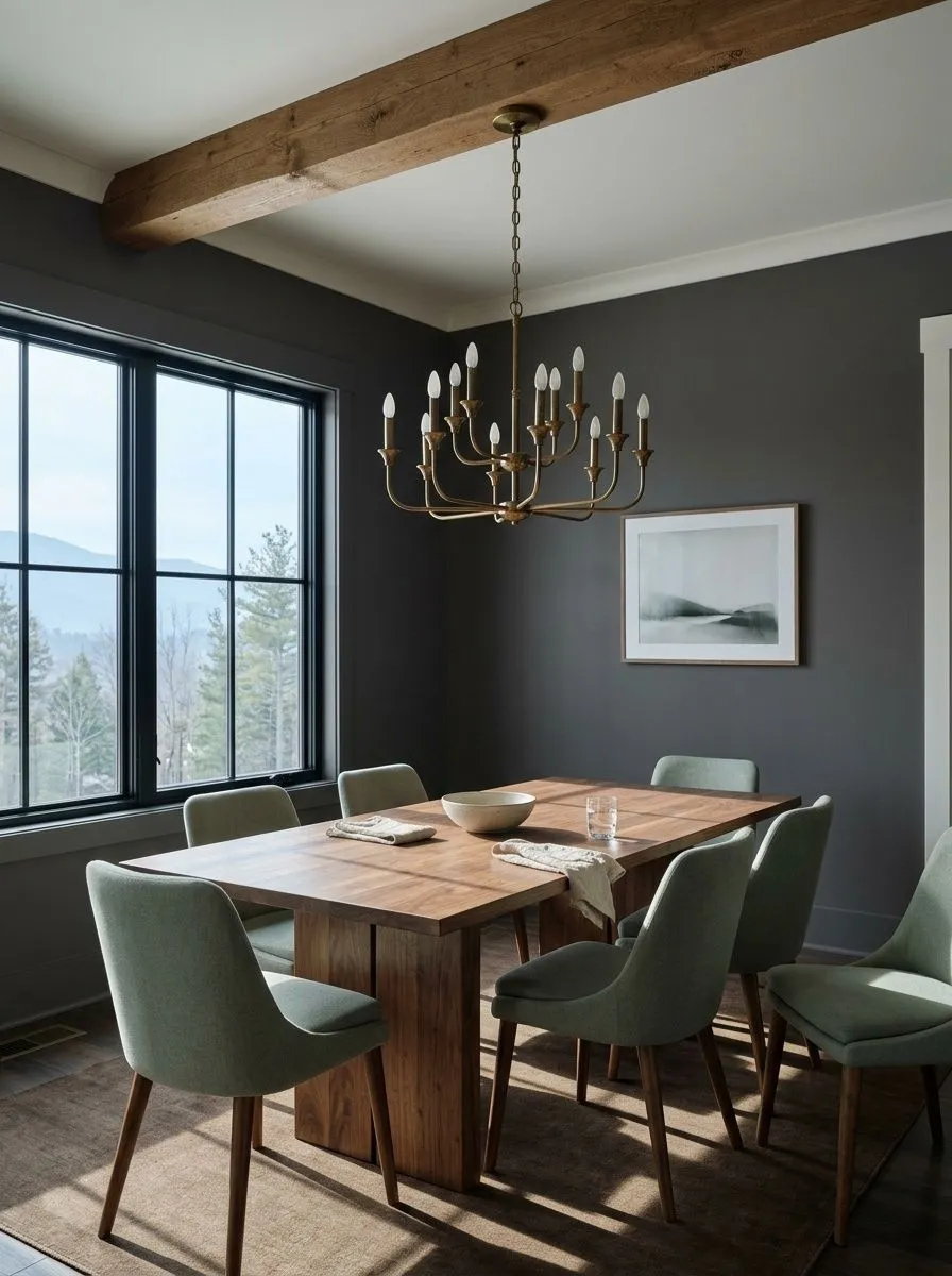
A deep, clean charcoal gray — grounded and neutral, reading a touch cooler in daylight and a touch warmer beside warm wood and lamplight. Sample it morning through evening before you commit.

Sherwin Williams Peppercorn paint is a deep, dark charcoal gray that sits at an LRV of 9.7, which puts it well into dark territory. In a room with limited natural light, it reads nearly black, and you will not see much gray character at all. Give it a bright, well-lit space, and the true charcoal quality comes forward: a rich, dense gray with enough depth to feel deliberate and moody without the flat finality of true black.
The color has earned its reputation as a not-quite-black alternative for good reason. It carries visual weight without absorbing all the light in a room the way a true black does, and that small margin makes it more workable on large surfaces like full walls, exterior siding, and cabinet banks. It is one of Sherwin-Williams best sellers and appears on their Top 50 list, which means it has been tested in an enormous variety of homes and lighting conditions. That real-world track record is part of what makes it so frequently recommended, but it is also why the undertone story is more complicated than the chip suggests.
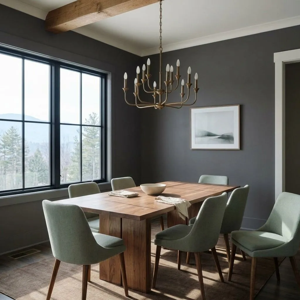
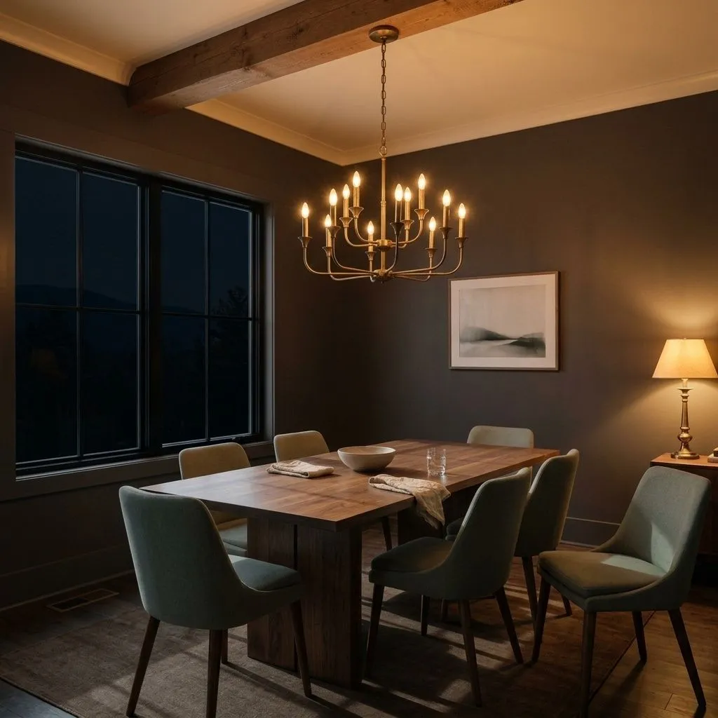

Peppercorn's undertone is the most debated thing about it, and the disagreement among reviewers is genuine and worth taking seriously rather than smoothing over. The most common description is that it behaves like a chameleon. Depending on the light source, time of day, and the colors around it, it can flash blue, green, purple, or some combination of all three. Several reviewers describe it as wildly unpredictable and difficult to pin down, and that characterization is not an exaggeration for rooms that cycle through a lot of different light conditions.
Other reviewers push back on the wildcard label and describe it as a nearly true gray that leans slightly cool, picking up only faint blue or purple hints without dramatic shifts. A third position lands between those two: a near-equal balance of warm and cool where the cool blue side edges ahead in practice, but warmth surfaces when strong direct natural light hits the wall. Our own color data tags it with warm and brown undertones, which does reflect what some people see in low or golden artificial light, particularly on cabinetry. Independent reviews, though, lean consistently toward neutral or cool in most real-world conditions.
The practical upshot is that the undertone is genuinely light-dependent. North-facing rooms and cooler light sources tend to hold it to a neutral or slightly cool charcoal gray. Warm, golden light and very low light can push it toward inky blue or even a subtle violet cast. Rooms with warm wood tones nearby may pull a faint brown warmth out of it. The only reliable advice is to sample it on the actual surface in your specific room, observe it morning through evening, and expect it to look different under each condition. Do not rely on a paint chip to predict what it will do on your walls.
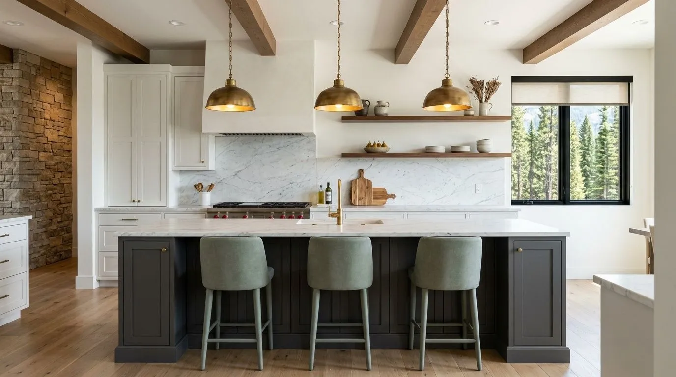
Peppercorn works best in rooms where you want presence and mood but are not ready to commit to true black. Reviewers consistently point to kitchen cabinetry as one of its strongest applications, particularly islands and lower cabinets paired with lighter uppers and white or marble countertops. That combination gives the dark color a contained space where its depth reads as sophisticated rather than oppressive. Bathroom vanities work by the same logic.
For full walls, rooms with generous natural light are where it performs most reliably. Dining rooms, home offices, and studies are frequently cited because those spaces often have focused lighting, smaller wall areas, or a tolerance for a moodier atmosphere that makes the low LRV of 9.7 feel intentional rather than gloomy. Bedrooms with good window exposure can handle it well, especially when paired with light bedding and warm wood furniture. Accent and feature walls are a lower-commitment way to use Peppercorn in rooms where you want depth on one surface but do not want to commit the whole space.
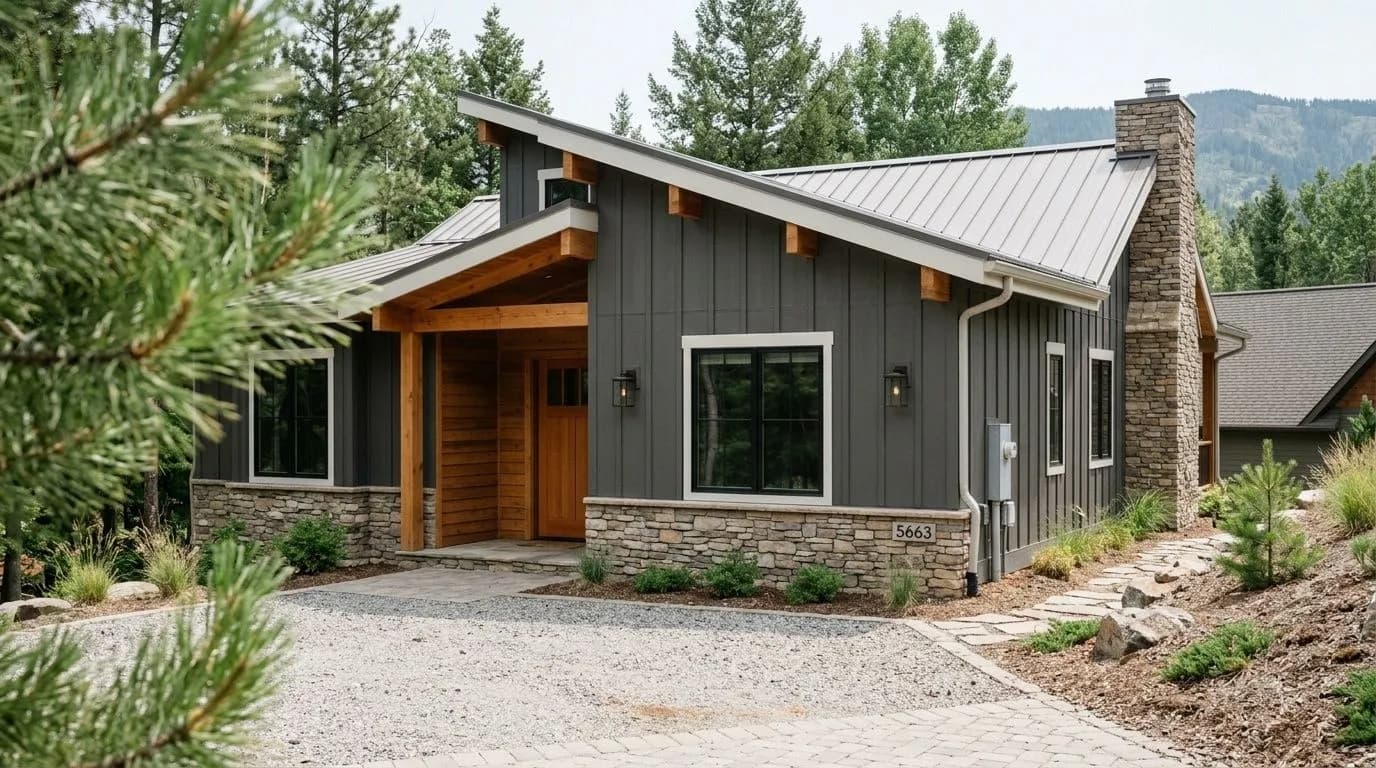
Exterior use is one of the most popular applications, covering siding, shutters, and front doors. The color reads as a clean, strong charcoal from the street and holds up well against natural daylight. That said, reviewers urge sampling outdoors specifically before committing, because the undertone behaves differently in full sun and open shade than it does indoors. South- and west-facing exteriors in bright climates will show the color differently than a north-facing shaded facade. Sample boards viewed at different points in the day will tell you more than any photo can.
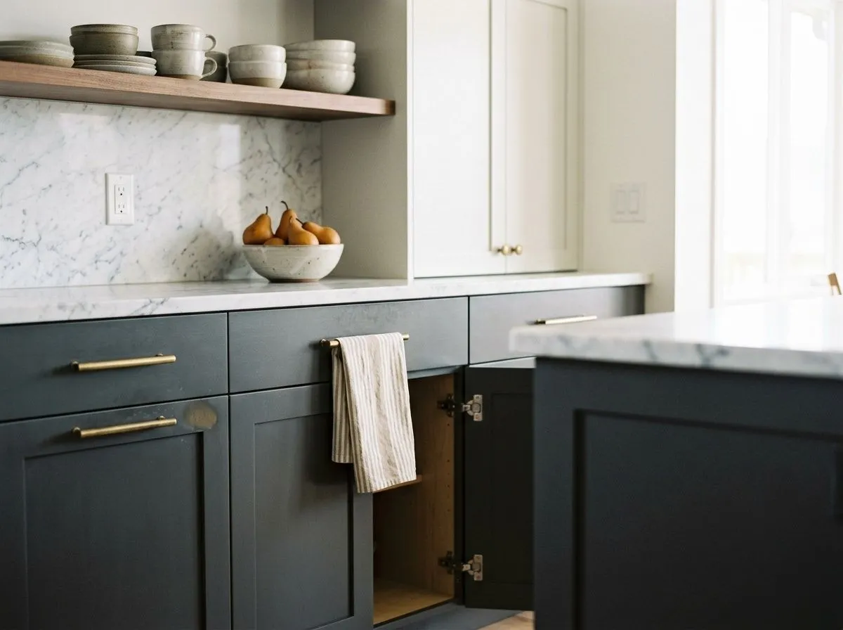
Peppercorn is a go-to for kitchen islands and lower cabinet banks where you want the drama of near-black without losing all warmth. Pair it with white or marble countertops and light upper cabinets to keep the kitchen functional and visually open. Brushed brass hardware pulls out any warm undertone the color carries and prevents it from reading flat.
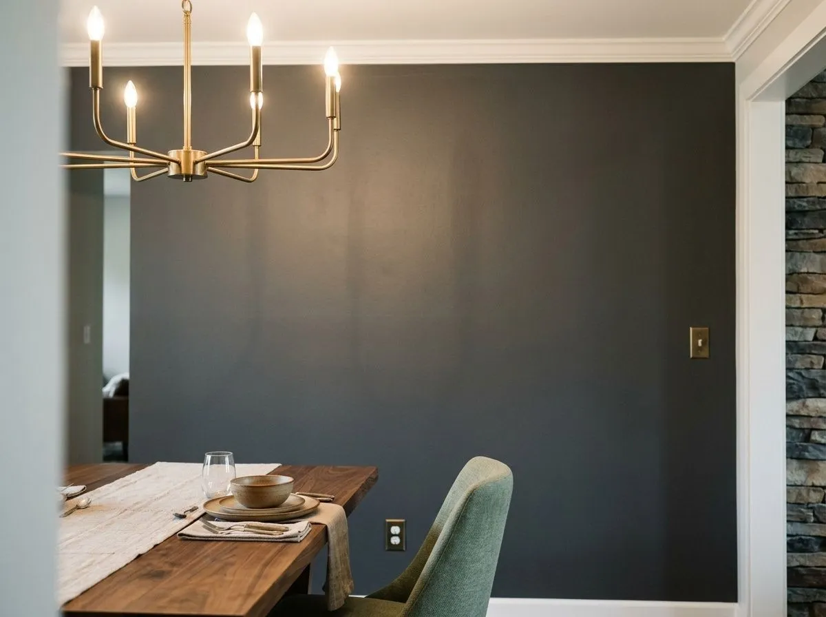
A dining room is one of the best full-wall applications because the space typically has focused overhead and ambient lighting, which lets you control how the LRV 9.7 depth reads. The enclosed scale of most dining rooms also means the dark color wraps the space in a way that feels cozy rather than cavernous. Light trim and a statement light fixture are the standard moves here.
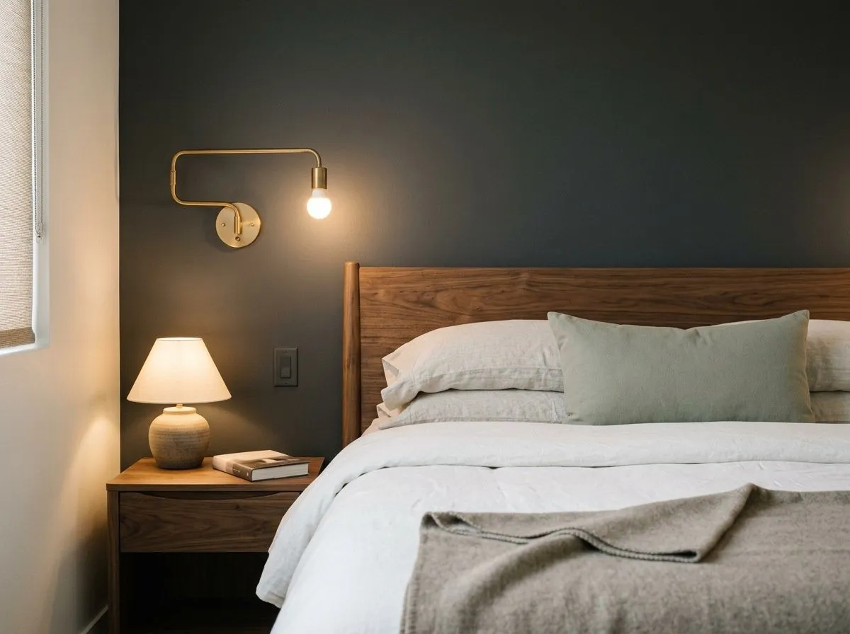
In a bedroom with good window exposure, Peppercorn on a feature wall or all four walls creates a genuinely restful, low-stimulation environment. Light bedding, warm wood furniture, and adequate lamps are non-negotiable at this LRV to keep the space from reading heavy at night. North-facing bedrooms need especially careful lighting planning.
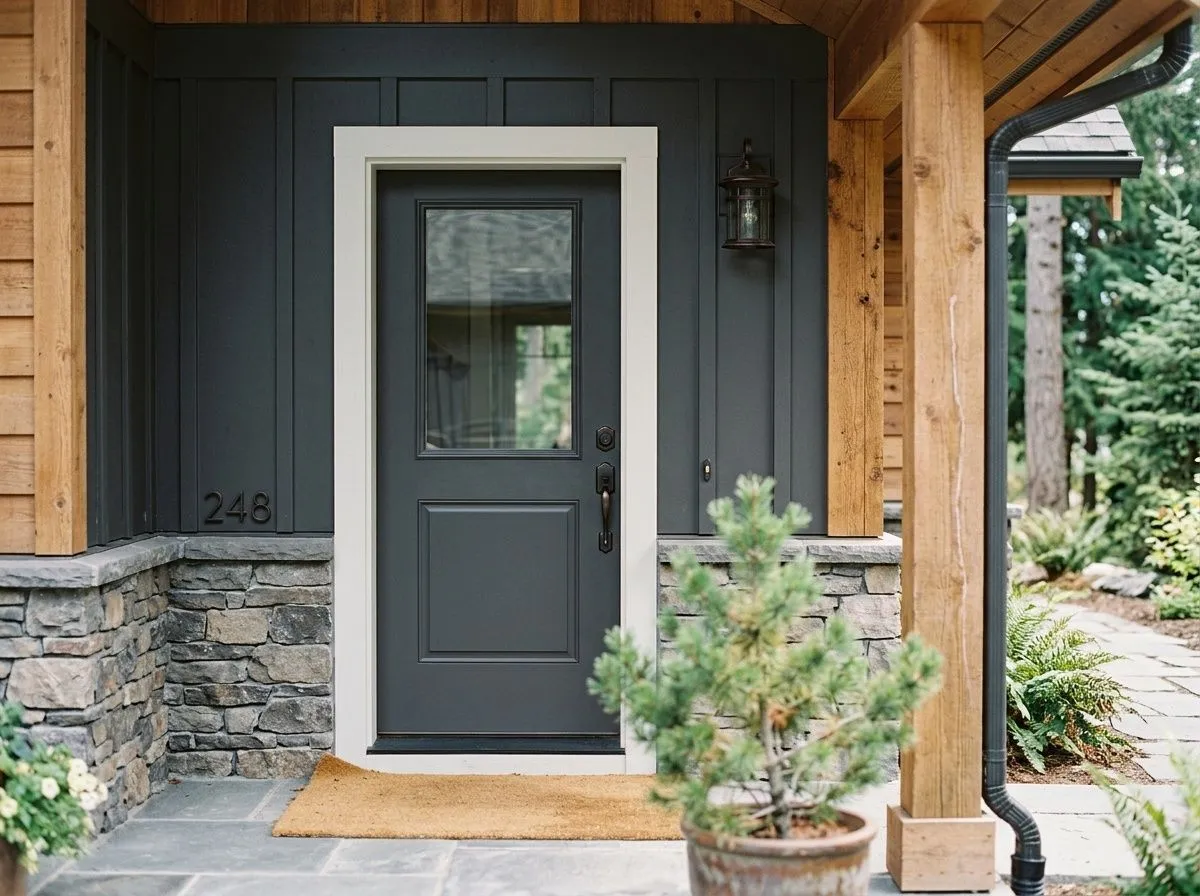
Peppercorn is one of Sherwin-Williams top exterior colors for a reason: it reads as a clean, confident charcoal on siding, shutters, and front doors without the harshness of true black. It pairs naturally with white trim and warm wood accents. Sample it outdoors in your specific orientation before committing, because the undertone shifts meaningfully between sun and shade.
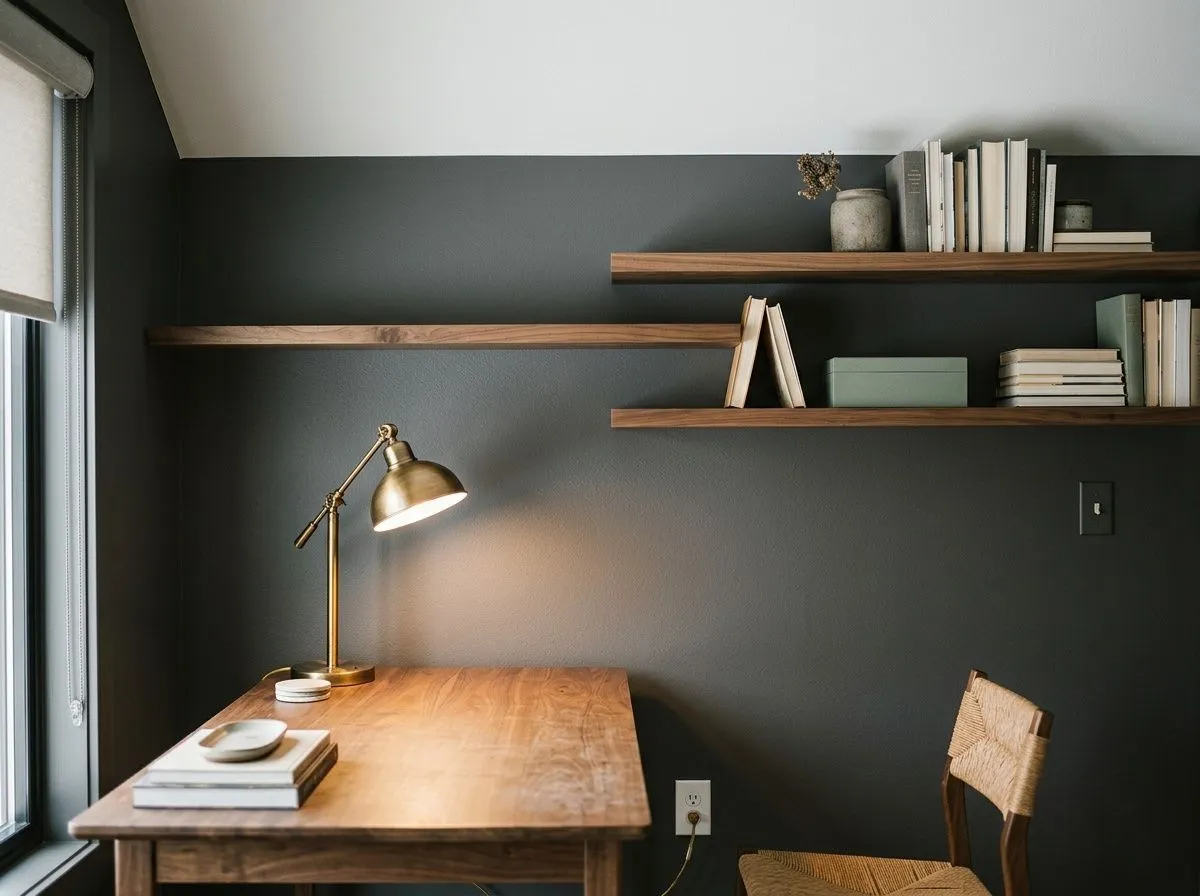
The moody depth of a 9.7 LRV color translates well to a home office or study where focused task lighting is already part of the plan. The enclosed atmosphere can aid concentration and gives the room a library-like seriousness. Layer in warm desk lighting and keep one surface, usually the ceiling, in a light neutral to avoid the space feeling compressed.
Peppercorn's depth means your pairing choices largely determine whether the room feels balanced or overwhelming. The most straightforward approach is high contrast: a crisp, clean white on ceilings, trim, and adjacent walls. Sherwin-Williams coordinates Nebulous White and Windfresh White alongside it for good reason. Both provide the light relief that a color with an LRV of 9.7 needs nearby to breathe. Willow Tree, the third coordinating color, takes a different direction, pairing Peppercorn with an earthy, muted green that reinforces the color's more naturalistic warm side and works particularly well in spaces with wood tones and organic materials.
Beyond the official coordinates, reviewers point to warm off-whites, natural wood tones, leather, and brushed brass or chrome hardware as reliable companions. For those who want to push bolder, mustard yellow, deep teal, and vibrant red all show up in real-world rooms as accent colors that play well against the charcoal. The key across all of these is giving the room enough light contrast so the dark ground does not swallow everything around it.
Most of what gives this kitchen its weight and warmth is not paint at all: the wood, stone, metal, and textiles do the heavy lifting, and each is shown here as its closest Sherwin-Williams match. Only two colors are actual paint, Peppercorn on the island base and paneled ends, and Nebulous White on the perimeter cabinets, trim, and walls. Hover any pin or swatch to see the full palette.
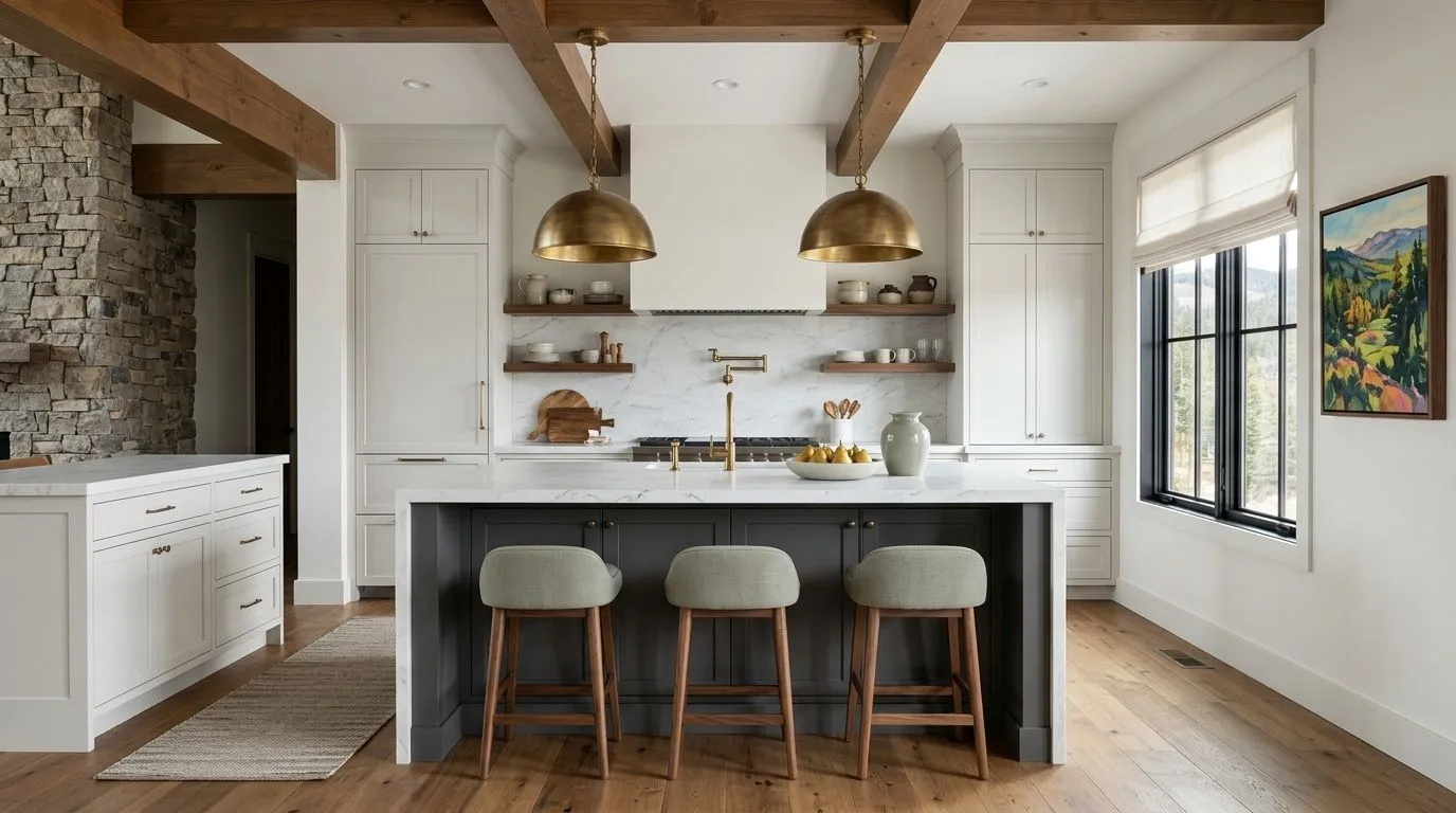
All comparisons are matched against Peppercorn at LRV 9.7.
Because Peppercorn can flash blue, green, or purple depending on light, many people choose it from a chip and then find the wall color looks nothing like what they expected, particularly in rooms with cool north light or fluorescent fixtures.
At LRV 9.7, Peppercorn reflects very little light. In a room with one small window, low ceilings, or minimal artificial lighting, it can make the space feel suffocating and dark well beyond what you intended.
In open floor plans where Peppercorn on one surface is visible alongside a cool blue or green wall, the color can pick up and amplify those cool tones, turning the charcoal distinctly blue-green in a way that feels unintended.
Peppercorn (SW 7674) is a deep charcoal gray with an LRV of 9.7. It reads nearly black in low light and shows its true gray character in well-lit spaces. It sits in the Warms and Neutrals color family but behaves as a neutral to cool charcoal in most lighting conditions.
Peppercorn's undertones are genuinely debated. It can show blue, green, purple, or faint warm brown depending on the light, the room's orientation, and surrounding colors. In most rooms and most light, it leans neutral to slightly cool. North-facing rooms and cool light sources tend to bring out blue or purple hints. Warm golden light or low light can reveal subtle warmth. Sampling in your specific space at different times of day is the only reliable way to know what it will do on your walls.
Peppercorn is best described as light-dependent. It most commonly reads as a neutral to slightly cool gray in everyday conditions, but it can shift toward warm brown in strong natural light and toward cool blue or purple in north-facing or artificially lit rooms. It is not reliably warm or reliably cool, which is both its appeal and its main challenge.
Peppercorn has an LRV of 9.7, which places it firmly in the dark range. Colors below LRV 25 are generally considered dark, so at 9.7 it reflects very little light. That low reflectance is what gives it its moody depth, but it also means the room needs adequate natural and artificial lighting to avoid feeling gloomy.
The Sherwin-Williams paint code is SW 7674. The hex value is #585858 and the RGB values are 88, 88, and 88. It is available in both interior and exterior formulas.
Peppercorn pairs well with crisp whites and light neutrals for high contrast, including the coordinating picks Nebulous White and Windfresh White. Willow Tree is the third official coordinate and brings an earthy green complement that works well with natural materials. Warm wood tones, leather, marble, and white countertops all work alongside it. For hardware, brushed brass and chrome are the most cited choices. If you want bolder accents, mustard yellow, deep teal, and vibrant red all show up in successful real-world rooms.
Yes to all three. Peppercorn is one of Sherwin-Williams top exterior colors and reads as a strong, clean charcoal on siding, shutters, and front doors. For cabinets, it is a popular island and lower-cabinet choice that gives a modern moody kitchen without the finality of true black. In all three applications, sample it in your actual conditions first, because the LRV of 9.7 reads differently in full sun, open shade, and indoor task lighting.