Web Gray lands in medium-dark territory with an LRV of 13.1, which puts it well below mid-tone but stops short of near-black. In a room with generous natural light, it reads softer and lighter than you might expect from looking at a chip, so do not assume it will feel cave-like. On a broad wall or exterior surface, it becomes a confident, dimensional charcoal gray with real presence.
The color carries a quiet depth that keeps it from feeling flat or heavy despite its low LRV. That depth comes from a subtle blue quality that you can see most clearly in cool, north-facing light or on a bright overcast day. In warm afternoon light or south-facing rooms, it settles toward a more neutral charcoal and loses some of that cool edge. The shift is noticeable enough that sampling on your actual walls at different times of day is genuinely worth your time, not just a formality.
Web Gray reads as a cool gray first, and reviewers broadly agree on that. The point of some disagreement is exactly what underlies that coolness. The most common read is a soft blue undertone, visible especially in bright or cool light. Some reviewers push that description further and call it blue-green, noting that the color takes on a faint aquatic depth when placed next to warm neutrals. Next to something distinctly green, it can shift all the way toward blue-violet by contrast, which shows how reactive this color is to its surroundings.
In warm ambient light the undertone quiets down considerably and the color reads closer to a straightforward neutral charcoal. This is the main source of disagreement in real-world reviews: people in warm, south-facing rooms sometimes do not see much blue at all, while people sampling in cooler light see it immediately. Neither experience is wrong. Web Gray is listed in the Warms and Neutrals family despite its cool editorial read, which creates some confusion, but on the wall it behaves like a cool gray in most conditions. If you have warm wood tones, amber lighting, or red-brick surroundings, expect the blue to stay hidden; in crisp modern spaces with white trim and cool light, it comes forward clearly.
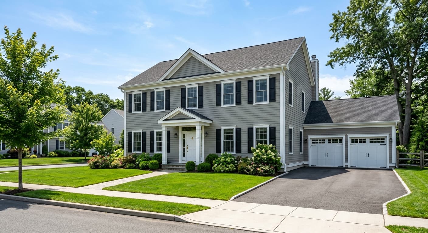
Web Gray earns its place on the Top Exterior Colors list and it is easy to see why. As a siding color it reads as a modern, sophisticated charcoal that holds up well against both crisp white trim and darker accent colors. It works equally well on craftsman and contemporary facades. Because its LRV is 13.1, it absorbs a fair amount of light, so on a large exterior surface in full sun it will look notably lighter than it does on a small chip, though it never loses its cool gray character.
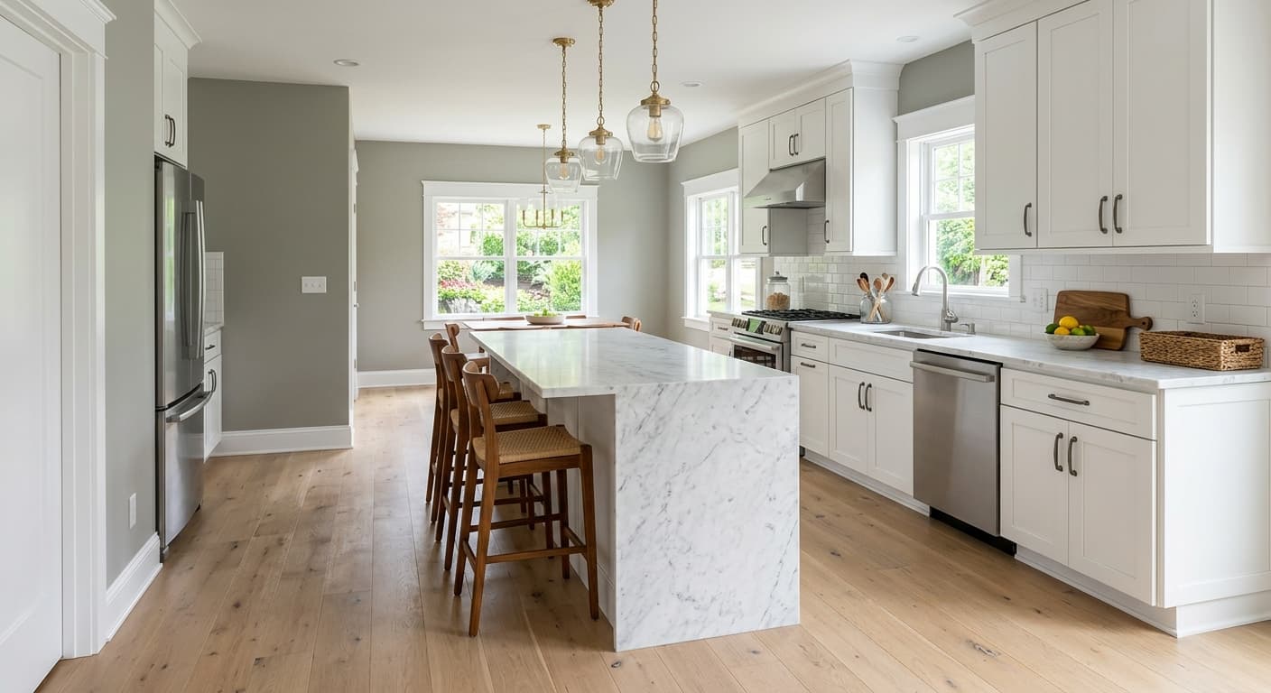
Indoors, the best fits are living rooms, bedrooms, and contemporary kitchens. In a living room it creates a cocooning effect without crossing into oppressive darkness, especially when paired with light trim and enough artificial or natural light. Bedrooms benefit from that same quality: the depth is calming rather than heavy. In a kitchen it works especially well on cabinetry, where the LRV contrast against white countertops and backsplash tile gives a sharp, modern result without the starkness of a true near-black.
Orientation matters more with Web Gray than with mid-tone colors. North-facing rooms will bring out the blue undertone more strongly and may make the space feel cooler than you intended, so plan your lighting accordingly. South-facing rooms get a warmer, more neutral charcoal that feels inviting. West-facing rooms will show a noticeable shift between morning gray and warmer afternoon readings. Any of these can work; you just want to know what you are getting before you commit.
On all four walls, Web Gray creates a cocooning, intimate feel that still feels polished rather than dark. Light trim in a crisp or warm white keeps the space from closing in. Add warm-toned textiles and natural wood to balance the color's cool blue depth.
The low LRV of 13.1 reads as restful and calming in a bedroom rather than gloomy, particularly with good bedside lighting. It holds its cool character overnight under artificial light, which some sleepers find ideal. Pair with warm bedding and light wood furniture to keep the room feeling balanced.
Web Gray on cabinetry gives a contemporary, high-contrast look against white countertops and light tile without the severity of a true near-black. The blue undertone reads clearly in a well-lit kitchen, adding dimension to flat cabinet faces. Matte black or brushed brass hardware both work well with it.
This is one of Sherwin-Williams's own top exterior picks, and the color earns that designation by reading as a modern charcoal that stays cool and composed in most light conditions. It pairs cleanly with white trim and dark windows. On large surfaces in direct sun it will read somewhat lighter than the chip, so that lightening is a feature rather than a problem.
As a front door color, Web Gray delivers a confident, modern statement without being as expected as black or navy. Against a light exterior field color it reads as a sharp, cool charcoal accent. The blue undertone keeps it from looking muddy or flat, which is a common risk with dark gray doors.
Web Gray pairs best with whites that either contrast crisply or soften the edge, and both approaches work depending on the mood you want. Site White SW 7070 gives a clean, slightly cool contrast that keeps the palette modern and sharp. Greek Villa SW 7551 is warmer and creamier, which pulls some warmth into the combination and makes the pairing feel less austere. For an accent that bridges the gap between the cool gray walls and warm furnishings, White Raisin SW 7685 brings a golden, honeyed quality that grounds the palette without fighting the cool gray base.
Beyond whites, Web Gray is comfortable with natural wood tones, matte black hardware, aged brass, and warm textiles in camel or rust. The blue-green undertone means you want to be careful with greens in the same space, since certain olive or sage tones can read blue-violet next to Web Gray by contrast. Stick with warmer, more yellow-based greens or keep greenery to plants rather than painted surfaces.
All comparisons are matched against Web Gray at LRV 13.1.
Web Gray's cool blue undertone and low LRV create a jarring temperature contrast when it meets warm beige or greige in an open floor plan. The transition reads abrupt rather than intentional.
Greens with a yellow or olive base can shift Web Gray toward blue-violet by contrast, and cool sage greens amplify the blue undertone to the point where the gray no longer reads as neutral.
At LRV 13.1, Web Gray absorbs a significant amount of light, and in a north-facing room with small windows and no added lighting it can feel heavier and darker than intended.
Web Gray SW 7075 is a deep, cool charcoal gray with an LRV of 13.1. It sits in medium-dark territory, not a true near-black, and carries a soft blue undertone that gives it depth and keeps it from reading flat on the wall.
The primary undertone is a soft blue, which some reviewers describe as blue-green in certain light conditions. In cool or north-facing light the blue reads clearly. In warm afternoon or south-facing light it quiets down and the color settles toward a more neutral charcoal. Next to distinctly green colors it can even shift toward blue-violet by contrast, so the undertone behavior depends heavily on your space.
Web Gray is cool. It holds its cool character even in warm afternoon light, though the intensity of the blue undertone varies by light source and orientation. It sits in the Warms and Neutrals color family on the Sherwin-Williams website, which surprises some buyers, but on the wall it behaves as a cool gray in most real-world conditions.
Web Gray has an LRV of 13.1, which places it in the medium-dark range. It absorbs considerably more light than a mid-tone gray but is not as deep as near-blacks, so it can read lighter than expected on a large surface in good natural light.
The Sherwin-Williams code is SW 7075. The hex value is #616669 and the RGB is 97, 102, 105.
Site White SW 7070 gives a crisp, cool-leaning contrast that keeps the palette modern. Greek Villa SW 7551 is warmer and creamier, softening the combination. White Raisin SW 7685 works as a warm golden accent that bridges the cool gray with warmer furnishings. Beyond whites, warm wood tones, matte black hardware, aged brass, and camel or rust textiles all complement it well.
Yes to all three. Web Gray is listed on the Sherwin-Williams Top Exterior Colors collection and works well as a modern siding color paired with white trim and dark windows. As a front door color it reads as a composed, cool charcoal that stands out without being dramatic. On kitchen cabinets it creates strong contrast against white countertops and light tile, and the blue undertone adds dimension to flat cabinet faces.
