Site White lands in that useful middle territory between a stark pure white and a clearly tinted off-white. At LRV 73, it reflects plenty of light and reads bright on the wall, but it carries just enough depth that it never feels flat or clinical. Stand back a few feet and it looks like a clean, polished white. Get closer or shift the light, and a soft gray cast starts to emerge.
The color shifts noticeably with the quality and direction of light. In rooms with generous natural daylight, especially north or east light, the gray side comes forward more decisively. Under warm artificial light, the gray softens and the whole color settles into something closer to a balanced clean white. Some reviewers report a faint blue surfacing under cool LED lighting, which is worth watching for in kitchens or bathrooms where recessed lighting dominates. That variability is not a flaw so much as the nature of a color sitting at this precise intersection of neutral and cool.
This is where opinions divide, and it is worth taking both sides seriously before you commit. The majority of independent reviewers land on a cool read: they describe Site White as having a soft blue-gray base that keeps it from feeling warm or creamy. The gray is the dominant character in most lighting, and in north-facing or cool-lit rooms it can read distinctly gray rather than white. The blue is fainter and more conditional, but it is real enough that testers in rooms with cool overhead lighting notice it.
A smaller but consistent group reads Site White as a more balanced, nearly neutral white that does not tip obviously cool. They point to how it behaves in warm natural light, where the cool undertones recede and it simply looks like a clean, unfussy white without a strong tint either way. Both camps have a point, which is why our editorial read calls it neutral and clean with a warm lean, while the research skews more toward cool-gray. The honest answer is that this color lives on the cooler side of neutral and will read warmer or cooler depending entirely on your room's light source and orientation.
The practical takeaway: if your space has a lot of warm wood tones, warm-toned furnishings, or south-facing light, the cool undertones balance out and the color works beautifully. If your room runs cool already, be prepared for the gray and occasional blue to assert themselves more than you might expect from a color marketed as a clean white. Sample it in your specific conditions before committing.
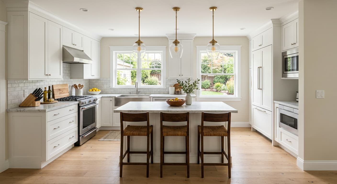
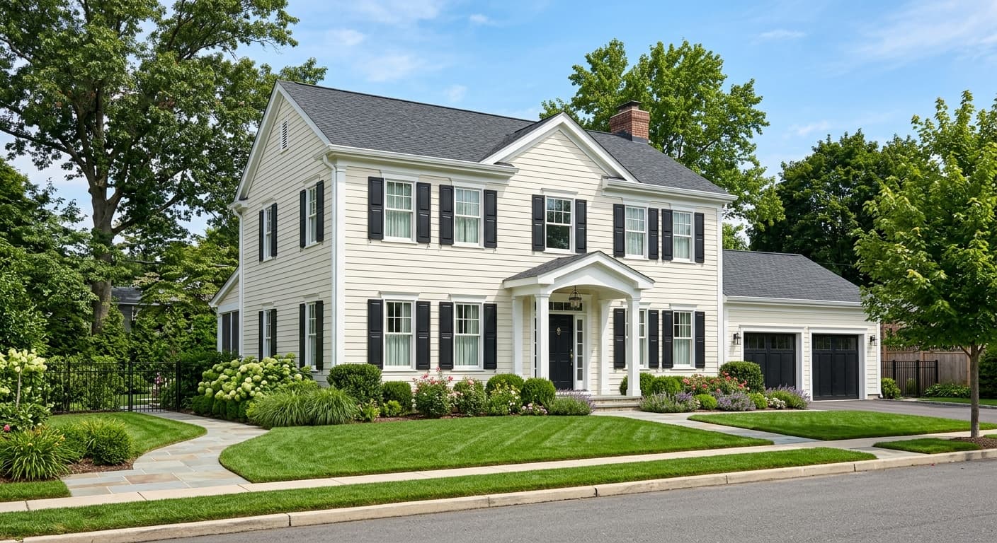
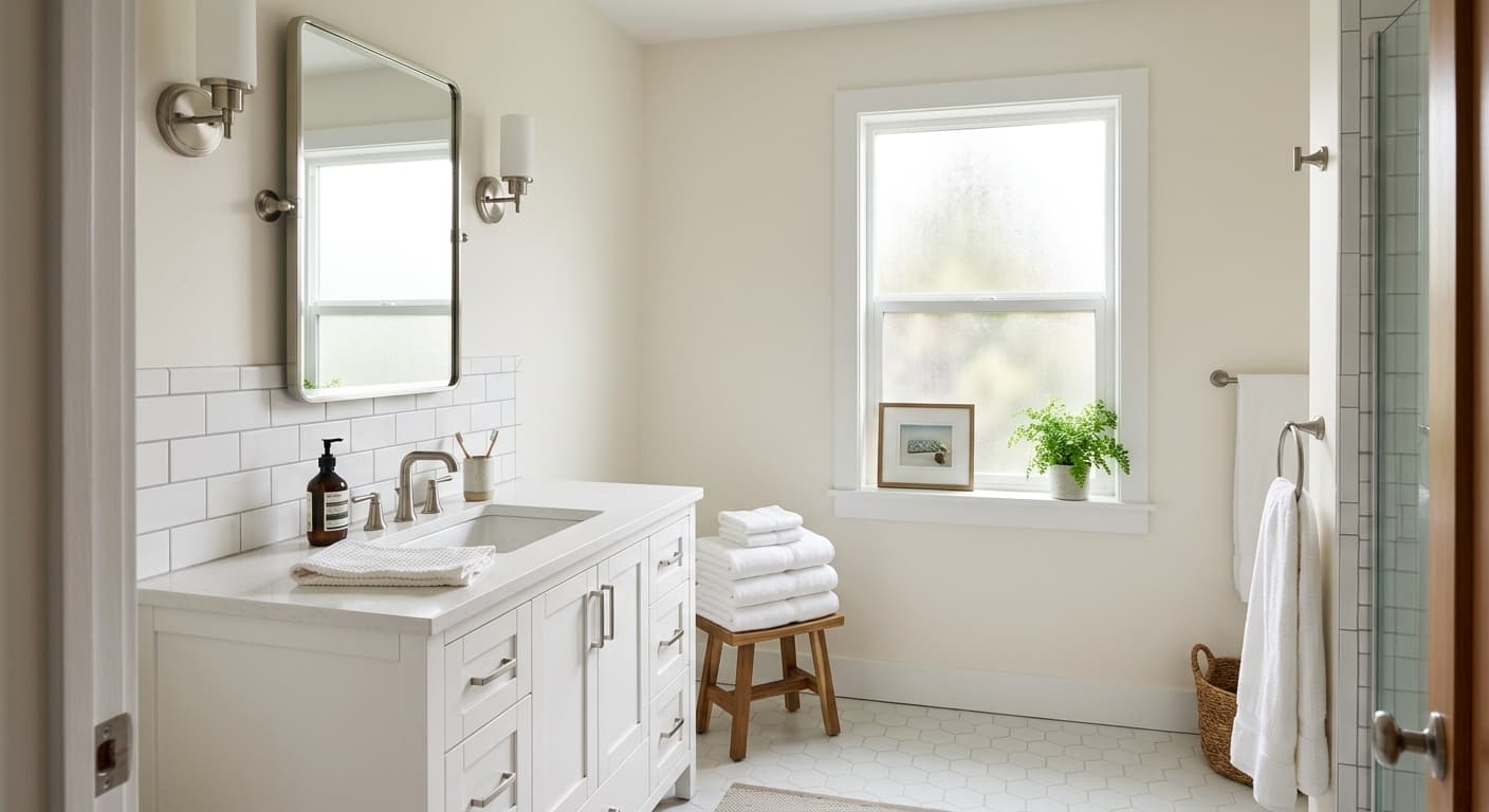
Site White earns its strongest reviews as a trim and ceiling color. It gives a crisp, finished edge without the harshness of a stark pure white, and because it sits on the cooler side of neutral it pairs cleanly with both warm and cool wall colors. If you want a trim that recedes rather than commands attention, this is a reliable choice. On ceilings it keeps things light and airy without introducing any yellow or cream that can make a room feel dated.
In kitchens and bathrooms it performs well as a cabinet or wall color, particularly in spaces with good natural light or warm artificial light to offset the cool lean. Designers lean on it for modern and minimalist interiors where the goal is brightness with a touch of softness rather than a pure white that reads stark under every condition. It also works on exteriors, where daylight tends to balance the gray undertone and the color reads as a clean, contemporary white with some dimension.
For whole-wall use, it suits rooms where you want brightness without committing to a true white. Minimalist living rooms and bedrooms with lighter furnishings benefit most. Rooms that already trend cool, think north-facing spaces with little warm light, demand careful sampling. In those situations the gray-blue character can intensify, so pair it with warm wood floors, warm-toned textiles, or warmer lighting to keep the room from feeling chilly.
Site White is one of the more dependable trim colors in this LRV range because it gives a polished, clean edge without the severity of a high-contrast pure white. It bridges warm and cool wall colors gracefully. Use it anywhere you want trim that reads white without announcing itself.
At LRV 73, Site White on the ceiling keeps a room feeling open and bright while avoiding the slight yellowing that can creep into warmer whites over time. It reads especially well when the walls are a medium or deeper cool-neutral tone. The gray undertone on the ceiling reads as clean rather than heavy.
On kitchen cabinets or walls, Site White delivers a modern, unfussy look that pairs with stainless steel, brushed nickel, and cooler stone countertops without visual competition. Warm wood elements like open shelving or butcher block soften the cool lean of the color. Watch your lighting: cool LEDs can intensify the blue-gray, so test before committing to a full cabinet paint.
In a bathroom with good light, Site White reads fresh and clean, which is exactly what most people want in the space. It works on walls, tile surrounds, or vanity cabinets. In windowless bathrooms relying on artificial light, sample carefully because cooler fixtures can pull out the blue undertone more strongly.
As a wall color in minimalist or modern rooms, Site White adds brightness with just enough softness to avoid the stark, cold feeling of a true white. Pair it with warm-toned textiles and wood accents to balance the cool undertone. North-facing rooms need warmer accessories and lighting to keep the space from feeling cool.
Site White plays well with a range of colors because its soft neutral-cool character does not compete. Sherwin-Williams coordinates it with Pure White (SW 7005) as a brighter, slightly warmer companion, which makes sense if you want to step up the brightness on trim or millwork while keeping walls in Site White. The contrast is subtle but effective, enough to define architectural detail without looking jarring.
Gray Screen (SW 7071) sits just a step deeper and greener in the gray family, making it a natural wall color when you want Site White to function as the lighter trim anchor. Cadet (SW 9143) pushes further into a soft blue-gray and gives you real contrast, useful in rooms where you want Site White on ceilings or trim to pop against a cooler, more saturated wall. All three pairings share the same cool-neutral DNA as Site White, so the palette holds together without effort.
All comparisons are matched against Site White at LRV 73.0.
In north-facing rooms or spaces dominated by cool LED fixtures, Site White's blue-gray undertone can intensify and the color stops reading as white, shifting toward a visible gray-blue instead.
Place Site White next to warm creamy whites, ivory fabrics, or yellow-toned wood and the cool undertone suddenly reads noticeably blue-gray by contrast, making both colors look off.
Pair Site White trim against deeply cool or blue-gray wall colors and the trim can lose definition, blending into the wall rather than providing the crisp contrast you want from trim.
Site White is a soft, light off-white with a gray-neutral character. At LRV 73 it reflects a lot of light and reads bright on the wall, but it carries enough depth to avoid looking stark or flat. It is not a pure white and not a true gray, sitting right at the intersection of the two.
Most reviewers identify a soft blue-gray base undertone that becomes more visible in natural daylight and cool artificial light. A smaller group reads it as a balanced, nearly neutral clean white that does not tip strongly either way. Both observations reflect real behavior under different lighting conditions, so the undertone you see will depend heavily on your room's light source and orientation.
It leans cool. The gray undertone is the dominant character and a faint blue can surface under cooler light. It is not aggressively cool, and in warm natural light or warm-toned rooms it settles into a cleaner, more balanced white. But if you are choosing between warm and cool, place Site White on the cool-neutral side of the line.
Site White has an LRV of 73, which puts it in bright territory. It reflects a significant amount of light and reads clearly as a light white in most rooms, though not as bright as a pure or stark white, which typically sit at LRV 85 or above.
The Sherwin-Williams color code is SW 7070. The hex value is #DCDEDC and the RGB breakdown is 220, 222, 220.
It pairs cleanly with Pure White (SW 7005) as a brighter trim companion, with Gray Screen (SW 7071) as a slightly deeper coordinating gray-white, and with Cadet (SW 9143) for more contrast in cooler color schemes. Because it sits on the cool-neutral side, it also coordinates well with warm wood tones, cool stone countertops, and most medium-to-deep wall colors that benefit from a light, unfussy trim or ceiling anchor.
Yes to all four. Trim and ceilings are where it earns its strongest marks, giving a polished, clean finish without the harshness of a stark white. On cabinets it reads modern and clean, best suited to kitchens with warm elements or good natural light to balance the cool undertone. On exteriors, natural daylight tends to soften the gray lean and the color reads as a clean contemporary white with some dimension.
