Rhinestone sits right at the edge where white becomes gray. At LRV 74.4 it is bright enough to feel open and airy in almost any room, but it has just enough depth to avoid the flat, clinical feel of a stark white. On the wall it reads as a soft, pale gray-white, the kind of color that feels calm rather than bold.
What makes it interesting is how much it moves with the light. In strong daylight, especially on a north or east wall, the cool quality sharpens and the color looks more like a clean, pale gray. Shift to an evening interior lit by warm bulbs and that same wall softens considerably, pulling toward a faint, pale warmth. Neither shift is dramatic, but it is enough to make the color feel different room to room and hour to hour. That behavior is exactly what most reviewers are reacting to when they call it a chameleon.
Here is where the disagreement lives, and it is worth taking seriously before you commit. The color data classifies Rhinestone as warm, neutral, and light. A large share of independent reviewers land somewhere different, describing the undertone as cool and pale gray with a noticeable blue lean. Some go further and flag a faint green quality under certain light conditions. These are not fringe opinions.
In practice, both reads have merit because the undertone shifts. Under bright natural light, especially cooler northern or eastern exposures, the blue quality is the dominant player and the color reads crisply cool. Under warmer incandescent or soft-white LED lighting, the cool undertone recedes and the color can pick up a faint pale yellow warmth that feels more inviting and less gray. This is why reviewers on one side say it feels cool and modern while reviewers on the other side call it a warm neutral. Both groups are looking at the same paint under different conditions.
The practical takeaway is that you cannot fully trust the chip or a small sample. Paint a large swatch, at least twelve by twelve inches, on two or three different walls in your actual room. Look at it in the morning, in full afternoon light, and again after dark with your lights on. The undertone you see most often in your specific exposure is the undertone you are committing to.
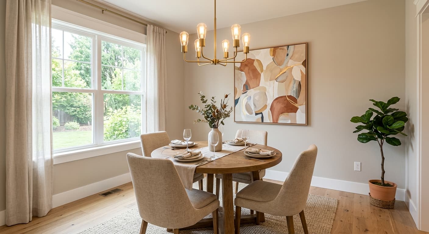
Rhinestone is built for rooms where you want light and calm without using a white so bright it feels aggressive. Living rooms and bedrooms are the most natural fits. In a living room it creates a neutral backdrop that does not compete with furniture, artwork, or textiles, and its light-shifting quality keeps the room from feeling static. In a bedroom the cool-to-neutral behavior reads as restful rather than sterile.
For whole-house use, Rhinestone earns its reputation. Because it moves between cool and warm depending on light, it tends to read consistently across rooms with different orientations rather than looking like a completely different color from one end of the house to the other. That flexibility is unusual at this LRV and explains why reviewers recommend it for large, open floor plans where paint needs to work across multiple light zones.
Orientation matters here more than with a pure warm neutral. South and west-facing rooms with strong, warm afternoon light will bring out the softer, faintly warm side of this color. North and east-facing rooms will lean into the cool blue quality more consistently. Either result can be exactly right depending on the mood you want, but it is worth knowing which side of the color you are likely to live with most of the time. For exteriors, the color works in shaded or moderate-light settings where the cool, soft quality reads as refined rather than washed out.
Rhinestone's LRV of 74.4 keeps a living room feeling open without the harshness of a bright white. Its light-shifting quality means it stays interesting across morning and evening light rather than reading as a flat, one-note backdrop. Pair it with warm wood floors and natural textiles and both the warm and cool sides of the color have something to respond to.
In a bedroom, the cool-leaning quality of Rhinestone reads as calm and restful, which is exactly what most people want from a sleep space. Under warm bedside lighting it softens enough to feel inviting rather than chilly. It works especially well in rooms with moderate to good natural light, where the LRV 74.4 brightness prevents it from feeling dim.
Reviewers consistently flag Rhinestone as one of the stronger choices for a whole-house color because it holds up across different room orientations without looking like a completely different color in each one. The cool-to-warm shift that happens with changing light actually helps it stay cohesive from room to room. Trim in Extra White (SW 7006) gives you clean definition throughout.
A north or east-facing home office will show Rhinestone's cooler, crisper side, which many people find focused and clear without being cold. The high LRV keeps the room bright even with limited natural light, reducing eye fatigue during long work sessions. Avoid pairing it with very warm yellow-toned wood furniture in this setting, since the contrast between the cool wall and warm furniture can feel slightly off.
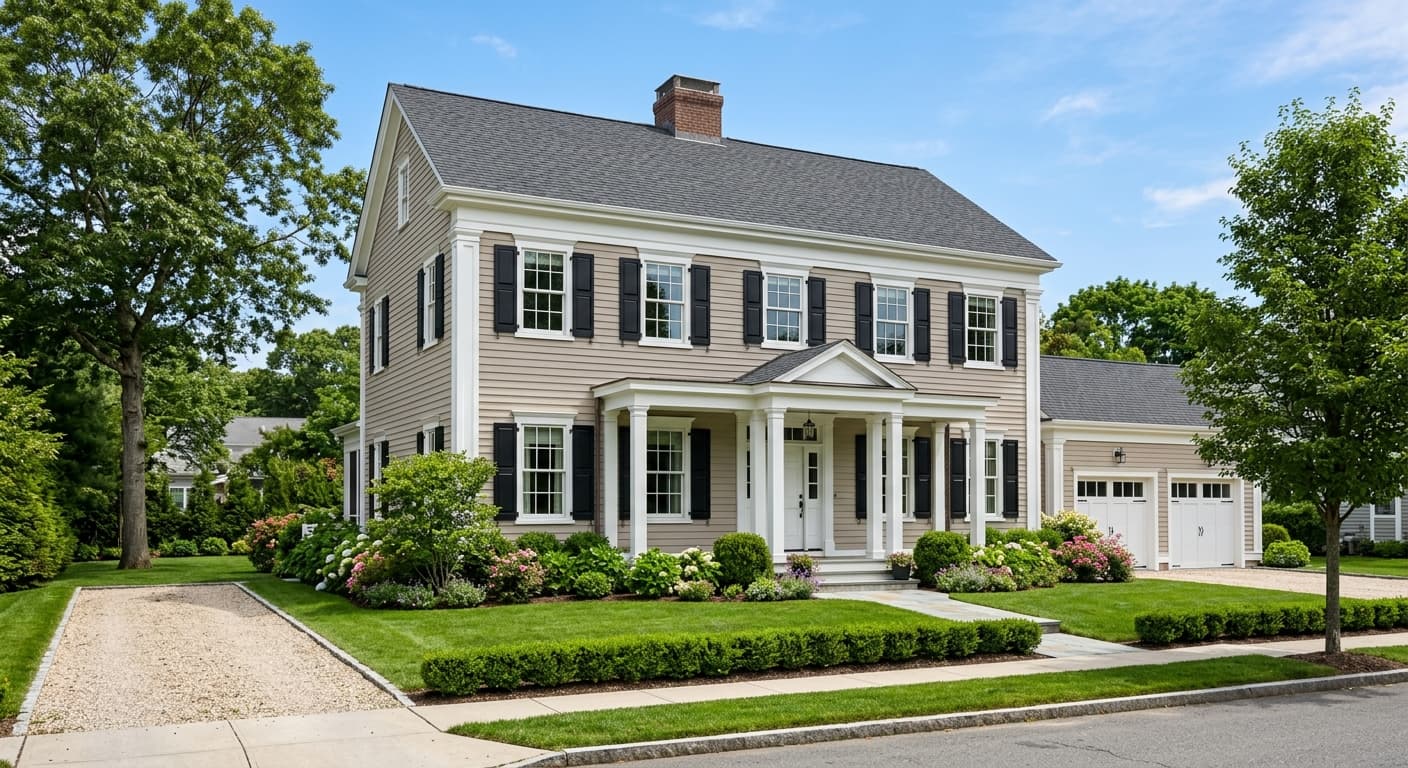
On an exterior, Rhinestone reads as a soft, refined pale gray-white that avoids the starkness of a true white while still feeling clean. It suits shaded elevations and moderate-light settings best. In full, intense sun it can lean cooler and slightly flatter, so consider how much direct light your facade gets before committing.
Rhinestone coordinates naturally with Extra White (SW 7006), March Wind (SW 7668), and Daphne (SW 9151). Extra White works well as a trim companion, sharp enough to give a clean edge without going so stark that it fights the softness of Rhinestone on the walls. March Wind, a deeper cool gray, gives you a logical stepping-stone if you want to create depth between a main color and an accent without jumping into a completely different palette.
Daphne brings a soft muted blue-green into the mix, which complements the cool undertone that reviewers often detect in Rhinestone. Because Rhinestone pairs with both warm wood tones and cooler metals equally well, you have a wide lane when it comes to hardware, furniture, and textiles. Warm brass, brushed nickel, natural oak, and painted white cabinetry all work alongside it without requiring you to pick a side.
All comparisons are matched against Rhinestone at LRV 74.4.
When Rhinestone's cool blue undertone is active, placing it next to a warm yellow or golden wall in an open floor plan creates a visible tension. The two undertones read as mismatched rather than complementary, making both colors look slightly off.
Pairing Rhinestone with a deep, saturated cool blue-gray accent wall can leave Rhinestone looking washed out and colorless rather than refined. The contrast between the saturated accent and the very light Rhinestone is too stark.
In a north-facing room where Rhinestone already leans cool, using very warm incandescent bulbs creates an odd push-pull where the light fights the wall color rather than complementing it. The result can look muddier than either effect alone.
Rhinestone is a very light, soft off-white that reads on the wall as a pale gray-white. It sits right at the boundary between white and light gray, with an LRV of 74.4, so it feels bright and open without looking stark. Its hex is #DEE0DE and its RGB values are 222, 224, 222.
This is genuinely contested. The color data reads it as a warm, light neutral. Most independent reviewers describe a cool, blue-leaning undertone, and some note a faint green quality under certain light. In practice, both are accurate depending on conditions: stronger natural light brings out the cool blue, while warm artificial light shifts it toward a faint pale warmth. Sample large before committing.
It behaves as both, depending on your light. The official classification says warm and neutral, but real-world use shows the cool side more often, particularly in rooms with natural light. In warm evening lighting it softens toward a faint neutral warmth. If you need a color that firmly stays warm or firmly stays cool, Rhinestone's flexibility can work against you.
The LRV is 74.4, which places it in the bright end of the light neutral range. It reflects a large amount of light and will keep most rooms feeling open and airy, though it is not so high that it reads as a stark or clinical white.
Sherwin-Williams coordinates it with Extra White (SW 7006) for trim, March Wind (SW 7668) as a deeper cool gray companion, and Daphne (SW 9151) for a soft muted blue-green accent. Because Rhinestone works with both warm wood tones and cooler metals, your options for furniture and hardware are wide.
The Sherwin-Williams code is SW 7656. The hex is #DEE0DE and the RGB is 222 red, 224 green, 222 blue.
It is available in both interior and exterior formulas. On exteriors it reads as a soft, refined pale gray-white that suits shaded or moderate-light settings best. Full, intense sun can flatten it and emphasize the cool side more strongly. For cabinets, the light, neutral quality works well in kitchens where you want a soft non-white option that pairs with both warm and cool countertop materials.
