Rock Candy reads as a very light, cool off-white on the wall, sitting right at an LRV of 74.6, which puts it firmly in bright territory without tipping into stark, clinical white. The color has enough pigment to feel intentional and grounded, yet it never crowds a room. It is soft, fresh, and calming in a way that a pure white simply cannot achieve.
The real story with Rock Candy is how much it moves. Reviewers consistently flag its morphing behavior as the most important thing to understand before committing. In the same house it can look like a barely-there off-white in one room and a clear, delicate gray-blue in another. That is not a flaw; it is what makes the color so livable and interesting. The shift feels atmospheric rather than indecisive, giving a space a quality of light that changes through the day.
The dominant undertone is blue, and that is where most reviewers agree. The blue reads soft and restrained rather than vivid, which is why the color stays in the white family rather than crossing into a pastel. It takes the sharpness out of a bright white and replaces it with a cool, settled calm. In direct, warm light the blue quiets down significantly and the color can read almost as a clean neutral off-white.
The disagreement in the research is about whether a gray component or a green component also lives in this color. Many reviewers describe it primarily as a blue-gray, leaning more on the gray side in certain rooms. Others, particularly those testing it in older homes with warm incandescent lighting, have noted a faint green cast that surprised them. That green read is not the dominant experience, but it is real enough that it shows up in independent testing often enough to mention. It is most likely to surface in rooms with warm ambient light or against warm wood tones, where the cool undertone of the paint reacts against the warmth around it.
Orientation makes the undertone story much more dramatic. In north-facing rooms with no direct sun, the blue-gray character deepens noticeably and the color reads clearly as a cool tinted white rather than a neutral. In bright south-facing rooms, ample light washes the undertone back and the color lands closer to a simple, airy off-white. Because of that range, paint large samples on at least two different walls and look at them at multiple times of day before deciding.
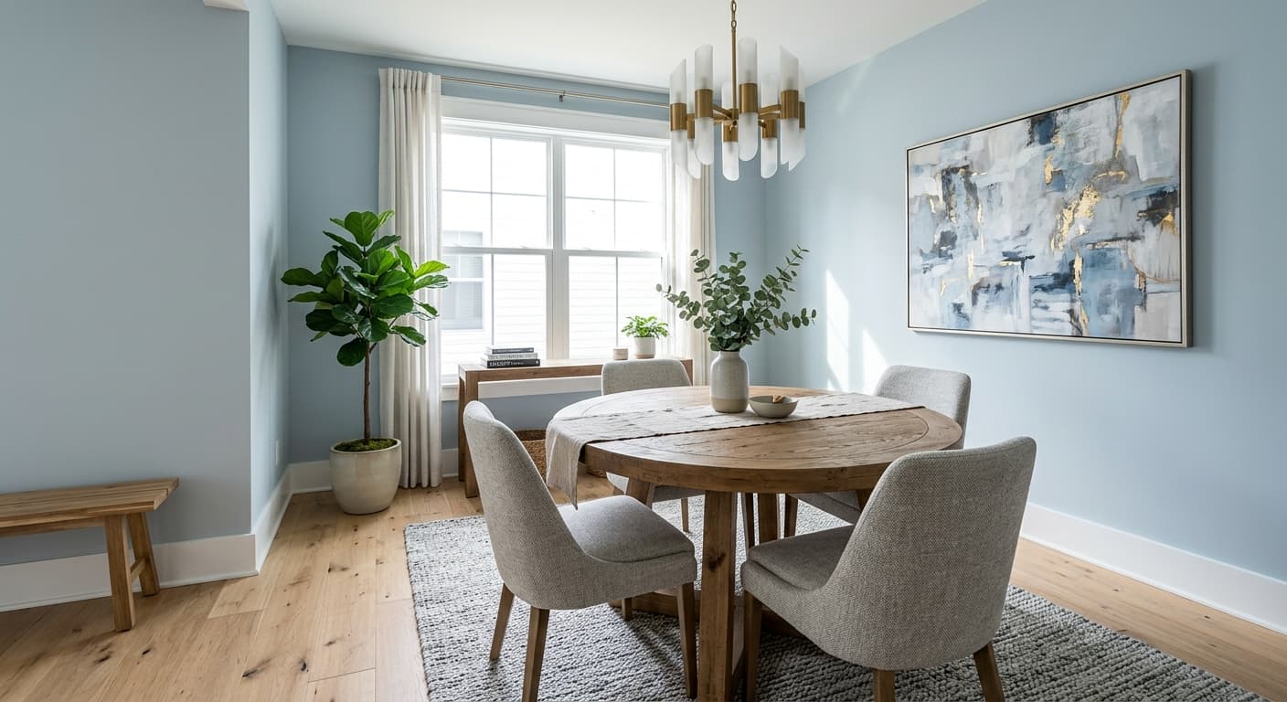
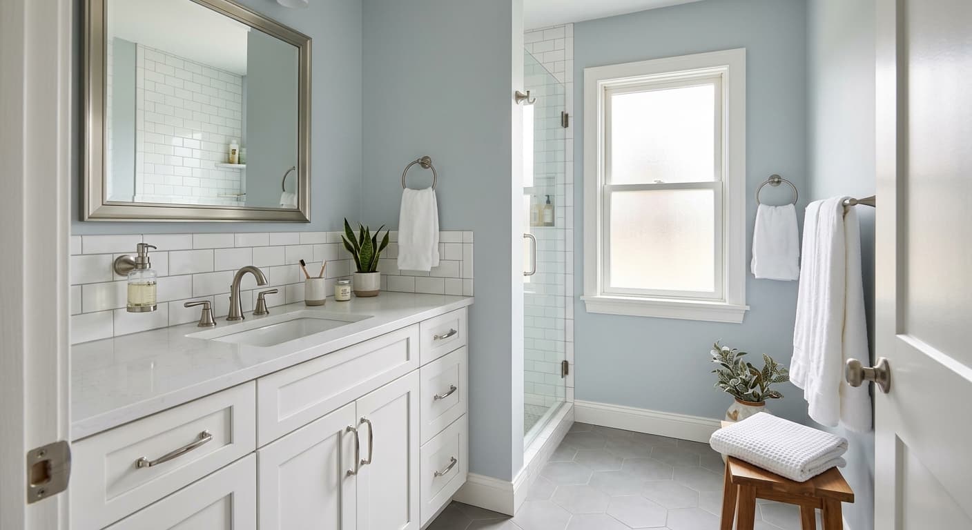
Rock Candy is built for spaces where you want calm and lightness without the harshness of a stark white. Bedrooms, bathrooms, and nurseries are where it earns its strongest reviews, and that tracks with its LRV of 74.6 and its cool, restful character. In a bedroom it creates a serene backdrop that supports sleep without making the room feel cold or institutional. In a bathroom, particularly one with white tile and chrome or brushed nickel fixtures, it reinforces a clean, spa-like freshness.
For nurseries it works especially well because the soft blue undertone is gender-neutral and easy on the eyes, and the high LRV keeps the room feeling open even with a small footprint. Reviewers also use it heavily in minimalist, Scandinavian, and coastal interiors, where its airy quality reads as intentional and refined rather than underdone. It suits contemporary spaces that lean into a quiet, pared-back palette.
Light direction is the single biggest variable to account for when planning where to use Rock Candy. North-facing rooms will show you the gray-blue version of this color most of the time, which can feel moody and cool in a way you either love or want to avoid. South-facing rooms will give you the lighter, airier read. East and west-facing rooms will cycle between the two through the day. Any of those situations can work beautifully, but you need to know which version of the color you are getting in your specific space before you commit.
Rock Candy's cool, restful blue undertone makes it a natural fit for a bedroom where the goal is calm. The LRV of 74.6 keeps the space bright and open without morning glare. Pair it with warm linen bedding and natural wood furniture to balance the coolness and keep the room from feeling remote.
In a bathroom with white tile and chrome or brushed nickel fixtures, Rock Candy reinforces a clean, fresh atmosphere. The soft blue undertone reads especially well against crisp white grout and cool-toned stone. Keep trim in Pure White (SW 7005) for a tight, cohesive finish.
The color's gentle blue-gray character is calm and gender-neutral, which is exactly what makes it work so well in a nursery. At LRV 74.6 it keeps a small room feeling open and light throughout the day. Soft textiles in sage, blush, or warm white complement it without fighting the undertone.
In a well-lit home office Rock Candy provides a focused, non-distracting backdrop that feels professional and settled. South or east-facing rooms will give you the lighter, more neutral read, which helps reduce eye fatigue on screens. Add dark-stained shelving or black metal accents to keep it from feeling too soft.
Rock Candy can carry an open-plan living and dining area in a coastal or Scandinavian-inspired home, where its airy quality feels deliberate rather than washed out. The morphing behavior means the color will shift subtly from the bright kitchen end to the shadowed dining end, which adds visual depth naturally. Ground it with In the Navy (SW 9178) on an accent wall or in furnishings to prevent the overall palette from floating.
Rock Candy layers best with colors that either reinforce its cool, airy quality or provide enough contrast to anchor it. Pure White (SW 7005) is the natural trim partner, a slightly warmer clean white that keeps ceilings and woodwork crisp without competing with Rock Candy's cool tone. The contrast is subtle but it keeps the color from feeling flat. In the Navy (SW 9178) works as a deep accent, on a single wall, in built-ins, or in soft furnishings, and the pairing is striking because the navy draws out the blue undertone in Rock Candy and makes the whole room feel cohesive rather than accidental.
Beyond the official coordinating palette, Rock Candy plays well with dark grays, black ironwork or hardware, sage green textiles, soft mauve, and rust or terracotta accents. Those warmer accent tones work because they contrast with the cool base rather than competing on the same temperature, which keeps the room from reading monochromatic. Crisp white and natural linen are the safe, reliable supporting players if you want the color to carry the mood quietly on its own.
All comparisons are matched against Rock Candy at LRV 74.6.
Rock Candy's cool blue undertone reacts against warm yellow-toned wood, flooring, or cabinetry, and the two temperatures fight each other rather than creating contrast. The paint can start to read greenish or murky rather than clean and cool.
Rock Candy is quiet and low-key at LRV 74.6, and a heavily saturated accent color, think primary red, vivid orange, or bright yellow, will overpower it and make the wall color disappear rather than serve as a backdrop.
Under warm incandescent bulbs the cool blue undertone in Rock Candy can shift toward a subtle greenish cast, which surprises many reviewers who tested the color under natural light only. The result can feel dingy rather than crisp.
Rock Candy (SW 6231) is a very light cool off-white with soft blue undertones. It sits at an LRV of 74.6, which puts it on the brighter end of the off-white family. In strong light it reads as a clean, airy white; in lower light or north-facing rooms it shifts toward a soft gray-blue. It never looks stark or cold, but it is clearly a cool-toned color rather than a warm or neutral one.
The primary undertone is blue, soft and restrained rather than vivid. Most reviewers also describe a gray component that appears in lower-light rooms, and a smaller number have noted a faint green cast when the color is viewed under warm incandescent lighting or against warm wood tones. The blue-gray read is by far the most common experience. Orientation and light source both affect which undertone surfaces, so testing large samples in your specific room is essential.
Rock Candy is a cool color. The blue undertone is consistent across most lighting conditions, and it sits on the cool side of the off-white family. It does not have the warmth of a cream or ivory white. That said, in very bright south-facing light the coolness softens considerably and the color can approach a near-neutral read, but it never crosses into warm territory.
Rock Candy has a precise LRV of 74.6. That places it firmly in the light range, bright enough to open up small rooms and work well in spaces with limited natural light, but with enough pigment to read as intentional rather than washed out. For reference, most true whites land above 85 LRV, so Rock Candy has real presence despite its lightness.
The Sherwin-Williams color code is SW 6231. The hex value is #DEE1DF and the RGB breakdown is 222 red, 225 green, 223 blue. The close balance across those RGB values explains why the color reads as a near-neutral, with the slight edge in the green and blue channels producing the cool, subtle undertone.
Rock Candy pairs well with Pure White (SW 7005) for trim and ceilings, and In the Navy (SW 9178) as a deep accent that draws out the blue undertone. Beyond those coordinating options, dark grays, black hardware or ironwork, sage green textiles, soft mauve, and muted rust or terracotta all work well because they provide contrast without fighting the cool base. Avoid warm yellow or heavily saturated bright colors, which tend to overpower or visually muddy the color.
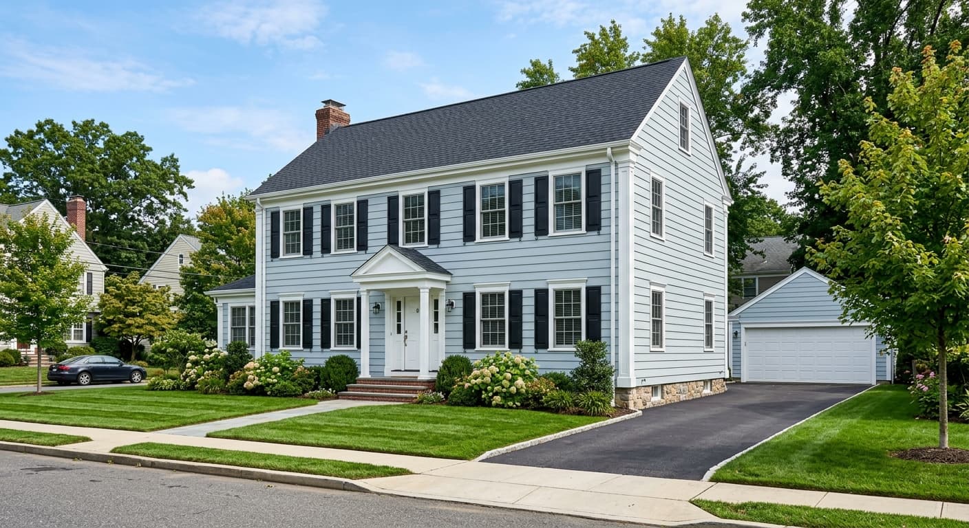
Rock Candy is available in both interior and exterior formulations, so it is a viable exterior option. On exteriors the cool undertone reads quietly and suits coastal, contemporary, or Scandinavian-style homes well. On a front door the very light value may feel understated since front doors tend to benefit from more contrast with the siding; something in the Rock Candy coordinating palette like In the Navy (SW 9178) would make a bolder statement there. For cabinets, Rock Candy can work in a bathroom or laundry room where a light, cool neutral is the goal, but in a kitchen the very light value may require careful lighting to avoid reading flat under task lighting.
