March Wind lands somewhere between light and medium gray on the wall. Its LRV of 48.7 puts it in the middle of the brightness scale, so it reads with real presence without going dark, and it holds enough light to keep a room feeling open. At a glance it looks like a composed, clean gray, the kind that feels calm rather than cold.
In practice, the color carries more quiet complexity than a flat gray. Depending on the light and the hour, it can read as a crisp blue-gray or soften into something slightly warmer and more layered. That subtlety is exactly what makes it appealing: it avoids the harsh, sterile quality that simpler cool grays sometimes carry. Reviewers consistently describe it as airy and serene, which tracks with how it behaves at its LRV.
This is where March Wind gets genuinely interesting, and where you need to sample it before committing. Many people read a soft blue undertone, which is the most common description and aligns with how it presents in cool, north-facing light. That blue reads as fresh and quiet rather than pronounced or icy.
Others pull something more complex out of it. Some reviewers identify a whisper of purple underneath the gray, and a smaller contingent also spots a pale yellow base note. Those two readings are not contradictory: a subtle yellow can actually keep a purple-gray from feeling cold, which may be why March Wind reads softer and less sharp than straightforward cool grays. What all of this means practically is that the color can shift from clean blue-gray in cooler or north light to something with a slightly purple or warmer cast in incandescent or south-facing conditions.
The disagreement among reviewers is real and worth taking seriously. Sample March Wind on the actual wall in your actual lighting. Look at it in the morning and again at night under your bulbs. The shift is part of its character, not a defect, but you want to know which direction it leans in your specific room before you commit.
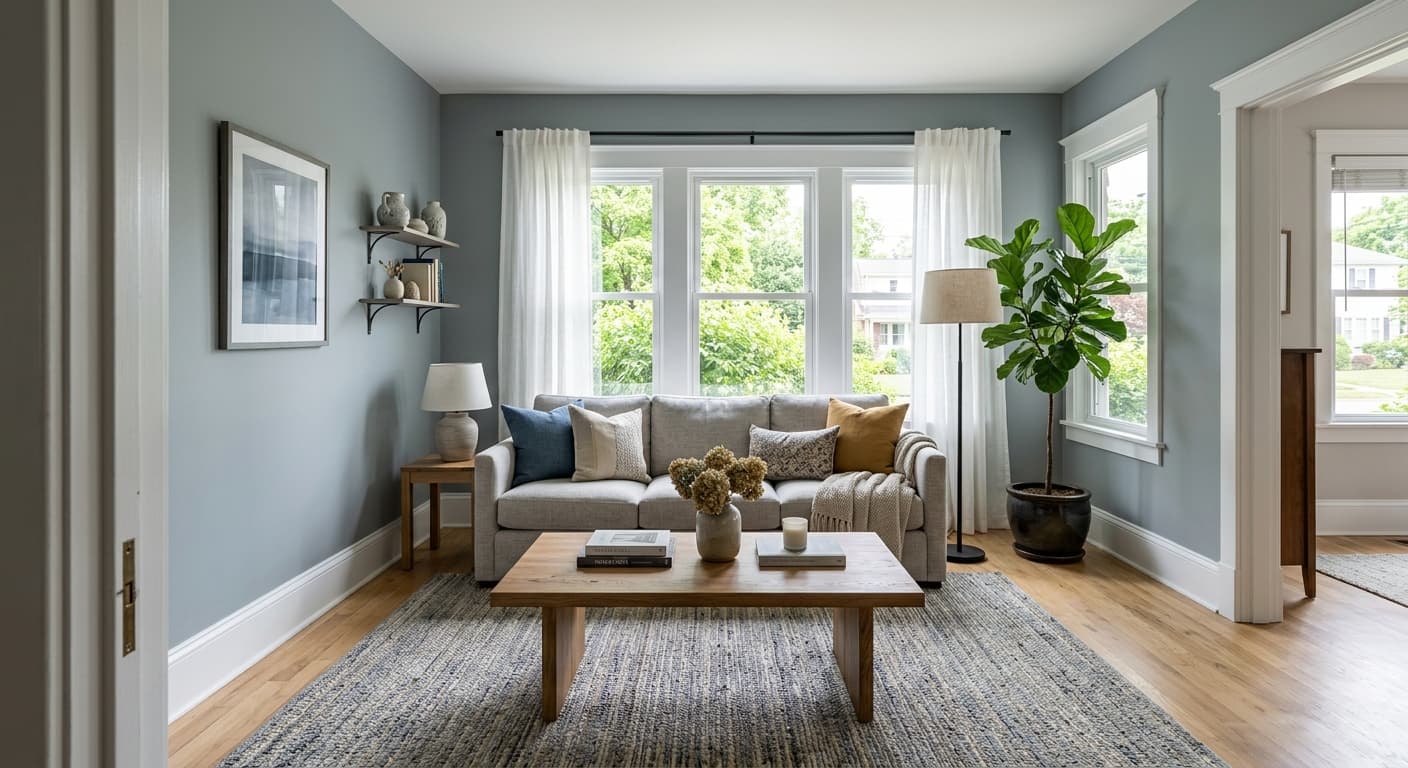
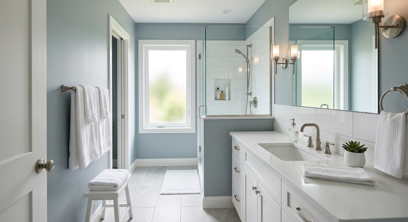
March Wind fits naturally into bedrooms, bathrooms, and living rooms. In a bedroom it contributes to the calm, restful atmosphere most people want, and its mid-range LRV of 48.7 keeps the space from feeling dim. In a bathroom it pairs well with white tile and chrome or brushed nickel fixtures, and the cool blue read reinforces a clean, fresh feeling. In a living room it works as a sophisticated neutral background that does not compete with furniture or art.

Light direction matters with this color. In north-facing rooms the cool undertone will be more pronounced, leaning firmly blue-gray. South and west light will warm it slightly and can coax out the subtle purple notes some reviewers describe. East-facing rooms get the truest read on the color in morning hours. Any of these can work, but knowing the orientation helps you predict which version of March Wind you will be living with most of the day.
Beyond the three primary room types, March Wind suits contemporary and minimalist spaces that want a clean neutral without white, and it also works in classic or traditional rooms where a soft gray with some depth is more interesting than a flat beige. It is available for exterior use as well, where its balanced LRV holds well on siding and carries the cool airy quality into curb appeal.
March Wind is consistently recommended for bedrooms, and the reason is straightforward: the cool gray with its soft blue undertone reads as calm and restful without feeling cold or clinical. At LRV 48.7 it is bright enough to avoid making a bedroom feel cave-like. Pair it with Alabaster on trim and warm wood nightstands to keep the room from going too cool.
In a bathroom the cool, airy quality of March Wind works in its favor, reinforcing the clean and fresh atmosphere most people want in the space. White tile, chrome, and brushed nickel all coordinate naturally. Because bathrooms often have limited natural light, test a large sample under your actual fixture type to confirm whether the blue or the warmer purple note dominates.
As a living room neutral, March Wind provides a calm backdrop that does not compete with furniture, textiles, or art. Its mid-range LRV of 48.7 gives the walls enough color to read as intentional rather than default. Extra White on the trim keeps the contrast clean, and deeper accent pillows or a charcoal rug give the room a grounding note.
March Wind pairs most cleanly with crisp, cool-leaning whites for trim and ceilings. Extra White (SW 7006) is the sharpest option and keeps the whole scheme feeling fresh and contemporary. If that contrast reads too stark for the space, Alabaster (SW 7008) brings a warm creaminess that softens the edge between trim and wall without muddying the gray.
For accent and depth, Dried Lavender (SW 9072) is a natural companion, picking up the purple undertone that some reviewers detect in March Wind and pulling that note into the open. Beyond those coordinates, March Wind plays well with natural wood tones, matte black hardware, and deeper charcoal accents that give it a grounding point without overwhelming its quieter character.
All comparisons are matched against March Wind at LRV 48.7.
Strong orange or yellow undertones in wood flooring, cabinetry, or furniture can pull hard against March Wind's cool blue-gray, making both elements look off rather than complementary.
Deep terracotta or rust tones sit on the opposite side of the color wheel from March Wind's cool blue-gray read, and the pairing can feel jarring rather than intentional.
A trim white that leans warm or creamy-yellow can make March Wind read more purple or lavender by contrast, amplifying the undertone in a way that surprises some homeowners.
March Wind is a soft, light-to-medium gray with an LRV of 48.7. It reads as a calm, airy neutral on the wall, with enough depth to feel intentional but not so dark that it weighs a room down.
Most people see a soft blue undertone, which gives it a fresh, serene quality. A meaningful number of reviewers also detect a whisper of purple, and some identify a pale yellow base note underneath the gray. Those readings are not mutually exclusive: a subtle yellow can soften what would otherwise be a stark cool gray. Because the color can shift depending on light, sample it in your room before committing.
March Wind is a cool gray. Sherwin-Williams places it in the Warms and Neutrals family, but independent reviews consistently read it as cool, driven by the blue and potential purple undertones. It is not icy or harsh, but it is not a warm or greige gray.
The precise LRV is 48.7, which puts it in the middle of the brightness range. It is bright enough to keep a room from feeling dim, but it carries enough color to read as a real gray rather than a near-white.
The Sherwin-Williams color code is SW 7668. The hex value is #BAB9B6, and the RGB is 186, 185, 182.
For trim and ceilings, Extra White (SW 7006) gives a crisp, clean contrast and Alabaster (SW 7008) offers a warmer, softer option. Dried Lavender (SW 9072) works as a deeper accent that picks up the color's purple undertone. In general, cool whites, gray-toned woods, matte black hardware, and charcoal accents all coordinate well.
Yes, March Wind is available in both interior and exterior formulations. On exteriors it holds its calm, cool gray character well on siding. For cabinets, its mid-range LRV of 48.7 gives enough color presence to read clearly without going too dark. On a front door it works best paired with crisp white trim to keep the cool gray looking sharp rather than somber.
