Gray Clouds lands squarely in light-to-medium gray territory, the kind that reads as a genuine gray rather than a near-white or a brooding slate. At LRV 47.3 it reflects close to half the light that pure white does, which means it brings real color to a room without going dark or oppressive. You get a calm, mist-like quality, something that earns the name without being theatrical about it.
In strong natural light the color reads clean and airy, staying lighter and more open than you might expect from a mid-range LRV. As light drops, whether at dusk or in a lamp-lit room at night, it deepens slightly and takes on more weight. It never tips into charcoal territory, but it does shift, and that shift is part of what makes it interesting. Rooms with it feel settled rather than bare.
On large wall expanses the color holds together well. It is not flat or chalky. The subtle movement in the undertone gives it a bit of visual life, and reviewers consistently describe it as welcoming rather than cold, even though the undertone family is cool. That is the balance this color is working with.
The undertone conversation around Gray Clouds is genuinely split, and it is worth understanding before you commit. Sherwin-Williams' own color system points to a cool cyan cast as the primary undertone driver. Many independent reviewers land somewhere close to that, describing faint blue-green movement rather than a pure blue or a strict gray-on-gray neutrality. That distinction matters: a blue-green undertone keeps the color from reading as icy or stark blue, but it also means it will not behave like a purely neutral gray that disappears into the background.
Some reviewers, however, argue the color reads more balanced than cool, especially in warm artificial light or in south- and west-facing rooms with afternoon sun. In those conditions the blue-green recedes and the color can feel closer to a true neutral medium gray. This is where the disagreement lives. Neither camp is wrong. The undertone is genuinely light and context-dependent, and it does not announce itself the way a strong blue or green gray would.
The practical consequence is that north-facing rooms or spaces with limited natural light will pull that cool undertone forward, making the color feel crisper and potentially chillier than the same paint in a sun-drenched room. If your room runs cool already, plan around that. Sample it on multiple walls and watch it across morning, midday, and evening light before deciding. The research is consistent on this point: lighting is the variable that settles the undertone debate in your specific space.
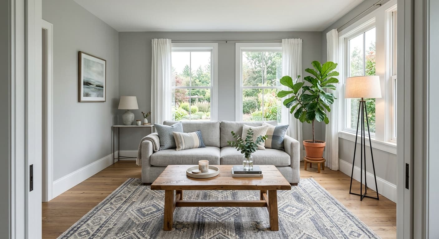
Gray Clouds suits living rooms, bedrooms, and bathrooms particularly well. In living rooms it brings a restful, composed quality without the flatness of a white or the commitment of a deep gray. It works comfortably in both modern and more casual, rustic schemes because the undertone is balanced enough to flex. Pair it with crisp trim and you get a clean contemporary look. Leave it with natural wood and you get something warmer and more relaxed.
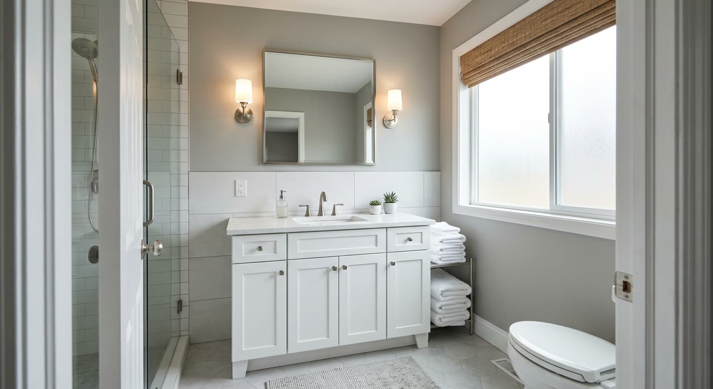
In bedrooms the LRV of 47.3 keeps the space from feeling cavelike while still providing the visual weight that makes a room feel cozy and enclosed rather than unfinished. Reviewers frequently note it as calming, which tracks for a sleep space. Bathrooms benefit from its ability to stay light without going stark white, and the cool undertone can complement tile and fixtures without fighting them.
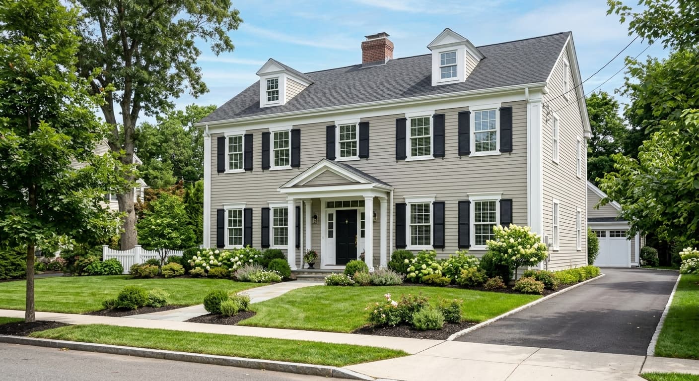
Orientation matters significantly here. South- and west-facing rooms give this color its best version: the warmer ambient light softens the cool undertone and the color reads balanced and easy. North-facing rooms will sharpen the coolness, which can be a feature if you want a crisper, more contemporary feel, but may feel stark if the room already lacks warmth. East-facing spaces land somewhere in between, reading well in morning light and shifting slightly at dusk. It works on exteriors too, where it reads as a composed, understated gray that holds up well against white trim and dark accents.
Gray Clouds gives a living room a calm, composed backdrop that reads neutral without disappearing. At LRV 47.3 there is enough depth to feel intentional, but not so much that the room feels heavy. It works with a wide range of furniture tones, from warm wood to cool metal and upholstery.
The restful, mist-like quality of Gray Clouds makes it a reliable bedroom choice. It provides visual weight without making the space feel dim, and the cool undertone leans calming rather than energizing. Pair with warm bedding and natural wood tones to keep the room from reading too cool.
In a bathroom, Gray Clouds stays light enough to feel clean and open without defaulting to white. It complements most tile colors, especially whites, soft blues, and warm creams. The cool undertone can harmonize well with chrome and brushed nickel fixtures.
On an exterior Gray Clouds reads as a composed, understated light gray that holds its value well in daylight. It pairs cleanly with bright white trim and dark charcoal or black accents. The cool undertone reads cleanly outdoors without shifting green or muddy the way some warmer grays can.
For a home office, the balanced cool neutrality of Gray Clouds keeps the space feeling focused and uncluttered. It does not compete visually with screens or artwork on the walls. Watch the orientation: north-facing offices will read crisper and cooler, which some find sharp and productive, others find chilly.
Gray Clouds coordinates naturally with Eider White (SW 7014), a soft warm white that keeps the pairing from feeling clinical. The slight warmth in Eider White plays against the cool undertone in Gray Clouds in a way that feels balanced rather than contrasting. Use it on trim, ceilings, or adjacent walls and the two colors settle into each other without either one dominating.
For more depth and contrast, the coordinating palette also includes Soulful Blue (SW 6543) and Truepenny (SW 6355). A deeper blue-toned accent brings out the cool blue-green undertone in Gray Clouds and anchors a contemporary scheme, while a warm mid-tone like Truepenny provides grounding contrast that keeps the overall palette from reading cold. Beyond the coordinating list, Gray Clouds plays well with warm beiges and creamy off-whites for a softer, layered look, and pairs cleanly with deep charcoal for bold contrast in more modern rooms.
All comparisons are matched against Gray Clouds at LRV 47.3.
Warm yellow-based woods, golden brass fixtures, or honey-toned flooring can pull the cool blue-green undertone in Gray Clouds forward sharply, making the wall color read colder and the warm materials look clashing rather than complementary.
If adjacent rooms or furnishings carry grays with pink or violet undertones, those will read noticeably warmer next to Gray Clouds, making the cool blue-green undertone seem more pronounced than it is on its own.
In a north-facing room already receiving cool, indirect daylight, combined with cool-spectrum LED or fluorescent lighting, the undertone in Gray Clouds can intensify enough that the color reads closer to a muted blue-gray than a balanced neutral.
Gray Clouds is a soft light-to-medium neutral gray with an LRV of 47.3. It reads as a genuine, mist-like gray on the wall rather than a near-white or a deep slate, with subtle cool undertones that give it quiet visual interest without pushing hard toward blue or green.
The undertones are the subject of real debate among reviewers. Sherwin-Williams points to a cool cyan cast, while many independent reviewers describe faint blue-green movement. In warm light or south-facing rooms the color can read as a fairly balanced neutral gray. In north-facing or low-light rooms the cool undertone becomes more apparent. Neither read is wrong: the undertone is light and context-sensitive, which is why sampling in your specific room and lighting is important.
Gray Clouds sits on the cool side of neutral. Its undertone family is cool, with faint blue-green movement, but it is balanced enough that it does not read as a stark or icy blue-gray. Warm ambient light and south or west-facing orientations can bring it very close to a true neutral, while cool or indirect light will pull the cool undertone forward more noticeably.
The LRV of Gray Clouds SW 7658 is 47.3. That places it in light-to-medium territory, reflecting close to half the light of pure white. It is bright enough to keep a room from feeling heavy but has enough depth to read as a deliberate color choice rather than a near-white.
Gray Clouds pairs well with Eider White (SW 7014) for trim and ceilings, which adds a touch of warmth that balances the cool undertone. Soulful Blue (SW 6543) works as a deeper accent that picks up the blue-green undertone in a cohesive way. Truepenny (SW 6355) provides warm mid-tone contrast. Broader pairings include warm beiges, creamy off-whites, and deep charcoals for contemporary contrast.
Gray Clouds is Sherwin-Williams SW 7658. The hex code is #B7B7B2 and the RGB values are 183, 183, 178. The precise LRV is 47.3.
Yes on all three. On exteriors it reads as a composed, understated light gray that holds up well in daylight and pairs cleanly with white trim and dark accents. On a front door it offers a restrained, contemporary gray without being too dark or too light for the scale. On cabinets the LRV of 47.3 provides enough depth to read as a true gray rather than a washed-out neutral, and the cool undertone works well with brushed nickel and chrome hardware.
