Sensible Hue lands in a genuinely interesting middle ground. Its LRV of 46.1 puts it squarely in the mid-tones, bright enough to keep a room from feeling cave-like but deep enough to read as a real color rather than a wispy near-white. On the wall it presents as a soft, muted green-gray, calm and grounded, with enough color presence to register intentionally without dominating the room.
What makes it interesting is how much it moves with the light. In direct daylight and south-facing rooms it tips noticeably toward a muted sage, the green coming forward and the gray receding. Under dimmer conditions, overcast skies, or in north-facing rooms, the gray asserts itself and the green quiets down to the point where some people simply read it as a warm neutral. That chameleon quality is why the research community is split: some reviewers call it a muted earthy green first and a gray second, while others file it firmly as a warm gray that occasionally shows a green lean. Both camps are correct, just looking at different lighting conditions.
In person, the hex value (#B6B5AB) tells part of the story: the red, green, and blue channels sit very close together, which explains the neutral, almost achromatic quality when light is flat. But the slight green lift in the middle channel is what gives it that botanical whisper rather than a straight gray. The overall impression is serene, sophisticated, and easy to live with, never loud, never washed out.
The undertone conversation around Sensible Hue is worth taking seriously because the disagreement is real and not just splitting hairs. Sherwin-Williams places it in the Greens and Sage family, and a meaningful portion of reviewers back that up, describing a gentle earthy green undertone that keeps the color from being a plain gray. These observers note it reads closest to a soft sage when daylight is strong, lending walls a quiet, naturalistic quality.
Others push back on that framing. They see a warm gray as the dominant character, with green showing up only as a secondary lean that surfaces under the right conditions. This is not the same as saying the color has no green; it is more that in many real-world interiors, especially those with warm artificial lighting or limited daylight, the green recedes and the color behaves like a versatile warm-gray neutral. Both of those reads are happening in the same color, and that is the key thing to understand.
The warm descriptor in our editorial read is important here. Sensible Hue does not tip blue or purple the way a cool gray does. Even when the green is not obvious, there is a subtle earthiness that keeps it from feeling clinical. That warm grounding is precisely what makes it approachable and easy to coordinate. Because the undertone balance shifts with light, sampling on an actual wall in your specific space is not optional advice; it is the only way to know which version of this color you are getting.
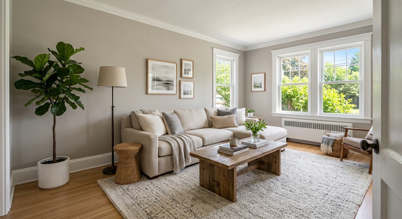
Sensible Hue is a reliable choice for living rooms and main gathering spaces where you want a backdrop that feels considered without demanding attention. The mid-range LRV of 46.1 means it holds up in rooms that get a fair amount of furniture and layering; it does not get lost behind a sectional and a bookcase the way a very light neutral might. South and west-facing rooms, where natural light runs warm and strong, are where the sage character comes through most clearly, giving the space a quietly earthy, organic feeling.
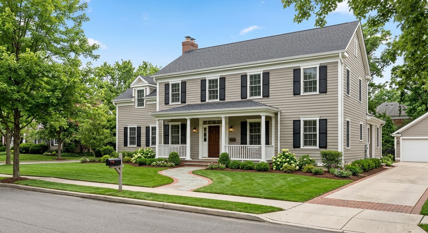
Bedrooms are another natural home for it. The muted, low-contrast quality reads restful, and the warm undertone prevents the walls from feeling cold after the lights go down and you are relying on incandescent or warm-LED sources. North-facing bedrooms, which can make cool colors feel harsh, actually suit Sensible Hue well because the color softens toward a comfortable gray rather than turning icy. Because it is approved for exterior use, it also works as a siding color in schemes where you want a sophisticated, nature-adjacent neutral that is not a straight greige.
The research points to kitchen use as well, particularly when cabinetry runs toward white or natural wood. As a whole-house color it performs because its green-gray balance does not fight with adjacent spaces painted in warm whites or deeper earth tones. Wherever you use it, keep in mind that the 46.1 LRV places it firmly in medium territory: supplemental lighting matters in darker rooms, and oversized or very bright rooms may ask for a slightly deeper version of this palette if you want more presence.
In a living room, the 46.1 LRV gives walls enough weight to anchor furniture without feeling heavy. The color works especially well behind warm wood pieces and earthy textiles, where it reads like a natural extension of those materials. South-facing living rooms will show the sage lean most clearly, which can feel deliberate and calm.
Sensible Hue is a restful bedroom color because the muted, low-saturation palette does not compete with anything you put in front of it. Under warm artificial light the green recedes and the gray warms up, which is a comfortable transition as daylight fades. North-facing bedrooms benefit particularly because the color does not turn cold the way a blue-gray would.
In a kitchen with white or natural wood cabinetry, Sensible Hue on the walls or as a cabinet color provides a soft, nature-adjacent backdrop that does not read as aggressive or trendy. It pairs well with hardware in brushed brass or unlacquered metals, which pull out the warm undertone. Avoid pairing it with stark cool whites on adjacent surfaces, as those will push the undertone toward an awkward grayish-green.
The color is specifically noted by reviewers as a whole-house candidate, largely because it transitions smoothly between different orientations and light conditions. The warm-gray character reads consistent enough to unify connected spaces without every room looking identical. Using Origami White on trim and ceilings throughout keeps the palette cohesive.
On an exterior, Sensible Hue sits in a range of muted green-grays that read natural and unpretentious against landscaping. It works best with white or off-white trim to define the architecture, and the medium LRV of 46.1 means it holds good contrast without going dark. In full sun the sage character is visible and intentional; in overcast light it reads as a thoughtful warm gray.
Sensible Hue coordinates naturally with whites that share its warm, slightly earthy base. Origami White brings a creamy softness that keeps the pairing cohesive rather than stark, making it a practical choice for trim, ceilings, and millwork throughout. Frosty White reads similarly soft and works in spaces where you want a whisper of contrast without the sharp edge a bright white would introduce. Both whites respect the green-gray balance of the walls rather than pulling it cool.
For a deeper anchor or an accent wall situation, Retreat offers a richer green that connects directly to the botanical side of Sensible Hue. The relationship reads intentional because both colors share the same muted, earthy quality; Retreat simply turns up the volume. Beyond the official coordinates, Sensible Hue plays well with warm wood tones, natural linen, terracotta, and soft ochre accents, materials and colors that reinforce the grounded, organic character the color already suggests.
All comparisons are matched against Sensible Hue at LRV 46.1.
Pairing Sensible Hue with a bright, blue-leaning white on trim or ceilings pulls the wall color toward an unflattering grayish-green. The warm undertone in Sensible Hue conflicts with cool whites rather than being softened by them.
Polished chrome or cool-toned silver hardware can make the warm earthiness in Sensible Hue look muddy by contrast, emphasizing the gray without flattering the green.
Because Sensible Hue sits at a mid-range LRV of 46.1 and carries low saturation, strongly saturated accent colors in adjacent spaces or on furniture can overpower it and make the walls look washed out or colorless by comparison.
Sensible Hue SW 6198 is a soft, muted green-gray in the mid-tone range. It sits between a warm gray and a quiet sage, shifting toward one or the other depending on the light in your room. Its hex is #B6B5AB and its RGB is 182, 181, 171.
The undertone picture is genuinely mixed. Sherwin-Williams places it in the Greens and Sage family, and in strong daylight the earthy green lean is visible. But many reviewers experience it primarily as a warm gray that occasionally shows a green undertone, especially under dimmer or warmer artificial light. There is no purple, blue, or pink in it; the warmth is always present even when the green is not.
It reads warm overall. Even in situations where the green recedes and the color behaves more like a gray, the cool or blue quality that defines a truly cool gray is absent. The warmth is subtle but consistent, which is a large part of why it is easy to live with and coordinate.
The LRV is 46.1, putting it squarely in the mid-tone range. It is not light enough to read as a near-white or airy neutral, and not dark enough to feel moody. In practical terms, it holds its own against furniture and layered decor while still functioning as a background color rather than a statement.
The Sherwin-Williams code is SW 6198. The hex is #B6B5AB and the RGB is 182, 181, 171.
It is in Sherwin-Williams's Greens and Sage family, and in good daylight the sage quality is real and visible. But it carries enough gray influence that calling it a sage green outright oversimplifies it. Think of it as a green-gray that leans sage rather than a true sage that leans gray. If you want a color that reads unambiguously sage in most lighting conditions, Oyster Bay (SW 6206) or Soft Sage (SW 9647) will be more consistent.
Yes on exteriors. It is approved for both interior and exterior use, and the muted green-gray reads natural and composed on siding. For cabinets it works as a soft, understated option, particularly in kitchens with warm wood or white elements. As a front door color it is subtle rather than bold, so if you want a door that makes a clear statement this may read too quiet; if you want a refined, nature-adjacent look it is a solid choice.
