
MorningCooler · reads its most neutral
A soft warm off-white with a taupe base, sitting between a true white and a warm greige without committing to either. Sample it in your own light before you decide.
Origami White lands squarely in off-white territory with an LRV of 76, well below the 81 to 82 threshold where true whites begin. On the wall it reads as a soft, muted, warm off-white that stays quiet and low-drama. It never jumps out at you, which is exactly the point. Think of it as a white that has been gently warmed with a whisper of taupe or cream, then pulled back just enough to stay refined rather than cozy.
What makes it interesting is how much it shifts with light. In south- or west-facing rooms it warms up and edges toward a soft cream. In north-facing rooms it becomes more neutral and slightly gray, which can actually read as more sophisticated than warm in cooler light. That range is forgiving in an open floor plan or a whole-home application because the color never swings to an extreme in either direction. It holds together across rooms without feeling mismatched.
Because the color is so muted, it can appear almost monochromatic without a contrast partner. A deeper accent wall, dark trim, or warm wood furniture helps reveal its character and prevents it from disappearing into the background. On its own it is very serene, bordering on tonally flat, which some homeowners love and others find underwhelming until they add furnishings.
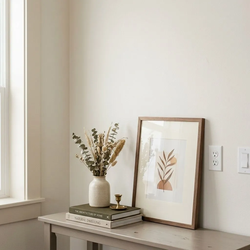
This is where Origami White gets genuinely interesting and a little contentious. Sherwin-Williams markets it as a delicate white with cool violet undertones. Most independent reviewers push back on that read. The majority describe it as warm, built on a soft taupe-cream or warm greige base rather than anything violet or cool. It does not go buttery or golden the way a more saturated warm white can, but it is not cool either. The warm base is subtle but consistent.
That said, a faint violet or pink cast does appear in certain lighting conditions, and reviewers who notice it say it functions as a quiet cooling agent. It prevents the color from yellowing in warm light while stopping it short of any blue or green shift. So there is a real undertone debate here: is this a warm white with a violet modifier, or a warm greige with a barely-there pink edge? The honest answer is that both reads are defensible depending on your light source, your wall orientation, and what colors surround it. Do not flatten this into one story before you sample it.
What almost everyone agrees on is that it never reads green or blue, and it does not shift into mustard or butter territory. The warmth is restrained. Next to a stark bright white it can look faintly dingy or gray, which tells you the warm-neutral base is real even if the violet cast is subtle. Sample it alongside your trim color before you commit, because its true undertone character only becomes clear in context.
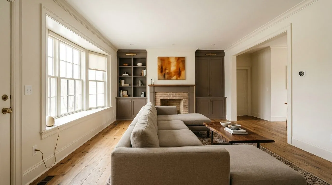
Origami White works across a wide range of rooms and orientations, which explains its spot on multiple Sherwin-Williams bestseller lists. Living rooms and bedrooms are the strongest fit. It creates a calm, collected backdrop that recedes rather than competes, and it holds up well under both natural and artificial light. In bedrooms it reads restful. In living rooms it gives you enough warmth to feel livable without the color becoming a statement.
Kitchens are listed as a core use, and it works well on kitchen walls and even cabinetry, though reviewers note that as a cabinet color it is quite muted. It will not give you a crisp, clean look the way a brighter white would, and it may lack the depth to be a standalone statement on full-height cabinets unless your hardware and countertops carry the contrast. For kitchen walls paired with white or wood cabinetry it performs well. Dining rooms, bathrooms, and home offices also come up repeatedly in independent reviews as good fits, largely because the color does not fatigue the eye over long periods.
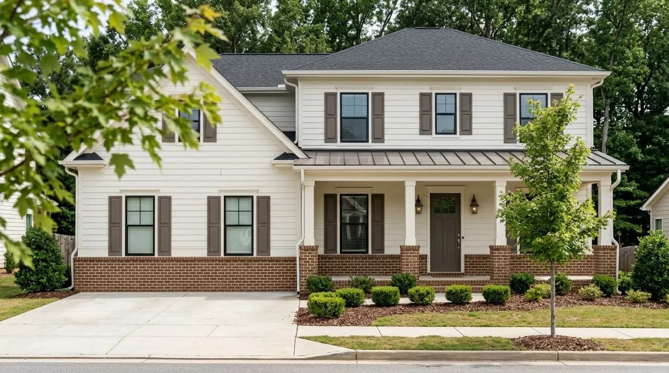
For exteriors, the high LRV of 76 means you need a clearly distinct trim color to get any visual depth on the facade. A crisp white trim is the most reliable move. On a front door it can read as understated to the point of blending in unless the surrounding trim or siding creates contrast. It appears on Sherwin-Williams' Top Exterior Colors list, so it holds up to daylight and UV exposure, but plan your exterior palette around contrast because Origami White alone will not give you a bold curb statement.
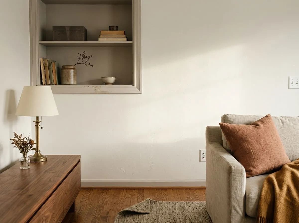
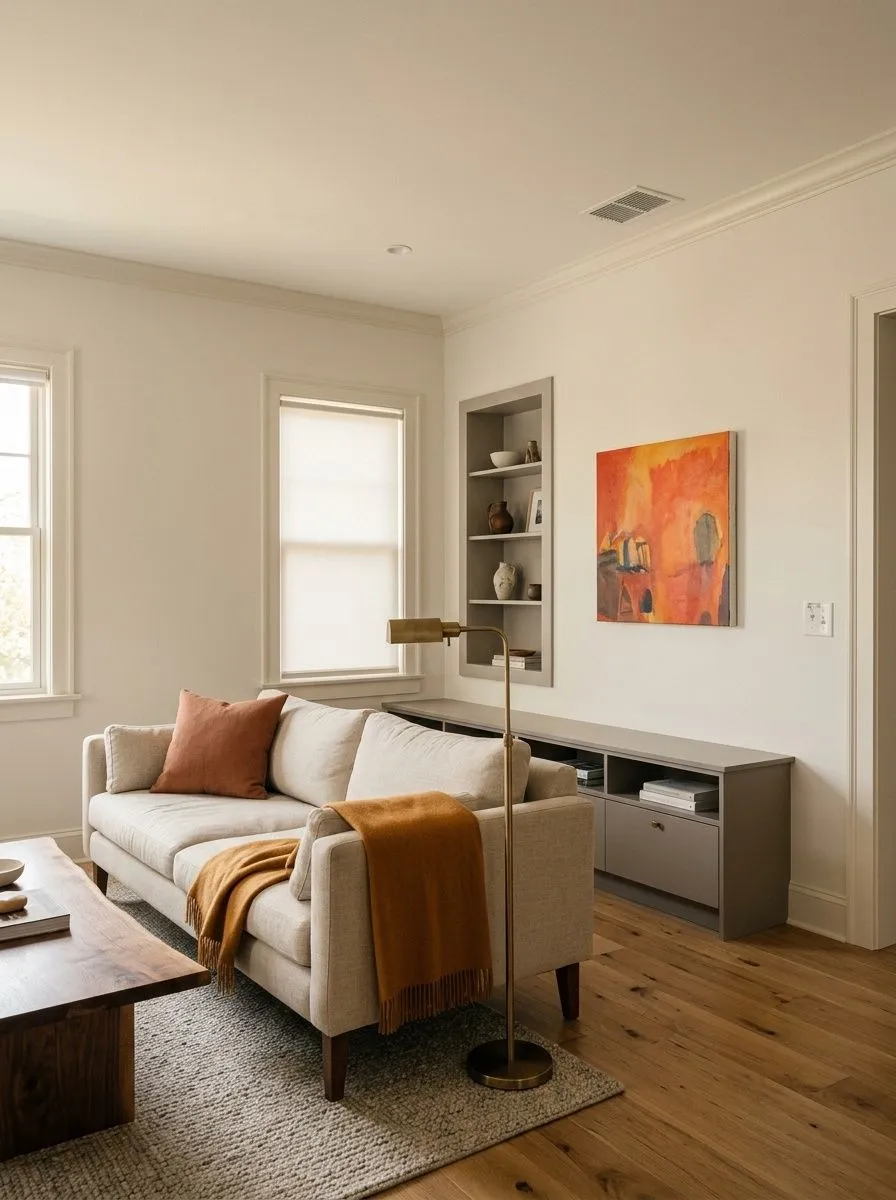
Origami White is a natural living room color. It creates a backdrop that feels warm and settled without drawing attention to itself, letting furniture and textiles do the work. In a south-facing living room it picks up a soft cream quality; in a north-facing one it stays neutral and polished.

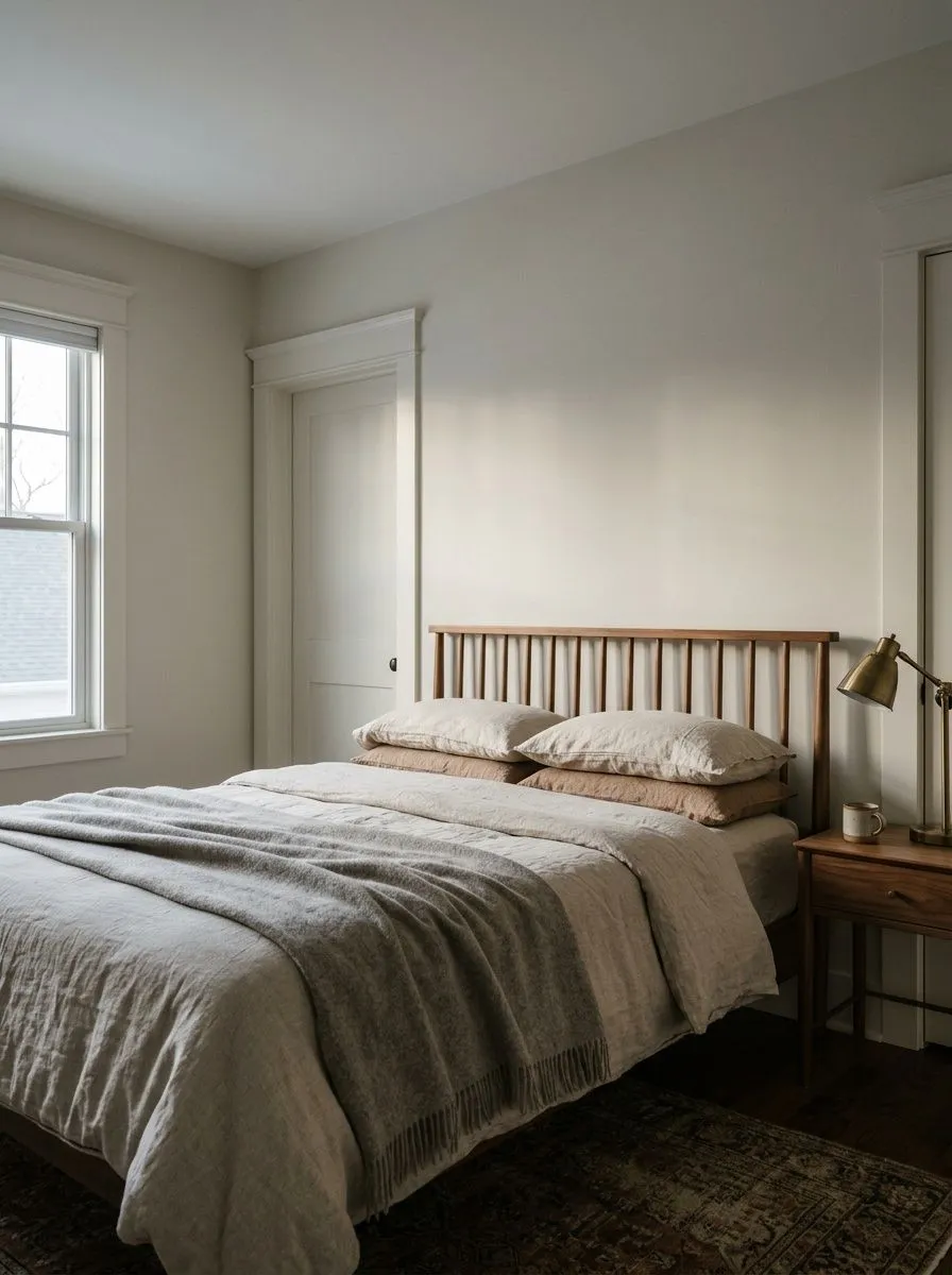
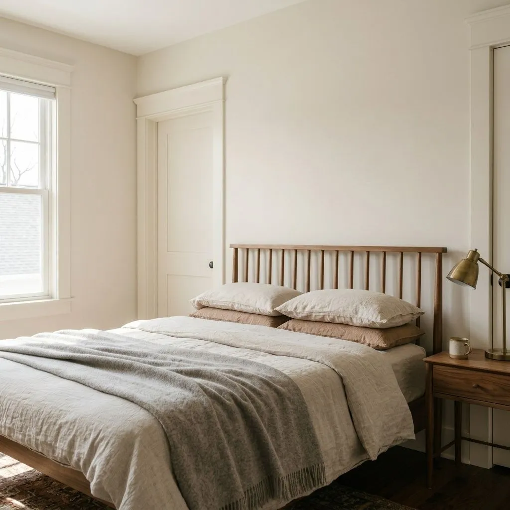
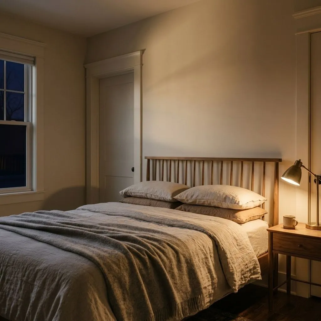
The low-drama, muted warmth of Origami White makes it genuinely restful in a bedroom. It does not energize or activate a space, which is a strength here. Pair it with warm wood tones or linen textiles to bring out the cream quality in the undertone.
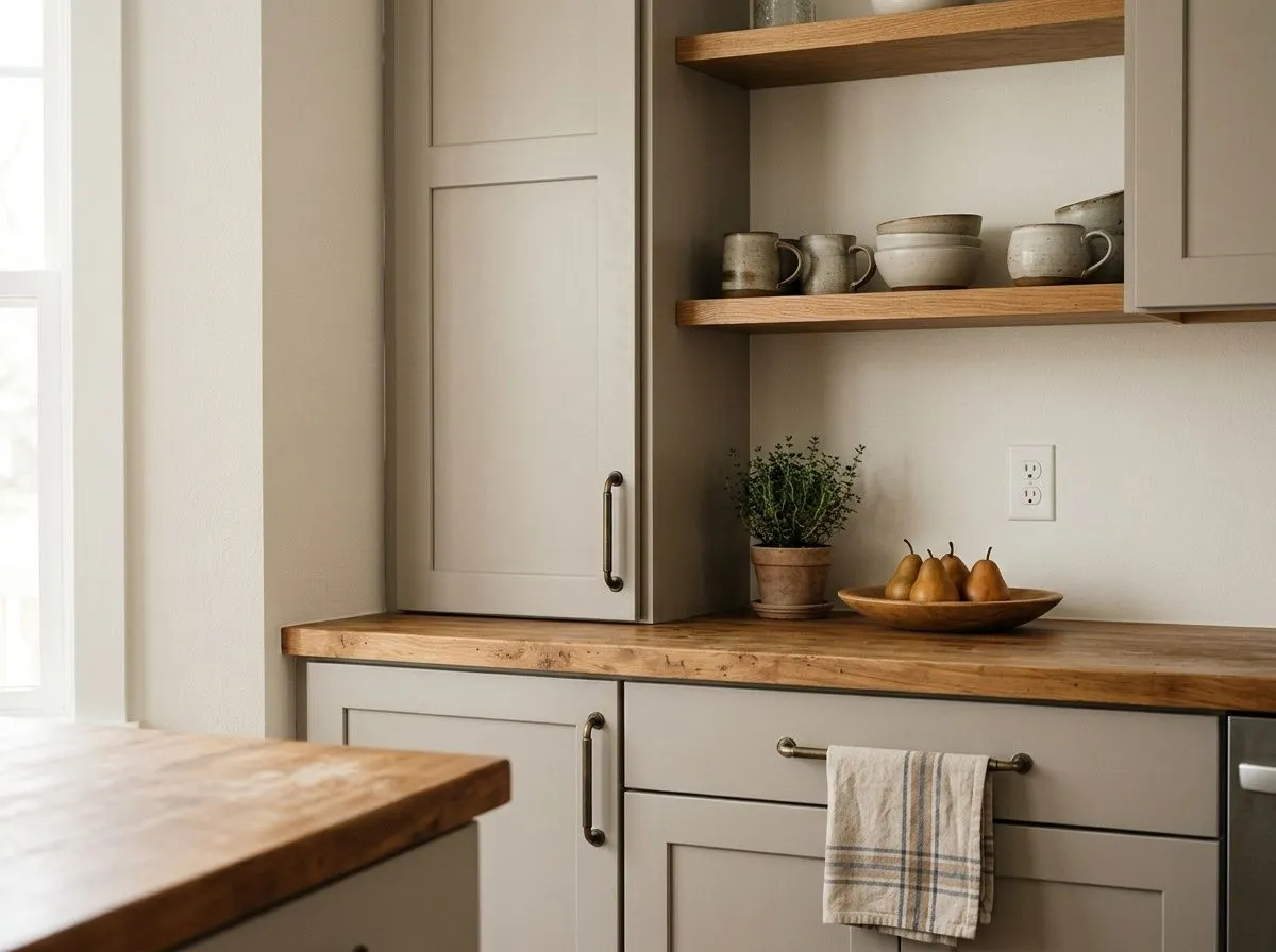
On kitchen walls Origami White is a clean, livable choice that reads neither too stark nor too creamy. As a cabinet color it is very understated, so plan on hardware and countertops that carry the contrast. It works best in kitchens where another element, not the cabinets, is meant to be the focal point.
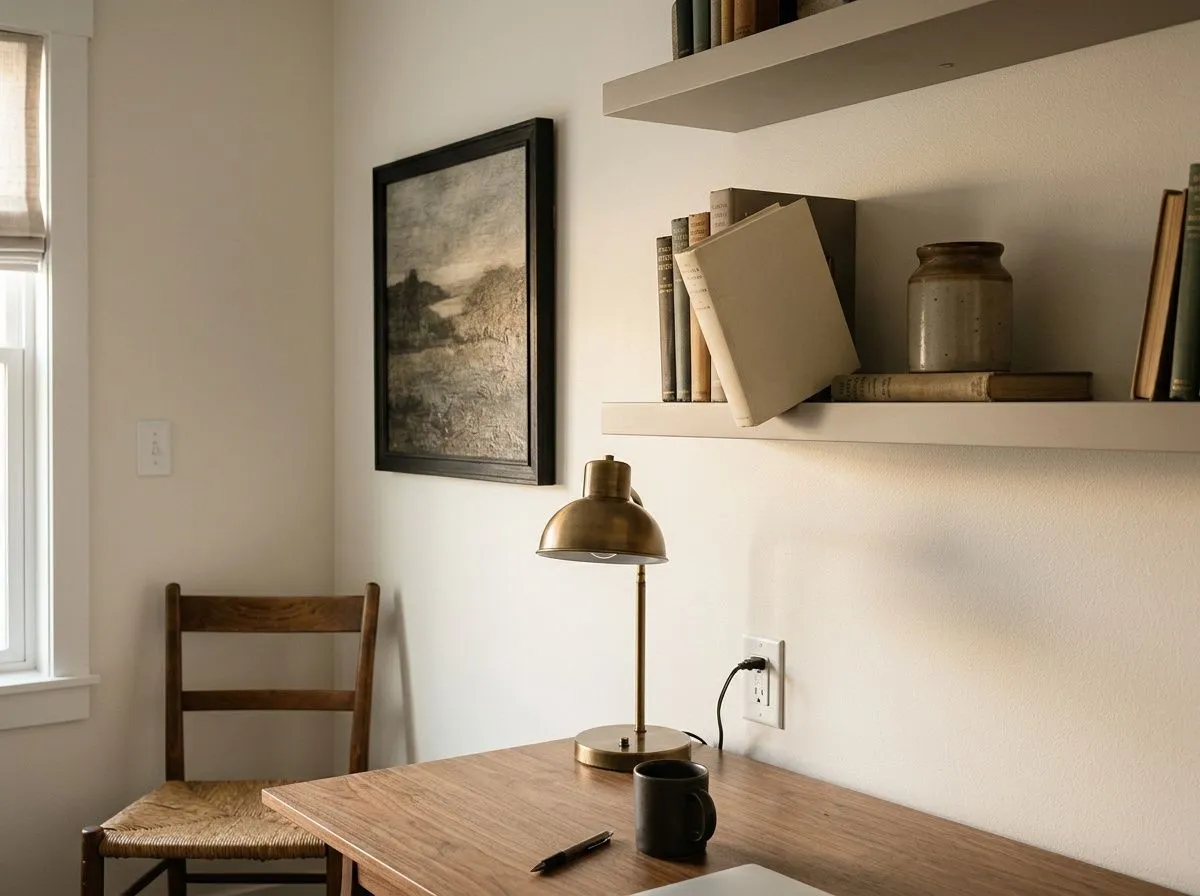
Origami White does not fatigue the eye, which is a real advantage in a room you spend hours in. It keeps the space feeling open without the visual noise of a color. A deeper accent, bookshelves, or dark-framed artwork will keep it from feeling flat.
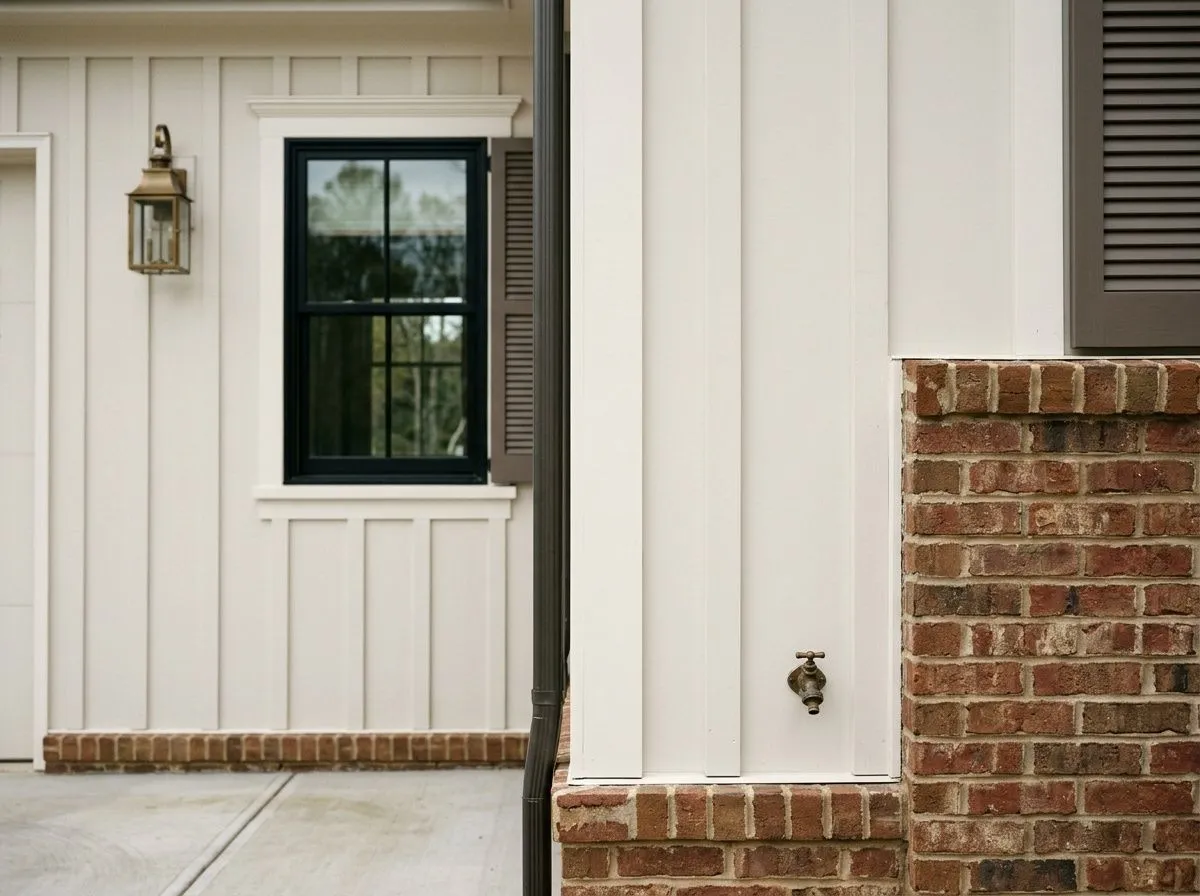
Origami White holds up on exteriors and appears on multiple Sherwin-Williams top exterior lists, but its LRV of 76 means you need a clearly distinct trim to read depth on the facade. Pair it with a clean, slightly brighter white trim and a darker accent on shutters or the front door to get contrast.
Origami White pairs naturally with Anew Gray (SW 7030), which reads as a warm, medium-depth greige and gives you a tonal progression that feels cohesive rather than stark. That combination works especially well in open floor plans where you want adjacent spaces to feel connected. For a softer, more tonal approach, Spalding Gray offers a similar greige warmth at a slightly deeper value, making it a good choice for an accent wall or cabinetry alongside Origami White walls.
Beyond those coordinating picks, Origami White takes well to deeper anchor colors for trim or accent work. Navy and dark charcoal tones create a clean contrast that reveals the warmth in the off-white. Warm wood tones, terracotta, clay, and amber accessories all sit naturally against it. For a cooler accent direction, sage, teal, and muted blue-greens work without fighting the subtle warmth of the base. The one pairing to approach carefully is bright or stark white trim. Next to a cooler, higher-LRV white, Origami White can look slightly dingy, so choose a trim white that is either warm itself or only slightly brighter.
Origami White, Anew Gray, and Spalding Gray are the only paint here, covering the walls, ceiling, and office envelope, the built-in bookcases, and the lower cabinet run respectively. The remaining four colors, Naval, Clary Sage, Umber Rust, and Aged Brass, are the room's furnishings and materials, each shown as its closest Sherwin-Williams paint match. Hover any pin or swatch to see exactly which color is doing that job.
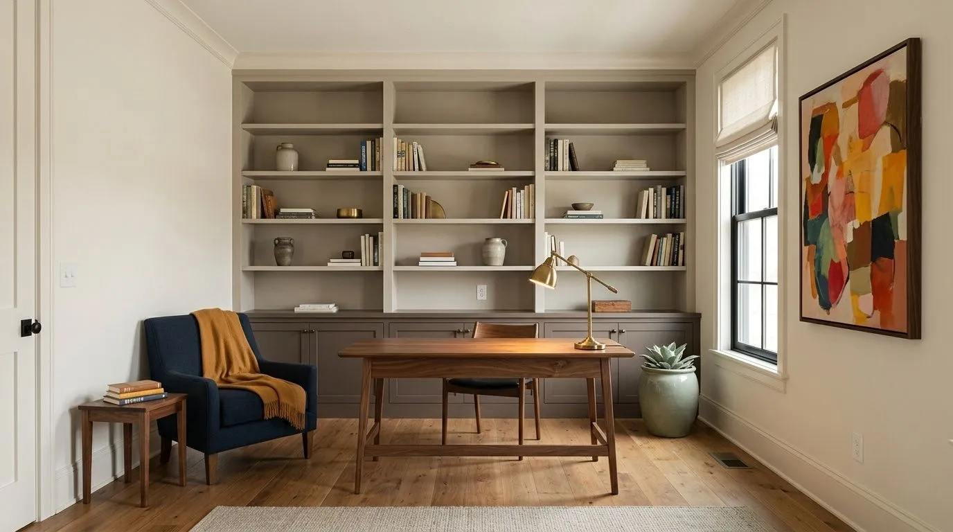
All comparisons are matched against Origami White at LRV 76.
Next to a cool, high-LRV bright white, Origami White's warm neutral base reads dingy or slightly gray. The contrast exposes the warmth in an unflattering way rather than complementing it.
In an open floor plan, placing Origami White next to a cool or strongly gray-blue color creates an undertone clash. The faint warmth in Origami White and the cool cast of a blue-gray fight each other at the transition.
Origami White's subtlety depends on its muted quality. A high-gloss or semi-gloss finish on large wall surfaces amplifies every undertone shift, including the occasional violet cast, and can make the color look inconsistent or slightly off across the room.
Origami White is a soft, muted off-white with a warm taupe-cream base. It reads as a quiet warm neutral on the wall, not stark white, not creamy yellow, just a settled and refined off-white with an LRV of 76.
Most independent reviewers read Origami White as warm, with a soft taupe-cream or warm greige base. Sherwin-Williams markets it as having cool violet undertones, and a faint pink-violet cast can appear in certain light conditions, acting as a subtle coolant that keeps it from going yellow. The honest answer is that both reads have merit depending on your room's orientation and surrounding colors, so sample it in your own light.
It is warm. Despite Sherwin-Williams describing violet undertones, the majority of real-world reviews describe a warm neutral base. It does not go buttery or golden, but it is decidedly warmer than a true neutral or cool white. North-facing rooms will nudge it toward neutral-gray, but it never reads as cool or crisp.
The LRV is 76. That places it firmly in off-white territory. True whites typically start around 81 to 82, so Origami White has enough depth to read as a color rather than a blank canvas, while still being light enough for ceilings and trim in many applications.
The Sherwin-Williams paint code is SW 7636. The hex value is #E5E2DA and the RGB breakdown is 229 / 226 / 218.
Anew Gray (SW 7030) is a coordinating color that creates a warm, tonal greige progression. Spalding Gray works as a slightly deeper accent or adjacent wall color in the same warm family. For high-contrast trim or accents, deeper tones in navy, charcoal, or warm brown read well. Warm wood tones, terracotta, and clay sit naturally against Origami White, and cooler accents like sage, teal, and muted blues work without fighting the base. Avoid very bright or cool stark whites as trim partners.
It is on Sherwin-Williams' Top Exterior Colors list and holds up outdoors, but its LRV of 76 means you need a clearly distinct trim color to read depth on the facade. For cabinets, it is a very understated choice. It will not give you a crisp clean look, and it may feel flat without hardware and countertops that carry the contrast. On walls in kitchens it performs more confidently than it does as a standalone cabinet color.