
MorningGray forward · calm, cool
A muted, earthy sage with gray doing most of the heavy lifting and a quiet yellow that surfaces in warm light. Sample it in your actual room before you commit.
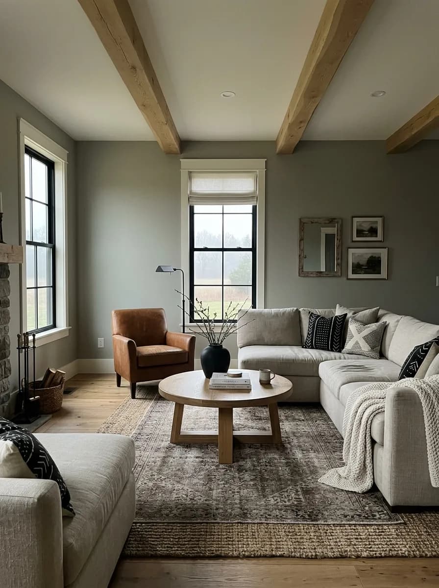
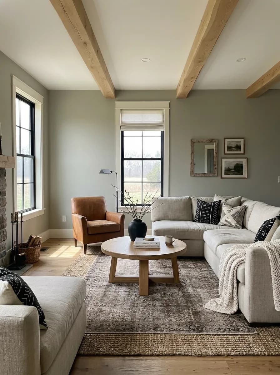
Clary Sage SW 6178 is a medium sage green with enough gray in it to keep it from reading as a true botanical green. On the wall it lands somewhere between a weathered herb and a warm greige, soft and muted rather than vivid or leafy. The gray base is what most reviewers notice first. It grounds the color and pulls it toward the neutral side of the green family, which is a big part of why it works in so many rooms.
The yellow is quieter but it matters. It surfaces most clearly in warm afternoon light or in south-facing spaces, adding a bit of gentle warmth that keeps the color from going cold or clinical. In cooler or lower light, the gray takes over and the whole color reads more subdued, even slightly shadowy. That range is wide enough that the same gallon can look noticeably different in two rooms of the same house.
At LRV 41, this is a genuine mid-tone. It absorbs roughly half the light that hits it, so it reads with some weight on the wall. It is not a pale, whispery sage. It has presence and depth, which works in its favor when you want a room to feel settled and calm, but it can feel heavy in a room that already lacks natural light.
Clary Sage carries three undertones: green, yellow, and gray. They do not all show up equally at once, and that is where reviewers part ways a little. Most people identify the gray-green combination first and call it the dominant character of the paint. The yellow is secondary but real, and it is what prevents the color from reading as a cool, bluish, or slate-toned gray-green.
The disagreement worth knowing about centers on how warm or cool the color actually feels. Reviewers who test it in south-facing rooms or warm artificial light consistently report the yellow coming forward, making the paint feel warmer and more honey-kissed than a swatch suggests. Reviewers who tested it in north-facing rooms or under cooler light say the gray takes over almost completely, and the yellow nearly disappears. Both observations are accurate. The color genuinely shifts, and that shift is substantial enough to cause real surprise if you pick it off a chip and paint a north-facing room expecting warmth.
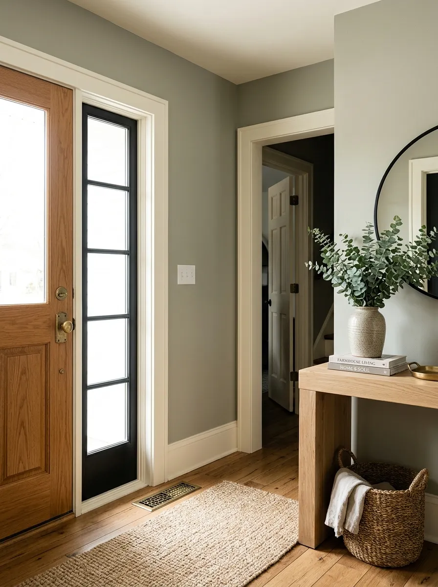
There is also a practical tension in the undertone story around whites. The yellow in Clary Sage is incompatible with stark, cool, or heavily gray-toned whites. Multiple sources flag that pairing it with those whites can make the sage read muddy or flat, as if the color went slightly off. Soft warm whites and creamy whites resolve that tension by complementing the yellow rather than fighting it. If you are sampling, put your white sample right next to Clary Sage and look at both in the actual room light before committing.
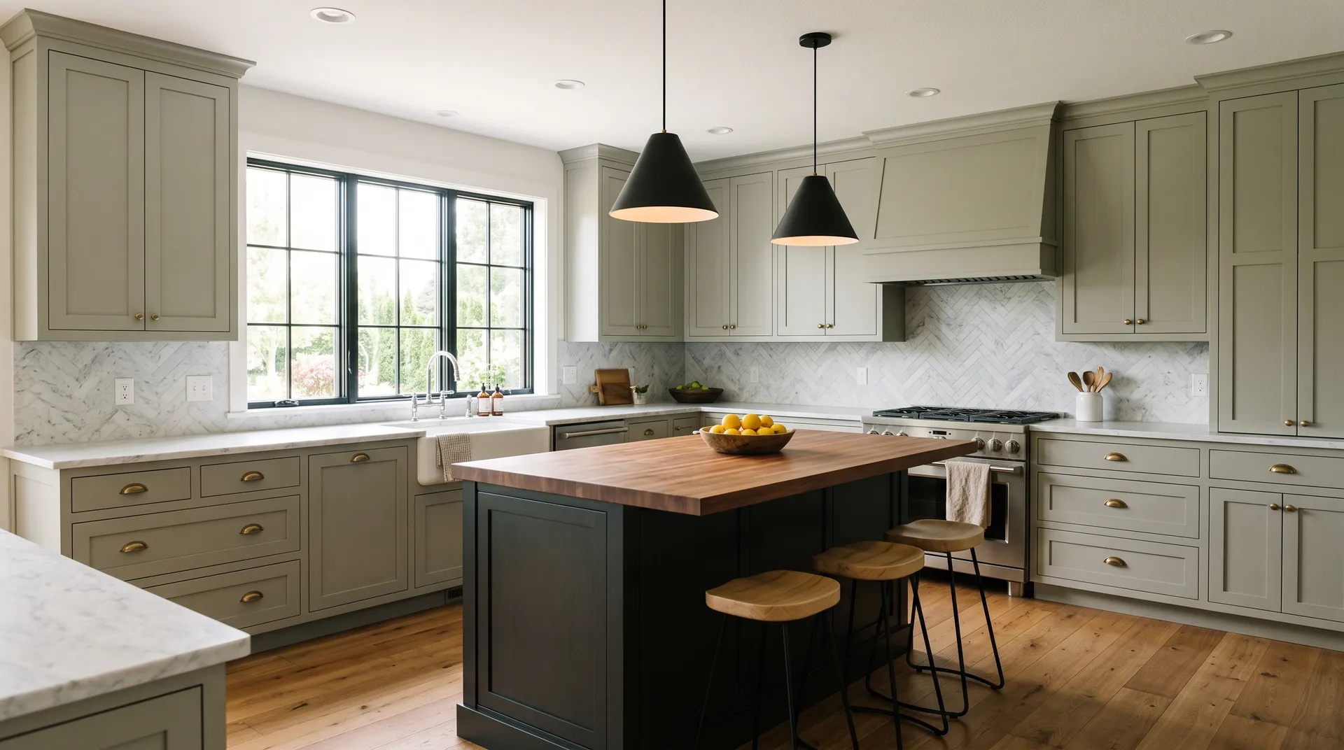
Clary Sage comes up most often in kitchens, and specifically on cabinets and islands. Its muted, earthy character gives wood-and-stone kitchens an organic, grounded feel without the loudness of a true botanical green. Many reviewers show it on upper cabinets paired with a near-black or charcoal lower cabinet for contrast. It reads as a sophisticated, current cabinet color that holds up over time rather than trending in and out.
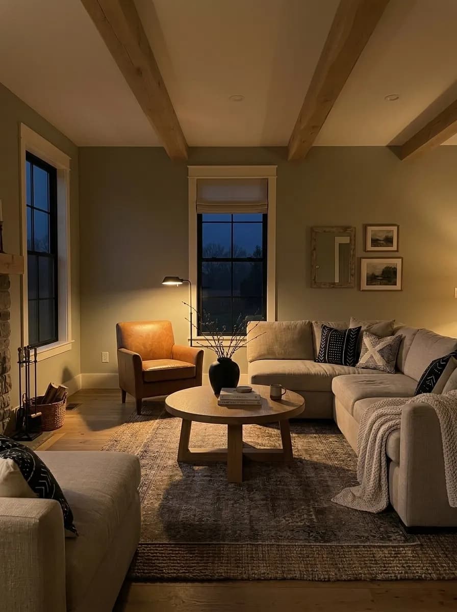
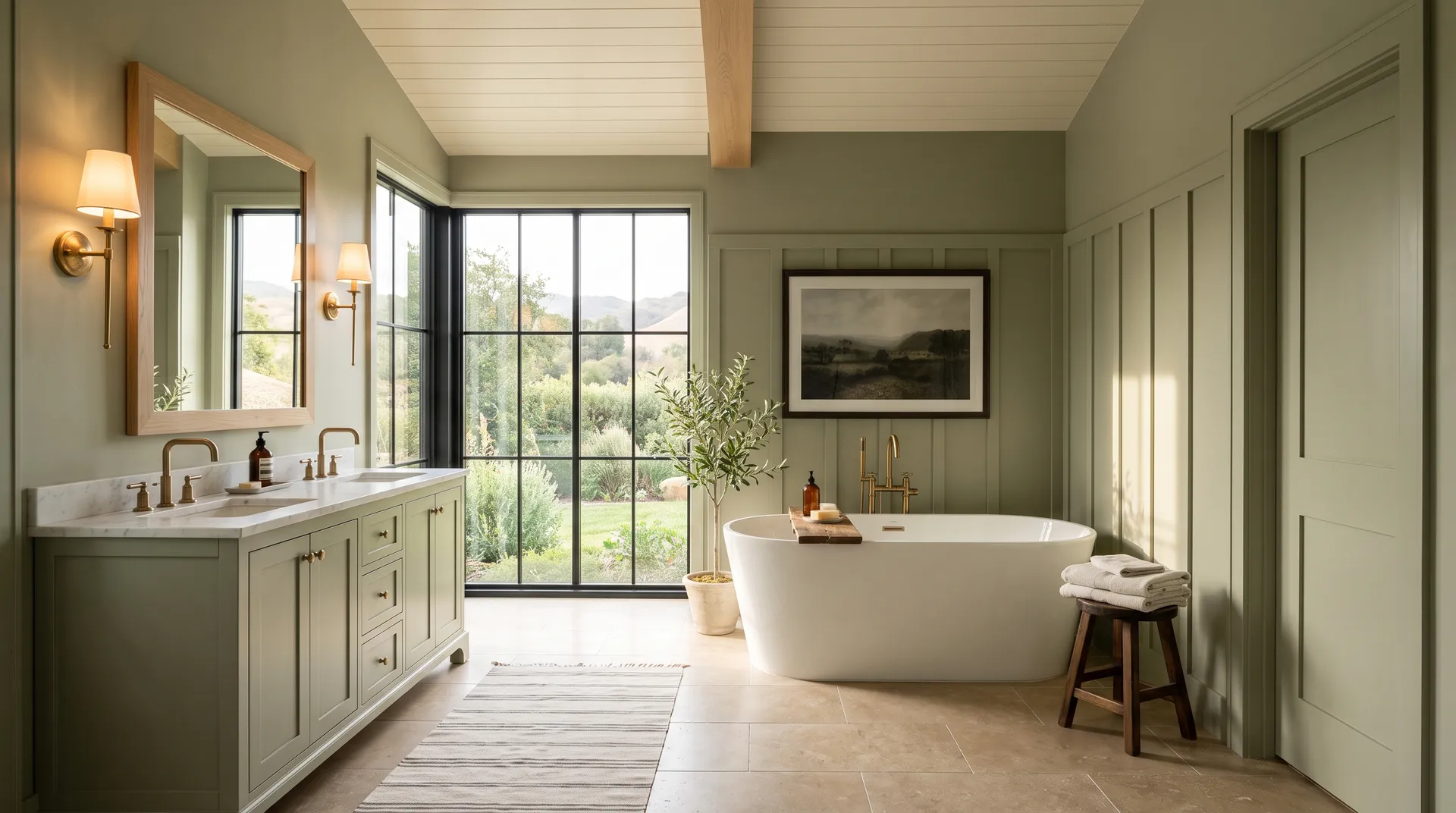
Bedrooms are the second most common use case across sources. The gray in the undertone structure keeps it calm, and the low-key warmth from the yellow makes it restful rather than clinical. It comes up for nurseries too, where that same balance of earthy softness and neutrality works well. Bathrooms and vanities are a strong application, particularly where warm wood or stone elements are already present. The LRV of 41 means a windowless bathroom will feel noticeably darker with this color, so bathroom use works best with at least some natural light or good layered artificial lighting.
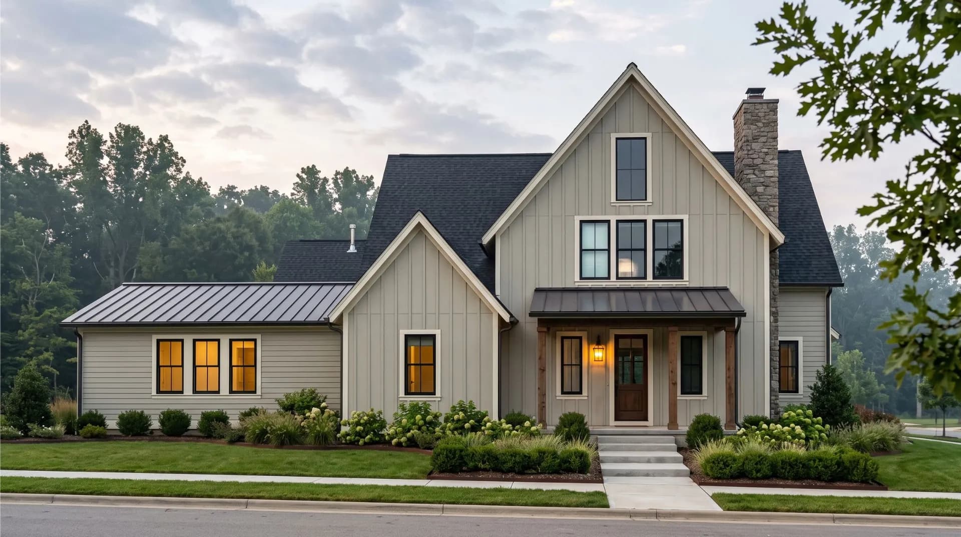
For orientation, south and west-facing rooms are the most forgiving. They bring out the warmth and keep the color from going flat. North-facing rooms can make it look darker and cooler than you expect, so if that is your room, sample it on a large board and live with it through a full day before committing. Exteriors are confirmed by reviewers as a real option. It pairs well with stone, brick, and cream trim on house exteriors, and it also gets called out as a front door color that reads as both welcoming and current.
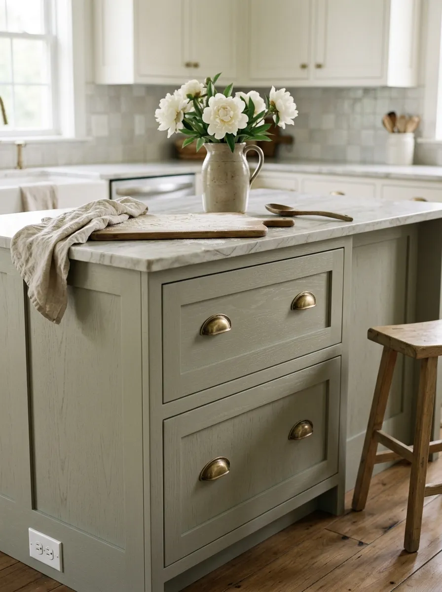
Clary Sage is a standout cabinet and island color in kitchens with warm wood floors, stone countertops, or brick elements. It reads as a sophisticated earthy green that feels current without being trendy in a short-lived way. Brass or aged bronze hardware elevates the combination and pulls the warm yellow undertone forward.
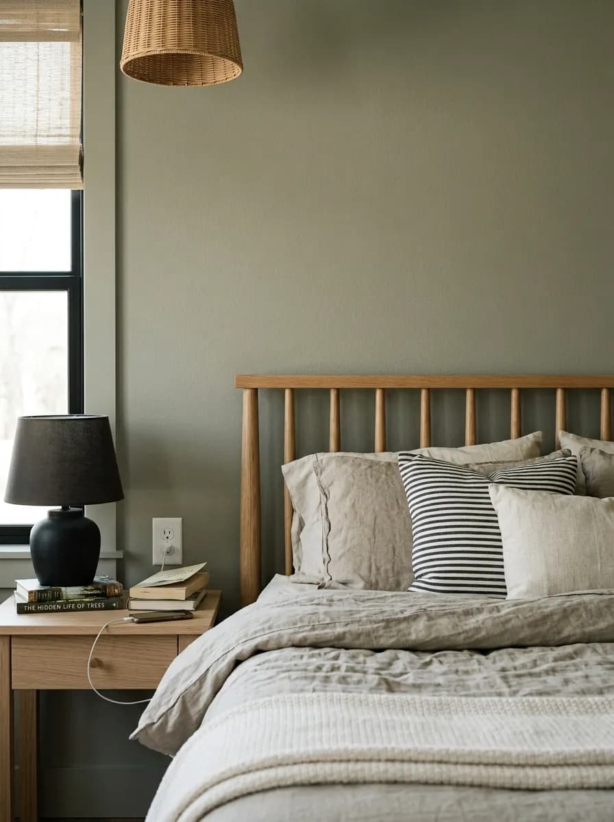
In a bedroom, Clary Sage creates a calm, restful atmosphere. The gray in its structure keeps the room from feeling too warm or active, while the yellow keeps it from going cold or clinical. It works especially well with linen, warm wood furniture, and soft natural textiles.
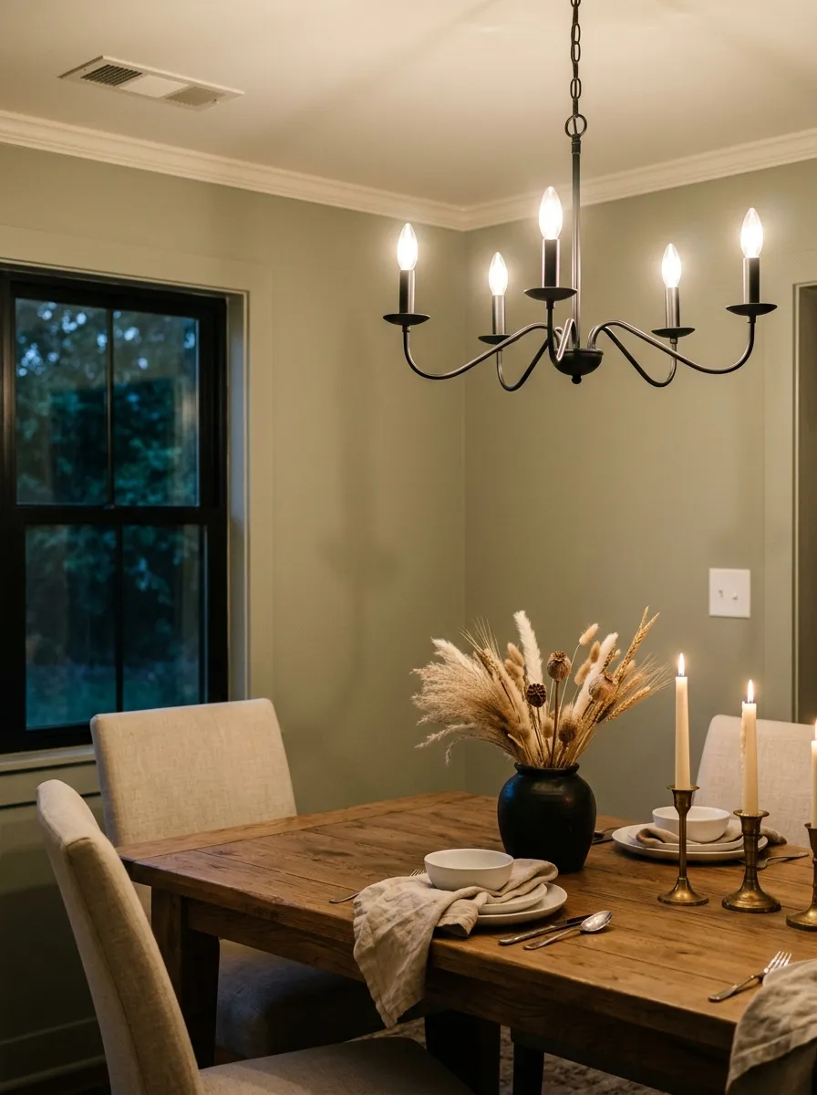
At LRV 41, Clary Sage has enough depth to give a dining room a sense of intimacy and enclosure. Warm candlelight and incandescent bulbs pull out the yellow and make the color feel rich and inviting at night. Pair it with a soft warm white on trim and a wood or stone table to keep the earthy palette cohesive.
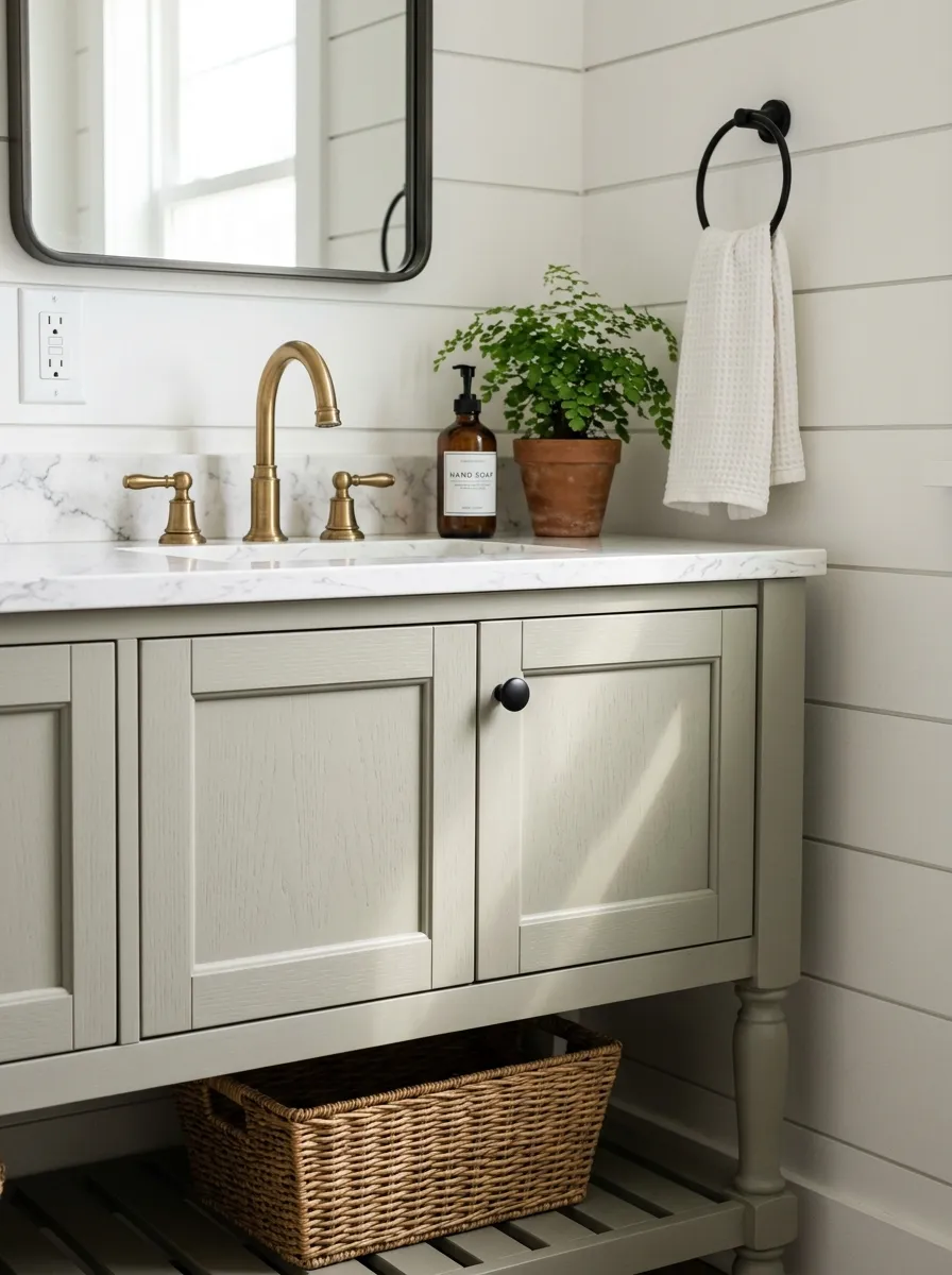
Clary Sage works well on vanities and as a full wall color in bathrooms that get natural light. It pairs naturally with warm stone tile, wood accents, and matte black or brass fixtures. Avoid it in windowless bathrooms where the LRV of 41 will make the space feel noticeably dark and the gray undertone will dominate.
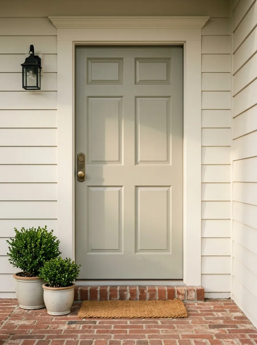
Reviewers confirm Clary Sage holds up outdoors and reads as a welcoming, grounded front door color. On exteriors it pairs well with stone, brick, and cream or warm white trim. The muted quality of the sage keeps it from looking too bold or unexpected against natural materials.
The coordinating palette Sherwin-Williams groups with Clary Sage leans into its earthy, muted identity. Sagey (SW 6175) sits in the same green family and works as a companion tone for multi-room schemes or for trim and accent applications where you want to stay within the sage range. Dover White (SW 6385) is the warm white anchor in the palette, a soft off-white that works with the yellow in Clary Sage rather than fighting it, exactly the kind of pairing reviewers recommend when they warn against cool or gray whites. Tumblin' Tumbleweed (SW 9120) brings in a warm, dusty tan that grounds the palette with an earthy contrast, useful for a room that needs a bit more depth without going dark.
Beyond those three, reviewers consistently point to warm wood tones, greige and taupe, and deeper accent colors like charcoal, navy, or a heavier iron gray for contrast. Terracotta and burnt caramel accents come up as well for a warmer, more organic scheme. For metals, brass, antique gold, aged bronze, copper, and matte black all come up favorably across sources. The common thread is warmth. Every pairing that reviewers praise leans toward the warm or earthy side of the spectrum, reinforcing that the yellow undertone in Clary Sage wants company that flatters it.
The wood, stone, and metal do the heavy lifting here, and each material is shown as its closest Sherwin-Williams paint match so you can shop the whole palette in one place. Only two colors are actual paint: Clary Sage covers the walls, board-and-batten paneling, and furniture-style vanity, while Dover White goes on the tongue-and-groove plank ceiling and oak beam surround. Hover any pin or swatch to see the exact name.
All comparisons are matched against Clary Sage at LRV 41.
The yellow undertone in Clary Sage is incompatible with stark, icy, or heavily gray whites. When placed next to them the sage can read muddy, flat, or slightly off, as if the color went bad rather than simply neutral.
At LRV 41, Clary Sage absorbs a substantial amount of light. In a north-facing room or any space with limited windows, the gray undertone dominates, the yellow disappears, and the color can read darker and moodier than the swatch ever suggested.
Clary Sage is an earthy, organic color. Pairing it with cool grays, chrome hardware, or stark white contemporary finishes fights its fundamental character. The color looks awkward and neither element of the room looks intentional.
Clary Sage is a medium sage green with gray, yellow, and green undertones. It reads as a muted, earthy gray-green on the wall, grounded enough to behave almost like a warm neutral while still reading clearly as a green. It is not a bright or minty green. Its LRV of 41 puts it in the mid-tone range, so it carries real depth and presence.
The three undertones are green, yellow, and gray. The gray-green combination is what most people read first and it gives the color its muted, earthy character. The yellow is secondary but meaningful. It adds warmth and prevents the color from reading cold or bluish. In warm or south-facing light the yellow comes forward noticeably. In cooler or north-facing light the gray takes over and the yellow nearly disappears.
It sits in between, which is both its appeal and its challenge. The gray pulls it toward cool and the yellow pulls it toward warm, and the balance between them shifts with the light in the room. South-facing and warmer rooms push it warmer. North-facing and lower-light rooms push it cooler and more muted. Reviewers broadly describe it as a balanced, flexible color that never fully commits to one temperature, which is why sampling in your specific room matters so much.
The LRV of Clary Sage SW 6178 is 41. That places it squarely in the mid-tone range. It reflects about half the light that hits it, which means it reads with real depth and weight on the wall. It is not a light or airy color. Rooms with limited natural light will feel noticeably darker with this color, and multiple reviewers flag that as a key consideration before committing.
The Sherwin-Williams color code is SW 6178. The hex value is #ACAD97 and the RGB values are 172, 173, 151.
Soft warm and creamy whites are the near-universal pairing recommendation for trim and ceilings. Dover White (SW 6385) is the coordinating white in Sherwin-Williams's own palette for this color. Warm wood tones, greige and taupe, and deeper accents in charcoal, navy, or iron gray all work well for contrast. Terracotta and burnt caramel add warmth in an earthy scheme. For metals, brass, antique gold, aged bronze, copper, and matte black all come up consistently as flattering choices. The one pairing to avoid is cool or gray-toned whites, which can make the color read muddy.
Yes to all three. Kitchen cabinets and islands are one of the most common applications reviewers highlight, often shown with warm wood countertops or stone and paired with brass or matte black hardware. As a front door color it reads welcoming and grounded. On exteriors it pairs well with stone, brick, and cream or warm white trim and holds up as a full exterior body color.
Yes. It sits in Sherwin-Williams's Greens and Sage family and behaves like a classic muted sage green, earthy, soft, and gray-green rather than vivid or leafy. What separates it from simpler sage greens is the yellow undertone that adds warmth, and the degree to which it shifts with light. It is a sage green that leans toward the warm-neutral end of the range rather than the crisp or herbal end.