
MorningCoolest · crisp and balanced
A soft warm ivory white that holds its character without tipping stark or cool. Its warmth comes through the wood, stone, and brass beside it — never a cast on the paint itself. Sample it in your own light before committing.
Dover White reads as a creamy, soft white on the wall, not a bright white and not a stark one. With an LRV of 82.5 it sits at the high end of the off-white range, which means it stays genuinely light and reflective while still carrying visible warmth. Most people who see it in person describe it as inviting rather than clinical, the kind of white that feels like it belongs in a room rather than coating it.
The yellow undertone is the defining visual feature, and it is not subtle. Under most conditions Dover White will look noticeably warmer and creamier than a standard white, with that golden note sitting just beneath the surface. Light amplifies this: in south-facing rooms or spaces with warm artificial light, it can tip from creamy white into creamy yellow. Pull back to a north-facing room and the cool light balances the warmth, and it behaves much more like a sophisticated off-white. East and west exposures land somewhere in between, and they are the hardest to predict without sampling.
Next to a true or bright white, Dover White will look dingy. That is not a flaw in the color, it is just the contrast revealing how much warmth it carries. Keep it away from cooler whites and it holds its own confidently. Many reviewers note it photographs slightly differently room to room, which is your cue to put up a large sample before committing.
The undertone story with Dover White is mainly about yellow, and how strong it is. Independent reviewers are consistent: this is not a color with a whisper of warmth. The yellow is present and identifiable, accompanied by a secondary beige and cream note that softens it enough to read as white rather than yellow paint. The result is a color that sits firmly in warm-white territory rather than straddling neutral.
Where reviewers disagree is on how welcome that yellow is. Some find it exactly right, the warmth that makes a room feel settled and cozy without introducing an obvious color. Others, especially those who wanted a clean or slightly cooler off-white, find the yellow too assertive once it is on four walls under their lighting. A few note that certain warm artificial bulbs push it into territory that feels unintentionally golden. The honest takeaway is that the yellow is real, it is consistent across sources, and your lighting will determine whether it reads as charm or a problem.
The beige and cream secondary notes do real work in daylight. In balanced or cooler light they come forward enough to keep Dover White feeling like a white rather than a warm neutral, and this is part of why it flows well across open plans. In stronger light the yellow leads and the beige recedes. If you were hoping for a color where the yellow stays quietly in the background, most reviewers suggest you test carefully, because in many real-home conditions it does not.

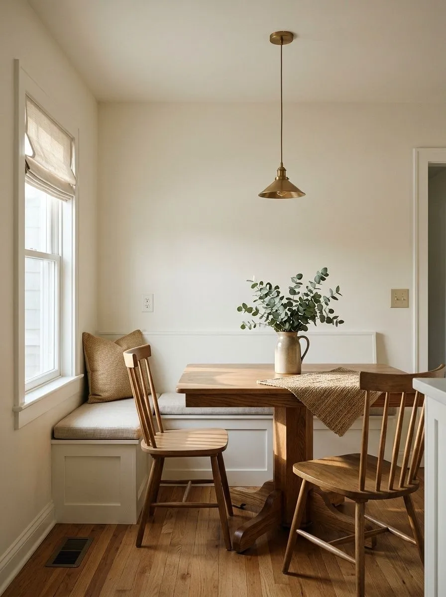
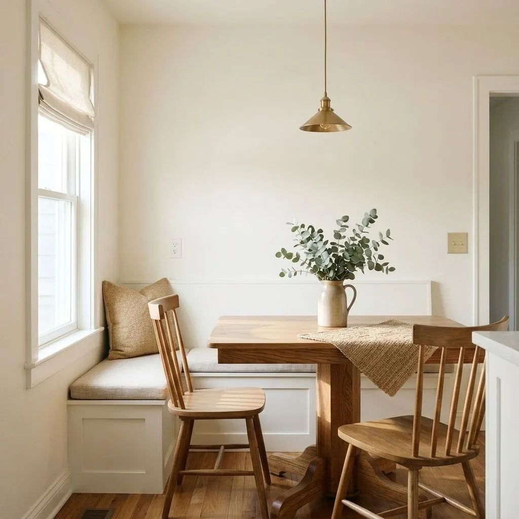
Dover White earns its reputation in warm, traditional, colonial, and modern farmhouse interiors. It was built for spaces where warm wood tones, stone, and natural materials are doing a lot of the work, and it rewards that company. On wood floors and alongside unpainted wood millwork, the cream and golden notes in Dover White feel cohesive rather than accidental. It is one of those whites that seems to belong in a room without announcing itself.
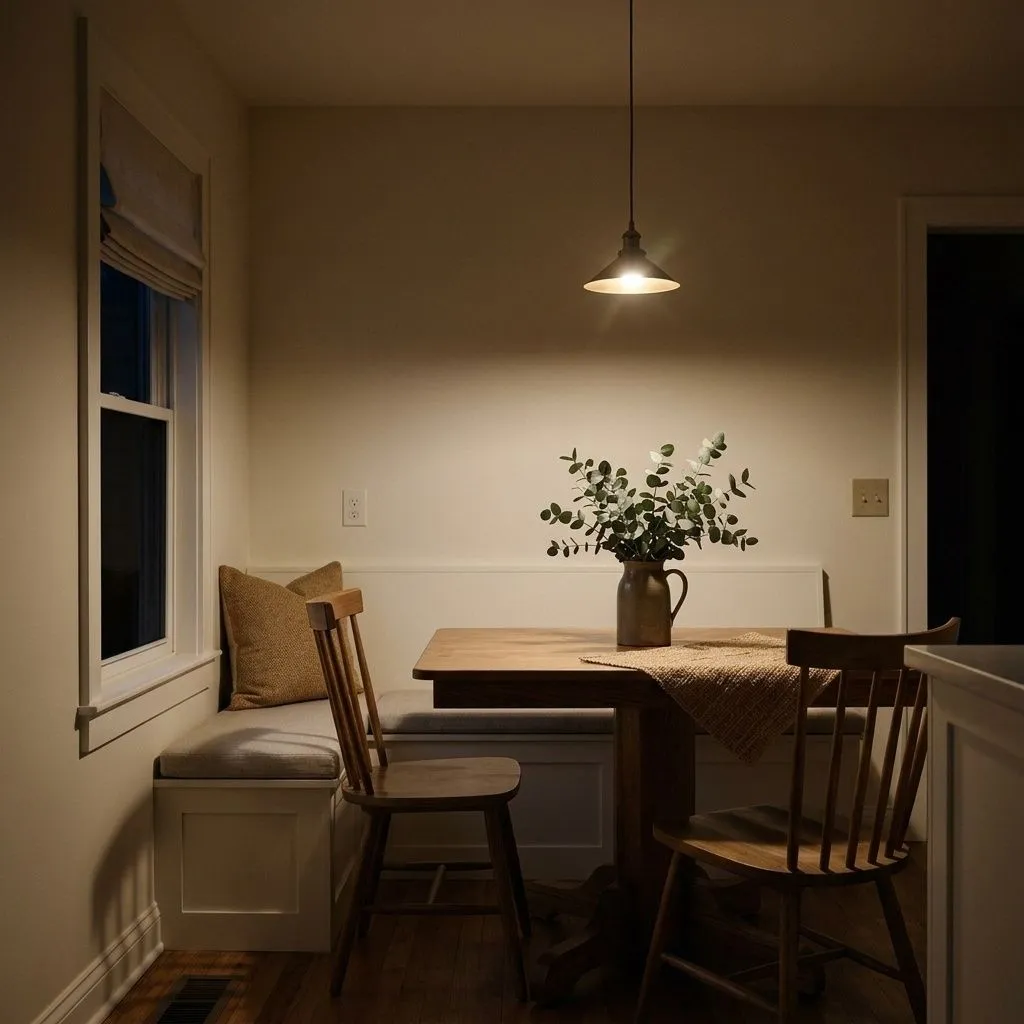
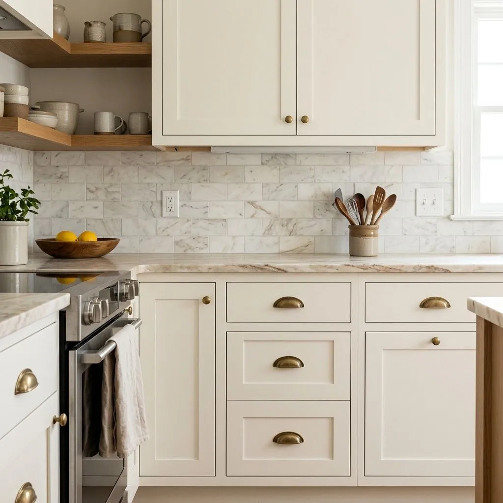
In bedrooms it delivers a cozy, settled quality that brighter whites cannot. Living rooms with warm wood furniture and textile-heavy styling are a natural home for it. In kitchens, reviewers split on cabinets: some love Dover White as a cabinet color because it gives warmth without going full cream or yellow, while others caution that under bright task lighting the yellow comes forward and it stops reading as white. That split is worth taking seriously. If you want cabinets that read as clean white, sample first. If you want cabinets that feel warm and a little aged in a good way, Dover White is worth a serious look.
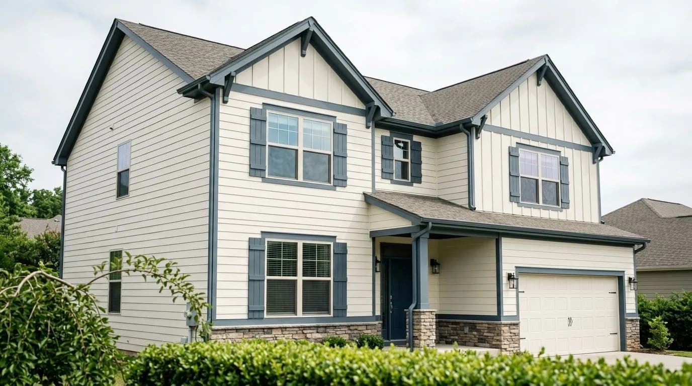
On exteriors it performs well on traditional and farmhouse homes as both siding and trim. It reads softer and warmer than a true white, which suits historic and traditional profiles well. Pair it with dark accents, black trim, or natural wood elements and the warmth reads as intentional and well-considered. The yellow does show more prominently outdoors in direct sun, so if your goal is a crisp, modern exterior white, this is not the right direction. For a warm, welcoming traditional facade, it is a reliable choice with a long track record.
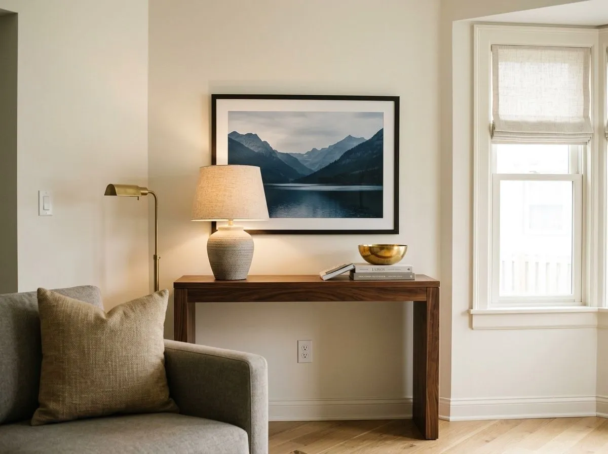
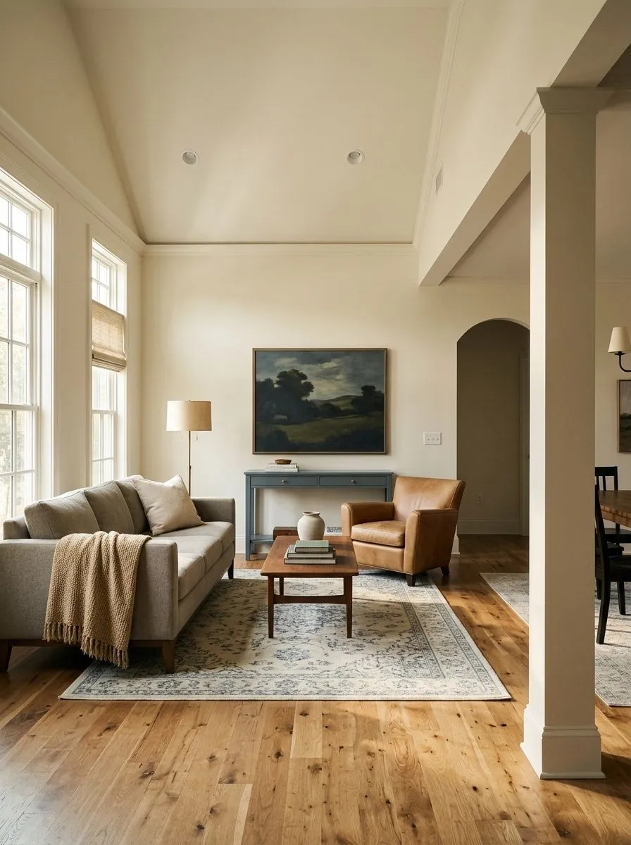
Dover White brings a settled, warm quality to living rooms, especially those with wood floors or warm-toned furniture. It keeps the space feeling light without going cold or sterile. Pair it with soft textiles and natural materials and it reads as cohesive and considered.
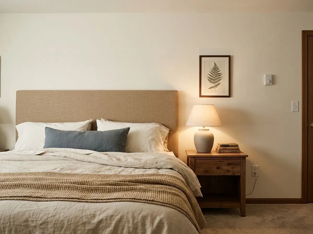
In a bedroom Dover White creates a cozy, restful atmosphere that bright whites tend to miss. The golden creaminess is more noticeable in rooms with warm bedside lighting, which most people find appealing here. It suits traditional, farmhouse, and cottagecore bedroom styles particularly well.
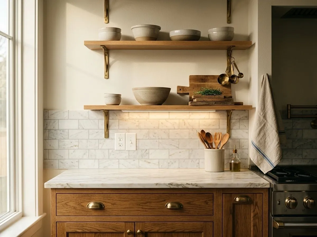
On kitchen walls Dover White works reliably with warm wood cabinetry and stone counters. On cabinets themselves, opinions split: it gives warmth and character, but under strong task lighting the yellow comes forward and it may not satisfy anyone who actually wants a clean white finish. Sample it on a cabinet door before committing.
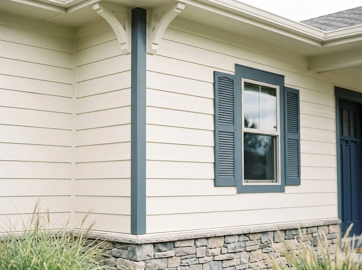
Dover White has a strong track record on traditional and farmhouse exteriors as both siding and trim color. It reads softer and warmer than a crisp white, and it suits historic profiles and natural materials well. Black or dark accents sharpen the look and prevent it from feeling flat.
Dover White pairs best with colors that accept and complement its warmth rather than fight it. Cooler grays and cooler greiges tend to pull the yellow out and make Dover White look off, so the safer path is toward warm, muted tones that share its temperature. Soft blues and muted blue-greens are a favorite pairing in the independent reviews, giving the room some contrast without introducing the cool tones that clash. Warm browns, tans, deeper creams, and soft earthy greens all work well alongside it.
From the coordinating palette, Dakota Wheat brings in a warm, wheaty mid-tone that plays naturally with Dover White's golden undertone, grounding a room without going dark. Waterloo (SW 9141) adds a cooler, dusty blue-purple note that creates contrast while staying muted enough to coexist with Dover White's warmth. The one thing to avoid is pairing Dover White with brighter or cooler whites in the same space. The contrast will make Dover White look dingy, not intentionally layered.
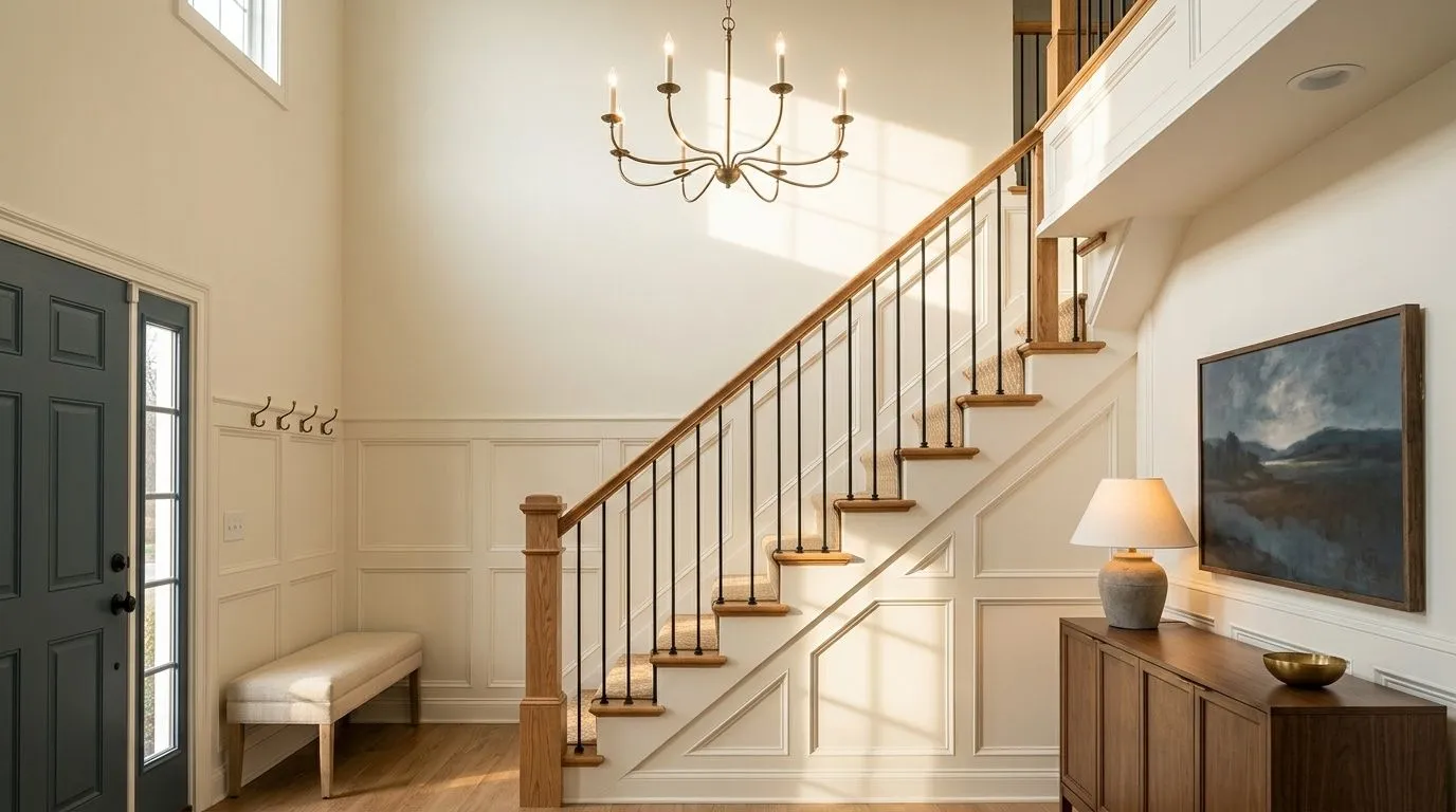
The stained oak, woven linen, wheat-toned textiles, aged brass, and slate-blue art do most of the visual work here; the paint is almost incidental by comparison. Only two Sherwin-Williams colors are actual paint: Dover White blankets the walls, wainscot, trim, and two-story ceiling in a full ivory drench, while Waterloo marks the interior face of the front door. The other five colors are the room's materials, each matched to their closest Sherwin-Williams equivalent, so hover any pin or swatch to see them.
All comparisons are matched against Dover White at LRV 82.5.
Placing Dover White next to cooler whites or true bright whites creates an unflattering contrast that makes Dover White look dingy and yellowed rather than warmly creamy.
Cool grays and greiges pull the yellow undertone out of Dover White aggressively, making the color look more yellow and less white than it does on its own.
Under warm-toned bulbs, Dover White's already assertive yellow undertone intensifies and the color can drift into a noticeably golden-yellow on the wall rather than a soft creamy white.
Dover White is a warm, creamy off-white with a distinctly golden undertone. It is not a bright or true white. With an LRV of 82.5 it stays light and reflective but reads with visible warmth, landing firmly in creamy off-white territory rather than anywhere near stark or cool.
The primary undertone is yellow, and most independent reviewers describe it as noticeable rather than subtle. A secondary beige and cream note softens it enough that the color still reads as white in balanced light, but the yellow is the dominant characteristic you need to plan around. Lighting conditions determine how much of that yellow surfaces on your walls.
Definitively warm. Dover White has no cool or gray in its character. The golden yellow undertone is consistent across lighting conditions, and the color will always sit on the warm side. In north-facing rooms with cool natural light it balances out pleasantly. In south-facing or warm-lit rooms it pushes even warmer.
Dover White has an LRV of 82.5, which places it at the high end of the off-white range. It is light and reflective enough to keep rooms feeling open, but the warmth of the undertone means it never looks bright or clinical. It sits slightly above Creamy (SW 7012) at 81.2 and meaningfully below Roman Column (SW 7562) at 87.6.
Dover White's Sherwin-Williams code is SW 6385. The hex value is #F0EADC and the RGB breakdown is 240 red, 234 green, 220 blue. The warm, golden bias of the color is visible in the hex: the red and green channels are high and close together while blue runs noticeably lower, which is exactly what produces that creamy yellow warmth.
Dover White pairs best with colors that share or complement its warmth. Muted soft blues, blue-greens, warm browns, tans, earthy greens, and deeper creams all work well. From the coordinating palette, Dakota Wheat brings in a warm wheaty mid-tone and Waterloo (SW 9141) adds a dusty, cooler contrast that stays muted enough to coexist. Avoid cool grays, cool greiges, and brighter or cooler whites in the same space. Those combinations pull the yellow out or make Dover White look dingy.
On exteriors, Dover White has a strong track record on traditional, colonial, and farmhouse homes. It reads softer and warmer than a crisp white, suits historic profiles well, and looks sharp paired with dark or black accents. The yellow shows more prominently in direct sun, so it is not the right pick for a modern or crisp-white look. On cabinets, reviewer opinions split. It gives warmth and character that many homeowners love, but under strong kitchen task lighting the yellow comes forward. If your goal is a clean white cabinet, sample it carefully on a door first.