
MorningFresh · yellow stays soft
A warm, buttery off-white with a persistent yellow undertone, bright enough at LRV 81.2 to open a room but soft enough to stay cozy. See how the yellow reads in your light.
Creamy SW 7012 lands in warm off-white territory, reading as a soft, muted butter cream on the wall. Its hex is #EFE8DB and its RGB is 239 / 232 / 219, numbers that back up what you see: a high-value, light color that still carries noticeable warmth. At LRV 81.2 it sits near the top of the off-white range, bright enough to open a room without the cold snap of a stark white, yet soft enough that it never reads clinical.
The color changes personality depending on the hour and the source of light. Morning daylight keeps it fresh and airy. By evening, under warm incandescent or LED bulbs with a warm color temperature, it deepens into something cozier, almost golden. Strong afternoon sun on a south or west-facing wall will pull out the yellow with real force, and the whole room can take on a golden cast that surprises first-time buyers of this color. That is not a defect, but it is worth knowing before you commit.
In very bright rooms with no trim contrast, a few reviewers note it can read slightly washed out because the warm and light values start to collapse together. Adding a crisper white on trim and millwork gives the eye a reference point and lets Creamy actually look creamy rather than just pale. That contrast move is one of the most repeated practical tips across independent reviews of this color.
Nearly every independent reviewer lands on yellow as the defining undertone of Creamy SW 7012. It is a warm, buttery yellow muted by a neutral base so it stays cream rather than veering into day-glo or paint-chip yellow. Some reviewers reach for words like butter or gold to describe it in strong light. The message is consistent: if you are hoping for a white with only the faintest warmth, or if yellow in a white bothers you at all, this is the wrong color.
Where reviewers diverge slightly is in how much the yellow dominates versus recedes. In cooler north and east-facing light several people find the yellow settles back and the color reads as a balanced, muted off-white, close to what you might call a classic warm neutral. A smaller group notes the yellow still shows even in north light, so the undertone is genuinely persistent, not just a lighting trick. South and west exposures resolve the debate decisively in favor of yellow-forward.
The warm beige backbone underneath the yellow matters too. It keeps the color grounded and prevents it from feeling acidic or sharp. That beige base is also why Creamy photographs well against natural wood tones and warm stone, both of which share its underlying warmth. Where it runs into trouble is beside cool-toned finishes: stainless appliances, cool gray countertops, or bright blue-white trim can make the yellow undertone look like a mistake rather than a design choice.
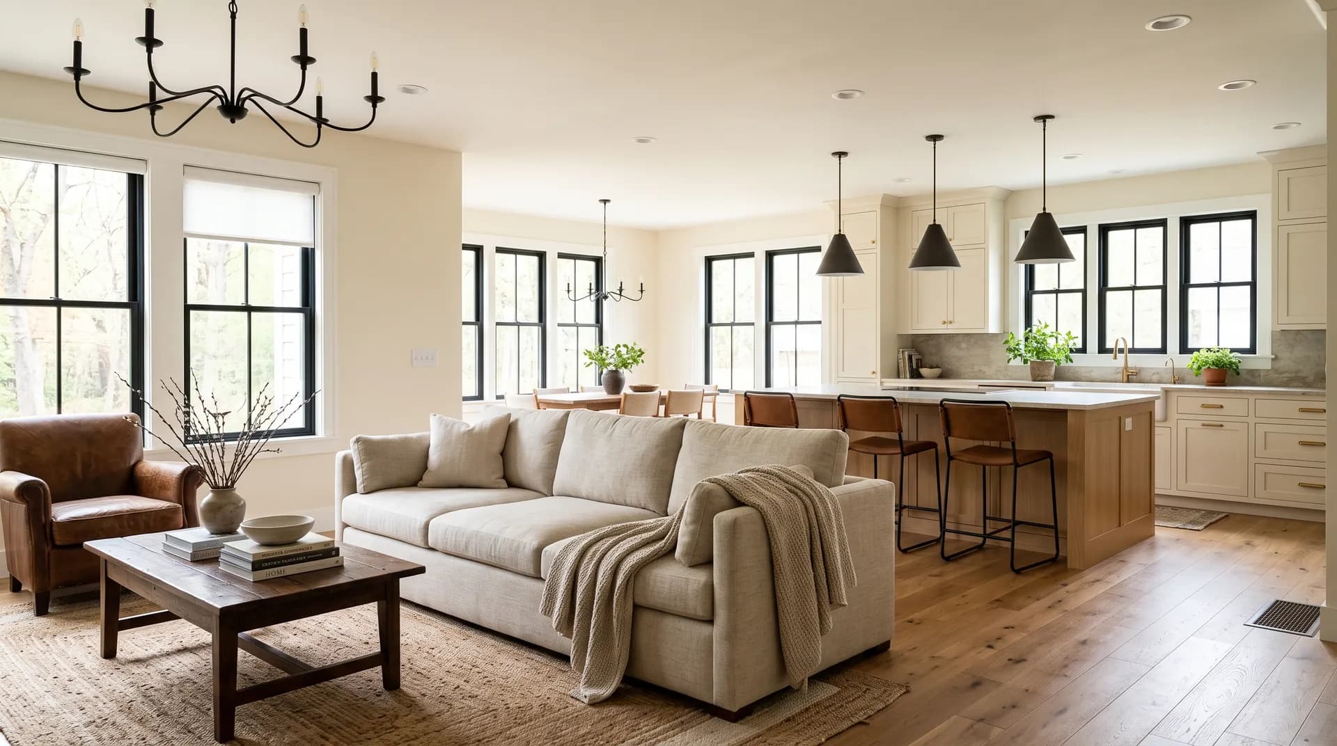
Creamy performs best as a whole-home wall color in spaces that already lean warm. Open-concept layouts benefit from its consistency: running the same color through connected rooms creates a cohesive, settled backdrop that reads as intentional rather than indecisive. Traditional, farmhouse, cottage, and warm transitional interiors are the styles reviewers mention most often, and it shows up frequently in home staging contexts where the goal is broad appeal through a sense of warmth and comfort.
Orientation matters more with this color than with most near-neutrals. North and east-facing rooms give you the most controlled, balanced version of the color, where the yellow stays soft and the overall effect is a gentle, flattering off-white. South and west exposures amplify the warmth and yellow considerably, so if you are painting a sun-drenched living room or a west-facing master bedroom, go in knowing the afternoon version of the color will be noticeably warmer than the chip or the digital swatch suggested.
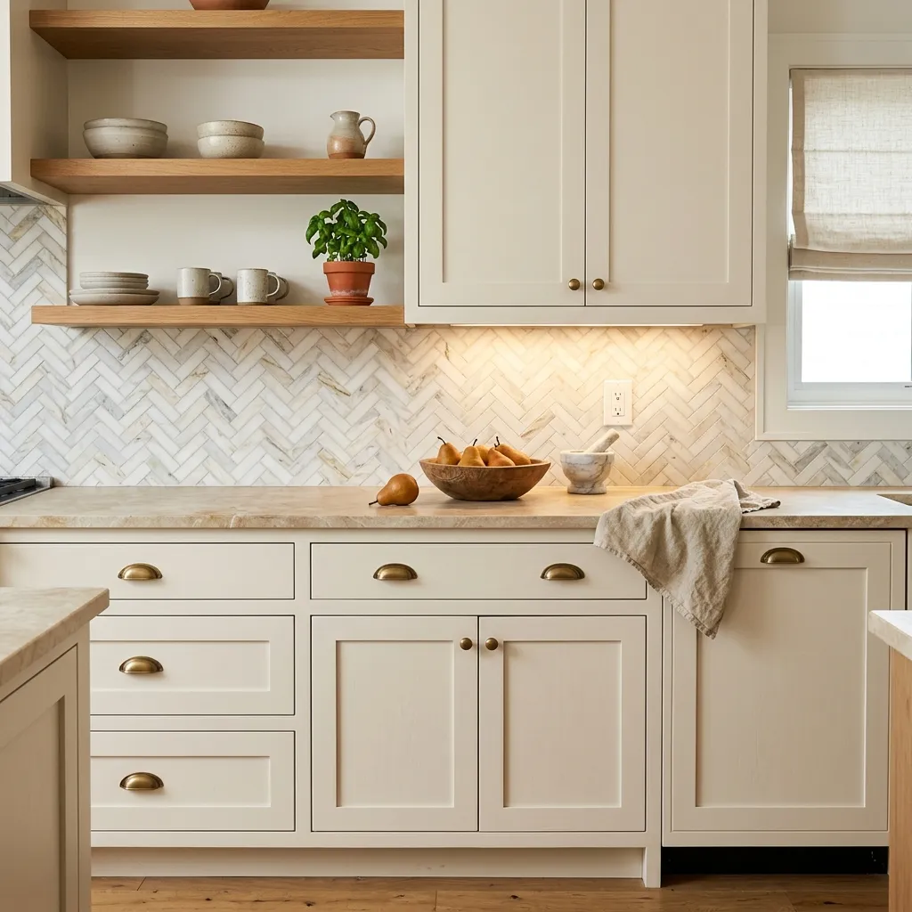
For kitchens and bathrooms, Creamy works best when the surrounding finishes are warm too. Warm wood cabinetry, butcher block, warm-toned stone, and brass or unlacquered hardware all play well with it. Reviewers consistently flag the challenge of pairing it with cool-toned countertops or stainless steel in kitchens, where the yellow undertone can start to look unintentional. As a cabinet color specifically, most reviewers suggest warmer-toned alternatives unless the kitchen is a fully warm, traditional space where the yellow reads as cohesive.
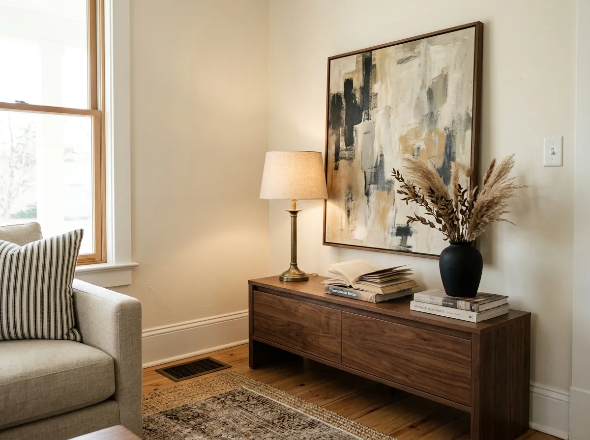
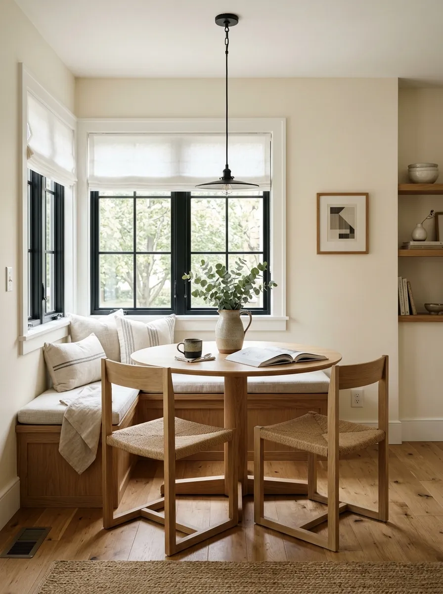
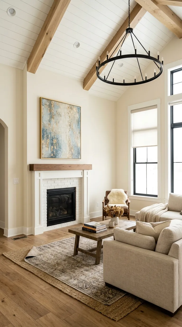
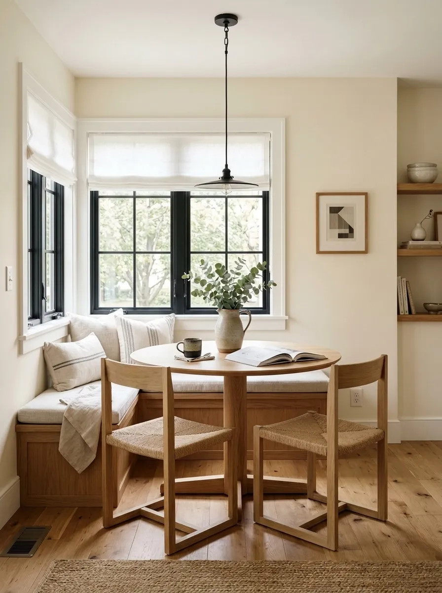
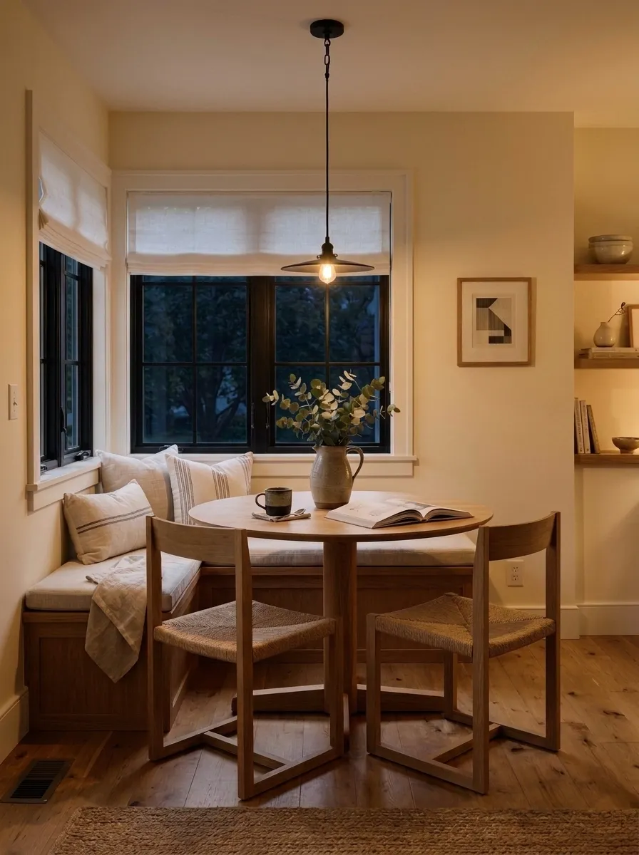
In a living room, Creamy creates a warm, inviting backdrop that flatters wood floors, leather, linen, and natural fiber rugs without requiring precise color matching. It reads well at scale on larger walls where a sharper white might feel flat. Pair with crisper white trim to keep the space from feeling too soft.
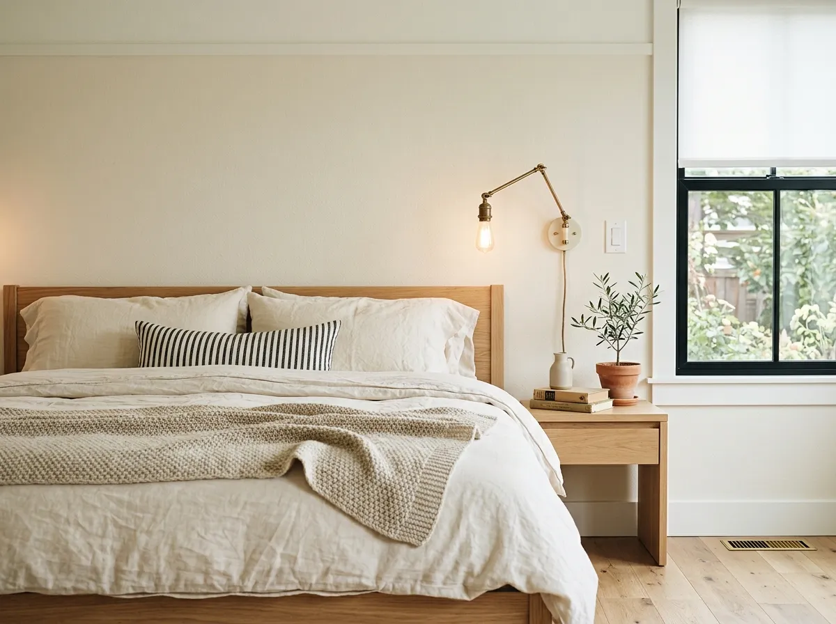
Creamy in a bedroom feels relaxed and warm, especially in rooms with morning east light where the color stays fresh rather than golden. Evening lighting deepens it into something genuinely cozy, which suits bedrooms well. Avoid it in north-facing bedrooms that already feel dim, where the warmth can drift toward yellow without enough light to balance it.
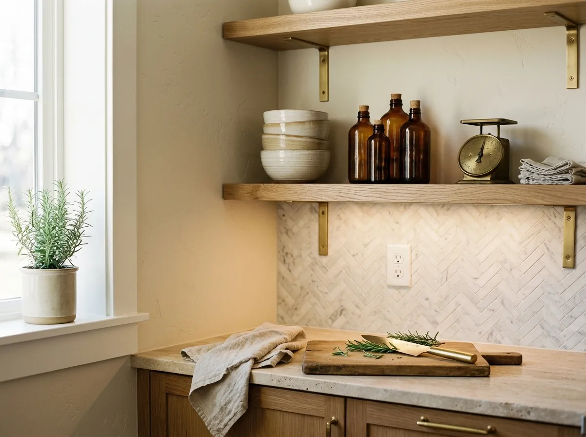
Use Creamy on kitchen walls only when the rest of the kitchen is warm-toned: warm wood cabinets, stone in beige or gold ranges, and warm metal hardware. Cool gray countertops, stainless steel, or white appliances will pull the yellow undertone forward in an unflattering way. On cabinets, most reviewers recommend a warmer-toned alternative with more neutral balance.
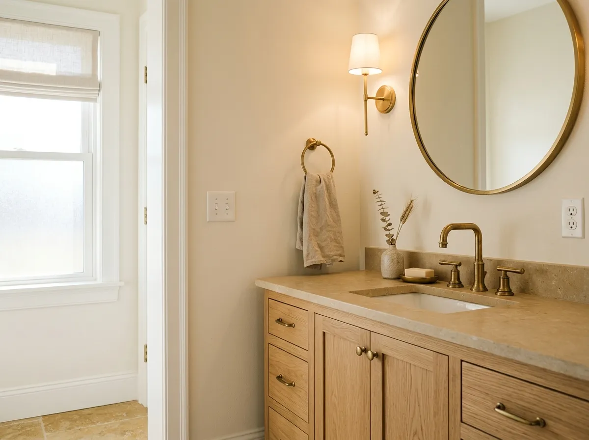
Creamy works in a bathroom when the fixtures and finishes lean warm, such as warm white fixtures, warm wood vanities, or beige and gold stone tile. In a bathroom with bright cool lighting and chrome or nickel hardware, the yellow undertone can feel at odds with the rest of the space.
This is arguably Creamy's strongest use case. Running it through connected rooms on an open floor plan creates visual continuity and a sense of warmth throughout. It bridges living, dining, and hall spaces naturally. Use a consistent trim white across all the rooms to tie everything together and give each doorway and window a clean edge.
Creamy's coordinating palette leans into its warm, earthy character. Studio Taupe SW 7549 gives you a grounded, warm medium-depth neutral that anchors Creamy without pulling the room cool, a strong choice for an accent wall, furniture, or soft furnishings where you want contrast that still feels harmonious. Reynard SW 6348 moves further into warm terracotta-adjacent territory and works well as a bold accent in a room where Creamy handles the walls, adding depth and a traditional, lived-in quality.
For trim and millwork, the most recommended move across independent reviews is to pair Creamy walls with a crisper, brighter white on the woodwork. This gives the room definition and prevents the warm tones from softening into each other. Pure White SW 7005 and Extra White SW 7006 are both named frequently as trim companions that sharpen the overall look without going so cool that they fight the wall color.
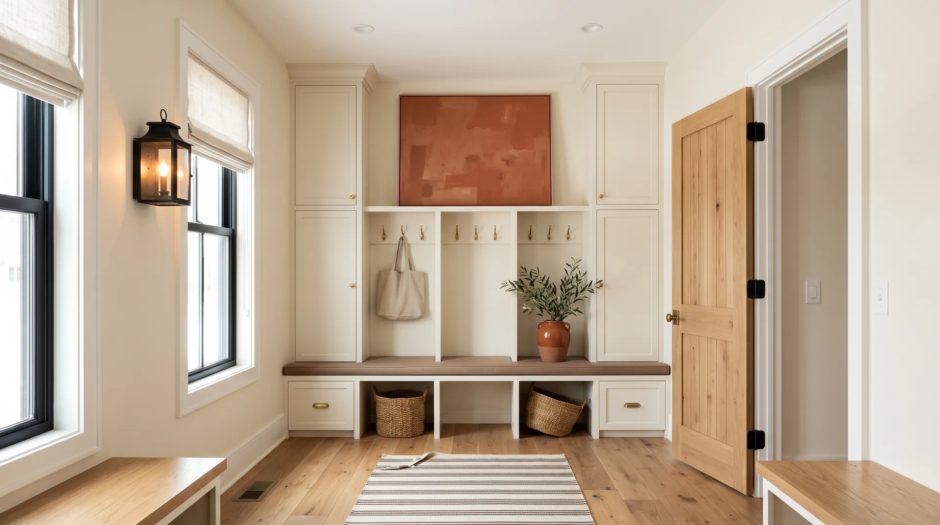
If you want to recreate this warm, collected sitting room, every color you need is gathered here as Sherwin-Williams swatches so you can shop the full palette in one place. Two of the seven are actual paint: Creamy wraps the built-ins, bench base, walls, and ceiling as an envelope, while Pure White sharpens the trim, door casing, and built-in face-frame. The remaining five represent the room's furnishings and materials, each shown as its closest Sherwin-Williams match, and hovering any pin or swatch will tell you exactly what it is.
All comparisons are matched against Creamy at LRV 81.2.
Creamy's yellow undertone and cool gray stone or quartz sit in direct opposition on the color wheel. Next to a cool gray counter, the wall color can read as dingy or unintentionally yellowed rather than warmly creamy.
A very cool, blue-toned bright white on trim next to Creamy walls creates a jarring contrast that makes the walls look stained or yellowed rather than warmly off-white.
In a south or west-facing room where strong afternoon sun combines with warm incandescent or warm-toned LED fixtures, Creamy can accumulate warmth to the point where it reads genuinely golden rather than softly creamy, which may not be the look you intended.
Creamy is a warm, soft off-white with a buttery, muted yellow character. It is not a stark or bright white. On the wall it reads as a classic cream, sitting comfortably in the off-white family with enough warmth to feel inviting rather than cold.
The dominant undertone is warm yellow, with hints of gold and butter, grounded by a neutral beige base that keeps it from reading as paint-chip yellow. Nearly every independent reviewer names yellow as the defining trait. In cooler north or east light the yellow can soften and settle back, but it does not disappear. In south and west exposures and under warm artificial light it becomes more prominent.
Creamy is definitively warm. There is no cool, gray, or green pull in this color. If you are looking for a white that leans neutral or has any coolness to it, Creamy is not the right choice.
Creamy has an LRV of 81.2. That places it near the top of the off-white range, bright enough to feel open and light in most rooms, but not so high that it reads as a near-pure white.
The Sherwin-Williams color code is SW 7012. The hex value is #EFE8DB and the RGB is 239 / 232 / 219.
Most independent reviewers advise caution here. On cabinets, the yellow undertone can look out of place next to cool-toned countertops, stainless appliances, or modern hardware, and it offers limited contrast range as finishes in the room change. It can work on cabinets in a warm traditional or cottage kitchen where all the finishes lean warm. On trim, many reviewers prefer a slightly crisper, more neutral off-white that provides a cleaner line and is easier to pair across changing rooms.
Creamy pairs well with warm, earthy, and natural tones. Studio Taupe SW 7549 works as a grounded warm neutral for accents, and Reynard SW 6348 adds a bolder warm terracotta-adjacent depth. For trim, a brighter but still warm white such as Pure White SW 7005 or Extra White SW 7006 creates a crisp contrast that makes the walls read more intentional. Natural wood, warm stone, brass, and unlacquered metals are all strong material pairings.