
MorningSoft · green reads true
A warm, muted sage with yellow and brown undertones, sitting mid-range at LRV 42.1, earthy and grounded rather than bright or botanical. Sample it across morning, afternoon, and evening before you commit.
Sage SW 2860 is a medium, muted green with a gray base that keeps it from reading as either a bright botanical or a clean mint. On the wall it lands in earthy, organic territory, closer to the color of dried herb leaves than fresh ones. Its LRV of 42.1 puts it squarely in the middle of the value scale, meaning it absorbs more light than it gives back and settles into a room with quiet weight rather than airy brightness.
The color shifts meaningfully across the day and from room to room, which is the single most important thing to understand before committing. In good natural light, especially from the south or west, the warm yellow tones open up and the green reads fuller and more present. By late afternoon in a west-facing room it can push toward olive, giving it a richer, more intense character than you saw on the chip. In lower light or under incandescent bulbs, the brown undertone moves forward and the overall effect gets heavier and more muted. Every reviewer stresses sampling this one in your actual space across morning, midday, and evening before painting out a full room.
The broad consensus from independent reviewers is that Sage SW 2860 is a warm sage, not a cool or neutral one. The green base carries yellow and, in lower light, brown, with a warm gray underneath that keeps the whole thing from feeling saturated or loud. It is decidedly warmer than many other paint colors that use the word "sage" in their name, and that warmth is what gives it its earthy, grounded quality.
That said, there is genuine disagreement about the extent of the warmth and exactly which undertones dominate. Some reviewers describe the swing as yellow and faint orange or pink on one end versus a cooler mint or gray on the other, calling the color balanced overall. The stronger independent read, though, is that warm tones win out in most real-world conditions. Yellow is the most consistently noticed secondary tone, brown shows up in dim or artificial light, and the cooler gray or mint reading is a minority experience tied to specific light conditions like overcast northern exposure.
What this means practically is that Sage is not a traditional neutral, but its muted, mid-value quality allows it to behave like one in rooms with the right light and palette. If your space runs cool, gray, or north-facing, you may find the green recedes into something flatter and more gray-brown than the warm sage you were hoping for. If your room is warm and well-lit, the yellow-green character will come through clearly. Either way, the undertone is not stable enough to assume, which is why a large sample tested across multiple lighting conditions is non-negotiable here.
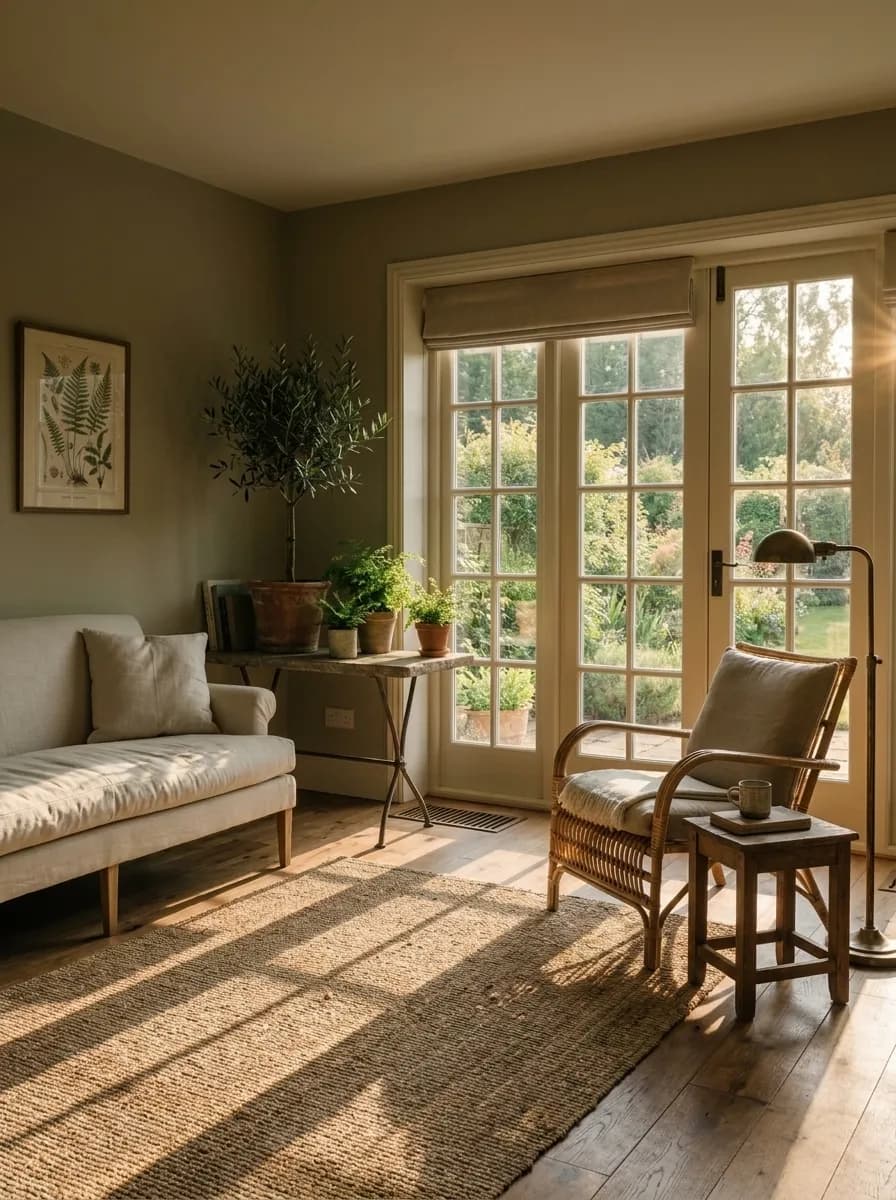
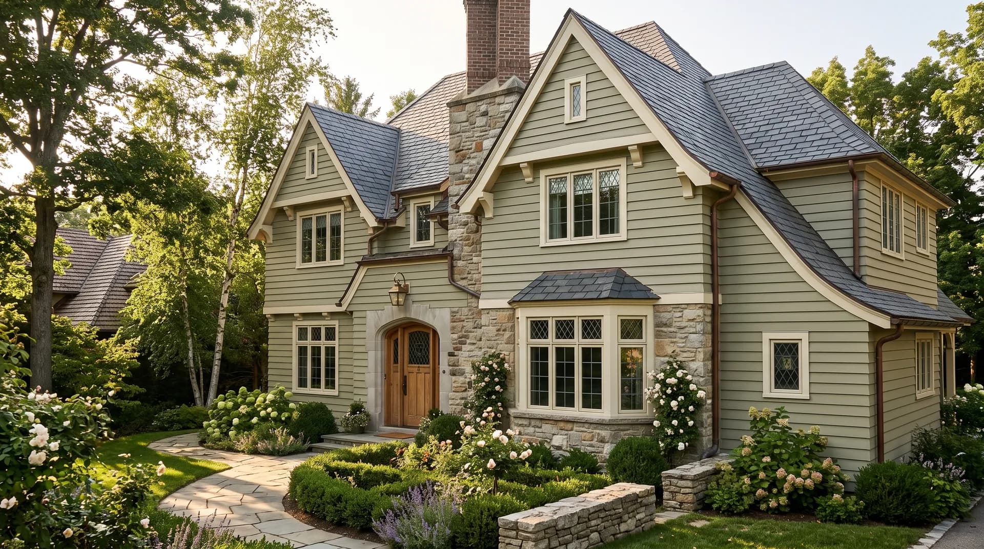
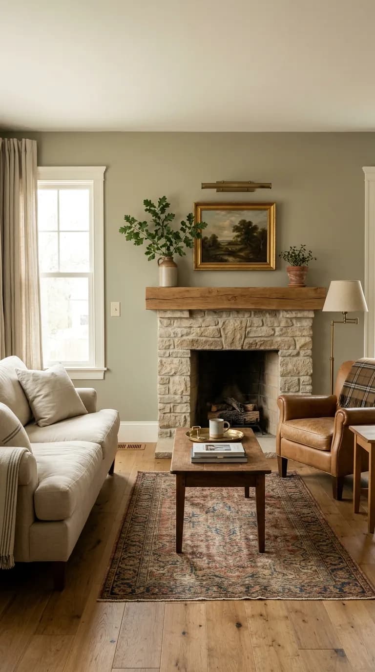
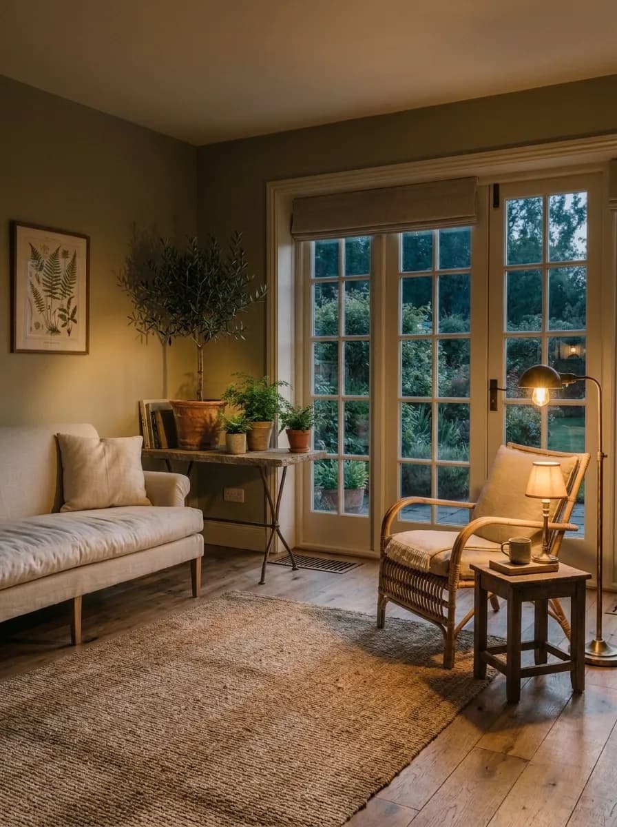
Sage SW 2860 performs best in rooms that get genuine natural light, where it can show its warm green character rather than flattening into a dull gray-brown. Living rooms and bedrooms are the natural fits, and the color brings a calm, organic quality to both without feeling trendy or overdone. Its Historic Colors pedigree means it reads at home in traditional, transitional, and even Craftsman-era spaces, but it also works in more relaxed modern and coastal settings where an earthy palette is the goal.
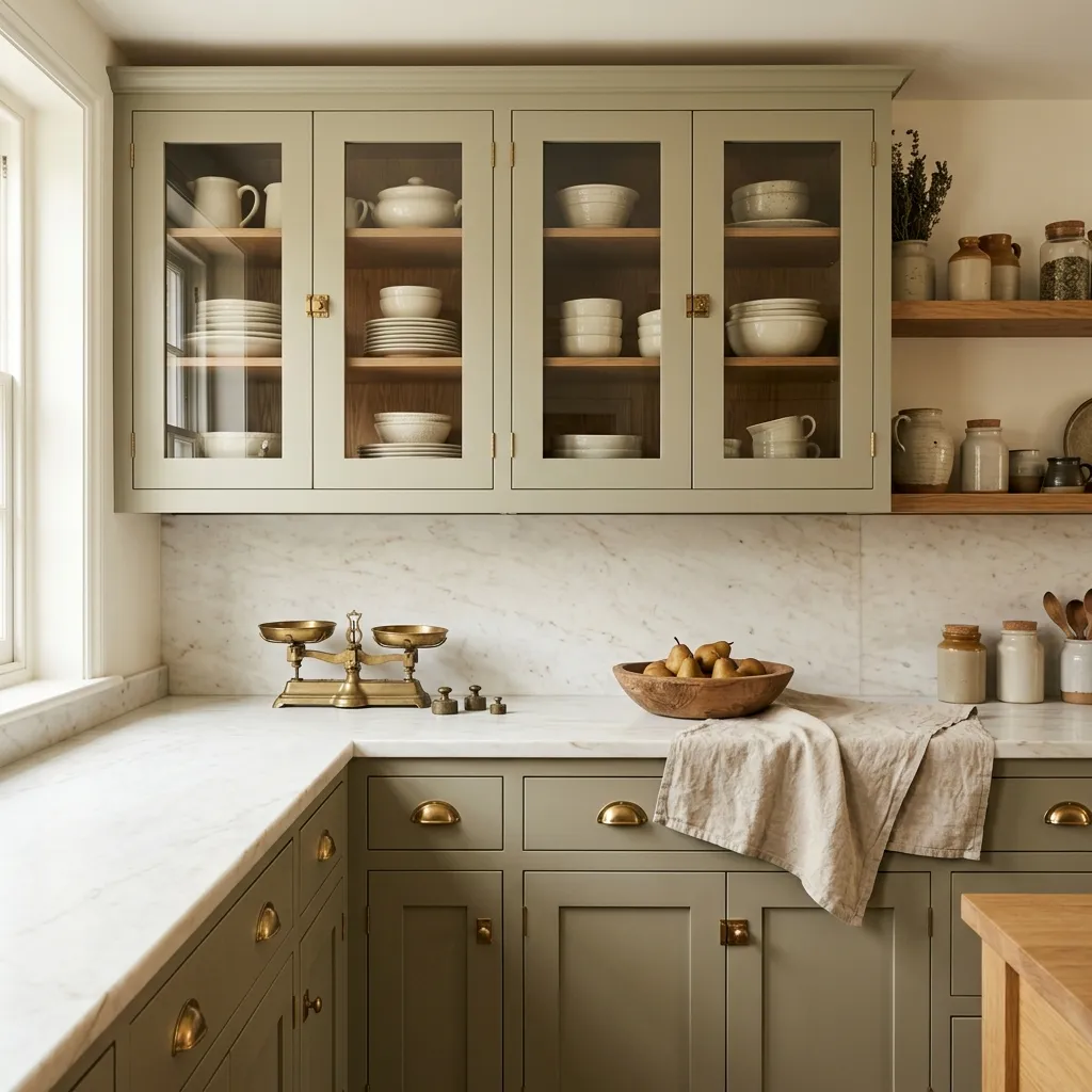
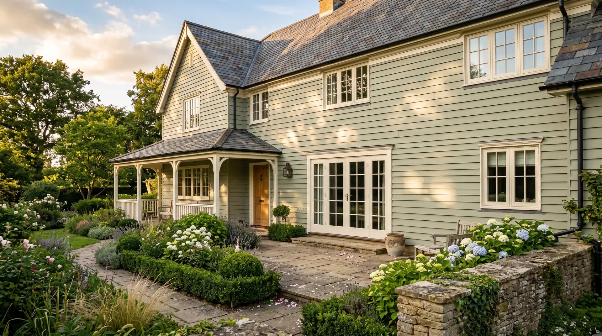
On cabinetry it has a strong following. Reviewers have used it on kitchen cabinets paired with white or cream walls, and on pantry cabinetry where its muted depth reads well against lighter surroundings. It also suits furniture, bookshelves, and front doors, where the mid-range LRV of 42.1 gives it enough presence to read clearly without going dark. For exteriors, its Historic Collections backstory supports coastal, Caribbean, ranch, and transitional architecture, and it holds up well as a body color with cream or white trim.
The main caution is scale and light. In a small, dim, or poorly lit room, the LRV 42.1 depth can feel heavy and the color may read dingy rather than warm. It is better suited to larger rooms, rooms with multiple windows, or spaces where warm artificial lighting supplements natural light. If you are considering it for a compact bathroom or a dark hallway, test it carefully before committing. South- and west-facing rooms give you the most flattering version of this color. North-facing rooms can work but will shift the read noticeably grayer and cooler.
A living room with south or west exposure lets Sage SW 2860 show its warmest, most settled green character across the walls. Pair it with cream or warm white trim, natural wood floors, and tan or terracotta accents for a room that feels grounded without being heavy. The LRV of 42.1 gives the space enough depth to feel cozy in the evening without going cave-like.
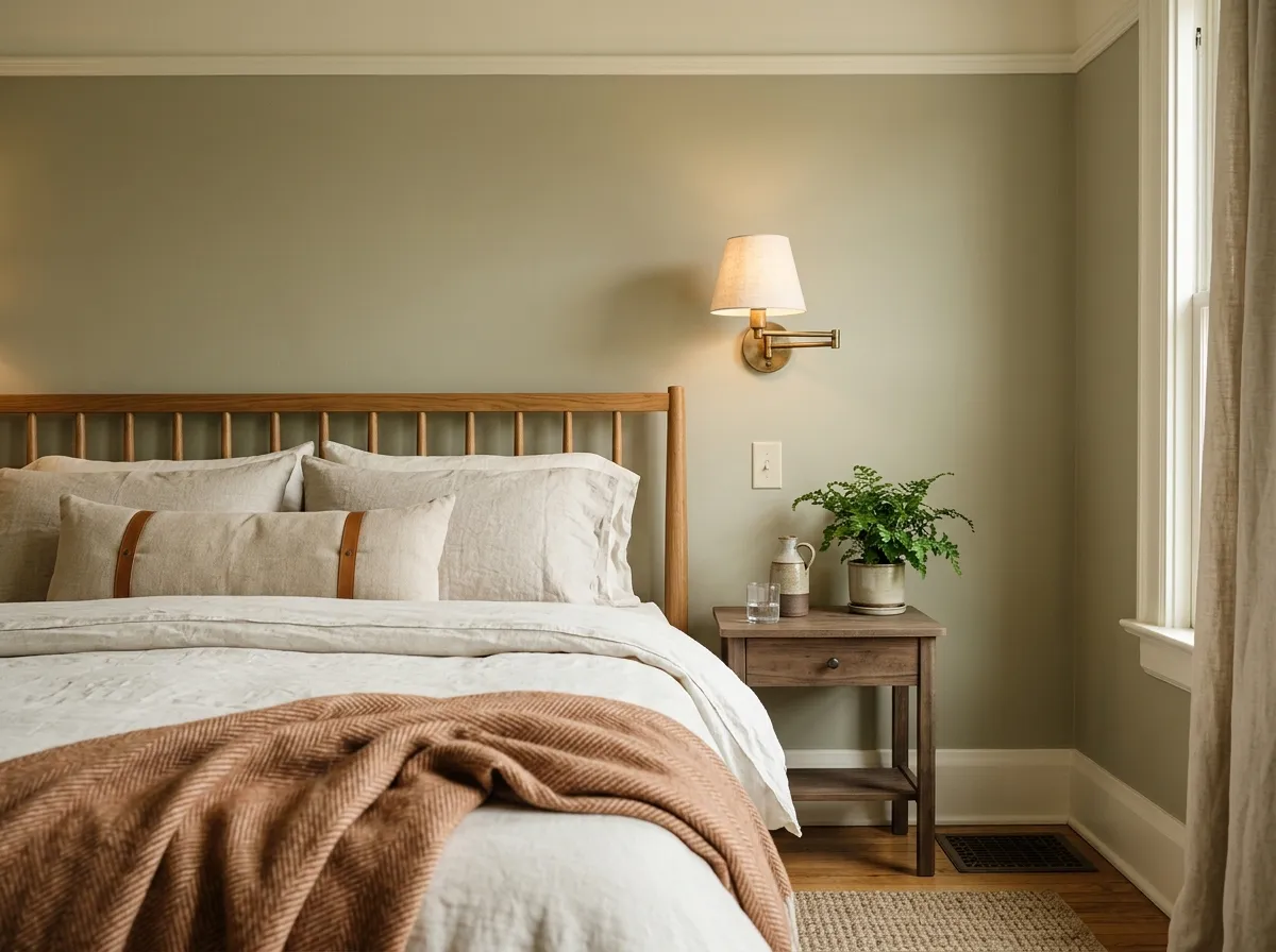
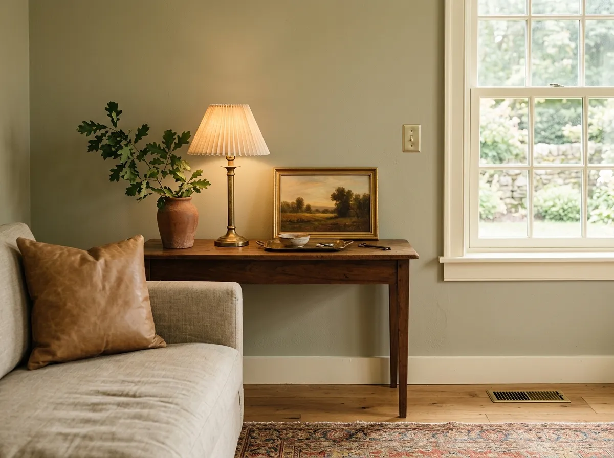
Sage works well in a bedroom where the muted, earthy green reads calm rather than energizing. It suits a nature-inspired or organic palette with linen bedding, wood furniture, and warm-toned textiles. Keep the ceiling lighter to avoid the mid-range LRV 42.1 depth pulling the room down.
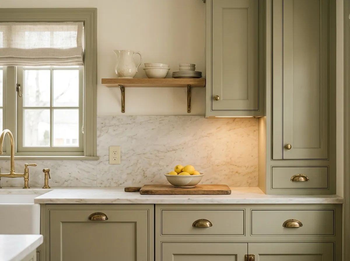
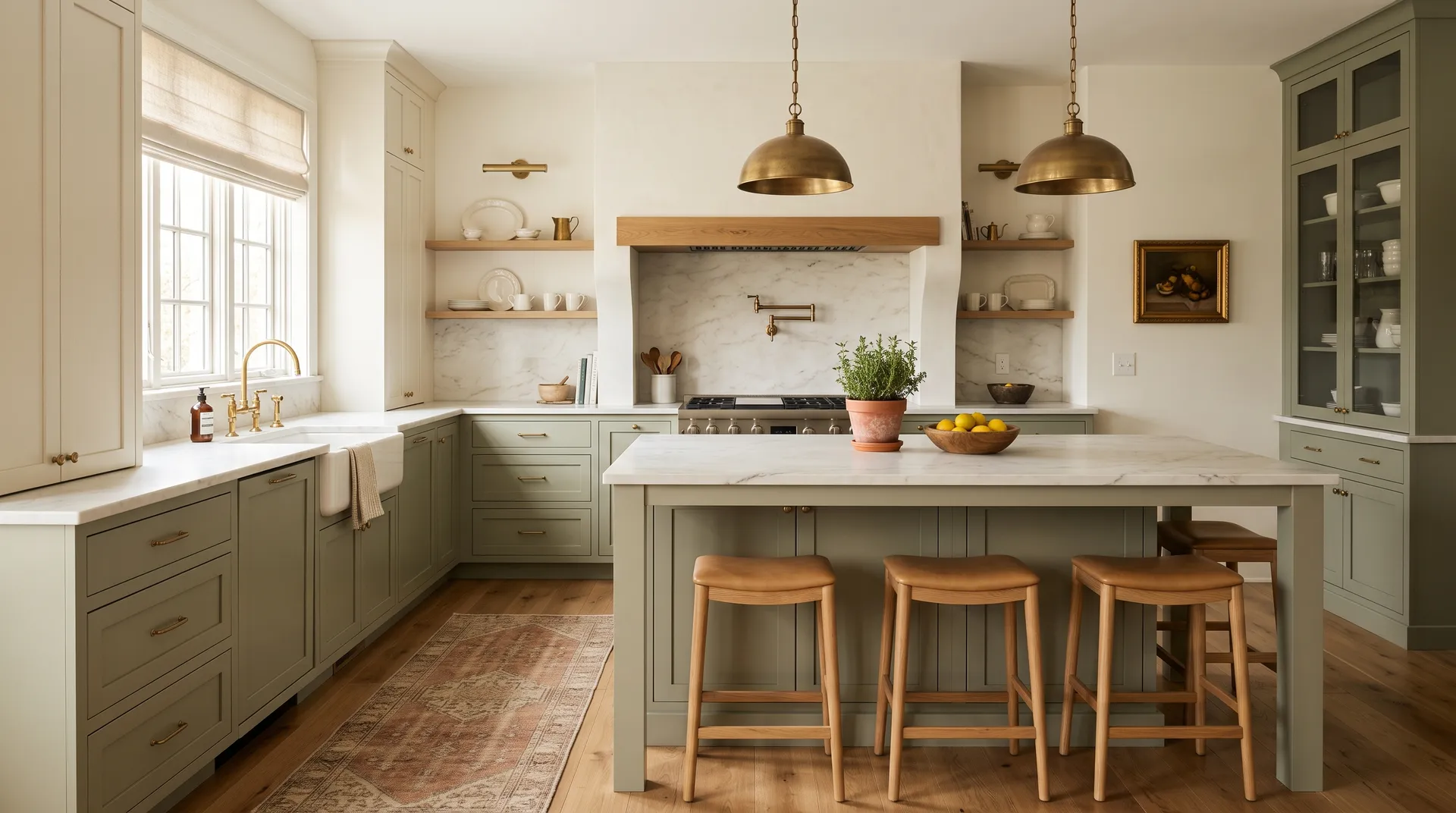
On kitchen cabinetry, Sage brings a warm, heritage quality that suits both traditional and transitional kitchens. Pair it with cream or warm white walls and brass or unlacquered hardware for a cohesive earthy palette. It reads more olive in kitchens with warm artificial lighting, so test a door or drawer front in your actual space before painting everything out.
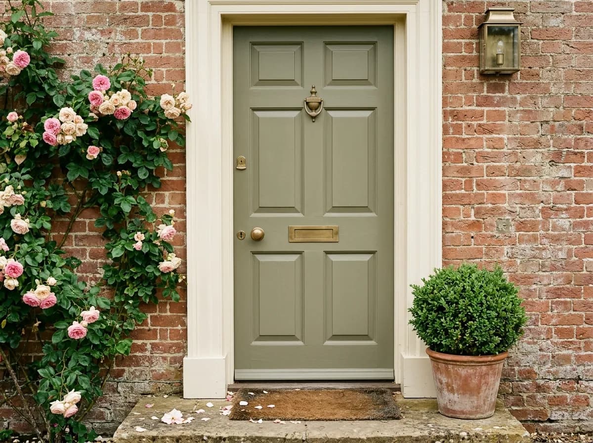
Sage makes a composed, characterful front door color on exteriors, especially on coastal, ranch, or transitional homes where an earthy green suits the architecture. At LRV 42.1 it has enough contrast against cream or white trim to read clearly from the street. It carries genuine Historic Colors credentials, which means it holds up against more formal traditional facades as well.
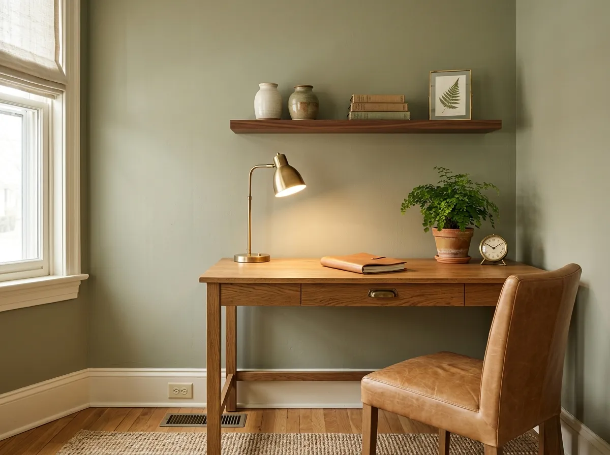
In a home office with good natural light, Sage provides a calm, low-distraction backdrop that reviewers associate with focus and ease. Be cautious in a north-facing office with no supplemental warm light, where the LRV 42.1 depth and the gray-brown shift can make the space feel dim and heavy rather than restful.
Sage SW 2860 pairs most naturally with creamy and warm whites rather than stark or blue-based whites. White Heron works well as a trim and ceiling companion because it brings warmth that echoes the yellow undertone in Sage without competing with the green. Sage Green Light SW 2851 gives you a deeper, richer tone in the same family, useful when you want a layered, tonal scheme across cabinetry, walls, or interior woodwork. For accent colors, warm metallics in gold or brass, terracotta, tan leather, and rich browns all reinforce the earthy, organic direction the color already wants to go. Urbane Bronze or matte black provide grounding contrast without pulling the room cold.
On the trim and wall side, light beiges, taupes, and soft warm grays read harmoniously against the muted green. If you want more contrast, a true cream is more successful than a cool or bright white, which can make the brown undertone in Sage look muddy by comparison. Avoid pairing it with anything that has a strong blue or cool gray cast, as those tend to pull out the least flattering, flattest version of this color.
The leather, terracotta, marble, oak, and brass do most of the heavy lifting here, and each material is shown as its closest Sherwin-Williams paint match so you can see exactly what you are working with. Only three of the seven colors are actual paint: Sage on the perimeter base cabinets and island, White Heron on the walls and upper cabinets, and Sage Green Light on the pantry cabinet for a deeper tonal hit. Hover any pin or swatch to pull the full color details.
All comparisons are matched against Sage at LRV 42.1.
Pairing Sage SW 2860 with a bright, cool, or blue-leaning white on trim or ceilings tends to pull out the least flattering version of its undertone, making the brown-gray shift look muddy and disconnected from the trim rather than harmonious.
At LRV 42.1, Sage absorbs more light than it reflects, and in a compact or naturally dim room that absorption compounds. The color shifts toward gray-brown in low light and can make a small space feel heavier and dingier than you expect from the chip.
Cool grays, slate blues, or anything with a strong blue-purple cast will fight the yellow and brown warmth in Sage rather than complement it, making both colors look off and the room feel unresolved.
Sage SW 2860 is a medium, muted green-gray with an earthy, organic character. It is not a bright or minty sage. Its hex is #B3AE95 and its RGB is 179, 174, 149, which puts it in warm gray-green territory. At LRV 42.1 it sits in the middle of the value scale, absorbing more light than it reflects and reading with quiet depth rather than brightness.
The primary undertones are warm green, yellow, and brown, with warm gray underneath. Yellow is the most consistently noticed secondary tone in natural light, while brown moves forward in lower or artificial light. Some reviewers describe a cooler mint or gray read in specific lighting conditions, but the stronger independent consensus is that this is a decidedly warm sage, warmer than many similarly named greens on the market.
It is warm. The yellow and brown undertones dominate across most real-world conditions, and the muted gray base keeps it from feeling bright or saturated rather than from feeling warm. In north-facing rooms or overcast light it can shift grayer and feel more balanced, but even then the warmth is present. It sits on the warmer, more yellow-brown end of the muted sage category.
The LRV is 42.1. That is a mid-range value, meaning the color absorbs more light than it reflects. It will make a room feel grounded and cozy rather than airy, and it reads best in rooms with good natural light. In small or poorly lit spaces the depth can tip into feeling heavy.
Warm and creamy whites work best for trim and ceilings. White Heron is a named coordinate that bridges the warmth well. Sage Green Light SW 2851 gives you a deeper companion in the same family for a tonal layered scheme. For accents, warm metallics in gold or brass, terracotta, tan leather, and natural wood all reinforce the earthy direction. Urbane Bronze or matte black add grounding contrast. Avoid cool grays, blue-toned whites, and anything with a blue or purple cast, which will pull out the muddy brown-gray shift rather than the warm green.
The Sherwin-Williams code is SW 2860. The hex is #B3AE95 and the RGB is 179, 174, 149. The LRV is 42.1.
Yes to all three. Sage carries Historic Colors credentials in both the Exterior Historic and Historic Suburban Modern collections, making it a solid choice for home exteriors in coastal, ranch, Caribbean, and transitional styles. On a front door it reads with enough presence at LRV 42.1 to stand out against cream or white trim. On cabinetry, reviewers have used it successfully on kitchen cabinets and pantry cabinetry, pairing it with warm white or cream walls for a cohesive earthy scheme. Test it in your actual kitchen light before painting everything, as warm artificial lighting will push it more olive.