Silver Plate reads as a light-to-medium true gray on the wall, the kind that looks genuinely gray rather than sliding into beige, greige, or purple. At LRV 52.6 it sits squarely in the middle of the value scale, so it neither washes out in a bright room nor drags a smaller space down. That midpoint is actually one of its most useful qualities. You get real presence and color without any heaviness.
The character reviewers keep returning to is clean and polished. Some describe it as stormy in the best sense: there is depth and a slight cool crispness to it, but it never tips into icy or clinical. Under warm artificial light it softens noticeably and reads more like a calm, composed neutral. In brighter natural light the cool side sharpens and the color feels fresh and airy. It is a genuinely versatile mid-gray that shifts mood with the light rather than fighting it.
Many people who have lived with it call it underrated, precisely because it does not announce itself. It does its job quietly. If you have been burned by grays that showed unexpected purple or green on your walls, Silver Plate is the kind of color that tends to stay in its lane.
Sherwin-Williams tags Silver Plate as cool and silver, and most independent reviewers agree the color leans cool. The dominant undertone is a faint, restrained blue-gray. It is subtle enough that some people read it as nearly neutral, but it is there, especially in north-facing rooms or under cool-spectrum lighting where the blue-gray comes forward and reads crisply.
There is a minor undertone debate worth knowing about. A portion of reviewers detect a slight blue-green quality in certain light conditions, particularly in bright or indirect northern daylight. It is not a strong green cast, and most people do not experience it as disruptive, but it is real enough that you will find it mentioned in independent discussions. In warm incandescent or soft LED light, that cool edge recedes almost entirely and the color settles into something closer to a balanced, slightly silvery neutral. So whether Silver Plate reads cool or near-neutral to you will depend heavily on your room's orientation and your light sources.
What Silver Plate does not do is pull beige, purple, or obvious green in the way that many competing light grays do. That is actually its selling point for people who want a gray that stays gray. If your walls are picking up a lot of warm afternoon sun, expect the cooler qualities to be suppressed. If your room is north-facing or lit with daylight-balanced bulbs, expect the blue-gray to be the dominant read. Sample it at different times of day before committing.
Silver Plate is well suited to contemporary and transitional spaces that want a clean, polished neutral without going stark white or committing to a bold statement. Because it sits at LRV 52.6, it works in rooms with a reasonable amount of natural light and holds up in spaces that depend more on artificial light, though you will want warm-toned bulbs in the latter case to keep it from reading too cool.
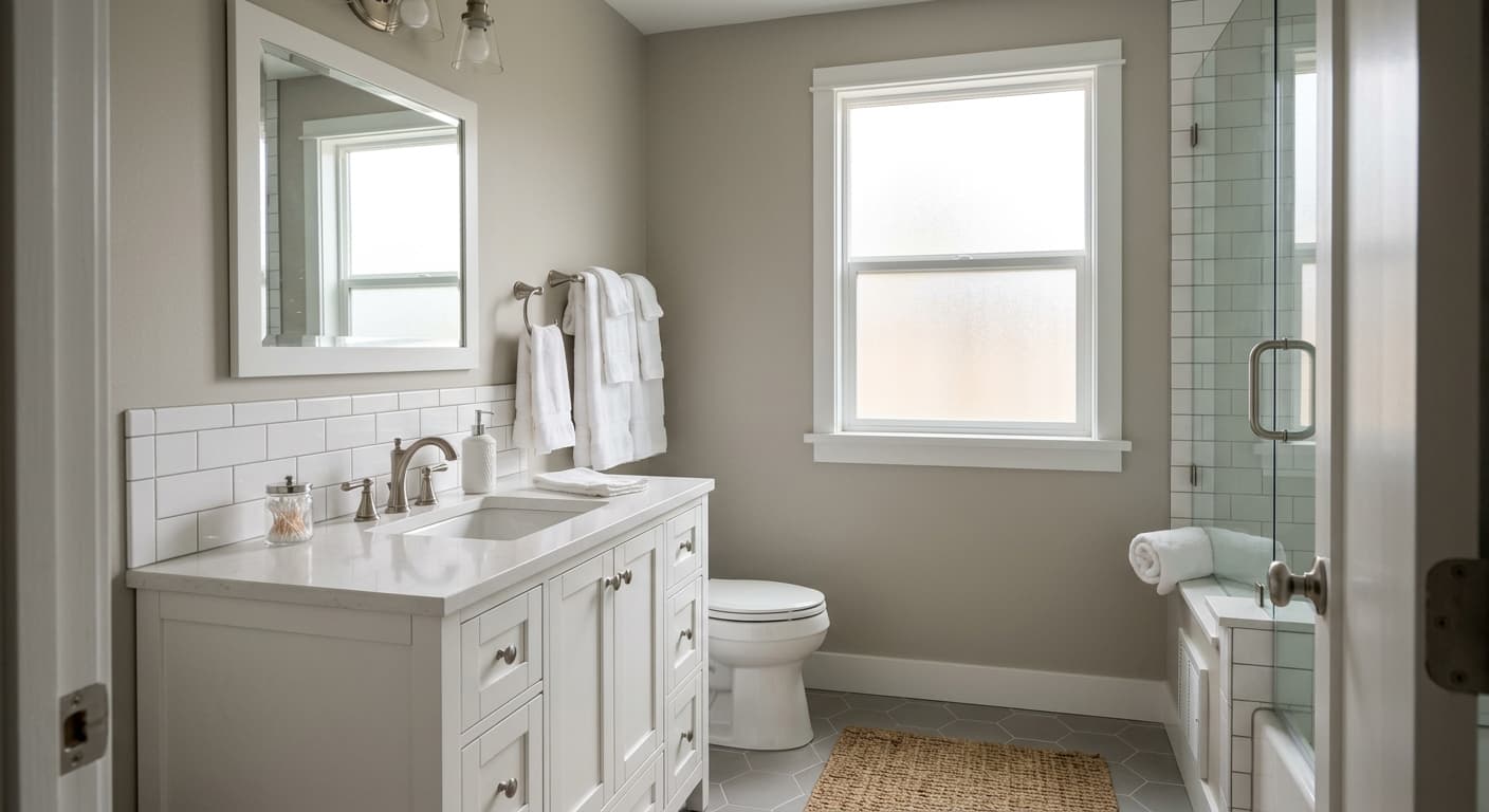
It earns its whole-house neutral reputation because the color is consistent and non-committal enough to carry across connected spaces without clashing. Open-concept living areas are a natural fit, where you need a single color to read well from a kitchen into a dining space or living room. Bedrooms benefit from its calm, composed quality, and bathrooms get a crisp, clean feel from it, especially with white tile and chrome or brushed nickel fixtures. It is also a strong candidate for anyone doing a full interior repaint who wants continuity across rooms with different orientations, since Silver Plate adapts reasonably well to both north-facing and south-facing exposures.
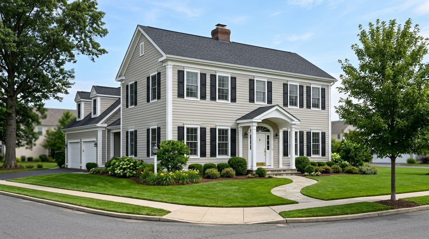
For exteriors, its mid-LRV and cool gray character can work well on siding in climates where the light is strong, pairing naturally with white trim and darker gray or black accents. On cabinets it delivers a sophisticated, clean gray without the purple or green cast that plagues some light grays in kitchen lighting. As always with a color this subtle, the specific light environment in your kitchen or bathroom matters a great deal, and a large sample is worth the effort before you commit to cabinetry.
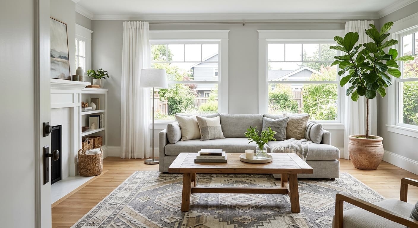
In a living room, Silver Plate provides a calm, cohesive backdrop that lets furniture and textiles carry the personality. Its LRV 52.6 gives the walls enough presence to feel intentional rather than like an afterthought. Pair it with warm wood tones or soft textured upholstery to balance the cool undertone.
Silver Plate reads composed and restful in a bedroom, especially with warm-white bedding and soft lighting that tempers the cool undertone. It avoids the harshness of a true pale gray while still delivering a clean, modern feel. North-facing bedrooms will get the fullest cool gray expression; south-facing rooms will soften it considerably.
In bathrooms, the cool gray quality pairs well with white tile, chrome, and brushed nickel, giving the space a crisp, clean look without going stark. At LRV 52.6 it holds up in smaller bathrooms that get limited natural light, as long as you use warm-balanced bulbs overhead. It avoids the purple or green shift that troubles many light grays in bathroom lighting.
On cabinetry Silver Plate delivers a sophisticated mid-gray that stays genuinely gray under most kitchen lighting conditions. It avoids the common pitfalls of purple or green casts that show up in similar-value competitors. Pair with a warm white on walls and Cityscape SW 7067 on an island for a layered, contemporary kitchen.
This is where Silver Plate genuinely earns its reputation. It reads consistently across rooms with different orientations because its undertone is subtle enough not to clash with itself in changing light. Use it throughout connected open-concept spaces, then anchor transitions with Cityscape SW 7067 on doors or focal walls.
Silver Plate layers naturally with both warm and cool whites, which gives you real flexibility in how you set the temperature of a space. Eider White SW 7014 is the warm-side trim choice: it keeps the overall scheme from feeling too cool and adds a soft, lived-in quality to the pairing. For a crisper, more contemporary look, Nebulous White SW 7063 holds the palette on the cooler side and reads sharp and clean against Silver Plate's mid-gray body. Either white works on trim, ceilings, or millwork depending on the mood you are after.
For contrast and depth, Cityscape SW 7067 is the natural anchor. It is a considerably deeper gray that can carry an accent wall, a kitchen island, interior doors, or built-in cabinetry without pulling a different undertone into the scheme. The combination of Silver Plate on walls, a white trim option, and Cityscape as an accent is a straightforward, cohesive approach that reviewers and designers return to repeatedly for contemporary and transitional interiors.
All comparisons are matched against Silver Plate at LRV 52.6.
Heavy honey oak floors or orange-toned wood cabinetry can clash with Silver Plate's cool undertone, creating an awkward tension between the warm wood and the cool wall color that makes neither look intentional.
Very creamy, ivory, or strongly warm-white upholstery and soft goods can read slightly yellowed or dingy against Silver Plate's cool gray, because the contrast in color temperature highlights the warm cast in the fabrics.
In an open-concept layout, placing a bold cool-blue or green accent in the same sightline as Silver Plate can amplify the subtle blue-green undertone in Silver Plate in a way that feels unintentional and muddy rather than coordinated.
Silver Plate is a light-to-medium true gray. It reads as a clean, polished gray on the wall with a very subtle cool undertone, closer to a classic gray than a greige or a warm neutral. At LRV 52.6 it has real presence without being heavy.
The primary undertone is a faint, restrained cool blue-gray. In certain light conditions, particularly north-facing rooms or under daylight-balanced bulbs, some reviewers also detect a slight blue-green quality. Under warm artificial light the cool edge softens and the color reads closer to a balanced neutral. It does not pull purple, beige, or obvious green the way many competing light grays do.
Silver Plate is cool. Sherwin-Williams categorizes it with cool and silver undertones, and independent reviewers consistently describe it as a clean, cool gray. It is not aggressively cold or icy, but it leans cool rather than warm, especially in north-facing rooms or with daylight-spectrum lighting.
Silver Plate has an LRV of 52.6, which places it solidly in the middle of the light-reflectance scale. It is light enough to keep a room feeling open and airy but has enough depth to read as a distinct color rather than washing out.
Silver Plate's Sherwin-Williams code is SW 7649. The hex value is #C2C0BA and the RGB is 194, 192, 186.
Silver Plate pairs well with Eider White SW 7014 on trim for a warmer, softer contrast, or Nebulous White SW 7063 for a crisper, cooler white that keeps the palette contemporary. Cityscape SW 7067 works as a deeper gray anchor on accent walls, doors, or cabinetry. Warm wood tones, soft linen textiles, and true whites all sit comfortably alongside it.
Yes to all three, with some considerations. On exteriors its cool mid-gray reads well in strong natural light paired with white trim and dark accents. On a front door it delivers a sophisticated, contemporary gray without going too dark. On cabinets it holds up as a clean, true gray in kitchen lighting without the purple or green cast that troubles some competitors at this value. Sample on your specific surface in your specific light before committing to cabinetry, since kitchen lighting varies widely.
