Essential Gray lands in that middle zone where light grays meet warm neutrals. With an LRV of 48.4, it reflects almost exactly half the available light, which means it reads as a genuine color on the wall rather than a near-white or an accent, but it never darkens a room into gloom. In person, it has a soft, approachable quality that photographs tend to flatten; the warmth is subtle but real.
What surprises most people is how greige it actually is. The name suggests a straightforward gray, and it can read that way in cool, flat daylight. But the taupe and beige woven into it are not incidental. In warmer or lower light they come forward noticeably, giving the wall a cozy, settled quality that pure grays rarely achieve. This is a color that shifts with its environment, and that adaptability is both its main selling point and its main complication.
The undertone story here is genuinely contested, and you should know that going in. Most reviewers agree on the core: Essential Gray carries warm taupe and beige undertones that give it a greige character rather than a cold steel gray. In warm artificial light, that warmth amplifies and the color reads almost like a soft, muted taupe. In flat or neutral daylight it settles into a balanced gray that earns the name on the label.
The disagreement is about the cool flash. A meaningful number of observers report a lavender or violet-gray cast appearing under certain lighting conditions, particularly in rooms with cool north light or where the surrounding trim and furnishings lean blue or purple. This is not universal, and plenty of people use Essential Gray without ever seeing it. But it is common enough that you should take it seriously rather than dismiss it as an outlier. The practical takeaway is to treat the lavender risk as a real variable, not a fringe complaint.
Because of that variability, sampling is not optional here. Paint large swatches on at least two walls, one that catches direct daylight and one that does not, and look at them in the morning, in the afternoon, and under your actual evening lighting. If you see violet pulling in any of those conditions, that tells you something important about how this color will live in that specific room.
Essential Gray is genuinely well suited to whole-house use, and that is where it performs most consistently for most people. Because its LRV of 48.4 sits near the midpoint of the reflectance scale, it does not behave dramatically differently from room to room the way very dark or very light colors can. Open-plan spaces, hallways, and rooms that flow into each other all benefit from that stability.
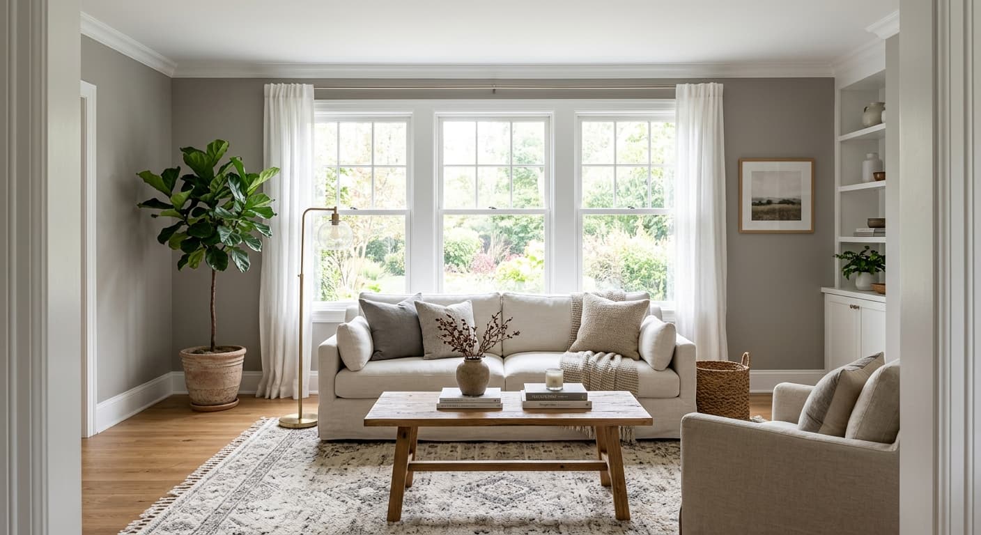
Living rooms and bedrooms are the rooms reviewers mention most. In a living room, the warm greige quality makes the space feel inhabited rather than clinical, which is harder to achieve with cooler grays. In a bedroom it reads restful without being dull. For both spaces, south- and west-facing rooms tend to bring out the taupe warmth most reliably, which is where Essential Gray is at its most settled and consistent.
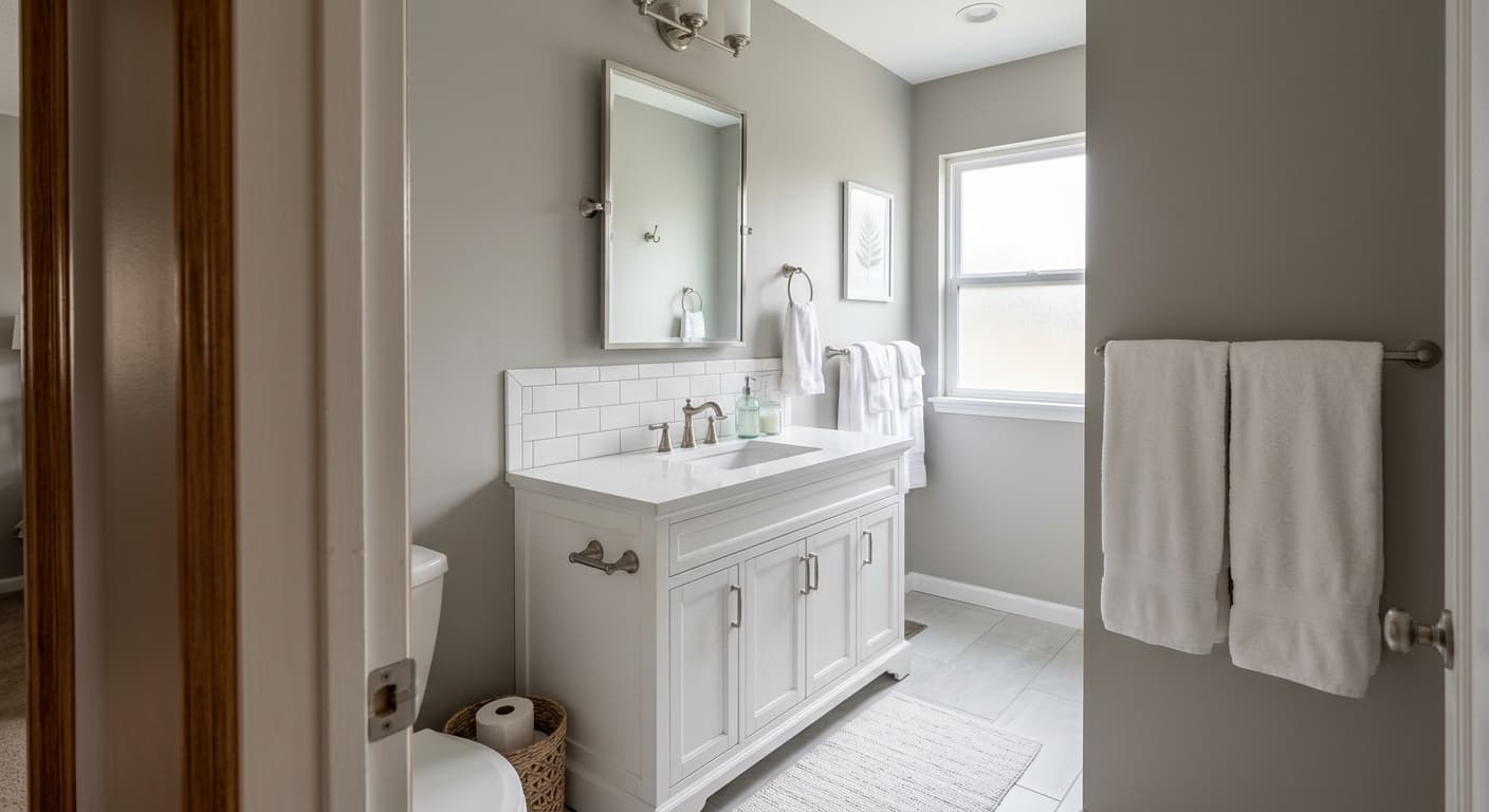
North-facing rooms are where you need to be careful. Cool north light is the condition most likely to activate the lavender or violet-gray cast that some reviewers report. That does not rule out using Essential Gray in a north-facing room, but it does mean sampling is especially important there. If after sampling the violet cast is present and bothers you, shifting to a warmer greige will usually solve it. For exteriors, Essential Gray can work on siding where there is enough mass for the color to read fully, and it handles well on cabinets where the greige warmth pairs naturally with wood tones and hardware in brushed nickel or warm brass.
Essential Gray reads warm and grounded in a living room, especially in south- or west-facing spaces where afternoon light brings the taupe forward. At LRV 48.4 it gives the walls real presence without making the room feel smaller. Pair it with natural wood furniture and warm white trim to keep the greige reading consistent.
In a bedroom, the muted warmth of Essential Gray reads restful rather than cold, which is the quality most people are looking for in a sleep space. It works equally well as an all-four-walls color or as a backdrop for a deeper accent behind the bed. Warm lighting here reinforces the taupe side of the undertone and keeps the color feeling cozy.
Essential Gray is a reliable whole-house neutral precisely because its LRV 48.4 does not shift dramatically as it moves from room to room through changing light. In an open plan where the kitchen, dining, and living areas share one color, it reads consistently enough to unify the space. Coordinate trim in a warm white to keep the greige tone from reading flat.
On cabinetry, Essential Gray brings a soft warmth that avoids the sterile quality some cooler grays can have in a kitchen. It pairs naturally with wood shelving, butcher block, or stone countertops that have warm movement in them. Hardware in brushed brass or warm nickel reinforces the greige and keeps the lavender cast from surfacing.
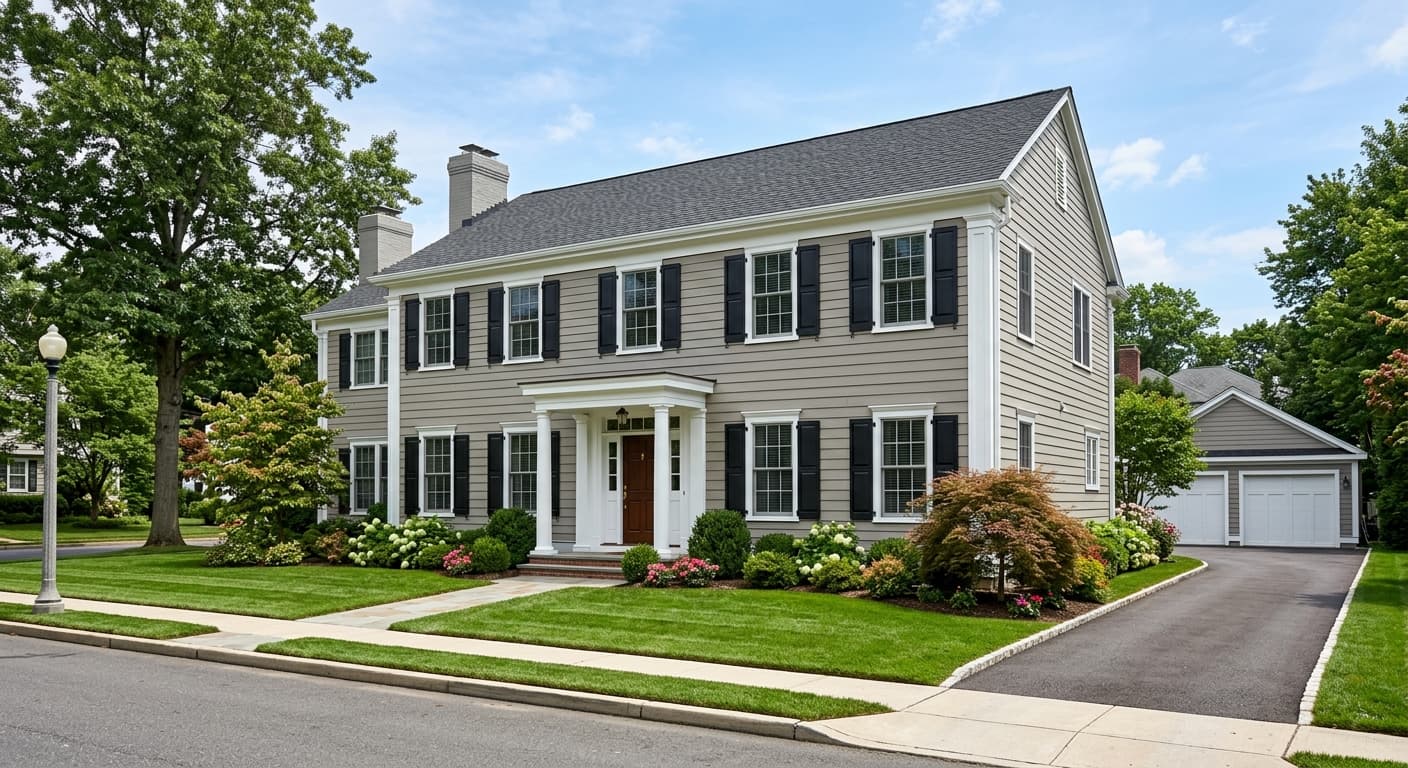
Essential Gray has enough body at LRV 48.4 to read as a full color on exterior siding, where very light colors can wash out in bright sun. It suits transitional and craftsman-style homes especially well and coordinates with both warm wood trim and crisp white fascia. Sample it on the actual facade, though, because exterior light conditions vary more than interior ones.
Essential Gray coordinates naturally with the colors Sherwin-Williams pairs it with in its own lineup. Snowfall anchors the combination at the light end, giving you a warm white for trim and ceilings that does not fight the greige quality in the walls. Gossamer Veil extends the palette into a softer, slightly more blush-adjacent neutral that layers well in spaces where you want tonal depth without contrast. Dress Blues pulls in the opposite direction entirely, giving you a deep, saturated anchor color for an accent wall, cabinetry, or upholstery.
Beyond those specific pairings, Essential Gray works well with warm wood tones, natural linen textures, and metals that have warmth in them, particularly brushed brass and unlacquered bronze. It holds its own against charcoal and near-black accents without losing its softness. Avoid pairing it with anything that has a strong blue or purple base unless you have confirmed through sampling that the lavender cast is not present in your space, because those combinations can amplify it.
All comparisons are matched against Essential Gray at LRV 48.4.
Pairing Essential Gray with strongly blue or violet accent colors, whether in upholstery, rugs, or an adjacent wall, can activate and amplify the lavender undertone that some reviewers already see in this color on its own.
Crisp, blue-toned white trim can pull Essential Gray toward its cooler, violet-adjacent reading and make the wall color look less intentional than it should.
Cool north light is the lighting condition most likely to make Essential Gray read lavender or violet-gray rather than a warm greige, and that shift can be jarring if you did not see it coming.
Essential Gray is a light-medium gray with a strong greige quality. Its hex is #BCB8B6 and its RGB values are 188, 184, 182. In person it reads as a soft, warm gray with taupe and beige woven in, rather than a cold or steely gray. The exact reading shifts with light conditions.
The dominant undertones are warm taupe and beige, which is why many people describe it as a greige rather than a true gray. Under warm artificial light those undertones come forward and the color reads almost like a muted taupe. Under cool north light or near blue and purple furnishings, some reviewers also see a lavender or violet-gray cast. That cooler flash is not universal, but it is common enough to sample for.
It sits closer to the warm side. The taupe and beige undertones give it a greige character that reads warmer than most grays at a similar depth. That said, the potential lavender cast under cool light means it is not unconditionally warm. Think of it as a warm neutral that can behave coolly in the wrong conditions.
The precise LRV is 48.4, which puts it very close to the midpoint of the reflectance scale. It reflects nearly half the available light in a room, keeping spaces airy without washing the color out.
The Sherwin-Williams code is SW 6002. The hex is #BCB8B6 and the RGB values are 188, 184, 182.
Its coordinating palette includes Gossamer Veil for a soft tonal layer, Snowfall for warm white trim and ceilings, and Dress Blues for a deep, saturated accent. More broadly, it pairs well with warm wood tones, natural linens, and hardware in brushed brass or warm nickel. Avoid pairing it with strongly blue or violet colors unless you have confirmed through sampling that the lavender cast is not showing up in your specific space.
Yes to all three with some caveats. On exteriors, its LRV of 48.4 gives it enough body to read as a full color on siding without washing out, and it suits transitional and craftsman homes well. On cabinets, the greige warmth pairs naturally with wood countertops, stone, and warm hardware. For a front door it works best on homes that already have warm or neutral trim colors. In all three applications, sample on the actual surface before committing, since exterior and cabinet finishes change how the color reads.
