
MorningGrayer · green whisper shows
A warm, soft greige with a gray backbone that reads light gray in cool light and settles into quiet warmth when the sun swings south or west. Sample it on your wall before you decide.
Gossamer Veil lands somewhere between light warm gray and greige without fully committing to either. On the wall it reads as a soft, warm gray with enough body to feel intentional but enough lightness to keep a room open. With an LRV of 61.8 it sits in the light to light-medium range, and most reviewers note it looks noticeably lighter in person than the chip implies, which is a good surprise.
What makes it reliable as a neutral is that no single undertone shouts at you. It does not pull strongly pink or dramatically purple the way some warm grays can. In generous natural light, it settles into a warm, slightly taupe-leaning gray that feels grounded and calm. In weaker or artificial light, the gray base asserts itself more and the overall effect cools down a few degrees, which can slide toward flat if the room has no contrast to play against.
It needs white trim to fully come to life. Without a crisp anchor, it can drift toward drab in dim spaces, particularly dark hallways or rooms with a single northern exposure. When trimmed correctly it resolves into one of those workhouse neutrals that reads different and interesting throughout the day rather than just sitting there.
Most independent reviewers identify a subtle green undertone as the primary driver, though it is not the kind of obvious sage-green that announces itself. It is more of a quiet, cool-leaning whisper within a warm gray base, and many people never notice it unless they place the color next to something clearly warm-cream or clearly cool-purple, at which point it shows up clearly.
Not everyone agrees on the green read, and that is worth knowing. Some reviewers describe it more straightforwardly as warm taupe with a hint of beige, without mentioning green at all. A separate group notes an occasional violet or purple flash in certain lighting, usually in north-facing rooms in the afternoon. So you have three camps: warm-taupe, green-leaning gray, and sometimes-violet gray. The honest answer is that it can shift between all three depending on the light in your specific room, which is exactly why every reviewer without exception says to sample it on your actual wall before committing.
What the camps agree on is that Gossamer Veil is warm-leaning overall. South and west afternoon light pull it toward cozy greige warmth, suppressing any cool reads. North and east exposures bring out the grayer and slightly greenish side. The gray base is strong enough that this is not a true greige: it will not read the same as a tan or beige in most conditions. That distinction matters if you are trying to match it with warm wood tones or cream textiles, where the gray base can create an unexpected contrast.
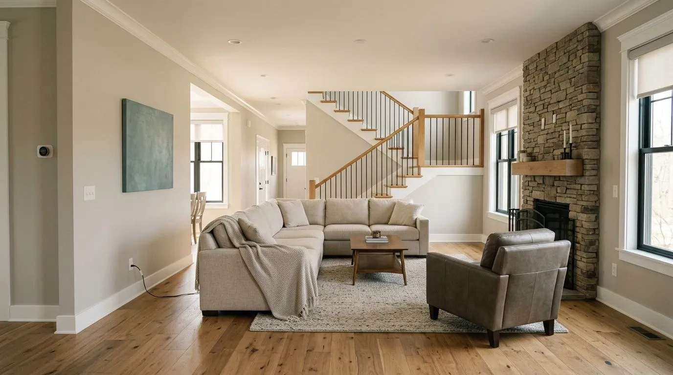
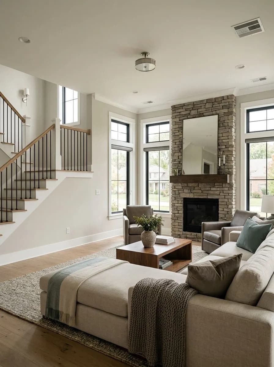
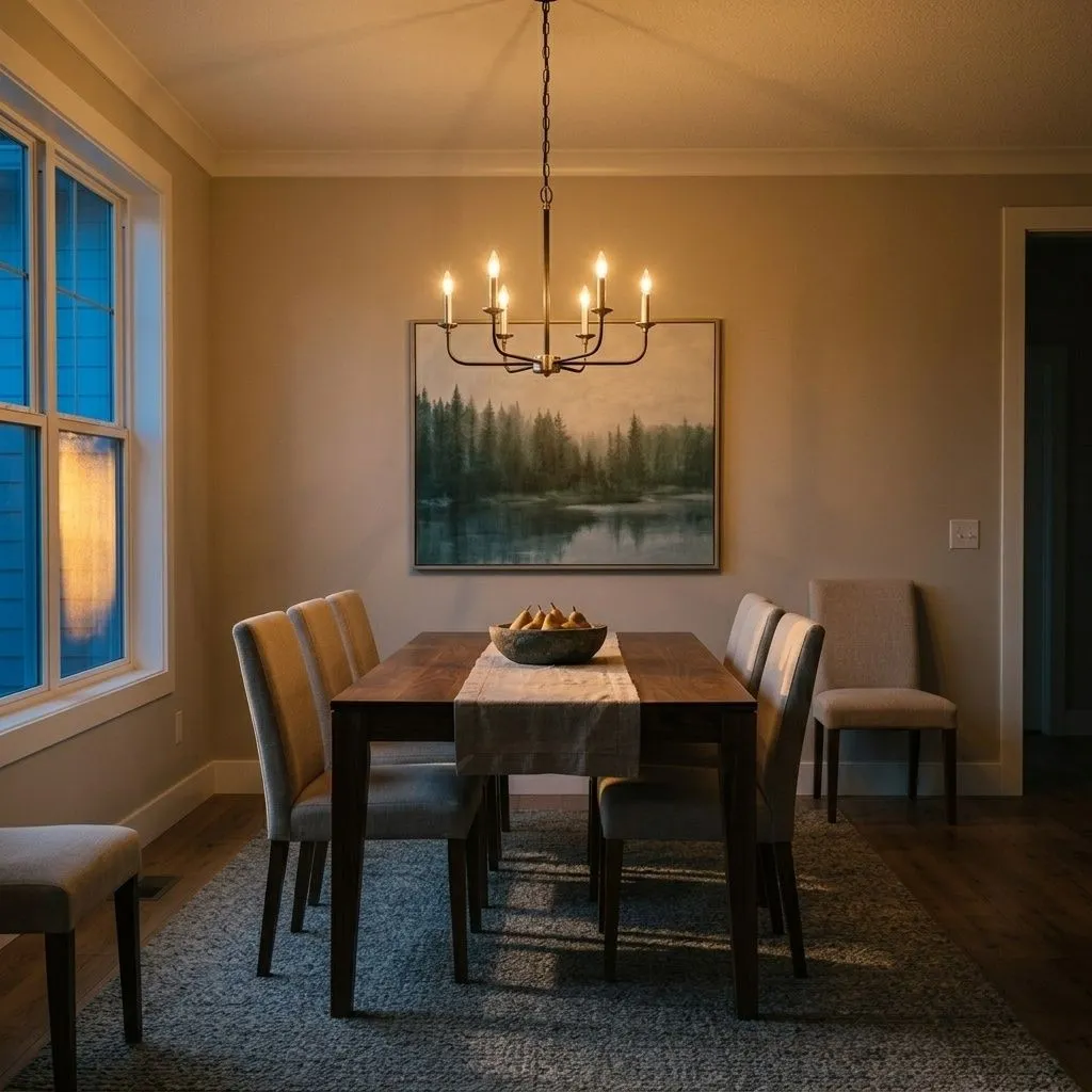
Gossamer Veil is built for the whole-house neutral role. Because it avoids the dramatic undertone swings of many popular grays, it carries through open-concept spaces without fighting itself from room to room. Reviewers consistently endorse it for living rooms, main bedrooms, entryways, and kitchens, where its warmth reads as inviting rather than stark but its gray base keeps it feeling current rather than dated.
Light and orientation shape the experience significantly. In south- and west-facing rooms it leans warmest and is most likely to satisfy people who want that cozy greige feel without going full beige. In north- and east-facing rooms it pulls grayer and can show its subtle green, which some people find fresh and others find slightly off. Either way it needs a source of contrast, whether that is white trim, natural wood, or a stronger accent, to keep it from reading as one-dimensional in lower light.
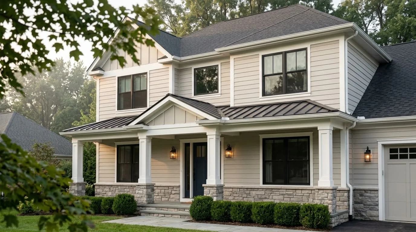
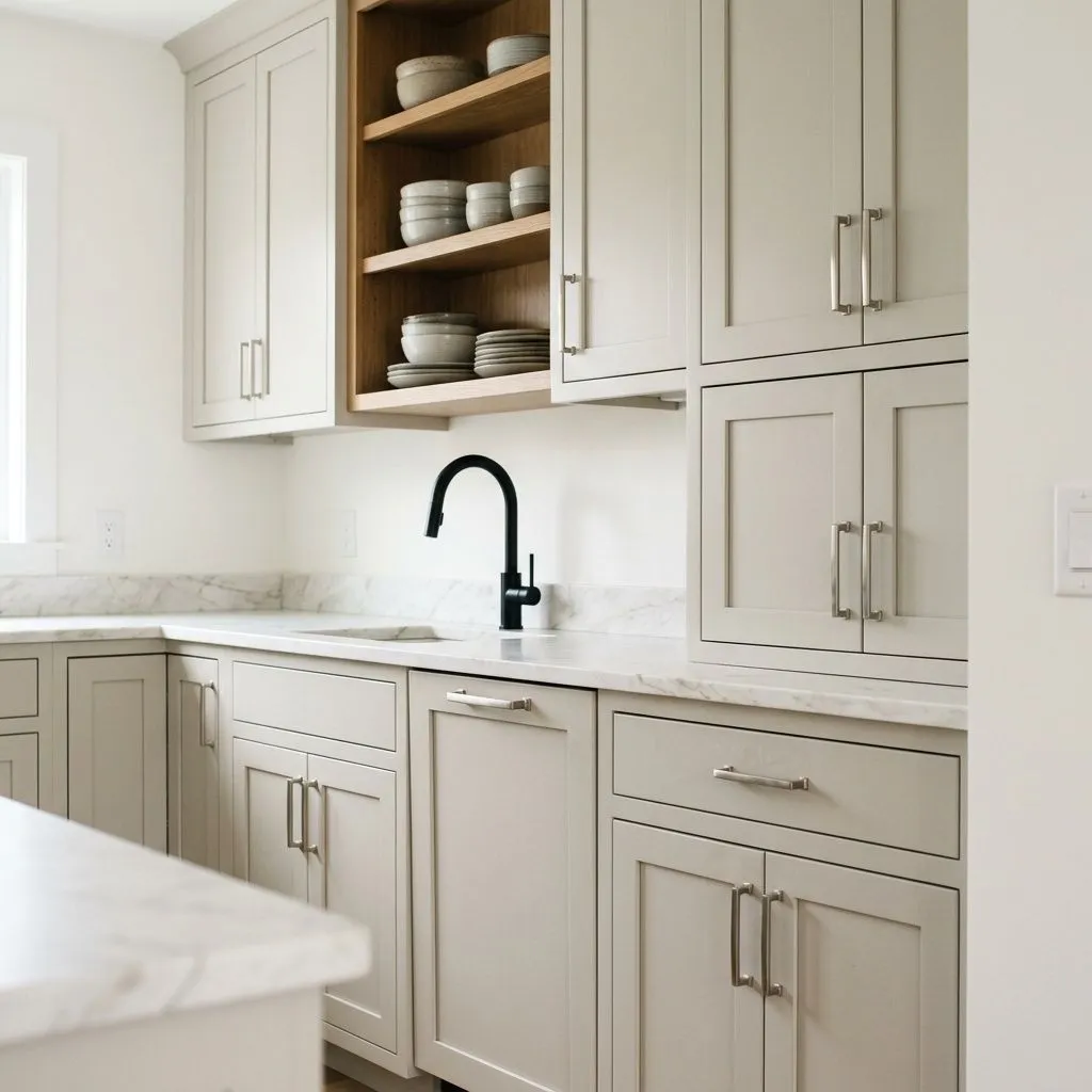
Beyond walls, reviewers find it works well on cabinets, where it reads as a sophisticated soft neutral that is not as expected as a stark white or as bold as a charcoal. It shows up on exterior projects too, particularly as a body color or trim in climates with good sun exposure, and Sherwin-Williams lists it in their Top Exterior Colors collection for that reason. It pairs naturally with both painted white baseboards and natural wood trim, giving it flexibility across traditional, transitional, and modern organic interiors.
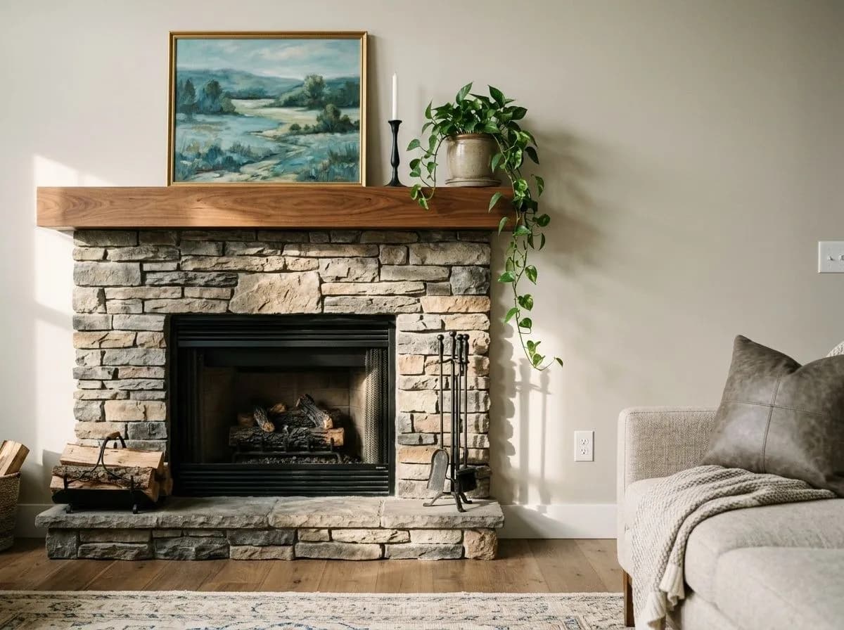
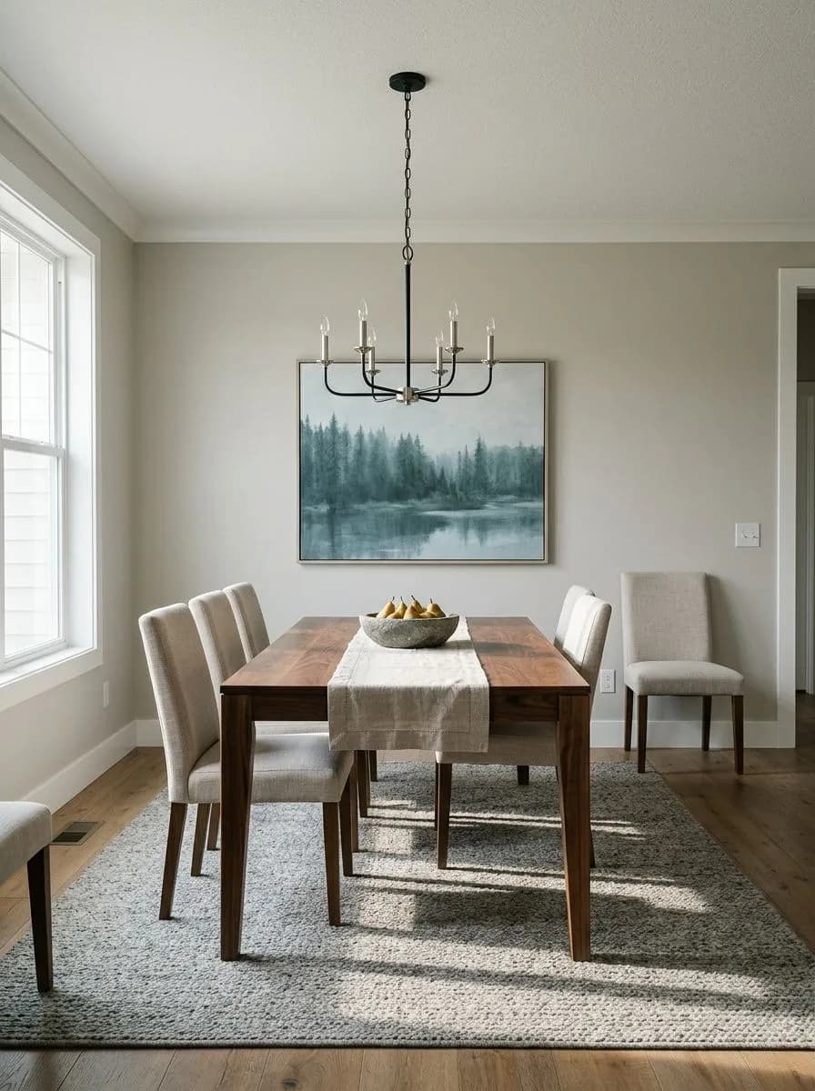
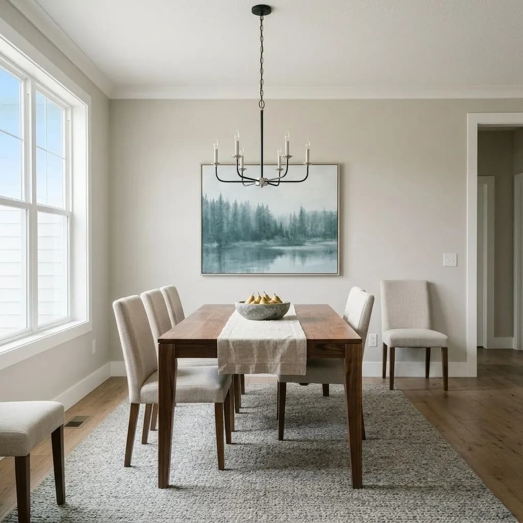
In a well-lit living room Gossamer Veil reads as a warm, settled gray that works with wood furniture, linen sofas, and either painted or natural trim. South or west afternoon light brings out its warmest side, making it feel welcoming without tipping into yellow-beige. Keep trim crisp and white rather than cream to maintain the color's integrity.
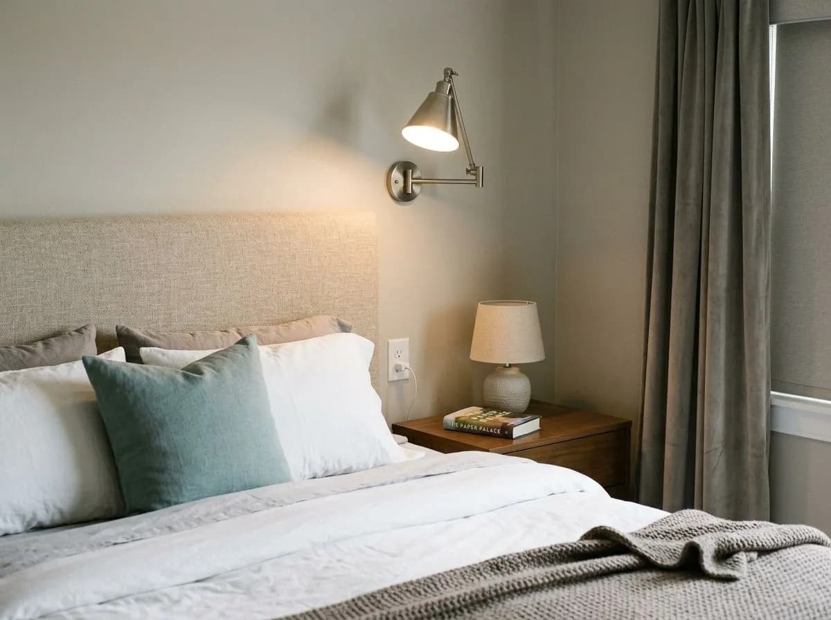
Reviewers consistently recommend it for bedrooms because the warm gray base is calm without being cold and reads as a restful backdrop for most bedding palettes. It handles a range of wood tones in furniture well, from light oak to darker walnut. In a north-facing bedroom, add a warm lamp or layered textiles to offset the cooler, grayer read the orientation pulls out.
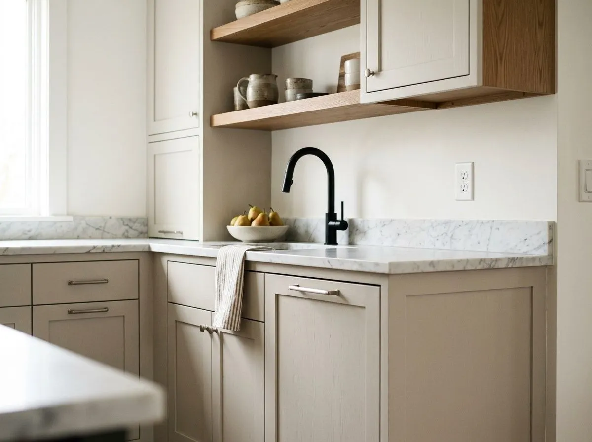
On kitchen walls it works as a sophisticated neutral that does not compete with countertop materials or cabinetry. On cabinets specifically, it reads as a soft warm gray that is more nuanced than a flat off-white but far less committal than a bold color. Pair with white uppers or white trim to keep the space from feeling heavy.
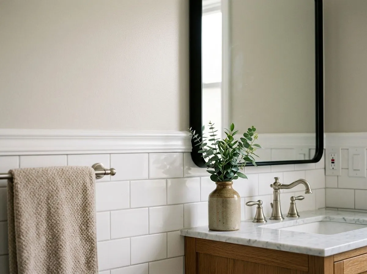
In a bathroom with good artificial light, Gossamer Veil reads as a clean, warm gray that suits both modern and transitional fixtures. It works well with brushed nickel and matte black hardware, and it does not clash with white subway tile the way some violet-leaning grays can. Dim bathrooms with no natural light are a harder fit, as the color can lose its warmth and flatten.
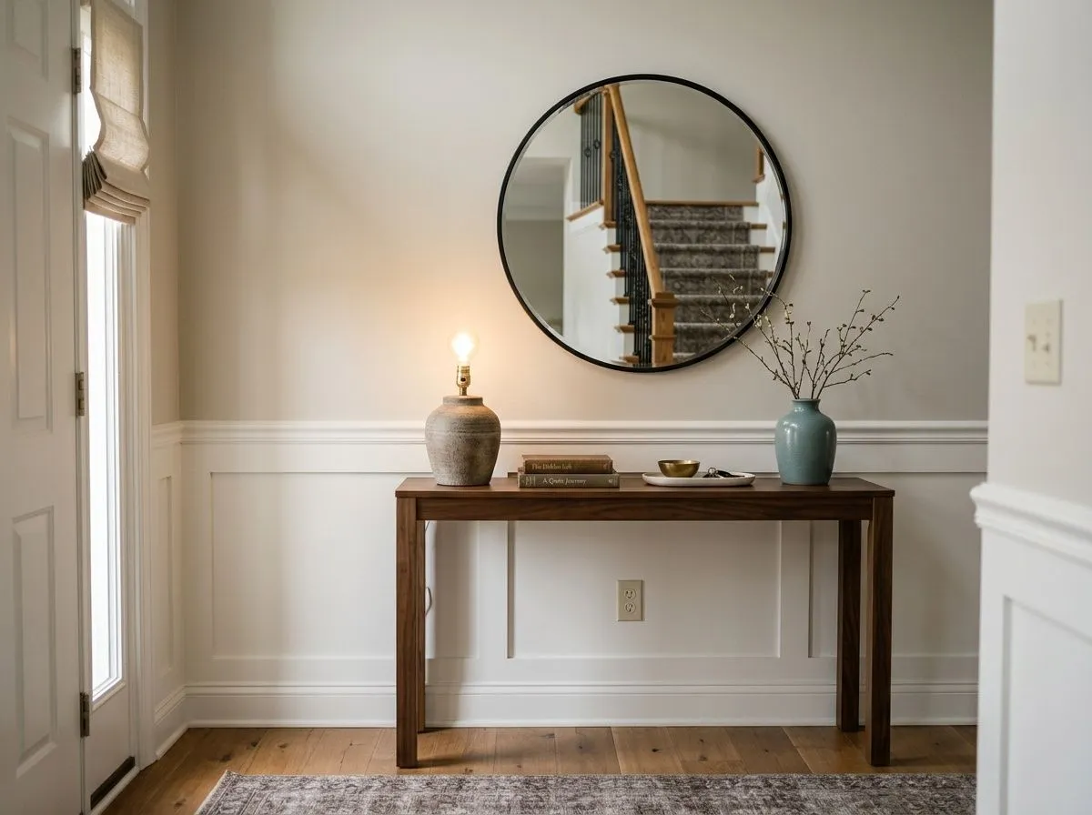
As an entry color it reads as a polished, unpretentious welcome that flows into adjacent spaces without a hard visual stop. Because it sits in the middle of the warm-to-cool spectrum, it tends to coordinate with whatever is in the adjoining rooms. Pair with crisp white trim and a natural wood floor for the most grounded result.
Sherwin-Williams pairs Gossamer Veil with Eider White and Anchors Aweigh as its core coordinates. Eider White makes a slightly warmer, softer trim choice than a bright white, which keeps the palette cohesive and gentle. Anchors Aweigh introduces a deeper, more saturated direction for an accent wall or cabinetry. The third official coordinate, African Gray, adds a mid-tone warm gray layer for multi-room flow.
Beyond the official palette, Gossamer Veil works with a broad range of directions. Crisp bright whites on trim sharpen it and prevent the drift toward drab. Warm natural wood tones in flooring or furniture complement its greige side. Deeper charcoal-toned neutrals or moody gray-green accents give it contrast without fighting its undertones. Softer blue-green accents also coordinate well. What to avoid is pairing it with creamy or ivory whites, which flatten the whole palette, or with cool violet-based grays, which create an uncomfortable clash rather than a harmonious contrast.
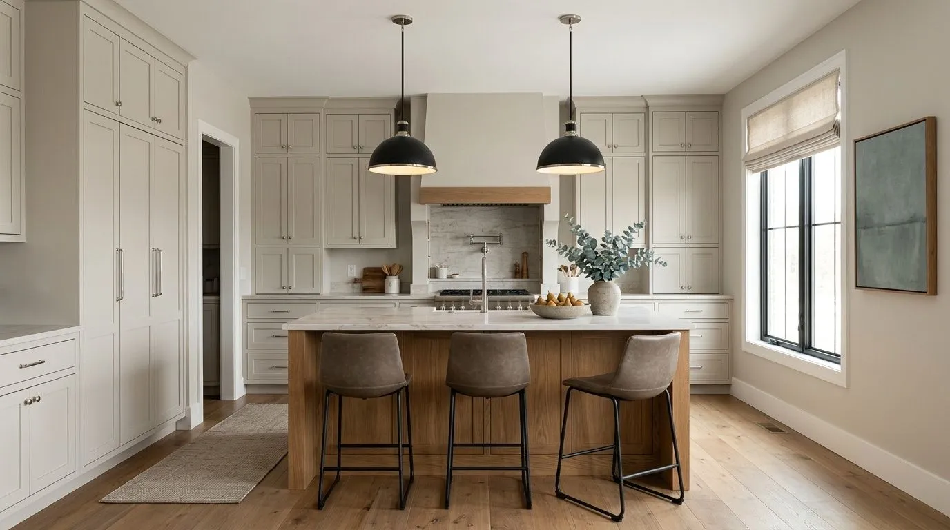
This kitchen holds together because Gossamer Veil wraps the whole room, landing somewhere between warm and cool without committing to either. Only three of the seven colors here are actual paint: Gossamer Veil on the perimeter cabinetry and walls, Pure White on the ceiling and trim, and Tricorn Black on the pendant lights and window frames. The remaining four colors come from the room's materials and furnishings, each matched to its closest Sherwin-Williams equivalent. Hover any pin or swatch to see which is which.
All comparisons are matched against Gossamer Veil at LRV 61.8.
Cream and ivory trim pull warmth in a different direction than Gossamer Veil's gray base allows, and the combination ends up looking neither fresh nor warm. The yellow-white of cream makes the wall color look slightly green by contrast, and the overall palette feels muddied.
Placing Gossamer Veil next to a cool gray with violet or purple undertones creates a visual competition where each color makes the other look wrong. Gossamer Veil starts looking greenish and the cool gray looks harsh, and neither reads as intended.
Pink-toned or pickled wood and strongly orange-red stained floors or furniture pull attention to whatever warm-green undertone is lurking in Gossamer Veil, and the combination reads as unintentionally olive or muddy.
Gossamer Veil is a light warm gray that sits at the greige edge of the gray spectrum without fully becoming a greige. It reads as warm and calm in most light conditions, with a gray base that keeps it feeling current rather than beige. Its LRV is 61.8, placing it in the light to light-medium range.
The undertone picture is genuinely debated by reviewers and worth taking seriously. Most identify a subtle green undertone within the warm gray base, though it is quiet rather than obvious. Others read it as warm taupe with a beige hint and do not notice green at all. A third group sees an occasional violet or purple flash in certain light, typically north-facing rooms. All three reads are real depending on your specific exposure and finishes, which is the main reason sampling in your actual room is essential.
It is warm-leaning overall, with enough gray in its base that it does not read as a true beige or greige. South and west light pull out the warmest reads. North and east exposures push it grayer and can surface the cooler, slightly green side. The overall impression in most rooms is comfortably warm without being yellow or honey-toned.
The LRV is 61.8. This puts it solidly in the light range, meaning it reflects a good amount of light but still carries enough color depth to read as a definite, intentional gray rather than a near-white. Reviewers note it looks lighter in person than the chip suggests, which works in its favor in most rooms.
Crisp bright whites on trim and ceilings are the most consistent recommendation for anchoring it. Natural wood tones in flooring and furniture complement its greige side. Deeper warm-gray or charcoal accents give it contrast without conflict. Muted blue-green or gray-green accent colors also coordinate well. The official Sherwin-Williams palette pairs it with Eider White, Anchors Aweigh, and African Gray. Avoid creamy ivory whites for trim and avoid cool violet-based grays in the same space.
The Sherwin-Williams color code is SW 9165. The hex value is #D3CEC4 and the RGB is 211, 206, 196. The LRV is 61.8. It is available in both interior and exterior formulas and appears in several Sherwin-Williams collections including Top 50 Colors, Living Well, and Finest Whites and Neutrals.
Yes to all three with some context. Sherwin-Williams includes it in their Top Exterior Colors collection, and it works best as an exterior body or trim color in climates with good sun exposure where its warmth can fully read. On cabinets it reads as a refined, soft warm gray that is more nuanced than white but less committal than a saturated color. For a front door it works as a sophisticated neutral, though reviewers suggest confirming how it handles the increased UV and foot-traffic context before committing. As always, sample in the actual exterior light of your home first.