
MorningCooler · gray side leads
A warm, light greige that sits right between beige and gray, holding its balance across most rooms and light conditions. Sample it in your actual space before you commit.
Agreeable Gray lands right on the line between gray and beige, which is exactly why it became the color that made greige a mainstream category. On the wall it reads as a soft, light neutral that most people register as a warm gray first and a beige second. Its LRV of 60.4 keeps it light without losing its character. It holds color in a normally lit room without going washed out, but it is not so pale that it disappears.
The color shifts meaningfully with light. In south-facing rooms and in warm afternoon sun, it pulls creamy and almost reads like a warm off-white. In north or east-facing rooms the gray side takes over, the warmth recedes, and in dim conditions it can look flat or dull. West-facing spaces show you both versions in a single day. Reviewers are consistent on this point: Agreeable Gray is well-behaved in a well-lit room and less forgiving in a dark one.
Bulb temperature matters here more than with some colors. A 3000K warm white bulb keeps it in its best range. Cool or dim bulbs push it toward a grim or even grayish-blue reading, which surprises people who sampled it in a sunny showroom. Plan your lighting before you commit to any significant square footage.
The undertone picture is more complicated than the popular narrative suggests, and reviewers disagree enough that you should not take anyone's single-sentence summary as the whole story. The most commonly cited base undertone is a barely perceptible warm green. That green is subtle, almost invisible in isolation, and it is what keeps Agreeable Gray from looking too yellow-beige or too cool-gray. It sits in a balanced middle zone, which is the whole point of the color.
The disagreement centers on a secondary flash that some reviewers see and others do not. Several sources warn that under cool north light, beneath cool-temperature bulbs, or when placed next to violet-leaning or pink-adjacent finishes, Agreeable Gray can throw a faint violet or fleshy tone. This is not a hallucination: the interaction is real and is usually triggered by neighboring surfaces, specifically by warm creams, pink-based whites, or cooler violet grays in the same space. When you pull it away from those triggers and look at it in neutral daylight, the violet flash largely disappears.
The practical consensus is that the undertone is real but situational. Most people painting a room with neutral furnishings and reasonable light will never notice anything strange. But if your trim is a cream with a pink base, if your flooring has a rosy tone, or if you are placing it next to a cooler gray, you should sample it before you paint. A 12-by-12 inch sample card in your actual room, viewed morning and evening, will tell you more than any review can.
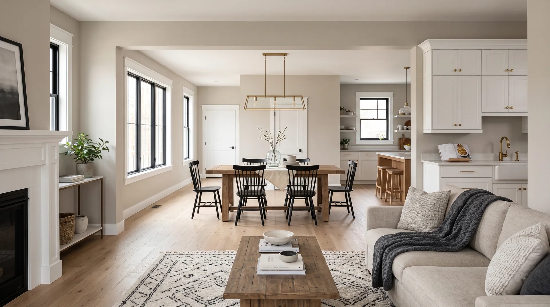
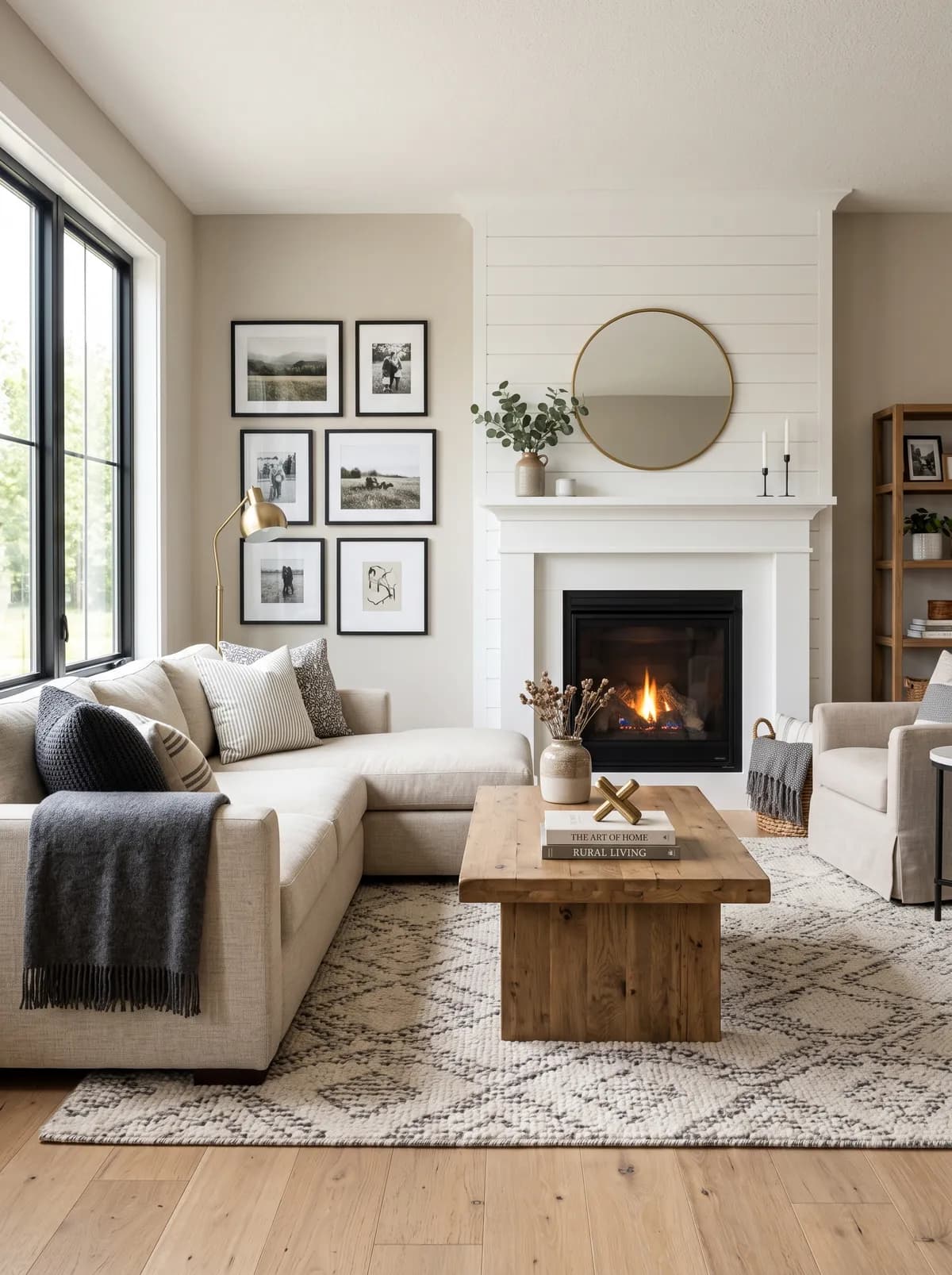
Agreeable Gray is one of the most widely used whole-house neutrals available. It works on walls, ceilings, and trim together for a seamless tonal look, and it reads as calm and cohesive when carried through open-concept floor plans where multiple rooms are visible at once. Because it is neither definitively beige nor definitively gray, it does not fight with a wide range of furniture finishes, flooring, and textiles.
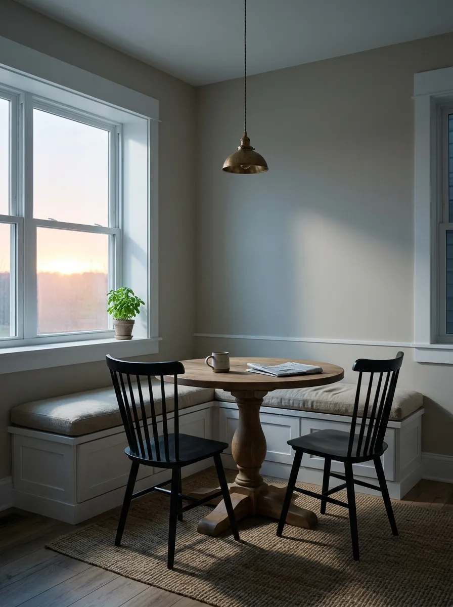
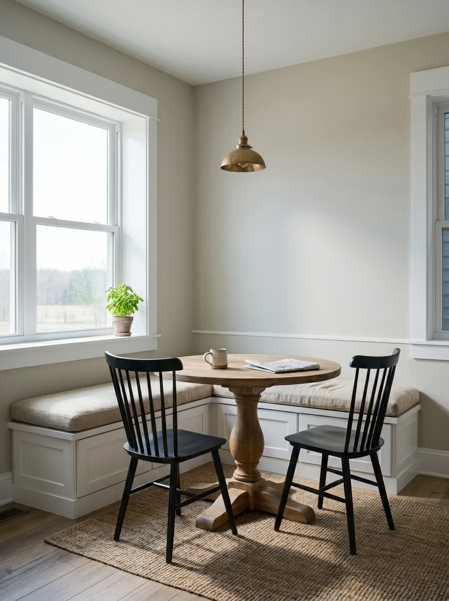
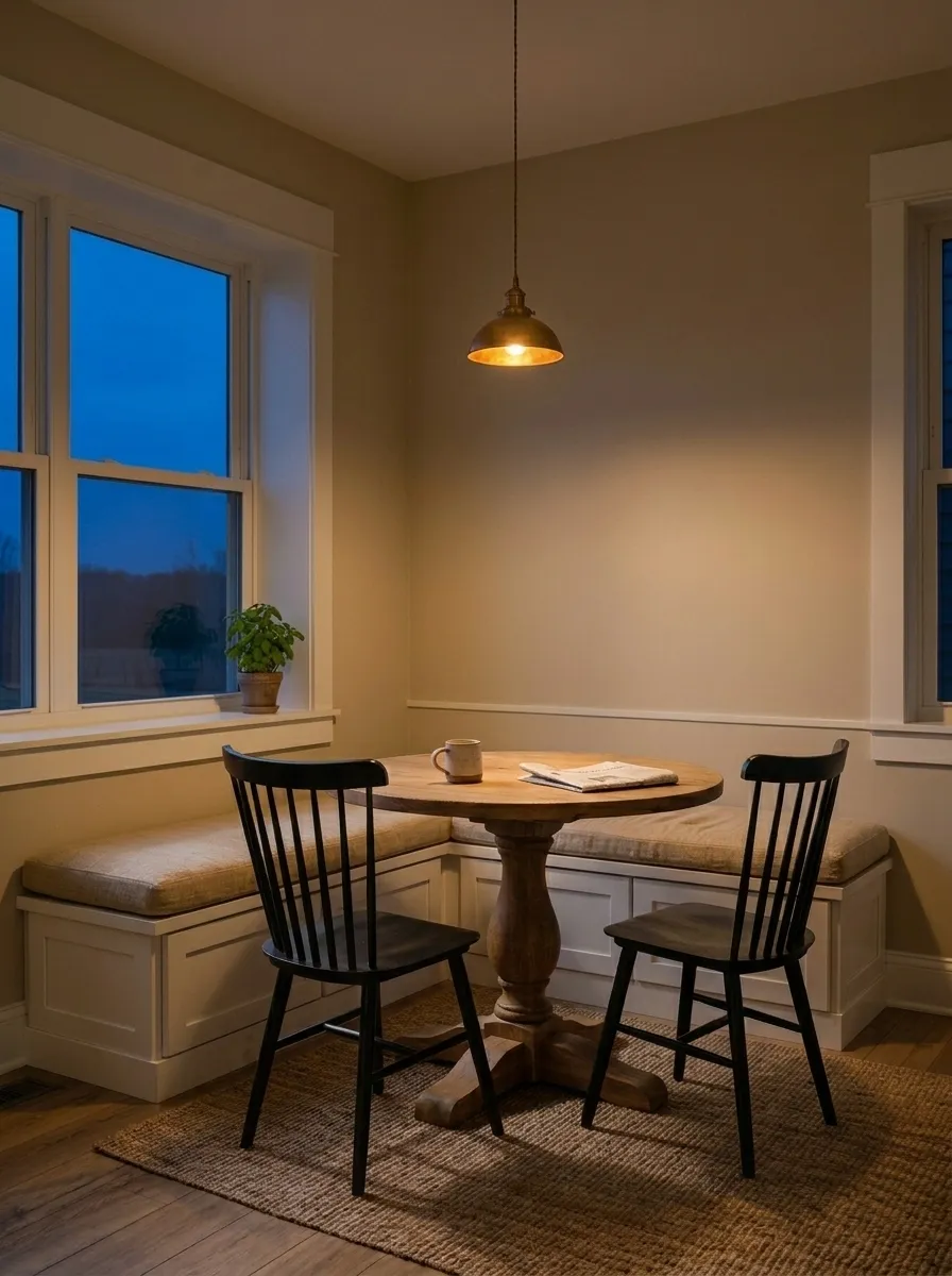
For specific rooms, it earns consistent high marks in living rooms and bedrooms where daylight is moderate and furnishings are in the warm-to-neutral range. Kitchens are a strong use case, particularly on cabinetry, where its LRV of 60.4 keeps the space feeling open without competing with countertops or hardware. It also appears on exteriors with good results, where direct sun brightens it noticeably and it can read as a soft near-white on siding or trim. It pairs well with dark siding or red brick, and reviewers note it performs especially well in high-sun southern climates.
The limits matter as much as the strengths. Genuinely dark rooms, north-facing spaces with limited windows, or rooms with heavy warm-cream finishes are not good fits. In those conditions the color loses its greige balance and can look dingy or strangely cool. It is also worth being honest about the trend curve: designers note that interest in Agreeable Gray has eased as warmer and more saturated neutrals have gained ground, so if you are painting for resale in a market that skews contemporary, it still reads as safe and broadly appealing, but it is no longer the automatic default it was a few years ago.
In a living room with adequate natural light, Agreeable Gray holds its greige balance and reads as calm and welcoming. It does not compete with varied furniture finishes and works equally well with light oak, dark walnut, and upholstered pieces in warm neutrals. Keep your trim to a crisp white like Extra White (SW 7006) for clean definition.
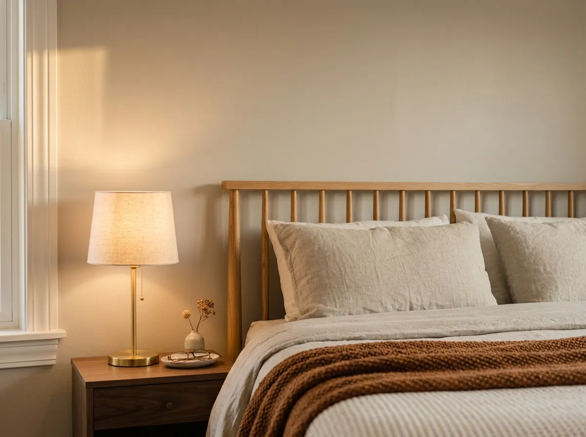
Bedrooms are a reliable use case, especially in rooms with south or west exposure where the warm side of the color comes forward in evening light. In a north-facing bedroom, add warm-toned textiles and a 3000K bedside bulb to keep it from going flat. It pairs quietly with warm wood furniture and soft natural linens.
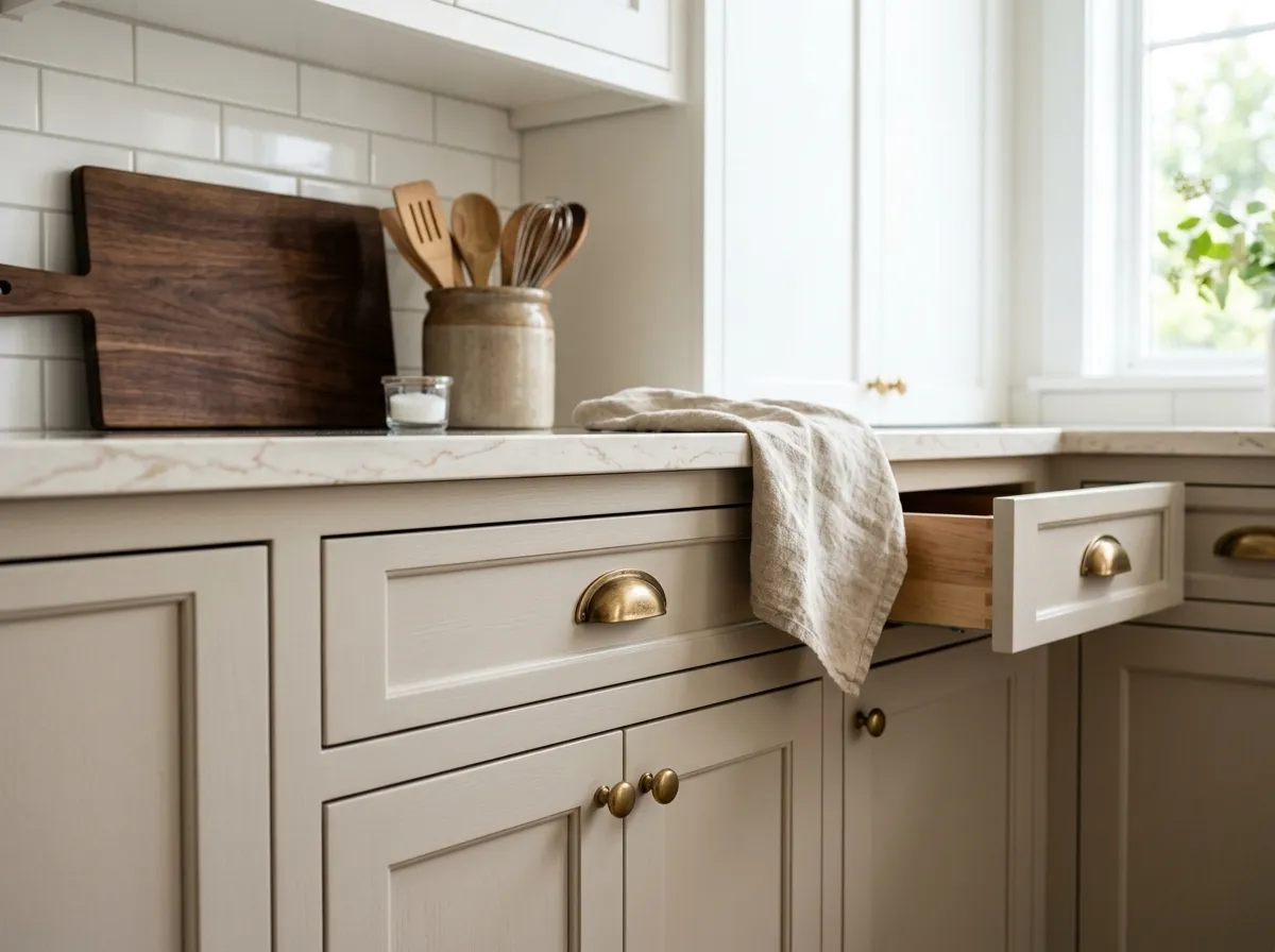
On kitchen cabinets it is one of the most widely used neutral options available, and for good reason: LRV 60.4 keeps the space feeling open while the greige tone warms up what could otherwise be a cold room. Pair it with a white or off-white upper cabinet or a light stone countertop, and use warm-metal hardware to reinforce the beige side of the color.
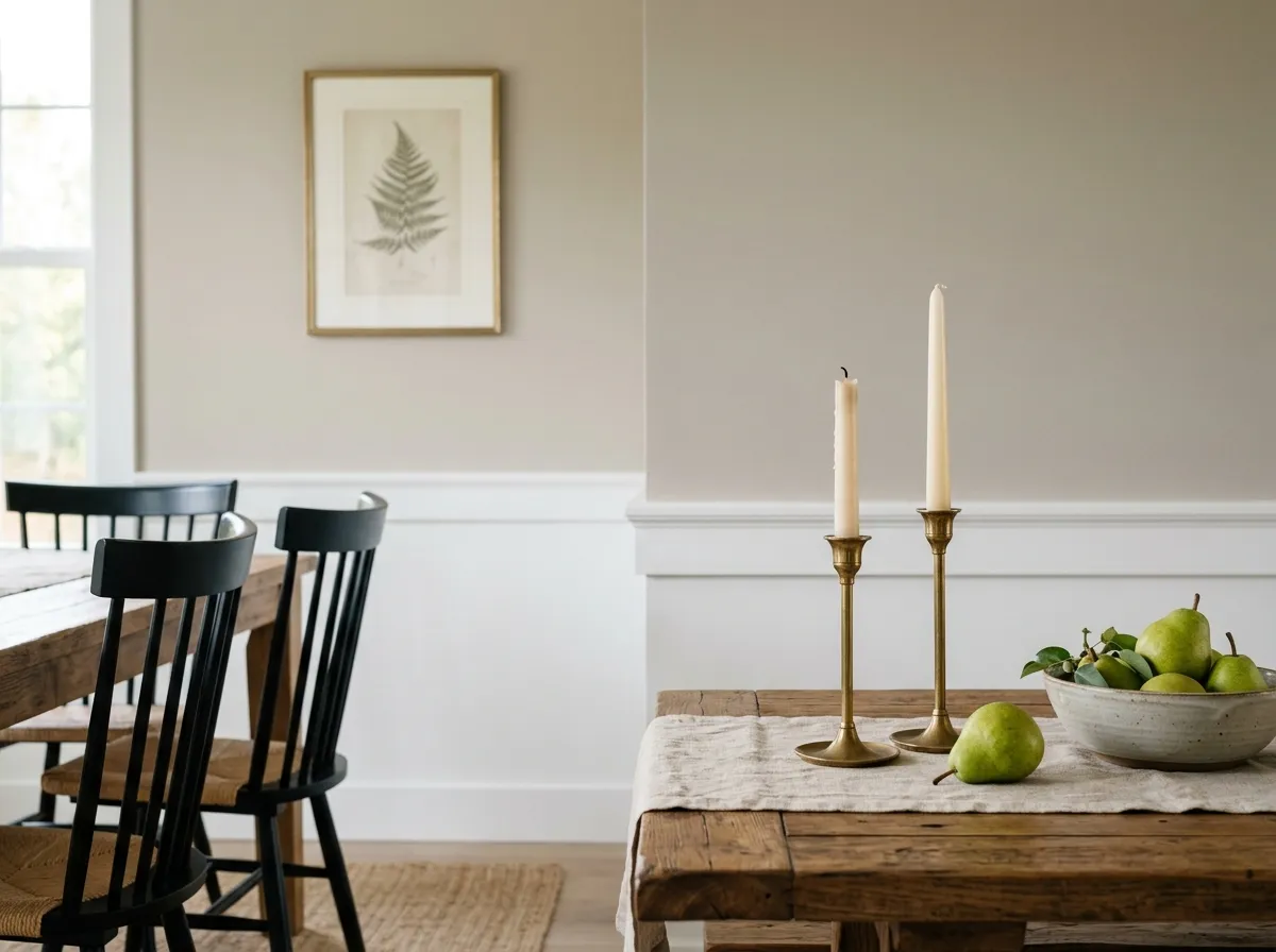
In a dining room the color holds up well under the range of light conditions a dining space sees throughout the day and into candlelit evenings. Avoid warm cream or yellow-beige trim in this room specifically, as that combination tends to trigger the cooler, slightly blue reading that frustrates people. Stick to a clean white trim.
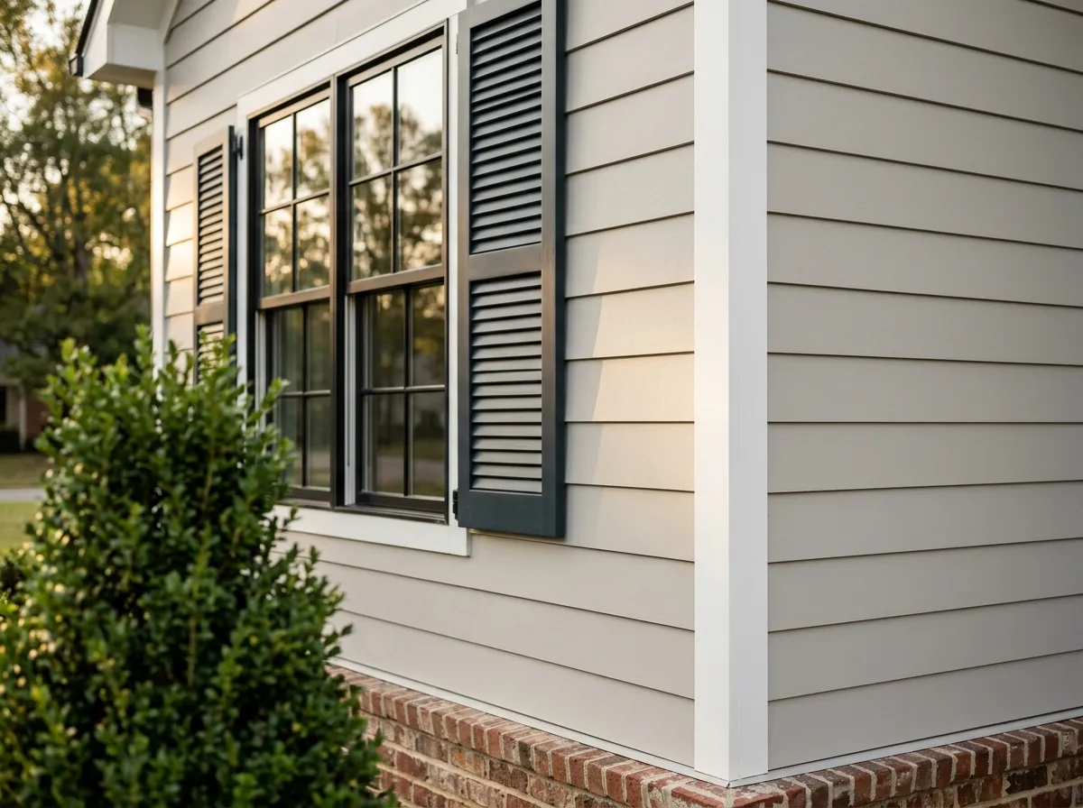
On exteriors, direct sun brightens Agreeable Gray considerably and it reads closer to a soft warm white on siding. It pairs well with dark shutters or a darker trim, and reviewers single it out as especially successful against red brick or in high-sun climates. Its broad recognition also makes it a reliable choice for resale.
Agreeable Gray coordinates naturally with clean whites for trim and ceilings. Extra White (SW 7006) is a sharp, cool-leaning white that gives you clear contrast and reads crisply against the warm greige of the walls. Incredible White (SW 7028) is softer and sits closer in value, but reviewers flag it specifically as a risky pairing because it carries a pink-purple base that can make Agreeable Gray read slightly blue or dingy beside it. If you are drawn to Incredible White, sample them together on adjacent surfaces in your actual room first.
For accent and accent-adjacent uses, Coral Rose (SW 9004) is a coordinating option that brings warmth and contrast without introducing a competing neutral undertone. On the broader palette, the color plays well with warm wood tones, soft charcoals, natural linens, and brass or bronze hardware. Cool silvers and stark cool-white trims can amplify the gray side of it more than most people want, so if warmth is the goal, steer your accents in that direction.
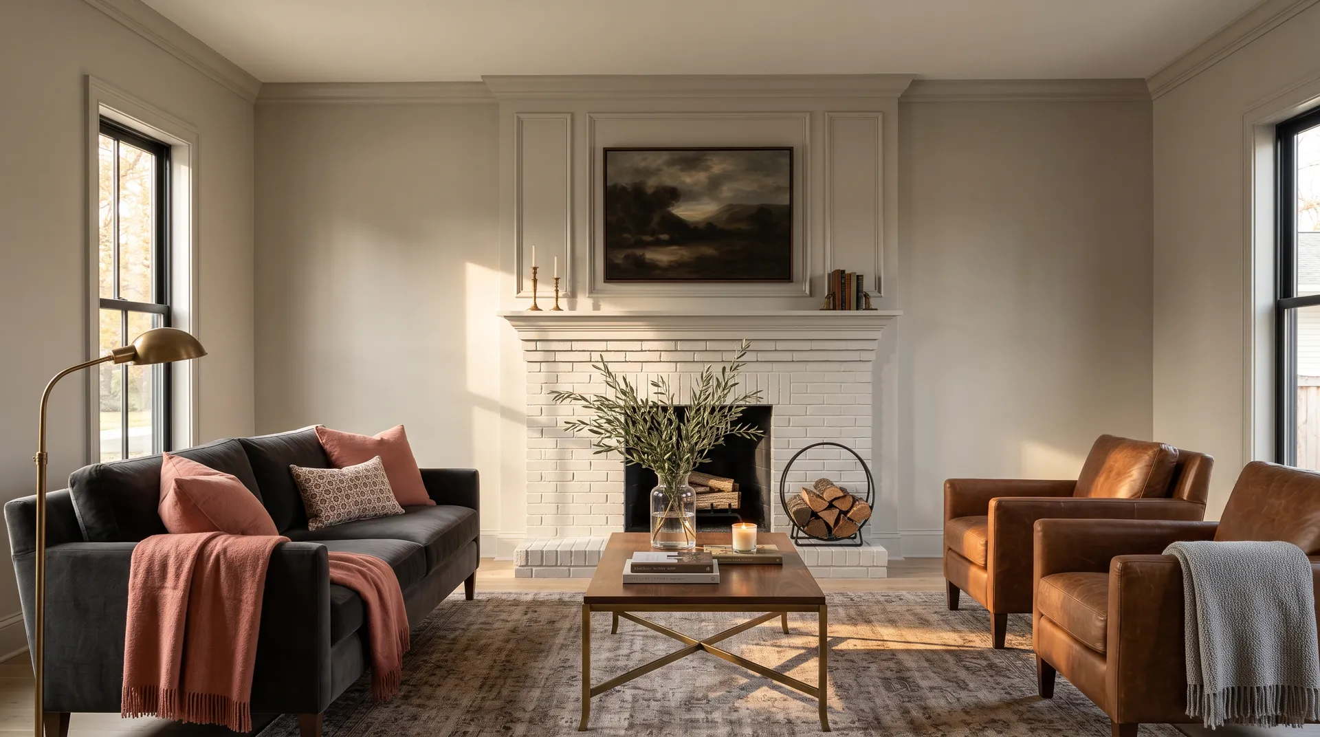
Agreeable Gray SW 7029 is the only paint here, and it goes everywhere: walls, trim, ceiling, and the painted-brick fireplace, a full drench. The other six colors represent the room's actual furnishings and materials, each one matched to its closest Sherwin-Williams equivalent so you can work with real paint chips. Hover any pin or swatch to see which SW color it maps to.
All comparisons are matched against Agreeable Gray at LRV 60.4.
When you place Agreeable Gray walls next to trim or cabinets in a warm cream or yellow-beige, the contrast shifts the gray's undertone toward blue or dingy rather than greige. The wall color looks like it does not belong.
Placing Agreeable Gray in an open floor plan next to a cooler, purple-side gray amplifies the faint violet flash that is already latent in Agreeable Gray's undertone. The two colors pull against each other and neither reads as intended.
Under cool-temperature bulbs, in north-facing rooms, or in any space that lacks adequate natural light, Agreeable Gray loses its warmth and can read flat, dull, or even prison-like, which is the opposite of what most people are after.
Agreeable Gray SW 7029 is a light greige, sitting almost exactly between warm beige and soft gray. On the wall it reads as a warm, restrained neutral that most people register as a warm gray rather than a tan or beige. Its hex is #D1CBC1 and its RGB is 209 / 203 / 193. At LRV 60.4 it is light enough to keep a room feeling open but has enough color to avoid looking like a bare primer coat.
The base undertone most reviewers identify is a subtle warm green. That green is easy to miss in isolation but is what keeps the color from sliding too far into beige or too far into cool gray. A secondary flash of faint violet or slightly fleshy pink can appear under cool north light, beneath cool bulbs, or when the color is placed next to warm-cream or violet-leaning surfaces. The purple flash is real but situational and typically triggered by neighboring finishes rather than the paint itself. Sample it in your actual room, under your actual lighting, before committing.
It is a warm neutral overall. The greige balance leans warm, and in south-facing rooms or in warm afternoon light it can read almost creamy. In north-facing or low-light conditions the gray side takes over and it cools noticeably. The warm read is the baseline but it is not unconditional, which is why light orientation and bulb temperature matter so much with this color.
The precise LRV is 60.4. That puts it solidly in the light range, bright enough to keep a moderately sized room feeling open, but not so high that it reads as a near-white. It holds color in a normally lit space and reflects enough light to feel airy without washing out.
The Sherwin-Williams code is SW 7029. The hex is #D1CBC1. The RGB values are 209 red, 203 green, and 193 blue. The precise LRV is 60.4.
For trim and ceilings, a clean bright white like Extra White (SW 7006) gives clear contrast without introducing competing undertones. Coordinating accent colors include Coral Rose (SW 9004) for warmth. On the broader palette, warm wood tones, natural linens, soft charcoals, and brass or bronze hardware all reinforce the warm greige direction. Avoid warm cream or yellow-beige trims, which can make the walls look blue or dingy by contrast, and be cautious pairing it with violet-leaning grays in the same open floor plan.
Yes to all three, with some qualifications. On exteriors, direct sun brightens it noticeably and it can read as a soft warm near-white on siding. It pairs well with dark shutters, dark trim, or red brick, and it performs especially well in high-sun climates. On kitchen or bathroom cabinets it is one of the most widely used neutral options, and its LRV of 60.4 keeps cabinetry feeling open. On a front door, it reads as a refined, welcoming neutral, though in very shaded entry conditions the gray side dominates more than most people expect, so sample it on a door panel before committing.