
MorningClean · reads its brightest
A clean, bright white with a faint cool note that stays quiet in good light and surfaces in north or dim rooms. Pull a sample and see how it sits in your actual room.
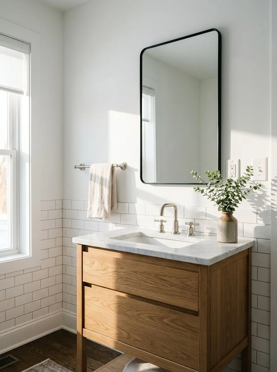
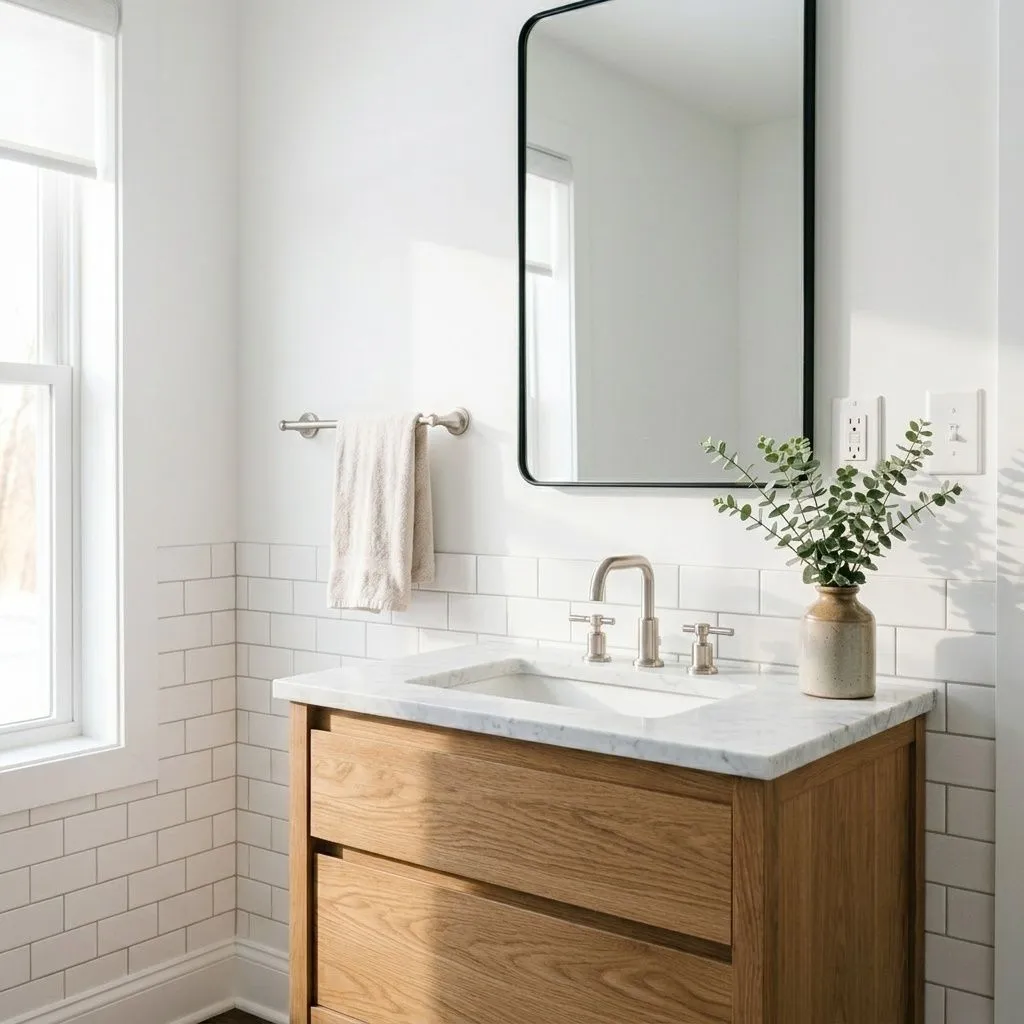
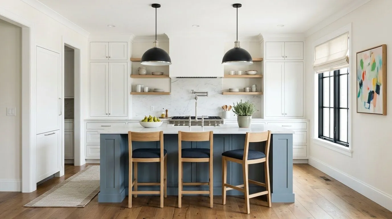
Extra White reads as a clean, crisp white on the wall. It is not the starkest white in the Sherwin-Williams lineup, but at LRV 85.9 it lands solidly in bright territory. Most people looking at it in a well-lit room see simply white, with no obvious color cast pulling it toward cream or gray. That is its core appeal: it behaves like a true white without announcing itself.
That said, it is not a flat, featureless white. The surface reads slightly soft compared to the most extreme bright whites, and that softness is what gives it usable depth on larger surfaces. Reviewers consistently describe it as modern rather than traditional, clean rather than warm. It does not carry any of the creaminess or antiqued feeling that people associate with off-whites. In rooms with a lot of natural light and neutral or cool furnishings, the overall effect is airy and open. In lower light, the wall color can deepen a little and begin to show more gray.
The undertone conversation around Extra White is fairly consistent across independent reviewers, which is unusual for a white. The dominant note is a very slight cool blue, sometimes described as blue-gray. A smaller number of reviewers detect a faint green alongside it. Neither undertone is strong enough to announce itself under normal conditions, which is exactly why the paint reads as a simple white to most eyes most of the time.
Light changes the picture. In south-facing rooms or spaces with warm artificial lighting, the cool undertone is nearly invisible and the paint looks bright and clean. In north-facing rooms or spaces with limited natural light, the blue-gray note can emerge noticeably. Shadows on the wall can read grayer than expected, and next to cooler furniture or finishes, the undertone becomes easier to see. Placed next to a warm creamy white, Extra White can look almost blue by comparison. That contrast effect is worth keeping in mind when mixing whites across a room.
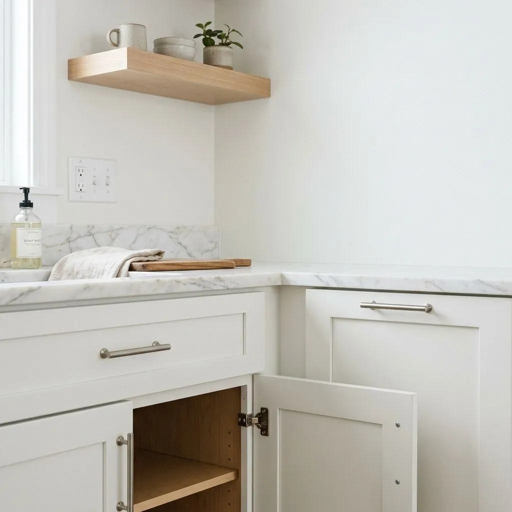
There is also a practical wrinkle that multiple reviewers flag: Extra White behaves differently depending on the surface and the tint base used to mix it. On walls it reads coolest and cleanest, with the blue note most present. On cabinets and trim, which use a different base formula, it can read slightly warmer. The result is that painting all your surfaces in Extra White does not guarantee they will match visually. If you are using it across walls, trim, and cabinets simultaneously, test all three surfaces in your actual space before committing.
Extra White earns consistent praise as a trim and ceiling color. At LRV 85.9 it provides a clean, defined edge against almost any wall color without competing or going garish. It works alongside cool wall colors and mid-tone neutrals alike, and on trim it creates that classic crisp boundary that makes a room feel finished. On ceilings it keeps things bright without adding any warmth that might fight a cool palette below.
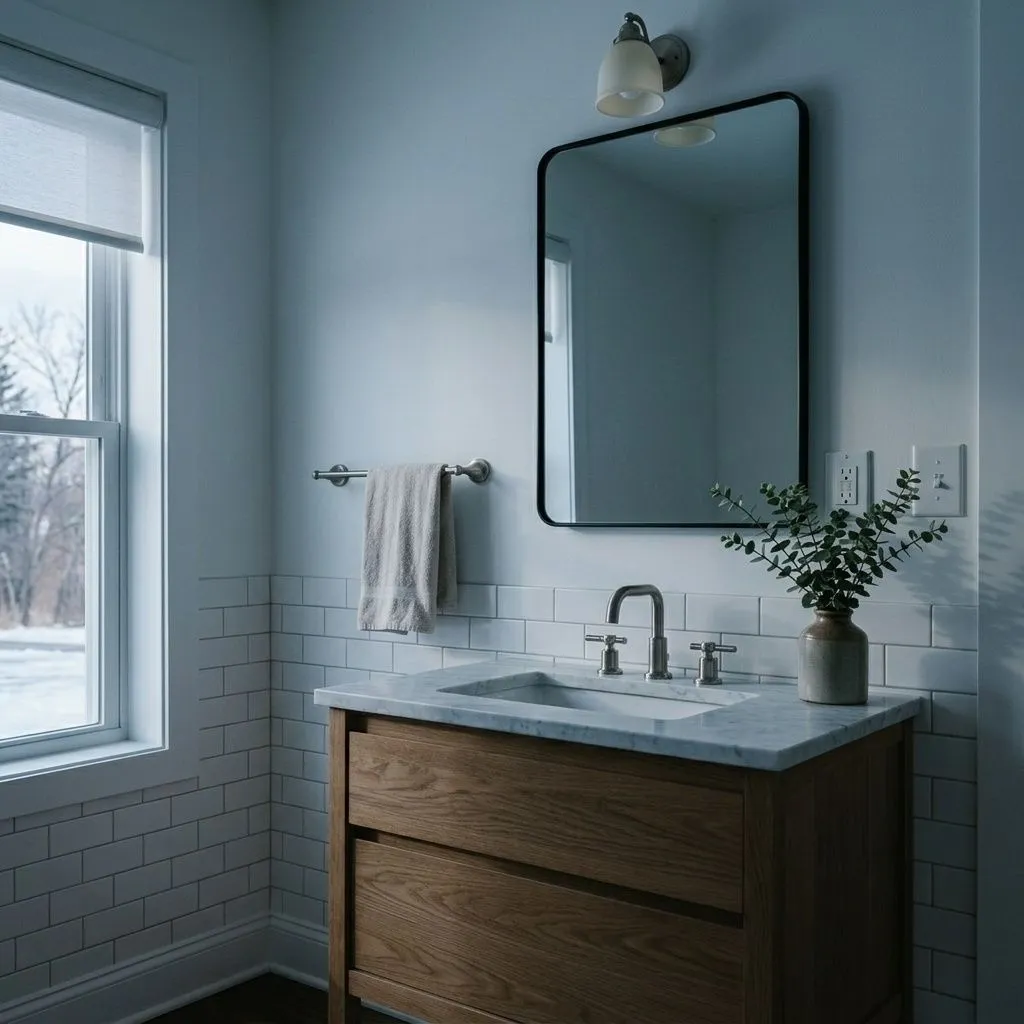
As a wall color it performs best in spaces that are already working in its favor: rooms with good natural light, south or east orientation, and furnishings that lean cool, neutral, or modern. Open-plan kitchens, bathrooms, laundry rooms, closets, and pantries are spaces reviewers mention repeatedly, partly because the brightness reads as clean and functional and partly because those rooms often benefit from a reflective white that bounces available light around. Modern and transitional kitchens, especially with light or natural wood elements, are a recurring use case.
The spaces where Extra White struggles are equally worth knowing. North-facing rooms or rooms that rely heavily on artificial light are risky, because the blue-gray undertone can push the wall toward dingy or cold. Rooms anchored by heavy warm wood tones or warm beige furnishings create an awkward contrast, where the cool white looks stark rather than clean. Pairing it on the same surface as a warm creamy white will almost always look mismatched. Exterior use is a strong application, where the clean brightness reads well in full sun and holds up against landscaping and architectural detail.
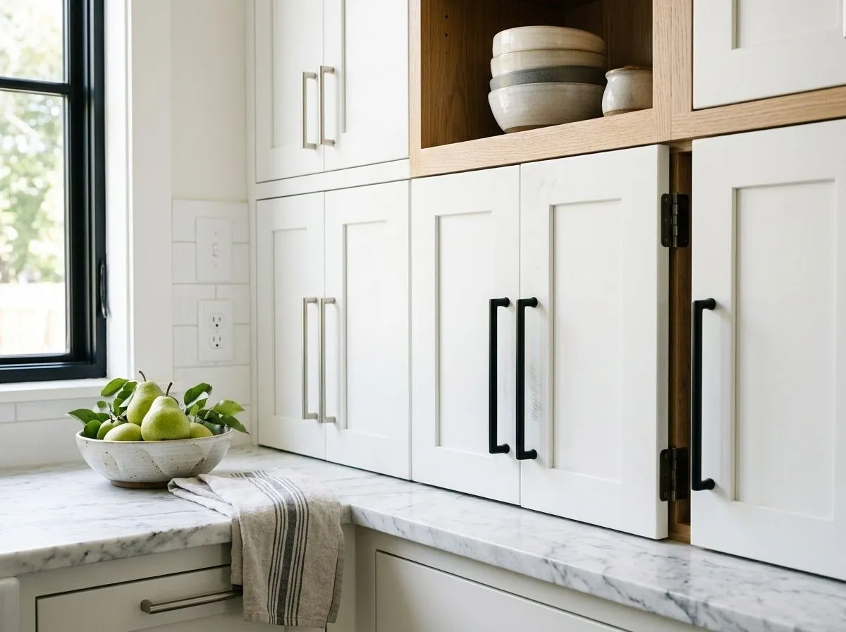
On kitchen cabinets Extra White delivers a clean, modern look that reads brighter than warmer whites without going clinical. The tint-base variation is worth testing here: cabinet surfaces can read slightly warmer than wall applications, so sample on actual cabinet stock before painting all surfaces. It works especially well with light natural wood countertops or open shelving that adds warmth the white itself does not provide.
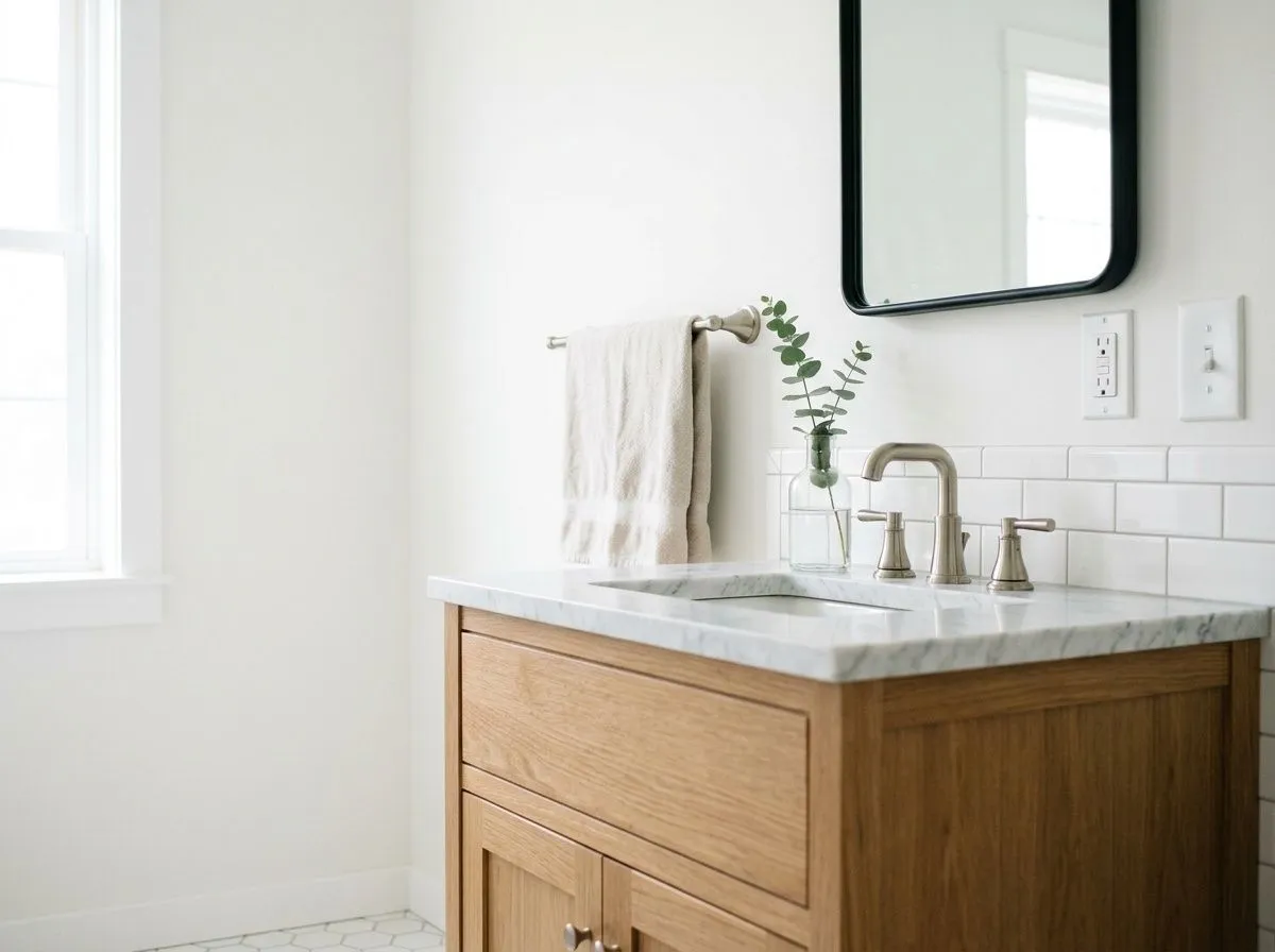
Bright, reflective, and easy to keep clean-looking, Extra White is a reliable bathroom choice in rooms with good light. In windowless bathrooms or spaces lit entirely by artificial light, the blue-gray undertone can make the room feel colder than intended, so warm your lighting source if possible. Pairing it with cool-toned tile or fixtures reinforces the clean, spa-adjacent feeling many reviewers describe.
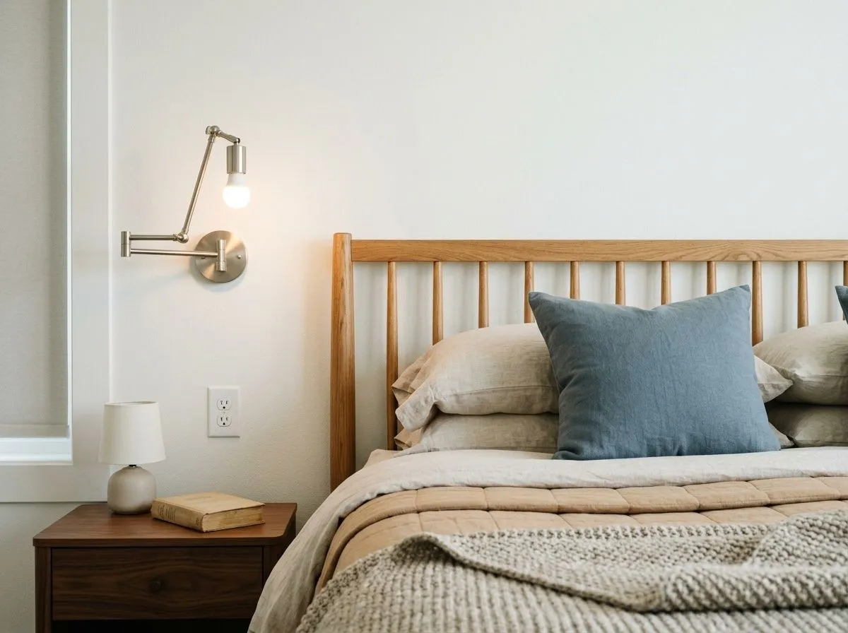
In a well-lit bedroom with a cool or neutral palette, Extra White gives you a fresh, uncluttered backdrop that makes the room feel larger. North-facing bedrooms are trickier: the undertone can drift toward gray in low light and feel less restful than expected. Adding warm textiles and natural wood furniture is a practical way to balance the coolness without changing the wall color.
This is where Extra White earns its reputation. It creates a sharp, clean boundary against almost any wall color and reads as a true white rather than a beige or cream. The caveat is pairing it with warm-toned wall whites, where the contrast can look unintentional rather than designed. Against cool or mid-tone wall colors it is hard to beat at this LRV.
At LRV 85.9, Extra White on a ceiling keeps the room bright without adding warmth that might conflict with a cool palette on the walls. It is a stronger choice than many warm-toned ceiling whites for modern or transitional spaces. In rooms with a lot of blue or gray in the furnishings, the ceiling will reinforce that cool register, which is either an asset or something to watch depending on your intent.
Extra White works best with colors that respect its cool, clean character rather than fight it. Smoky Azurite (SW 9148) is a natural partner, a muted, dusty blue-gray that shares the same cool register and makes Extra White's crispness feel intentional rather than stark. Charcoal Blue (SW 2739) gives you a much deeper contrast option, a near-navy depth that frames Extra White trim or cabinetry with real visual weight. Both pairings lean into the cool side of the palette, which is where Extra White is most at home.
Beyond the coordinating colors, Extra White plays well with soft cool grays, deep muted neutrals, and restrained greens. Light oak or natural wood accents are a practical way to add warmth to a room anchored in Extra White without choosing a warmer white. What reviewers consistently caution against is pairing it with warm creamy whites or warm beige tones, where the contrast reads as a mistake rather than a choice.
Recreating this kitchen means tracking down all seven colors at once, and this palette makes that easier by gathering everything in one place. Two are actual paint: Extra White goes on the perimeter cabinets, trim, and ceiling, while Greek Villa covers the walls and roman shade. The remaining five colors represent the room's real materials, each matched to its closest Sherwin-Williams equivalent, so hover any pin or swatch to identify what you're looking at.
All comparisons are matched against Extra White at LRV 85.9.
Place Extra White next to a warm creamy white on trim, millwork, or a neighboring wall and the cool blue undertone in Extra White becomes very visible. The contrast reads as a mismatch rather than an intentional palette choice.
In rooms without strong natural light, Extra White's blue-gray undertone surfaces and the walls can read grayer or slightly dingy, particularly in the shadows. The effect is more pronounced next to cool furnishings or finishes.
Extra White's cool crispness can look stark or out of place against golden hardwood floors, honey-toned cabinetry, or rooms decorated in warm beige and terracotta. The temperature contrast creates visual tension that is hard to resolve with accessories.
Extra White is a clean, crisp white with an LRV of 85.9. It reads as a true white in most lighting conditions, without the creaminess or beige warmth of off-whites. Its hex value is #EEEFEA and its RGB is 238, 239, 234.
Extra White carries a very subtle cool blue undertone, sometimes described as blue-gray. A smaller number of reviewers also detect a faint green note. The undertones are mild enough that the paint reads as a simple white under most conditions, but they become more visible in north-facing rooms or low-light settings, and when placed next to warmer whites.
It is a cool white. The undertone leans blue-gray rather than cream or yellow, which is why it reads crisp and modern rather than soft or traditional. In warm, well-lit rooms the coolness is barely noticeable, but in dimmer or north-facing spaces the cool quality becomes more apparent.
The LRV of Extra White SW 7006 is 85.9. That makes it a bright white, though not the brightest in the Sherwin-Williams lineup. White Snow (SW 9541) reaches LRV 90.3 if you need something noticeably higher-reflectance.
The Sherwin-Williams color code is SW 7006. The hex value is #EEEFEA and the RGB is 238, 239, 234.
Yes on all three, with one important caveat for cabinets. On exteriors and front doors, Extra White's clean brightness reads well in full sun and holds its crisp character against architectural detail. For cabinets, the tint base used for cabinet paint differs from the wall formula, which can make cabinet surfaces read slightly warmer than your walls even in the same color. Sample it on your actual cabinet material and next to your wall surface before committing to avoid mismatched whites.
Extra White pairs most naturally with cool and muted palettes. Smoky Azurite (SW 9148) and Charcoal Blue (SW 2739) are its named coordinating colors and both work well given the shared cool register. Soft cool grays, deep muted neutrals, and restrained blue-greens are all natural partners. Light natural oak is a practical way to add warmth without shifting the white itself. Avoid pairing Extra White with warm creamy whites or heavy beige and warm wood tones, where the temperature contrast tends to read as a mismatch.