Gray Screen lands in the light-to-mid gray range, with an LRV of 58.5 that keeps walls feeling open without washing out to near-white. It reads as a clean, composed gray in most conditions, the kind that photographs as a true gray rather than slipping into beige or greige territory. On a large wall in a well-lit room, it has a crisp, airy quality that suits contemporary and transitional spaces without feeling cold or clinical.
The color does shift with the light. In bright natural light, especially from south or west-facing windows, it looks lighter and crisper, almost silvery. In lower light or in the evening under warm incandescent bulbs, the cool undertone can pull toward flat or slightly dreary. That range is worth understanding before you commit, because the same color that looks polished at noon can feel underwhelming by lamplight if the room is not well layered with warm textures or wood tones.
This is where Gray Screen generates the most debate among reviewers, and it is worth taking seriously rather than smoothing over. The majority of independent observers call out a cool blue undertone, placing it firmly in blue-gray territory. Our own editorial read logs it as gray, green, and cool, and a meaningful number of reviewers land on a soft green cast rather than blue, particularly in rooms with north-facing light or green-leaning fixed elements like certain hardwoods or tile.
What actually happens in practice is that the color can flicker between blue-gray and a faintly green-gray depending on three variables: the direction your windows face, the color temperature of your light fixtures, and what surrounds it on adjacent surfaces. Next to warm white trim, the cool green can become more noticeable. Next to stark bright white, the blue reads stronger. If your room has warm-toned wood floors or cabinetry, those warm elements tend to neutralize the green flicker and let the clean gray quality dominate.
The practical takeaway is that you cannot call this undertone settled from a chip. Sample it at 8 by 10 inches or larger on your actual wall, and check it at multiple times of day including after dark under your real lighting. The shift is real enough that some people who purchased it expecting a straightforward cool blue-gray were surprised by a green lean, while others in different rooms reported no green at all.
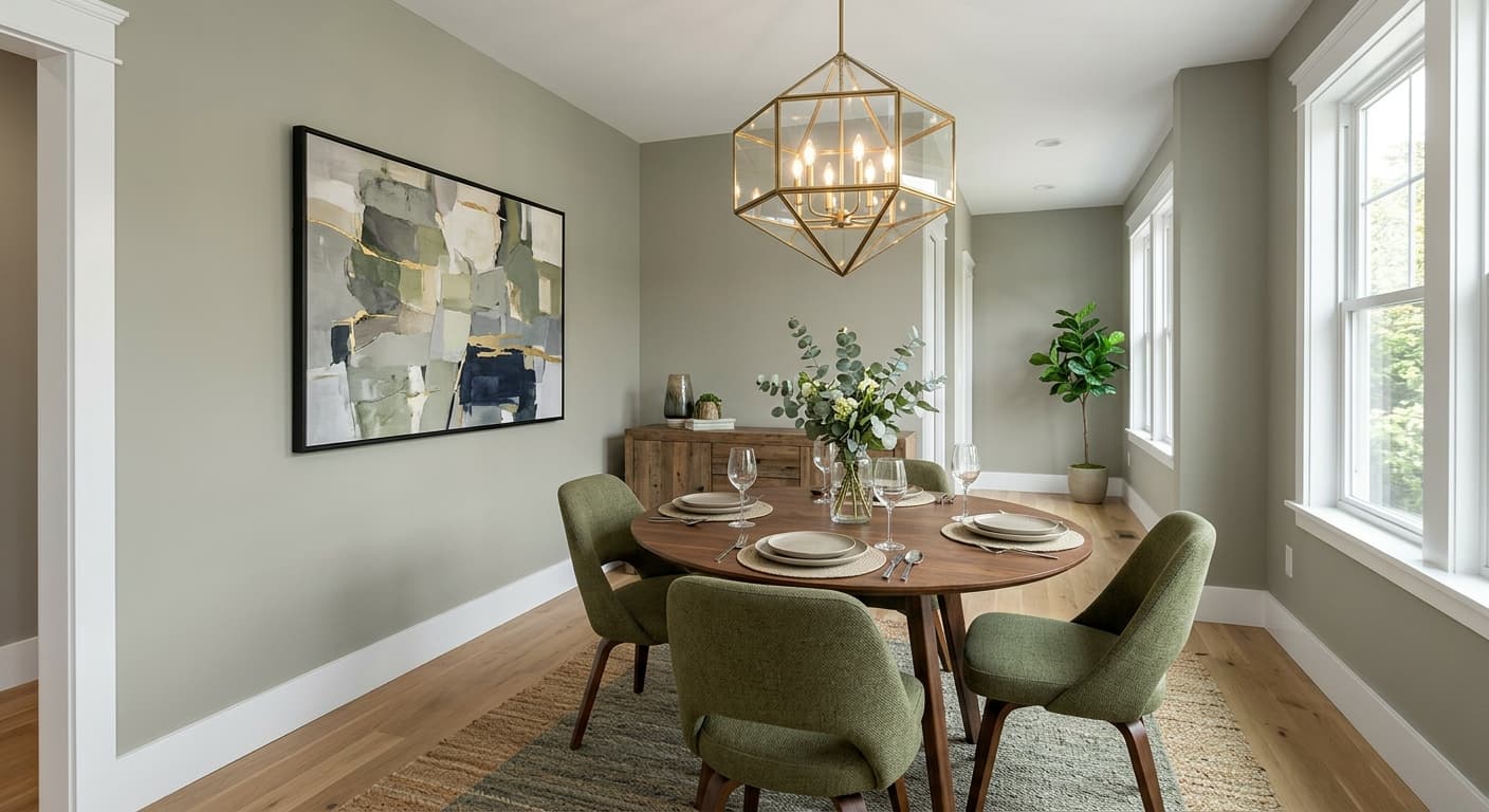
Gray Screen is a natural fit for living rooms and bedrooms where you want a calming, neutral backdrop without resorting to off-white. Its LRV of 58.5 is high enough to keep spaces feeling light, but it has enough depth to give walls some definition. In living rooms, wood floors and upholstered furniture in warm tones offset the coolness well. In bedrooms, it reads restful rather than stark, especially with warm bedding and wood furniture.
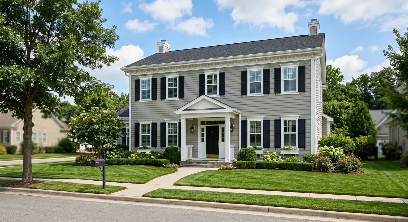
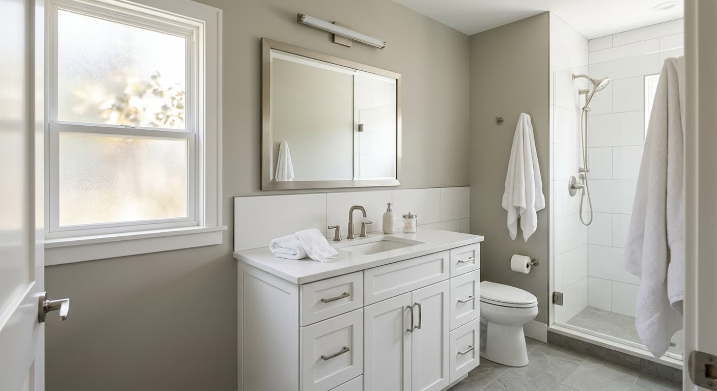
Bathrooms are a strong use case. The color pairs cleanly with white subway tile, porcelain fixtures, and chrome or brushed nickel hardware, and the cool tone feels appropriately fresh in that context. It also performs well on exterior applications, where it holds its own as a clean, contemporary gray siding color. Sherwin-Williams includes it in their Top Exterior Colors collection, and reviewers confirm it reads well in full sun without going too light or too cool.
Orientation matters. South- and west-facing rooms are generally the best fit because natural warmth balances the cool undertone. In north-facing rooms, the color can lean noticeably cooler and the potential green cast may become more pronounced, so supplement with warm artificial light and warm textiles. East-facing rooms tend to be fine in the morning but should be checked in afternoon light as well. For cabinet painting, the color can work on kitchen or bathroom cabinets in the right setting, particularly in a modern or transitional kitchen with white countertops and stainless appliances, though the undertone shift with different cabinet materials is worth sampling first.
Gray Screen gives a living room a calm, neutral base with enough depth to feel intentional. Warm wood floors and upholstered pieces in camel, tan, or terracotta tones offset the cool undertone and keep the space from feeling chilly. Pair with Site White (SW 7070) trim and you have a clean, contemporary framework that works across furniture styles.
At LRV 58.5, Gray Screen is light enough to keep a bedroom from feeling heavy but has enough presence to feel distinct from white. It reads restful and quiet, which suits a sleeping space well. Layer in warm bedding, natural wood nightstands, and soft lighting to prevent the cool undertone from dominating in the evening.
This is one of Gray Screen's strongest rooms. It pairs cleanly with white tile, porcelain fixtures, and chrome or brushed nickel hardware, and the cool gray tone feels fresh and appropriate in a bath context. Make sure your lighting is adequate, since the color can turn flat under dim or poorly positioned bulbs.
Gray Screen earns its spot in Sherwin-Williams' Top Exterior Colors collection. It reads as a crisp, contemporary mid-gray on siding and performs well in full sunlight without going too light. Crisp white trim from Site White (SW 7070) sharpens the look, and a darker front door color adds the contrast the palette needs.
Gray Screen can work on cabinets in a modern or transitional kitchen, particularly with white countertops and stainless or chrome hardware. The undertone can shift depending on your cabinet wood substrate and surrounding finishes, so sample it on an actual door before committing to a full kitchen.
The coordinating colors Sherwin-Williams pairs with Gray Screen are well chosen and worth following. Site White (SW 7070) is the natural trim companion, slightly warmer than a cold bright white, which keeps the pairing from going too stark while still providing clear contrast. The result is a clean, grounded look that suits Craftsman trim profiles as well as contemporary flat casings.
Studio Blue Green (SW 0047) works as a deeper accent, giving you a way to echo and intensify the blue-green flicker already present in Gray Screen rather than fighting it. That combination reads as deliberate and cohesive. For a softer secondary palette, the coordinating warm white listed for this color provides a gentler, creamier option for ceilings or built-ins, keeping the overall scheme from feeling too cool throughout the room.
All comparisons are matched against Gray Screen at LRV 58.5.
Heavily orange or yellow-toned wood floors and cabinets, think older honey oak or pine, can clash with Gray Screen's cool undertone by making the green cast more obvious and creating an unresolved tension between the wall and the floor.
Pairing Gray Screen with beige or tan trim creates an undertone conflict. The cool wall fights the warm trim and neither reads correctly, making the space feel like a color mistake rather than a considered palette.
In a poorly lit north-facing room with cool daylight fluorescent fixtures and no warm texture, Gray Screen can turn flat and slightly gray-green in a way that reads dingy rather than sophisticated.
Gray Screen (SW 7071) is a light, airy cool gray with an LRV of 58.5. It sits in the light-to-mid gray range, clear enough to read as a true gray rather than greige or white, with a cool undertone that can shift between blue-gray and a faintly green-gray depending on your lighting and surrounding finishes.
Most reviewers identify a cool blue undertone, and our editorial read logs it as gray, green, and cool. In practice the color can flicker between a blue-gray and a soft green-gray depending on light direction, fixture color temperature, and neighboring finishes. North-facing rooms and certain wood tones tend to bring out the green lean, while bright well-lit rooms with warm surroundings let the clean blue-cool gray quality dominate.
Gray Screen is a cool gray. Its hex and RGB values sit in cool gray territory, and both independent reviewers and our editorial team consistently read it as cool. It is not a warm gray, greige, or anything close to beige.
Gray Screen has an LRV of 58.5, which places it firmly in the light range. It reflects enough light to keep rooms feeling open and bright without reading as an off-white or near-white.
Site White (SW 7070) is the cleanest trim pairing and is Sherwin-Williams' own coordinating recommendation. Studio Blue Green (SW 0047) works as a deeper accent that echoes the color's blue-green quality. For contrast and grounding, deeper colors like a rich navy or a warm dark bronze work well. Warm wood tones in floors and furniture help balance the coolness throughout a room.
The Sherwin-Williams color code is SW 7071. The hex value is #C6CACA and the RGB values are 198, 202, 202. The LRV is 58.5.
Yes on exteriors. Sherwin-Williams includes it in their Top Exterior Colors collection and it reads as a crisp, contemporary gray on siding in full sunlight. For front doors, it can work as a whole-door color on a contemporary home, though many people opt to use it on siding and choose a deeper accent for the door itself. For cabinets, it is workable in a modern or transitional kitchen with white countertops and cool-toned hardware, but the undertone can shift depending on your cabinet substrate, so sample it on an actual door before committing.
