Aloof Gray lands somewhere between soft sage and cool cement. It is a light, low-chroma color with an LRV of 57.9, which puts it firmly in the airy zone: it reflects the majority of light in a room and keeps the space feeling open rather than heavy. The green-gray character is what separates it from the crowd of simple beige-leaning neutrals. Sherwin-Williams files it in the green family, and that classification tells you something real about how it reads on a wall, especially in rooms that receive moderate to strong daylight.
In practice, Aloof Gray is a quiet color. It does not shout sage, and it does not collapse into plain gray. The muted quality is consistent across a range of finishes and surfaces, and reviewers consistently describe the color as calm and contemporary rather than bold or rustic. That serene, restrained character is its core appeal, and it works across a surprisingly wide range of interior styles, from clean Scandinavian spaces to transitional and even softly traditional rooms.
The undertone story here is genuinely complicated, and sources do not all agree, so take that as useful information rather than a problem. The primary read is green-gray: most reviewers see a cool, slightly minty cast that earns the color its place in Sherwin-Williams' green family. That green is rarely loud, but it is real, and it becomes more visible in rooms with natural light and white or cream trim alongside it.
Beyond that green layer, reviewers identify secondary undertones including faint yellow, blue, and in some lighting conditions even a trace of lilac or lavender. This is where the disagreement lives. In warm natural daylight, the yellow and mint facets surface and the color can feel slightly warmer and almost spa-like. Under cool artificial lighting, the blue and lilac readings become more prominent, and the color shifts to feel cleaner and more urbane. Neither of those readings is wrong: both are real behaviors of the same pigment mix.
What that means practically is that Aloof Gray is not the same color in every room of your house. A south-facing room with afternoon sun will show you a warmer, greener version. A north-facing room under overhead LED lighting will show you something cooler and quieter, with more of that faint blue-lilac shadow. Sample it on a large board and live with it through morning and evening before committing, especially if your space has a strong directional light source.
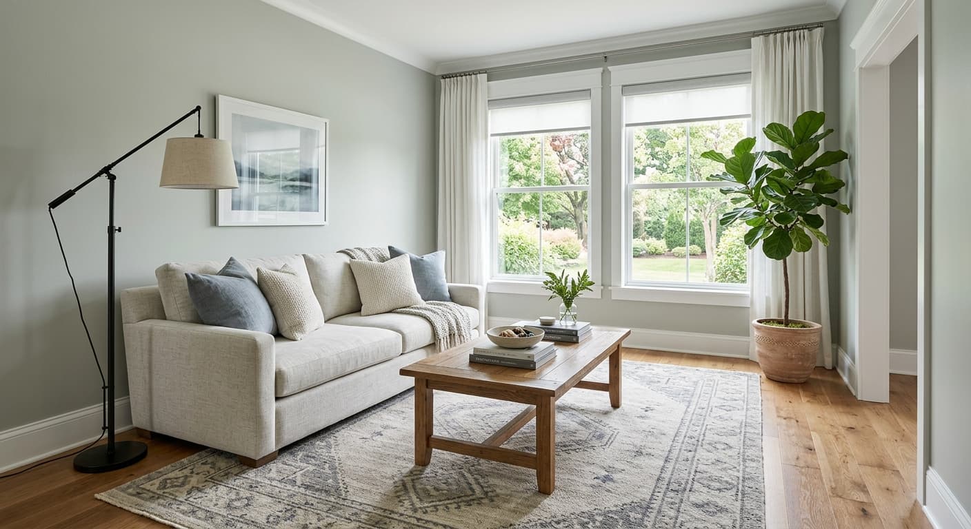
Aloof Gray reads well in living rooms and bedrooms where you want a genuinely restful, contemporary backdrop without resorting to a flat, personality-free gray. Its LRV of 57.9 keeps it light enough for everyday living spaces, and the cool green-gray quality brings a quiet sophistication that warmer greiges and taupes do not. Reviewers frequently describe it as a whole-house neutral, meaning it holds up across adjacent rooms and hallways without feeling jarring at transitions.
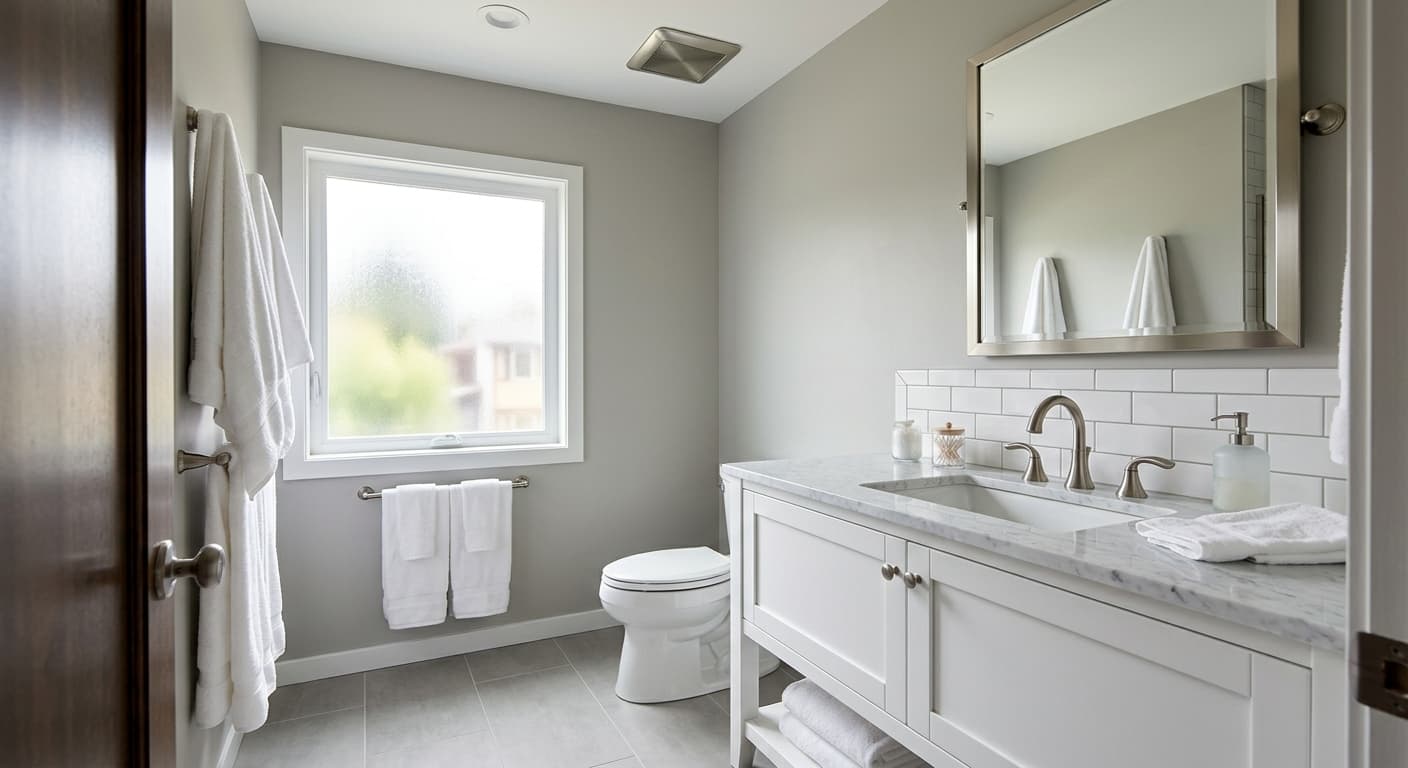
Bathrooms are another strong application. The cool, spa-adjacent undertone works well in spaces with white tile, chrome or brushed nickel fixtures, and natural stone. The color's ability to feel either fresh or serene depending on light intensity gives it range in a room where light conditions shift from task lighting to ambient.
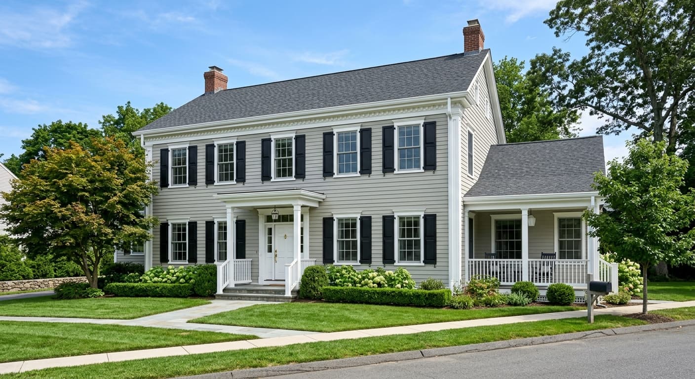
Exposure matters more with Aloof Gray than with a true mid-tone warm gray. North-facing rooms bring out the cooler, slightly lilac side, which can feel sophisticated but might read chilly in a bedroom if you are not pairing it with warmer textiles and wood tones. South- and west-facing rooms are more forgiving and will give you that warmer green-mint quality. For exteriors, the cool gray-green reads as a refined, slightly traditional choice on siding, particularly against white trim and black or dark bronze hardware.
In a living room, Aloof Gray provides a calm, airy backdrop that reads contemporary without feeling cold. Its LRV of 57.9 keeps the space bright in daylight while the green-gray base adds quiet character that flat neutral grays lack. Layer in natural wood tones and muted blue or green textiles to bring out the color's more organic qualities.
For a bedroom, the serene, low-energy quality of Aloof Gray is a genuine asset. It encourages rest rather than visual activity, and the cool side of the color makes warm bedding and wood furniture feel especially inviting by contrast. In north-facing bedrooms, add warmer lighting and wood-toned nightstands to prevent the cooler blue-lilac undertone from making the space feel too withdrawn.
Aloof Gray is a natural in bathrooms, where its cool green-gray reads as clean and spa-like rather than merely gray. It pairs well with white ceramic tile, brushed nickel, chrome, and natural stone without competing. The color holds up under the range of lighting conditions bathrooms typically see, from bright task light to soft ambient.
Reviewers commonly use Aloof Gray as a whole-house neutral, and it earns that role by staying consistent through transitions between differently lit rooms. Its restrained chroma means it does not clash with adjacent spaces painted in coordinating cooler or slightly warmer tones. Anchoring trim in a clean warm white throughout keeps the palette cohesive.
On cabinetry, Aloof Gray gives you a soft, sophisticated alternative to white without the higher-maintenance concerns of a dark color. The green-gray reads as fresh and current on kitchen and bathroom cabinets, especially with warm brass or unlacquered bronze hardware. On a front door, the color holds well against natural wood, brick, or white siding.
Sherwin-Williams pairs Aloof Gray with Frosty White, Cast Iron, and Primavera, and that trio covers the range of tonal directions the color can take. Frosty White provides a clean, cool trim option that keeps the palette contemporary without introducing warmth that fights the green-gray base. Cast Iron gives you a grounded dark anchor, ideal for cabinetry, doors, or accent walls where you need serious contrast without going full black. Primavera brings a warmer, softer counterpoint that works particularly well in spaces where you want the green facet of Aloof Gray to feel less austere.
Beyond the official coordinates, Aloof Gray responds well to muted navy and dusty blue textiles, natural white oak and light walnut furniture, and any trim white that leans slightly warm rather than stark cool. Crisp warm whites on trim keep the green undertone from tipping into clinical territory. If you go with a very blue-white trim, you risk emphasizing the cooler, lilac-adjacent side of the color, which can make rooms feel colder than intended.
All comparisons are matched against Aloof Gray at LRV 57.9.
Pairing Aloof Gray with a very blue-white or pure bright white trim amplifies the cooler, lilac-adjacent undertone and can make rooms feel colder and more clinical than intended.
Heavily orange or red-stained hardwood floors create direct contrast with Aloof Gray's cool green undertone, and the two pull visibly against each other rather than settling into a cohesive palette.
Yellow and gold accent colors compete directly with the faint yellow secondary undertone in Aloof Gray, amplifying it unevenly across the room and making the green-gray read muddy or jaundiced rather than clean.
Aloof Gray SW 6197 is a light, low-chroma green-gray with an LRV of 57.9. It sits between soft sage and cool cement in character, muted enough to read as a neutral but with enough green-gray presence to feel distinctive next to flat or warm grays.
The primary undertone is green-gray, which is why Sherwin-Williams places it in the green color family. Secondary undertones include faint yellow, blue, and in some conditions a trace of lilac. These shift with light: warm natural daylight surfaces the yellow-mint side, while cool artificial light brings out the bluer, more lilac edge.
It reads cool overall. The green-gray base keeps it on the cooler side of the neutral spectrum, and the blue and lilac secondary undertones reinforce that in certain lighting. In strong warm daylight it can feel slightly warmer, but it never crosses into greige or beige territory.
Aloof Gray has an LRV of 57.9, which puts it in the genuinely light category. It reflects the majority of light in a room and contributes to an airy, open feel rather than a weighty or dramatic one.
The Sherwin-Williams code is SW 6197. The hex value is #C9C9C0 and the RGB values are 201 red, 201 green, 192 blue.
Not exactly. It is categorized in Sherwin-Williams' green family and does carry a green undertone, but it reads more as a cool green-gray than a recognizable sage. The green is subtle and shifts with light rather than sitting forward the way a true sage wall color would.
Yes to all three. On exteriors, the cool green-gray reads as refined against white trim and dark hardware. On a front door it offers quiet contrast without high drama. On cabinetry it provides a soft, updated alternative to white, especially with warm metal hardware in brass or dark bronze.
