Sweater Weather reads as a soft, light greige on the wall, sitting right in the middle ground between a proper gray and a warm beige. At LRV 59.8 it is light enough to keep a room feeling open and airy, but it holds its color far more than a bright off-white would. You get a calm, low-contrast backdrop that still has personality.
In person, the color has a quiet, muted quality that many reviewers describe as genuinely cozy without being heavy. It belongs to Sherwin-Williams' Designer Color Collection and leans into that minimal, modern sensibility: understated, composed, and easy to live with. It is not a stark color and not a flashy one. Think of it as the kind of neutral that recedes gracefully and lets furniture and textiles do the talking.
What makes it interesting is how it shifts across a day. In flat or overcast light it holds a steady soft gray quality. When warm afternoon light hits it, the beige character comes forward and the room feels distinctly warmer. It never becomes a different color entirely, but the emphasis moves, which is part of why it works so well as a whole-house color.
This is where Sweater Weather generates the most disagreement among independent reviewers, and it is worth sitting with that honestly rather than giving you a tidy single answer. The official read from our database is warm, beige, and gray, which is accurate as a composite, but it does not capture the full picture of how different people experience this color in different rooms.
Some reviewers read the undertone as a subtle cool blue or blue-green that stays very muted, almost imperceptible in warm light but noticeable in north-facing spaces or on cloudy days. Others see a faint warm green-yellow cast, describing it as a very light soft gray with a greige warmth that edges slightly toward sage. These are genuinely different readings, not one person being wrong, because the color genuinely behaves differently depending on the ambient light in the room.
In practice, Sweater Weather behaves more like a balanced greige than a committed cool gray or a committed warm tan. In south-facing and west-facing rooms with afternoon sun, the beige and warm notes dominate and the color feels settled and welcoming. In north-facing rooms, the gray strengthens, the cooler undertones surface, and you get a crisper, slightly more contemporary feeling. If you have a room that gets a strong cool or green cast from nearby foliage outside the windows, the green-leaning reads some reviewers mention will become more apparent. Sample it on at least two walls in your actual space and check it morning, midday, and evening before committing.
Sweater Weather is listed for living rooms, bedrooms, and whole-house use, and the research backs that up. As a cozy warm neutral with an LRV of 59.8, it is light enough to work in rooms where you want brightness but still grounded enough to feel deliberate rather than washed out. It suits transitional and modern minimal interiors especially well, where a single cohesive backdrop across multiple rooms reads as intentional and calm rather than indecisive.
Lighting and orientation shape how the color performs. South-facing and west-facing rooms are where Sweater Weather is most flattering: the warm afternoon light pulls out its beige character and the overall effect is settled and comfortable. North-facing rooms are workable but require more care. In those spaces the gray and subtle cool undertones strengthen, and the color can feel a touch colder than you expected. Pairing it with warm-toned lighting and wood furnishings helps compensate.
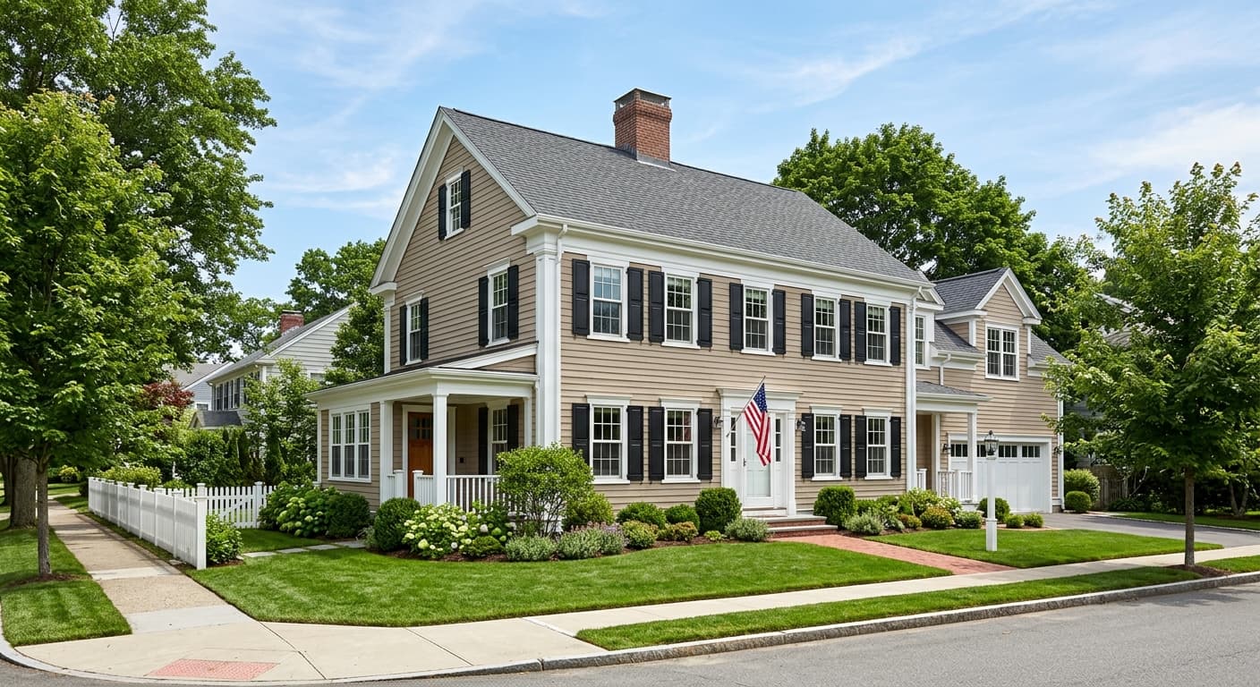
Beyond interiors, Sweater Weather is available in both interior and exterior finishes, so it is a viable option for exterior siding or a front door if you want a refined, understated gray-beige. On exteriors, the warm beige notes tend to read more clearly in natural daylight, giving the facade a soft, approachable quality rather than a stark cool gray look. As always with a color this nuanced, get a large sample on the actual surface and check it at different times of day before making the call.
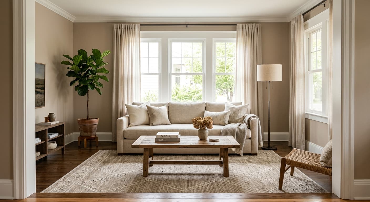
In a living room, Sweater Weather creates a backdrop that feels relaxed and cohesive without reading as boring. Its LRV of 59.8 keeps the space feeling bright enough in most orientations while still giving the walls some presence. Pair it with warm wood floors, soft textiles, and White Sail on the trim for a pulled-together but unfussy result.
Sweater Weather suits bedrooms well because its low-saturation greige quality reads as genuinely restful rather than clinical. The warm beige notes that come forward in softer evening lighting make the room feel inviting. In a north-facing bedroom, lean into warm lighting and wood or linen furnishings to keep the cooler undertones from taking over.
This is one of Sweater Weather's strongest use cases. At LRV 59.8 and with its balanced warm-gray undertone, it flows from room to room without feeling monotonous or fighting itself in different light conditions. Using White Sail on trim throughout creates a clean, unified system that works across varying orientations.
On exteriors, Sweater Weather reads as a soft, warm gray-beige that avoids the starkness of a true cool gray. Natural daylight tends to pull out its beige character, giving the facade a quiet, settled look. It works well with white trim and natural wood or stone accents at the entry.
For a home office, Sweater Weather provides a calm, non-distracting backdrop that does not drain energy the way a bright white might. In east-facing offices that get morning light, the color stays warm and clear. In darker offices, supplement with warm-toned artificial light to prevent the gray undertones from pulling too cool.
Sweater Weather's coordinating palette keeps things calm and cohesive. White Sail is the natural trim companion: a clean white that does not fight the warm-gray body color and keeps the whole scheme feeling fresh rather than yellow. For an accent or adjacent room color, Fresh Eucalyptus brings a soft sage green that works with both the warm beige and the gray notes in Sweater Weather, depending on the light, making it a reliable bridge color if you want to introduce a plant-inspired tone without going bold.
For deeper contrast, Mountain Pass provides a moodier, richer accent that grounds the lighter gray-beige body color. Use it on a single focal wall, built-ins, or cabinetry to add weight without disrupting the overall calm of the palette. Because Sweater Weather sits in that balanced greige zone, it plays well with natural wood tones, warm metals like brass and bronze, and textured fabrics in off-white or oatmeal, all of which reinforce its cozy, layered quality.
All comparisons are matched against Sweater Weather at LRV 59.8.
Pairing Sweater Weather with a stark blue-toned white on trim creates an undertone conflict. The cool white amplifies any blue-gray notes in Sweater Weather, and the two colors fight rather than complement each other, making the walls look unintentionally cool and the trim look almost clinical.
In rooms with large windows overlooking heavy foliage, the reflected green light from outside can push Sweater Weather's faint green-yellow undertone to become quite noticeable on the walls. What looked like a balanced greige on the sample card reads as more of a gray-green in that environment.
In a large open-plan room, Sweater Weather in a high-gloss or semi-gloss finish can look unexpectedly flat or chalky, because the reflective surface picks up every shift in the ambient light and the subtle undertone inconsistency becomes amplified at scale.
Sweater Weather is a light soft greige, sitting between warm beige and gray with a muted, low-saturation quality. It reads as a calm, cozy neutral that holds its color at LRV 59.8, meaning it is lighter than a mid-tone but more present than a near-white.
The undertones are the most debated aspect of this color. Our editorial read is warm, beige, and gray, but independent reviewers split: some see a subtle cool blue or blue-green that surfaces in north-facing or low-light conditions, while others read a faint warm green-yellow cast that nudges it toward greige. In practice it behaves as a balanced color that shifts with your light rather than committing firmly to one undertone, which is why sampling in your actual space is essential.
It is balanced, leaning warm in direct or afternoon sun and leaning cooler in north-facing rooms or on overcast days. Most reviewers land on warm greige as the dominant character, but the cool notes are real and can become more prominent depending on your room's orientation and light sources.
The LRV is 59.8, which places it in the light range. It reflects most light and keeps spaces feeling open, but it holds enough color that it reads as a deliberate choice rather than a near-white.
White Sail works well on trim as a clean, non-competing white. Fresh Eucalyptus is a soft sage green that pairs naturally with both the warm and gray notes in Sweater Weather. Mountain Pass provides deeper contrast for accents, built-ins, or cabinetry. Natural wood tones, warm metals like brass or bronze, and off-white or oatmeal textiles all reinforce the color's cozy, layered quality.
The Sherwin-Williams code is SW 9548. The hex is #ccccc5 and the RGB values are 204, 204, 197.
Yes to both. Sweater Weather is available in interior and exterior finishes, and on exteriors it reads as a soft warm gray-beige that avoids starkness. As a whole-house interior color it is one of its strongest applications: the balanced undertone and LRV of 59.8 allow it to flow across rooms with different orientations without fighting itself, especially with White Sail on trim throughout.
