On the Rocks reads as a light, soft gray that sits right at the edge of the off-white family. Its LRV of 61.6 means it reflects a solid amount of light, so it never feels heavy or moody on the wall. Most people clock it immediately as a gray, but one that feels comfortable and lived-in rather than cold or clinical.
The color has a quiet stone quality to it. Think of a smooth river rock or a sun-warmed concrete surface, something with a little warmth baked in. That quality keeps it from looking flat. It shifts subtly with the time of day, looking a touch softer and creamier in morning light and more cleanly gray in midday sun.
At LRV 61.6 it sits in a sweet spot for a neutral: light enough to keep a room feeling open, but with just enough presence to register as a real color choice rather than a default. In smaller rooms or spaces with limited natural light it reads on the brighter end of its range. In large, well-lit rooms it settles into a quiet, confident mid-tone.
The undertone conversation around On the Rocks is genuinely interesting because reviewers do not all land in the same place, and that is worth knowing before you commit. The brand editorial read identifies warm, gray, and taupe as the core undertones, and most independent reviewers agree on the warm-leaning gray description. The taupe quality is subtle but real, giving the color its stone-like feeling rather than a flat or industrial gray.
A segment of reviewers, though, pick up something else: a faint violet or mauve quality, particularly in certain lighting conditions or when placed against warm wood tones. This is not a bold violet. It will never read purple in a room. But in north-facing rooms or under cool LED lighting, that faint lavender-adjacent quality can surface and surprise people who expected a straightforward warm greige. It is worth testing specifically in those conditions before painting a full room.
The warm-versus-cool question does not have a single clean answer. Most lighting conditions will read it as warm or neutral. Cool daylight and cooler artificial light can nudge it toward the violet end of its range. Because the taupe and warm gray undertones are doing a lot of work, surrounding finishes matter too. Pair it with warm wood tones and natural textiles and the warmth wins. Set it beside stark cool whites or blue-gray accents and the cooler facet becomes more visible.
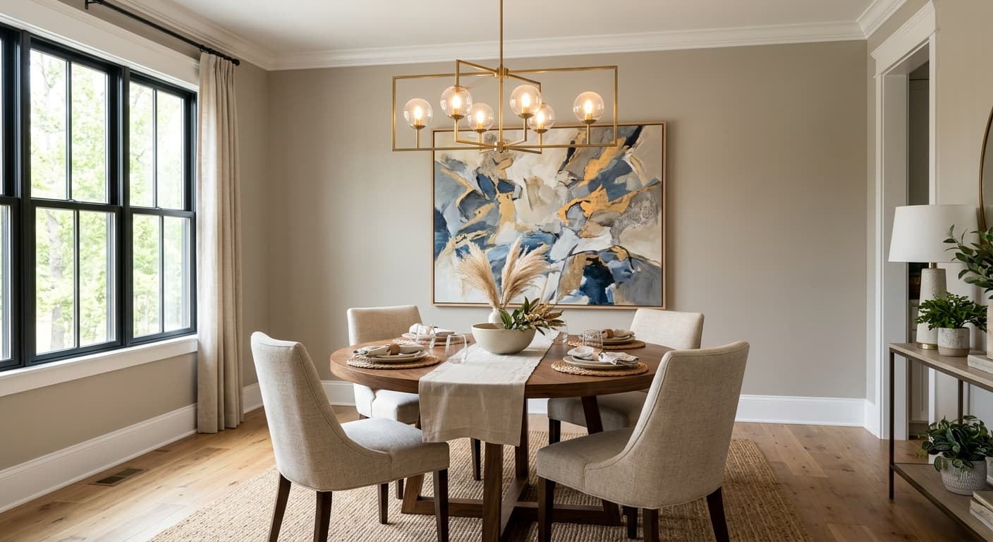
On the Rocks is a natural fit for living rooms, dining rooms, and bedrooms, which tracks with where real-world reviewers report using it most. In a living room it functions as an easygoing backdrop that does not compete with furniture or art. In a bedroom the warm-gray quality feels calm without being drowsy. In a dining room it pairs well with natural wood tables and linen textiles, where its stone undertone feels grounded and inviting.
Lighting and orientation matter quite a bit. South- and west-facing rooms are the most forgiving, letting the warm undertone show consistently throughout the day. East-facing rooms work well in the morning. North-facing rooms are where you need to be most careful, as cooler ambient light can pull out that faint violet quality some reviewers have flagged. If your room faces north, sample generously and look at the swatch in the evening under your actual artificial lighting before deciding.
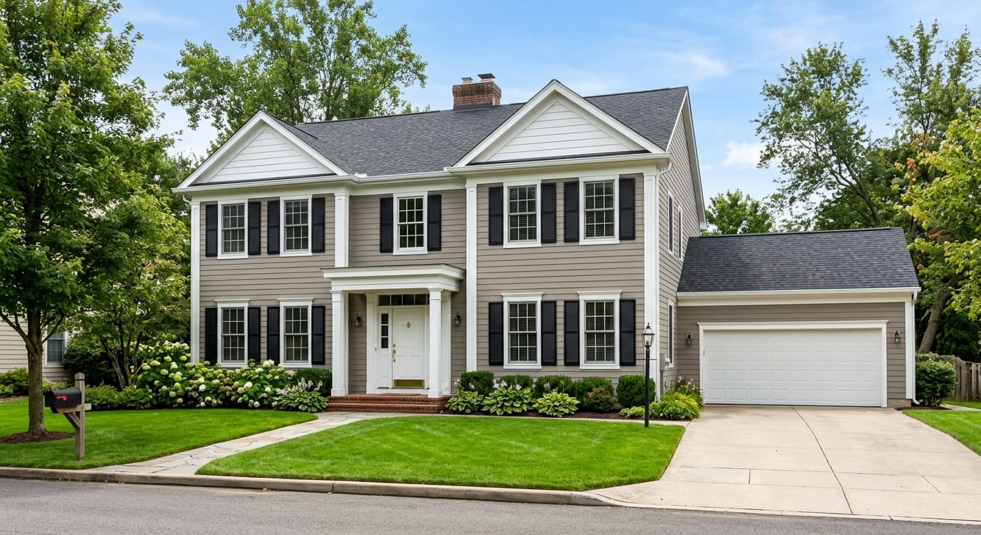
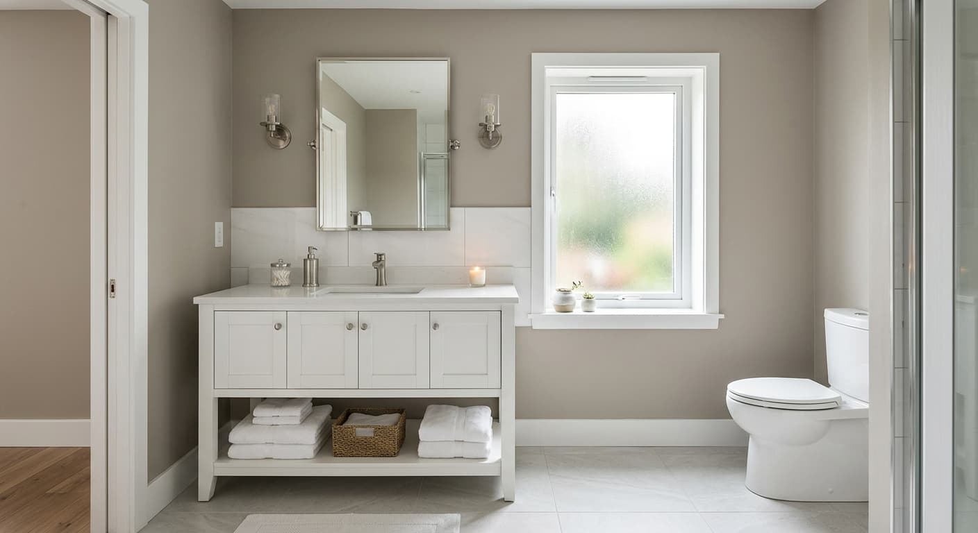
Beyond walls, this color has been used effectively on kitchen cabinets and exteriors. On cabinets, reviewers note that the soft gray reads clean and current without the severity of a true charcoal. On exteriors it comes across as a warm stone gray that integrates naturally with brick, wood siding, and natural stone trim. The practical side of its medium-value gray also deserves a mention: at LRV 61.6 it hides everyday fingerprints and smudges better than brighter whites or very pale colors, which makes it a sensible choice for busy households.
In a living room, On the Rocks settles into the walls without demanding attention, letting furniture and art carry the room. Its LRV of 61.6 keeps the space feeling light and open even in rooms with average natural light. Layer in warm wood tones and textured textiles to bring out the taupe quality and keep the palette from feeling flat.
The warm-gray quality makes this a calming bedroom color that reads restful without being cold. It works especially well with linen bedding, natural wood furniture, and soft ambient lighting. In a bedroom with south or west exposure it will look consistently warm throughout the day.
In a dining room, the stone undertone of On the Rocks feels grounded and complementary to natural materials like wood tables and ceramic tableware. Its LRV of 61.6 means the room stays comfortable and well-lit even in spaces that rely on artificial light for evening dining. Pair with a warm white trim for a clean, cohesive finish.
Reviewers report using it successfully on kitchen cabinets, where it reads as a current warm gray without going as dark or stark as true charcoal options. It works particularly well in kitchens with wood open shelving, stone countertops, or brass hardware. Use a crisp white or soft warm white on the walls to let the cabinets define the room.
On exteriors, On the Rocks comes across as a natural stone gray that integrates well with brick, wood, and natural stone. Its LRV of 61.6 keeps it on the lighter end of exterior grays, so it reads friendly and approachable rather than heavy. It pairs cleanly with warm white trim and dark accents on shutters or doors.
On the Rocks coordinates naturally with colors that either echo its warm neutrality or provide clean contrast without fighting its subtle undertones. The coordinating palette Sherwin-Williams suggests pairs it with Extra White (SW 7006) for crisp, high-contrast trim work, Greek Villa (SW 7551) for a softer, warmer trim option that keeps the overall palette cozy, and Almond Roca (SW 9105) as a deeper warm accent that grounds the composition.
For furnishings and materials, its stone-gray quality plays well with natural wood in warm and medium tones, linen and wool textiles, matte black hardware, and brushed brass or bronze metals. Designers often use it as a bridge color in rooms that mix warm and cool elements, since its undertone range allows it to read as a companion to both. If you are using it on cabinets, a warm white on the upper cabinets or walls will keep the palette cohesive rather than creating an unintentional contrast.
All comparisons are matched against On the Rocks at LRV 61.6.
Placing On the Rocks next to cool blue or blue-gray colors can activate the faint violet quality in its undertone, pushing the overall palette toward an unintended cool, slightly purple cast rather than the warm stone neutral you chose it for.
Against very high-LRV, blue-white trims, On the Rocks can look dingier or more yellow than it actually is. The contrast between a cool bright white and its warm gray quality makes both colors look off in comparison.
In rooms with little warm natural light and cool-spectrum artificial lighting, the subtle violet facet that some reviewers have identified can become more visible, making the color feel less like a warm stone gray and more like a muted lavender-gray.
On the Rocks is a light warm stone gray that sits at the edge of the off-white family. At LRV 61.6 it reads soft and bright rather than heavy, with a quiet taupe quality that keeps it from feeling cold or flat. Most people describe it as a comfortable, versatile gray with just enough warmth to feel welcoming.
The primary undertones are warm gray and taupe, which give it its stone-like quality. A segment of independent reviewers also pick up a faint violet or mauve note, particularly under cool lighting or next to warm wood tones. That violet quality is never bold, but it can surface in north-facing rooms or under cool LED lighting, so it is worth testing in your specific space before painting.
It leans warm in most conditions, which is why it sits comfortably in the off-white family despite being recognizably gray. The taupe and warm gray undertones dominate in typical daylight and warm artificial light. Under cool north-facing light it can edge toward neutral or show a faint cooler cast. Call it warm-leaning rather than definitively warm or cool.
The LRV is 61.6, which places it firmly in the light range. It reflects a solid amount of light and reads open and airy rather than moody. It is lighter than a true mid-tone gray but has enough depth to feel intentional rather than default.
The Sherwin-Williams color code is SW 7671. The hex value is #D0CEC8 and the RGB values are 208, 206, 200.
For trim, Extra White (SW 7006) gives crisp high contrast and Greek Villa (SW 7551) gives a softer, warmer result. Almond Roca (SW 9105) works well as a deeper warm accent. In the room broadly, warm wood tones, natural stone, linen textiles, brushed brass, bronze, and matte black hardware all complement its stone-gray quality. Avoid cool blue-gray accents and stark cool whites, which can pull out the cooler facet of its undertone.
Yes to both. On exteriors it reads as a natural warm stone gray that pairs well with brick, wood siding, and natural stone trim, and its LRV of 61.6 keeps it on the friendlier, lighter end of exterior grays. On cabinets it offers a current warm gray without the severity of darker options. For cabinets, pairing it with a warm white on surrounding walls keeps the palette cohesive and avoids an unintentional clash.
