Raisin reads as a very deep, rich chocolate brown at first glance, but give it a few minutes and the light in the room starts pulling out something more complex. There is a wine quality to it, a red-purple warmth that keeps it from feeling flat or simply dark. At LRV 2.8 it sits right at the edge of near-black territory, absorbing far more light than it reflects, so the overall effect on a wall is enveloping and dimensional rather than stark.
The color shifts noticeably depending on your light source. Warm incandescent or Edison-bulb light draws out the chocolatey brown side and gives the room a rich, almost edible warmth. Cooler daylight or north-facing light brings the plum and purple forward, pushing it closer to a deep burgundy or dark berry. Because of that range, the same color can feel different hour to hour in the same room, which is part of its appeal but also why sampling on the actual wall before committing is genuinely important.
In full shade or dim conditions it can read almost black, and you will not see much color variation from across the room. Up close or when light grazes the surface, the wine and plum tones surface and give it character. It is the kind of color that rewards proximity and good lighting placement.
The primary undertone debate around Raisin is whether it reads more brown-red or brown-purple, and the honest answer is that it depends on your room. Most reviewers land on a red-brown base with a purple or plum secondary, which together produce that wine or dark berry quality. Some people see it as straightforwardly a very dark reddish brown, closer to a dried-fig tone. Others, especially in rooms with natural cool light, read it as firmly purple-leaning, closer to an eggplant or dark mulberry. Both observations are legitimate because the undertone blend genuinely shifts with light temperature.
What almost no one disputes is that it is a warm color. The red base keeps it out of the cool blue-black or neutral gray-black category entirely. If your room has warm wood tones, warm-toned metals like brass or copper, or warm-white trim, Raisin will read cohesively with all of those. If your room leans cool, with gray floors, chrome fixtures, or cool-white trim, the purple side will be more prominent and the overall effect can feel more jewel-toned than cozy.
The LRV of 2.8 complicates undertone reading in practice. When a color absorbs this much light, subtle undertones can disappear in shadow and only emerge in bright or directional light. Some reviewers with lower-light rooms report that it simply reads as a very dark neutral with a vague warmth, and the plum quality is hard to see at all. If showing that wine-purple character is important to you, plan for good light sources, whether natural or artificial, aimed at or washing the wall.
Dining rooms are the most cited use case for Raisin, and it is easy to see why. A low-LRV color like this draws people inward and makes a space feel intimate, which is exactly what you want around a table. In a dining room with warm overhead lighting or candles, the chocolate-to-wine range of Raisin creates a backdrop that makes food and people look warm and well-lit. It works whether the room is formal or relaxed in style, from a traditional mahogany-and-crystal setup to a more casual bohemian dining space with mismatched chairs and natural textiles.
Bedrooms are another strong fit, particularly if you want a cocooning, jewel-toned feel. Painting all four walls in Raisin produces an enveloping effect that many reviewers describe as deeply restful. It suits both maximalist spaces loaded with pattern and texture and more minimal rooms where the color itself carries the weight of the design. For bedrooms that get strong morning sun from an east-facing window, the warm-light shift toward chocolatey brown can be a genuinely pleasant way to start the day.
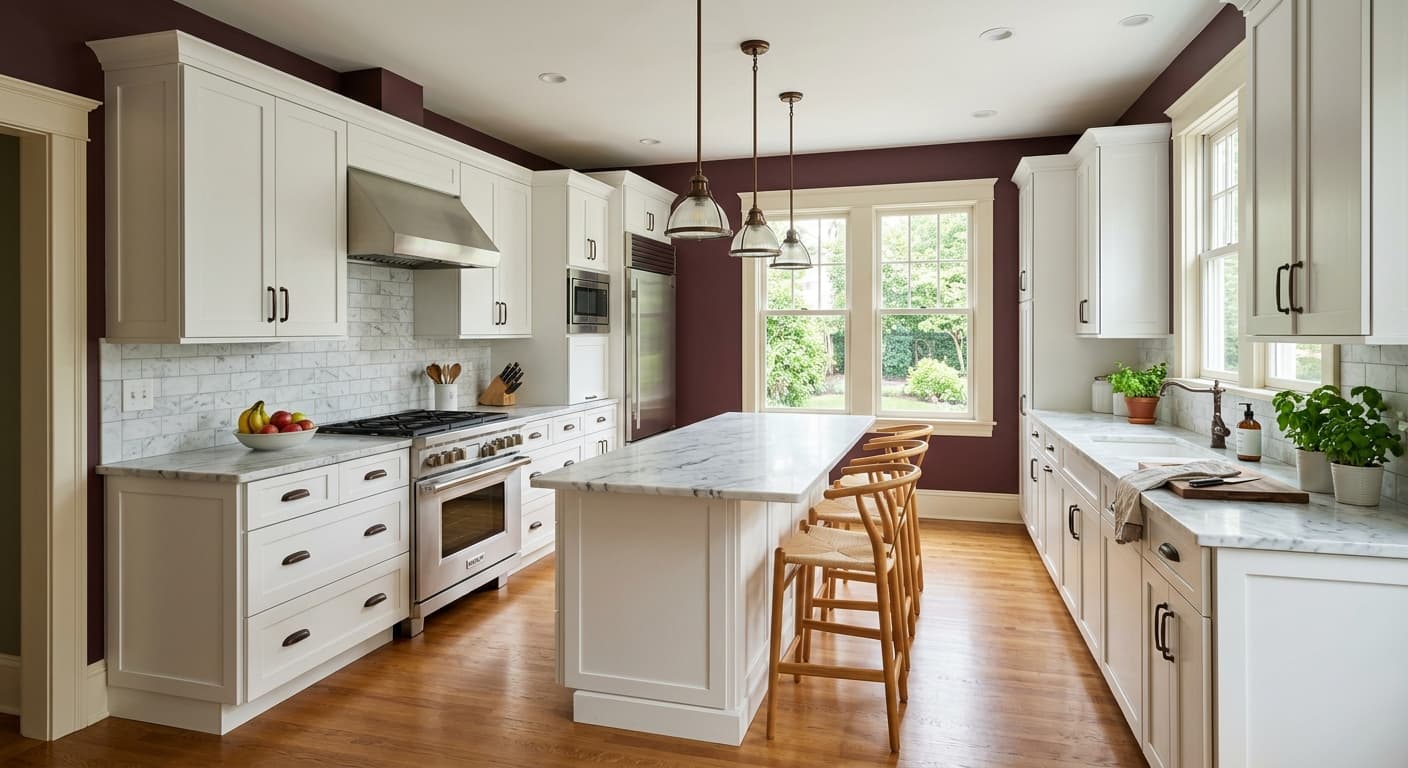
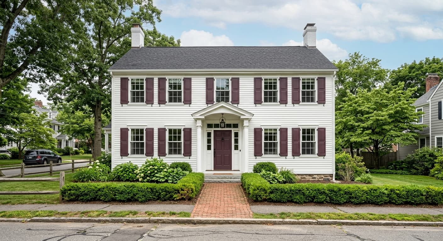
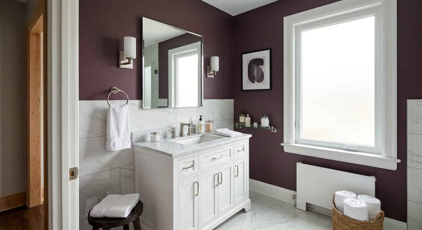
Accent walls, front doors, and cabinetry are also well-documented uses. On an accent wall behind a bed or sofa it provides drama without committing the whole room. On a front door it projects confidence and a slight sense of the unexpected, standing out from the standard navy or black options common in the neighborhood. For kitchen or bathroom cabinets, reviewers note it pairs well with warm brass hardware and natural stone countertops, and the washability and stain resistance of the finish make it practical in high-use areas. Home offices painted in Raisin show up often in the research as well, with people noting that the enveloping quality aids focus rather than distraction.
Raisin is most at home in a dining room where you want intimacy over openness. Warm overhead light or candles will pull out the chocolatey-brown register and make the space feel rich and enveloping around a table. Pair the walls with Zurich White SW 7626 on the trim to keep the boundaries clean and the contrast sharp.
All-four-walls Raisin in a bedroom creates the cocooning effect that makes this color a recurring favorite in jewel-toned bedroom projects. It suits both maximalist layered-textile rooms and more pared-back spaces where the color does the heavy lifting. Layer in warm brass lighting and natural wood furniture to lean into the warm-brown register rather than the cooler purple side.
As an accent wall behind a bed, sofa, or fireplace, Raisin delivers drama without requiring full commitment. At LRV 2.8 it will anchor the wall visually and push lighter furniture and decor forward. A warm white like Spatial White SW 6259 on the remaining walls keeps the room from feeling too heavy.
Reviewers consistently mention Raisin for home offices, noting that the enveloping quality aids focus. The color reads almost like a backdrop that retreats rather than distracts, especially under warm task lighting. It works particularly well in smaller offices where you want the room to feel purposeful and private.
On a front door, Raisin is a compelling alternative to standard black or navy, projecting warmth and depth that reads as confident without being expected. On kitchen or bathroom cabinetry it pairs naturally with warm brass hardware and natural stone, and its documented washability and stain resistance make the practicality match the aesthetics.
Raisin has a coordinating palette built around contrast and tonal layering. Zurich White SW 7626 is the highest-contrast pairing, a warm crisp white that keeps the look clean without going stark, ideal for trim, ceilings, or adjacent walls. Spatial White SW 6259 offers a softer warm-white option for the same purpose, pulling slightly more toward cream and easing the contrast a degree or two. Both whites let the depth of Raisin read fully rather than competing with it.
For a tonal approach rather than a contrast approach, Exclusive Plum SW 6263 works as a coordinating mid-tone. It shares Raisin's plum-and-wine DNA at a lighter value, which means you can use it on an adjacent wall, in soft furnishings, or in trim in spaces where you want the whole room to feel moody and cohesive rather than high-contrast. Beyond the official coordinates, the color's warm-dark nature makes it compatible with brass and antique gold metals, warm terracotta ceramics, natural linen and leather, deep jewel-toned textiles in emerald or sapphire, and natural wood in medium to dark tones.
All comparisons are matched against Raisin at LRV 2.8.
Cool gray floors pull the purple undertone in Raisin forward aggressively, and the two can compete rather than complement, making the room feel disjointed rather than moody.
A stark, blue-based white on trim or ceilings amplifies the purple side of Raisin and can make the combination feel cold rather than rich, undercutting the warm drama the color is meant to deliver.
Cool-metal finishes in chrome or nickel lean into the purple register of Raisin in a way that can feel slightly off, pushing the overall palette toward cool when the color works best in a warm context.
Raisin is a very deep, near-black wine-brown with a subtle red-purple or plum undertone. At LRV 2.8 it absorbs most light and can read almost black in shadow, but in warm or directional light it reveals a rich chocolate-to-burgundy range that gives it its name.
The primary undertone is red-brown, with a secondary purple or plum quality. Warm light emphasizes the chocolatey brown side while cooler light brings the plum forward. Some reviewers read it as purely a dark reddish brown, others as firmly purple-leaning, and both are accurate depending on the specific light in a room. Sample it on your actual wall to see how your light source handles the undertone blend.
Raisin is a warm color. The red base keeps it out of the cool gray-black or blue-black category entirely. Even when the purple undertone surfaces in cool light, the overall effect is warm and jewel-toned rather than cold or gray.
Raisin has an LRV of 2.8, placing it in near-black territory. It reflects very little light back into the room, which is what produces its enveloping, cocooning effect. Note that some third-party sources have cited a slightly higher figure, but the authoritative value is 2.8.
For high contrast, pair it with Zurich White SW 7626 on trim and ceilings, or use Spatial White SW 6259 for a slightly softer warm white. For a tonal, all-moody approach, Exclusive Plum SW 6263 works as a coordinating mid-tone that shares Raisin's plum-wine DNA. In terms of materials, warm brass hardware, natural wood, linen, leather, and deep jewel-toned textiles in emerald or sapphire all complement it well.
The Sherwin-Williams code is SW 7630. The hex is #392B2D and the RGB values are 57, 43, 45. The LRV is 2.8.
Yes, all three are well-supported uses. On a front door it reads as an unusual and confident alternative to black or navy, with a warmth that standard darks do not have. On cabinetry it pairs naturally with warm brass hardware and natural stone countertops, and reviewers cite its smooth application and stain resistance as practical advantages in high-use areas. For exteriors it works as a deep accent color on doors, shutters, or trim.
