
MorningWarm · quiet richness
A deep espresso brown, warm at its core but pulling toward near-black once the sun drops. Sample it large and watch it shift.
Turkish Coffee SW 6076 is one of the darkest browns Sherwin-Williams makes. With an LRV of 4.7, it sits just a few points above true black on the reflectance scale, which means it absorbs far more light than it gives back. On the wall it reads as a rich espresso brown, closer to a deep coffee than a classic chocolate or a red-tinged sienna. In a well-lit room during midday it shows its warmth clearly. By evening, or in any room that does not get generous natural light, it pulls dramatically darker and can read almost black.
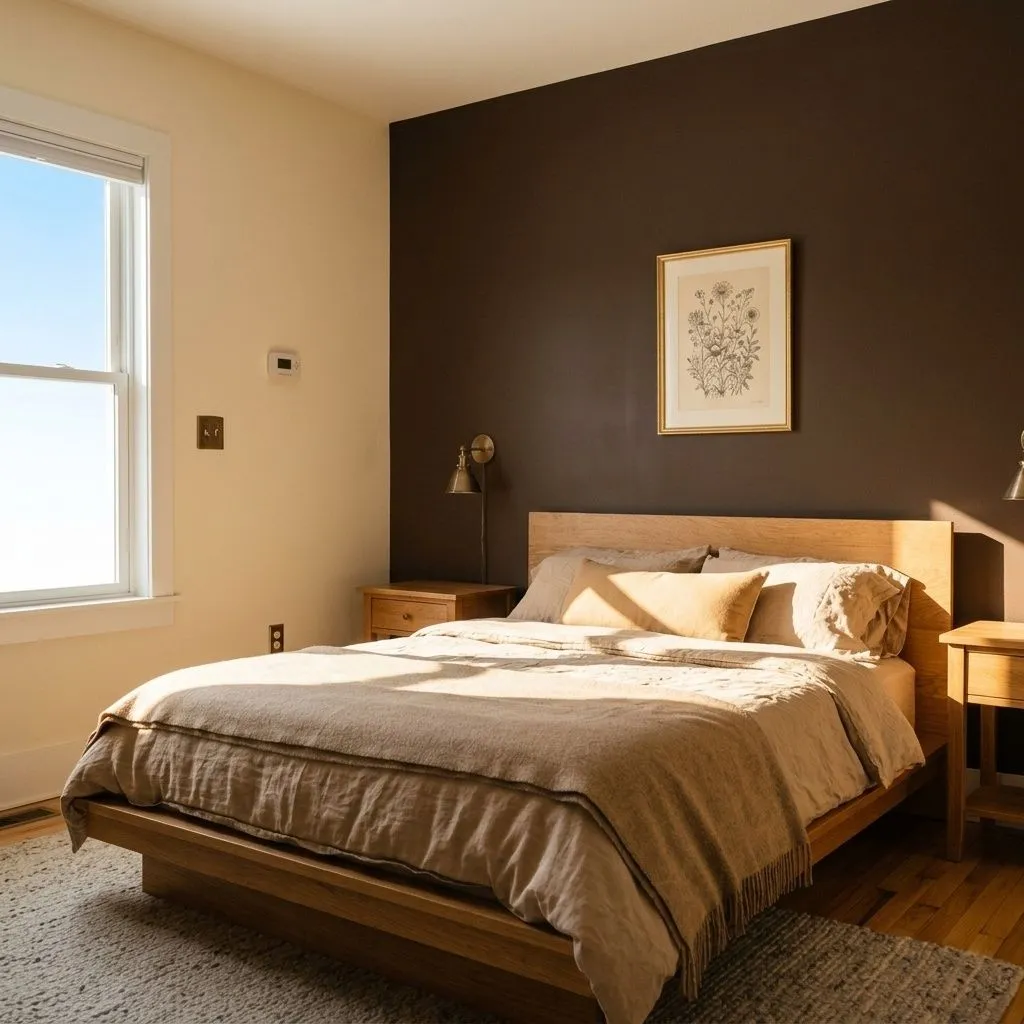
Size and scale matter here. Reviewers are consistent: this color makes a room feel smaller, cozier, and more intimate. That is not a flaw if intimacy is your goal, but it is a real physical effect you need to plan around. A large living room with south-facing windows will carry it well. A compact north-facing bedroom will feel like a cave. The color rewards commitment to the right space rather than casual application across any room you happen to own.
Every reviewer agrees Turkish Coffee is warm. Where they part ways is on the specific secondary cast, and that disagreement is worth taking seriously rather than smoothing over. Some sources read a faint yellow warmth that becomes noticeable in natural light, particularly in south-facing rooms where the sunny quality can feel almost honeyed. Others pick up a reddish-brown coffee note, the kind of undertone that connects it to espresso rather than to a flat neutral brown. A third read, supported by close analysis of the hex value, describes it as a fairly muted, nearly neutral warm brown without strong red or yellow dominance, more of a quiet richness than an assertive cast.
The practical consequence of this disagreement is that the undertone you see will depend heavily on your specific light conditions. Warm artificial light in the evening tends to deepen and enrich it, nudging whatever warmth is present into the foreground. North-facing rooms cool it slightly, which can suppress the yellow cast and make it read more neutral or even faintly gray. Natural light in south or east exposures brings out the warmth most clearly. Because the undertone shifts this much across conditions, sampling a large board and observing it at different times of day is not optional advice here. It is genuinely necessary.
Turkish Coffee performs best in rooms that are both large enough to absorb a very dark color and bright enough to let it breathe. Living rooms, bedrooms, studies, dens, and libraries are the spaces reviewers point to most often. The common thread is that these are rooms where a moody, sophisticated atmosphere is a feature rather than a problem. An accent or feature wall in an otherwise light room is one of the most reliable approaches, giving you the drama of the color without committing every surface to LRV 4.7.
Bathrooms come up as a credible option when they have decent natural light and you want a spa-like, enveloping feel. Kitchen cabinetry is another strong use case, particularly lower cabinets paired with light countertops and warm or brushed metal hardware. The contrast between the deep brown and a pale stone or quartz surface does the work that might otherwise require a busier finish or pattern.
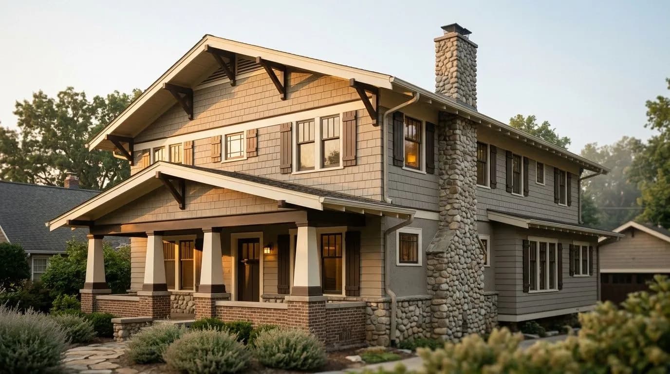
On exteriors, Turkish Coffee has real staying power. It reads as timeless rather than trendy, and its warm depth gives good definition to architectural details. Reviewers who specifically discuss exterior trim note that the color suits cooler climates better than warm, humid ones, where a very dark pigment can absorb heat in ways that stress the paint film over time. Front doors are a natural fit if the surrounding facade is a light or medium neutral. The color discourages well: small apartments, poorly lit rooms, Scandinavian or light-filled bohemian schemes, and any space where making a room feel smaller would be genuinely unwelcome.
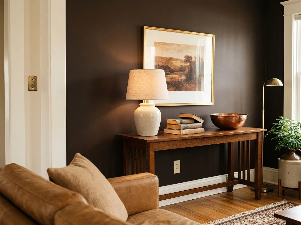
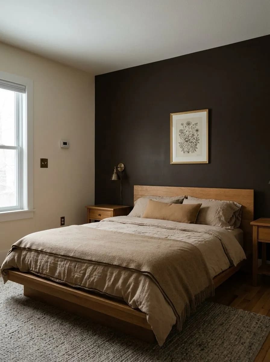
A large, well-lit living room is where Turkish Coffee earns its reputation. Use it on a single feature wall behind a sofa or media unit and let warm white or a soft greige like Heron Plume (SW 6070) carry the remaining walls. The contrast creates focus without overwhelming the space.
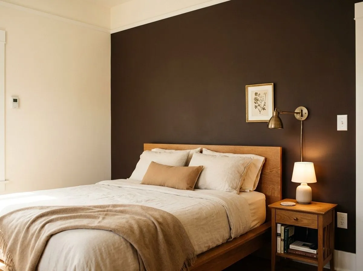
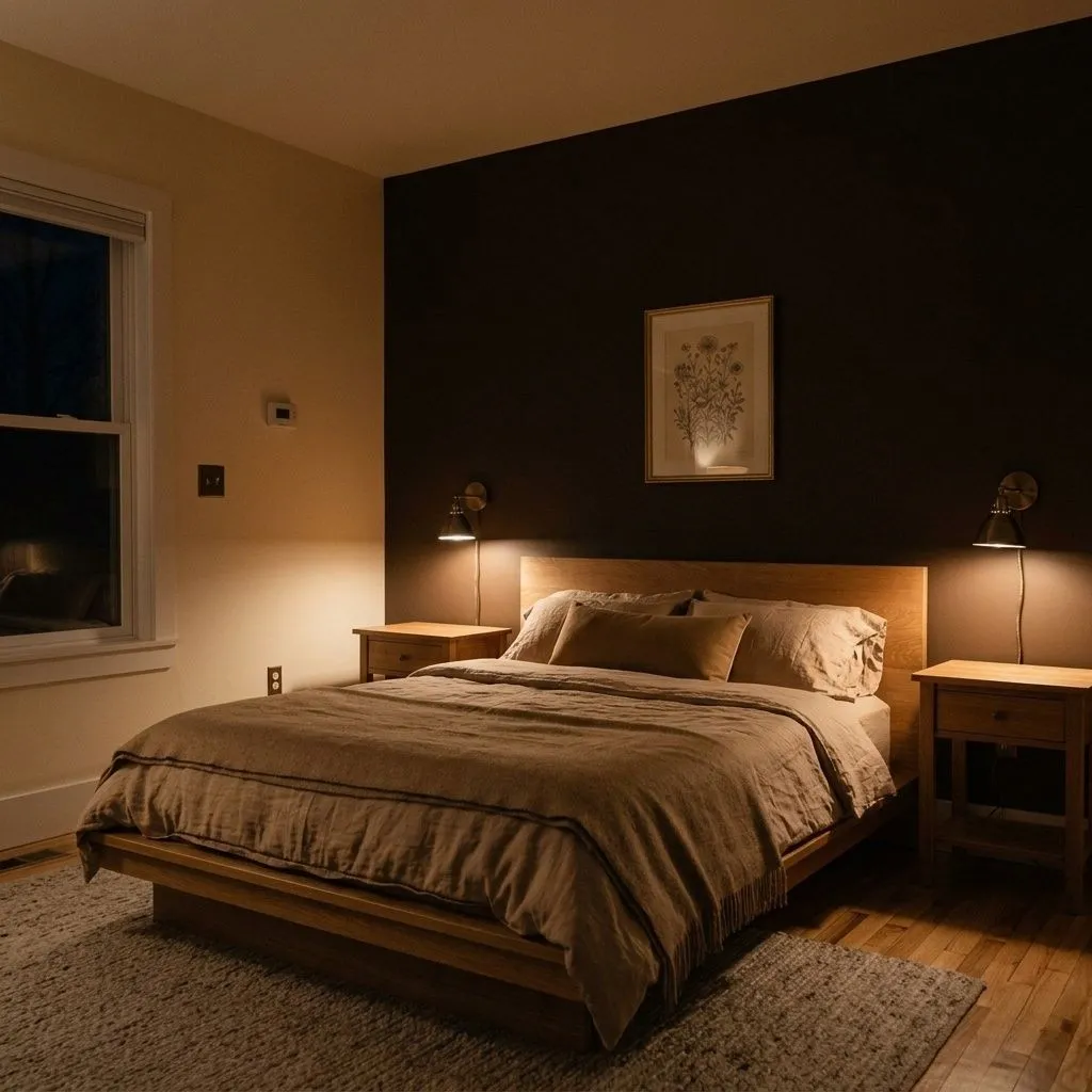
In a bedroom, the intimacy that Turkish Coffee creates works in your favor. An accent wall behind the bed paired with warm linen bedding and brass fixtures pulls the room together into something cozy and deliberate. Keep the ceiling and other walls light to preserve a sense of height.
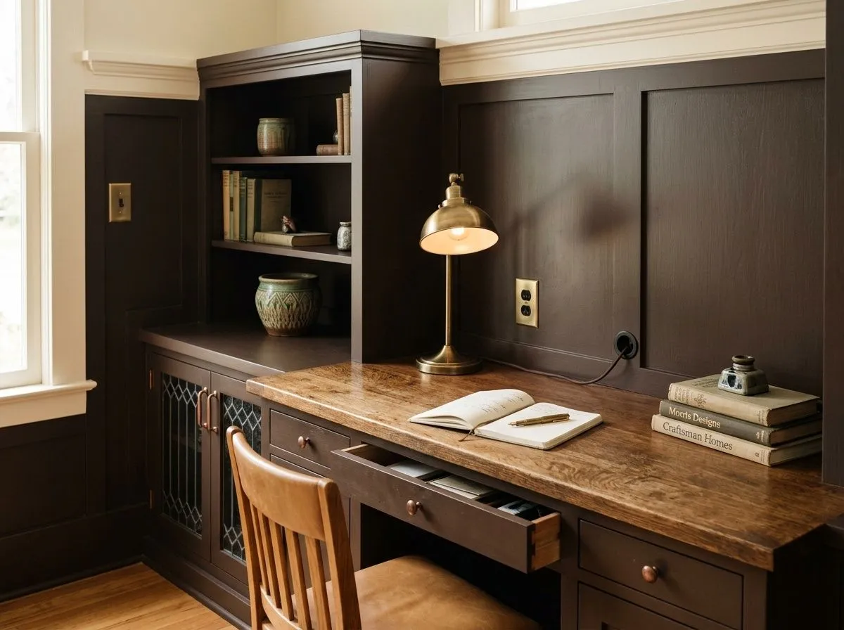
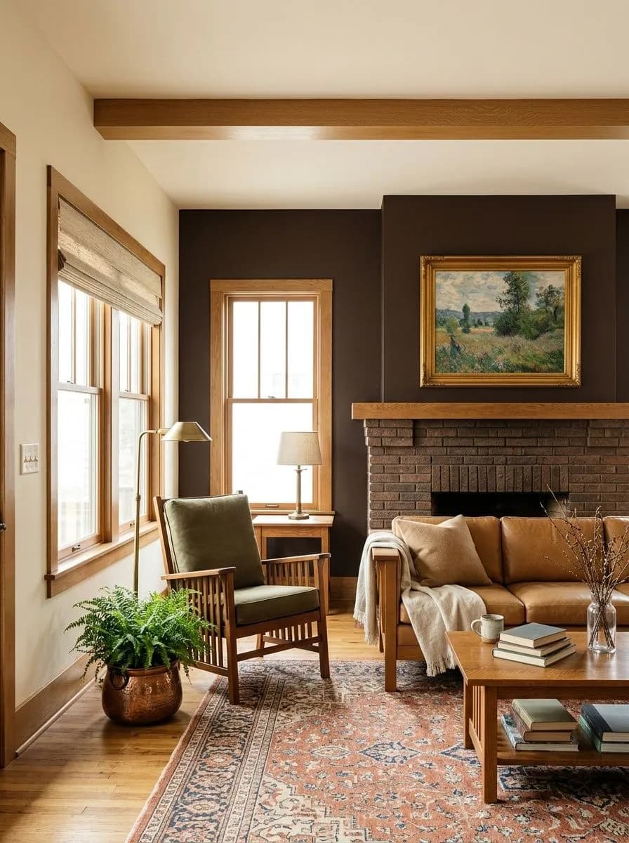
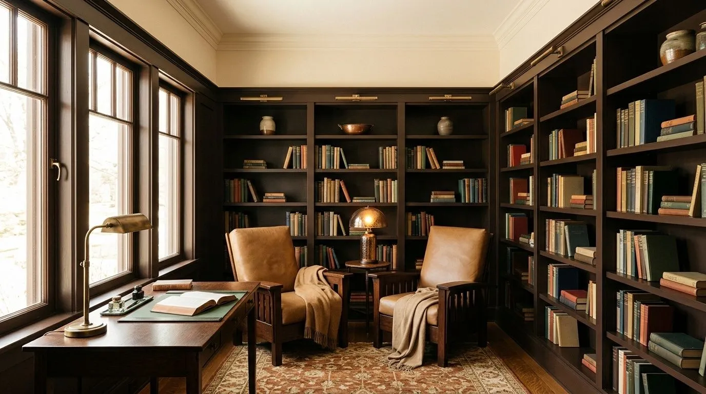
Libraries and studies are a natural home for this color. The enveloping quality aids concentration, and the depth signals a serious, considered space. Pair with warm wood shelving and leather or textured seating for a look that holds up over years without feeling dated.
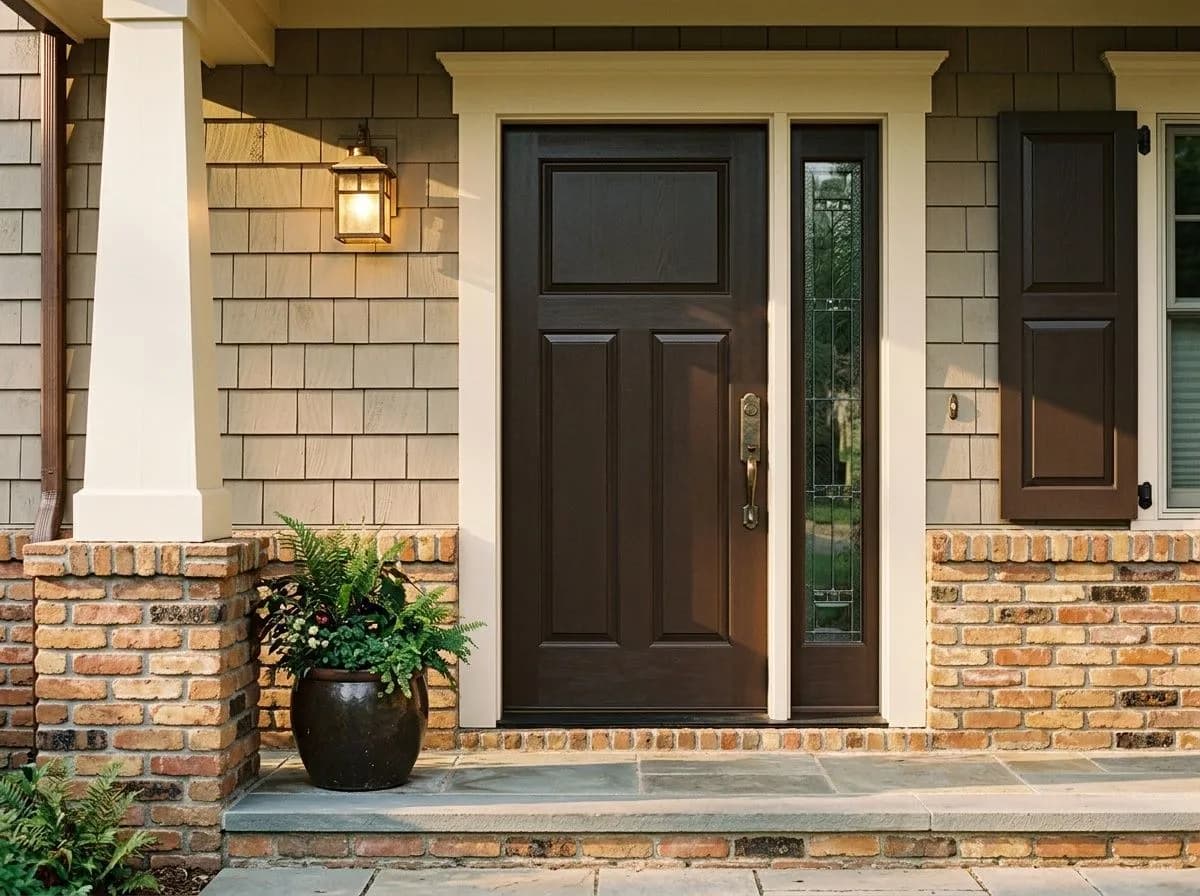
On exteriors, Turkish Coffee reads as a grounded, timeless dark brown that gives strong definition to trim, shutters, or a front door. It pairs well with stone, brick, or a warm white body color. If you are in a warm, humid climate, consult with your contractor about paint formulation, as very dark exterior colors can absorb significant heat.
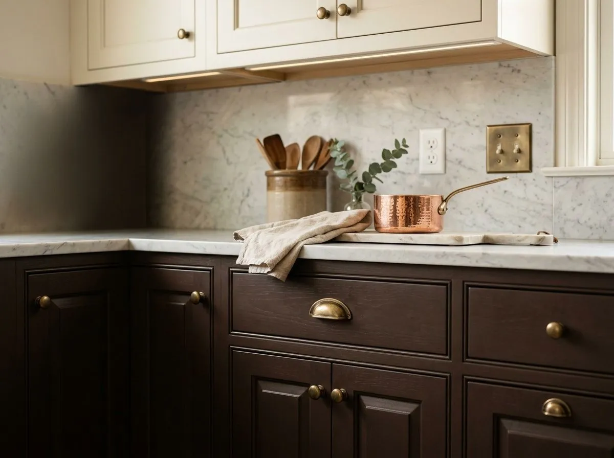
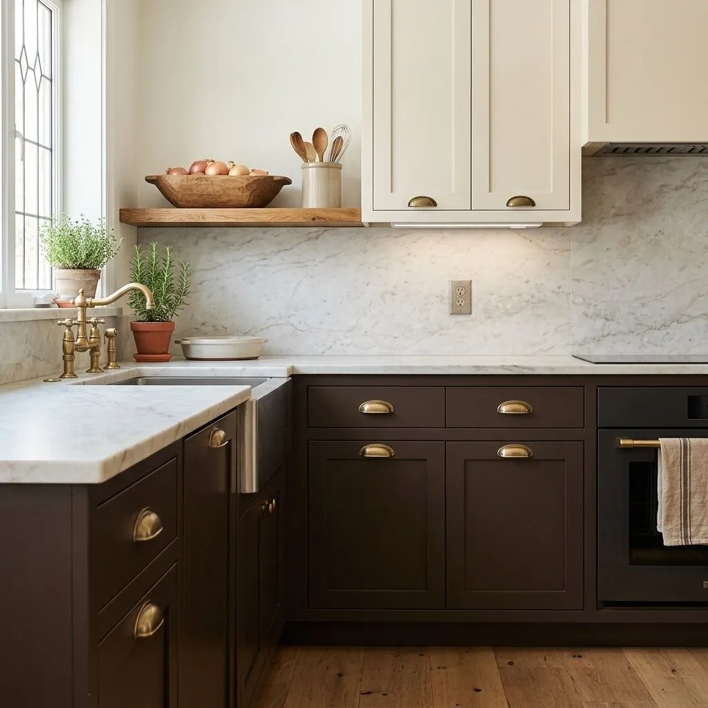
On lower kitchen cabinets, Turkish Coffee creates a grounded, anchored base that pairs well with light quartz or marble countertops and warm metal hardware. Keep upper cabinets in Casa Blanca (SW 7571) or another warm white to prevent the kitchen from feeling boxed in.
Because Turkish Coffee sits at LRV 4.7, its best pairings are colors that give it contrast and air rather than crowd it further into darkness. The coordinating palette Sherwin-Williams suggests leans into warm, airy companions. Heron Plume (SW 6070) is a soft warm greige that sits light enough to open up a space without feeling cold or stark against the deep brown. Casa Blanca (SW 7571) brings a creamy warm white that reads approachable rather than harsh, which matters because several reviewers caution against pairing Turkish Coffee with a stark, cool white that creates too brittle a contrast. Spalding Gray (SW 6074) offers a warmer gray-leaning neutral for situations where you want a more tonal, layered look rather than a high-contrast one.
Beyond those three, the research consistently points toward warm whites, soft taupes, and warm neutrals as reliable partners. In trim and millwork, a warm white keeps the room feeling intentional rather than accidental. For furniture and textiles, camel, tan, natural linen, and brass or bronze hardware all reinforce the espresso warmth without fighting it. Avoid pairing it with dark cabinetry or other very deep colors in the same room, as the result tends to feel heavy rather than sophisticated.
Turkish Coffee is the only paint in this seven-color Arts and Crafts kitchen, landing on the lower cabinets and island base where it anchors the two-tone scheme from the ground up. The other six colors, pale honed marble, quarter-sawn white oak, aged unlacquered brass and the rest, are the room's actual materials, each translated here into its closest Sherwin-Williams paint match so the palette is easy to shop. Hover any pin or swatch to see the full color details.

All comparisons are matched against Turkish Coffee at LRV 4.7.
At LRV 4.7, Turkish Coffee absorbs most of the light that hits it. In a small room or one with limited natural light, this translates quickly to a space that feels oppressive rather than intimate.
Pairing Turkish Coffee with a very bright, cool-toned white on trim or adjacent walls creates a contrast that several reviewers describe as too brittle, making the dark color look cut out rather than integrated.
Turkish Coffee carries warm undertones that can read yellow or reddish-brown depending on the light. Cool-toned gray furniture, blue-gray textiles, or chrome fixtures will pull against those warm undertones and make the color look muddier than it should.
Turkish Coffee is a very deep warm brown that reads as a rich espresso on the wall. It is one of the darkest browns in the Sherwin-Williams line, with an LRV of 4.7, meaning it absorbs most light and can pull close to black in low-light conditions.
Reviewers agree it is warm but disagree on the specific cast. Depending on your light, it can read with a faint yellow warmth, a reddish-brown coffee note, or as a fairly muted neutral brown without strong dominance from either direction. South-facing natural light tends to bring out yellow warmth, while north-facing or artificial light can push it toward a more neutral or faintly gray read. Sample it in your actual space across the day before committing.
It is firmly warm. There is no meaningful cool or blue cast in this color. The debate among reviewers is only about which kind of warmth shows up, yellow, reddish-brown, or a quieter muted brown, not about whether it leans cool.
The LRV is 4.7, which places it among the darkest colors in the Sherwin-Williams catalog. At this level it reflects very little light and will make any room feel noticeably smaller and more intimate.
The Sherwin-Williams code is SW 6076. The hex is #4D3930 and the RGB values are 77 red, 57 green, 48 blue.
Warm whites and soft warm neutrals are the most reliable partners. Sherwin-Williams coordinates Heron Plume (SW 6070) and Casa Blanca (SW 7571) directly with it, and Spalding Gray (SW 6074) works well if you want a warmer gray-leaning neutral. For furniture and textiles, camel, tan, natural linen, and brass or bronze hardware all complement the espresso warmth. Avoid very dark cabinetry in the same room and steer clear of stark cool whites on trim.
Yes to all three with some conditions. On exteriors it reads as a grounded, timeless dark brown that suits trim, shutters, and doors especially well alongside light or warm-toned body colors. In warm, humid climates, discuss heat absorption with your contractor before committing. For cabinets, it works best on lower cabinets paired with light countertops and warm hardware, with lighter uppers to keep the kitchen from feeling heavy.