Carnelian SW 7580 is a deep, complex color that resists a single easy description. At first glance it reads as a rich, brownish-red, somewhere between a dried rose and a brick-toned burgundy. Look longer and the color starts to move. It can land as a muted crimson, a dusty aubergine, or, in low light, something close to a true deep violet. That shifting quality is not a flaw but a feature, and it is exactly why this color keeps showing up on designers' mood boards.
With a precise LRV of 5.8, Carnelian absorbs nearly all light that hits it. Walls painted in it will read as intensely dark and enveloping from the moment you enter the room. That low reflectance is what gives the color its dramatic, close-in atmosphere. It does not glow or bloom the way a mid-tone red might. Instead, it settles heavily and creates a sense of depth and containment. Think less "statement red" and more "velvet curtain" in terms of how it affects a space.
Finish choice matters a lot here. A flat or matte sheen keeps the color moody and slightly chalky, pulling it toward the dusty crimson side. A satin or eggshell finish introduces a faint warmth and makes the brownish-red facet come forward more. Either way, the color photographs darker than it appears in person, so if you are relying on photos or screen swatches to judge it, plan to be surprised by its actual depth on the wall.
Most reviewers agree that Carnelian carries earthy brown and muted red as its core undertones, with a layer of orange underneath that adds warmth. That combination is what prevents it from reading as a pure purple or a clean, cool burgundy. The orange base in particular is what keeps it from going cold even in shadowy corners. It stays warm-leaning regardless of the lighting conditions, which is one reason it pairs so naturally with metals like brass and bronze.
The debate among reviewers is about what secondary undertone dominates. In a room with strong natural light, especially warm southern or western light, the brown and red come forward clearly, and the color reads almost like a rich reddish-brown or a deeply muted terracotta. In a north-facing room or under artificial incandescent light, the color tips noticeably toward violet and aubergine. Some reviewers have been genuinely surprised to find that what looked brownish-red in the paint store turned into something much closer to a plummy purple on their north-facing walls. That disagreement in the reviews is real and worth taking seriously.
Sherwin-Williams catalogs it in the Purples and Pinks family, which speaks to just how much the violet undertone can assert itself in the right conditions. If you are hoping to avoid any purple reading, you need warm, direct light and warm-toned artificial bulbs to keep the brown and red facets dominant. If you are open to the violet shift, it adds an extra dimension that many homeowners find genuinely compelling. Either way, sampling at a large scale in your actual room, under both daytime and evening lighting, is not optional with a color this complex.
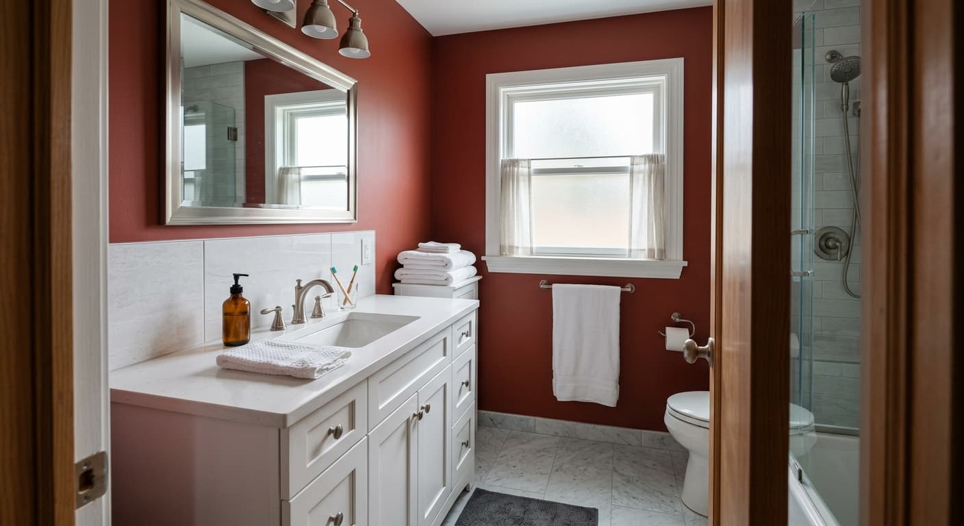
Carnelian earns its place in rooms where you want drama and intimacy rather than openness and brightness. Dining rooms are the most natural fit. The low LRV of 5.8 makes the walls recede and the room feel like it wraps around the table, which is exactly the effect you want for a space meant to feel convivial and memorable after dark. Candlelight and warm overhead fixtures bring out the red and brown facets beautifully in a dining context.
Libraries, studies, and home offices are another strong application. The color creates a focused, contained feeling that many people find easier to concentrate in than a brighter, airier room. Accent walls in bedrooms are popular as well, particularly behind the bed, where the depth of a 5.8 LRV color reads as a backdrop rather than a surrounding envelope. For those willing to commit, an all-four-walls bedroom treatment creates a genuinely cocoon-like space that reviewers describe as both romantic and restful.
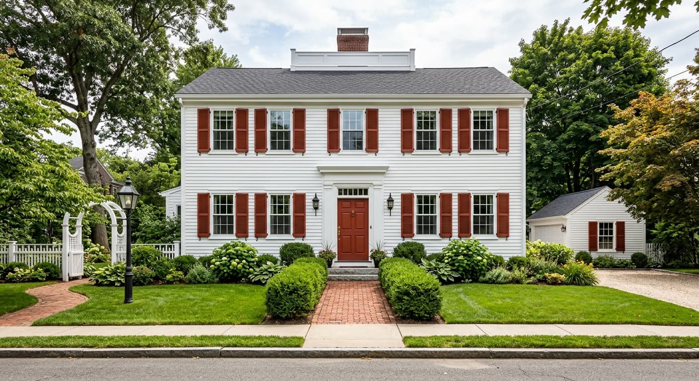
On exteriors, Carnelian works especially well on front doors. Its warmth and depth register as distinctive from the street without being loud, and it holds up against a range of siding colors, from white and cream to gray and natural wood tones. Cabinet applications in kitchens and bathrooms have grown in popularity alongside the broader trend toward deep, moody case goods. Because the LRV is so low, dark cabinet interiors read even darker, so open shelving is often the more effective choice if you want the color to really show.
This is the most natural use case for Carnelian. The all-four-walls treatment at an LRV of 5.8 makes the room feel wrapped and intimate at dinner, and warm overhead light brings the brownish-red facet forward in a way that flatters both food and faces. Pair it with White Duck SW 7010 on the ceiling and trim to keep the space from feeling completely enclosed.
A single Carnelian wall, especially behind a bed or sofa, reads as a deep, saturated backdrop without committing the whole room. The color is dramatic enough at LRV 5.8 that one wall does a lot of work. Warm textiles and wood tones in the room keep the accent from pulling purple in cooler light.
Carnelian on a front door signals character from the street. It reads as a distinctive, deeply warm red that avoids the predictability of a brighter red, and it holds well against both white and darker siding. Brass hardware is a natural complement and picks up the orange base in the color.
The low LRV and warm depth make Carnelian a classic choice for a reading room or home office that is meant to feel focused and cocooning. Built-in shelves in a lighter natural wood or painted White Duck SW 7010 break up the darkness and give the room enough visual contrast to feel intentional rather than oppressive.
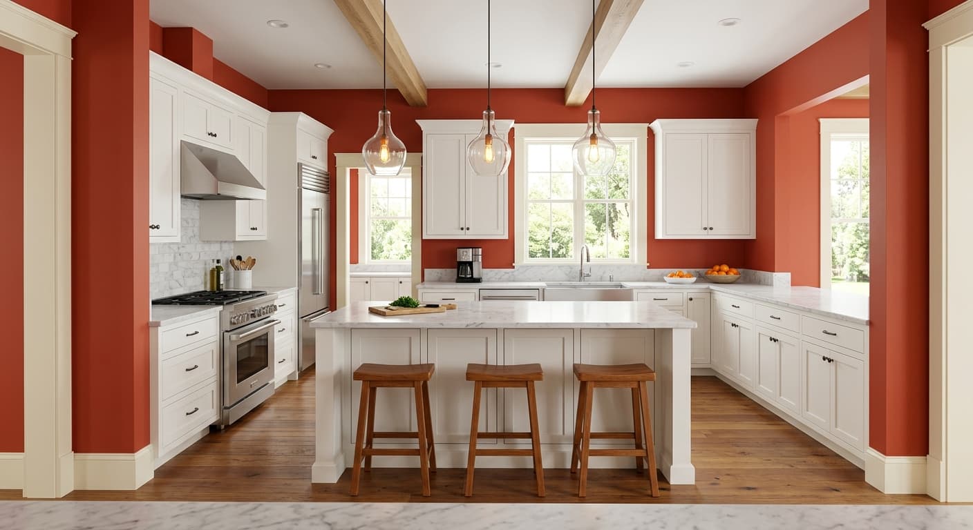
Carnelian on perimeter cabinets with a lighter countertop and backsplash creates a moody, grounded kitchen without requiring a full room commitment. Keep the upper cabinets lighter or leave them open to avoid the overall kitchen going too dark at a reflectance this low.
Carnelian's earthy warmth and low reflectance mean it pairs best with colors that either contrast it cleanly or echo its warmth without competing with its depth. White Duck SW 7010 is a natural anchor here: it is a warm, slightly creamy white that does not go stark or blue next to a color this dark, making it an effective trim and ceiling partner. Quaint Peche and Artistic Taupe both carry warm, soft tones that sit comfortably alongside Carnelian without fighting its drama, and either one works well as a bridging color in adjacent spaces or as a lighter accent within the same room.
Beyond the coordinating palette, Carnelian responds well to natural materials. Warm metals like brass and unlacquered bronze pick up the orange undertone and make it glow. Natural stone, particularly creamy marble or warm travertine, provides textural contrast without a color clash. Black works as a sharp foil if you want a more graphic, editorial look. Keep textiles in the room on the warmer or more neutral side, since cool grays and blues can pull the violet undertone in the color in a direction that feels unintentional.
All comparisons are matched against Carnelian at LRV 5.8.
Cool or blue-leaning grays next to Carnelian pull the violet undertone in the color forward and make the transition feel unintentional and discordant rather than planned.
A bright, bluish-white trim color next to Carnelian highlights the purple facet and makes the overall combination feel colder and less cohesive than you probably want.
Chrome and brushed nickel finishes read as cool and modern next to Carnelian's earthy warmth, and the contrast tends to feel accidental rather than editorial.
Carnelian is a deep, complex brownish-red with an LRV of 5.8, placing it firmly in the dark-and-dramatic category. It shifts between dusty crimson, reddish-brown, and aubergine depending on your room's light conditions. It is not a clean, bright red and not a true purple: it lives in the nuanced territory between those two.
The primary undertones are earthy brown and muted red, with a layer of warm orange underneath. That orange base is what keeps the color from going cool. A secondary violet or aubergine undertone becomes more visible in north-facing rooms or under cooler artificial light, which is the source of most of the disagreement you will find in real-world reviews. In warm, sunny conditions the brown and red dominate; in low or cool light the plummy quality emerges.
Carnelian is warm overall. Its red, brown, and orange undertones ensure it reads on the warm side of the spectrum in most lighting conditions. The violet facet that can appear in cooler light is a secondary character rather than a defining one, so if you are maintaining warm light sources in your room you will keep it firmly in warm territory.
The precise LRV is 5.8, which is very low. For reference, pure white is 100 and pure black is 0. At 5.8, Carnelian absorbs the vast majority of light that hits it and will make a room feel noticeably darker, moodier, and more intimate. It is not a color to use where you want a sense of openness or brightness.
Carnelian pairs well with warm whites, warm neutrals, natural wood tones, and warm metals. White Duck SW 7010 is a coordinating warm white that works on trim and ceilings. Warm metals like brass and unlacquered bronze pull out the orange undertone beautifully. Natural stone in creamy or warm tones, black as a sharp graphic contrast, and soft warm greiges in adjacent rooms all work well. Avoid cool grays and cool-white trims, which push the violet undertone forward.
The Sherwin-Williams color code is SW 7580. The hex value is #573E3E and the RGB is 87, 62, 62. The LRV is precisely 5.8.
Yes to all three, with some nuance. On front doors it is an excellent choice: deep, warm, and distinctive without being loud. For full exterior use it works best on accents, shutters, or doors rather than large field areas, where such a low LRV can read as very heavy in some architectural contexts. On kitchen or bath cabinets it has genuine appeal as a moody, grounded alternative to more predictable neutrals. Because the LRV is 5.8, keep adjacent surfaces lighter so the cabinets read as a deliberate contrast rather than a darkness that swallows the room.
