
MorningWarm start · cools toward greige
A warm cream-greige with just enough pigment to stay interesting at LRV 74, shifting between soft white and quiet beige as the light changes. Sample it in your room before you commit.
White Duck lands somewhere between a soft cream and a light greige. At LRV 74 it reflects plenty of light, so it never feels heavy on the wall, but it carries enough pigment to stay visible and interesting rather than washing out. Most people looking at a dried sample would call it a warm off-white with a quiet, complex character that shifts depending on the hour and the room.
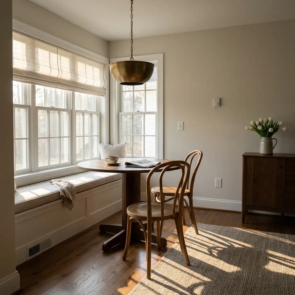
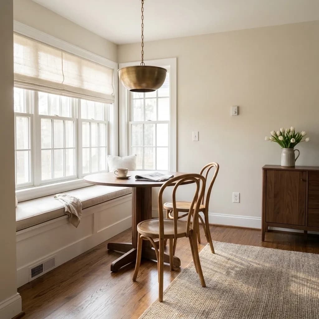
Up close, the color reads as a creamy beige with a subtle dusty quality that keeps it from feeling sweet or old-fashioned. It hides minor scuffs and marks better than a true white would, which makes it genuinely livable. In bright climates it reads close to white; in cloudier conditions or lower-light spaces, the cream comes forward more noticeably. Evening light, especially from the west, pushes the warmth up and gives walls a cozy, amber-tinged read. Morning east light starts warm and can cool toward greige as the day progresses.
On cabinets it looks particularly considered, adding warmth and dimension without the sterile quality of a stark white. On exterior siding it sits naturally alongside brick, stone, and wood, behaving like a color that belongs outside rather than one that was painted on.
Everyone who has put White Duck on a wall agrees it is warm, but beyond that the undertone story gets a little complicated, and that is actually useful to know before you commit. The dominant read is cream-beige, and it resists the overtly yellow cast that trips up some warmer whites. It does not lean pink. It does not lean strongly gray. Most of the time it is simply a warm, hushed cream.
The disagreement starts when you look more carefully. A number of reviewers describe a soft greige quality underneath the cream, a hint of gray that moderates the warmth and prevents it from reading too buttery. That greige note is part of what makes it versatile across rooms. A smaller group of reviewers, though, note that under certain lighting conditions, particularly with cool north or east light or near green-heavy surroundings, White Duck can grab a faint green cast. It is not a predictable or constant green, but it is real enough that the research mentions it repeatedly. Treat that possibility as a conditional, not a guarantee.
A couple of observers describe the undertone as nearly neutral, meaning they see no strong green, pink, or yellow pull at all. That spread of opinion tells you the color is doing something genuinely complex: it is reading differently depending on the light source, the surrounding finishes, and what the eye compares it to. The practical advice that emerges from all of it is consistent: sample it in your specific room before committing, and pay attention to how it looks at different times of day.
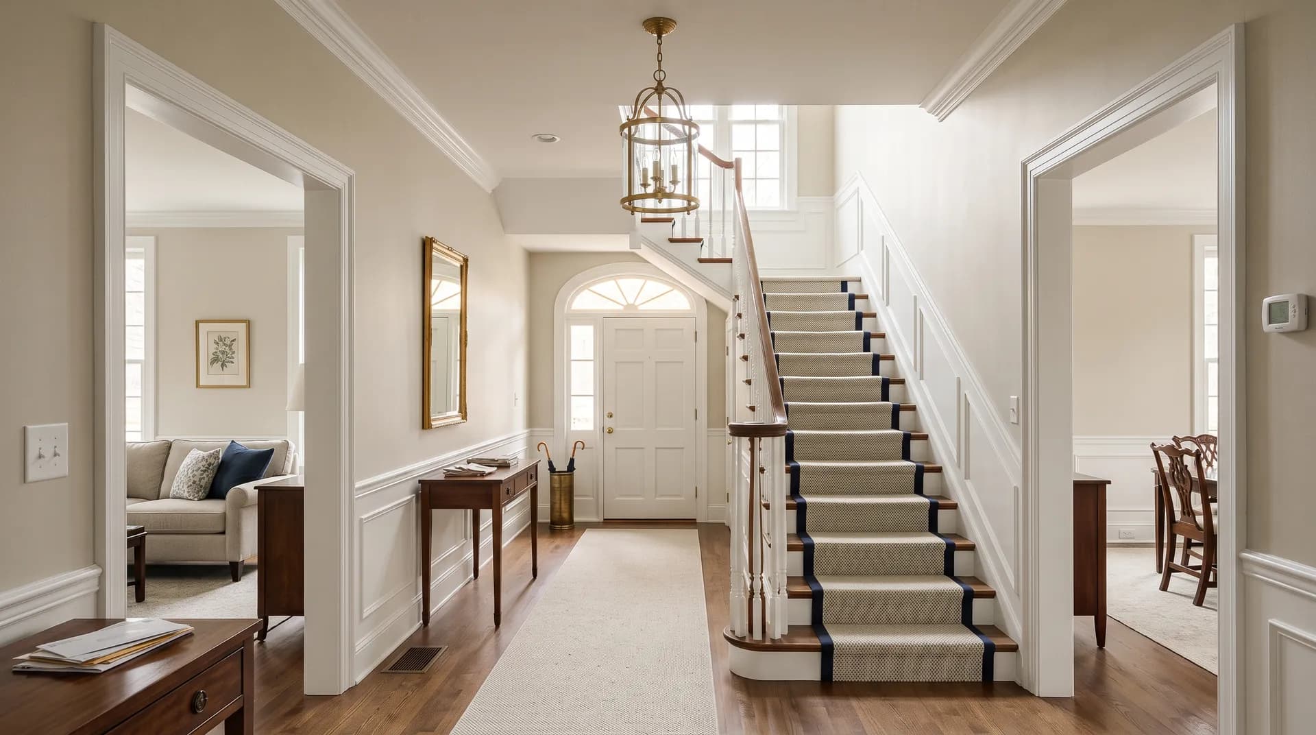
White Duck works as a whole-house neutral, and reviewers use it exactly that way in open-concept layouts where one color needs to flow through a kitchen, dining room, living room, and entry without clashing anywhere. That kind of continuity is one of its strongest practical arguments. It is also a natural fit for individual rooms: bedrooms, dining rooms, basements that need brightening without going cold, and entries where you want an immediate sense of warmth.
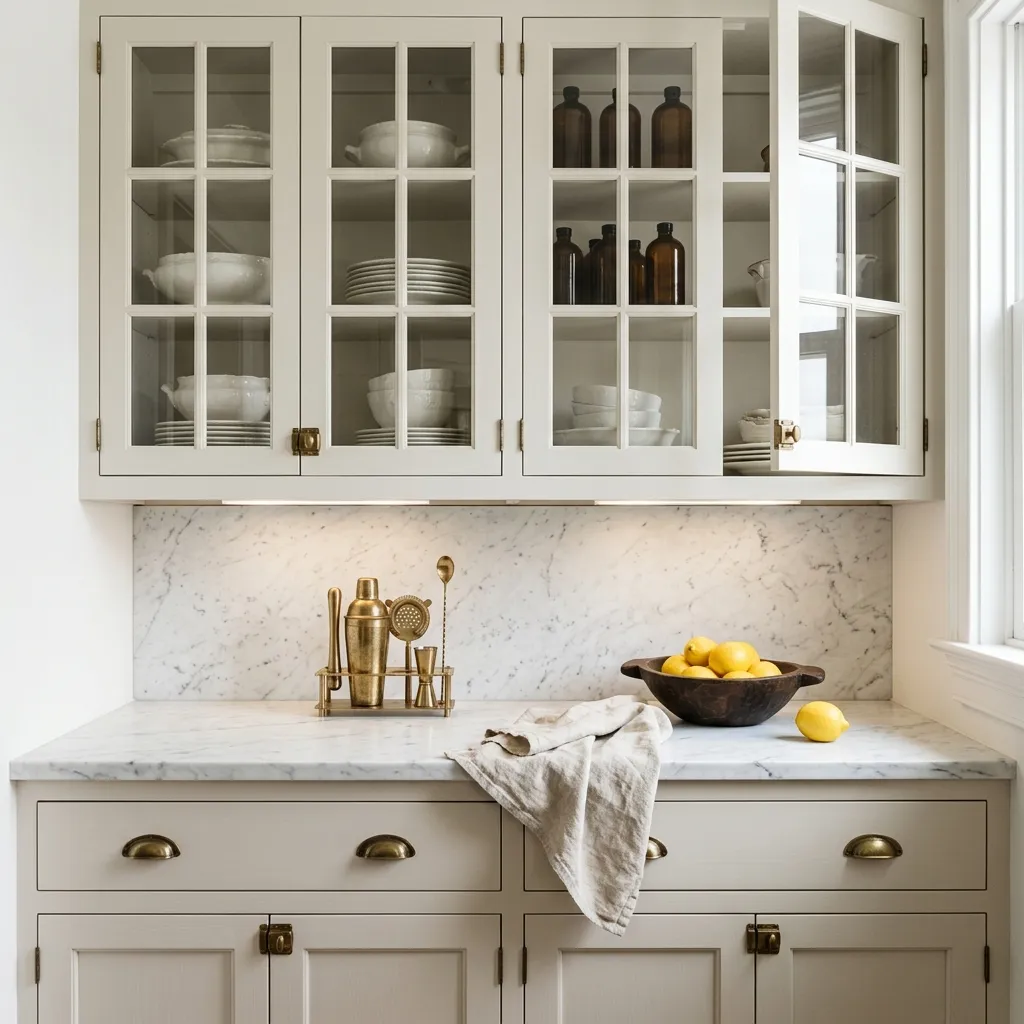
In the kitchen it shows up on both walls and cabinets. On cabinets it adds warmth and a touch of softness that pairs well with quartz countertops, muted brass hardware, and farmhouse-style fixtures. It gives cabinetry a considered, layered look that a clean white would not. In bathrooms the same logic applies: warm without being yellow, bright without being harsh.
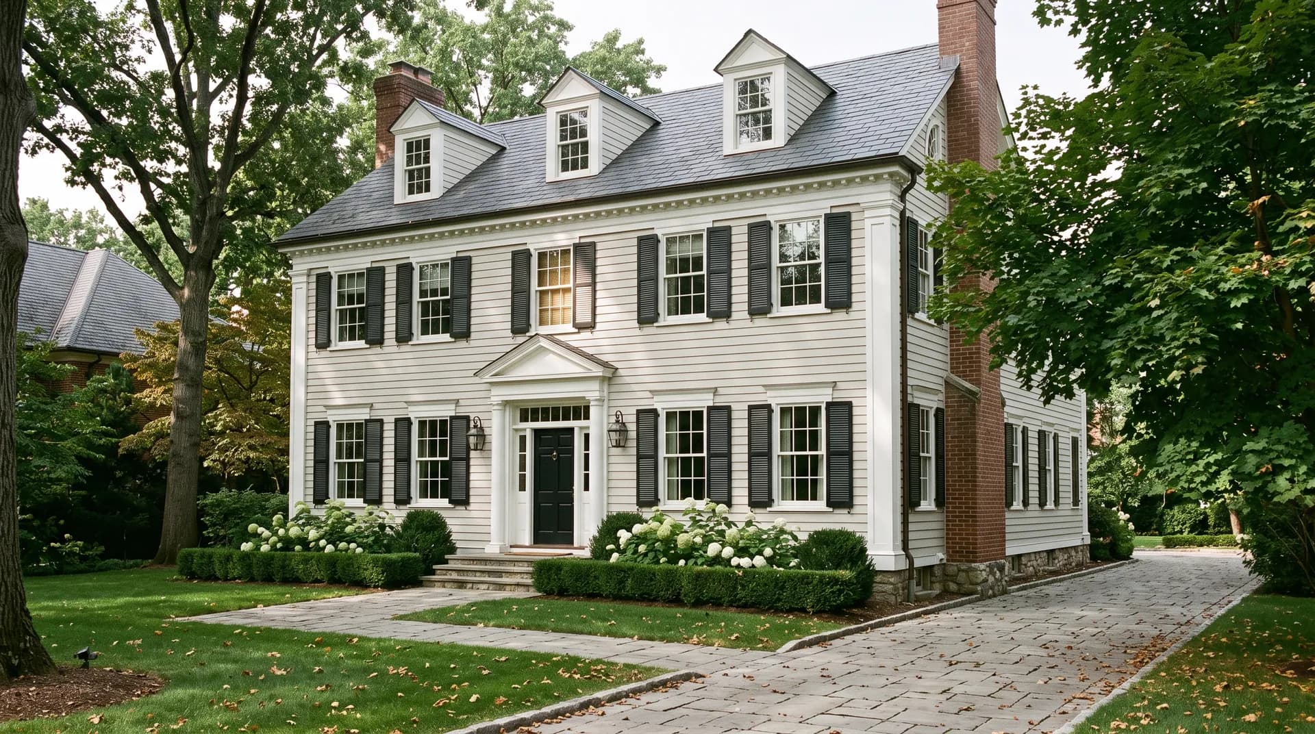
Exterior use is well documented. It suits modern farmhouse, craftsman, colonial, and transitional architecture comfortably, and it reads especially well on painted brick where its cream-greige tone echoes the natural variation of the masonry. The color tends to look closer to white in bright, sunny climates and more distinctly cream in the Pacific Northwest or other overcast regions, so your geography matters. For interior orientation, north-facing rooms benefit from its warmth, which keeps those spaces feeling lived-in rather than cold. South-facing rooms in full light will push it lighter and creamier, which most people find appealing.
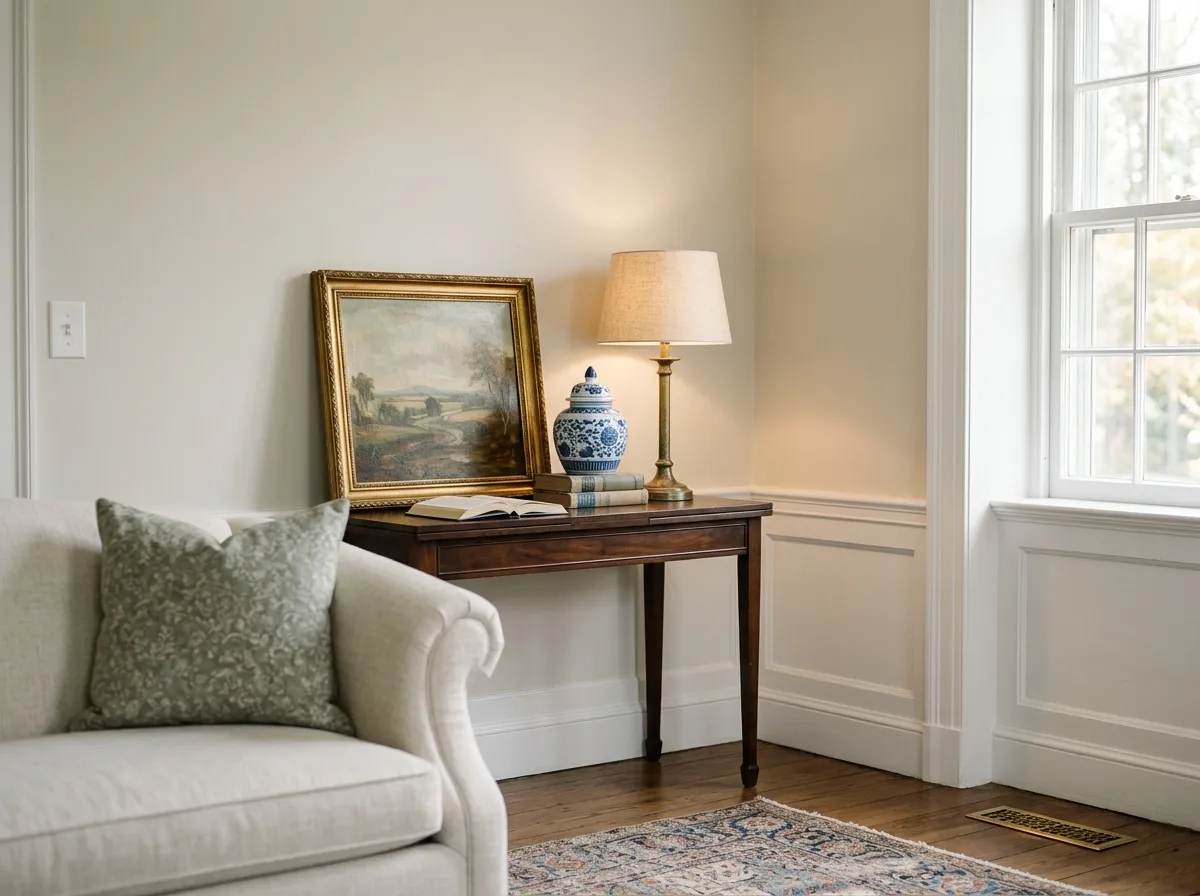
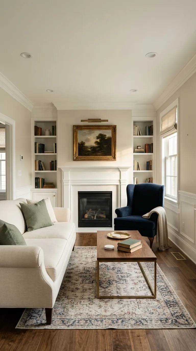
White Duck gives a living room a relaxed, layered warmth that reads sophisticated without demanding attention. Its LRV of 74 keeps the space bright while the cream-greige undertone makes large walls feel grounded. Pair it with a soft black accent on a fireplace surround or bookshelves for definition.
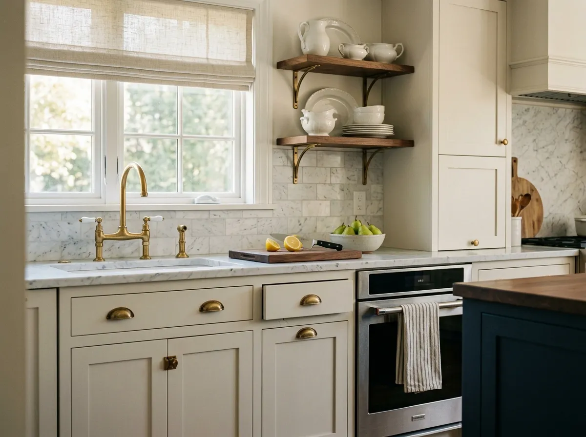
On kitchen cabinets it adds warmth and depth that a cold white cannot, and it coordinates naturally with quartz, stone countertops, and brass or bronze hardware. As a wall color in a kitchen it keeps the space feeling clean without the sterility of pure white. Two coats over primer are standard for even coverage on cabinet-grade surfaces.
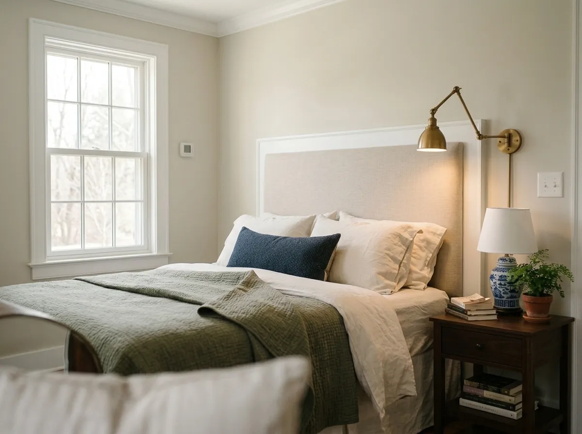
The warm cream read is restful in a bedroom, especially in rooms with limited natural light where a cooler white would feel clinical. It works with linen, wood tones, and muted textiles without clashing. North-facing bedrooms in particular benefit from its ability to hold warmth through the day.
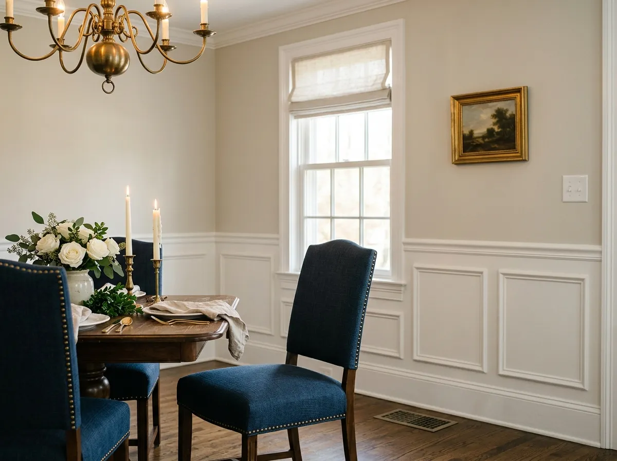
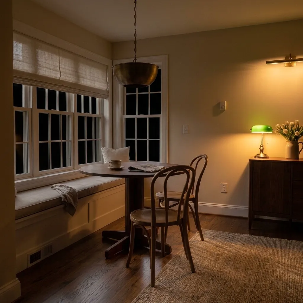
Evening and candlelight push White Duck's warmth up, which suits a dining room well. The cream-greige base reads convivial and soft rather than stark. It pairs well with wood furniture and woven textures, and a deeper warm neutral on an accent wall or in drapery adds dimension without breaking the palette.
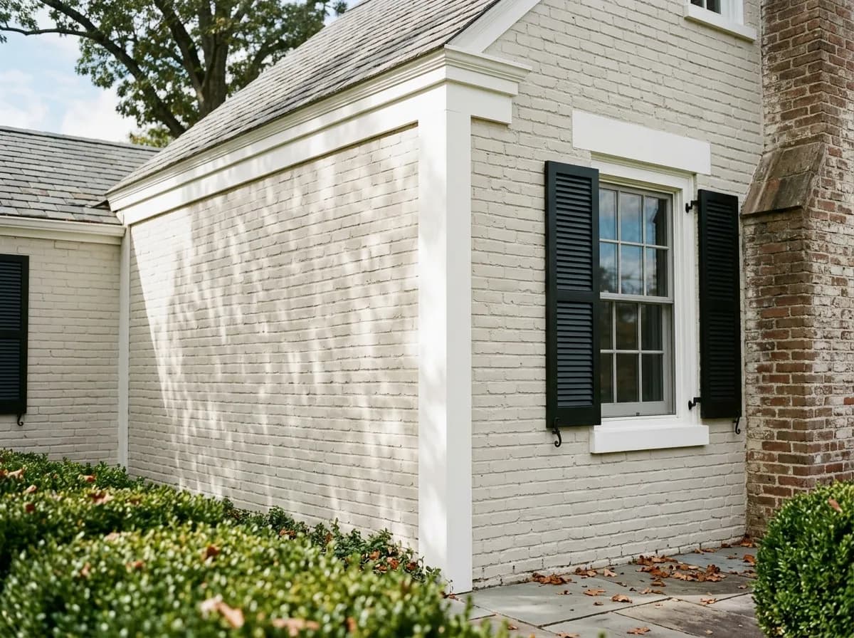
White Duck is listed as a top exterior color for good reason: it reads naturally alongside brick, stone, and wood trim rather than looking applied. It suits modern farmhouse, craftsman, and colonial profiles. In sunnier climates it reads close to white from the street; in cloudier regions it shows more cream, so consider your local light before committing.
White Duck pairs well with warm neutrals that share its temperature without competing with its undertone. Resort Tan and Portico both work in that role, bringing earthy depth that feels intentional alongside the cream-greige base. For trim and ceilings, the consistent recommendation is to step up to a crisper white: Pure White or Extra White from Sherwin-Williams give you clear contrast without a jarring jump, and Benjamin Moore Chantilly Lace offers an even brighter, cleaner edge if you want trim that reads sharp and fresh. Avoid using a warmer white as trim since it blurs with the wall color and flattens the whole scheme.
For accents and furnishings, White Duck pairs naturally with muted greens that echo its occasional green undertone, blue-leaning grays and greiges, blue-greens, navy, and soft blacks. It handles natural wood and woven textures well, and it sits comfortably with muted brass, aged bronze, and unlacquered fixtures. If you are working with stone or brick in the same space, White Duck tends to bridge those materials without effort.
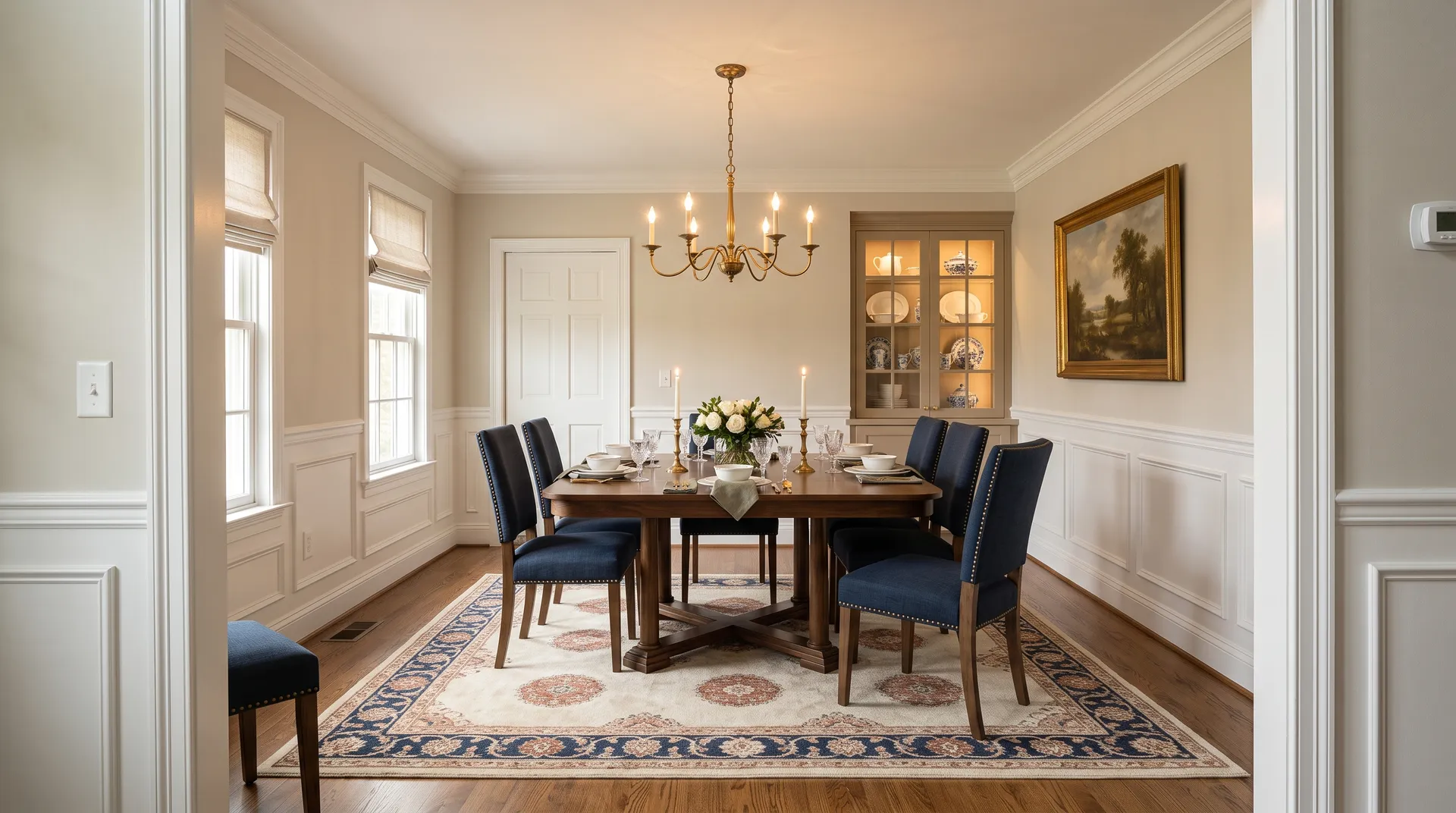
If you want to recreate this warm, layered dining room, every color in the palette is gathered here as a Sherwin-Williams swatch so you can shop it in one place. Three are actual paint: White Duck on the dining walls, wainscoting panels, and envelope; Pure White on the crown, wainscoting face, chair rail, and casings; and Resort Tan on the built-in china cabinet. The remaining four colors represent the room's linens, rug, wood tones, and hardware, each matched to its closest Sherwin-Williams equivalent. Hover any pin or swatch to see the color name.
All comparisons are matched against White Duck at LRV 74.
Using White Duck as both wall and trim color eliminates the contrast that trim is supposed to provide. The warmth and similar value cause the two surfaces to blend together, and the architecture of the room reads flat.
Wood stains or cabinet finishes with strong pink or orange undertones fight with White Duck's cream-greige base, creating a muddy or mismatched look that neither color deserves.
In north-facing rooms or under cool fluorescent or LED lighting, White Duck can pull a faint green that surprises people who expected a clean cream. Surrounding green-heavy plants or landscaping viewed through windows can amplify the effect.
White Duck is a warm, light off-white that reads as a soft cream-greige on the wall. It sits between beige and greige in character, carrying enough warmth to feel cozy without going overtly yellow or buttery. Its LRV of 74 puts it firmly in the light range, so it reads bright while still showing real color.
The dominant undertone is warm cream-beige with a quiet greige quality underneath that moderates the warmth. Most reviewers agree it resists yellow, pink, and strong gray pulls. The nuance is that under certain lighting, particularly cool north or east light, it can show a faint green cast. That green read is conditional and not constant, but it is real enough to factor in when sampling.
White Duck is warm. It sits on the warm side of the off-white spectrum, reading cream or beige rather than gray or cool. The greige quality in its undertone keeps it from tipping into yellow, but there is no mistaking it for a cool or neutral white.
White Duck has an LRV of 74, which places it near the top of the light range. It reflects a strong amount of light, which is why it works in low-light spaces without feeling heavy, while still carrying enough pigment to look intentional rather than washed out.
The Sherwin-Williams code is SW 7010. The hex value is #E5DFD2 and the RGB breakdown is 229 / 223 / 210.
For trim and ceilings, use a crisper white for contrast: Pure White and Extra White are reliable choices, and Benjamin Moore Chantilly Lace gives sharper definition. The coordinating warm neutrals Resort Tan and Portico work well for adjacent spaces or accent elements. Accent colors that pair naturally include muted greens, blue-leaning grays and greiges, blue-greens, navy, and soft blacks. Muted brass, aged bronze, and unlacquered metal finishes all complement the cream-greige base. Avoid warmer whites as trim since they blend with the wall color and lose contrast.
Yes to all three. On exteriors it is a top-listed Sherwin-Williams color that reads naturally next to brick, stone, and wood trim on farmhouse, craftsman, colonial, and transitional homes. On kitchen and bathroom cabinets it is widely praised for adding warmth without the sterility of a cold white, pairing well with quartz, stone, and brass or bronze hardware. For a front door it works as part of a warm whole-house exterior palette, though you may want a slightly deeper accent color on the door itself for visual emphasis.