
MorningWarm · beige forward

A warm, muted greige that reads as soft beige indoors and a clean off-white outside, shifting quietly with every change in light. Sample it in your room before you commit.
Sherwin Williams Oyster White (SW 7637) is not a white in the traditional sense. On the wall it reads as a very light greige, warm and muted, with enough depth to feel intentional but never heavy. The hex is #E2DDD0 and the LRV sits at 72.5, which puts it firmly in the light range while giving it just enough pigment to shift with the light rather than staying flat.
Indoors, it settles into a soft beige with a quiet, almost chalky quality. Outside, it behaves differently entirely. On an exterior it washes back to a clean, gentle off-white that avoids the harshness of a bright white while still looking fresh. Reviewers consistently note this interior-versus-exterior split as one of its defining traits. Indoors you get character and warmth. Outdoors you get restraint and lightness.
The finish you choose affects how it reads. On a flat or matte wall the greige quality comes forward. In a semi-gloss or satin, especially on cabinetry, it picks up a slight glow that makes it feel creamier and a touch more refined. Either way it avoids the clinical edge that many off-whites carry.
The undertone story on Oyster White is genuinely layered, and reviewers do not fully agree, which is worth taking seriously before you commit a gallon. The base read is warm beige with a touch of gray, but the signature detail is a subtle green undertone that sits underneath both. It is not a green paint. You will not see it described as sage or mint. But that green-adjacent quality is what keeps it from reading as a straight cream or a straightforward beige.
Most colorists land it on the warm side. The beige and the greige quality dominate under most conditions, and warm artificial light can push it toward yellow, which is a reason to sample carefully under your specific bulbs. However, one credible read in the review pool frames it as a cool-leaning greige that flexes between gray and beige depending on context. Both camps are working from real observations, just different rooms and light conditions.
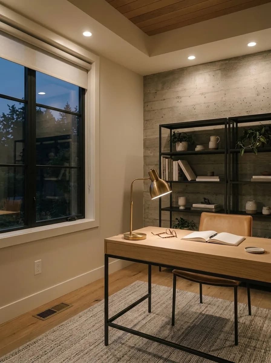
Orientation is the reconciling factor. North-facing rooms amplify the gray-green and make Oyster White feel calmer and cooler, almost more like a greige than a warm white. South-facing rooms pull warmth forward and mute the green entirely, delivering a creamy, hospitable off-white. East-facing rooms run warm and beige in the morning light, then cool down through the afternoon. West-facing rooms do the reverse. If your room gets consistent artificial light rather than strong natural light, test a large sample first because warm bulbs can tip it noticeably toward yellow.
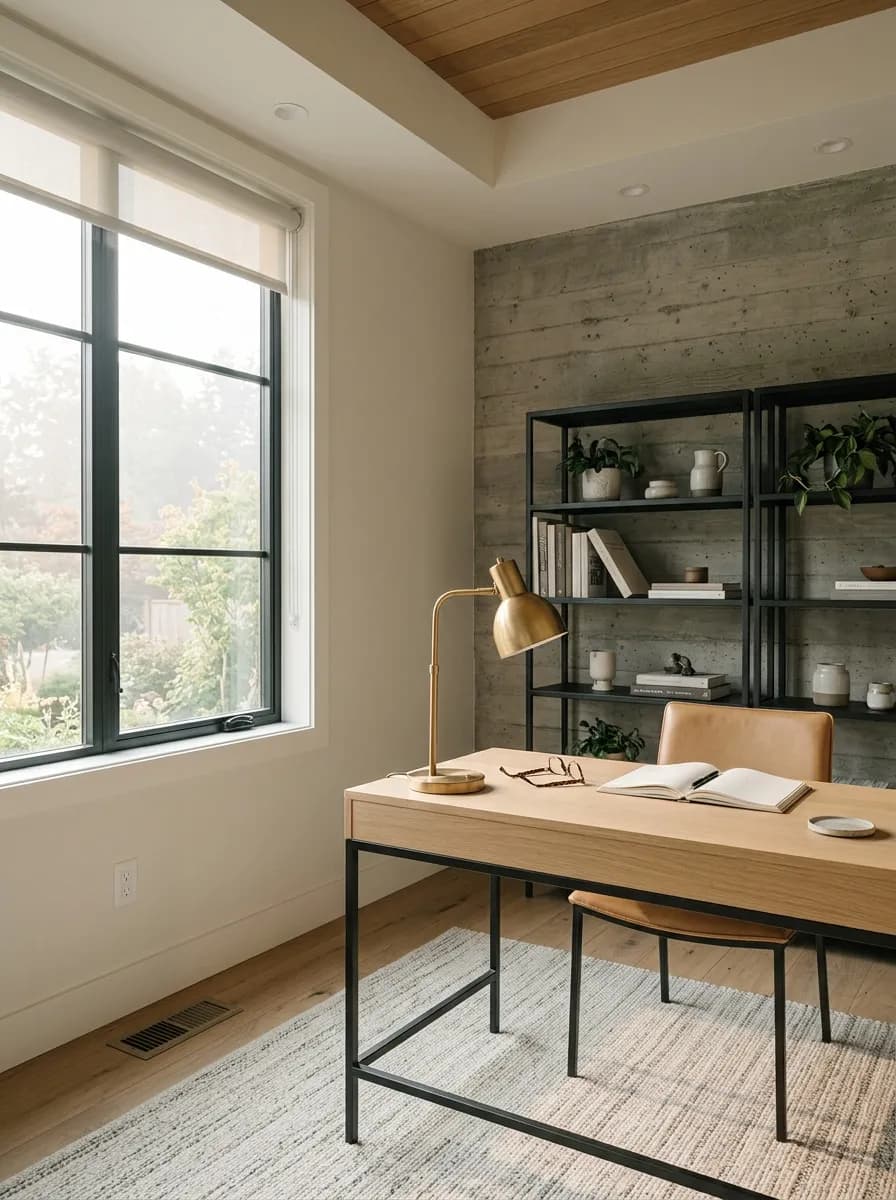
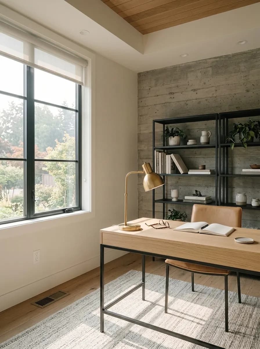
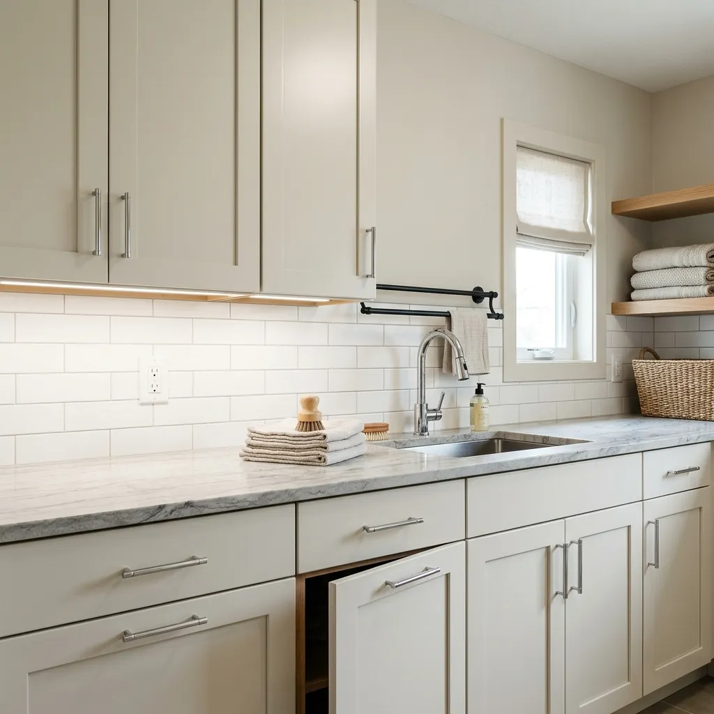
Oyster White earns its whole-house neutral status by genuinely working across nearly every room type and orientation. It has a specific strength in transitional spaces, hallways, entryways, and laundry rooms where you want a warm, grounded backdrop that does not demand attention. In those in-between spaces it provides continuity without monotony.
For exteriors it is a reliable performer and is included in Sherwin-Williams's own Top Exterior Colors list. It reads as a soft, non-stark off-white that works especially well against red brick and warm stone, flattering both without competing. Traditional and modern facades both absorb it well. Because it washes lighter outdoors, it avoids the muddiness that deeper greiges can develop under strong sun.
For cabinets, the research points consistently toward semi-gloss or high gloss as the finish of choice. The sheen adds durability and gives the color a slightly creamier, more polished appearance than flat wall paint delivers. In kitchens and bathrooms where cabinetry is the main event, this finish choice makes a meaningful difference in the result. On bedroom and living room walls, a flat or eggshell lets the muted warmth settle naturally into the room.
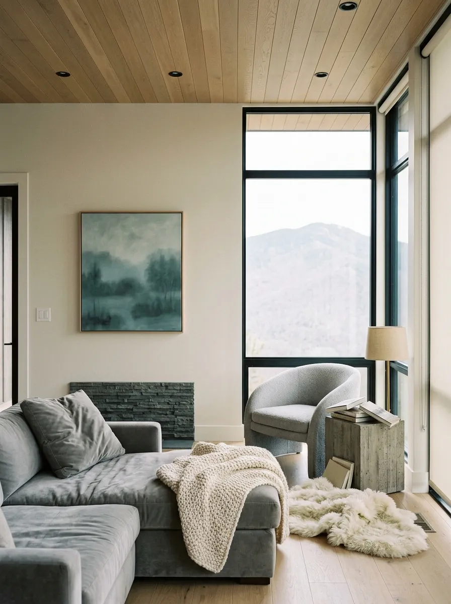
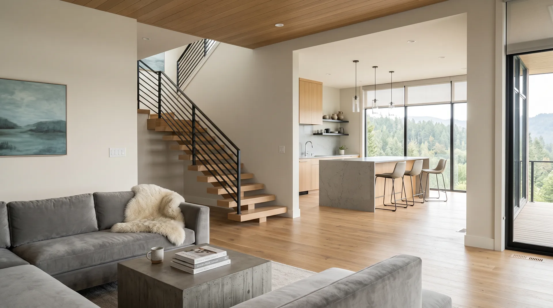
In a living room, Oyster White acts as a warm, non-competitive backdrop that lets furniture and textiles carry the visual weight. It works especially well with wood floors and natural linen because the green-beige undertone reads as organic rather than flat.
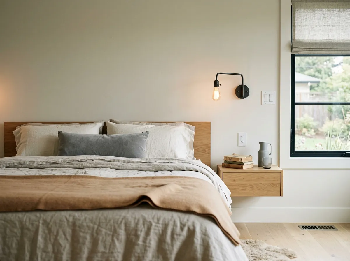
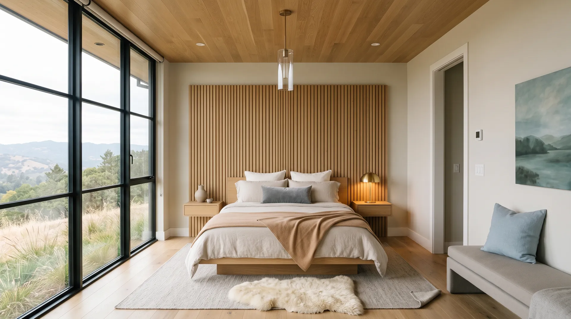
Oyster White's muted, chalky quality makes bedrooms feel restful without feeling cold. It avoids the sterile flatness of a true white and the heaviness of a mid-tone beige, landing in a range that feels genuinely calm. In east-facing bedrooms it opens warm in the morning and cools through the day, which works naturally with the rhythm of the room.
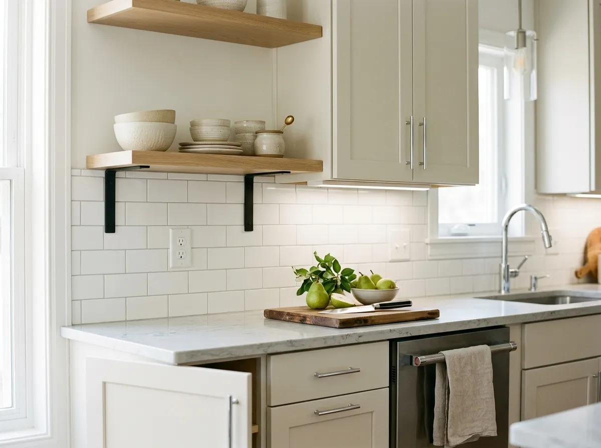
On kitchen cabinets in semi-gloss or high gloss, Oyster White reads as a warm, clean cabinet color with just enough depth to look considered rather than default. It avoids the yellow-cream read that some warmer whites develop under under-cabinet lighting, though warm bulbs can push it, so check your specific fixture temperature before committing. It pairs cleanly with both warm wood and cooler stone countertops.
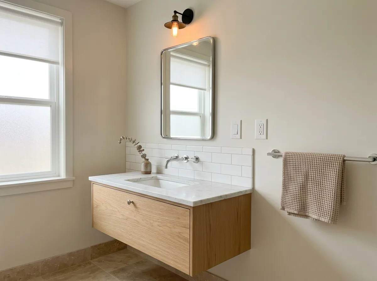
In a bathroom, Oyster White delivers warmth without the yellow tinge that cream-heavy whites often carry under vanity lighting. The gray in its makeup keeps it from going too soft, and it reads well against white subway tile and natural stone. Semi-gloss on bathroom walls holds up to moisture and keeps the color looking fresh rather than chalky.
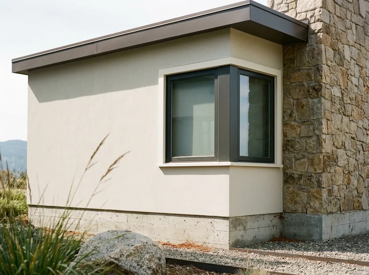
As an exterior color, Oyster White is one of the more reliable performers in this family. It washes back to a soft, light off-white in full sun, shedding the indoor greige quality and reading clean from the street. It flatters red brick and warm stone particularly well, and suits both traditional and contemporary facades without looking trendy or safe-to-the-point-of-boring.
Oyster White's green-beige undertone makes it a natural match for colors with organic, earthy, or muted qualities. Among Sherwin-Williams's own coordinating pairings, Analytical Gray (SW 7051) brings a cooler neutral anchor that grounds the warmth of Oyster White without clashing with its subtle green thread. Brassy (SW 6410) reads as a warm, golden-toned accent that plays directly into the beige and warm-light behavior of Oyster White, making it a confident choice for a single feature wall or accent furniture.
Beyond the official coordinates, Oyster White pairs well with muted greens and soft blues that echo its undertone rather than fighting it. Deeper grounding accents add contrast without harshness. For trim, the consistent recommendation across reviewers is to reach for a soft white rather than a crisp bright white. Warm-side soft whites keep the pairing cohesive. Crisp icy whites used as trim read too cool against Oyster White's warmth and can make the wall color look slightly off. Avoid using Oyster White itself as trim next to much lighter whites in the same space, where the contrast can make it read dingy rather than intentional.
This bedroom holds together because every layer is quiet, each material pulling toward the same warm-cool middle ground that Oyster White naturally occupies. Only one of the seven colors here is actual paint, Oyster White on the suite walls, ceiling line, and envelope. The other six are the room's furnishings and materials, each shown as its closest Sherwin-Williams match. Hover any pin or swatch to see what it is.
All comparisons are matched against Oyster White at LRV 72.5.
Pairing Oyster White with very deep colors in a room that does not get strong natural light can flatten the wall color rather than create useful contrast. The light-to-dark jump reads muddy rather than dramatic when neither color has enough illumination to show its character.
Trim colors that lean cool or bright white, think very high-LRV whites with blue or gray undertones, expose the warmth of Oyster White walls in an unflattering way. The wall reads yellow or dingy by comparison rather than intentionally warm.
Bold warm colors with significant red or orange content can activate the green undertone in Oyster White, making the wall color read more noticeably green than it does in isolation. Rust, terracotta, and saturated coral are the most common triggers.
Oyster White is a warm off-white that reads more like a very light greige than a traditional white. It has a warm beige base with a subtle gray-green undertone that keeps it from looking stark or creamy. On the wall indoors it settles into a muted, light beige with quiet depth. On exteriors it washes back to a soft, clean off-white.
The primary undertones are warm beige and a touch of gray, but the detail that distinguishes Oyster White from straightforward beige off-whites is a subtle green thread sitting underneath both. That green quality is not visible as a color on its own, but it shows up when Oyster White is placed next to strong reds or oranges, and it is what gives the color its greige rather than purely creamy quality. Warm artificial light can suppress the green and push the color toward yellow.
It is primarily warm, but the answer depends on your room's orientation. South-facing rooms pull out the warmth and make it feel creamy and inviting. North-facing rooms surface the gray-green and make it read cooler and more like a true greige. One credible body of reviews describes it as a cool-leaning greige that flexes depending on light, so both warm and cool readings come from real conditions rather than error. Testing in your specific room is genuinely important here.
The precise LRV is 72.5. That places it solidly in the light range, reflective enough to keep spaces feeling open and airy, but with enough pigment that it shifts perceptibly with the light rather than disappearing into the wall.
The Sherwin-Williams paint code is SW 7637. The hex value is #E2DDD0 and the RGB breakdown is 226 red, 221 green, and 208 blue.
Muted greens, soft blues, and earthy neutrals are consistent companions because they harmonize with Oyster White's green-beige undertone rather than fighting it. For trim, warm soft whites are the consensus choice. Crisp bright whites read too cool against Oyster White's warmth. For grounding accents, deeper warm neutrals and near-blacks add contrast without creating the color clash that saturated reds or oranges can trigger. Among the official Sherwin-Williams coordinates, Analytical Gray (SW 7051) provides a cool neutral anchor and Brassy (SW 6410) brings a warm golden accent.
Yes on both counts. For exteriors it is included in Sherwin-Williams's Top Exterior Colors list and reads as a soft, non-stark off-white that performs especially well alongside red brick and warm stone. On cabinets, semi-gloss or high gloss is the recommended finish for durability and to bring forward a slight glow in the color. In a flat finish on cabinets it can look chalky rather than crisp.