Arrowroote is a light, warm off-white that lands somewhere between soft beige and the palest muted wheat. On the wall it reads as a calm, quiet neutral, never stark and never loud. The straw-yellow warmth is present but restrained, which keeps the color from feeling dated or yellowed the way older cream paints sometimes do. At LRV 73.5 it reflects a healthy amount of light and makes rooms feel noticeably brighter and more open without ever looking white.
The overall effect is sophisticated in a low-key way. It has that ease you want from a whole-room neutral: no strong personality that fights your furniture, but enough warmth to keep bare walls from feeling cold or clinical. Reviewers consistently describe it as inviting and easy to live with, which tracks. It photographs close to what you see in person, and it does not do anything dramatic or surprising once it dries.
Sherwin-Williams and most reviewers call Arrowroote warm, with golden and straw undertones, and that is the dominant read. In rooms with good natural light and warm-toned furnishings, the straw-yellow quality comes forward subtly and the color feels honey-adjacent without being obviously yellow.
That said, there is a genuine undertone disagreement worth knowing about. Some reviewers in different lighting conditions, particularly in north-facing rooms or spaces with cooler artificial light, pick up a faint greenish-gray cast rather than pure straw-yellow. It does not turn outright green, but it can shift toward a muted, slightly sage-adjacent warmth rather than the golden warmth you might expect. This is the nature of a color that sits at the crossroads of beige, straw, and pale gray-green, and sources do not all agree on which quality wins in a given space.
The practical takeaway is straightforward: Arrowroote is warm overall, but it is not a one-note warm white. Paint a large sample, at least 12 by 12 inches, directly on your wall and observe it in morning light, afternoon light, and evening under your actual bulbs before committing. The undertone you experience will depend heavily on your room's orientation and the color temperature of your lighting.
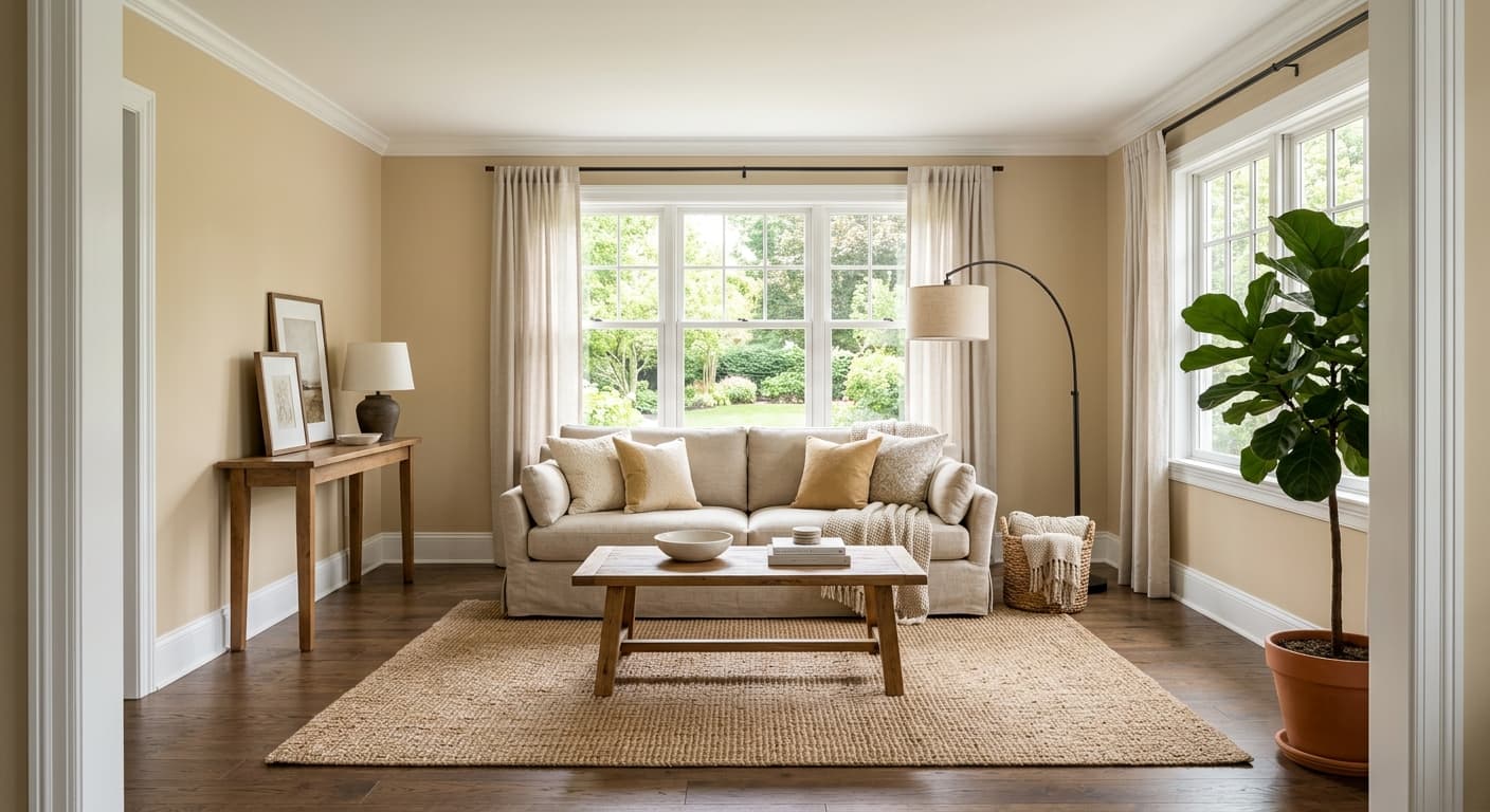
Arrowroote earns consistent praise as a living room and bedroom color, and that makes sense given its LRV of 73.5 and its calm, enveloping warmth. In a living room it serves as a backdrop that makes natural wood floors, linen upholstery, and earthy green accents feel cohesive rather than assembled. In a bedroom the muted straw quality reads restful rather than energizing, which is exactly what you want.
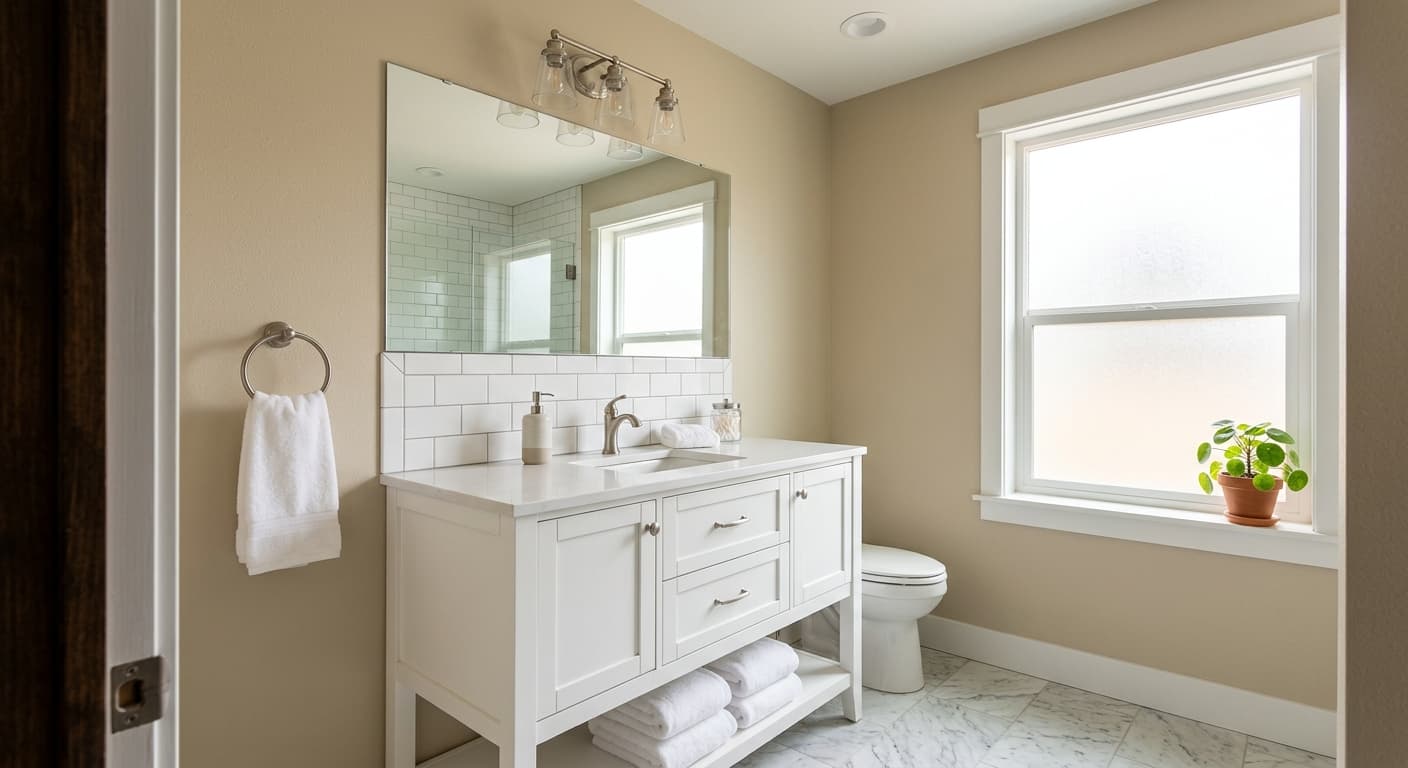
Dining rooms are another strong fit. The warmth flatters natural wood dining tables and cane chairs, and it holds up well under warm incandescent or Edison-style bulbs in the evening, which is when dining rooms see their most important use. Reviewers also mention it in home offices as a focus-friendly backdrop that does not demand attention but does not feel depressing either. Kitchens work when the cabinetry runs warm, think natural wood, cream, or warm white, since the straw undertone in Arrowroote will read oddly next to cool gray or bright white cabinetry.
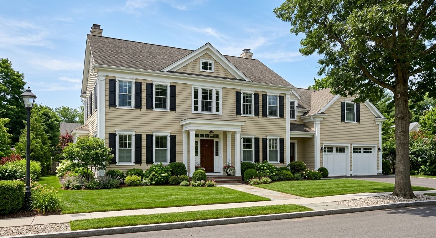
Orientation matters. South and west-facing rooms give this color the warm light it needs to perform at its best. North-facing rooms can pull out that cooler greenish-gray cast some reviewers flag, so if you have a north-facing space be especially diligent about sampling. It is sold in both interior and exterior formulas, and the warm straw quality does read well on exteriors in farmhouse and cottage contexts, especially paired with deep earthy green or warm white trim.
At LRV 73.5, Arrowroote brightens a living room without pushing it toward stark white. The straw warmth makes linen sofas, wood coffee tables, and woven rugs feel intentional and put-together. Keep trim in Cotton (SW 9581) for a tonal, low-contrast finish that reads calm and considered.
The muted warmth of Arrowroote keeps a bedroom feeling relaxed rather than alert. It works especially well with natural linen bedding, rattan or wood furniture, and warm-toned lighting. It reflects enough light, LRV 73.5, to keep the room feeling open even with heavier drapes.
Arrowroote holds its warmth beautifully under the incandescent and Edison bulbs most people use in dining rooms at night. Paired with a natural wood table and Mushroom (SW 9587) on a built-in or sideboard, the space feels warm and grounded without being heavy.
Reviewers call it focus-friendly, and that is accurate. Arrowroote is warm enough to feel comfortable during a long work day but quiet enough not to compete with what is on your screen. It pairs well with warm white or wood desk furniture and earthy green plants.
Arrowroote works in kitchens with warm-toned cabinetry, cream, natural wood, or warm white. Avoid pairing it with cool gray or bright white cabinets, where the straw undertone can look off. On walls behind open shelving it reads like a soft, earthy backdrop that does not compete with dishware or accessories.
Arrowroote is designed to work inside a warm, grounded palette. Cotton (SW 9581) is the natural first partner, a softer, lighter warm white that lets Arrowroote serve as the deeper anchor while Cotton handles trim, ceiling, or adjacent rooms. Mushroom (SW 9587) brings in a deeper, more saturated warm taupe that grounds the palette and works well on a single accent wall or on cabinetry.
Beyond the direct coordinates, Arrowroote pairs well with earthy greens, warm terracottas, and natural wood tones. Think sage-to-olive green, raw linen, beeswax candle tones, and unfinished or oiled wood. It is also a clean pairing with matte black hardware or fixtures, where the warmth of the wall softens what might otherwise feel stark. Keep your metal finishes on the warmer side, brushed brass and unlacquered brass both look at home here, and you will hold the cohesive, grounded feel that makes this color work.
All comparisons are matched against Arrowroote at LRV 73.5.
Arrowroote's straw-yellow undertone will fight visibly with cool gray or blue-gray trim. The contrast reads muddy rather than crisp, and it highlights the greenish-gray shift that some reviewers already notice in the wall color under certain light.
A stark bright white or cool white ceiling above Arrowroote walls will make the walls look dingy or yellowed by comparison, because the contrast emphasizes the warm undertone in an unflattering way.
Cool blue-gray sofas, rugs, or curtains placed against Arrowroote walls pull the color toward its cooler greenish-gray undertone, making the whole room feel slightly unsettled and off-tone rather than cohesive.
Arrowroote SW 9502 is a light, warm off-white that reads on the wall as a soft, muted beige with a subtle straw-yellow quality. It sits comfortably between creamy white and pale beige and has an LRV of 73.5, so it is quite light and reflective without being a true white.
The dominant undertones are warm, golden, and straw-yellow. In good natural light and warm-lit rooms, the straw quality is the most noticeable. However, some reviewers in north-facing or cooler-lit spaces pick up a faint greenish-gray cast rather than pure yellow warmth. It does not flip dramatically, but it is enough of a shift that sampling in your actual room before committing is genuinely important.
It is warm. Sherwin-Williams places it in the warm, golden, straw category, and most reviewers agree. The warmth is moderate and restrained rather than pronounced, which is part of why it reads as sophisticated rather than old-fashioned. In cooler light conditions it can soften toward a more muted, slightly sage-adjacent warmth, but it does not cross into cool territory.
Arrowroote has an LRV of 73.5, which puts it firmly in the light category. It reflects a substantial amount of light, making rooms feel brighter and more open. It is not so high that it reads as a near-white, so you still get visible warmth and color on the wall.
The Sherwin-Williams color code is SW 9502. The hex value is #e4decf and the RGB values are 228, 222, 207.
Within the Sherwin-Williams line, Cotton (SW 9581) works well as a trim or ceiling companion and Mushroom (SW 9587) brings in a deeper warm taupe for grounding. Beyond paint, Arrowroote pairs well with earthy greens, natural wood tones, warm linen, rattan, terracotta, and brass or unlacquered brass hardware. Keep all your palette choices on the warm side of the spectrum to let Arrowroote's straw undertone read cleanly.
Yes on exteriors. It is available in both interior and exterior formulas and its warm straw quality reads well on farmhouse and cottage-style homes, especially with earthy green or deep warm-toned accents. For cabinets, it can work but test carefully: at LRV 73.5 it is quite light, and the straw undertone may read unexpected next to cool-toned countertops or hardware. It is best suited to cabinet applications in kitchens with warm wood, cream, or earthy palettes.
