Analytical Gray lands squarely in warm greige territory. It is not a true gray and not a true beige, but a balanced middle ground that most people read as a warm gray leaning toward taupe. At LRV 47.5 it reflects roughly half the light that hits it, which means it registers as a mid-range neutral on the wall, not a bright or airy color. If you are expecting something light and barely-there, you will be surprised by how grounded it feels in person.
The color shifts noticeably with light conditions, and that is both its appeal and the reason you must sample it before committing. In rooms with strong natural daylight it warms up, pulls beige, and feels almost sandy. As light diminishes or shifts to artificial sources in the evening, it cools down, and some reviewers pick up a subtle gray or even faintly blue-gray quality in those conditions. A smaller number of observers note a very slight green lean in certain lighting, particularly in rooms with a north-facing orientation. It does not look the same in every room of the house, which is worth planning around rather than being caught off guard by.
The undertone picture for Analytical Gray is genuinely contested, and that disagreement is worth taking seriously. The dominant read across reviewers is warm, with beige and taupe cited most frequently. In daylight-flooded spaces, especially those with south or west exposure, the beige quality takes over and the gray almost recedes. That warmth is what makes it feel livable and approachable rather than cold or clinical.
The complication is what happens when light changes. Some reviewers, particularly those with north-facing rooms or heavy artificial lighting, report a cooler shift that reads as gray-blue. A distinct subset picks up a green undertone, and our editorial database flags that lean as well. The green is subtle, not olive, but it can surface against certain whites and in rooms where daylight has a cooler color temperature. This is not a defect in the color; it is simply the nature of a complex neutral. It means that your trim white, your flooring, and your room orientation all influence which undertone wins on any given day.
The practical takeaway is that you cannot predict which undertone will dominate without testing a large sample on your specific wall under your specific lighting at different times of day. Reviewers who skipped that step and went straight from a chip to a full gallon are the ones who describe the color as surprising or unpredictable. Reviewers who sampled it describe it as a reliable, flexible neutral with just enough warmth to feel welcoming.
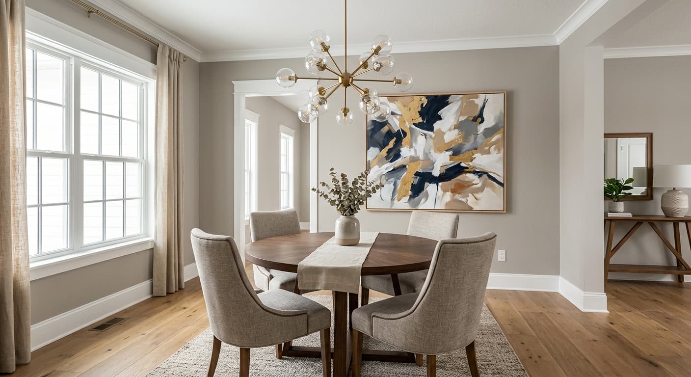
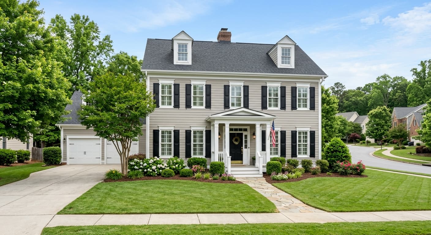
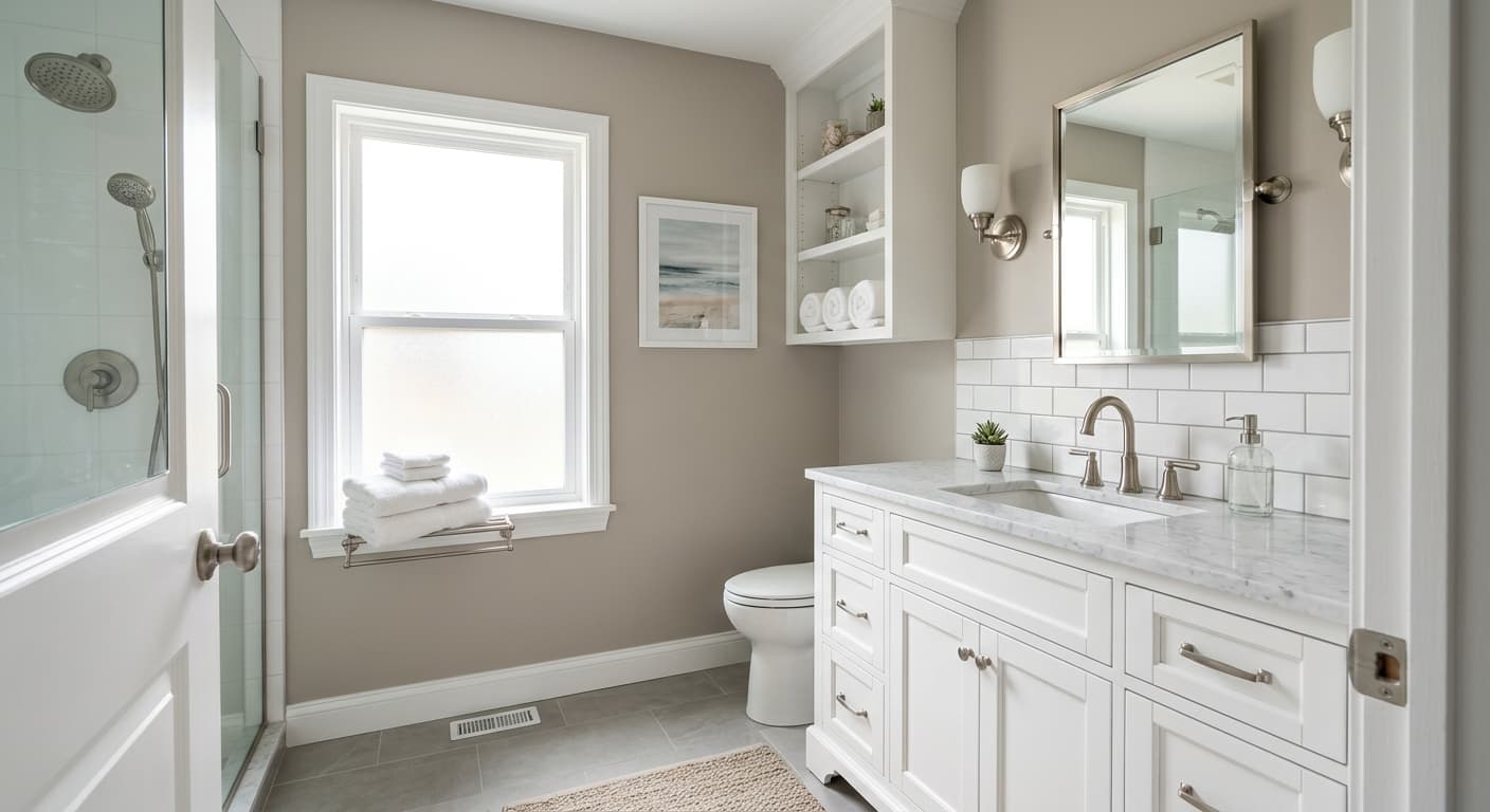
Analytical Gray works best in rooms that get decent natural light. At LRV 47.5 it has enough depth to feel cozy and grounded, but in a room with limited windows it can feel heavier than intended, closing the space down rather than opening it up. South- and west-facing rooms are the sweet spot, where daylight brings out its warmth and the color reads at its most inviting. East-facing rooms work reasonably well in the morning. North-facing rooms are where you are most likely to encounter the cooler, slightly green-gray shift, and those rooms require the most careful sampling.
Because it sits in that balanced warm-gray zone, Analytical Gray has become a popular whole-house neutral. It moves between a living room, bedroom, hallway, and kitchen without jarring transitions, which is exactly what you want from a color that needs to work across different lighting and different furnishing contexts. It suits transitional, modern farmhouse, and Scandinavian-leaning interiors particularly well, where the palette often combines natural wood, linen, and crisp white trim. The color sits far enough from cool-gray territory to work with warm wood tones without looking mismatched, and it is warm enough to complement stone surfaces and natural textiles.
Sherwin-Williams lists it for both interior and exterior use. On exteriors it functions as a solid mid-tone warm gray body color, pairing well with white trim and natural wood or stone accents. For cabinetry, reviewers note that it can work in kitchens where a warm, muted gray is the goal, though the depth at LRV 47.5 means it will read darker on cabinets than on walls, especially in kitchens with limited task lighting.
In a living room with good natural light, Analytical Gray reads as a warm, settled neutral that makes wood furniture and soft textiles feel cohesive rather than competing. At LRV 47.5 it has enough weight to give the room a sense of definition. Pair it with warm white trim and linen upholstery for a palette that feels easy to live with over time.
Analytical Gray brings a calm, grounded quality to bedrooms that works especially well when the goal is a cozy, restful atmosphere rather than a bright airy one. It suits primary bedrooms and guest rooms equally, and it layers well with natural bedding in ivory, oatmeal, and soft caramel tones. Just be aware that in a bedroom with minimal windows it will read noticeably darker than the chip suggests.
As a kitchen wall color it functions as a warm backdrop that does not compete with natural wood cabinets or stone countertops. On cabinets it will read noticeably deeper than on walls because of reduced light reflection, so sample it on a cabinet door before committing. Bright task lighting helps keep the warm undertone active rather than letting the cooler shifts take over.
This is genuinely one of Analytical Gray's strongest applications. Its balanced warm-gray tone reads consistently across different room types and furnishing styles without demanding that every room match. Using a lighter warm neutral like Nuance (SW 7049) on ceilings throughout keeps the overall palette feeling open while Analytical Gray anchors the walls.
On exteriors Analytical Gray works as a mid-tone warm gray body color with real visual presence. White trim and natural wood or stone accents are the most cited pairings in independent reviews. Because LRV 47.5 reads as a true mid-tone, it photographs well and holds up against both bright sun and overcast sky without washing out or looking muddy.
Analytical Gray plays well with other warm neutrals that share its tonal family. Sherwin-Williams coordinates it with Nuance (SW 7049), which sits lighter and airier and makes a good choice for ceilings or adjoining rooms where you want to step up the brightness while staying in the same warm family. Useful Gray (SW 7050) is a close tonal neighbor that can work as a subtle layering option in an open-plan space where you want gentle variation without contrast. For something more unexpected, Silken Peacock (SW 9059) brings a muted, sophisticated complement that plays off the color's gray quality rather than its beige side.
For trim and millwork, a crisp warm white keeps the palette feeling fresh without the coldness of a stark bright white. Natural wood tones, including oak, walnut, and lighter-stained pine, sit comfortably alongside Analytical Gray. Warm metals like brass and unlacquered bronze pick up its beige quality and feel intentional rather than accidental. Black accents work well as grounding elements, particularly in transitional or modern farmhouse settings.
All comparisons are matched against Analytical Gray at LRV 47.5.
Pairing Analytical Gray with a stark cool white trim, particularly whites with blue or gray undertones, can make the wall color's green shift surface more aggressively and leave the overall palette feeling slightly off or muddy.
Cool gray tile or cool-toned gray hardwood can pull the color toward its cooler, gray-green shift rather than its warmer beige quality, making the whole room feel flatter and less welcoming than you expected from the chip.
It sounds counterintuitive, but very warm incandescent or low-kelvin LED lighting in a small or north-facing room can shift Analytical Gray in ways that make it look more yellow-green than warm gray, particularly in the evening hours.
Analytical Gray is a warm, light-medium greige, a blend of gray and beige that sits firmly in the middle of the two. Most people read it as a warm gray leaning toward taupe, though in bright daylight it warms up and shows more beige, and in lower light it can cool down and shift slightly toward gray-green.
The primary undertones are warm and beige-leaning, but Analytical Gray is one of those colors where reviewers genuinely disagree. In daylight-rich, south-facing rooms the beige quality dominates. In north-facing rooms or under certain artificial lighting, a cooler gray or subtle green undertone can surface. Our database flags warm, gray, and slightly green as the undertone profile, which matches the range of real-world reports. This is exactly why a large wall sample in your actual room is essential before you buy a full gallon.
It reads as warm overall, and that is the consensus across most independent reviews. The beige component keeps it from feeling cold or clinical. However, it is not purely warm in all conditions. Under low light or in north-facing rooms it can shift toward a cooler, slightly gray or green quality, so it is better described as a warm-leaning neutral with occasional cool shifts rather than a solidly warm color.
The precise LRV is 47.5, which places it in the mid-range. It reflects roughly half the light that hits it, so it reads as a true medium-depth neutral on the wall rather than a light or bright color. In smaller rooms or rooms with limited windows it will feel noticeably deeper than you might expect from a paint chip.
Sherwin-Williams coordinates it with Nuance (SW 7049) and Silken Peacock (SW 9059). For trim, a warm white keeps the palette cohesive without the coldness of a bright stark white. Natural wood tones in oak, walnut, and pine sit comfortably alongside it, and warm metals like brass and unlacquered bronze complement the beige quality. Black accents work well as grounding elements in transitional or farmhouse-style spaces.
The Sherwin-Williams paint code is SW 7051. The hex value is #BFB6A7, and the RGB breakdown is 191 red, 182 green, 167 blue. The precise LRV is 47.5.
For exteriors it is a solid choice. Sherwin-Williams lists it for exterior use, and independent reviewers confirm it works as a warm mid-tone gray body color paired with white trim and natural stone or wood accents. For cabinets, it can work in kitchens where a warm muted gray is the goal, but be aware that at LRV 47.5 it reads noticeably darker on cabinets than on walls, particularly in kitchens with limited task lighting, so sample a full cabinet door first. As a front door color it has enough depth and warmth to read confidently without being dramatic.
