French Roast reads as a very deep, rich espresso brown, and with an LRV of 4.3 it sits at the dark end of Sherwin-Williams' entire palette. In a well-lit room, the color opens up and shows its true character: a warm, chocolatey brown with visible red depth that keeps it from ever feeling flat or muddy. It has an earthy, grounded presence that draws you in rather than pushing you away.
In lower light or north-facing rooms, French Roast collapses toward near-black. That shift is part of its appeal in the right context, where a dramatic, cave-like backdrop is the goal, but it means the color can look very different on a bright south-facing wall versus a dim interior corner. Reviewers consistently note that the warmth holds even as it darkens, so it never tips cold or sooty the way some deep browns do. Sherwin-Williams classifies it in the reds and oranges family, which is a useful clue: there is genuine red in its DNA, not just brown.
The dominant undertone in French Roast is red, layered over a deep chocolate brown base. In direct or warm incandescent light that red character becomes noticeably visible, giving the color a rich, almost mahogany quality. Many reviewers describe it as espresso with a clear warm flush, and that warmth is what separates it from cooler or grayer deep browns that can feel more industrial or cold.
There is some disagreement in the wild about how prominent the red reads. In rooms with cool natural light or when paired with cooler whites, some find the red recedes and the color looks closer to a straight dark brown. Others, especially those who have placed it next to warm-toned woods or brass hardware, find the red very evident and sometimes more orange-adjacent than they expected from swatch alone. Sherwin-Williams' own classification in the red family supports the reviewers who see more red than brown at first glance.
The practical takeaway is that French Roast is not a neutral espresso. It is a warm, red-leaning dark brown, and that distinction matters when you are choosing trims, textiles, and metals. Sampling it in your actual space under your actual lighting is not optional at this LRV. The undertone swing between a warm-light room and a cool-light room is significant enough that you could be looking at two different colors.
French Roast is built for rooms where you want enclosure and atmosphere, not openness. Dining rooms are a natural fit: the warmth and depth create a cocooning quality that makes evenings feel intentional and candlelit. Studies and home libraries work for the same reason, where dark walls act as a backdrop that makes everything in the room, books, leather, wood furniture, feel more considered and layered.
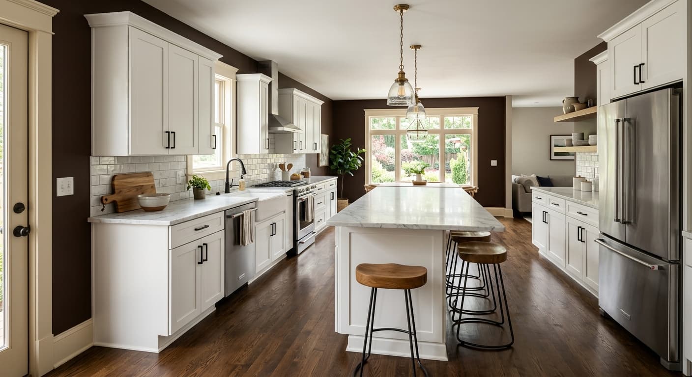
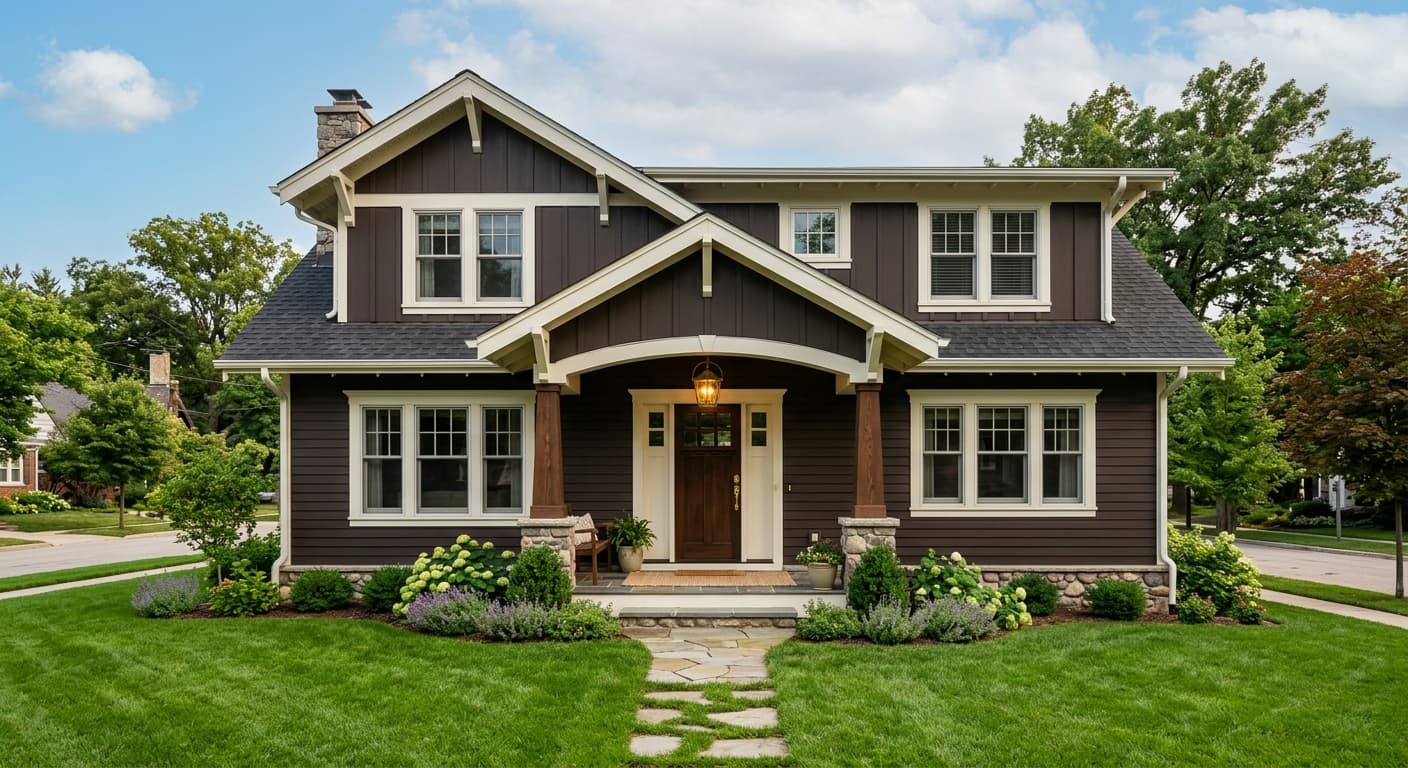
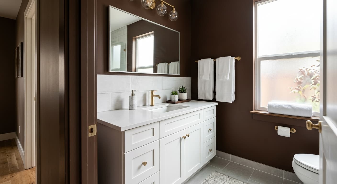
Accent walls are perhaps the most versatile application. A single wall in French Roast anchors a living room or bedroom without committing the entire space to such a low LRV. Because it absorbs light heavily at 4.3, doing four walls in a smaller room will read very dark and make the space feel noticeably smaller. That is not always wrong, but it is worth planning around good artificial lighting if you go full coverage. The color also performs well on exteriors and front doors, where its strong, grounded character reads as confident and welcoming rather than heavy, especially against warm stone, brick, or natural wood siding.
Orientation matters here more than with most colors. South and west-facing rooms where warm afternoon light hits the walls will bring out the red and keep the color alive. North-facing rooms with cool, diffused light will push French Roast toward its near-black end, which can be striking or oppressive depending on room size and how much artificial light you are willing to add. Kitchens and small bathrooms are harder placements because the low LRV will fight the functional need for brightness.
This is a go-to use for French Roast. The deep espresso warmth creates the kind of enclosed, candlelit atmosphere that makes a dining room feel like an event. Pair it with brass light fixtures and a warm white ceiling to keep the space from feeling too closed in.
At LRV 4.3, French Roast wraps a study in a focused, moody calm that supports reading and conversation. Dark wood shelving and leather seating work with it naturally, and the red undertone keeps the room feeling warm rather than austere.
A single feature wall in French Roast anchors a living room or bedroom without demanding full commitment to such a dark palette. It gives the room a defined focal point, especially behind a bed or sofa, and lets you bring in lighter furnishings that pop against the dark ground.
French Roast works with confidence on exterior applications, where its grounded espresso tone reads as strong and deliberate. On a front door against warm stone or natural wood siding, it makes a clear, non-flashy statement that holds up in both direct sun and overcast light.
French Roast pairs best with colors and materials that either soften its intensity or commit fully to its warmth. On the soft side, Nice White (SW 6063) and Aged White (SW 9180) both work well as trim and ceiling companions: a warm creamy white keeps the contrast from feeling stark and allows the red-brown depth of French Roast to stay in the foreground. Aged White in particular leans warm enough that the two colors read as deliberate partners rather than awkward contrasts. For a more atmospheric, pulled-back combination, Acacia Haze (SW 9132) alongside French Roast creates an earthy, layered palette that works well in a study or dining space with natural wood and linen textiles.
Beyond paint, brass and unlacquered bronze hardware are frequently cited as the right metal pairing: they pick up the warmth in the undertone and amplify the richness of the color. Natural woods, especially medium to dark walnut and oak, sit comfortably alongside it. If you want to lean into the drama rather than soften it, deep jewel tones in textiles, forest greens, navy, or deep terracotta, keep the energy high and coherent. Avoid cool grays or stark bright whites as trim companions: they pull out the warmth French Roast relies on and can make the combination feel unresolved.
All comparisons are matched against French Roast at LRV 4.3.
French Roast's red-brown warmth and cool gray trims read as competing rather than coordinating. The gray pulls out cool undertones that are not present in French Roast, and the combination can feel unresolved and accidental.
A very high-LRV bright white next to French Roast creates a contrast so extreme that the eye goes to the seam rather than enjoying either color. It can also make the dark wall look colder and flatter than it actually is.
Cool silver metals sit awkwardly against French Roast's warm red-brown base. They neutralize the warmth that makes the color interesting and can make the overall palette feel dated and uncoordinated.
French Roast is a very deep, rich espresso brown with a warm red undertone. At LRV 4.3 it sits near the darkest end of the Sherwin-Williams line, reading as a near-black in low light and opening up to show its red-brown warmth in brighter conditions. Sherwin-Williams files it in the reds and oranges family, which reflects that genuine red character in the base.
The primary undertone is red, sitting over a deep chocolate brown base. In warm or direct light the red reads clearly, giving the color a mahogany-adjacent richness. In cool or low light it recedes and the color reads as a straight dark brown approaching black. Some reviewers find the red more orange-leaning than expected, especially next to warm woods, so sampling in your actual lighting before committing is important.
Firmly warm. The red and chocolate undertones keep French Roast on the warm side of the dark brown spectrum. It does not have the gray or blue-gray cast that makes some deep browns feel cool or industrial. That warmth is what gives it its cocooning, inviting quality even at such a low LRV.
The precise LRV is 4.3, which places it among the darkest colors in the Sherwin-Williams palette. At this LRV the color absorbs a significant amount of light, so rooms will read noticeably darker and feel smaller. Planning for strong artificial lighting or limiting it to an accent wall or large, well-lit room is worth doing before you paint.
The Sherwin-Williams code is SW 6069. The hex value is #4F3426 and the RGB values are 79 red, 52 green, 38 blue. These are the authoritative values from the Sherwin-Williams database.
Warm whites and creamy off-whites work well for trim, particularly Aged White (SW 9180) and Nice White (SW 6063). For a broader palette, Acacia Haze (SW 9132) adds an earthy, layered companion. In materials, brass and unlacquered bronze hardware amplify the warmth, and medium-to-dark natural wood tones sit naturally alongside it. For textiles, deep jewel tones including forest green, navy, and deep terracotta hold up against the intensity without competing.
Yes on exteriors and front doors. Its grounded espresso depth reads as strong and intentional on a facade or door, especially against warm stone, brick, or natural wood. It is available in both interior and exterior formulations. For cabinets it can work well in a kitchen or bathroom that has strong lighting and wants a moody, dramatic statement, but because the LRV is 4.3 it will make a small kitchen feel noticeably darker and heavier, so it suits larger spaces or lower cabinetry better than full upper-cabinet coverage in a compact room.
