White Snow lands in a sweet spot between a pure bright white and a soft creamy off-white. At LRV 90.3 it reflects a generous amount of light, so your first impression on the wall is clean and crisp. It reads as convincingly white rather than obviously tinted, and it outpaces warmer whites like Alabaster in sheer brightness. That said, it never crosses into the icy, clinical territory you get from stark cool whites.
Look closer, or watch it shift through the day, and a soft warmth surfaces. In direct sunlight it can look almost pure white, bright and airy. As light softens in the afternoon or in the evening under incandescent or warm LED lighting, a gentle creamy quality emerges. The color behaves differently depending on what surrounds it, and that context sensitivity is worth understanding before you commit.
This is where White Snow gets interesting, and where sources genuinely disagree. Sherwin-Williams positions it as neutral to cool in their editorial materials, and if you compare it directly to a yellow-heavy cream or a warm beige, that reading makes sense. It is not a color most people would call warm at first glance.
Detailed independent color reviews tell a different story. They describe a creamy base with faint yellow and very slight purple micro-undertones working together. In practice those micro-undertones make it lean warm rather than cool on most walls, even though it never announces itself as warm the way a richer off-white would. Think of it as a white that stays approachable and soft instead of crisp and cold, without ever reading beige.
The practical implication is that your fixed finishes will determine which read wins. Next to warm wood tones, warm brass hardware, or creamy stone, the slight yellow base stays subtle and harmonious. Place it next to cool gray LVP flooring, blue-toned tile, or bright white trim with a blue or green bias, and White Snow can pull noticeably yellow by contrast. Neither undertone reading is wrong; they are both real depending on what the color is reacting to in your specific room.
White Snow earns its place on trim and ceilings first. At LRV 90.3 it is bright enough to read as a true white in those roles, yet the soft warmth keeps it from feeling stark next to wall colors with any depth. It is a natural fit for modern and minimalist interiors where the goal is light and airiness without a cold, hospital-white edge.
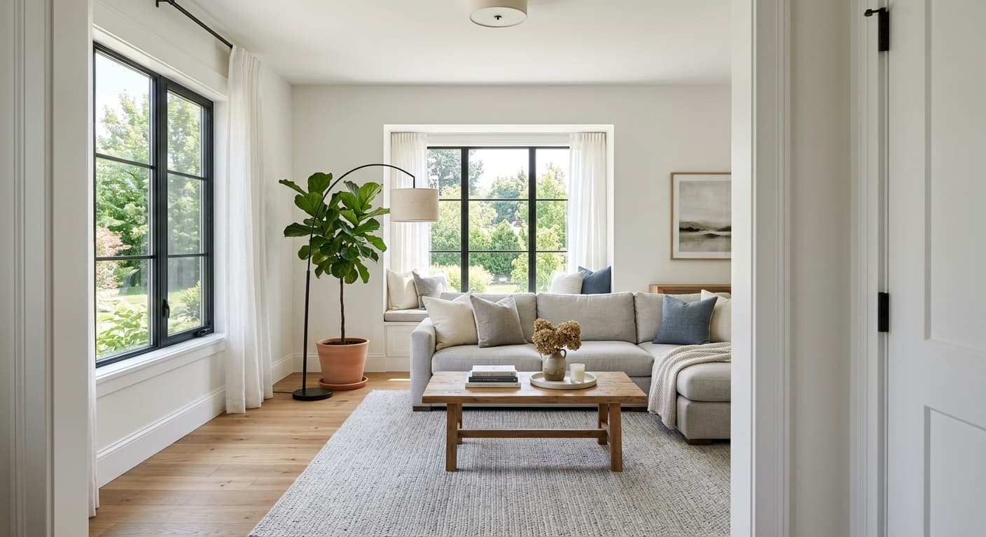
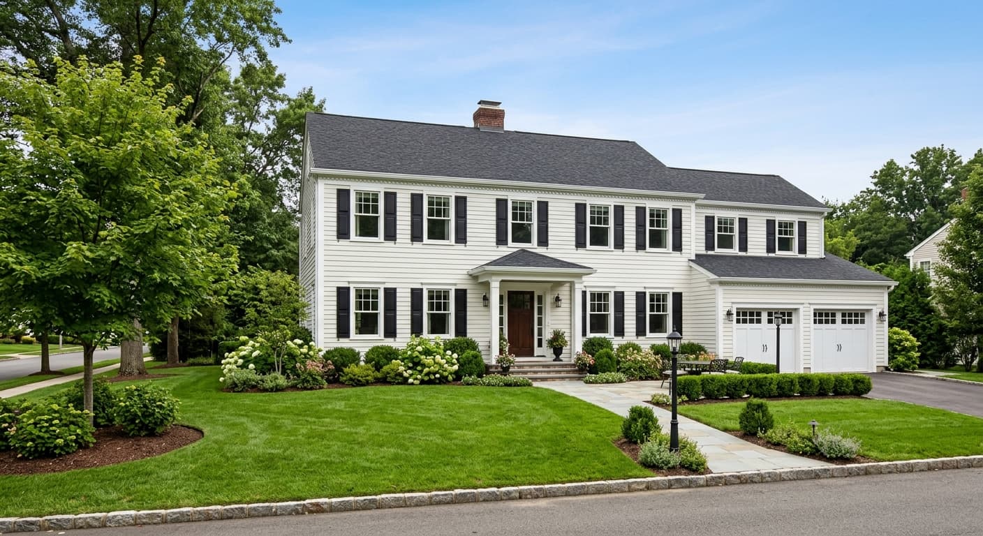
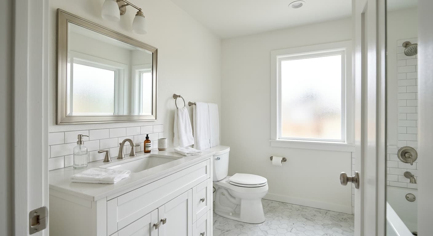
North-facing rooms are a strong use case. Those rooms miss direct sunlight and often read chilly with cool whites, but White Snow holds a bit of warmth that keeps the space feeling livable throughout the day. It also works hard in small rooms, bedrooms, and bathrooms where you want to maximize perceived space without sacrificing any sense of comfort. Open-concept layouts benefit from it too, since the high reflectivity helps light travel across a space.
Kitchens are another natural fit, particularly for cabinets, where the clean brightness reads fresh and the soft warmth pairs well with wood countertops or warm-toned hardware. On the exterior, White Snow is available for trim and doors but is not offered for siding, so plan accordingly if you are thinking about a whole-house exterior project.
This is where White Snow does its most reliable work. At LRV 90.3 it is bright enough to register as a clean white in these roles, and the soft warmth prevents the harshness you can get from a cooler trim white. It reads fresh and sharp against most wall colors without draining them.
The high reflectivity opens up smaller bedrooms and the warm lean keeps the space feeling restful rather than clinical. It works especially well in north-facing bedrooms where a cooler white would feel cold. Pair it with natural wood furniture and warm textiles to let the undertones stay balanced.
White Snow reads clean and bright in a bathroom, which is exactly what most people want. Watch your tile choice: if your tile has a cool gray or blue-white cast, the warm base can look yellow in comparison. Warmer cream or white tile, or natural stone with warm veining, will keep it looking intentional.
On cabinetry, White Snow offers a bright, fresh look with just enough warmth to feel inviting rather than sterile. It pairs well with warm wood open shelving, butcher block counters, or brass hardware. Cool gray or blue-toned countertops are the main thing to test against before committing.
The LRV 90.3 helps bounce light across large, connected areas so rooms feel cohesive and airy. Because it is warm-leaning rather than cool, it avoids the slightly cold or impersonal quality that very bright whites can develop in sprawling open-plan layouts. It works especially well when the flooring and furnishings stay in the warm to neutral range.
White Snow coordinates well with depth and contrast. Sherwin-Williams pairs it with Autonomous, Night Out, and Stone Fruit, a range that moves from a quiet mid-tone to a rich, saturated statement. That range tells you something useful: White Snow is versatile enough to anchor both subtle tonal schemes and bolder color stories without fighting either.
Because the color carries a soft warm lean, your best pairings share that warmth or at least stay neutral. Warm-toned woods, brass or unlacquered bronze hardware, and natural textiles in linen or wool all work with it rather than against it. If you are going monochromatic, keep your other whites in the warm-neutral camp. Mixing White Snow with a sharply cool bright white on adjacent surfaces will expose the warm base in a way that can look unintentional.
All comparisons are matched against White Snow at LRV 90.3.
Cool gray flooring creates a high-contrast temperature conflict with White Snow's warm base. The floor reads unmistakably cool and blue-gray while the walls read yellow by comparison, making both look off rather than complementary.
Crisp, blue-toned stone or tile makes the warm undertone in White Snow visible in an unflattering way. The paint will look like an accidental yellow-white next to surfaces that read almost pure white or faintly blue.
If you mix White Snow with a trim or adjacent paint that has a strong blue or green bias and a similar or higher LRV, the contrast will expose White Snow's warm base and it will look dingy or yellowed rather than clean.
White Snow is a highly luminous off-white with hex #F5F4EE and RGB values of 245, 244, 238. At LRV 90.3 it reads as a clean, bright white on the wall, softened by a faint warm undertone that keeps it from feeling cold or clinical.
There is genuine debate here. Sherwin-Williams positions White Snow as neutral to cool, and at a glance it reads close to pure white. Independent detailed color reviews identify a creamy base with faint yellow and slight purple micro-undertones that make it lean warm in practice. Both reads are real: context and surrounding finishes determine which one dominates in your space.
It sits in the middle, but leans warm in real-world conditions. It is noticeably warmer and more inviting than a stark cool white, yet brighter and less creamy than a classic warm off-white. If your fixed finishes are cool-toned, the warm base may show through more than you expect.
White Snow has a precise LRV of 90.3, which puts it in the high-reflectivity range for off-whites. It reflects a large amount of light, making spaces feel open and airy, while staying slightly softer than the very brightest pure whites on the market.
The Sherwin-Williams code is SW 9541, the hex is #F5F4EE, and the RGB is 245, 244, 238.
White Snow coordinates with Autonomous, Night Out, and Stone Fruit in Sherwin-Williams' own palette, a range that spans from quiet mid-tones to richer saturated colors. More broadly, it pairs well with warm wood tones, brass and unlacquered bronze hardware, warm stone, and natural linen or wool textiles. Keep adjacent whites in the warm-to-neutral range to avoid a color temperature clash.
Yes, and those are among its best uses. On trim and ceilings the LRV 90.3 delivers genuine brightness while the soft warmth prevents harshness. On cabinetry in kitchens and bathrooms it reads fresh and clean, though you should test it against your countertop and tile samples before committing, especially if those surfaces have a cool or blue-toned cast.
