Cheviot reads as a soft, creamy off-white on the wall, bright without being harsh. Its LRV of 88.7 means it reflects the vast majority of light that hits it, so rooms feel open and airy rather than weighted down. It is not the kind of white that startles you. It settles in warmly, more like a well-lit linen than a clinical blank slate.
In warm light, whether that is incandescent bulbs or afternoon sun pouring through south- or west-facing windows, Cheviot leans noticeably creamier. You will see the beige and yellow tones come forward. In cooler north-facing light or under daylight-balanced LEDs it calms down and sits closer to a quiet warm neutral without reading yellow. That variability is not a flaw, but it is a real behavior you need to account for before committing.
Finish affects the read, too. In a flat or matte finish the warmth is soft and diffused. In eggshell or satin the slight sheen can amplify the creamy quality, which works beautifully on trim but can intensify the yellow lean on large walls depending on your light source. Reviewers consistently note strong, even coverage in two coats.
The undertone conversation around Cheviot is genuinely unsettled, and it is worth sitting with that rather than smoothing it over. Most reviewers land on soft yellow or beige as the primary influence, which is what gives it the warm, inviting quality that makes it popular as a main wall color and trim color alike. That warm-beige read is the most common experience across independent reviews.
A smaller but consistent group sees the warmth push further, reading an orange or golden cast, particularly in rooms with a lot of warm artificial light or in spaces painted alongside cooler colors. This matters because if your furnishings run warm, that orange-gold influence can compound and the color can feel more saturated than the LRV suggests. If your room has a lot of cool-toned materials, the warmth reads as pleasant contrast rather than excess.
At least one camp sees a faint gray quality in Cheviot, likely visible in lower light conditions or on walls that receive mostly indirect daylight. Our editorial read identifies warm, beige, and gray as the three layers at play, so that gray observer is not wrong. The practical takeaway: Cheviot is warm-dominant, but it is not a single-note color. Paint a large sample on two or three walls and look at it morning, midday, and evening before deciding.
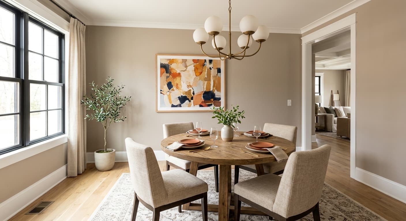
Cheviot is a natural fit for living rooms and bedrooms, where a warm, breathing white makes a space feel relaxed rather than institutional. Its high LRV of 88.7 means even smaller rooms benefit because the color bounces light around without making the walls disappear. It works particularly well in traditional homes and transitional spaces, where a bit of warmth keeps things from feeling cold or overly spare.
Orientation matters a lot with this color. South- and west-facing rooms with abundant warm sunlight will see Cheviot lean creamy and yellow-adjacent, which can be exactly what you want in a bedroom or a cozy dining room. North-facing rooms are actually a strong use case too, because Cheviot's built-in warmth counteracts the blue-gray quality that north light tends to impose on cooler whites. East-facing rooms get the morning warmth and a cooler afternoon, and Cheviot handles both gracefully.
Beyond walls, reviewers and designers use Cheviot on trim, ceilings, and as a whole-room monochromatic scheme. It pairs best with warmer whites and soft neutrals in adjacent spaces. Putting it next to a crisp, cool white is a common pitfall because the contrast pulls the yellow undertones forward more than expected. It is also used on cabinetry and exterior trim in traditional palettes, where its soft warmth reads as refined rather than plain.
In a living room Cheviot acts as a warm, generous backdrop that makes wood furniture and earthy textiles feel at home. The high LRV of 88.7 keeps the space bright even with heavier furnishings. It handles both natural and artificial light well, though warm evening lighting will pull the creamy tones forward noticeably.
Cheviot is a strong bedroom choice because the warmth reads as calm rather than energizing, which supports a restful atmosphere. It works in both small and large bedrooms since the LRV prevents it from feeling enclosed. Pair it with soft linen bedding and warm wood or rattan furniture to let the color do its best work.
Warm whites in dining rooms create an inviting, flattering light environment, and Cheviot delivers that reliably. Candlelight and warm pendant fixtures will amplify the creamy yellow tones in a way that feels intentional and welcoming. Keep trim in the same warm family to maintain a cohesive, settled look.
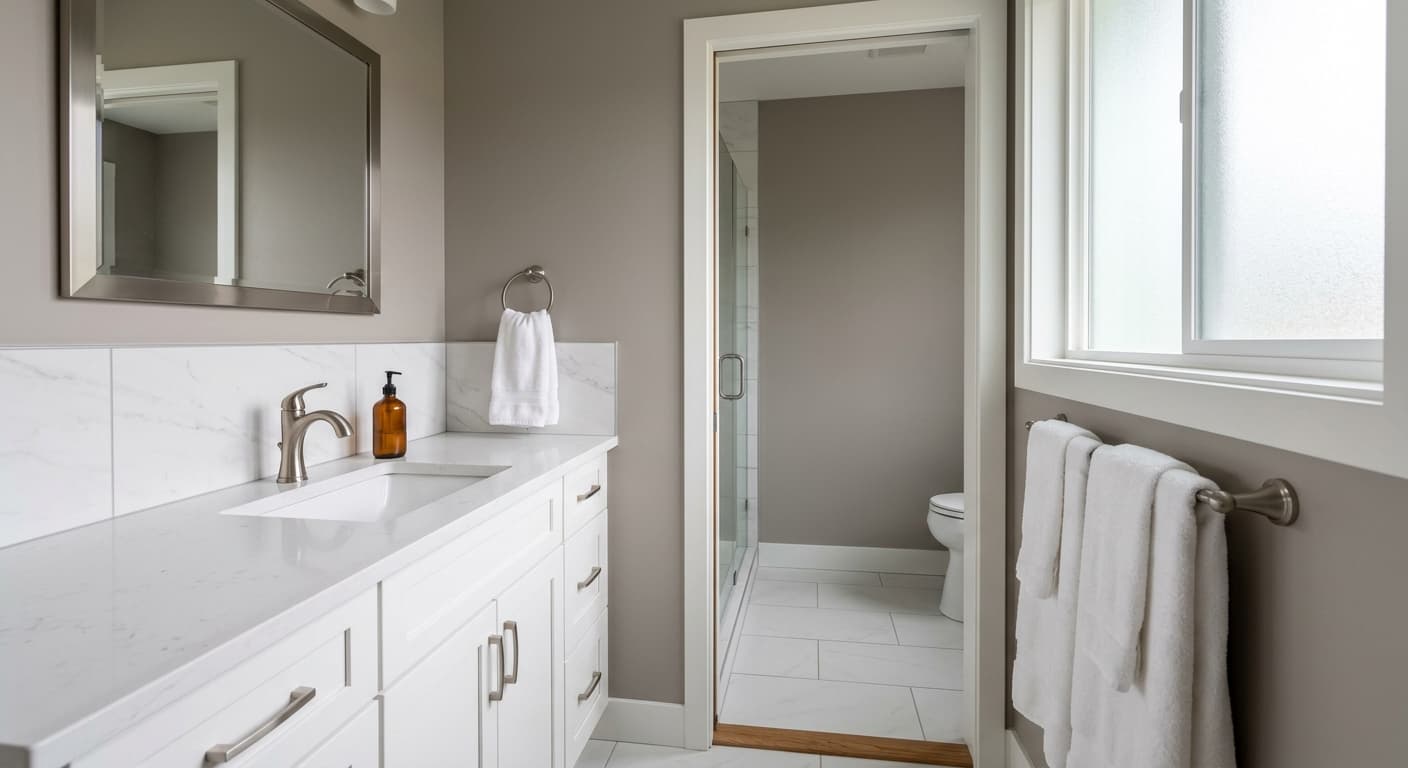
Cheviot works well as a trim color in homes where a stark bright white would feel too sharp. It softens the contrast between walls and woodwork without disappearing. Use it consistently across baseboards, door casings, and crown molding for a traditional, pulled-together finish.
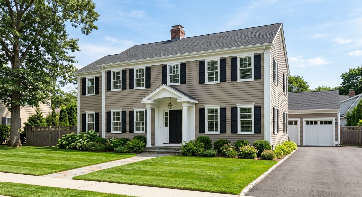
On exteriors Cheviot reads as a classic warm white that suits traditional architecture well. It holds up cleanly on siding and is a natural choice for trim and door surrounds in a warm neutral palette. Avoid pairing it with cool gray or blue accents on the exterior, as those combinations will expose its yellow undertones in full sun.
Cheviot's coordinating palette leans into its warm, grounded character. Beachcomber (SW 9617) brings a deeper, earthier warmth that anchors Cheviot well as an accent wall color, on cabinetry, or in an adjoining room. Teakwood and Prelude extend the palette toward richer mid-tones, giving you natural transition points if you want to move from this bright warm white into something with more depth and body.
Because Cheviot sits in warm-white territory, it plays well with natural materials: wood tones, linen, jute, and stone all read beautifully against it. Avoid pairing it with cool, blue-based whites on adjacent trim or ceilings. That combination forces the eye to see Cheviot as yellower than it actually is. Stick to warm whites and soft greiges in the same space and the color will read clean and intentional.
All comparisons are matched against Cheviot at LRV 88.7.
Placing Cheviot next to a crisp cool white on trim or an adjacent ceiling forces a contrast that reads as Cheviot being yellow rather than warmly neutral. The eye locks onto the temperature difference and the color stops looking like a deliberate choice.
A high-gloss finish at LRV 88.7 can create uneven light reflection that amplifies the yellow undertones unevenly across a large wall surface, making the color look blotchy or unexpectedly saturated in spots.
If your flooring or countertops run cool gray or blue-gray, Cheviot's warm undertones can clash visually. The warmth in the walls and the coolness underfoot create a subtle tension that makes both surfaces look slightly off.
Cheviot is a soft, warm off-white with a creamy, beige-influenced quality. It is bright and light-reflective at LRV 88.7 but never stark or cold. It reads as an inviting, gentle white that works in both traditional and contemporary interiors.
Most reviewers read a soft yellow or beige warmth as the dominant undertone. A smaller group sees more orange or gold, particularly under warm artificial light. At least some observers pick up a faint gray quality in cooler or indirect light. Sherwin-Williams and our editorial read identify warm, beige, and gray all as present, which explains why Cheviot can shift noticeably depending on your light source and adjacent colors. Sample it on a large area and view it at multiple times of day.
Cheviot is warm. Its beige and yellow undertones place it firmly in warm-white territory. Even the faint gray some reviewers notice does not make it cool overall. Compared to a cool or bright white it will always read warmer, and that gap becomes more visible when the two are placed side by side.
Cheviot's LRV is 88.7. That is very high, meaning it reflects most of the light that hits it and keeps rooms feeling bright and open. It is one of the lighter off-whites in Sherwin-Williams's lineup.
Cheviot coordinates well with Beachcomber (SW 9617), which brings a deeper earthy warmth as an accent or adjoining room color. Teakwood and Prelude extend the palette toward richer mid-tones. In general, warm mid-tone neutrals, natural wood tones, linen textiles, and soft greiges all work well with Cheviot. Avoid cool or blue-based whites on adjacent trim or ceilings.
Cheviot's Sherwin-Williams color code is SW 9503. Its hex value is #F6F2E8 and its RGB is 246, 242, 232. Its LRV is 88.7.
Yes. Cheviot works well on exterior siding and trim in traditional palettes where a warm, classic white is the goal. On interior trim it softens the contrast between walls and woodwork without disappearing. The main caveat is to keep all trim and adjacent whites in the same warm family so the undertones read as intentional rather than yellowed.
