Warm Winter reads as a soft, light warm greige on the wall. It sits comfortably between beige and gray, warm enough to feel inviting but never so golden that it tips into yellow territory. With an LRV of 69.8, it reflects plenty of light and keeps a room feeling open without approaching the flatness of a stark white.
In direct sun, especially in south-facing rooms, it warms up noticeably and shifts toward a creamy beige. Pull the light away, and it settles into a more neutral, slightly deeper tone that reads closer to a warm taupe. Cool LED or fluorescent lighting nudges it crisper and grayer; swap in warm incandescent bulbs and its cozy beige side comes forward. That predictable shift makes it easy to plan around.
The finish you choose changes things too. In eggshell or satin it reads a touch richer and more saturated, which suits trim, cabinetry, or accent walls. In flat or matte, it softens further and leans more diffuse, a good call for large living and bedroom walls where you want it to recede and just wrap the room.
Most reviewers land on warm beige and taupe as the primary undertones in Warm Winter, which aligns with the hex value of #E1D9C6. The warm, slightly golden base is present but restrained. That restraint is the key point: this is not a color that announces itself as beige. It hovers in greige territory where the warmth is felt more than seen.
A smaller group of reviewers picks up a soft warm gray quality, and a few note a faint red or gold cast in certain light conditions. These are not contradictory readings. Because warm and cool elements coexist here in close balance, the undertone you perceive depends heavily on the fixed colors already in the room. If your trim is a cool stark white, the beige in Warm Winter becomes more visible by contrast. If your trim is a creamy off-white, the whole combination reads more unified and the gray quality can surface instead.
What reviewers broadly agree on is the absence of an obvious yellow undertone. That is the practical reassurance worth holding onto. Warm Winter will not turn your walls butter yellow under most lighting conditions, which makes it considerably more forgiving than many similarly warm neutrals at this LRV.
Warm Winter was built for whole-house use, and that intent shows in how it behaves across different rooms and orientations. Because it sits at LRV 69.8 and carries a balanced warmth, it avoids the two most common failure modes of a whole-house neutral: too cool and clinical, or too warm and overwhelming. It holds its character across living rooms, bedrooms, and dining rooms without reading differently enough to feel disconnected from room to room.
South- and west-facing rooms are its most natural home. The strong warm light amplifies the color's beige quality and gives those spaces a genuinely cozy, settled feel. North-facing rooms work too, though the color will read a bit more neutral and slightly deeper there, which is not a problem if you want a soft envelope rather than an airy brightness. East-facing rooms get the best of both: warm morning light that brings out the beige, then a cooler afternoon shift that keeps the color from feeling heavy.
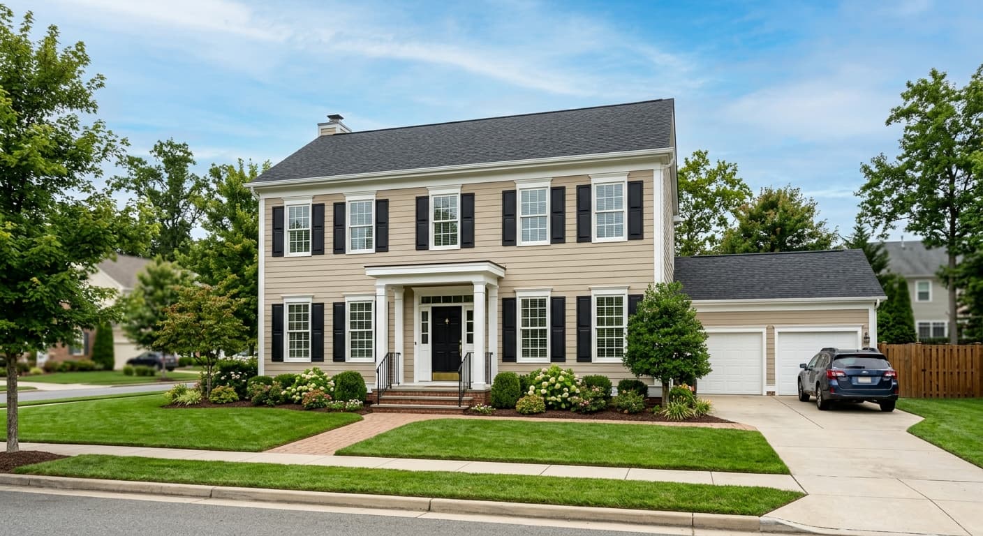
Its warmth and softness suit traditional and transitional interiors particularly well. It pairs naturally with warm-toned woods, linen, cream textiles, and natural materials like rattan and stone. In an open-plan home it gives the whole floor a unified backdrop that lets furniture and finishes do the work. It also performs well on exteriors in temperate climates where its warm neutrality reads grounded rather than stark, and it can handle cabinetry in a kitchen or bathroom where you want something warmer than white without committing to color.
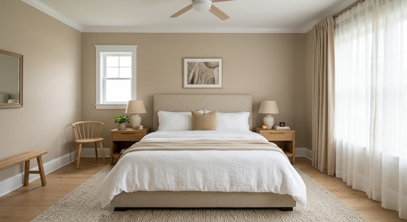
In a living room, Warm Winter creates a soft, settled backdrop that works with almost any furniture style. Its LRV of 69.8 keeps the room bright without feeling clinical, and the warm greige reads particularly well against wood floors and natural textiles. Use Cold Foam SW 9504 on the ceiling and trim to keep the envelope cohesive.
Warm Winter suits bedrooms well because its warmth reads as restful rather than stimulating. The color pulls toward a cozy beige in evening light with warm bulbs, which is exactly what most people want from a bedroom wall. Layer in cream bedding and warm wood furniture and the whole room feels cohesive without effort.
In a dining room, Warm Winter gains depth at night under warm candlelight or incandescent fixtures, where its golden undertone becomes more present. It suits both formal and casual dining rooms and holds its own alongside rich wood dining tables. Pair with Canal Street SW 9523 on a buffet or built-in for a grounded contrast.
As a whole-house color, Warm Winter earns its place by staying consistent enough across orientations that rooms feel connected, while responding to each room's light in small, flattering ways. It smooths transitions between open-plan spaces and avoids the sameness that can make a truly neutral whole-house color feel institutional.
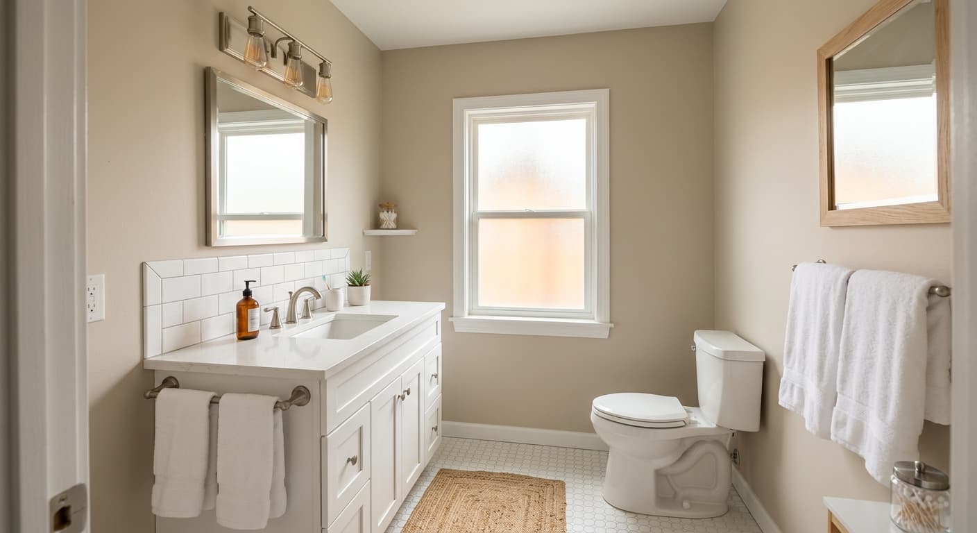
On kitchen walls or perimeter cabinetry, Warm Winter reads warm and approachable without being as bold a commitment as a true cream or tan. It coordinates well with both white and warm wood cabinetry and complements aged brass or bronze hardware. If you use it on walls with white cabinets, the contrast is gentle and flattering.
Warm Winter builds a complete palette most easily when you layer it with one lighter companion and one deeper anchor. Cold Foam SW 9504 is the natural lighter partner, a fresh near-white that gives you a clean break on ceilings, trim, or doors without introducing a jarring cool contrast. Threaded Loom SW 9512 steps in as a warm mid-tone greige that coordinates without competing, useful on an accent wall, built-ins, or millwork where you want depth that still reads as part of the same warm family.
For contrast and grounding, Canal Street SW 9523 brings a moody, deeper quality that works well on cabinetry, a kitchen island, or statement trim. The range from Cold Foam through Warm Winter to Canal Street gives you a tonal gradient that feels intentional in open-plan spaces. Beyond the coordinating palette, warm wood tones, cream and natural linen upholstery, aged brass or bronze hardware, and soft terracotta or rust accents all reinforce Warm Winter's cozy, grounded character without pulling it in a direction it does not naturally want to go.
All comparisons are matched against Warm Winter at LRV 69.8.
Pairing Warm Winter walls with a cool, blue-white trim color creates an undertone conflict that makes the wall color look unexpectedly yellow or dingy. The contrast exposes the warmth in Warm Winter rather than letting it settle quietly.
Cool gray tile or flooring fights the warm beige base of Warm Winter and can make the walls look muddy or indecisive, pulling the color neither warmly beige nor cleanly neutral.
Strong cool-toned accents, particularly cool blues or cool purples, create a stark contrast with Warm Winter's golden-beige undertone that can make the wall color look flat or washed out in comparison.
Warm Winter is a soft, light warm greige sitting between beige and gray. It reads as a creamy, cozy neutral with a warm beige and taupe character, light enough to feel open at LRV 69.8 but warm enough to feel inviting rather than stark.
The primary undertones are warm beige, taupe, and a restrained golden quality. Some reviewers also pick up a soft warm gray cast depending on the room's light and surrounding finishes. The important practical note is that Warm Winter does not read yellow on the wall despite its warmth, because the gray-greige balance keeps the golden element in check.
Warm Winter is definitively warm. It is grounded in beige and golden undertones with enough gray to keep it from going full yellow-beige, but it will read as a warm neutral in virtually all conditions rather than a cool or gray one.
Warm Winter has an LRV of 69.8, placing it in the light range. It reflects a solid amount of light and keeps spaces feeling open without approaching white. It is slightly deeper than most of its closest competitors in the warm neutral family.
The Sherwin-Williams color code is SW 9506. The hex value is #E1D9C6 and the RGB values are 225, 217, 198.
Cold Foam SW 9504 works as a fresh, lighter near-white for trim and ceilings. Threaded Loom SW 9512 layers in as a warm mid-tone greige for accent walls or millwork. Canal Street SW 9523 provides a deeper, moodier anchor for cabinetry or statement trim. Beyond the coordinating palette, warm woods, cream textiles, aged brass hardware, and muted earthy accents all support Warm Winter's character well.
Yes on all three counts. On exteriors in temperate climates it reads as a grounded, warm neutral that avoids looking stark. On cabinetry it delivers warmth without the full commitment of a cream or tan, coordinating well with both white and wood-toned elements. For a front door it can work as part of a tonal scheme, though a deeper color from the coordinating palette like Canal Street SW 9523 would make more visual impact.
