
MorningBalanced · settled cream
A warm, honey-cream that reads noticeably richer and more aged than standard off-whites, sitting at LRV 72.4 with a genuine yellow-orange backbone. Sample it on a large board in your actual light before you commit.
Antique White SW 6119 is not a white. It is a warm, soft cream that reads noticeably deeper and richer than the bright off-whites you see on most trim and ceilings. Its LRV of 72.4 places it well below the 82 to 94 range where typical trim whites live, and that gap is the whole reason it feels more saturated and aged than standard options. On the wall it has real color presence: a honey-cream warmth that immediately reads as antique rather than clinical.
In person the color shifts with the hour and the room. In north or east-facing spaces it holds its balanced creamy tone reliably through the day. Move it into a south or west-facing room and afternoon sun pushes it noticeably yellower, sometimes described by reviewers as toasty or roasty, depending on how much direct light it catches. Warm incandescent or Edison bulbs amplify this further. Small or dim rooms also concentrate the warmth, so what looked approachable on the chip can feel heavier on four walls. This is not a lighting flaw in the color; the yellow is baked in. Sample it on a large board in your actual room under your actual lighting before you commit.
The undertone picture in Antique White is mostly agreed upon but carries some honest nuance. The dominant read across independent reviews is yellow, specifically an orange-yellow rather than a clean lemon yellow. That warm, amber-tinged quality is what gives the color its aged character and separates it from cooler creams that lean gray or greige.
A smaller group of reviewers describe an occasional whisper of gray or a faint yellow-green depth that surfaces in certain lights, particularly in rooms with lots of natural green from trees or landscaping outside. This is a minority read, and it does not cancel the dominant warmth, but it is worth knowing if your room has heavy reflected green from exterior foliage. The gray note, when people perceive it, tends to appear in cooler north light rather than in direct sun.
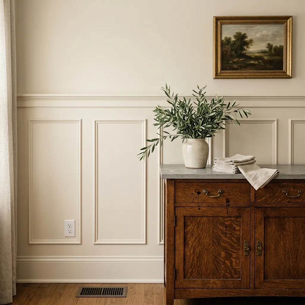
The practical consequence of all this is that Antique White rewards warm-on-warm pairings and punishes cool ones. If you set it next to a bright cool white trim, the contrast exposes and exaggerates the yellow-orange undertone, making the wall color look dingy or muddied. Warm companions absorb the undertone naturally. Cool ones put it on trial.
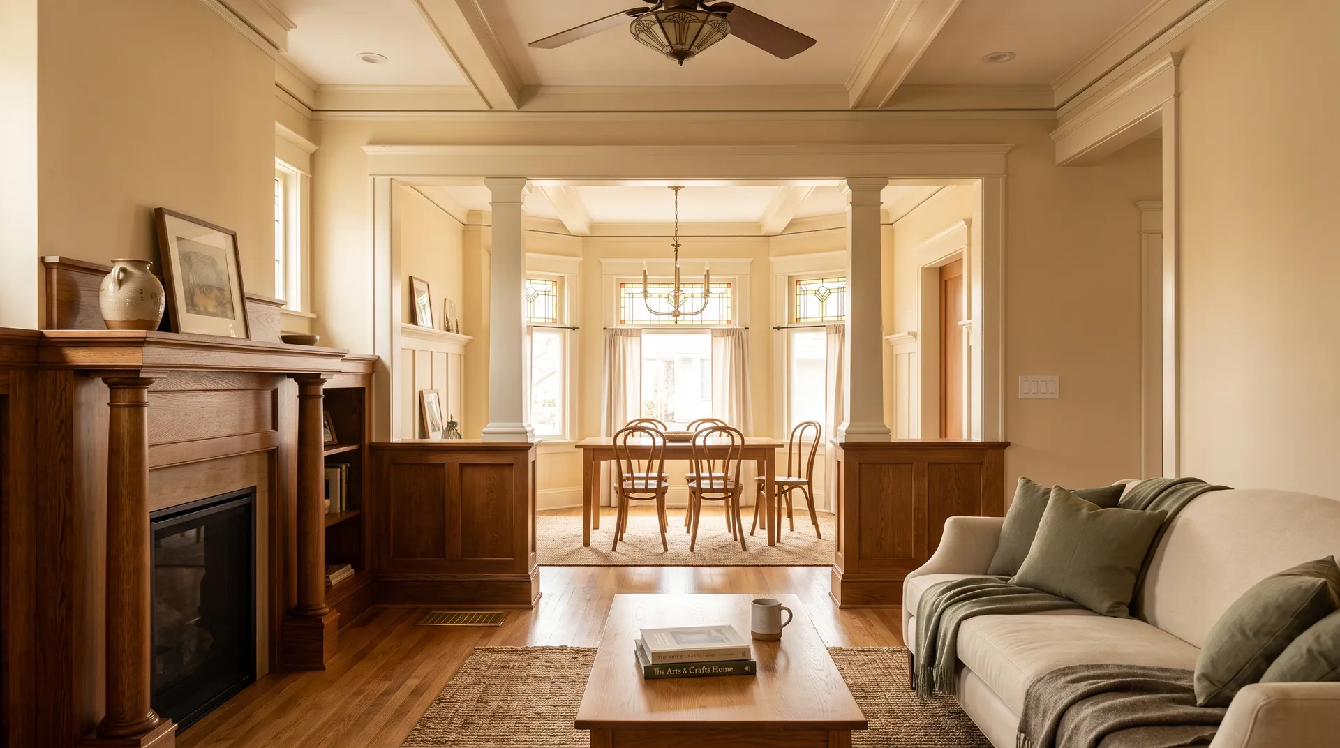
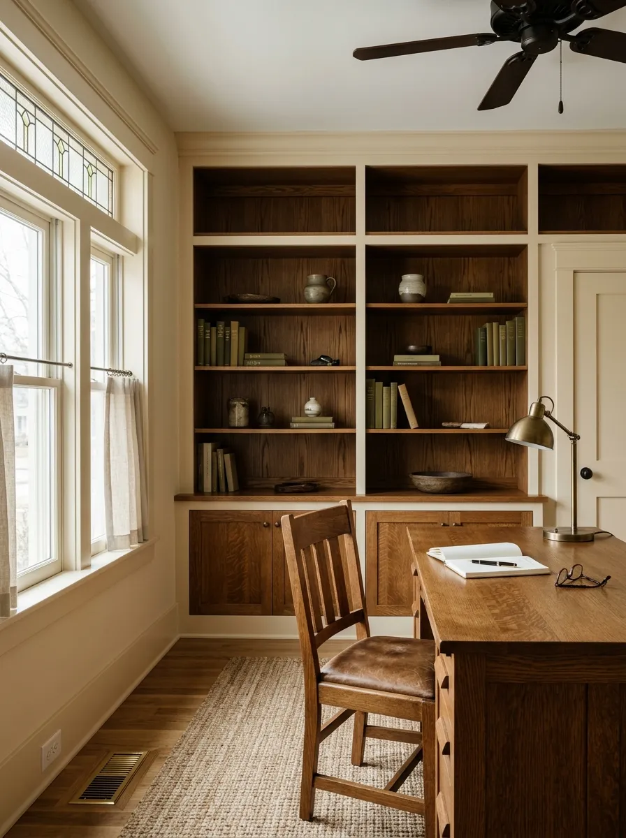
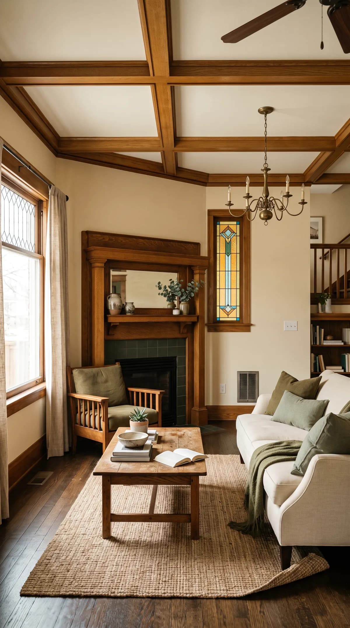
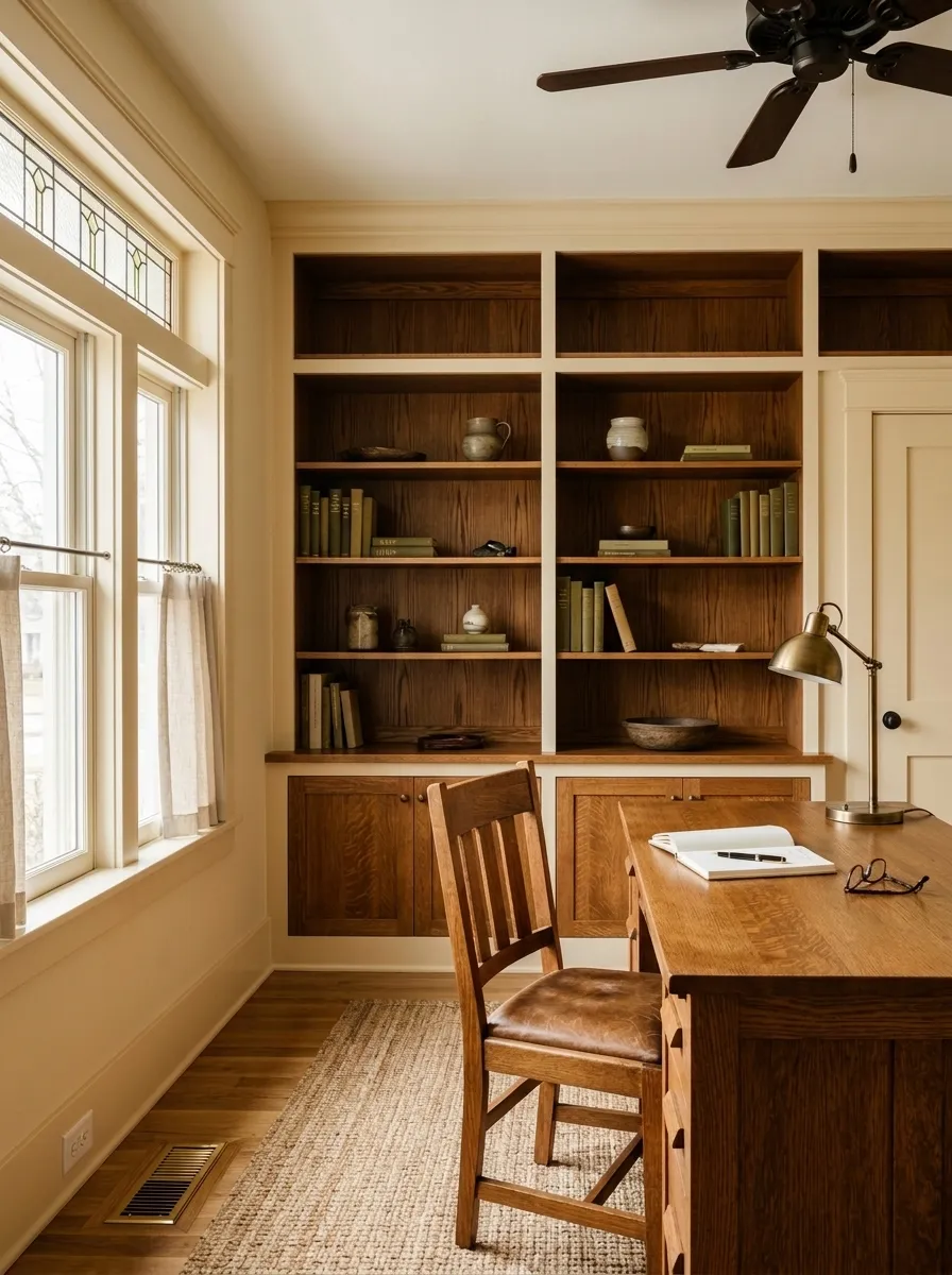
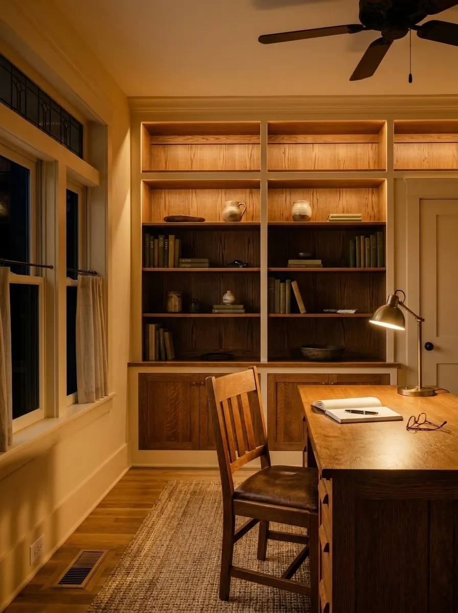
Antique White works best as a wall color in warm, traditional, vintage, or aged-style interiors. Reviewers consistently recommend it for living rooms, bedrooms, dining rooms, kitchens, and home offices where the goal is comfort and warmth rather than crispness. It suits spaces with wood tones, antique furnishings, linen textiles, and aged metals particularly well because the color's own warmth echoes those materials rather than fighting them.
Light direction matters a lot here. North and east-facing rooms give you the most controlled version of the color: creamy, settled, and readable without the aggressive yellow push you get in afternoon light. South and west-facing rooms can work beautifully with Antique White, but expect it to run warmer than the chip suggests, especially in summer. If your south-facing room already feels hot and sun-drenched, this color will read very yellow by mid-afternoon.
One firm boundary: most reviewers caution against using Antique White on trim or cabinets. Its LRV of 72.4 lacks the brightness and contrast that trim typically needs to read as clean and intentional. Cabinets painted in it can look dingy next to lighter wall colors, and they require companion colors that are one to two full tones darker than most homeowners initially picture. If you want this color on cabinets specifically, plan your wall color to be noticeably deeper, not lighter or similarly toned.
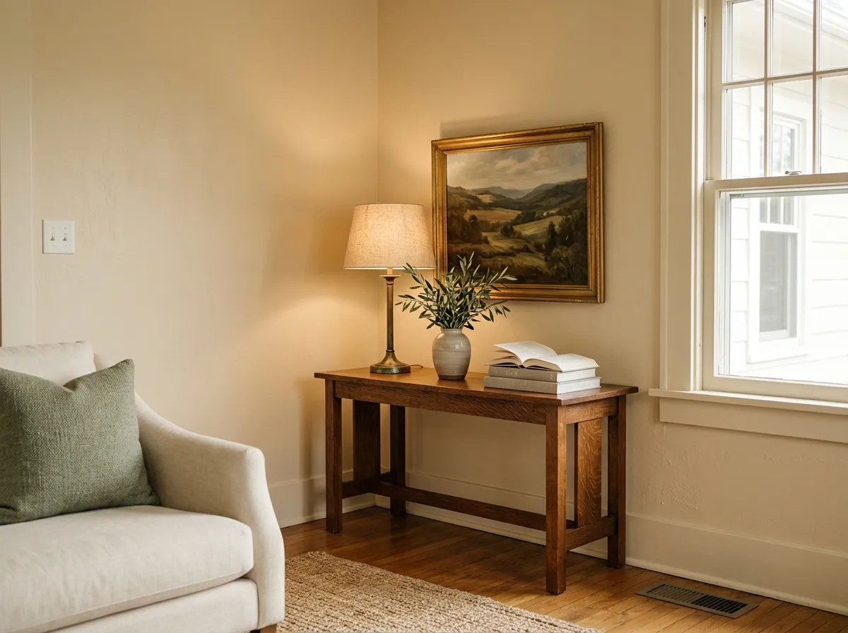
In a living room with wood floors, linen upholstery, or antique furnishings, Antique White wraps the space in warmth without feeling heavy. It reads rich and inviting rather than stark, which suits relaxed traditional or vintage-inspired sitting rooms well. Pair the walls with darker, warmer accent colors to give the room definition.
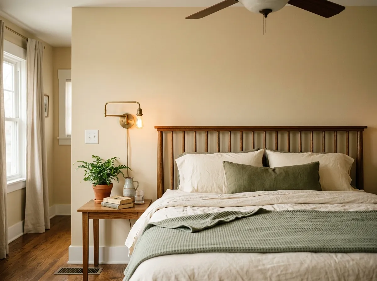
Antique White creates a calm, cocooning feel in bedrooms, especially in north or east-facing rooms where the warmth stays settled rather than going full yellow. It suits warm wood furniture, aged brass hardware, and soft linen or cotton bedding without competition. Avoid pairing it with bright white bedding or trim or the contrast will work against you.
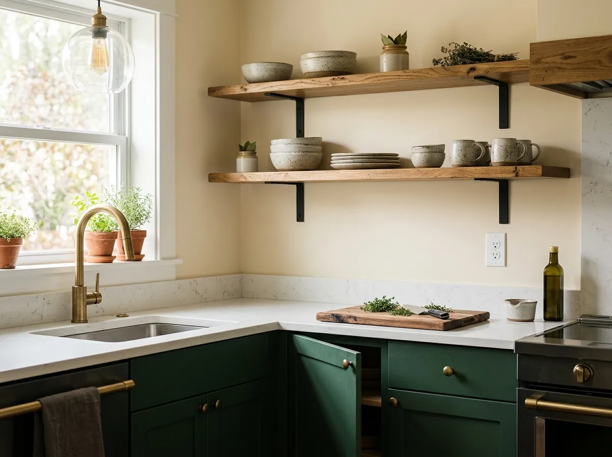
On kitchen walls, Antique White adds warmth and an aged, welcoming character that suits farmhouse or traditional kitchen styles. Avoid using it on cabinets unless your wall color is at least one to two full tones darker, since the LRV of 72.4 will read washed out next to lighter wall colors. Warm hardware finishes like aged brass or unlacquered brass complement it well.
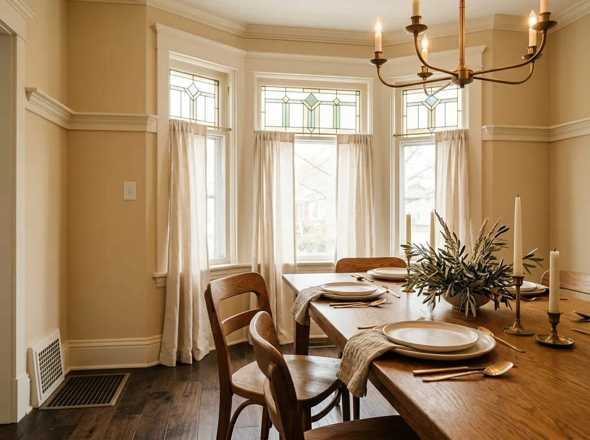
Dining rooms benefit from Antique White's flattering warmth, especially in spaces lit with warm-toned fixtures or candlelight in the evenings. The color has enough depth at LRV 72.4 to feel intentional and cozy rather than merely safe. Dark wood tables and warm textile chairs work naturally here.
Antique White's warmth means it pairs by pulling deeper and warmer, not by reaching for lighter or cooler companions. For trim and adjacent whites, warm options like Creamy (SW 7012) sit naturally beside it without creating a jarring contrast. Whole Wheat (SW 6121) takes the warmth a step further and works well for accent walls or adjacent spaces where you want a cohesive tonal shift rather than a hard break. Fallen Leaves (SW 9114) offers an earthy, grounded complement for spaces that want more contrast without going cool.
For bolder pairings, the research consistently points toward deep, saturated colors in the LRV 50 and below range: warm gray-greens, dark greiges with green undertones, and deep blues or near-black greens. These create the contrast Antique White needs to look intentional rather than faded. What to avoid: cool blues, taupe-based beiges, travertine or stone with orange-pink undertones, and anything lighter or similarly toned to Antique White itself. Bright cool white trim is the most common pairing mistake reviewers flag.
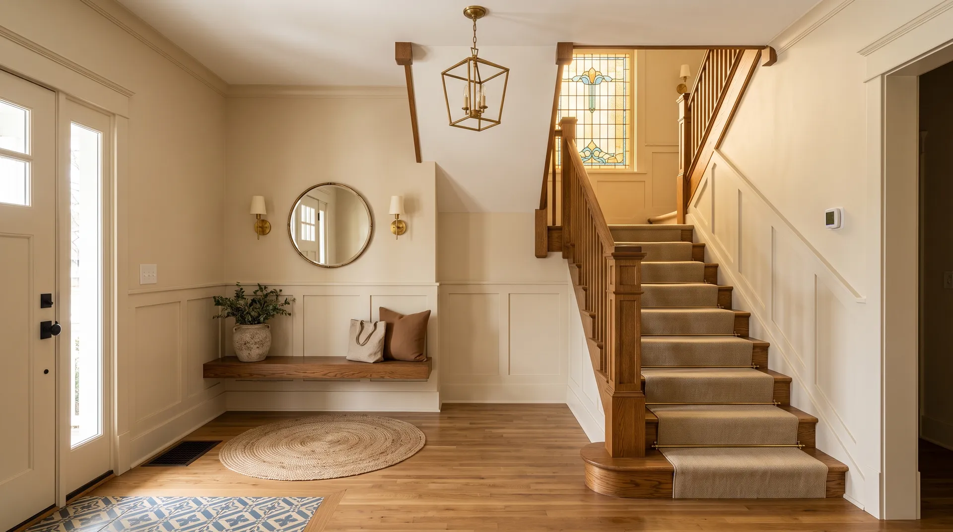
Two of the seven colors here are actual paint: Antique White wraps the entry and stair-hall walls, while Creamy handles the trim, wainscot, and stair skirt. The other five represent the room's furnishings and materials, each matched to its closest Sherwin-Williams equivalent, from Whole Wheat and Quarter-Sawn Oak to Potted Greenery, Fallen Leaves, and Aged Brass and Stained Glass. Hover any pin or swatch to see exactly which color you're looking at.
All comparisons are matched against Antique White at LRV 72.5.
Pairing Antique White walls with a bright or cool white trim color creates a contrast that exposes and exaggerates the yellow-orange undertone in SW 6119, making the walls look dingy or overly yellow-cream rather than warmly aged.
Cool blues and taupe-based beiges pull in the opposite undertone direction from Antique White's orange-yellow warmth, creating a visual tension where neither color looks its best and the cream reads muddier than it should.
Travertine tile and stone with orange or pink undertones compete directly with the orange-yellow warmth in Antique White, creating a muddy, overworked warmth that neither material intended.
It is a warm, soft cream with a clear yellow-orange undertone. It reads noticeably deeper and richer than typical whites due to its LRV of 72.4, well below the 82 to 94 range of standard bright whites. Think aged, honeyed cream rather than anything close to a true white.
The dominant undertone is yellow, specifically angled toward orange-yellow, which is what gives the color its antique warmth. A smaller group of reviewers note an occasional faint gray or yellow-green depth in certain north-facing or heavily foliage-reflected light, but that is a secondary read. The yellow-orange warmth is the primary character of the color.
Definitively warm. Its golden, orange-yellow undertone places it firmly in warm territory. It warms up further in south and west-facing rooms and under warm artificial bulbs, and it can read quite yellow by afternoon in strong direct light.
The precise LRV is 72.4. That is significantly lower than typical trim and cabinet whites, which usually run between 82 and 94, and it is why Antique White reads as a richer, more saturated cream rather than a near-white.
The Sherwin-Williams color code is SW 6119. The hex value is #E8DCC6, and the RGB is 232, 220, 198.
Warm whites like Creamy (SW 7012) work well for trim. Whole Wheat (SW 6121) and Fallen Leaves (SW 9114) are natural tonal companions. For bolder contrast, go deeper rather than lighter: warm gray-greens, dark greiges with green undertones, and deep saturated blues or near-black greens in the LRV 50 and below range all pair well. Avoid bright cool whites, cool blues, and taupe-based beiges.
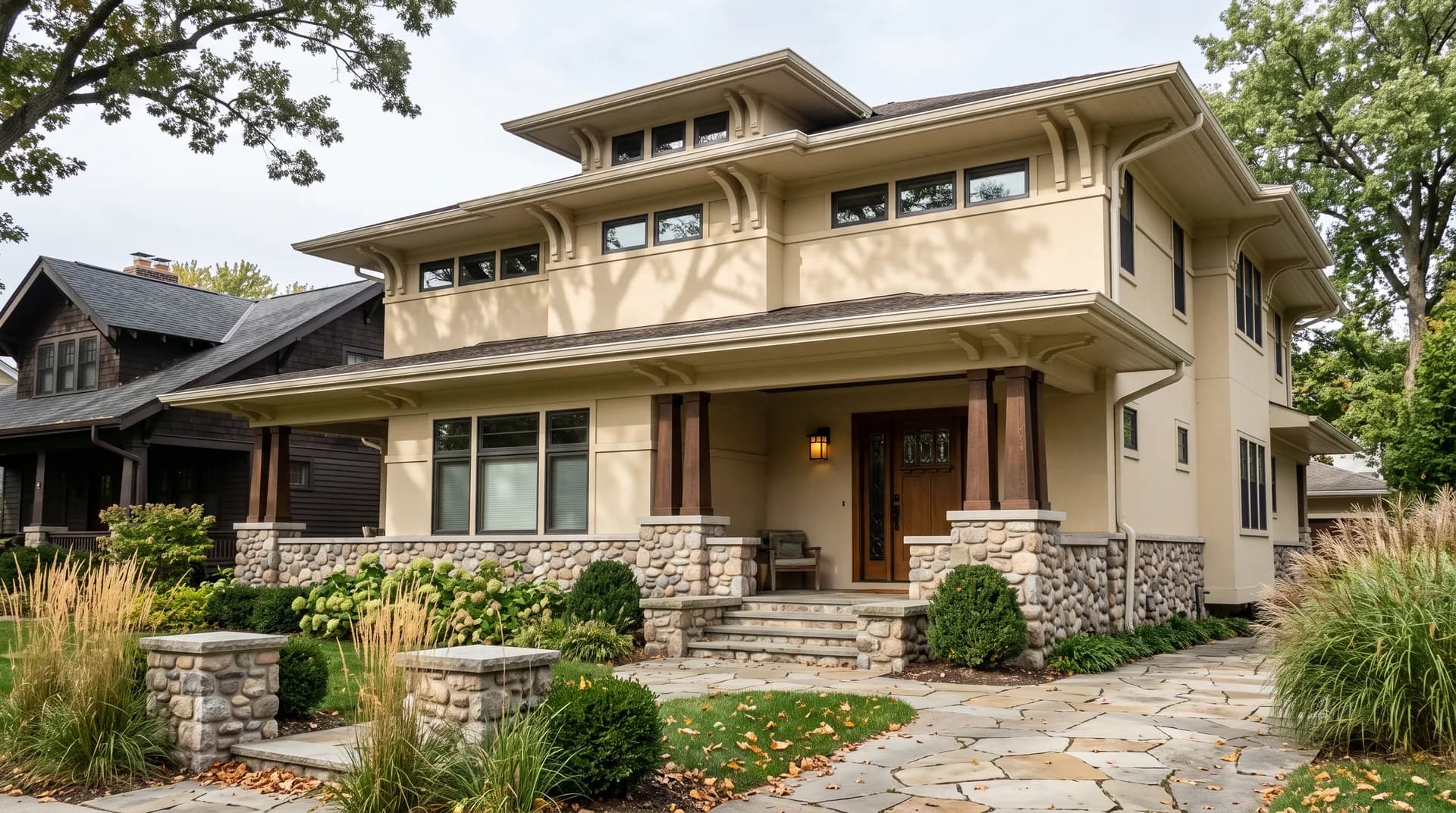
It is available in both interior and exterior formulas, so exterior use is an option, and on siding or shingles in a traditional or farmhouse-style home it can read warmly and well. Cabinets are trickier: the LRV of 72.4 lacks the crispness most cabinet whites need, and you must pair it with wall colors that are noticeably darker, not lighter. Most reviewers steer away from using it on trim for the same reason, as it tends to look dingy next to any lighter companion.