Canal Street is a medium, muted neutral that holds real presence on a wall without tipping into deep or dark territory. At LRV 28.8 it sits solidly in the mid-tone range, which means it carries enough depth to anchor a room but won't close a space down the way a true dark color would. Most people describe its on-wall character as a softened green-gray, something between a faded sage and a warm greige, with enough complexity that it refuses to read as a flat or simple color.
Light changes everything here. In strong natural light, Canal Street brightens and leans more lively, the earthy green note coming forward and giving walls a certain calm vitality. In low light or on overcast days it settles into something cozier and more serene, the gray quality deepening and the room feeling more enclosed. That range is part of the color's appeal, but it also means you genuinely need to sample it on multiple walls before committing. What looks like a soft sage on a south-facing wall can read quite differently in the same room's north-facing corner.
The overall effect is grounded and sophisticated without being heavy. It reads as a color with some age and intention to it, which suits interiors that want warmth and quiet character rather than brightness or contrast.
This is where Canal Street gets interesting and where sources genuinely disagree. Sherwin-Williams positions the color within a blue and teal undertone story, and that naming aligns with its New Orleans and deep coastal associations. In cooler north light or when placed next to crisp bright whites, that blue-leaning read can surface, and the color takes on a slightly more coastal, almost aquatic quality.
In practice, however, independent reviewers consistently lead with green-gray rather than blue or teal. The dominant character in most rooms, under most light conditions, is a muted earthy green sitting alongside warm gray. Some describe it as closer to a soft sage that has been dulled and warmed, others as a greige that has picked up a definite green note. The beige and warm-gray undertones keep it from ever reading as a pure cool green or a sharp blue, so it stays in that comfortable, complex middle ground.
The honest answer is that Canal Street behaves differently depending on what surrounds it and how much natural light hits it. Against warm off-whites the green-gray reads more softly. Against cool or bright whites the blue note the brand describes becomes more credible. This undertone debate is not a flaw in the color but a genuine feature of how it was mixed, and it means your specific room conditions will determine which read you live with.
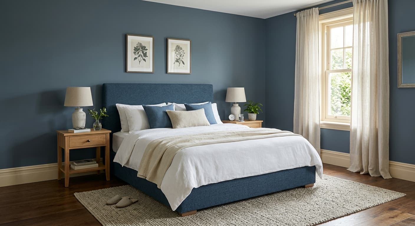
Canal Street earns its keep most readily in bedrooms and dining rooms, the two interior room types where its mid-depth, calming character does the most work. In a bedroom it creates a backdrop that feels settled and restful without being so dark that the room loses air. The green-gray quality is psychologically grounding, and reviewers consistently describe it as easy to live with over time rather than a color that demands attention or grows tiring.
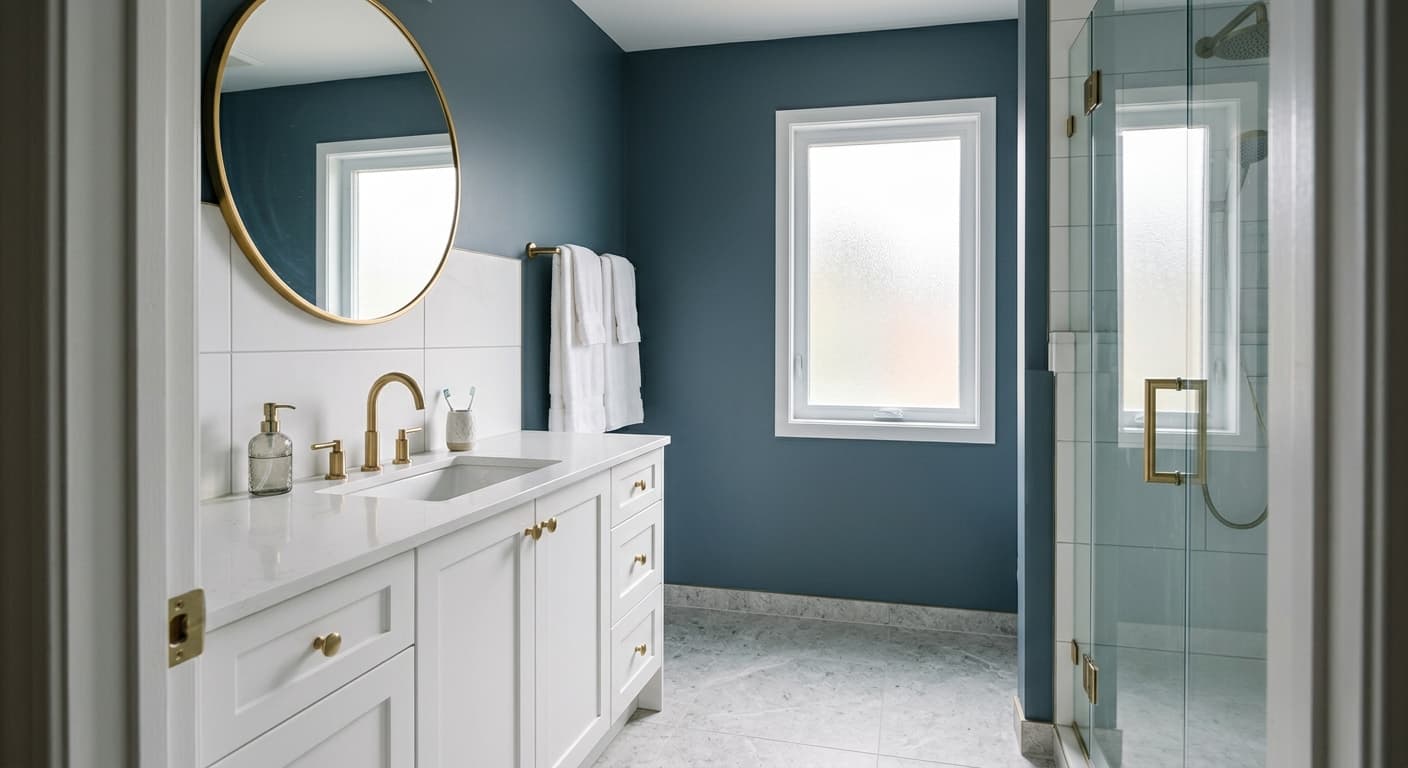
Dining rooms respond well to its depth. At LRV 28.8 it holds its color under evening lighting and candlelight, which is exactly the condition dining rooms need to perform in. It gives the space a cocooning quality during meals without making daytime use feel oppressive. Bathrooms and similar smaller spaces where a calm, spa-adjacent mood is wanted also suit it well, though the official room pairing focuses on bedrooms and dining rooms as the primary targets.
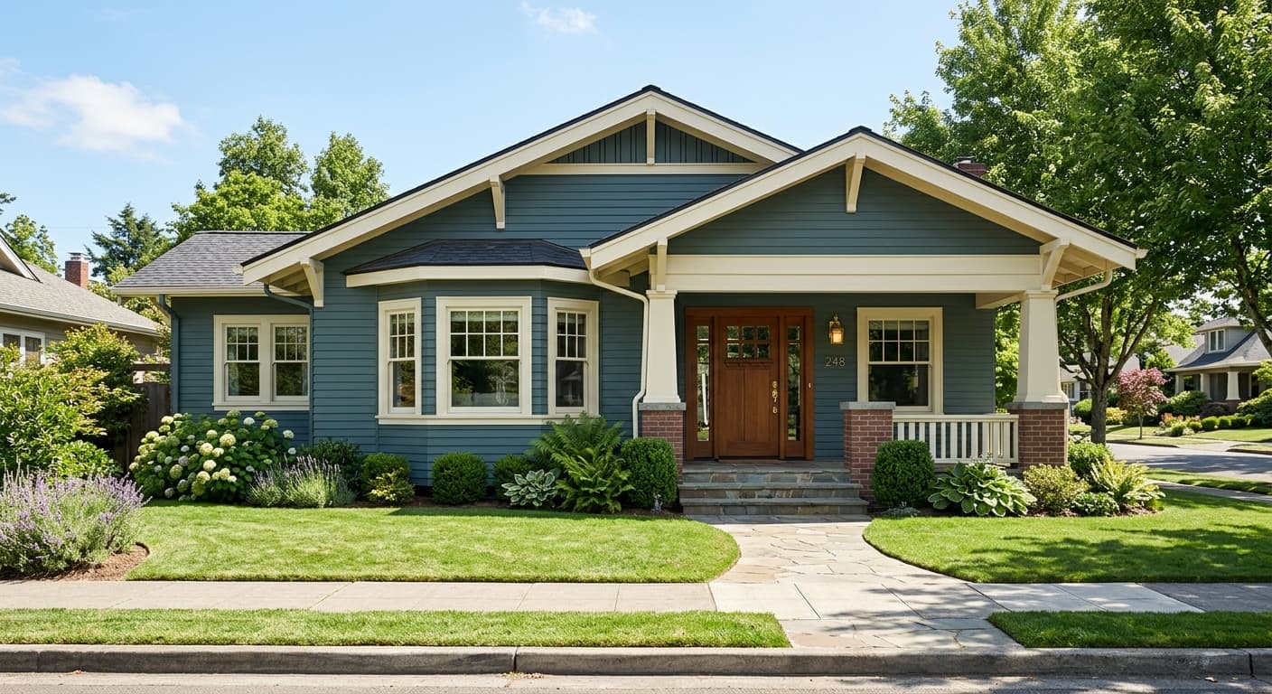
On exteriors Canal Street works as both a body color and a more dramatic accent. It functions well as a versatile mid-depth exterior option and suits architectural styles that call for a quiet, naturalistic palette rather than a bold statement. Designers also point to its compatibility with modern, minimalist, and Scandinavian interior styles, where its muted complexity reads as considered restraint. Orientations with strong direct light will push the color more toward its green-earthy register, while shaded elevations or north-facing conditions bring out that cooler, bluer quality the brand name suggests.
Canal Street's muted green-gray is genuinely restful in a bedroom, where LRV 28.8 gives walls enough depth to feel intentional without darkening the space uncomfortably. Pair it with natural linen, warm wood tones, and Cotton (SW 9581) on trim to keep the palette cohesive. The color holds through both bright morning light and evening lamp light without shifting into uncomfortable territory.
At LRV 28.8, Canal Street performs well under the evening and candlelight conditions that dining rooms actually live in most of the time. It gives walls a cocooning, settled quality that makes meals feel more considered. Keep the ceiling lighter, with Cotton (SW 9581) or a warm white, to maintain a sense of height.
On an exterior Canal Street reads as a mid-depth, naturalistic body color that suits craftsman, cottage, and modern farmhouse styles particularly well. Its green-gray quality blends with landscape rather than fighting it, and warm off-white trim in the Cotton family keeps the scheme from reading cold or flat. Sample on multiple elevations since shaded and sunlit sides will behave quite differently.
The grounded, calm character of Canal Street suits a workspace where focus rather than stimulation is the goal. Its earthy green-gray register avoids the starkness of a pure gray without introducing warmth that distracts. North-facing offices will see more of the blue-teal quality; south or east-facing rooms will read more green and lively.
Reviewers note that Canal Street works well in smaller rooms where a spa-adjacent, calming mood is wanted. The color's complexity keeps a bathroom from feeling monotone or flat, and its muted quality means it pairs easily with natural stone, warm metals, and wood accents. Adequate lighting matters here since at LRV 28.8 the space will feel noticeably different with and without natural light.
Canal Street pairs most directly with Cotton (SW 9581), a warm off-white that softens the color's green-gray edge rather than sharpening it. Using Cotton on trim, ceilings, or adjacent rooms keeps the palette feeling cohesive and naturalistic rather than high-contrast. The warmth in Cotton prevents Canal Street from sliding toward the cooler, more coastal blue read it can develop next to brighter or crisper whites.
Simple Stone and Braintree round out the coordinating trio, offering adjacent neutrals that stay in the same earthy, muted register. Together these pairings support an interior palette that leans toward modern organic, Scandinavian simplicity, or a restrained coastal aesthetic. For exterior applications the warm off-white direction remains the most reliable companion, keeping the overall scheme grounded and away from anything that reads harsh or stark against Canal Street's nuanced mid-tone.
All comparisons are matched against Canal Street at LRV 28.8.
Pairing Canal Street with a stark, cool bright white on trim or ceilings amplifies the blue-teal undertone and can make the combination feel sharp and slightly disconnected rather than cohesive.
A floor in a cool gray or blue-gray tone competes with Canal Street's own undertone ambiguity, and the two can fight rather than complement, making both surfaces look muddier than they are on their own.
At LRV 28.8, Canal Street in a high-gloss finish on full walls reflects a lot of light and can expose the undertone shifts dramatically across different parts of the room, making the color look inconsistent rather than complex.
Canal Street is a medium, muted neutral that most people read as a softened green-gray, sitting between a faded sage and a warm greige. Sherwin-Williams ties it to blue and teal associations through its coastal naming, and those undertones can surface in cooler light, but the dominant on-wall character in most rooms is an earthy green-gray.
This is genuinely a mixed answer depending on your source and your light. Sherwin-Williams lists blue and teal undertones, which align with the color's deep coastal positioning. Independent reviewers, however, consistently lead with green-gray and warm earthy tones as the dominant character. In north-facing or low-light conditions the blue quality becomes more credible. In direct natural light the earthy green-gray read takes over. The color contains enough complexity that both reads are real, and your specific room conditions will determine which one you experience most.
It sits in between, which is part of what makes it useful. The green-gray character and the earthy, slightly warm quality of the base keep it from reading as a cool or stark color, but the blue and teal undertones mean it is not warm in the way a true beige or tan would be. Most reviewers describe it as neutral-leaning with a grounded, calm quality rather than pinning it firmly to either side.
Canal Street has an LRV of 28.8, which puts it firmly in the mid-tone range. It holds real color on the wall without washing out in bright light, and it does not go so dark that it closes a room down. For context, colors below LRV 25 start to feel genuinely dark in typical rooms, so Canal Street at 28.8 sits at the deeper end of medium without crossing into dark territory.
Cotton (SW 9581) is the most reliable companion, a warm off-white that works on trim, ceilings, and adjacent spaces. Warm wood tones, natural linen textiles, and warm stone surfaces all sit comfortably alongside Canal Street's green-gray register. On exteriors, warm off-white trim keeps the scheme cohesive. Avoid cool grays and bright stark whites, which can push the undertone toward a colder, less intentional read.
Canal Street is Sherwin-Williams code SW 9523. Its hex is #969281 and its RGB values are 150, 146, 129. The LRV is 28.8.
Yes on exteriors, where Canal Street functions as a versatile mid-depth body or accent color that suits craftsman, cottage, and modern styles. Its naturalistic green-gray reads well alongside landscaping and pairs cleanly with warm off-white trim. For front doors and cabinetry the mid-tone depth at LRV 28.8 gives enough presence to make an impression without going so dark that the detail is lost. Sample it on the actual surface and check it at different times of day, since shaded and sunlit conditions will behave differently.
