Cornwall Slate
What Cornwall Slate Actually Looks Like
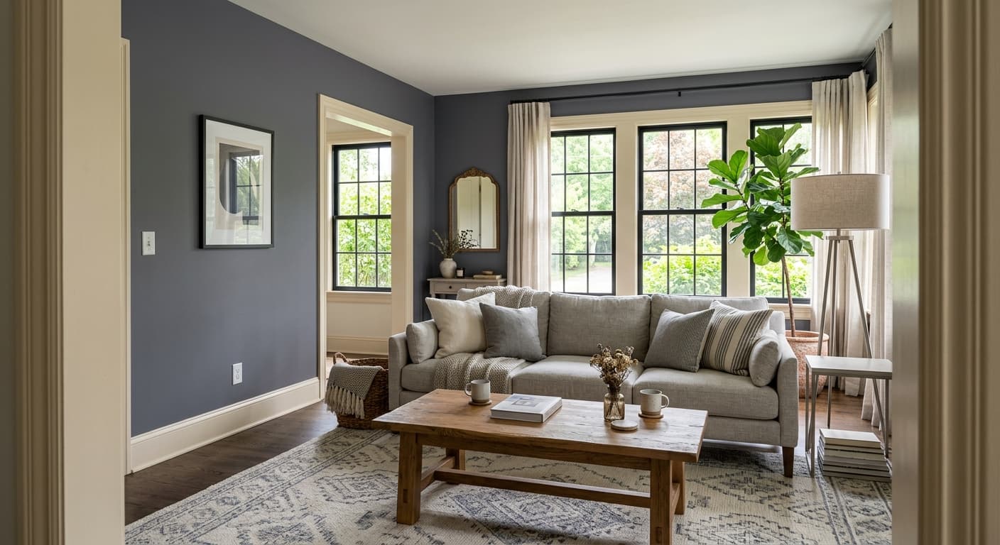
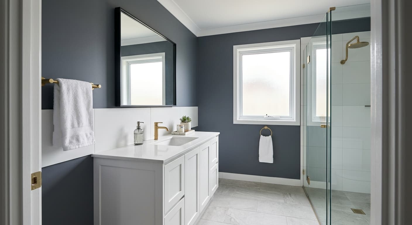
Cornwall Slate is a deep blue-gray that reads more gray in some rooms and more blue in others. Think of the color of wet slate roofing tile or storm clouds gathering over the ocean. It has weight to it. This is not a soft, airy color that disappears into the background.
In bright daylight, you will see the blue come forward and the gray settle back. The color looks cooler and crisper. Toward evening, or under warm lamplight, it shifts darker and the blue mutes into something closer to charcoal. That range is part of what makes it interesting to live with. The wall you saw at noon is not quite the wall you see at 9pm.
What sets it apart from a flat navy or a plain gray is that middle ground. It carries enough blue to feel intentional and enough gray to stay grounded and serious. On a north-facing wall it can lean almost slate-charcoal. On a south-facing wall, expect more of the blue to register.
Cornwall Slate Undertones
The dominant undertone here is blue, with a cool gray base underneath. Watch for that blue when you set it next to other colors. Put it beside something with a green or yellow undertone and the contrast can turn muddy. Pair it with clean cool whites and crisp neutrals and the blue stays clear and deliberate.
Undertones matter most at the edges, where your wall meets trim, flooring, and furniture. A warm beige carpet next to Cornwall Slate will fight the wall. A cool greige or a true gray will support it. Hold your samples against each other before you commit, because this color does not play nicely with everything.
Where Cornwall Slate Works Best
This color rewards rooms where you want depth and a little drama. Studies, dining rooms, powder rooms, and bedrooms all suit it well. It works beautifully on cabinetry and built-ins, where the depth reads as quality rather than heaviness. A kitchen island in Cornwall Slate gives you contrast without going fully black.
South and west-facing rooms get the most out of it because the warmer light keeps the blue lively. In a north-facing room, the color goes moodier and cooler, which can be exactly what you want for a den or a bedroom, but be honest about whether you want cozy or cold. In small rooms, lean into the drama instead of fighting it. A small powder room painted floor to ceiling in this color feels like a decision, not a mistake.
What to Pair With Cornwall Slate
For trim, a crisp white like Pure White (SW 7005) or High Reflective White (SW 7757) gives you clean contrast that makes the blue pop. If you want a softer edge, try Alabaster (SW 7008), though watch that its warmth does not clash. Brass and aged bronze hardware look excellent against this color. So does natural wood with a cool or neutral finish, like white oak.
For walls in adjacent rooms, pull from cool neutrals. Repose Gray (SW 7015) and Agreeable Gray (SW 7029) both transition well. White oak or medium-gray flooring grounds the room. For furnishings, lean into camel leather, cream linen, and deep greens. A velvet sofa in a muted olive or rust gives you that designer-level contrast without trying too hard.
Colors That Clash With Cornwall Slate
Skip warm-toned beiges, honey oak floors, and orange-leaning wood tones. They make the blue look dingy and pull the whole room out of balance. Avoid pairing it with another strong color of equal weight, since two heavy hitters in one room compete for attention. And do not use it in a windowless room expecting it to feel cozy. Without light to activate the blue, it can read as flat and cave-like.